Tag: color
Think beyond flowers.
I think we got the same memo – sensational gray.
With Rosemary Hallgarten.
Color Obsession: Citrus & Lime
I find myself craving color right now, drawn to everything bright, sunny, and cheerful.
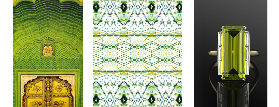
Maybe it’s because I was born in summer , but this my favorite time of year. I find myself craving color right now, drawn to everything bright, sunny, and cheerful. This is the season when I search for bold hues that make a big impact. Lemon, lime, and other citrusy colors remind me of the warmth of the sun and are perfect for this season. You see these colors in a lot of vintage fashion from the 1940s and 1950s, a time when people were adventurous in how they dressed. You can definitely make a summer splash with Citrus and Lime!
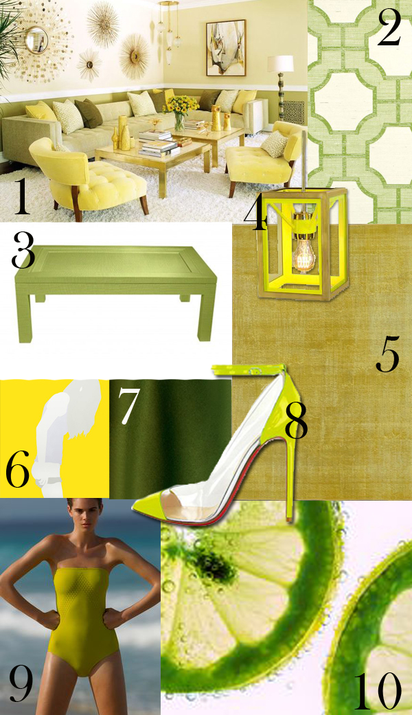
- Living room by Jeff Andrews Design.
- Imperial Gates – Green and Key Lime on Ivory Manila Hemp from Phillip Jeffries.
- Malibu Wrapped Coffee Table from Oomph.
- Cosy Light Fixture from Urban Electric.
- Overdyed Vintage Rug from Sacco Carpet.
- Pulling Down on Yellow, 2013. Gloss paint on aluminum. 49 x 49. By Natasha Law.
- Lime Alpaca from Sandra Jordan.
- Christian Louboutin Cap Toe Lucite Heels
- Swimsuit by Eres Paris.
- Bubbles and Lime Slices
Linda Colletta
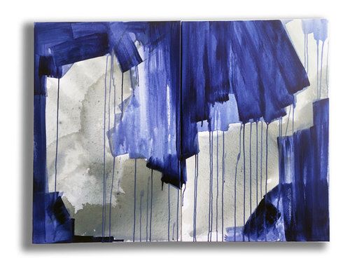
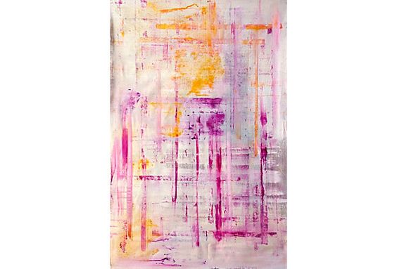
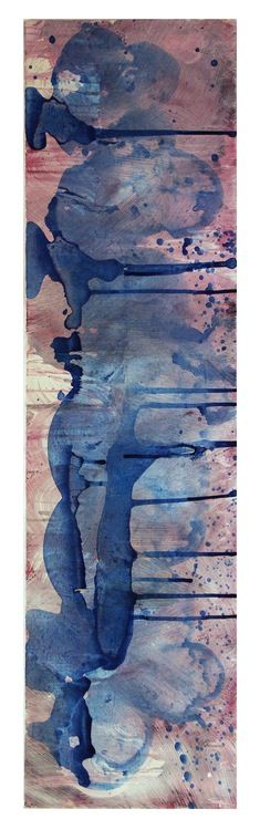
Linda Colletta is an abstract expressionist painter who lives and works in Bridgeport, CT.
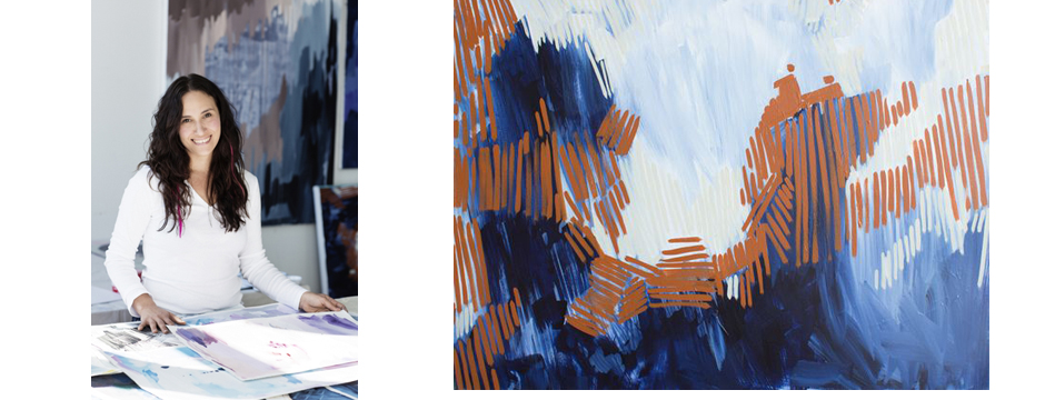
Linda Colletta is an abstract expressionist painter who lives and works in Bridgeport, CT. She began her career in art as a scenic painter in the music television industry after studying the Parsons School of Design. Linda’s artistic approach is focused on creating paintings that add beauty to the world.
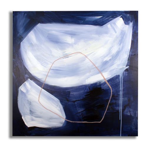
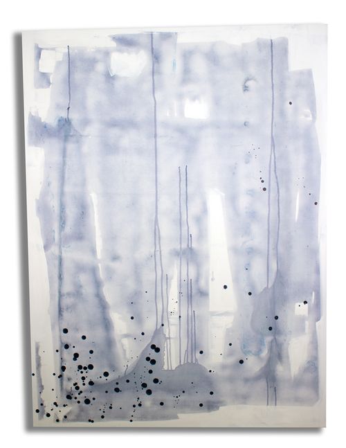
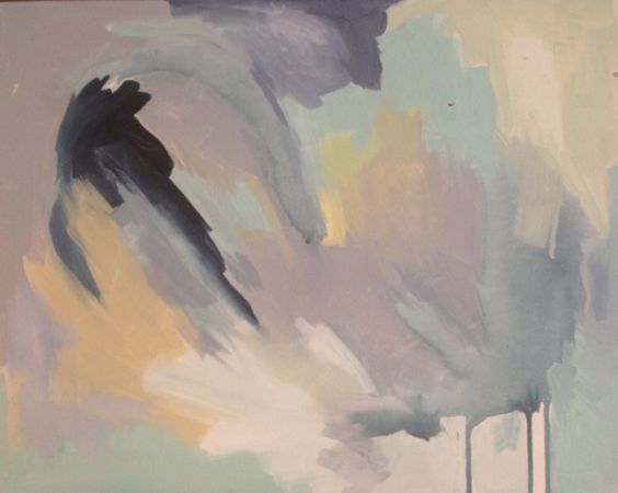
When I first met Linda, I instantly felt like I’d known her all my life. She seems truly connected with her work, a trait you quickly notice about her. Linda’s paintings offset either a traditional or modern setting so well. Her high impact work features bright, bold color with a lot of movement. Some of her paintings took serene to me, while others are definitely playful.
I love that Linda’s work can be curated. She can engage with clients to create custom, one of a kind pieces. If I select her work, for myself or for a client, I know she is completely vested to it.
You can see more of Linda’s work on her website. She is also on Facebook.
At Home in Fairfield County: Get Fresh
At Home in Fairfield County Magazine asked forty designers, including me, to pick tried and true colors for a fresh spring look.

At Home in Fairfield County Magazine asked twenty designers, including me, to pick tried and true colors for a fresh spring look. My choices are Steep Cliff Gray and French Lilac from Benjamin Moore. Pick up a copy of the March/April issue to see all of the top color choices!

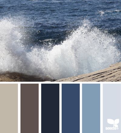
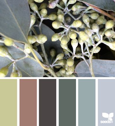
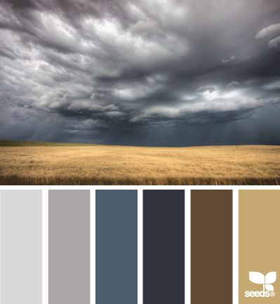
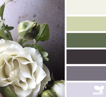
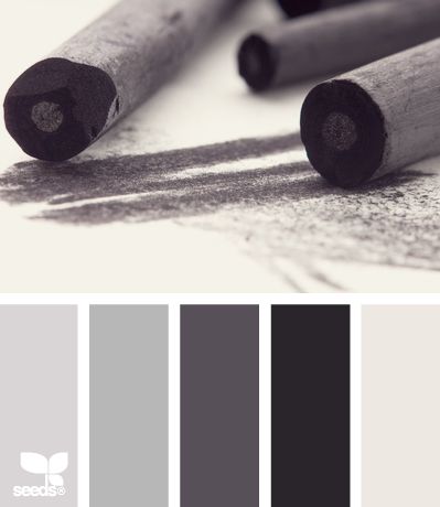
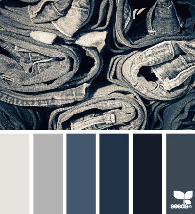
Design Seeds
Design Seeds is a site that celebrates colors found in nature.
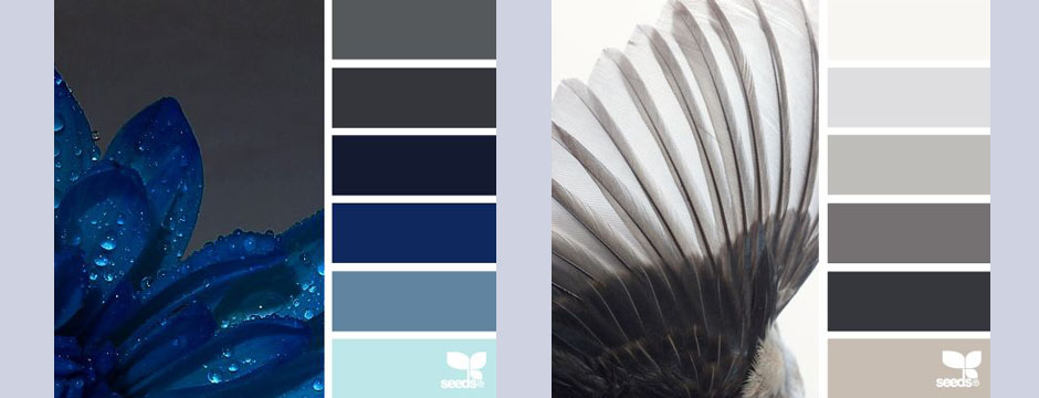
Design Seeds is a site that celebrates colors found in nature. Created by Jessica Colaluca, Design Seeds is a unique site that lets you explore color palettes based on stunning photos of everything from flowers to interior vignettes. Jessica uses her own photos or images submitted to her and creates custom color palettes based on those photos. Unlike automatic color generating programs, Jessica digitally creates each hue herself.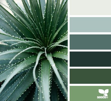
In addition to being visually quite beautiful, Design Seeds is a great resource for a variety of applications. Comparing the many palettes is really inspiring. It’s fascinating to see the images deconstructed to individual colors and to think of the many ways to incorporate them into an interior or other color scheme. Jessica has made the HEX code (a way of specifying color using hexadecimal values) available for each color, making it easier to digitally recreate a hue you may want to use. A good paint store should be able to match shades printed with a well calibrated printer.
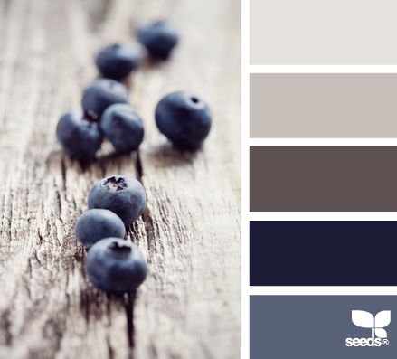
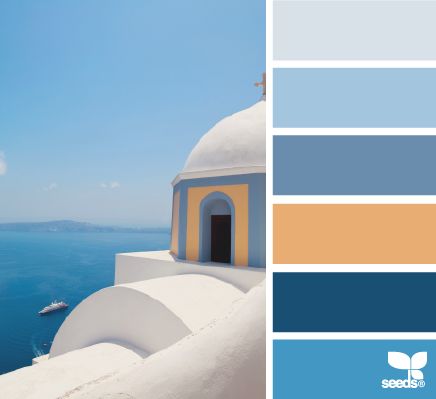
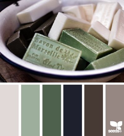
Design Seeds is a great resource. I love to browse through the site and feel inspired by how different colors are paired. It’s a fascinating way to create a palette as well as a helpful visual tool to exemplify a vision to a client.
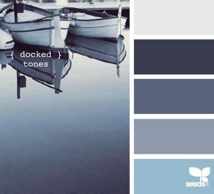
Color Obsession: Nautical Blue
To me, Nautical Blue brings to mind a more lush, sophisticated take on summer.
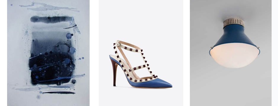
The word nautical typically conjures up images of novelty items like anchors, gulls, and sailboats. To me, Nautical Blue brings to mind a more lush, sophisticated take on summer. It’s a strong, bold color that reminds me of growing up on the water. Nautical Blue makes me think of the ocean, reflections, and the places where I find inspiration. As part of an interior, you can do a play on a nautical theme in a subtle way by using nubby fabric or a blue and white stripe. The interpretation of this shade and theme doesn’t have to be literal.

1. Togo Sofa from Ligne Roset
2. Commodore by Sherwin Williams
3. Cushion cover by Shibori
4. Chanel
5. Hexagon Range from Geometric Carpets
6. Blue Note Blonde, oil on canvas, Matt Story
7. Fabric by Ferrick Mason
8. Shoulder bag by Prada
Method Monday
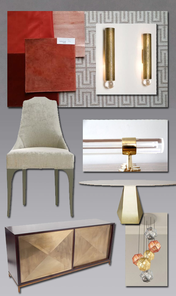
This design scheme came about while I was working with an existing client, brainstorming ideas for their dining room.
This design scheme came about while I was working with an existing client, brainstorming ideas for their dining room. I wanted to do something glamorous. The adjacent family room and kitchen included a lot of yellow, so for the dining room I decided to insert some brass for a touch of glimmer. The room is somewhat small and intimate, so I wanted to smother it in saffron. I thought of silk walls, saturated drapes, and a pure gradation of the same tone. The light fixture is something I really fell in love with. Because the plan for the walls and window treatments is monochromatic, the rug provides contrast. The resulting scheme has a depth of color reminiscent of summer and happiness.
Color Obsession: Apricot
Apricot makes me think of sun kissed skin and sheer femininity.
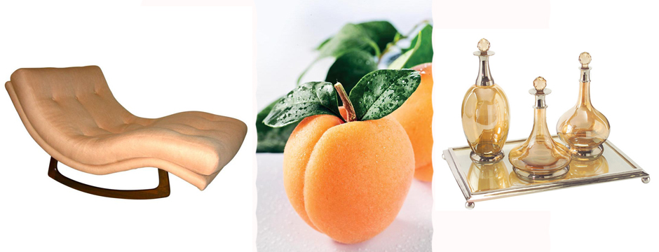
Apricot makes me think of sun kissed skin and sheer femininity. It evokes happiness, liveliness, and a kind of sweet freshness. Apricot is not as intense as orange, but has a lighter approach – it holds a yellow-pink undertone, making it possible to mix it with other palettes or maintain one consistent value.
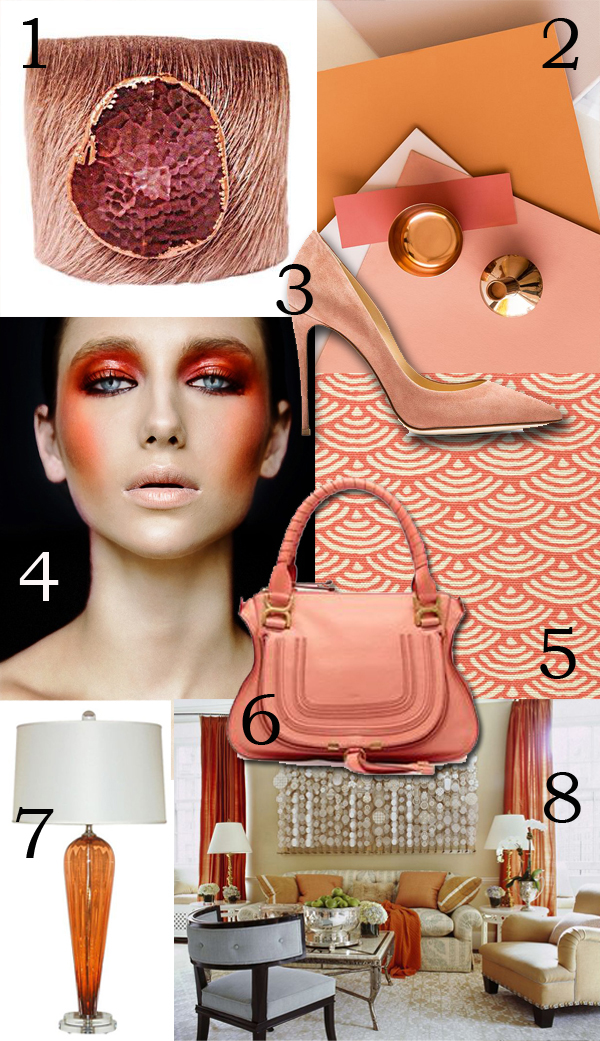
2. Great palette. Image via Elle Decoration.
3. Dolce & Gabbana Pumps
4. Stunning makeup.
8. Living room design by Jeffrey Bilhuber.