Connecticut Cottages and Gardens: Paper Chase

I had so much fun working with Connecticut Cottages and Gardens to compile wall paper collections for a feature in the April 2015 issue.

I had so much fun working with Connecticut Cottages and Gardens to compile wall paper collections for a feature in the April 2015 issue.  Each collection is based on a specific palette but combines patterns and textures to show a range of possibilities.  I hope you’ll pick up a copy and let me know what you think!

Amy Aidinis Hirsch cover

Amy Aidinis Hirsch 76Amy Aidinis Hirsch 77Amy Aidinis Hirsch 78Amy Aidinis Hirsch 79Amy Aidinis Hirsch 80Amy Aidinis Hirsch 81Amy Aidinis Hirsch 82Amy Aidinis Hirsch 83Amy Aidinis Hirsch 84Amy Aidinis Hirsch 85

Method Monday

Today’s Method Monday features a neutral scheme based on a grey palette.

Today’s Method Monday features a neutral scheme based on a grey palette.  I love this combination of fabrics and furnishings for the variety of textures.  The use of white elements brightens everything up and the overall feel is modern and sleek, but comfortable.

MONDAY POST2 copy

Method Monday

One of my favorite parts of the design process is pairing fabrics with furnishings, lighting, and accessories.

One of my favorite parts of the design process is pairing fabrics with furnishings, lighting, and accessories.  It’s the most creative part of what we do and the point where everything comes together.  This is the strategic part of balancing various elements.  Laying out fabric options so I can see how they work together in terms of color and texture is a simple method to narrow down and finalize choices.  When I add in other elements, a picture starts to come together and my vision for an interior really takes shape.  Here’s a glimpse at this method!

Amy Aidinis Hirsch Interior DesignI always start with the colors, and what I love about this combination is that the three colors are so cool together.  I would use navy for the rug, grounding the room.  The gold/yellow would be on the walls, brightening the space.  When the green is added, it just pops — and that particular element doesn’t work without the grounding aspect of the navy.  Together, they just work so well.

Color Obsession: Olive

Olive is one of those hues I tend to gravitate toward.

When I think of Olive, it reminds me of army colors.  It is one of those hues I tend to gravitate toward.  Olive is an earth-oriented shade, not something that pops with jolts of color.  It has a more serene presence.  Although part of the green color family, Olive has a brown under hue and works well with a gray or neutral based palette.  It’s also a very specific color.  When you say green, people visualize a whole spectrum of possibilities.  Say Olive, and everyone understands exactly what color that is.

Amy Aidinis Hirsch Color Obsession Olive

1.  Living room design by High Fashion Home.

2.  Cleos Breeze fabric by Robert Allen

3.  Z Spoke handbag by Zac Posen

4.  Over the knee boots by Christian Louboutin

5.  Paint colors by Benjamin Moore

6.  Image via Modernica

7.  Tripolina Chair from Environment Furniture

8.  Dress by Shinaz Engineer

9.  Risky Business, 2010, by Madeline Denaro


Cover Image:  Guiseppe Zanotti Open Toe Bootie, Valentino Rockstud Hobo, Living room image via DigsDigs


Color Obsession: Currant

When I think of Currant, I think of a deep, sultry color.

When I think of Currant, I think of a deep, sultry color.  I became inspired by it as a change from the trend of black, white, and neutral interiors.  I recently pitched this color for a library as a cohesive palette to pair well with and balance rich wood tones — think walnut and wine.  It’s definitely more dramatic, being so deep and saturated and just a more grounded color.   A hue like this is about taking chances and steering away from the path everyone else is walking.

Amy Aidinis Hirsch Interior Design CT

1.  Teatro Cervantes Buenos Aires IV, 2006 by  Candida Hofer

2.  Torn Spiral Series, Moss & Lam

3.  Sloop Chair by Amy Somerville

4.  Donna Karan, New York Fashion Week Fall 2014

5.  Currants, via Tumblr

6.  Decollete 554 by Louboutin

7.  Over Dyed Vintage by SACCO Carpet

8.  Rock Chronograph Watch by Marc Jacobs


Color Obsession: Celosia Orange

Celosia Orange is a great color for this time of year.

One of the best things about spring is the opportunity to embrace the brightness of the season.  Celosia Orange is a great color for this time of year.  It’s a crisp, saturated, uplifting hue that can add a bit of fun to a space or provide a boost with a dramatic splash of color.  Use it to spice up a neutral palette or add zest to a modern interior.  Bold and eye-catching, Celosia Orange is one of my favorite shades.

Amy Hirsch Celosia Orange

1.  An amazing color for a low rider!  (source)

2.  Hermes, always a classic.

3.  Mark Rothko, Untitled No. 11

4.  Saint Laurent Color Block Ring

5.  Celosia Orange Rug from Crate and Barrel

6.  Gorgeous design by S.R. Gambrel

7.  Cool shoes!  (source)

8.  Gorgeous dress by KaufmanFranco


Flower Arrangements

If those first daffodils make you smile when you’re out walking or driving around, imagine what a colorful bunch of flowers can do when you place them on your desk or around your home.

For many people, the arrival of spring brings an immediate lift in spirits.  Warmer weather, sunnier days, and greener scenery just naturally brighten life.  The added color of flowers returning to gardens and flower beds is another welcome sight this time of year.  If those first daffodils make you smile when you’re out walking or driving around, imagine what a colorful bunch of flowers can do when you place them on your desk or around your home.  While it’s quick and easy to pick up a bouquet at the market or order an arrangement online, the experience of visiting a flower shop and browsing the many different flowers available is both inspiring and relaxing.

Flower ArrangementsFlower Arrangements 2Flower Arrangements 6

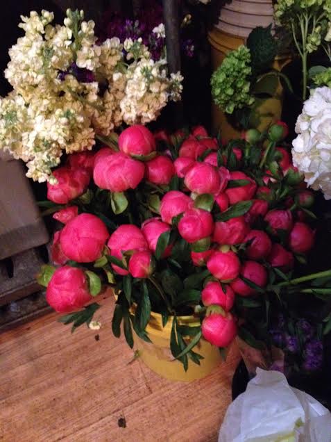
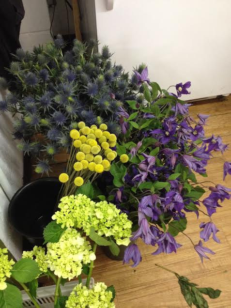
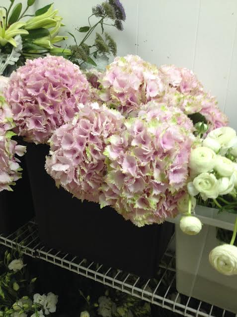
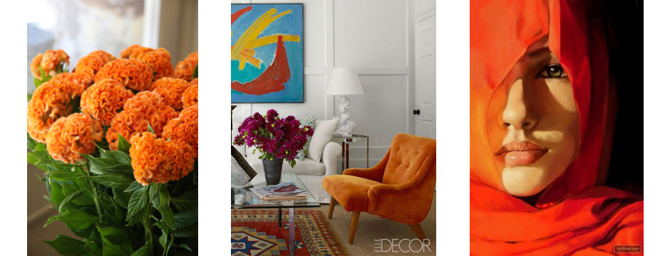
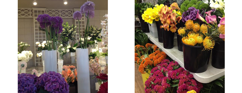
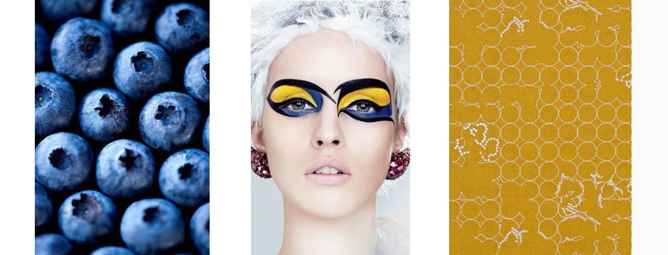
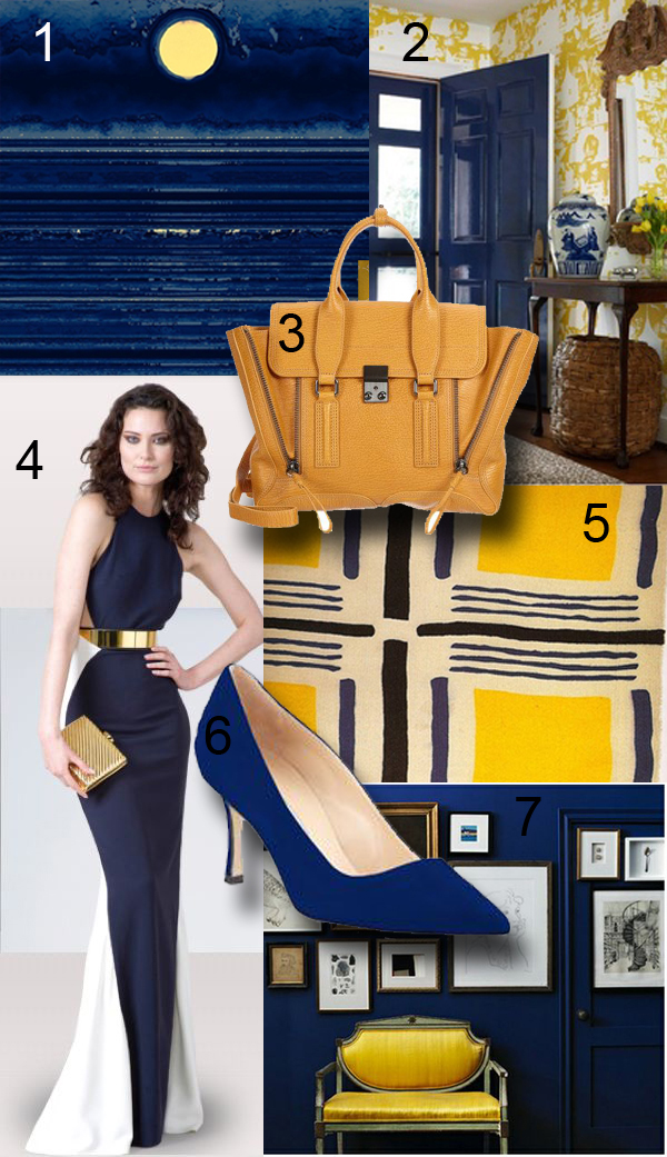
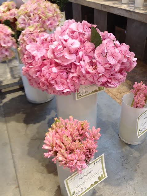
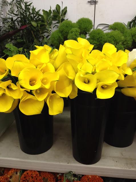
Exploring what your local florist has to offer provides you with so many more options than you get from a pre-made arrangement.  You can select the freshest flowers and most appealing palette, all while consulting the florist on the best way to display your choices.  You may find flowers you’ve never heard of, or be inspired by a particularly beautiful color.  My favorite flowers include all colors of calla lilies, celosias, and peonies.  Parrot tulips are as couture as they come, and hydrangeas remind me of the spirit of summer.  I love freesia for the smell alone and purple is my favorite!

Flower Arrangements 7Flower Arrangements 9

Hand-picking the flowers for an arrangement is a wonderful way to present someone with a thoughtful gift.  A custom arrangement for Mother’s Day is such a nice way to recognize the holiday.  While you’re choosing flowers for the mothers in your life, why not treat yourself to an arrangement as well?  Find a flower that really catches your eye.  It will make you smile for days!

Flower Arrangements 5Flower Arrangements 3

My go-to local florist is McArdle’s in Greenwich.  A family-owned business, they are always ready to pull off anything I ask for, even when I call at the last minute.  My flower selection process, like my approach to interiors, is carefully thought out, with thoughtfully paired elements.  How do you like to shop for flowers?


Amanda Nisbet

Amanda Nisbet is a true powerhouse in the world of interior design.

Amanda Nisbet is a true powerhouse in the world of interior design.  She is full of energy, with an exuberance that shows in her interiors.

Pops of color.
Pops of color.

Born in Montreal and educated in the U.S., Amanda Nisbet now lives in New York.  Early in life, she aspired to be an actress.  After a couple of commercials and small roles in smaller plays, she changed direction.  Acquaintances who loved the style of her apartment often asked for her help in decorating their own homes.  Amanda’s interior design skills come purely from talent — she did not go to design school or receive any formal training.  I’ve been fortunate enough to see her speak twice and find her work to be so inspiring.

Amazing wall treatment.
Organic rather than geometric shapes in the rug.

What I like about Amanda Nisbet’s design style is the fearlessness of her work.  Her designs are saturated with color in combinations that are really empowering.  She has a great sense of scale with art and a playful, avant garde feel.  You can see her personality in her interiors.  I really identify with her love of color.

Saturation of color -- no fear!
Saturation of color — no fear!
Large scale sofa.
Large scale sofa.
Great painting, whimsical light fixture, graphic rug.

To see more of Amanda Nisbet’s work, visit her website.  You can also find her on Facebook.


Color Obsession: Blueberry and Yellow

Blueberry and yellow is one color combination I really love.

A few days ago, I saw some freelance work my Project Manager Jess was working on.  She makes beautiful cards, and was testing colors for her creations.  One of her palettes used blueberry and yellow, and it struck me as so appealing.  The next day, Krystal, another project manager, came in dressed in a really great outfit with the same blueberry and yellow palette.  I love how inspiration can come in tiny ways like this; a lovely card or a striking outfit.  Inspiration doesn’t have to come from some grand scheme but can be found in so many places.  These colors became the inspiration for an entire family room design.

The contrasting shades of blueberry and yellow bring out the best in each other and provide such a bright, rich hue.  It’s a graphic and eye-catching combination, with the darker blue bringing out the sunniness of the yellow.  It brings to mind warm summer days, something most of us are looking forward to this time of year.  In both interior design and fashion, blueberry and yellow are so uplifting.

Amy Aidinis Hirsch

1.  Blue and Yellow

2.  Suellen Gregory Interior Design

3.  Phillip Lim Pashli Satchel

4.  Dress by Stella McCartney

5.  Swatch by artist Sonia Delaunay

6.  Manolo Blahnik Suede Pumps

7.  Design by Joel Bray