Method Monday

This is a design scheme we came up with for a coastal home with views of Long Island Sound.

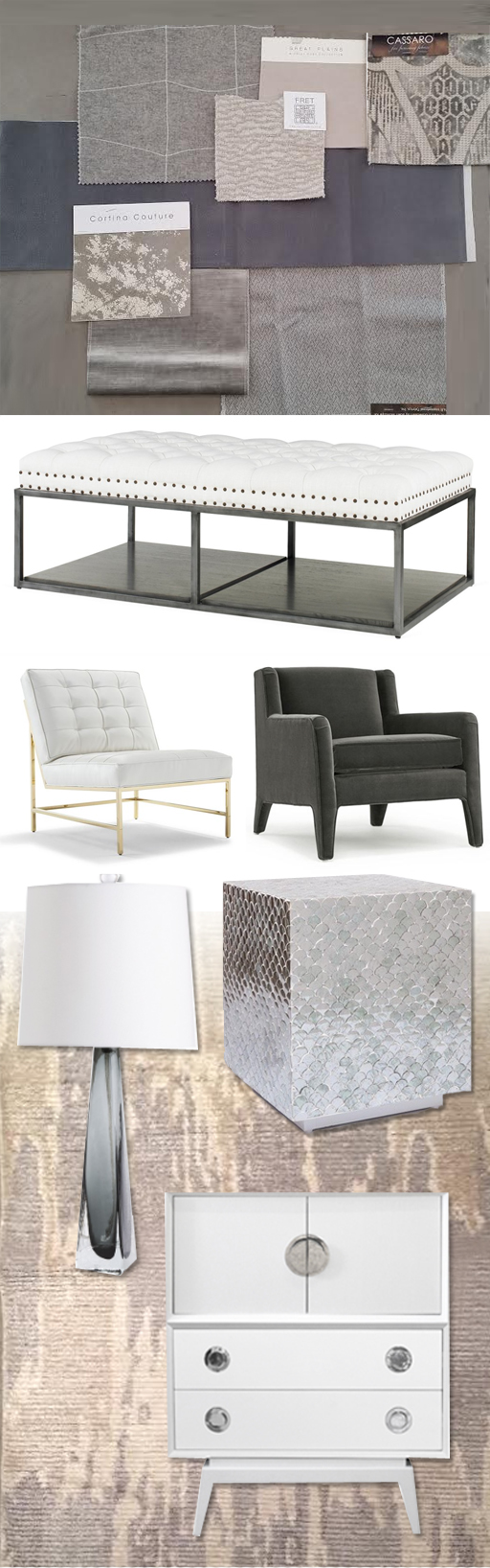
This is a design scheme developed for a coastal home with views of Long Island Sound.  The architecture embraces the view so that the all you see from the spectacular rear of the home is the sea.  In contemplating the design, we wanted no obstruction to the breathtaking setting.  One of the challenges of a home with a wide open floor plan is choosing furniture so that nothing competes .  There needs to be a cohesive feel throughout the space.  To achieve this, we chose a monochromatic, neutral palette.  There are transitional elements and a user friendly approach for this family — they have children and also like to entertain.  We kept a textural sense by combining the oak floors and douglas fir ceilings with cozy, warm fabrics.  The patterns are not overly bold, resulting in a welcoming, comfortable home that makes the most of the beautiful seascape.

version 4 copy

Save

Method Monday

This design scheme came about while I was working with an existing client, brainstorming ideas for their dining room.

This design scheme came about while I was working with an existing client, brainstorming ideas for their dining room.  I wanted to do something glamorous.  The adjacent family room and kitchen included a lot of yellow, so for the dining room I decided to insert some brass for a touch of glimmer.  The room is somewhat small and intimate, so I wanted to smother it in saffron.  I thought of silk walls, saturated drapes, and a pure gradation of the same tone.  The light fixture is something I really fell in love with.  Because the plan for the walls and window treatments is monochromatic, the rug provides contrast.  The resulting scheme has a depth of color reminiscent of summer and happiness.

Amy Aidinis Hirsch Interior Design

Method Monday

Today’s Method Monday features a neutral scheme based on a grey palette.

Today’s Method Monday features a neutral scheme based on a grey palette.  I love this combination of fabrics and furnishings for the variety of textures.  The use of white elements brightens everything up and the overall feel is modern and sleek, but comfortable.

MONDAY POST2 copy

Method Monday

One of my favorite parts of the design process is pairing fabrics with furnishings, lighting, and accessories.

One of my favorite parts of the design process is pairing fabrics with furnishings, lighting, and accessories.  It’s the most creative part of what we do and the point where everything comes together.  This is the strategic part of balancing various elements.  Laying out fabric options so I can see how they work together in terms of color and texture is a simple method to narrow down and finalize choices.  When I add in other elements, a picture starts to come together and my vision for an interior really takes shape.  Here’s a glimpse at this method!

Amy Aidinis Hirsch Interior DesignI always start with the colors, and what I love about this combination is that the three colors are so cool together.  I would use navy for the rug, grounding the room.  The gold/yellow would be on the walls, brightening the space.  When the green is added, it just pops — and that particular element doesn’t work without the grounding aspect of the navy.  Together, they just work so well.