Contemporary Dining Room

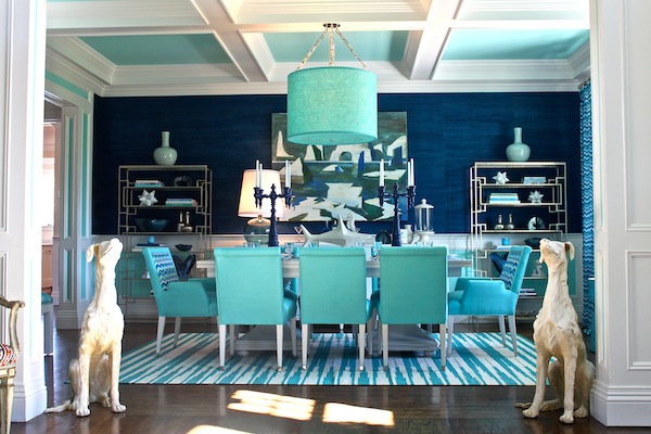
This dining room became one of my favorite projects.

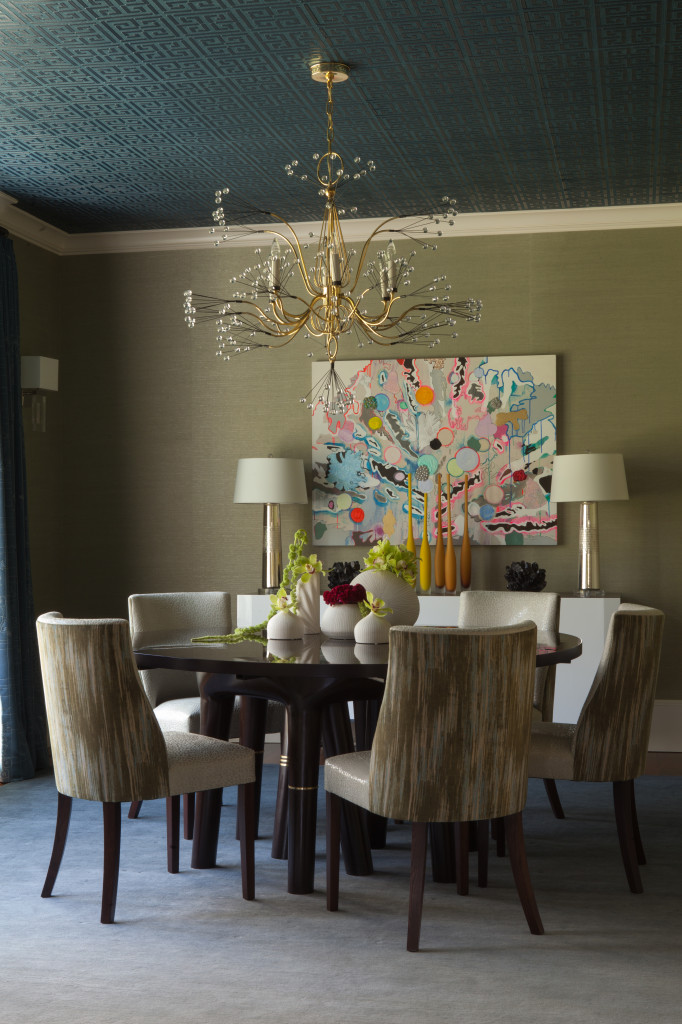
When I meet with a client to present my ideas for a design project, I come prepared with samples, tear sheets, and specific products.  This way, the finished room is true to the original vision.  When working on this dining room, I was so fortunate to have a client who was open to unexpected ideas.  While her style was reserved in many ways, she had a contemporary edge that particularly shows in the completed dining room.  By giving me carte blanche with this room, my client pushed me to be creative in designing a strong, confident room that combines traditional elements for a funky effect.

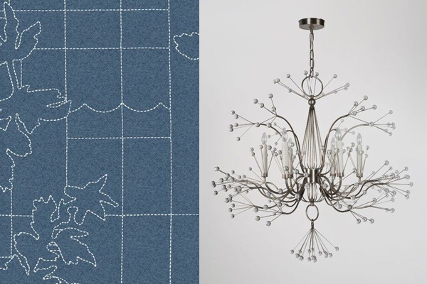
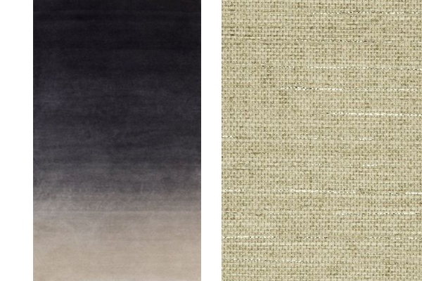
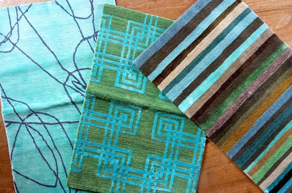
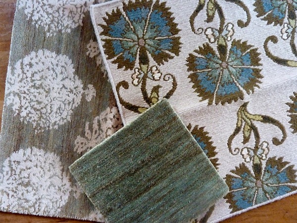
After getting to know this client by asking questions and spending time learning about her lifestyle and tastes, I went back to my studio to put together a presentation.  These are some of the individual elements I presented.  Sometimes it can be difficult for clients to look at these separate pieces and create a mental image of how they will come together in the finished room, but in this case we had a perfectly shared vision.
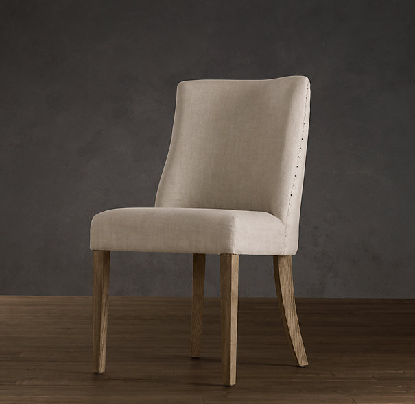
Restoration Hardware chair, before staining and reupholstering.
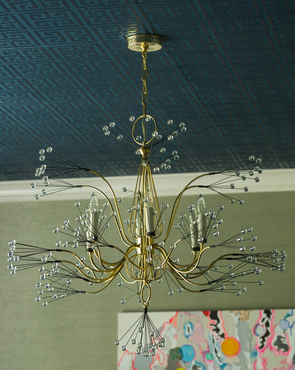
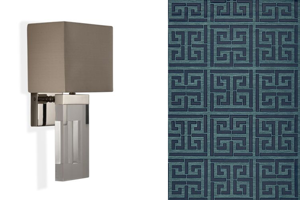
Light fixture and Greek Key pattern for ceiling.
Fabric for window treatments and chandelier.
Carpet with gradated color and grasscloth wallcovering.

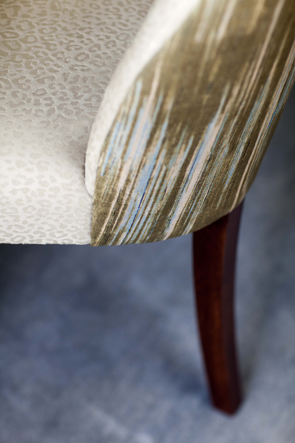
When I presented my ideas for the window treatments and ceiling, as well as the cool digital printing on the chairs, my client had faith in me that the installation would be cohesive.  When a client and I work together like this, the outcome is always a truly special interior.  That level of trust when working together produces the ideal collaboration.  Seeing the dining room bring together so many eclectic parts and become a wholly unique, exciting room was a testament to the relationship between client and designer.
Amy Aidinis Hirsch Interior Design
The finished dining room.
Amy Aidinis Hirsch dining room design 10
Detail of finished chair.
Amy Aidinis Hirsch dining room design 6
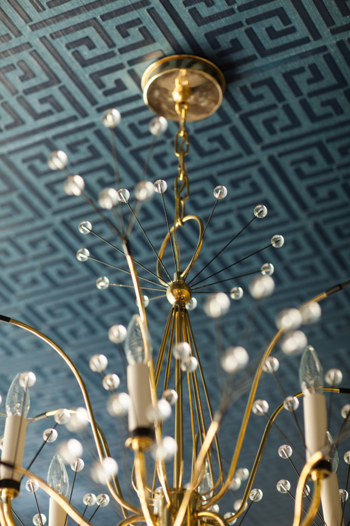
Greek Key wallcovering by Schumacher.
Amy Aidinis Hirsch dining room design 4
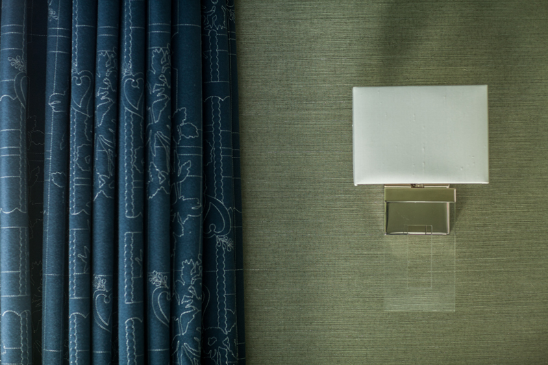
Window treatments, light fixture, and grass cloth wallcovering in completed room.

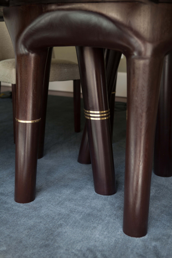
One of the challenges in designing this room was finding the right dining table.  My client wanted a table with versatility that would also give the room needed weight.  After an exhaustive search, we were able to design a table similar to another style we liked, but using different materials to achieve exactly the right look.  Brass bands were added to the table legs at the last minute to give the piece some needed jewelry.  The chandelier by Tony Duquette adds a bit of glam to the dining room.
Amy Aidinis Hirsch dining room design 2
The brass bands were the perfect finishing detail here.
Amy Aidinis Hirsch dining room design 9
Same chandelier presented above in a different finish. Perfect vintage vibe.

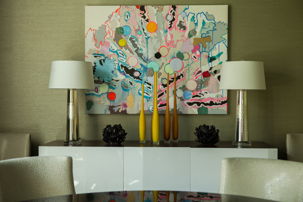
One focal point of this whimsical room is the art, a piece the client found.  I love it when my clients discover artwork; it’s such a personal, emotional choice and when the client has a hand in choosing the artwork, the room is a truer reflection of their taste and style.  This piece enhances the room’s art deco edge with whimsy.
Amy Aidinis Hirsch dining room design 11
Love the art my client chose!

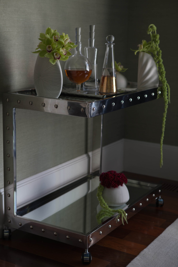
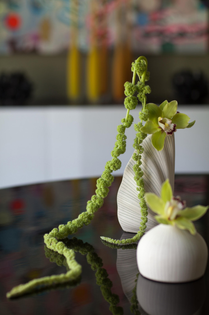
Other fun details add to the personality of the dining room, giving it added color and visual interest.
Amy Aidinis Hirsch dining room design 3
Bar cart with rivet details.
Amy Aidinis Hirsch dining room design 7
Even the greenery is funky.

This dining room became one of my favorite projects.  It is more artistic than most rooms I’ve designed and really shows the voice of the client as well as the result of an ideal collaboration between designer and homeowner.

Color Obsession: White

A naturally reflective and bright color, white accommodates a range of accent hues and pairs so well with natural tones.

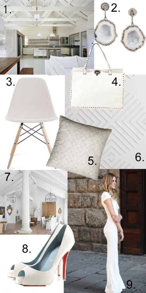
White is a great color in both design and fashion.  It is so clean, crisp, and refreshing.  A naturally reflective and bright color, white accommodates a range of accent hues and pairs so well with natural tones.  During the warm summer months, white looks cool against sun-kissed skin whether worn all over or just with accessories.  How do you like to use white?

white design and fashion

1.  Modern barn design in white by Robert Young Architects.

2.  Kimberly McDonald Geode and Diamond Earrings

3.  Eames Molded Plastic Dowel-Leg Side Chair from Design Within Reach

4.  Valentino Studded Leather Tote

5.  Vanderhurd Cushion

6.  Cavetto Wallcovering from Weitzner Limited

7.  Beautiful white living room.  Image via Safavieh

8.  Christian Louboutin Very Prive

9.  White dress by Alexander McQueen

My Favorite Magazines

You hear a lot about how the digital age is taking over the publishing market, but I still love my stacks and stacks of magazines.

You hear a lot about how the digital age is taking over the publishing market, but I still love my stacks and stacks of magazines.  Pinterest may be a great way to save and organize online inspiration, but I like to do some things the old, reliable, consistent way and that usually means ripping pages out of magazines when I see something I love!

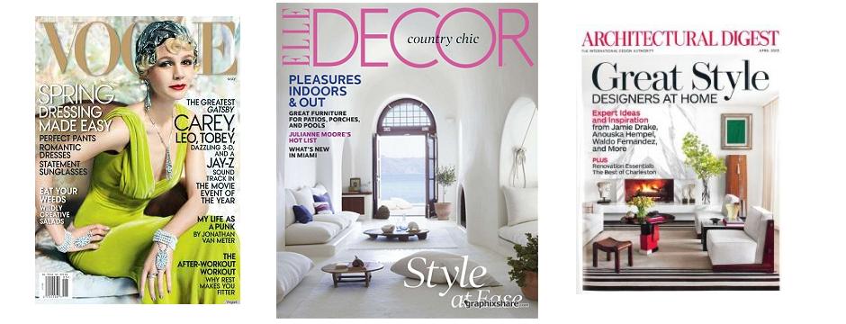
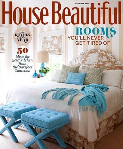
My stack of magazines consists of Elle Decor, House Beautiful, and Architectural Digest.  These staples of design inspiration are always a welcome sight in the mailbox and keep me updated on what my favorite designers and architects are doing, upcoming trends, and new products and books.  Every issue has something valuable.

House-Beautiful-Magazine

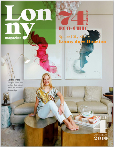
Of course, there are design magazines that I follow online as well.  These would include Lonny Magazine, Interiors, and Traditional Home.  Reading online is more interactive, with links to follow and images to pin to Pinterest.  I definitely enjoy this medium, but do hope it never entirely replaces print magazines.

lonny_magazine_cover

I also love some fashion and health magazines.  I read Vogue and Harper’s Bazaar online, both of which are great fashion resources.  I get a lot of inspiration from the world of fashion.  The health magazines I subscribe to are Shape and Women’s Health.  Both contain valuable, real-world information on a subject that is very important to me.  I also like the recipes in Women’s Health, even though I don’t often have time to try to them out.

shape

Everyone needs a trashy, veg-out type of magazine, and for me,  Us Weekly does the trick.  I read it backwards!

Us-Weekly-–-27-May-2013-cover

Which magazines do you read regularly?

Color Obsession: Navy, Vermillion, and Turquoise

This color combination is classic, sophisticated, and always stylish.

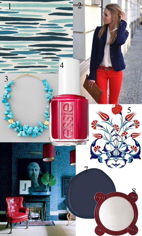
One of the things I love about being a designer is the opportunity to find inspiration anywhere.  The other day, I was dressed in navy, vermillion, and turquoise and was struck by how great those colors look together.  This color combination is classic, sophisticated, and always stylish.  In design, these three colors together look bold, confident, and eclectic.
Amy Aidinis Hirsch Greenwich CT Interior Design

1.  Ocean from Lulu DK

2.  Colorful chic!  Image via Breakfast at Yurman’s

3.  Devon Leigh Turquoise Beaded Necklace

4.  She’s Pampered from Essie:  My go-to summer nail color!

5.  Turkish Tulip.  Image via Susan Fredman

6.  Blue room design by Miles Redd via Elle Decor

7.  Deep Royal from Benjamin Moore

8.  Ohm Mirror by Bunny Williams

Cover image features, from left to right, Salutation III by Eric Zinner, Giorgio Armani for Elle Decor, and Abstract 116 by Kris Carlson.

Color Obsession: Antwerp Blue

With so many different shades of blue, it can be bright, serene, bold, subtle, or dramatic.

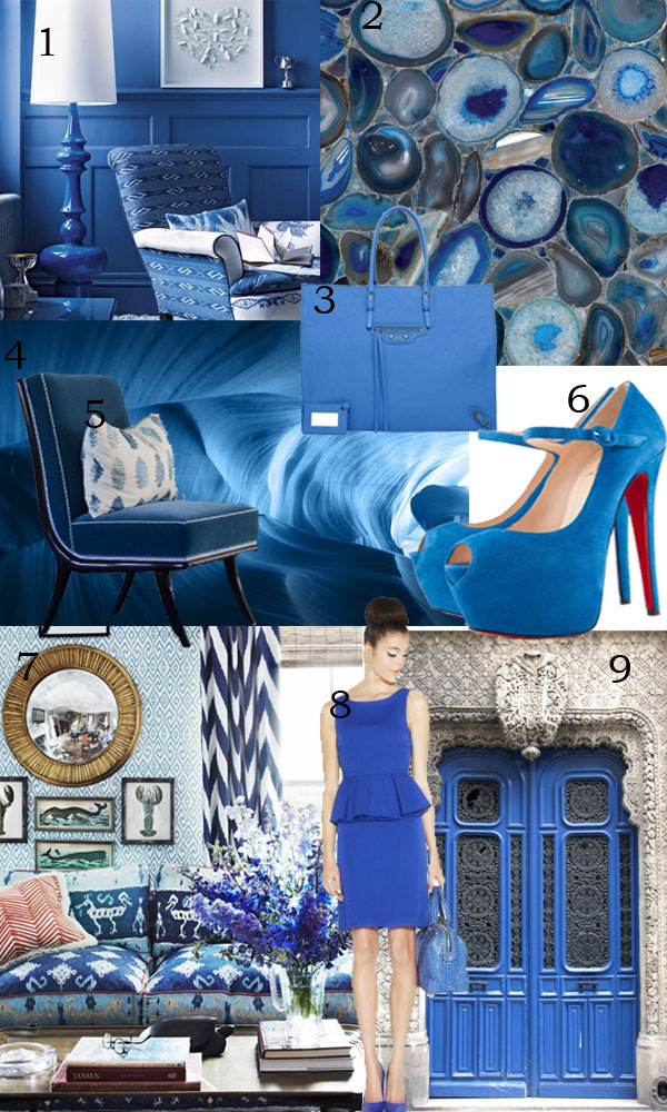
Blue is a safe color that a lot of people gravitate toward.  With so many different shades of blue, it can be bright, serene, bold, subtle, or dramatic.  You can drench a room in blue or use it as a strong accent color.  In fashion, blue looks good on almost anyone and pairs well with a lot of other hues.  What do you think of blue?
1.  Blue Living Room via Home Ideas Mag

2.  Blue Agate from Concetto

3.  Piscine Balenciaga

4.  Bluestone

5.  Custom chair in a client’s home.

6.  Christian Louboutin Lady Highness

7.  Quadrille Fabrics, image via House Beautiful

8.  June Short Pleated Peplum Dress by Alice and Olivia

9.  Ornate blue door, image via W5RAn

Wine Cellars

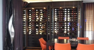
A wine cellar doesn’t have to be obvious, with grape vines on the walls or wine barrel tables.

One of my clients is in the process of adding a wine cellar to their home.  While they are working with a wine cellar professional on this project, they have consulted with me on architectural elements like flooring, paint, and lighting.  With a 10,000 bottle capacity, this wine cellar is no small undertaking!  I find their plans for the wine cellar really interesting and inspiring.

As I watched their excitement over the design of the wine cellar, I thought of my ideal vision for such a space.  I like the idea of incorporating traditional wine cellar materials like wood and stone, while adapting these things for a more modern look.  A wine cellar doesn’t have to be obvious, with grape vines on the walls or wine barrel tables.

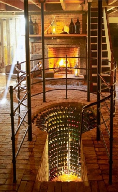
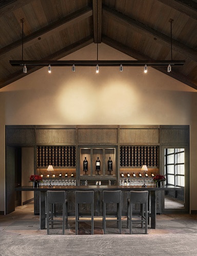
Traditional, but unconventional.
I love the catwalk above this wine cellar.
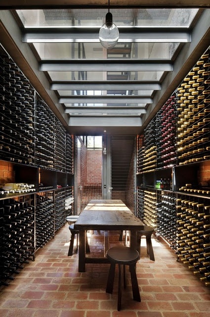
A large, sleek space that is spare and functional.

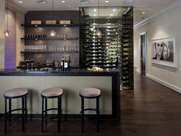
I also like the idea of making the wine cellar more than just a storage space.  Rather than keeping the wine out of sight in a place where the host or hostess retrieves it alone, why not incorporate some seating to turn the area into a gathering place?  Being able to sit with a a friend or two (or several!) surrounded by great wine sounds like such a relaxing way to socialize.

Wine Station wine cellar, by MAP Architects.
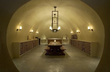
A more modern space.

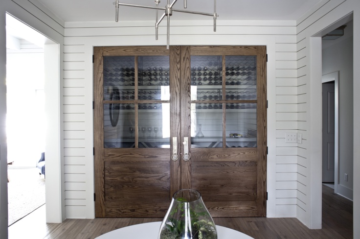
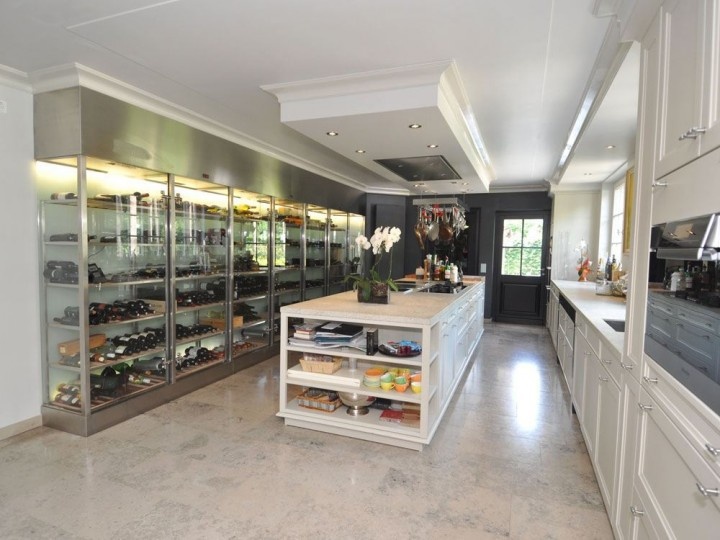
If you like the idea of making the wine cellar a place to spend time with friends and family, it’s not much of a stretch to take the entire place out of the cellar.  With modern technology making climate control possible in any part of the home, there’s no reason to confine a beautiful wine cellar to the basement.  You can capture the wine cellar look and feel in a not-so-obvious spot, such as a room divider or a nook you aren’t really using.  It’s an appealing and practical approach to create a usable wine area in a more accessible part of the home.

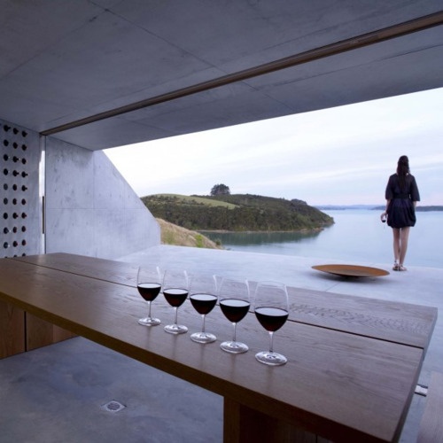
This would be such a cool place to spend time!
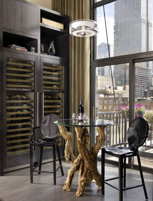
Accessible, functional, and beautiful.
Amazing kitchen with open wine “cellar.”
Warm and lofty.
Even a small area can be a sophisticated spot to display and enjoy wine.

What would your ideal wine cellar (or room!) look like?

Favorite Things: Lucite

In fashion and design, lucite accents add a modern chic touch.

Lately I have really been loving lucite.  For me it evokes the 1970s, a decade that I could happily live in forever.  In fashion and design, lucite accents add a modern chic touch.  It is strong, crystal clear, and easy to shape into any number of things.  Because lucite is nearly invisible, it brings brightness to a space without visually cluttering up a room.  It can work with any color and, when done correctly, looks so classy.  Here are some examples of lucite pieces that caught my eye.

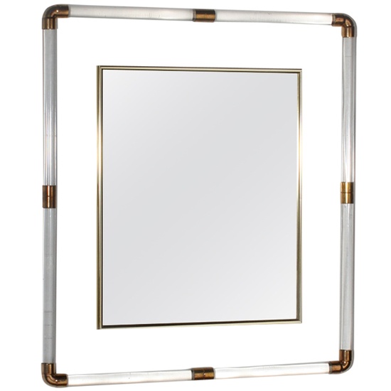
1.  Brass and Lucite Mirror by Charles Hollis Jones, c. 1970

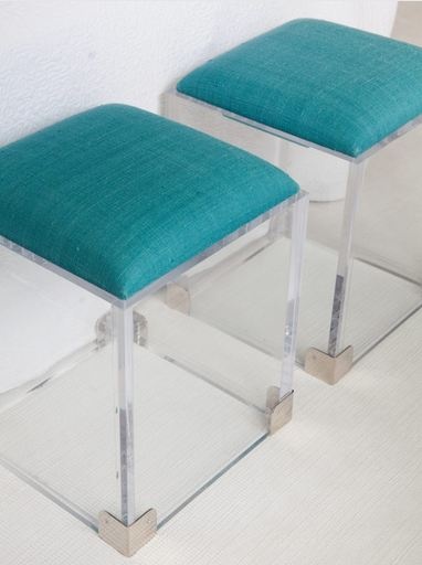
2.  Great benches from CocoCozy.

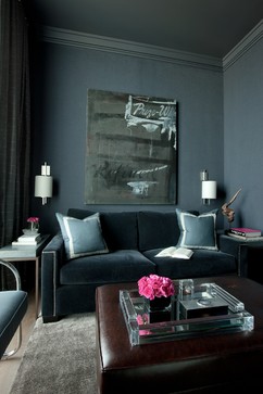
3.  This lucite tray from Eclectic Cool is a great accent on a ottoman.

4.  A Place in the Clouds:  Bedroom design by Jennifer Post.

5.  Lucite overload!  Image via Marie Burgos Design Blog

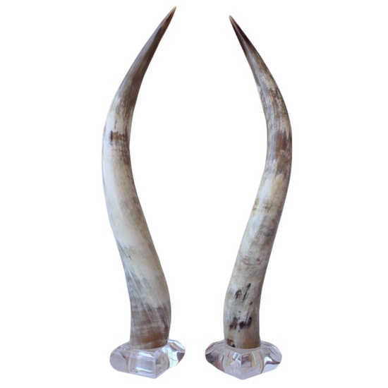
6.  Polished Steer Horns on Lucite

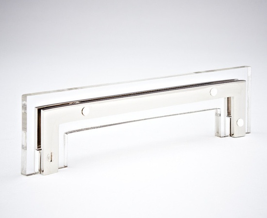
7.  Great hardware from Nest Studio.

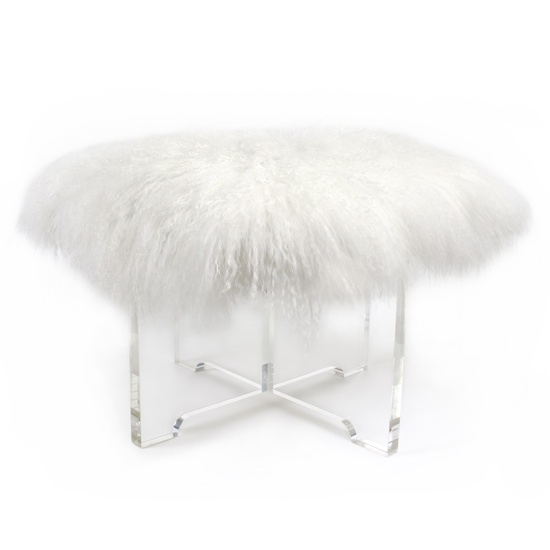
8.  Mongolian Lamb Bench by Jonathan Adler.

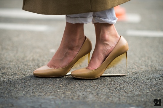
9.  Clear heels from Le 21eme

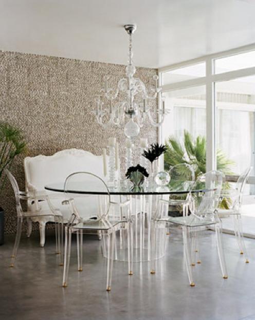
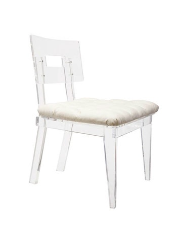
10.  George II Chair from Plexi-Craft

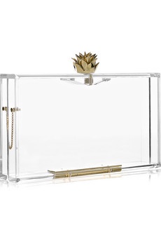
11.  Pandora Clutch

12.  Joss and Main coffee table

Riviera Maya

Just south of Cancun, Mexico lies Riviera Maya, a strip of perfect, white sand beach bordered by the lush jungle of the Yucatan Peninsula.

Just south of Cancun, Mexico lies a strip of perfect, white sand beach bordered by the lush jungle of the Yucatan Peninsula.  This gorgeous area on the Caribbean Sea is known as the Riviera Maya and is at the top of my must-visit list.

The Riviera Maya is about as close to paradise on Earth as you can get, with a heady mix of natural beauty, stunning ruins, rich local culture, luxurious accommodations, fine dining, and a huge variety of entertainment.  The area consists of ecological reserves, jungle, mangroves and lagoons, Mayan ruins, a large coral reef for diving and snorkeling, and picture-perfect turquoise seas.

Scuba diving at Riviera Maya
One of the beautiful lagoons.

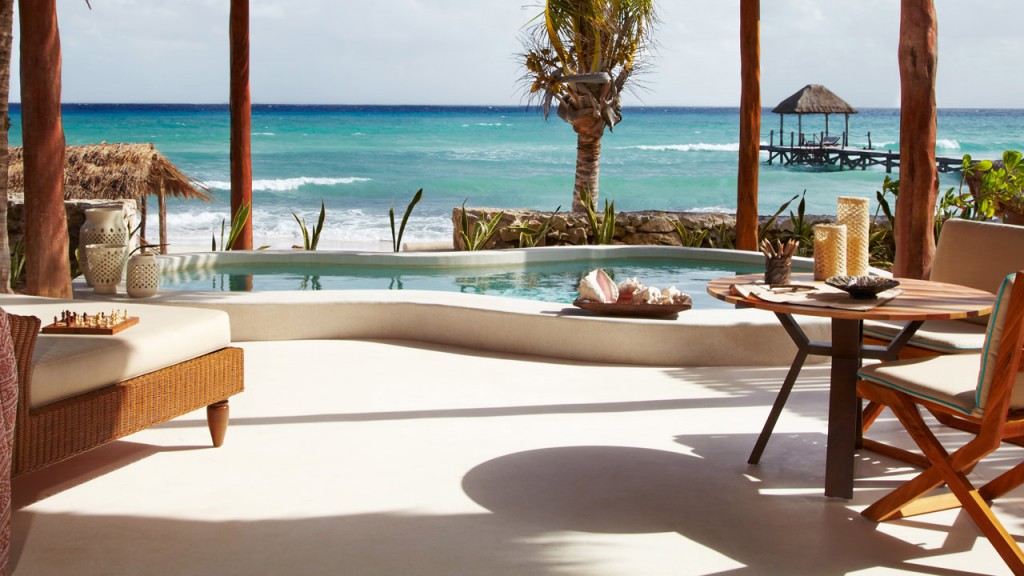
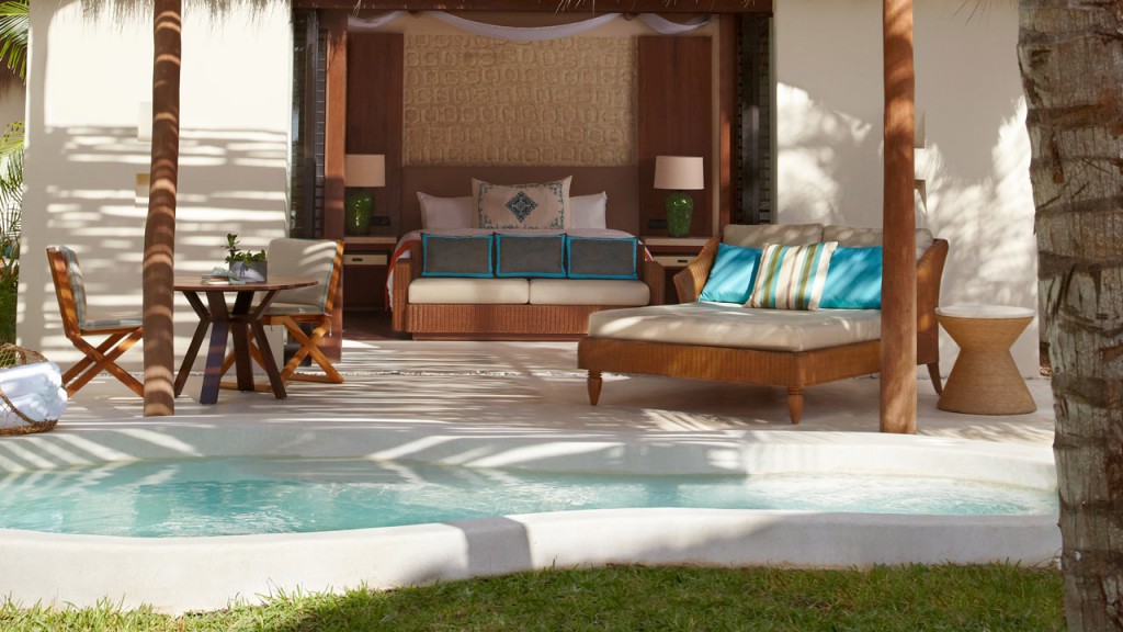
Riviera Maya boasts many luxurious places to stay, from all-inclusive resorts to smaller, personalized hotels.  The Viceroy Riviera Maya was designed to blend seamlessly into its surroundings outside Playa del Carmen. The decor shows an influence of Mayan simplicity, using natural materials to achieve a sophisticated and sexy environment.

Beachfront view at Viceroy Riviera Maya.
An ocean-view villa bedroom.
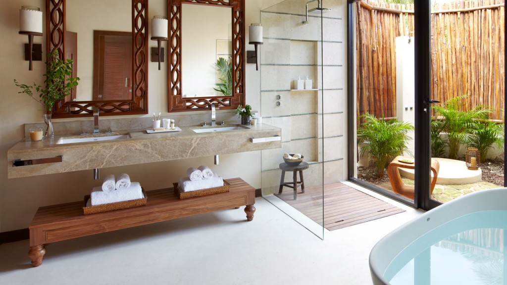
A luxurious bath at Viceroy Riviera Maya.

For a true escape from the rush a daily life, retreat to a cliffside villa at the Azulik resort in Tulum.  These incredible villas perch on rocky cliffs with stairways to the beach.  With no electricity or telephones, you’re truly surrounded by only the sights and sounds of the ocean, day and night.  These villas may look and sound a bit rustic, but guests are steeped in luxury with huge windows for incredible views and in-cabin massages.

Cliffside villa at Azulik

The most impressive aspect of Riviera Maya is the natural landscape.  When not taking in the wonders of the ocean and the coral reef, visitors can enjoy a guided tour to experience both ancient and modern Mayan culture.  The ruins at Tulum offer an incredible glimpse into the distant past at the intriguing Mayan civilization.  It must be a humbling experience to make the short trip from modern, luxurious surroundings to ancient ruins built by people without sophisticated tools or machinery.  You can even tour the Tulum ruins at night for a totally different perspective.  At night, the sounds and sights of the jungle are a completely alien experience from the daytime jungle.  Animals that aren’t active during the day emerge, the ruins must seem larger, more imposing and mysterious, and the brilliance of the stars isn’t dimmed by city lights.

The Mayan ruins at Tulum.

Wouldn’t this be the perfect escape from the ridiculous amount of snow we got last week?

2013: Year of the Snake

Tomorrow marks the start of 2013, the Year of the Snake.

According to legend, the Chinese zodiac originated long ago with the Jade emperor.  The emperor decided there should be some way of measuring time, and so challenged the animals to a swimming race across a swift river.  The first 12 animals to complete the race would each have a year named after them.  The story says 13 animals raced, with the cat coming in last after being tricked by the rat.  The sixth animal to complete the race was the sneaky snake.

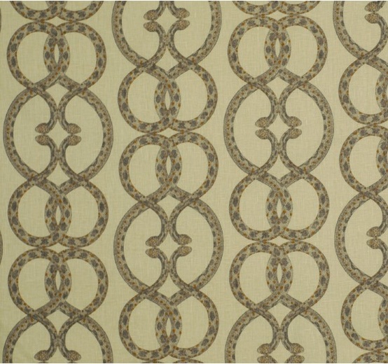
Tomorrow marks the start of 2013, the Year of the Snake.  Snake characteristics include traits such as intelligence, motivation, and influence.  In honor of the Year of the Snake, I’d like to use today’s blog post to look at the influence of snake imagery and snakeskin on the worlds of design and fashion.

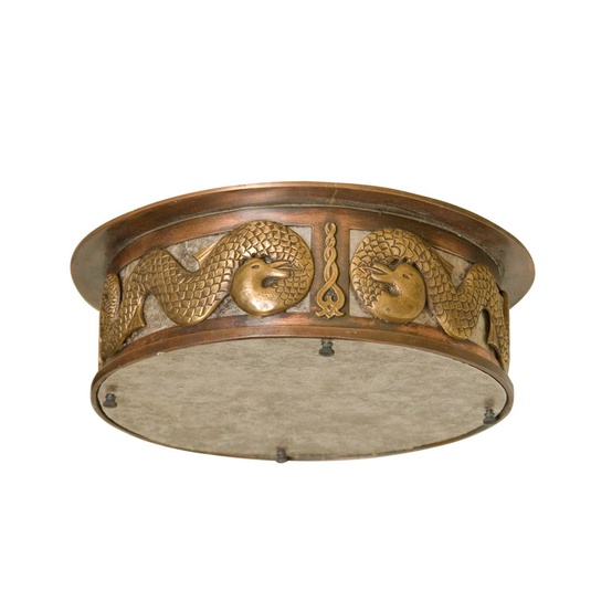
Deco cast bronze ceiling mounts by Paul Marra.

Snakeskin is a very conceptual texture, something a lot of people love.  It’s not for everyone and typically works best in small doses.  Snakeskin is about confidence and bringing out your inner fangs!

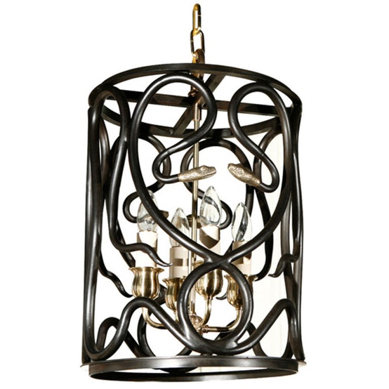
Paul Marra snake lantern.

The use of snake imagery doesn’t have to be literal.  It can be incorporated into hardware or mirrors or simply suggested in shapes and lines.  Snakeskin is a dramatic choice as well.  I used this gorgeous Maya paper on the face front of interior doors in a NYC residence with really amazing results.  It’s high glamour, over-the-top chic that doesn’t scream “reptile.”

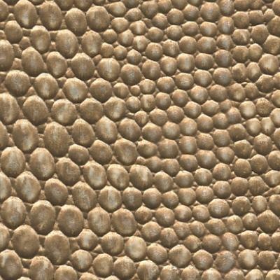
Slink™ Hand-Painted Vinyl by Maya Romanoff
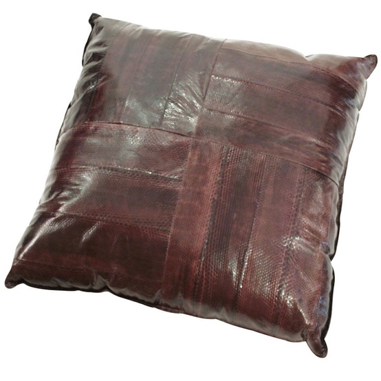
Large Custom Karung Snake Skin Pillow – Lobel Modern
Gold Tone Serpentine Mirror
Snake Chain fabric in Dove from Dwell Studio
Ligne Roset Serpentine Outdoor Chair

In fashion, snakeskin is all about confidence and bringing out your inner fangs!  I sport snakeskin about once a week on my shoes or bag.  It’s a really bold pattern and I love it!

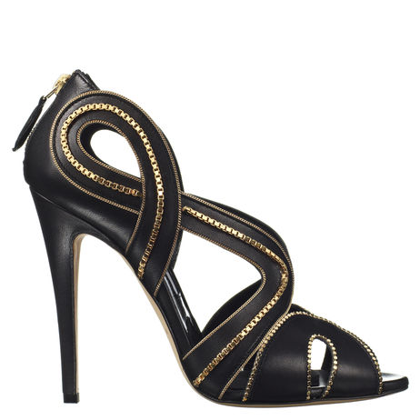
Lima by Brian Atwood – Serpentine inspired.
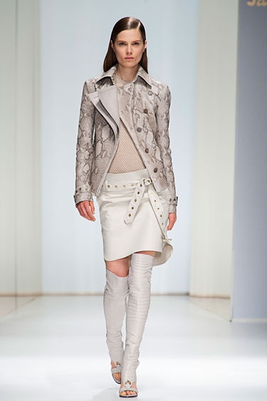
Milan Fashion Week Spring 2013 Runway Looks via Harper’s Bazaar
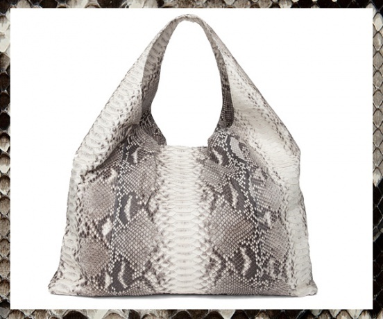
Python bag from IntermixOnline

What does the Year of the Snake have in store for you?


Quintessence Lifestyle Blog

Written by Stacey Bewkes, Quintessence focuses on “those special discoveries that make life just that much better.”

Quintessence is a lifestyle blog I really enjoy.  Written by Stacey Bewkes, Quintessence focuses on “those special discoveries that make life just that much better.”  After working as an art director in NYC for 17 years, Stacey left that world to raise her four children in Connecticut.  She then created Quintessence to continue to say involved in every aspect of the world of design and fashion.  Stacey attends design, lifestyle, and fashion events, and then blogs about them to bring the experience to her readers.  She also shares content on topics from art to movies and food to books, meaning you’ll always find something new and interesting at Quintessence.

Quintessence appeals to me because it is very cultured.  Stacey is worldly and involved and is always current on what’s happening.  She really does her homework and is clearly knowledgeable.  Her posts are interesting and relevant.  Having had the opportunity to meet Stacey, I know she is a lovely lady, very passionate and direct!

I like the segment of Stacey’s blog called Behind the Q, which is a monthly post showcasing an individual stylemaker.  I want more of it!  Stacey really creates an intimate behind the scenes look of people such as Thom Felicia and Miles Redd.  Her videos combined with the writing and several stunning photos is a clever new approach.  I can’t wait for the next installment!
Behind the Q
Before and after of Thom Filicia’s home, featured in his book American Beauty.

One of my favorite Quintessence posts was about NIBA rugs.   It jogged my memory of a source I had seen before but hadn’t logged into my mental catalog of go-to rugs.  I am so excited to incorporate some of these rugs into my interiors!

Hand knotted wool and silk rugs from NIBA.
Persian carpets from NIBA.
Since I was not able to make it to this year’s Southampton Showhouse, Stacey’s blogs about many of the spaces allowed me to think that I was there in person.  I love the dining room, with the large drum fixture and dining room chairs.  The combination is whimsical.  Thanks, Stacey for great observations and attention to detail in every room you visited at the Southampton Showhouse!
Showhouse dining room designed by Mabley Handler.
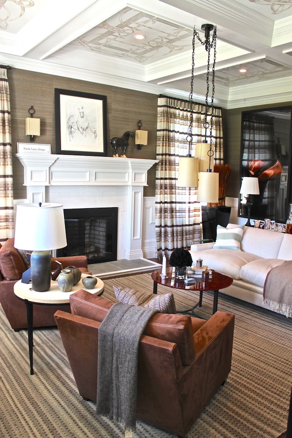
Study designed by Patrick Lonn at the Showhouse.
Guest suite designed by Jennifer McConnell.
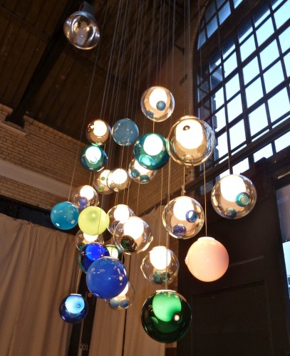
Another fascinating blog post focused on Stacey’s visit to Tramshed during the London Design Festival.  Although her visit to Tramshed was quick, Stacey still managed to take plenty of photos of incredible products from a variety of vendors.  Sharing this kind of experience with readers is part of what makes Quintessence such a fascinating blog.
Quarry lights by Benjamin Hubert.
Porcelain by Karen Morgan.
Hand blown lighting from Bocci.
I love that I can use Quintessence as a catalog of great thoughts and a resource to turn to for inspiration!  I hope you visit Quintessence soon; you can also find them on Facebook, Twitter, and Pinterest!