Heart Healthy Foods

By eating a variety of foods, including fresh fruit, vegetables, whole grains, fish, nuts and more, you are getting the different nutrients which are needed to protect your heart and blood vessels.

February is American Heart Month.  Keeping this in mind, I went to the Web MD website with a list of the 25 Top Heart Healthy Foods.  These foods are loaded with heart healthy nutrients that help protect your cardiovascular system.  By eating a variety of foods, including fresh fruit, vegetables, whole grains, fish, nuts and more, you are getting the different nutrients which are needed to protect your heart and
blood vessels.  I am very conscious of the meals I prepare and the ingredients I use in those meals.  I buy fresh herbs, produce, and vegetables and use olive oil when I cook.  We eat fish more than once a week and eat plenty of fresh fruit, so I am definitely into eating healthy.

I decided to highlight a few of the foods they recommended in the Web MD article.  It would be well worth your time to read the entire article.  You might be surprised to see that many of the foods are ones you probably already eat regularly!


Tuna is a good source of Omega-3s.
Asparagus has B-complex vitamins and heart protective antioxidants.
Carrots are a top cholesterol fighting food and may help control blood sugar levels and reduce the risk of developing diabetes.
Walnuts: a small handful a day may lower your cholesterol and reduce inflammation of the arteries of the heart.
Oatmeal can help your heart by lowering LDL, the bad cholesterol.
Blueberries have an extensive list of nutrients that support heart health.

I have a great recipe featuring a popular heart-healthy food.  This tuna dish is a favorite in our house, especially when my husband returns from an offshore fishing trip with fresh tuna.  The original recipe is from a Williams Sonoma cookbook titled “Essentials of Grilling,” a great book to have!  I have changed it some to suit our tastes, of course, and I hope you enjoy it!

Tuna with Wasabi Creme

Tuna with Wasabi Creme

Ingredients
Soy sauce, less sodium preferred
½ cup White Sesame seeds
½ cup Black Sesame seeds
4 Ahi Tuna Steaks, 6oz each, 1 inch thick

Wasabi Creme
1 cup crème fraiche
2 tsp. wasabi powder, or to taste
Chopped chives for garnish

In a shallow dish, add the soy sauce.  On a piece of wax paper, mix the white and black sesame seeds.  Dredge each piece of tuna in the mixture, then place in soy sauce, turning to coat.  Add any left over sesame seeds to tuna, cover, and refrigerate for 1 to 2 hrs.

To make wasabi crème, in a small bowl stir together the crème fraiche and wasabi powder.  Cover and refrigerate until ready to serve.  Add chives just before serving.

Grill your fish, turning once, until it is seared on the outside and rare on the inside,  3-5 minutes per side. If you prefer your tuna cooked through, leave it on the grill for 1 – 2 minutes longer per side. You can also cook the fish in a heavy skillet on high heat.

Transfer the tuna steaks to warm individual plates.  Garnish the wasabi crème with the chives, and pass at the table.

Serve with grilled or lightly steamed asparagus, dressed with an olive oil and herb mixture of chopped basil, parsley, and black pepper.  Enjoy!


New York International Gift Fair

I loved every minute I spent browsing through the Gift Fair!

Twice a year, the Javits Center and Piers 92 and 94 are home to the New York International Gift Fair.  This incredible Home Show is always really exciting for me.  There are so many neat products to discover from so many different designers and companies.  Last August, I had a great time at the Gift Fair and wrote about my favorite finds.  Once again, I loved every minute I spent browsing through the Gift Fair!

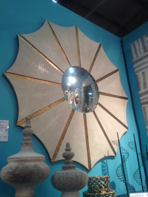
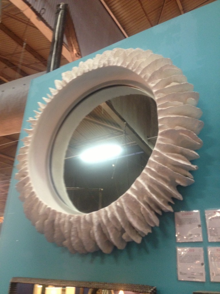
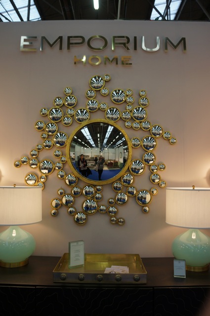
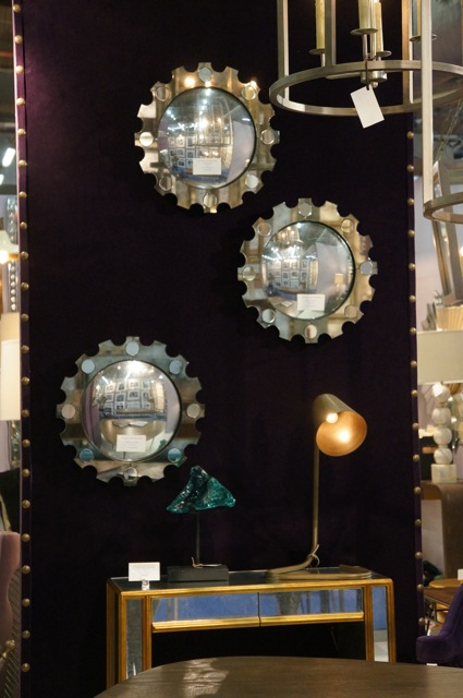
At this Fair, it seemed like every time I turned around, I saw another fantastic mirror.  So many styles and sizes to fall in love with!

Great mirror from Julien Chichester’s Mr. Brown line.
Daniella mirror from Made Goods
Serrat mirror from Made Goods
A work of art! By Emporium Home.
From Bliss Home
Mirror set from the Mr. Brown line.

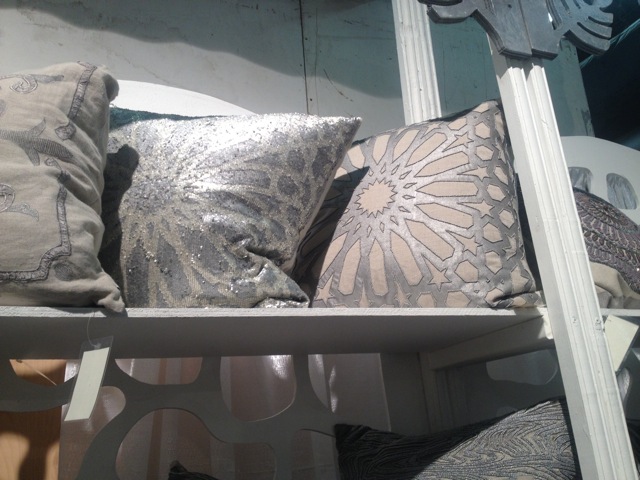
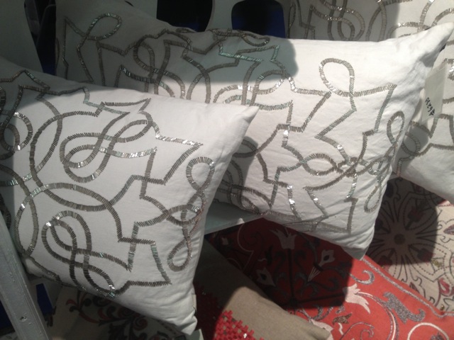
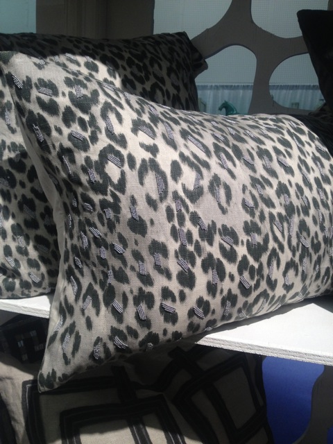
I also saw plenty of gorgeous pillows!  These are perfect accents for a quick change and a good example of how not every aspect of design has to be custom.

Pillow from Callisto Home
Very chic!
Sparkly but sophisticated!
I can never have too much leopard!

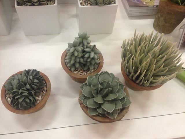
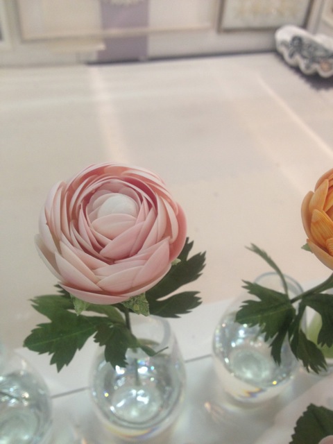
One of the coolest things I saw at the Fair this year were these beautiful accents.  They appear to be real plants, but if you take a closer look, you can see they are made of hand-painted shells.  They look amazing in person!

Made by Karen Robertson. An exciting find!
So unusual, and so pretty!
NYIGF definitely has a little bit of everything.  I found inspiration everywhere I looked, so much that I was able to find design ideas for an entire living room project I’ve been working on!
Wonderful pottery!
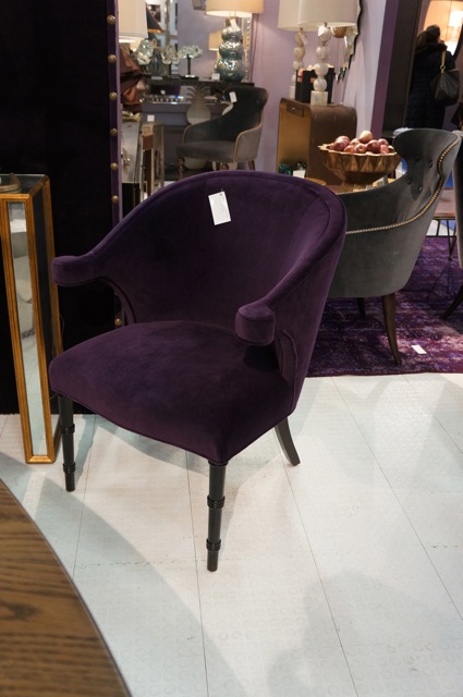
A truly comfortable chair from the Mr. Brown line.
Also from Mr. Brown, this gorgeous mirrored piece.
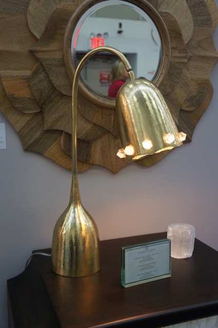
Spectacular tulip lamp with quartz detail from Emporium Home.
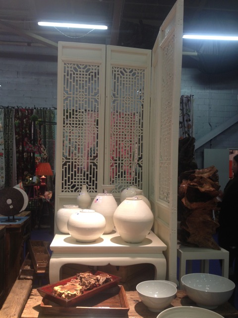
More great pottery, and I love the screen too!
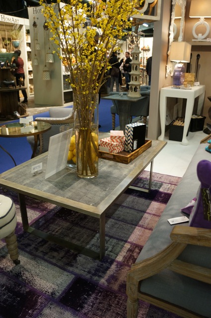
Coffee table with a shagreen top from Mr. Brown — must have!

When the Gift Fair returns in August, it will have a new name:  NY Now.  I’m already looking forward to it!

Darryl Carter’s Washington Store and Studio Restoration

When Darryl Carter, a favorite designer of mine, purchased the property for his new store and studio in Washington, the buildings were rundown and in need of a serious amount of work from years of neglect and decay.

When Darryl Carter, a favorite designer of mine, purchased the property for his new store and studio in Washington, the buildings were rundown and in need of a serious amount of work from years of neglect and decay.  Missing windows and a lack of working plumbing were only two of the building’s issues, but Darryl Carter was able to see past the blemishes to the building’s structure, history, and potential.  With the help of his own design team, Wnuk Spurlock Architecture, and Glass Construction, Carter succeeded in transforming the property.

This original skylight was kept in place during the restoration project.
The exposed brick became an important part of the finished space.
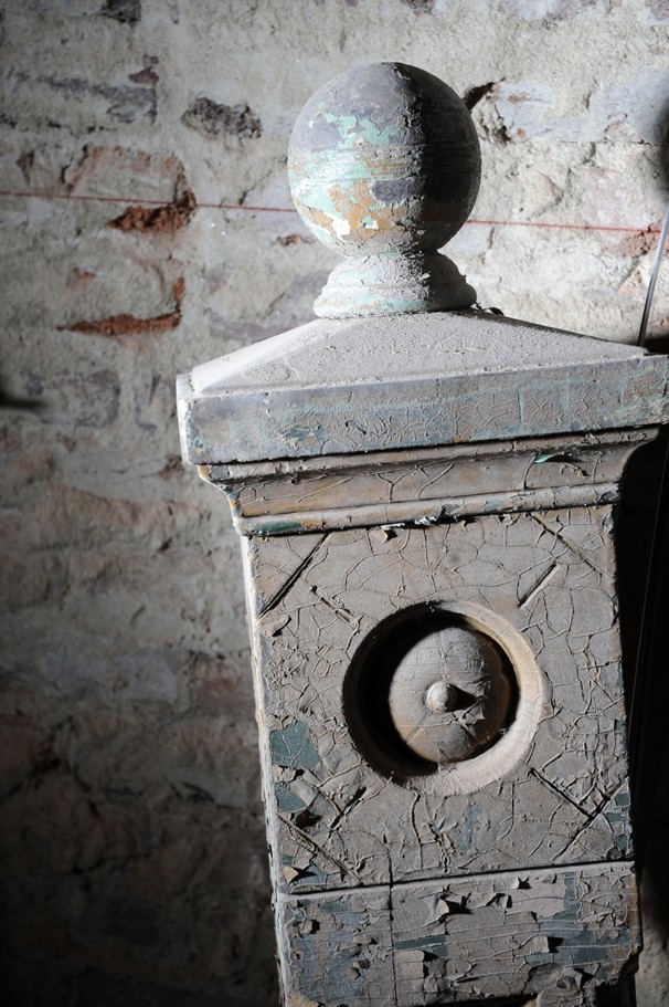
Part of a salvaged staircase.

With parts of the building dating to the pre-Civil War era, Carter was able to use many original aspects of the property to his advantage.  Wood beams, exposed brick, and other elements were salvaged during the restoration and incorporated into the final design.  Other materials for the store and studio have been salvaged from other places, including arched glass doors from Georgetown’s Dunbarton House, reclaimed timbers from the former embassy of the Central African Republic, and granite blocks from Baltimore’s Druid Hill.  The amount of vision that went into transforming the main building and carriage house from near ruin to completely beauty is incredible!

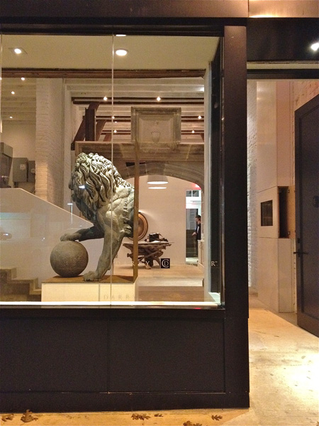
The finished storefront.
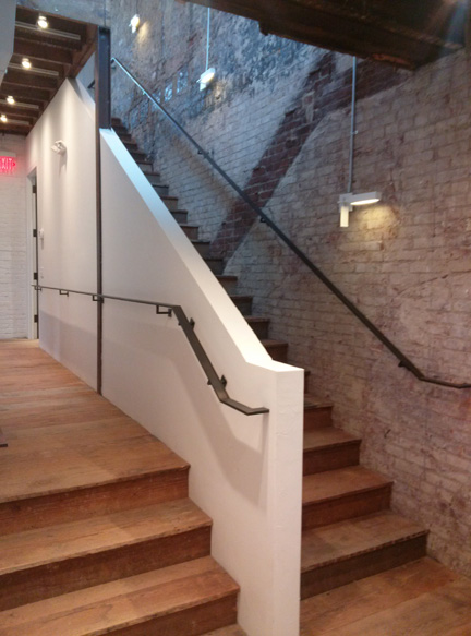
I love how the “ghost” of the original stairway is still visible!
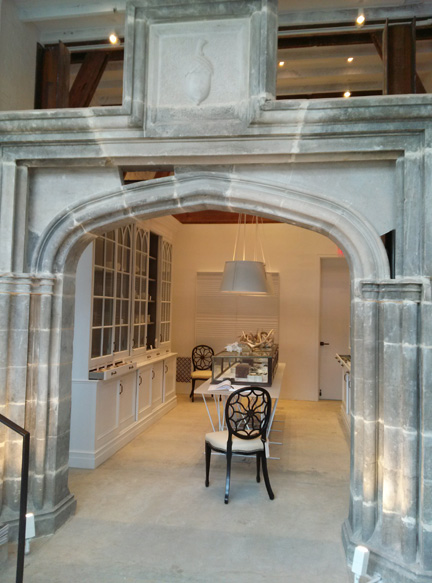
A gorgeous stone archway.
The finished store features so many rooms for shoppers to explore.

To see more examples of Darryl Carter’s designs, you can visit his website or find him on Facebook.  He also published The Collected Home and The New Traditional, both of which are great interior design books for any collection.

Flywheel

A neighbor recently introduced me to Flywheel, which currently seems to be the hottest fitness option.

A neighbor recently introduced me to Flywheel, which currently seems to be the hottest fitness option.  Flywheel Sports has a studio in Stamford’s Chelsea Piers sports complex and this was where I first experienced Flywheel.

For those of you not familiar with it, Flywheel is an intense indoor cycling experience.  Each session lasts from 45 to 60 minutes and includes climbs and descents all while working your arms with weighted bars.  During the class, momentum and enthusiasm are encouraged by unique playlists created by the instructors.  An in-house DJ compiles the music which the instructors use to choreograph a different experience for each class.  With the use of technology, Flywheel users can track their personal cycling stats to measure progress over time.  It’s an intense, energizing way to work out, taking the stationary bike to an entirely new level.

The idea of Flywheel really appealed to me as something different.  I wanted to try something new, especially because I hate running in cold weather.  I’ve never cycled, but thought Flywheel would be a great new workout to add to my routine.

It was insanely hard and super intense.  I had no idea what I was getting into and have never sweated so much in my life.  I couldn’t wait for the class to be over — but I want to do it again!  I was definitely out of my element but I don’t want to quit.  I am determined to master Flywheel!

Another class offered by Flywheel Sports is FlyBarre.  I haven’t tried this class yet and am a little nervous to take it on.  FlyBarre is a body sculpting class that includes weight training, dance, and core strengthening exercises, all choreographed to energetic, fast-paced music.

What I like about Flywheel is the opportunity to test my endurance and push myself to new limits.  I look forward to the challenge!

Are you trying out any new fitness routines this year?


House Beautiful Kitchen of the Year

I am already looking forward to House Beautiful’s Kitchen of the Year.

I know it’s still a while off, but I am already looking forward to House Beautiful’s Kitchen of the Year.  It’s a great opportunity to see new products and appliances.

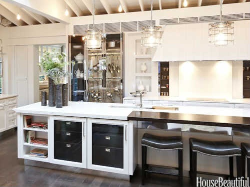
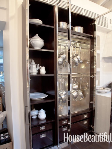
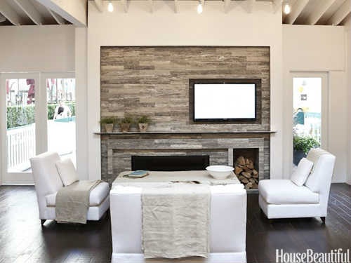
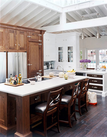
Last year’s Kitchen of the Year by Mick De Giulio featured a design that I absolutely loved.  It was so simple and beautiful.

Bright and open with a touch of glamor!
A stunning custom cabinet.
Including a cozy seating area in the kitchen is genius.
Love the casual, mismatched chairs in the dining area.

Another past Kitchen of the Year that made an impression on me was designed by Christopher Peacock in 2008.  His use of CaesarStone allowed clients and other designers to feel OK with using man-made materials.  In general, I think the Kitchen of the Year is a good gauge of the direction kitchen design is moving and which brands are reliable and comfortable for both client and designer.

Christopher Peacock’s kitchen design with CaesarStone.

I’d imagine House Beautiful’s Kitchen of the Year will be on display and open to the public at Rockefeller Center in NYC as in years past.  Show kitchen visitors will be able to enjoy demos and tastings from a variety of chefs, making this much more than a display kitchen.  It needs to be as functional as it is beautiful.

The 2008 Kitchen of the Year in Rockefeller Center.
NY Chef Marc Murphy cooks for a crowd in last year’s Kitchen of the Year.

I can’t wait to see this year’s kitchen!

Work in Progress: My New Office/Studio

I’m involved in a very exciting project right now — designing my new office and studio space.

I’m involved in a very exciting project right now — designing my new office and studio space.  Besides the excitement of moving into a bigger place better suited to my business needs, I am so happy to have a place to do something for myself.  I can’t wait to see my own simplified, well-edited vision come to life.

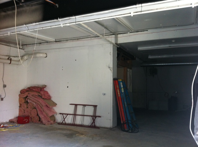
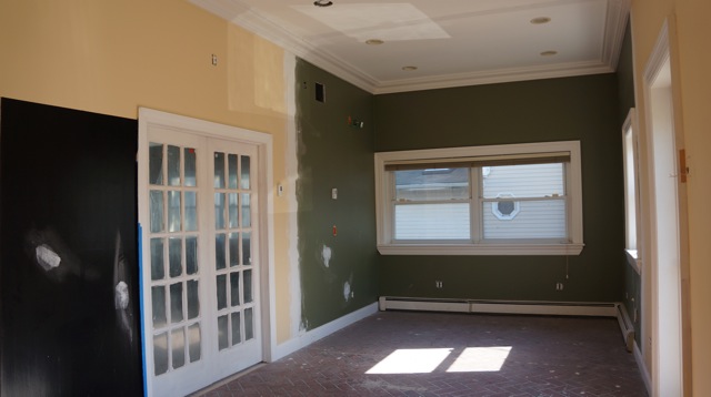
This is very much still a work in progress right now, as you can see from the “before” pictures.  One must have great vision to get through this mess!

The exterior.
Definitely a diamond in the rough!
Can you see the potential?

My goal for new new office space is to make my clients feel like they are in a showroom for a lifestyle rather than a product.  I see the overall design as minimal, not decorative.  I want it to be a neutral space, with quality products and craftsmanship, good lighting, and just the right details.  Everything will be functional, creating a great place for everyone to work.

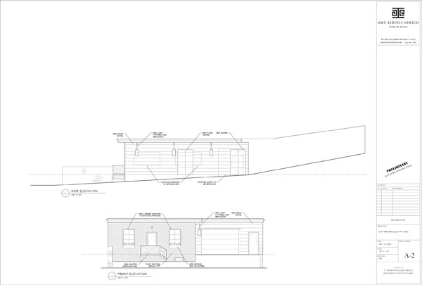
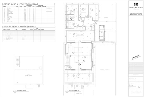
Plan for the exterior.
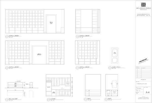
The plans give an idea of how the space will be utilized.
Plenty of open storage.

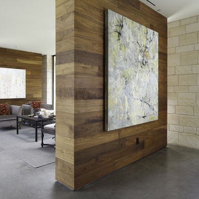
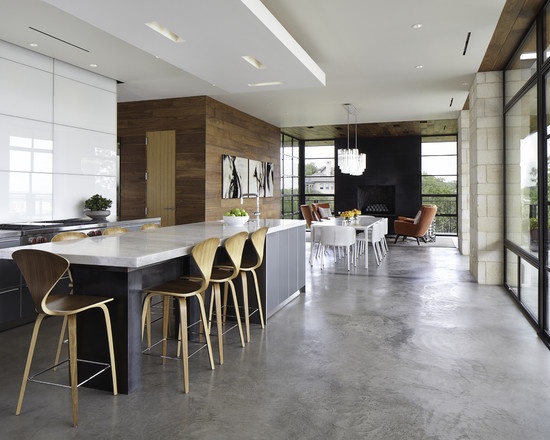
One important consideration I made when designing my office was to avoid distractions for my clients.  When I meet with a client to present designs for their projects, I don’t want the surroundings to compete with the samples and plans I show them.  I want the focus to be on their project, not my own office.  At the same time, I want to use elements that reflect the level of style and quality I appreciate in an interior.  I like the idea of wool window treatments with metal poles, reclaimed oak counter tops with nail heads, and walnut walls.  I love the idea of a concrete floor as well.

Walnut walls.
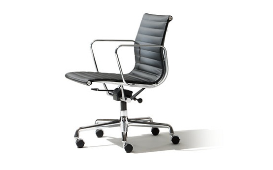
Sleek and functional Eames chair.
Concrete floor.
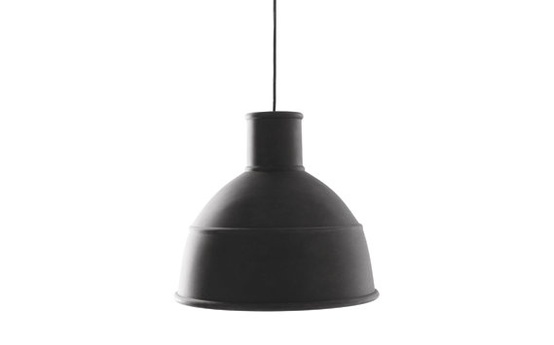
Unfold pendant light.
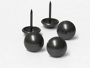
Nail heads.
Wallpaper covered in transparent beads.
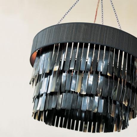
Ochre lighting.

I can’t wait to see how all of my plans come together!  Stay tuned for a future update on the finished office!

Interior Design Trends for 2013

I’ve seen quite a few lists of design trends to watch for in 2013, and several of them really resonate with me.

I’ve seen quite a few lists of design trends to watch for in 2013, and several of them really resonate with me.  Some appeal to the traditionalist in me, while others are a bit riskier.  It will be interesting to see which of these trends get the most attention over the upcoming year or beyond, and which turn out to be more short-lived.  Here are the predicted trends I am most excited about!

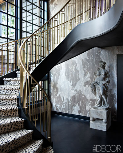
1.  Brass:  This is a metal I’ve seen come up on more than one list.  This warm, ’70s inspired finish is something I’m already in love with.

Brass staircase designed by Kelly Wearstler.

2.  High Gloss:  Nothing compares to the shine and polish of a high gloss lacquer!  Lacquered walls really stand out and, when thoughtfully combined with more traditional elements in a room, create an unforgettable look.

Incredible lacquer walls, design by Jeffrey Bilhuber.

3.  Art:  Selecting just the right piece of art for a client’s space is one of my favorite things about designing.  I am always on the look out for an artist whose work appeals to me and fits perfectly with one of my projects.   I love that this is a trend for 2013.

Octopus sketch by artist Tierra Connor.

4.  Antique Furniture:  The trend here lies in mixing antique furniture with more modern elements, something I always enjoy doing.  In fact, hunting for just the right piece until I find exactly what I’m looking for is so exciting.

This gorgeous antique piece I found for a client’s entry used to be part of an 1800’s bar in the south of France.

5.  Embellished Walls:  I have long been a fan of custom wall coverings.  There are so many amazing options available to suit the needs of nearly any client in nearly any space.  From grass cloth and linen to hand painted and beaded, wall coverings are as varied and unique as the spaces they decorate.

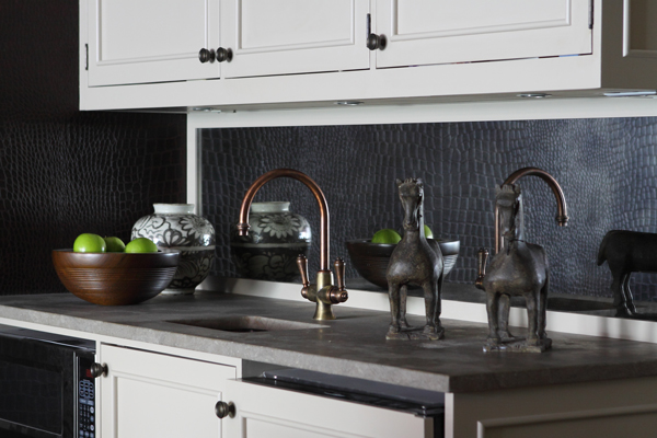
For this client, I covered the walls of their home theater in Ralph Lauren Mahogany Yacare Crocodile.

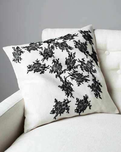
6.  Lace:  If the word lace makes you think of your grandmother’s doilies, think again.  Like other old-is-new trends, using lace in unexpected ways can bring a lot of beauty and character to a room.  Think of combining it with more contemporary designs or using it in small, non-traditional ways.

This pillow features black lace accents. From the Jason Wu/Canvas line.

Which trends for 2013 are you most excited about?


Top 6 Online Design Resources for 2013

As a designer, there are six online resources I find myself regularly using for different reasons.

There are so many online magazines, blogs, storefronts, and websites dedicated to the world of interior design that it’s often a daunting task to find a consistently reliable source of information and inspiration.  Add into that the possibilities of social media and apps, and the idea of staying on top  of changing technology and online resources begins to feel like a full time job!  Like any other resource, however, the internet is something each of us can find just the right way to use depending on our needs.  As a designer, there are six online resources I find myself regularly using for different reasons.  Throughout the upcoming year, I know I will utilize these sites and tools to enhance my business and the options I can offer to my clients.

1.  Houzz  Back in October, I wrote about why I love Houzz as a design resource.  It’s the ideal way to articulate my ideas to clients as well as an incredible place to find inspiration.

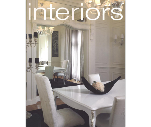
2.  Interiors Magazine  An international design magazine, Interiors is a unique voice among design publications, featuring designers and products I don’t often see in other magazines.  Their website allows you to browse digital versions past issues and is great for sourcing product.  For example, I discovered Kyle Bunting Rugs in Interiors Magazine and am really excited to keep them in mind for future clients.

3.  1st Dibs  I could submerge myself for hours in 1st Dibs.  Once a source for great furniture and lighting, you can now shop for jewelry, vintage fashion, and even real estate.  With designer highlights and options for shopping local, 1st Dibs is a worldwide market you can browse without ever leaving your home or office.

4.  Pinterest  Pinterest is a great organizational tool for categorizing thoughts and ideas.  I love seeing what other people are doing as well!  Having the Pin It button right on my toolbar makes it easy to go back to products and inspiration I find anywhere on the web.

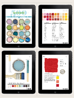
5.  Color River App from House Beautiful  Color River is a beautifully done app that I have on my iPad.  It’s a great tool to use with clients for choosing color and coordinating palettes.

6.  Dering Hall  Dering Hall is a favorite source of high end furniture and products from a huge collection of designers and storefronts.  Users can follow favorite designers, browse portfolios, and read about current design trends and happenings in the DH Blog.

Superfoods for 2013

Superfoods are known to prevent disease, help control weight, and maintain overall health.

Here we are at the start of the New Year, when many people are feeling more health conscious!  Between the television shows, tabloids, and fitness club offers, we’re all reminded of our options for eating and staying healthy.  Hopefully, the motivation to create healthier eating habits and consistent exercise routines will turn into long-term commitments that last throughout the year.

I recently came across a recipe for kale and knew I wanted to try it.  Then I thought, “Why not write about healthy eating in general?”  While looking through magazines and websites for ideas and recipes, I came across a Cooking Channel article called Superfoods:  Nutrient-Rich Foods to Eat Every Day.  These superfoods are known to prevent disease, help control weight, and maintain overall health.

Here are a few of the 21 foods recommended by the Cooking Channel.  To see the rest of the list, click here for the full article.

Kale: High in lutein and several vitamins, lowers the risk of cancer, and helps detoxify the body.
Sweet Potato: Great source of Vitamin B-6 and dietary fiber as well as Vitamin A. Good for eye and skin health.
Wild Salmon: Omega-3 fatty acids provide a number of important health benefits. Salmon is also a good source of Vitamins D and B-12, selenium, and protein.
Almonds: Protein, healthy fats, calcium, magnesium, antioxidants, and Vitamin E. Enjoy them whole, raw, and without salt for maximum benefit.
Dark Chocolate: A powerful antioxidant with many benefits for the heart.

I hope you enjoy this recipe for kale from Giada DiLaurentiis.  She is a favorite chef and author of mine!  Her cookbooks are great, and her recipes are delicious and easy to follow.  Her Spicy Parmesan Green Beans and Kale will convince you that eating healthy doesn’t mean eating bland or boring!

A beautiful and healthy side dish!

Spicy Parmesan Green Beans and Kale

Ingredients

  • 3 tablespoons olive oil
  • 1 onion, sliced
  • 1/4 pound cremini mushrooms, trimmed and quartered (about 14 mushrooms)
  • 1 1/2 pounds green beans, trimmed and slice into 1-inch pieces
  • 2 teaspoons salt
  • 1/2 teaspoon freshly ground black pepper
  • 1/4 cup white wine
  • 1/2 teaspoon red pepper flakes
  • 1 bunch kale (1/2 pound), rinsed, stemmed, and roughly chopped
  • 2 tablespoons lemon juice (about 1/2 a lemon)
  • 3 tablespoons finely grated Parmesan

Directions

Warm the olive oil in a large, heavy saute pan over medium-high heat. Add the onions and cook until translucent, about 4 minutes. Add the mushrooms, green beans, salt, and pepper and cook for 2 minutes. Add the wine and continue cooking until the green beans are almost tender, about 5 minutes. Add the red pepper flakes and the kale and continue cooking until the kale has wilted, about 4 to 5 minutes. Add the lemon juice and the Parmesan cheese. Toss to coat and serve immediately.

SERVES: 6 (SIDE); Calories: 138; Total Fat: 8 grams; Saturated Fat: 2 grams; Protein: 5 grams; Total carbohydrates: 15 grams; Sugar: 5 grams; Fiber: 4 grams; Cholesterol: 1 milligram; Sodium: 830 milligrams

Pantone’s 2013 Color Trends

I always look forward to Pantone’s list because it’s great to see how their choices compare with my own changing preferences as well as trends among my clients.

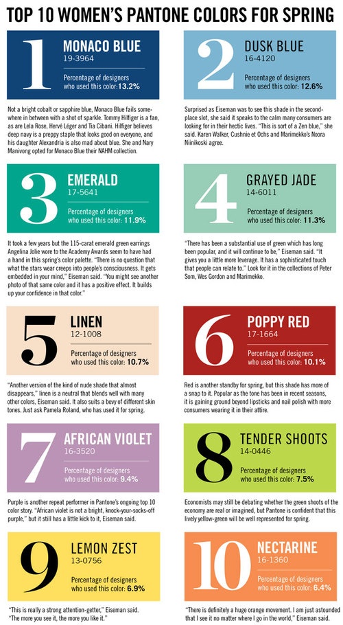
Each year, Pantone announces its choices for the Top Ten Women’s Colors for Spring and their Color of the Year.  This influential forecast highlights color trends in both fashion and design.  I always look forward to Pantone’s list because it’s great to see how their choices compare with my own changing preferences as well as trends among my clients.

My three favorite colors from this list are Lemon Zest, Grayed Jade, and Emerald, the Color of the Year.  In fact, I was pretty close to the mark last year when I created my Jade Color Board and my Yellow Color Board!

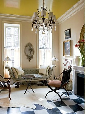
Lemon Zest is both bright and soothing.  It’s not a color I would have naturally gravitated toward in the past, but it stands out and and really has a mood-lifting effect.  I like it more and more as time goes on!

Yellow lacquered ceiling. Design by Jeffrey Bilhuber.
Lemon Zest canopy. Design by Jeffrey Bilhuber.
Lemon Zest works as a bright accent here, by Jeffrey Bilhuber.

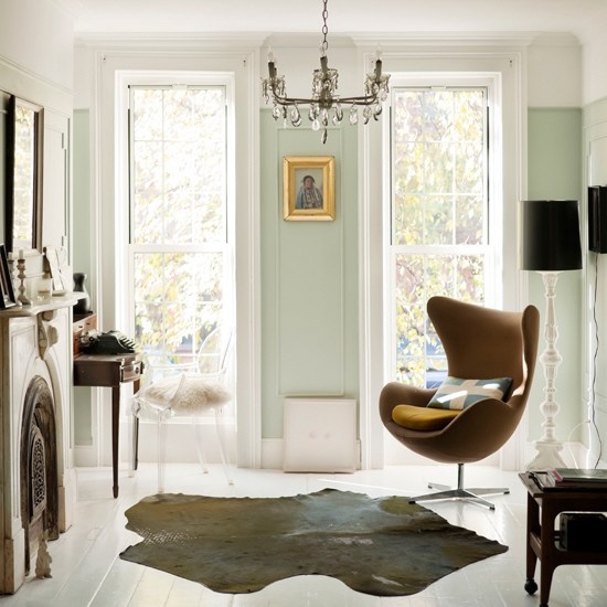
Grayed Jade’s soft, subtle hue appeals to my more traditionalist nature.  It pairs well with other shades and is a calm alternative to brighter greens and a more romantic alternative to simple gray.  It communicates elegance and sophistication.

Grayed Jade on the runway. By Rodarte.
Grayed Jade makes a very nice neutral.
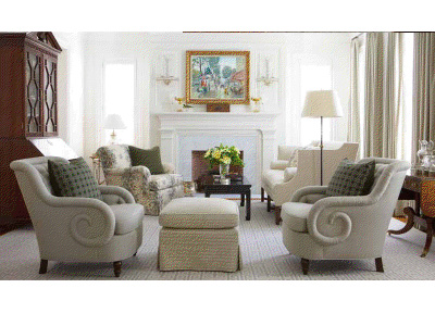
A living room I designed for a client, using tones of Grayed Jade.
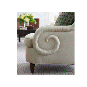
Chair detail.

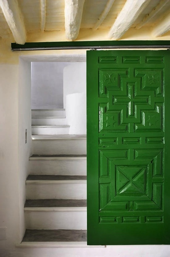
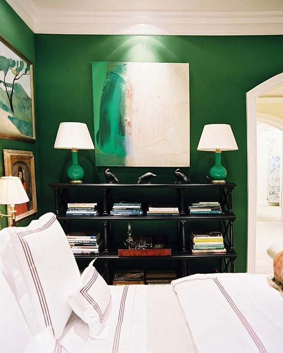
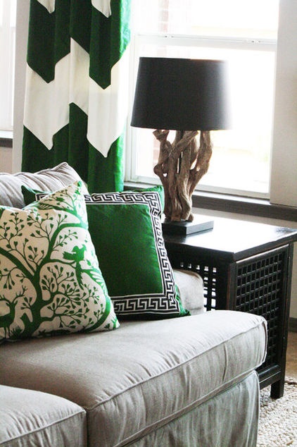
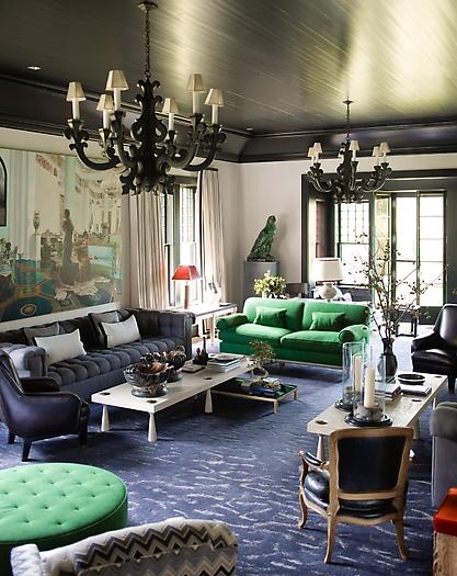
Emerald, Pantone’s Color of the Year, is also my favorite color from their Top Ten list for Spring.  Emerald is such a chic and glamorous color, bringing to mind gems and luxury.  For all its elegance, Emerald is also an energetic color that injects any space with a vibrant depth.

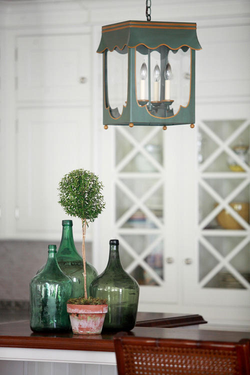
A kitchen I designed for a client with Emerald lanterns and accents.
Emerald sliding door.
Emerald house in the Netherlands.
Emerald green bedroom by Miles Redd. The artwork on the walls is perfect!
Emerald green as an accent. Design by Cristi Holcombe.
S.R. Gambrel’s great use of Emerald Green in a living room.

What do think of Pantone’s Top Colors for Spring and Color of the Year?  Which colors do you prefer from the list?  I look forward to a New Year of exciting design opportunities and challenges, as well as the chance to incorporate some of these colors into my own designs!