Method Monday

Today’s Method Monday features a neutral scheme based on a grey palette.

Today’s Method Monday features a neutral scheme based on a grey palette.  I love this combination of fabrics and furnishings for the variety of textures.  The use of white elements brightens everything up and the overall feel is modern and sleek, but comfortable.

MONDAY POST2 copy

Favorite Things: Fireplaces

The fireplace is a really special part of a home.

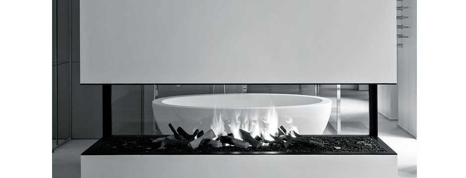
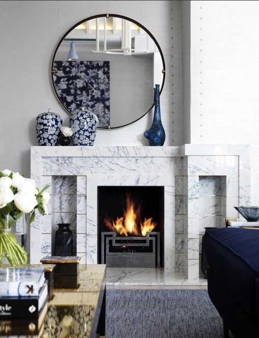
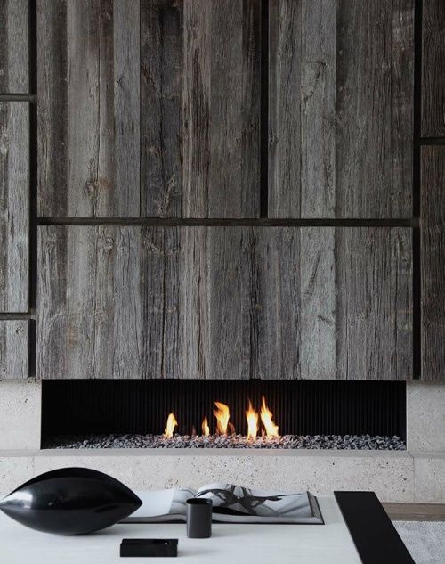
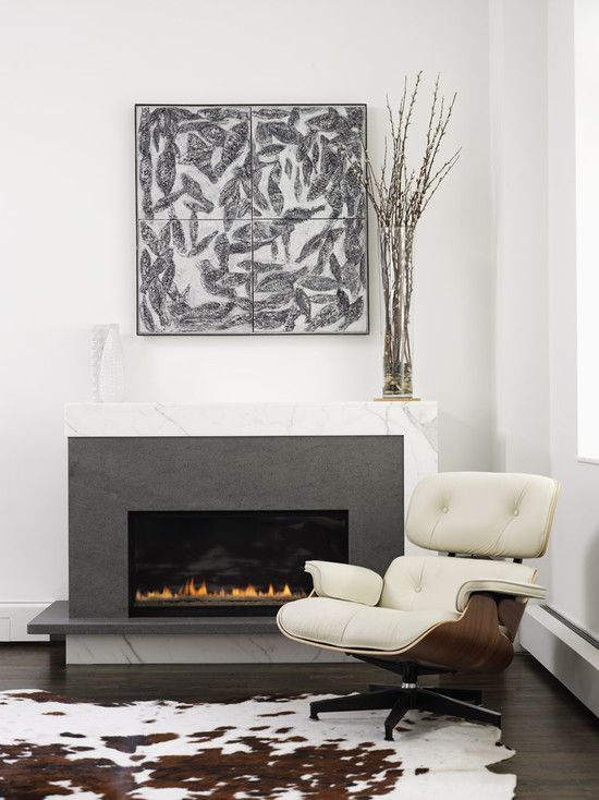
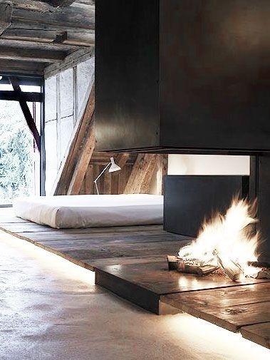
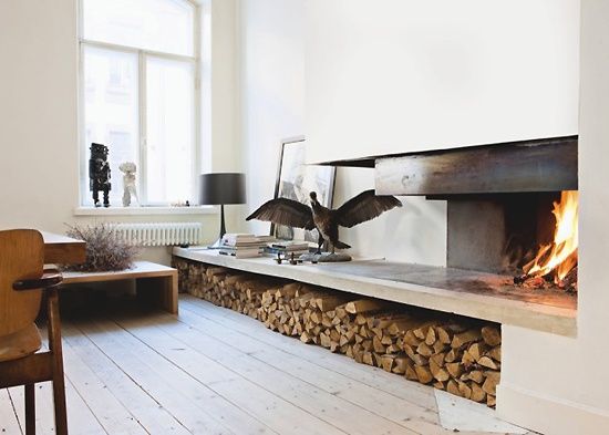
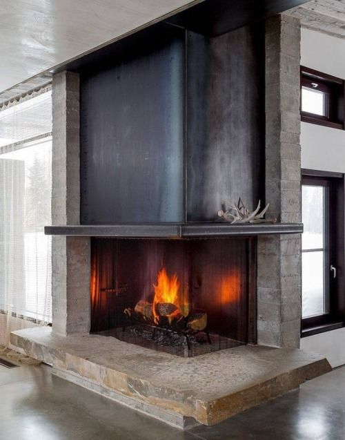
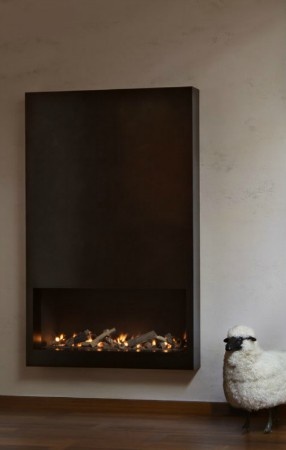
The fireplace is a really special part of a home.  In any room, any style, a fire is capable of creating a warmth and a mood like nothing else.  When thinking about fireplace design or looking at different styles of fireplaces, I’ve definitely been gravitating toward more linear, pronounced, modern styles lately.  As part of a modern interior, a fireplace can make a dramatic impression.

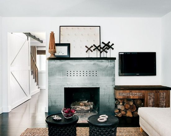
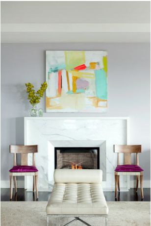
Fireplaces can range from rustic to formal to minimal.  The home’s architecture is what will define the type of fireplace goes into a space while the room the fireplace is in determines its purpose.  The fireplace can also define the period of the home and be simple or grandiose.  It’s a great opportunity to make an impact on an interior!  Here are some of my favorite examples of beautiful, modern fireplaces.

Fireplace Inspiration 10Fireplace Inspiration 9Fireplace Inspiration 8Fireplace Inspiration 6Fireplace Inspiration 7Fireplace Inspiration 5Fireplace Inspiration 4Fireplace Inspiration 3Fireplace Inspiration 2Fireplace Inspiration 1

What style of fireplace do you prefer?


Del Posto

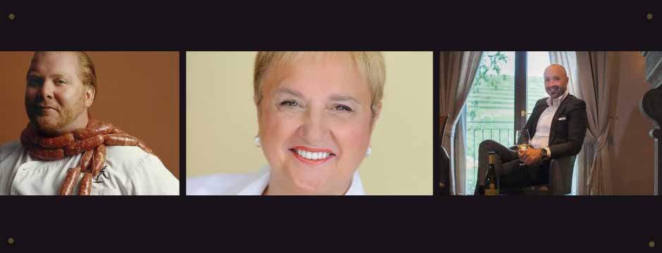
Located at 85 Tenth Avenue in NYC, Del Posto is the creation of Mario Batali, Joe Bastianich, and Lidia Bastianich.

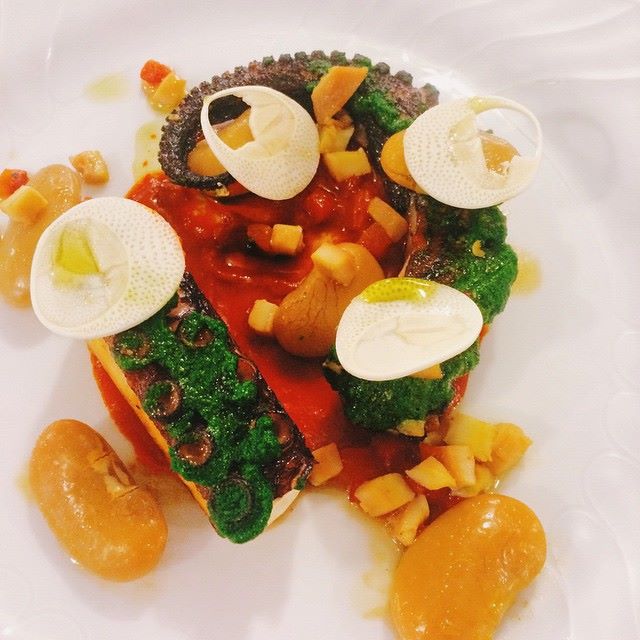
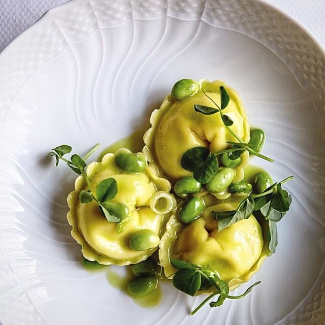
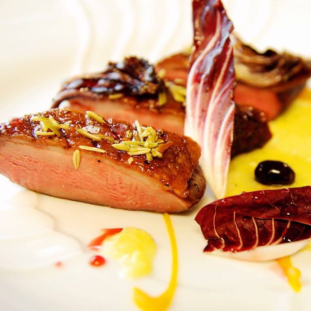
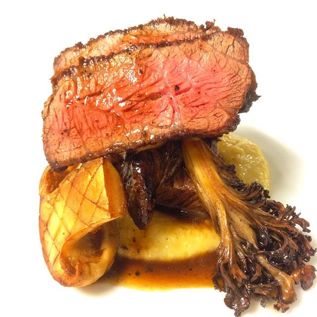
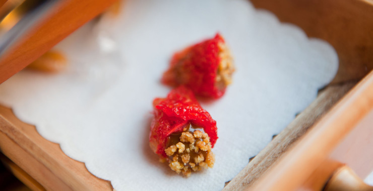
Located at 85 Tenth Avenue in NYC, Del Posto is the creation of Mario Batali, Joe Bastianich, and Lidia Bastianich.  The restaurant’s goal is to create an atmosphere of European luxury where guests enjoy refined Italian cuisine and a world class wine list.  The menu is crafted from the highest quality ingredients and tailored to provide an unrivaled experience.  Lunch consists of a 3 course prix fixe with antipasto, secondo, and dolce.  Dinner guests can choose for their table the five course Il Menu Del Posto or the sumptuous eight course Captain’s Menu, each available with wine pairings by Del Posto’s sommelier.  Each dish is executed to perfection and so beautifully presented with a truly memorable combination of flavors and textures.  The food is pure art — as soon as you see it, you know it tastes amazing.

Del Posto 6Del Posto 2Del Posto 5Del Posto 4Del Posto 1

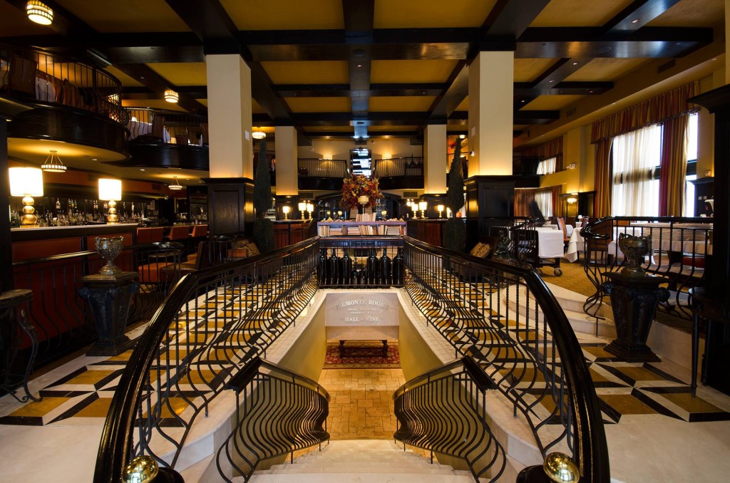
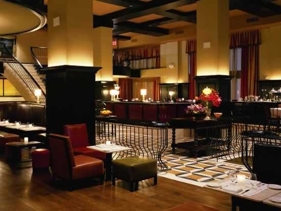
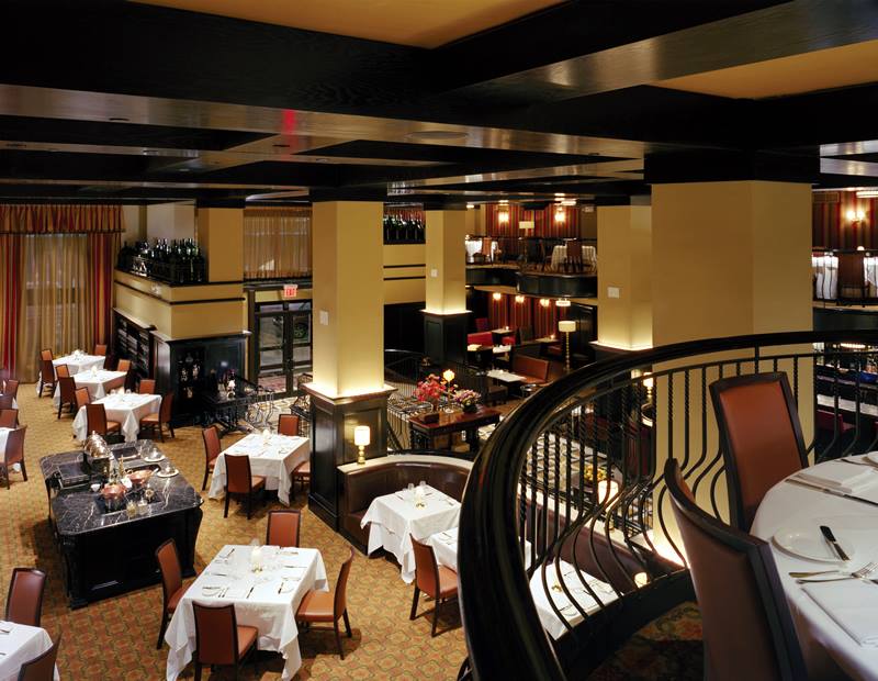
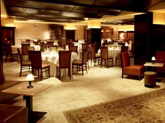
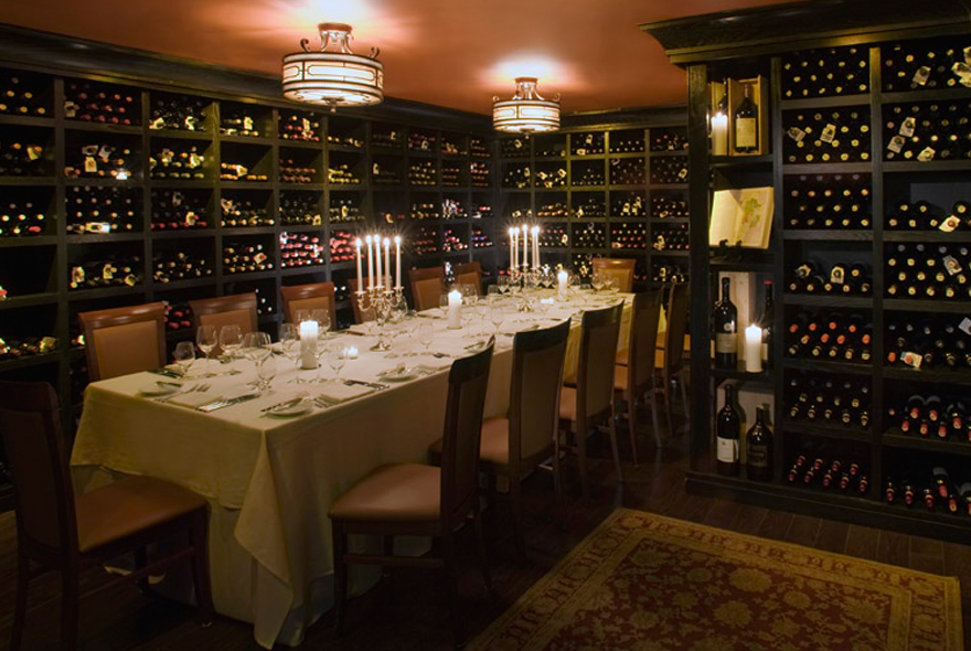
Of course, I always notice the interior of a restaurant.  As soon as you walk into Del Posto, the restaurant’s design influences your expectations and sets the tone for the meal you’re about to enjoy.  Del Posto’s dining room is opulent and lavish, but also inviting.  The food is bright and colorful while the interior is a handsome and masculine contrast with dark woods and geometric floors.  The yellow hue on the ceiling provides a light counter balance, and the overall effect is just a great backdrop to the food.  Del Posto is definitely on my must-visit list!

Del Posto 10Del Posto 3Del Posto 7Del Posto 9Del Posto 8Del Posto 11To see a complete menu, visit the Del Posto website.  You can also find them on Facebook.


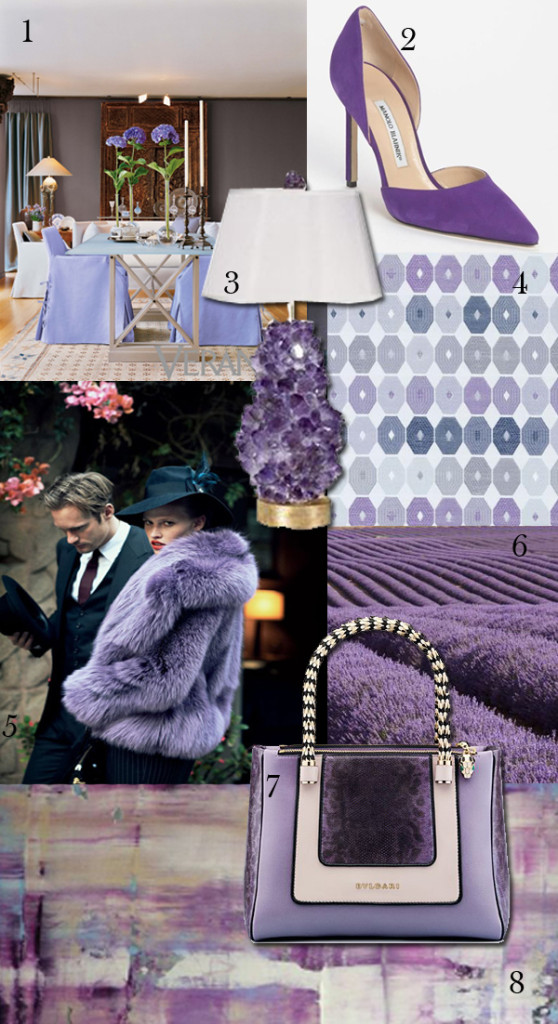
Color Obsession: Lavender, Amethyst, Violet, Oh My!

Lavender is my grey.

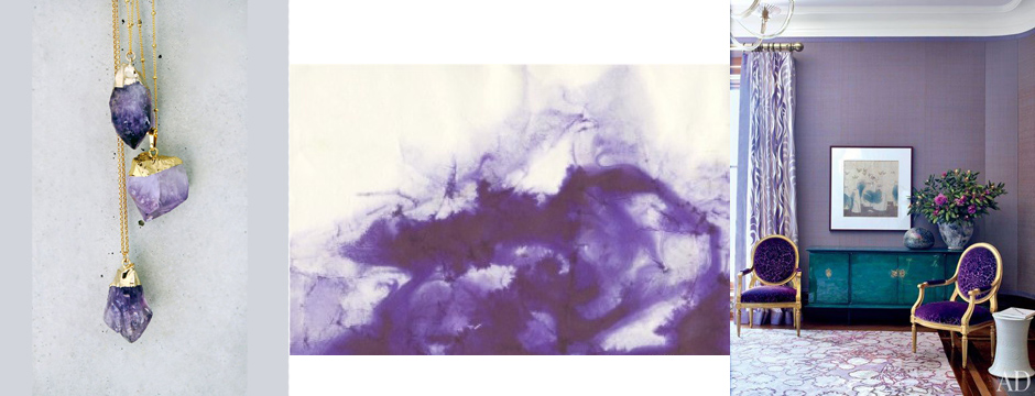
Lavender is my grey.  It’s a calming color that can be perceived as pretty and feminine.  It exudes a warmth where grey can be more cold and can range from amethyst to lilac.  We had the pleasure of designing a large office for a client who wanted the room to be her own space.  Everything in that room is purple, from the walls and upholstery to the window treatments.  She says it is one of the happiest spaces in her home, and she loves it.  It works because the shades of purple can be pushed to either end of the spectrum, toward blues or toward rose and pink.  Everybody looks good in purple.  A man wearing purple just exudes confidence.  What do you think of this color?

Amy Aidinis Hirsch Greenwich Interior Design 2

1.  Design by Carla Aston

2.  Manolo Blahnik

3.  Amethyst lamp by McCoy Design

4.  Emzee Fabric from Duralee

5.  Vogue

6.  Field of lavender.  (Source)

7.  Bulgari hand bag

8.  Innocent by Ali Kursun


Method Monday

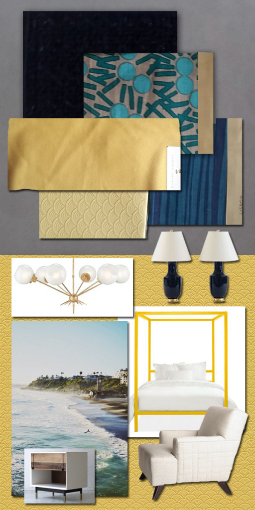
One of my favorite parts of the design process is pairing fabrics with furnishings, lighting, and accessories.

One of my favorite parts of the design process is pairing fabrics with furnishings, lighting, and accessories.  It’s the most creative part of what we do and the point where everything comes together.  This is the strategic part of balancing various elements.  Laying out fabric options so I can see how they work together in terms of color and texture is a simple method to narrow down and finalize choices.  When I add in other elements, a picture starts to come together and my vision for an interior really takes shape.  Here’s a glimpse at this method!

Amy Aidinis Hirsch Interior DesignI always start with the colors, and what I love about this combination is that the three colors are so cool together.  I would use navy for the rug, grounding the room.  The gold/yellow would be on the walls, brightening the space.  When the green is added, it just pops — and that particular element doesn’t work without the grounding aspect of the navy.  Together, they just work so well.

What Inspires Me: Wood

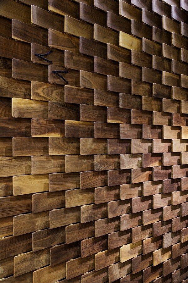
Even in its natural state, wood is so beautiful in its simplicity.

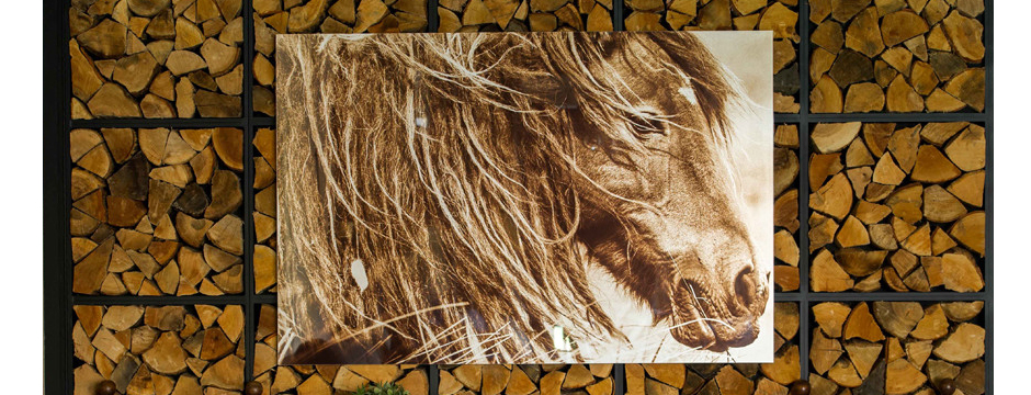
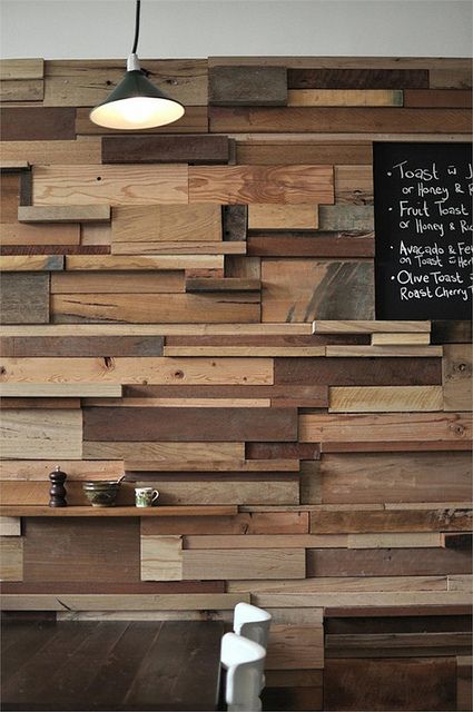
Wood is an element that can have such a variety of textures, patterns, and colors.  One species of wood can look very different depending on how it is cut, stained, or varnished.  Even in its natural state, wood is so beautiful in its simplicity.  It is definitely something that inspires me and I love the idea of incorporating it in ways that aren’t typical.

Wood 2 Wood 3 Wood 4

Color Obsession: Olive

Olive is one of those hues I tend to gravitate toward.

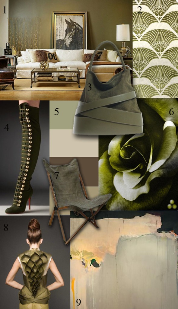
When I think of Olive, it reminds me of army colors.  It is one of those hues I tend to gravitate toward.  Olive is an earth-oriented shade, not something that pops with jolts of color.  It has a more serene presence.  Although part of the green color family, Olive has a brown under hue and works well with a gray or neutral based palette.  It’s also a very specific color.  When you say green, people visualize a whole spectrum of possibilities.  Say Olive, and everyone understands exactly what color that is.

Amy Aidinis Hirsch Color Obsession Olive

1.  Living room design by High Fashion Home.

2.  Cleos Breeze fabric by Robert Allen

3.  Z Spoke handbag by Zac Posen

4.  Over the knee boots by Christian Louboutin

5.  Paint colors by Benjamin Moore

6.  Image via Modernica

7.  Tripolina Chair from Environment Furniture

8.  Dress by Shinaz Engineer

9.  Risky Business, 2010, by Madeline Denaro


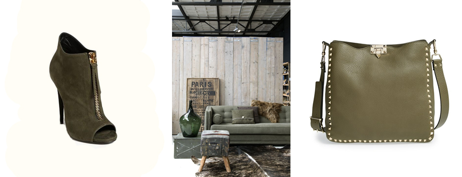
Cover Image:  Guiseppe Zanotti Open Toe Bootie, Valentino Rockstud Hobo, Living room image via DigsDigs


Evolution of a Project: Part 1

Every project, no matter the scope, begins with an initial consultation.

Every project has its own progression, its own DNA if you will.  I would like to share this process with my readers over several blog posts with the goal of giving a deeper understanding of the breadth of services we provide and the level of cooperation we have with everyone involved, from contractors and clients to architects and artisans.

Every project, no matter the scope, begins with an initial consultation.  My clients come from a variety of sources, and whether they find me by a referral or a magazine editorial, the beauty of meeting new clients is that I never know what I am going to walk into or where it will lead.  It’s always exciting to see the potential in a project and to sense the energy and good vibe between myself and a client.  Developing this good synergy is the first step as we look at the project, discuss the client’s wants, and go over the client’s needs.  During this initial meeting, we often get so deep into conversation that we lose track of time.  A project leads to months of time spent together, so there has to be some connection which I can almost always feel as soon as I meet a prospective client.

Recently, I had a call from a new client and set up a meeting.  When I learned of the location, I felt less than enthusiastic.  It was farther than I wanted to drive and I was definitely not excited about the distance.  The day of the meeting was beautiful, however, and as I drove I truly enjoyed the fall colors and the down time with my thoughts.  When I arrived at my client’s home, I knew from her unique interior and great personality that we would work so well together.  That kind of good energy makes me thrive!  The experience served as a reminder of why I love what I do.
_MG_1221

Of course, before a project can get underway, there are negotiations and contracts to go over.  This stage can be daunting and difficult, with variables and unknowns on both sides.  It takes trust from all parties to commit to a project on paper, which is one reason why it’s so important to establish a good connection during the initial meetings and discussions.

After these first meetings, negotiations, and contracts, exciting things begin to happen!


Year in Review: 2014

This past year has been an incredible journey for me.

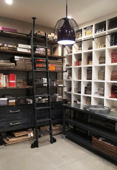
This past year has been an incredible journey for me.  I’ve worked with great clients to complete projects that challenged and inspired me, traveled to places I’ll always remember, and been able to enjoy time with my own family.  This time of year, I like to look back at my accomplishments and think of about how my firm has grown and where I want to see it go in the future.  In 2014, I settled in to my new office space and enjoyed having such ideal surroundings to meet with clients or work on projects with my staff.

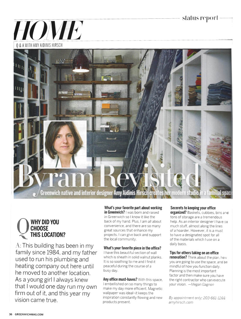
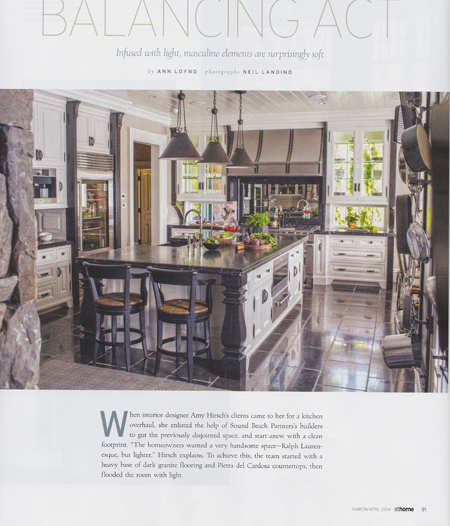
One of the ways I measure the visibility and direction of my business is by the attention my work receives from various publications.  Over the course of 2014, I was happy to have a presence in several fantastic magazines.  Here’s a recap of our press over the past year!
January 2014: Artisphere Online
January 2014: Greenwich Magazine
February 2014: New England Home
March 2014: At Home Magazine
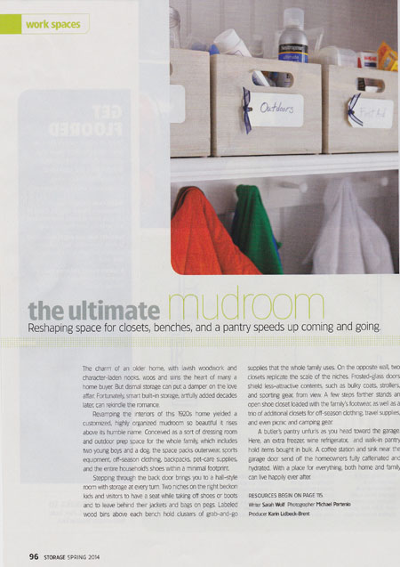
April 2014: Better Homes and Gardens - Storage
April 2014: Better Homes and Gardens – Storage
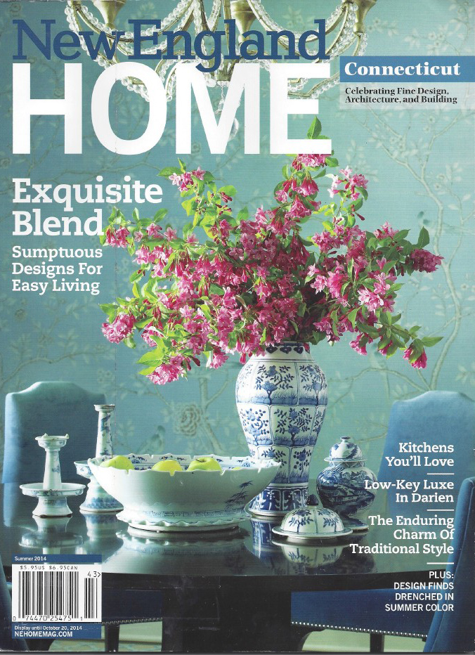
July 2014:  New England Home
July 2014: New England Home
November 2014:  Connecticut Cottages and Gardens
November 2014: Connecticut Cottages and Gardens


Drapery Hardware

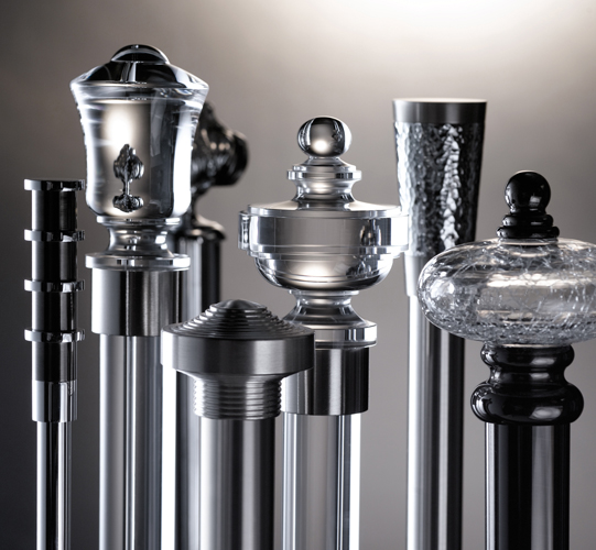
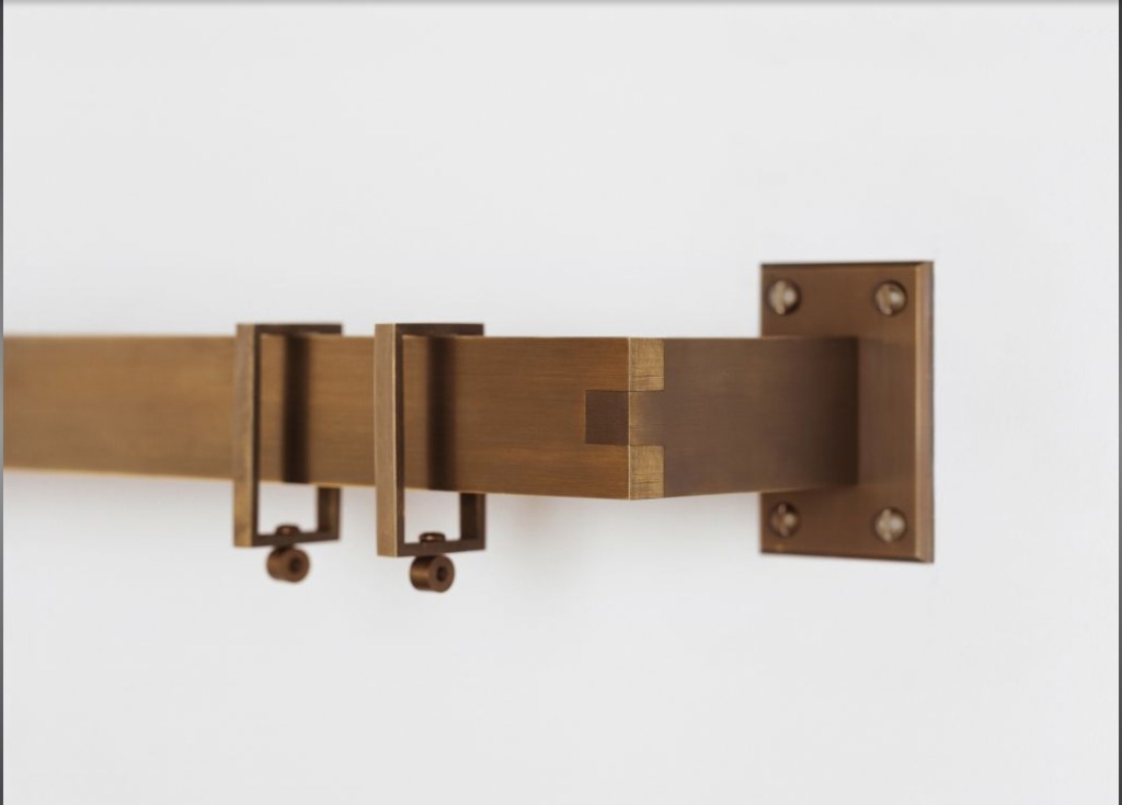
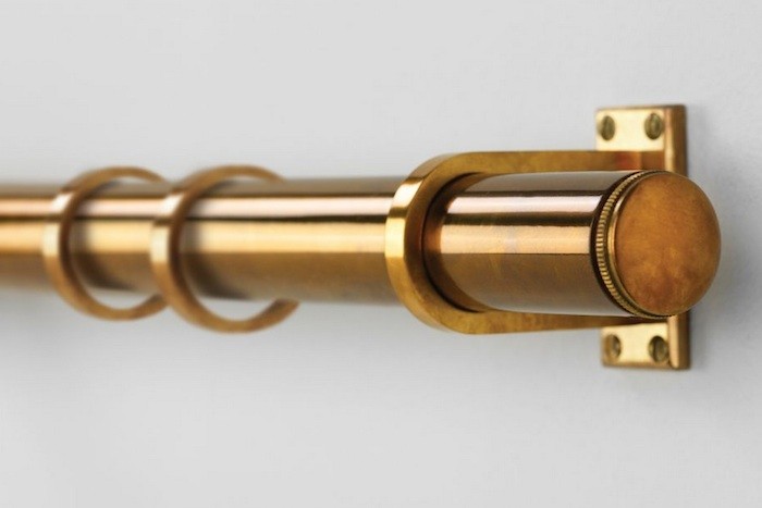
Drapery hardware is a finishing touch on a space that has a lot of potential to add interest to window treatments.

One of my favorite parts of the design process is getting to the stage where I choose final details for a room.  Drapery hardware is a finishing touch on a space that has a lot of potential to add interest to window treatments.  The hardware is like jewelry for the window, complementing the room or adding ornamentation.

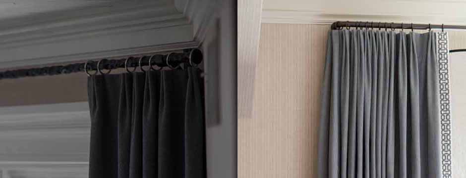
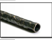
I love to use this pole along with a dark tarnish finish and sometimes a contrast ring.
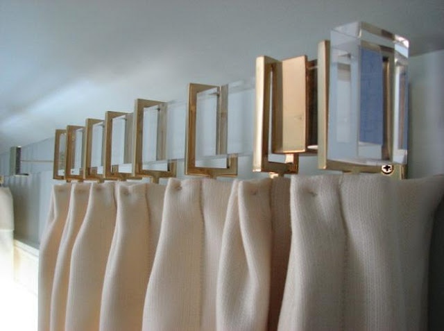
The lucite poles from Houles are just so cool.

There are so many styles of rods and rings available, from contemporary elements to more traditional styles and everything in between.  You can really customize the look of drapery hardware by thoughtful choice of materials, finishes, and accessories.   The hardware can be sleek and minimal or make a bigger visual impact.  Using contrasting rings with a bar is one way to achieve a memorable look.  You can also mix darks and lights or use varying materials for an unexpected twist on drapery hardware.

Love the square rings!
Great scale and tone. The finial is very simple.
Lucite with metal rings from Gretchen Everett Hardware.

In some cases, having simple hardware that is recessed allows the window treatments to be the focus.  Hardware that doesn’t dominate the look of the windows is sometimes a better choice for a room.

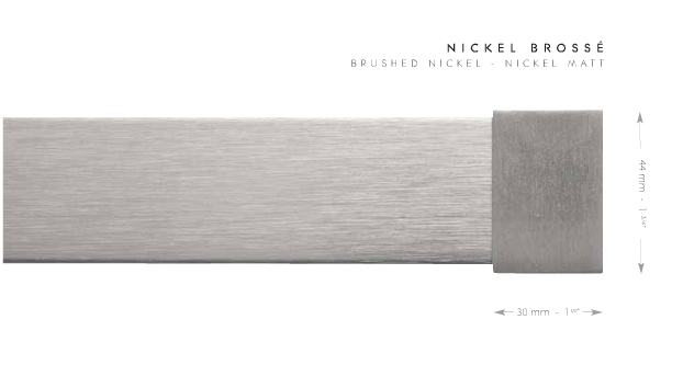
For a contemporary look – the pole from the Mina collection in brushed nickel is pretty sleek.

Which look do you prefer?