Super symmetrical.
Image from a vignette I designed for a Mitchell Gold furniture event.
Image from a vignette I designed for a Mitchell Gold furniture event.
I love the idea of pure creation represented by a collection of well-used paintbrushes.
I first learned about Southern Ocean Lodge from a client in Montana who wanted an interior inspired by the lodge.
Just off the southern coast of Australia lies Kangaroo Island, a 93 mile long paradise known for its wineries, honey production, and vacation destinations. It’s also the home of Southern Ocean Lodge, a beautiful luxury resort. I first learned about Southern Ocean Lodge from a client in Montana who wanted an interior inspired by the lodge. It brings us so much inspiration when a client points to something they experienced and want to emulate in their own environment. I love finding new things through clients!
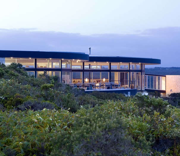
 Southern Ocean Lodge pampers guests in one of the world’s most stunning landscapes, near the island’s dramatic cliffs and adjacent to two national parks. The impressive natural beauty of Kangaroo Island surrounds Southern Ocean Lodge, providing access to the most memorable cliff walks and wildlife observations. Guests can enjoy world-class fine dining and a luxurious spa, all while relaxing in suites that incorporate sweeping and scenic Australian vistas. The area’s coastal palette is reflected in the lodge’s modern design, creating an almost seamless environmental experience for guests.
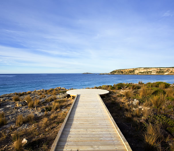
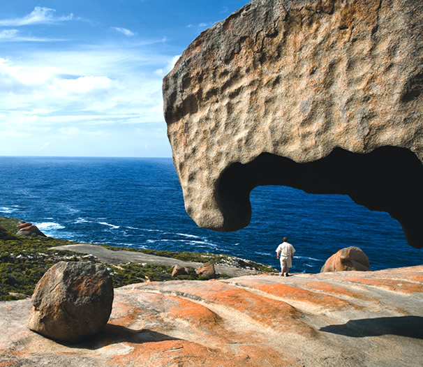
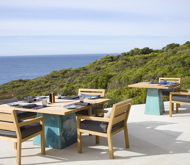 The aspects of Southern Ocean Lodge we focused on incorporating into the client’s home are gathering areas, the way the interior is laid out spatially, and capturing what’s happening in the exterior. Although the Australian vista is quite different from Montanta, we went with the concept of featuring the exterior landscape. We were careful to edit the design so as to avoid obstructing or taking away from the view. The room pictured below with the hanging fireplace is one reference we return to again and again, taking inspiration in the curve of the floor and playing with the way it presents itself. It’s often amazing to me what clients bring to a project.
Have you been to a place that inspired your interior?
To learn more about Southern Ocean Lodge, visit their website. You can also follow them on Facebook.
Image from a vignette I designed for a Mitchell Gold furniture event.
Lavender is my grey.
Lavender is my grey. It’s a calming color that can be perceived as pretty and feminine. It exudes a warmth where grey can be more cold and can range from amethyst to lilac. We had the pleasure of designing a large office for a client who wanted the room to be her own space. Everything in that room is purple, from the walls and upholstery to the window treatments. She says it is one of the happiest spaces in her home, and she loves it. It works because the shades of purple can be pushed to either end of the spectrum, toward blues or toward rose and pink. Everybody looks good in purple. A man wearing purple just exudes confidence. What do you think of this color?
1. Design by Carla Aston
3. Amethyst lamp by McCoy Design
4. Emzee Fabric from Duralee
5. Vogue
6. Field of lavender. (Source)
7. Bulgari hand bag
8. Innocent by Ali Kursun
One of my favorite parts of the design process is pairing fabrics with furnishings, lighting, and accessories.
One of my favorite parts of the design process is pairing fabrics with furnishings, lighting, and accessories. It’s the most creative part of what we do and the point where everything comes together. This is the strategic part of balancing various elements. Laying out fabric options so I can see how they work together in terms of color and texture is a simple method to narrow down and finalize choices. When I add in other elements, a picture starts to come together and my vision for an interior really takes shape. Here’s a glimpse at this method!
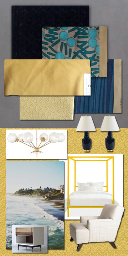 I always start with the colors, and what I love about this combination is that the three colors are so cool together. I would use navy for the rug, grounding the room. The gold/yellow would be on the walls, brightening the space. When the green is added, it just pops — and that particular element doesn’t work without the grounding aspect of the navy. Together, they just work so well.
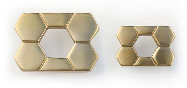
Lisa’s hardware has presence and intricacy; it isn’t your typical plain Jane hardware at all.
New York designer Lisa Jarvis has been interested in decorating since childhood. In addition to designing beautiful homes and offices, Lisa launched a successful furniture design business. Then, when she couldn’t find the hardware she wanted, she began to design that as well.
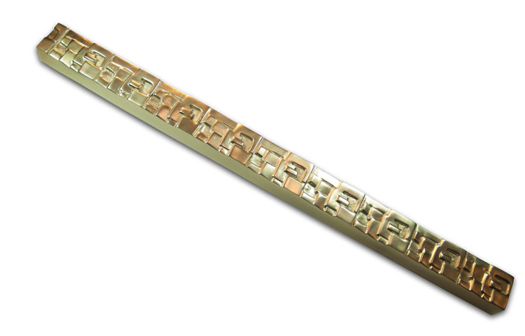
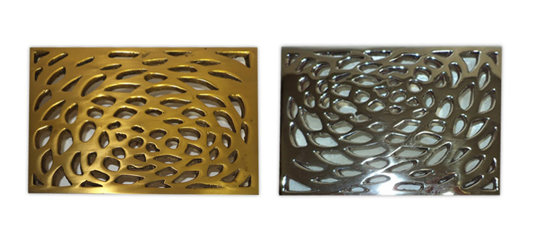
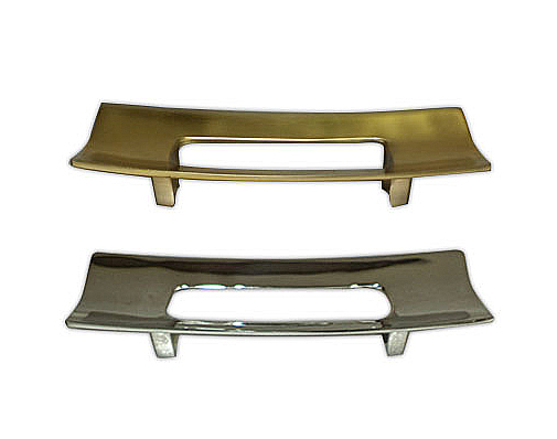
Lisa’s hardware designs are made from solid brass and are available brass or nickel finishes. Her pieces range from geometric to organic in shape and are so unique. Many of the handles and pulls have so much texture, while others shine with simplicity.
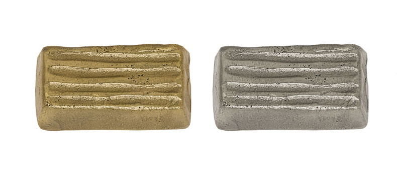
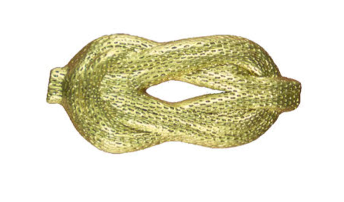
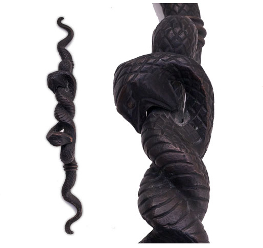
I love that this hardware is so substantial. It makes a statement and truly is jewelry for an interior. Lisa’s hardware has presence and intricacy; it isn’t your typical plain Jane hardware at all. When you want something to really sing, to be front and foremost, her pieces allow you to do that. You can have very simple cabinetry and add her pieces to impart a memorable look. You can mix the different hardware, join them together, take elements from different collections, and really create something. Using this hardware right in the center of a panel is like putting the perfect finishing touch on an outfit.
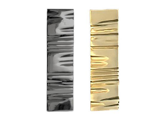
To see more of Lisa Jarvis’s hardware designs, visit her website.