La Dolce Vita

The success of La Dolce Vita stems from Paloma’s “passion for the sweet life.”

In 2007, during a summer break from her former career as a high school Spanish teacher, Paloma Contreras of Houston, TX, founded her style blog La Dolce Vita.  Since that time, she has attracted a worldwide readership and been featured in publications such as the New York Times, New York Magazine, Washington Post, Better Homes and Gardens, and many others.

The success of La Dolce Vita stems from Paloma’s “passion for the sweet life.”  Blog posts focus on interior design, fashion, travel, and people, and are beautifully complimented with photographs.  An impressive group of contributors, each with their own talents, interests, and perspectives, also provide material for La Dolce Vita.  Along with guest bloggers and contributions from designers, Paloma and her team have created a blog that appeals to a variety of styles and tastes.

Eclectic Family Room

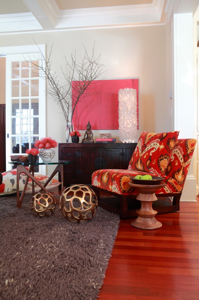
This family room was such a fun space to create.

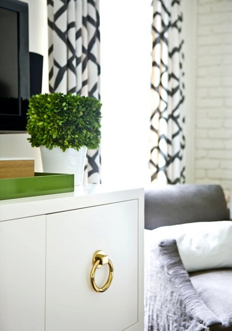
This family room was such a fun space to create.  It has an edgier vibe with a punch of color, definitely a modern room.  The palette and design approach allowed for so much creativity and the use of fantastic accents.

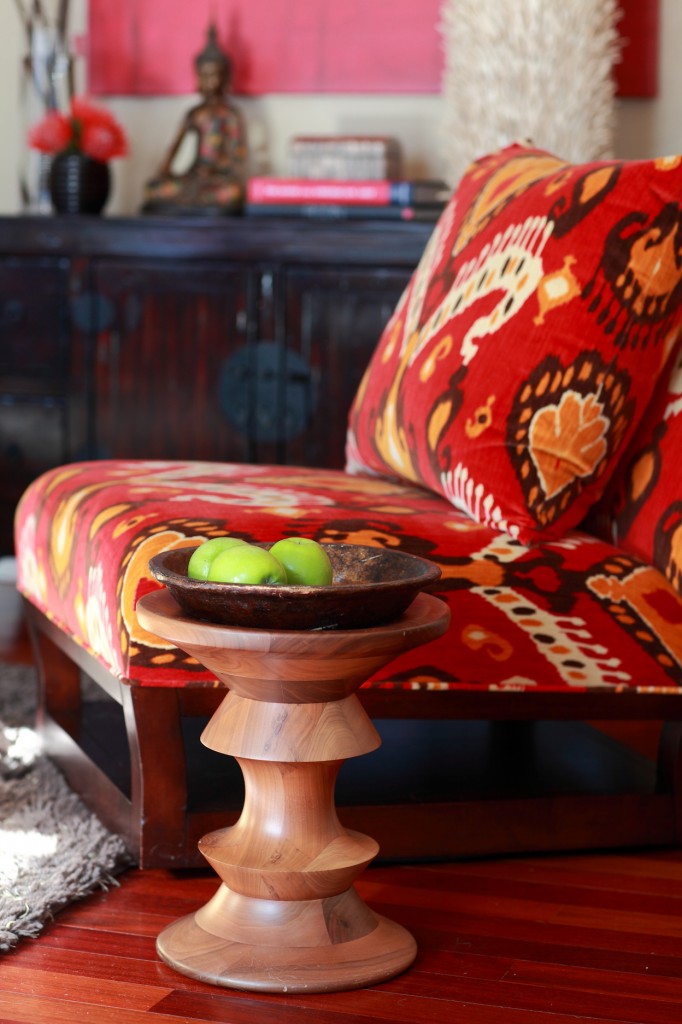
One piece that instantly sets the mood for the entire space is the Donghia swivel chair upholstered in F. Schumacher Ikat Velvet.  I just adore Ikat patterns!

The shag carpet from Patterson, Flynn & Martin is another favorite element of this family room.  Shag carpets can be a hard sell to present to a client, with its reminders of the 1970’s, but this carpet is hip and urban, especially with the dark grey hue.

Other important pieces for the room include the Pottery Barn storage cabinet and coffee and side tables from Design Within Reach.  All are solid and anchor the space  without detracting from the room’s modern lines.

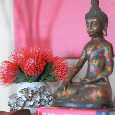
Finally, the accessories really make this space speak.  The hint of gold adds contrast to the furniture pieces.  The artwork is abstract and grounds the use of the dominating red hue of the room.  The unusual wood lamp and touch of Buddha spirit add a decorative element as well.  These are the kinds of essential details that make a project into something more than just a decorated room!


Les Lalanne at Les Arts Decoratifs, Paris

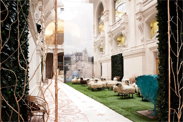
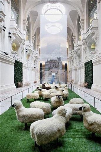
I recently came across these images of the Les Lelanne exhibit Les Arts Decoratifs and was entranced.

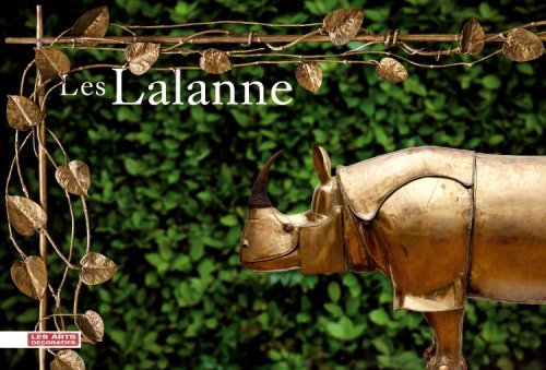
Les Arts Decoratifs, or the Museum of Decorative Art, in Paris holds more than 350,000 works in its collections.  I recently came across these images of the 2010 Les Lelanne exhibit at the museum and was entranced.

Les Lalanne is an artist duo comprised of French artists François-Xavier Lalanne (1927–2008) and Claude Lalanne (b. 1924).  The married couple co-created projects, with Francois focusing on animal sculptures and Claude preferring vegetation.  Their works have been exhibited in various venues, but I particularly love these exhibits  at Les Arts Decoratifs.

The appeal of this exhibit, for me, is the effect of the whimsical animals seeming to wander around in this vast architectural space.  Displayed in an area with minimal color, the exhibit produces a visceral reaction.

Grand Entry

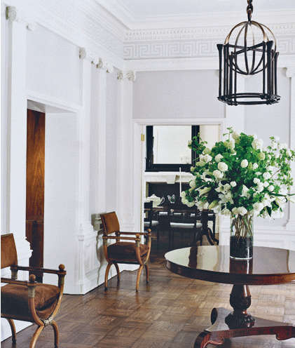
The entry is always the central core of a residence. It sets the mood for the first impression when a guest enters your home.

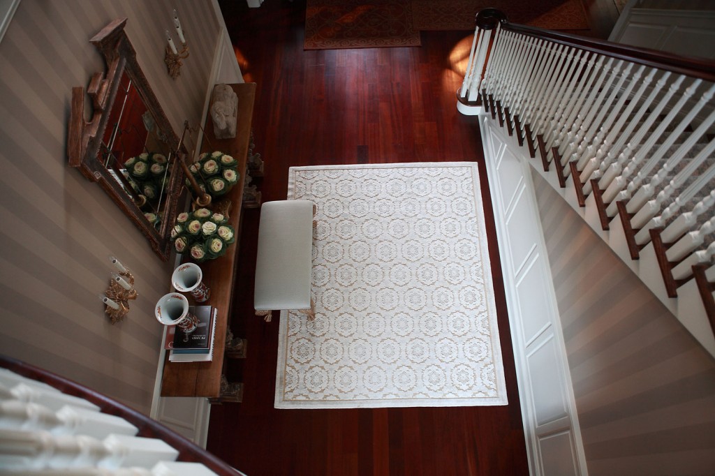
The entry is always the central core of a residence.  It sets the mood for the first impression when a guest enters your home.  This entry is vast in height with a grand stairway open to the upper floor.

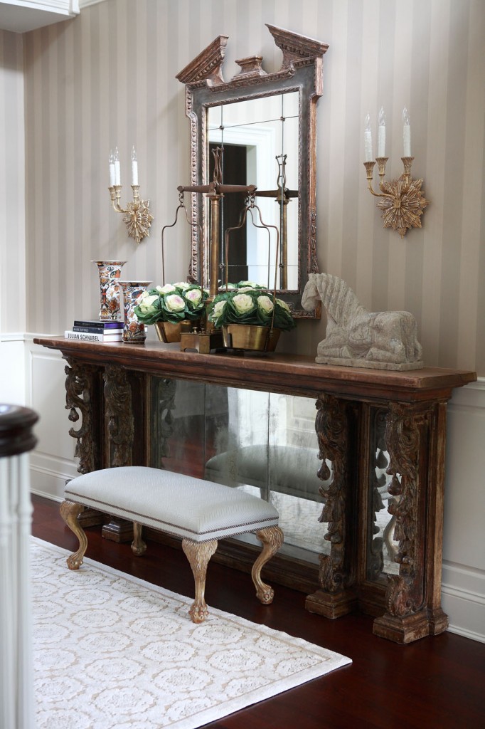
Finding the perfect entry table here turned into a real scavenger hunt.  Initially, I began sourcing antiques because I needed such a long table for this area.  Bored with the typical consoles and frustrated that the most spectacular pieces had been used by other designers, I thought, “Why not start the search from scratch?”  What I found was a table that originally formed part of an 1800’s bar that originated in the south of France.

I remember the day I presented the piece via email to the client and they said “Yes!”  I must have danced around the office like a silly child, so thrilled to have something authentic and aged in a newly refurbished space.

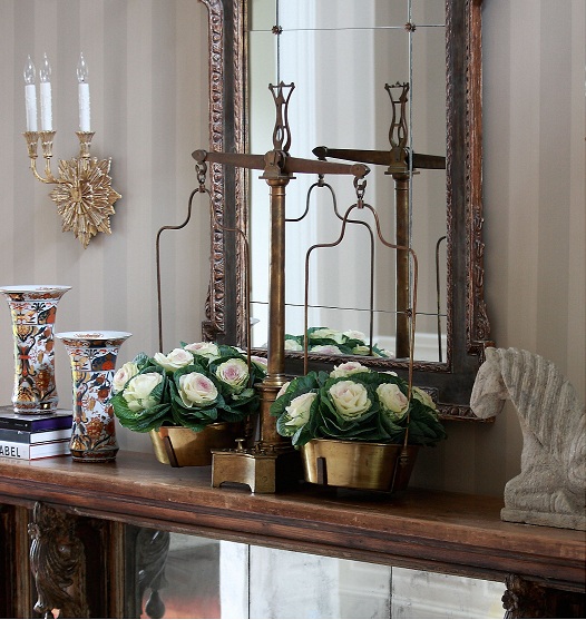
Another component I really like in this entry is the brass scale on top of the console table.  I have these moments where I speak up and conjure some crazy idea but have no idea where I’m going to locate what I’m presenting.  Somehow I always manage to figure it out, and the scales are a perfect example of that.  I wanted something of substance and not your typical accessory.  What I love about the scale is the way it functions as a vase for filling with flowers or other arrangements.

The console itself is a beautiful piece of art, but the accessories that adorn the top are so unique and strategically balanced.  The stone horse weighs a ton!  It was almost impossible to get it up there.

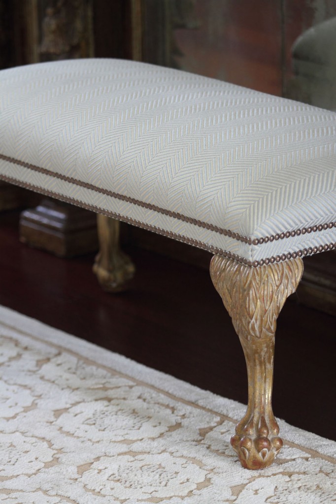
Being able to add so many custom elements to this entry also made it a memorable project.  The  gorgeous Buton area rug by JD Staron Galleries, light fixture in brass and dark bronze patina by Charles Edwards, and mirror and bench from Dennis & Leen, all complement each other and the grandness of the entry to form an overall atmosphere of impressive sophistication.  Finally, strie wall paper by Farrow & Ball cover the walls to provide subtle background texture and complexity.

New Exhibition at Anne Loucks Gallery, IL

From February 3 through March 31, Anne Loucks Gallery in Glencoe, IL (20 miles North of Chicago) will be running an exhibition titled Photography 2012: Through the Lens.

From February 3 through March 31, Anne Loucks Gallery in Glencoe, IL (20 miles North of Chicago) will be running an exhibition titled Photography 2012:  Through the Lens.  The exhibition will feature the work of several amazing artists.  I love the Anne Loucks Gallery and encourage you to experience the exhibit through their website if you can’t attend in person.

The photographers whose work is on display for this exhibit represent a variety of styles and subjects.  All of these artists are amazing!

Chris Honeysett

Oaks in Fog Mendocino
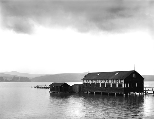
Pier, Inverness

 Jan Gauthier

Available Light
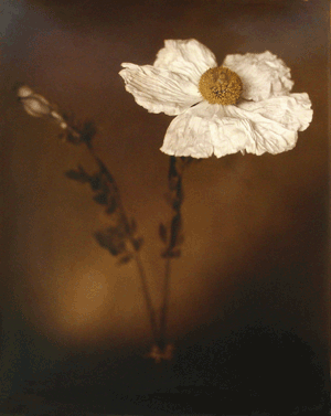
Apple Blossoms Late Spring

Joshua Jensen-Nagle

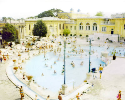
Budapest Bathers III
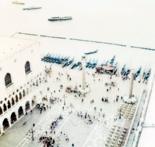
St. Marks from Bell Tower

Larry Chait

Sat10061101
Sun1708

Laurie Victor Kay

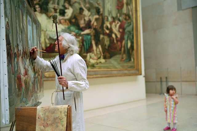
Painter, Lourve
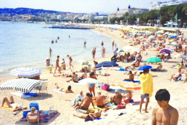
Plage, Noir

 Lyle Gomes

Maze, England 1998
Dew Trails, California 1998

To learn more about this exhibit or view more work by these artists, visit the gallery website.

Eataly, NYC

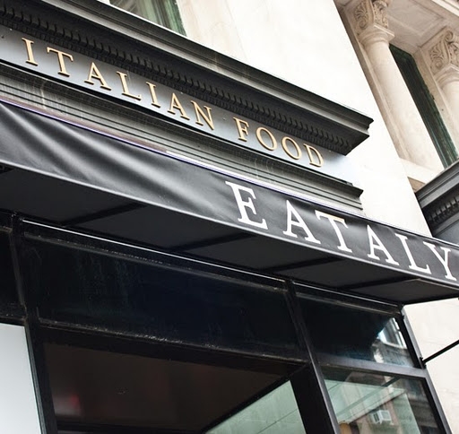
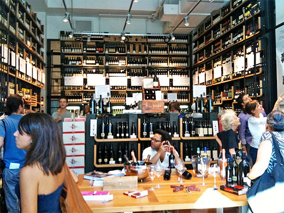
New York City, overflowing with people and experiences, is also home to one of my favorite shopping and dining experiences: Eataly, located at 200 5th Ave.

New York City, overflowing with people and experiences, is also home to one of my favorite shopping and dining experiences:  Eataly, located at 200 5th Ave.  A collaboration between culinary icons Mario Batali, Joe Bastianich, Lidia Matticchio Bastianich, and Eataly founder Oscar Farinetti, the NYC location aims to bring artisanal Italian foods to its clientele.

image from Happy Healthy Life

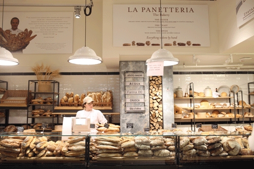
This is not your average grocery store.  It’s a market for true food lovers, those who want to know where their food came from and how it made the journey from field to shelf.  The feast begins when you enter the market and take in the sight of high ceilings and marble, displays of exotic produce and crusty breads, tempting gelato and cheeses, Italian pastas, and other delights not typically found in American supermarkets.

image courtesy of: need to know
photo by Evan Sung

If the idea of cooking up these culinary delights overwhelms you, Eataly offers a variety of cooking classes.  Or, you can enjoy a meal in one of the restaurants located right inside the market.  From the steakhouse to the vegan cafe, Eataly is sure to have something to tempt everyone.

Before leaving, be sure to check out the wine store.  The staff are helpful and knowledgeable, an invaluable combination when it comes to assisting wine shoppers.

photo by Bryan Hood

To learn more about Eataly’s philosophy, products, or classes, visit their website or look them up on Facebook.

Tabletop Inspirations

Don’t underestimate the ability of fine dinnerware to add a special or unique touch to the table.

What do you use your dishes for?  Are they simply utilitarian, something to toss on the table at dinner, then clean up and store out of sight once the meal is over?  On most nights of the week, dinner time is more about reconnecting with family after a busy day or fitting in a quick dinner between soccer and homework than about transforming your table into a masterpiece of a tablescape.

When you have guests, however, don’t underestimate the ability of fine dinnerware to add a special or unique touch to the table.  Dinnerware can add color, interest, and style to the table.  There’s no reason why you can’t use the dinnerware as another interesting element to make your guests feel special.

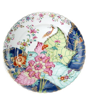
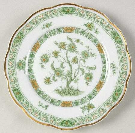
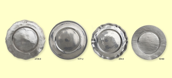
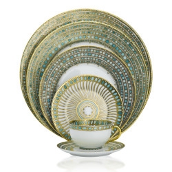
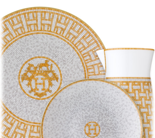
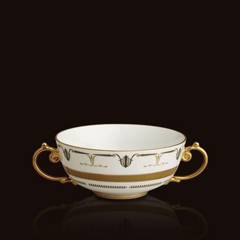
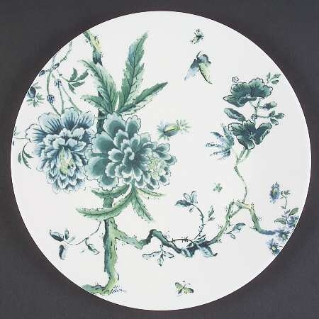
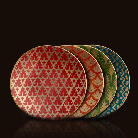
Here are some examples of dinnerware I love.  They represent a variety of colors and styles, but what they have in common is a heightened level of interest or detail that can easily be carried into other accent pieces for the table.

Decorate your table with this over the top tobacco leaf plate. Keep everything else simple.
This is my mother's china - Tree of Life. I have always loved the tree of life motif - inspiration from my mother!
Match - Pewter Table Top
Jasper Conran Chinoiserie


Fortuny & L'Objet - Fabulous!
Haviland
Classic Hermes
L'objet - Mythologie

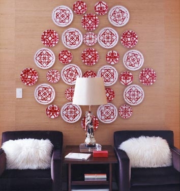
And of course, who says fabulous dinnerware has to be confined to a tabletop?

Cozy Chic Family Room

Our goal here was to create a comfortable, cozy environment in a livable space with absolutely nothing pretentious.

An open floor plan offers unique challenges and opportunities.  For this client, the family room opened to both the kitchen and dining area so all three spaces needed to tie together.  Our goal here was to create a comfortable, cozy environment in a livable space with absolutely nothing pretentious.  The rooms already had good flow from that open floor plan as well as lots of natural light and simple
architecture.  With these things in mind, we set out to create this cozy chic living room.

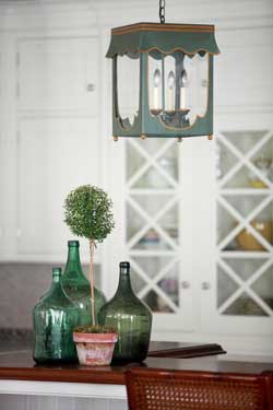
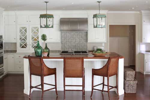
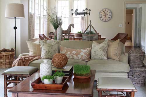
The primary color selection for this project was green.  Combined with all that wonderful light, the natural, organic color palette allows the influence of the outdoors to pour into the interior.  The resulting effect is inviting and has a simple influence but layers of warmth.   To achieve this, I chose materials like wicker, iron, walnut, and a hint of bamboo.  Since the space holds three different actions — eating, cooking, and lounging — elements had to not only compliment each other but also almost repeat to tie everything together.  For example, walnut in both the island and coffee table, bamboo on the ottomans and bar stools, and wicker chairs echoed by baskets.

Some of the items and materials used here were really enjoyable to work with.  The tile back splash warms up the white cabinetry of the kitchen while the Lamplight Designs lanterns over the island draw in that soft green color seen throughout the space.  The chenille sofa fabric from Cowtan & Tout, for example, or the John Rosselli & Associates bamboo ottomans upholstered in leather.  One of my favorite accents, however, is the Vaughan standing lamp in iron!

I think the finished room really lives up to all of its potential.  This is a great gathering area where everyone feels connected and part of the open communication of living together in a wonderfully habitable space.

Artist Marc Harrold

I found myself mesmerized by the sleekness of Marc Harrold’s photography at the Samuel Owen Gallery.

Typically, I am late for everything and recently on my mad dash to get lunch I stumbled into the Samuel Owen Gallery. With absolutely no time to spare, I found myself mesmerized by the sleekness of some photography at the gallery.  I knew the artwork would be perfect for a project I’m working on in Southampton.

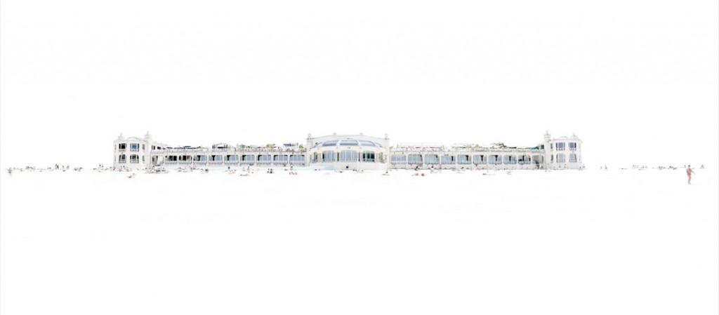
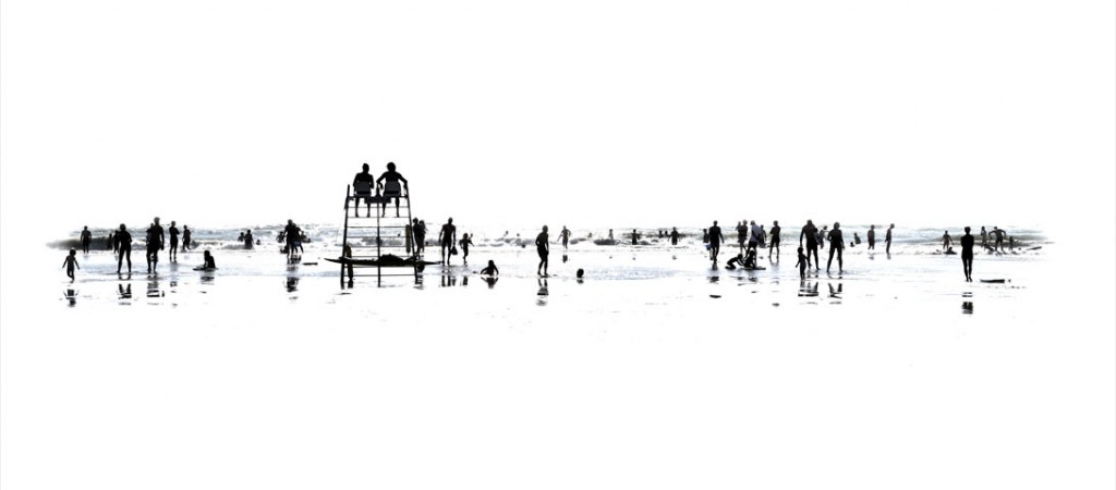
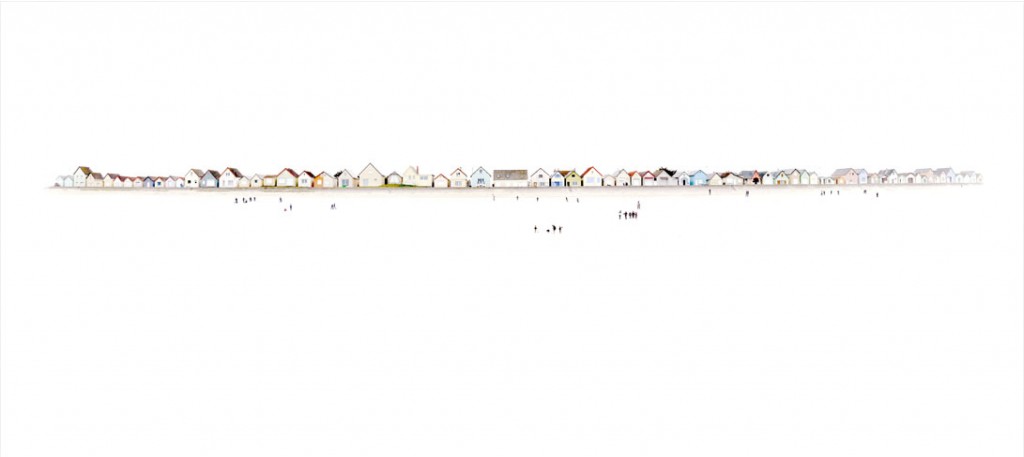
From the gallery I learned the artist behind these fascinating images is Marc Harrold from Paris, France.  To create his photos, Marc purposely overdevelops the images then selectively adds color back into the images.  The photographs are back mounted with 1/4″ UV acrylic with an aluminum backing to hold them rigid.  On the back of each photo is a cleat with a coordinating wall piece which allows the photo to rest flat against the wall.  The resulting artwork appears to float over the wall.

Marc primarily photographs beach scenes in his native France.  The wide spaces in his large-format prints combine with the brightness of the over-exposure, and prominent and sweeping horizon line, truly evoke the feeling of being at the beach with the sun in your eyes and feeling that you can see all the way to the edge of the world.

Later that day I actually had a meeting with my Southampton client and expressed my interest in the artwork of Marc’s I had seen earlier.  She perked right up and said, “I saw the same thing!” and we both were totally excited like two 5 year old children!

Art is so difficult to choose for a client.  It is just one of those things people have a very visceral  reaction to, sentimental and expressive of one’s personal reflection.  I can’t wait to install this artwork for my client; it is going to totally set the overall feeling of the house!
Beach 1

Of his own work, Marc says, “‘I take photos of places at different times of the day, sometimes randomly, to emphasize the interaction between the light and the shade, the effect of time on the beauty of the instant. This way, probable or more unlikely encounters unveil the invisible from the visible. My photos are a reflection on the fickleness of people, of things. Signs that draw their way through light and shadow. Aestheticism is important to me to carry my thoughts and feelings.  My work is not intended to carry any specific message, but rather to share an emotion that is magnified by the experience of the observer.”

Beach 46
Beach 37
Beach 62

It’s difficult to do this artwork any justice on a computer screen!  To see more examples of Marc Harrold’s photography, including detailed images, visit Samuel Owen Gallery or look them up on Facebook.

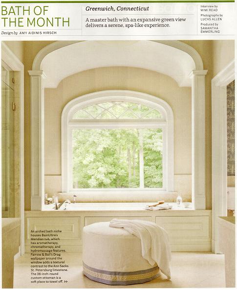
House Beautiful: Bath of the Month

Being one of my favorite design publications, I was thrilled to have a bath I designed chosen as Bath of the Month!

House Beautiful magazine’s March 2012 issue just arrived in my mailbox.  Being one of my favorite design publications, I was thrilled to have a bath I designed chosen as Bath of the Month!  Here is my interview, done by Mimi Read, with photographs by Lucas Allen.  It was a true pleasure working with them and seeing the article in print!

Here is the article in full, but I suggest you pick up an issue to enjoy from cover to cover!

Mimi Read:  You do know how to frame a view.

Amy Aidinis Hirsch:  We wanted an expansive window to fill the room with natural light, and to make the exterior part of the interior.  We didn’t use a window treatment because it would have blocked the view.  Those lush green woods are like a painting for the space.

That’s a brave move, putting a tub right in front of a huge uncovered window.

The house is at the end of a cul-de-sac — my clients have total privacy here.  That’s a dual soaking tub, so it accommodates two people.  They wanted a bathroom for both of them to enjoy together — a perfect symmetry of his-and-hers everything.  He travels a lot, and it was particularly important to him to have a tranquil space to retreat when he comes home.  It’s their Zen haven.

Cladding the walls and floor in all this honey-vanilla limestone creates such a spa-like feeling.

We chose vanilla limestone because we were going for warm and simple, understated.  Marble would have had too much movement —  all that veining — and that would have competed with what we were trying to achieve here.  The driving force for choosing limestone was the previous floor.  It was Jerusalem gold marble, and it was jarring, not welcoming at all.  This is such a soft, calming color, very gentle on the eye, and also to the hand — it’s quite smooth, not pitted in any way.  And using it everywhere unifies everything.

You’ve even used tilted limestone slabs as vanities.  Why no drawers or cabinets under the sinks?
My clients didn’t want conventional vanities — they wanted something clean and minimal.  They were actually inspired by a tiny vignette of a bathroom they’d seen at Paris Ceramics.  They were there looking, and they really fell in love with the mother-of-pearl on the vessel sinks and the backsplash.  The way the light picks up on it is exquisite.  I repeated the mother-of-pearl tiles in the shower and made it thicker, right at eye level.  It’s definitely the bling.
It’s beautiful the way the mirrored door between the vanities reflects the woodsy view.

The details are so beautiful, too.  The panes frame antique mercury mirror, and the rosettes are hand-carved.  You really notice the beauty because of the sleek, angular simplicity of the vanities.  The door slides into the wall, so it never obscures either of the vessel sinks.  Those sinks are works of art.

–MR