Color Obsession: Lavender, Amethyst, Violet, Oh My!

Lavender is my grey.

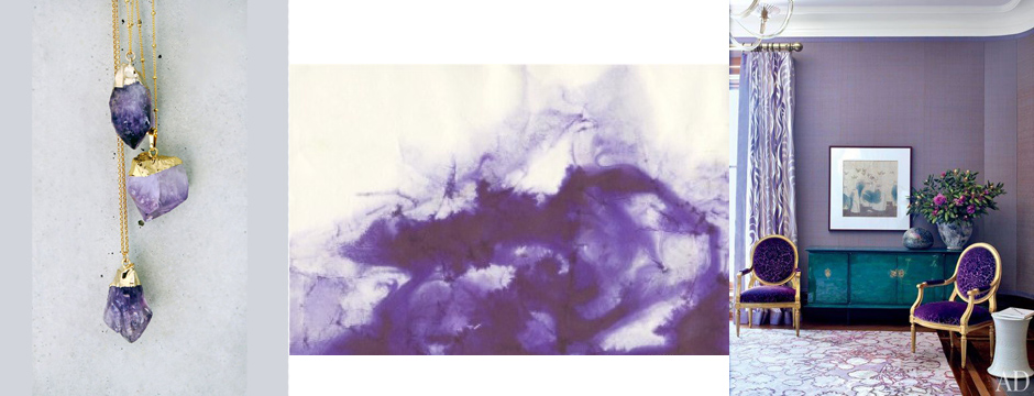
Lavender is my grey.  It’s a calming color that can be perceived as pretty and feminine.  It exudes a warmth where grey can be more cold and can range from amethyst to lilac.  We had the pleasure of designing a large office for a client who wanted the room to be her own space.  Everything in that room is purple, from the walls and upholstery to the window treatments.  She says it is one of the happiest spaces in her home, and she loves it.  It works because the shades of purple can be pushed to either end of the spectrum, toward blues or toward rose and pink.  Everybody looks good in purple.  A man wearing purple just exudes confidence.  What do you think of this color?

Amy Aidinis Hirsch Greenwich Interior Design 2

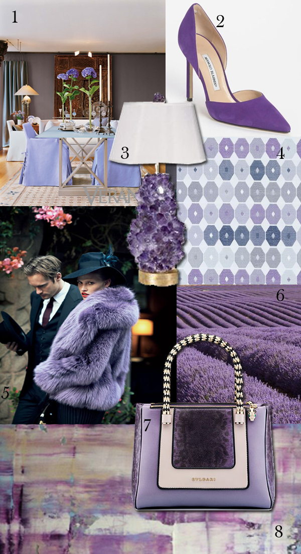
1.  Design by Carla Aston

2.  Manolo Blahnik

3.  Amethyst lamp by McCoy Design

4.  Emzee Fabric from Duralee

5.  Vogue

6.  Field of lavender.  (Source)

7.  Bulgari hand bag

8.  Innocent by Ali Kursun


Method Monday

One of my favorite parts of the design process is pairing fabrics with furnishings, lighting, and accessories.

One of my favorite parts of the design process is pairing fabrics with furnishings, lighting, and accessories.  It’s the most creative part of what we do and the point where everything comes together.  This is the strategic part of balancing various elements.  Laying out fabric options so I can see how they work together in terms of color and texture is a simple method to narrow down and finalize choices.  When I add in other elements, a picture starts to come together and my vision for an interior really takes shape.  Here’s a glimpse at this method!

Amy Aidinis Hirsch Interior DesignI always start with the colors, and what I love about this combination is that the three colors are so cool together.  I would use navy for the rug, grounding the room.  The gold/yellow would be on the walls, brightening the space.  When the green is added, it just pops — and that particular element doesn’t work without the grounding aspect of the navy.  Together, they just work so well.

Unique Hardware: Lisa Jarvis

Lisa’s hardware has presence and intricacy; it isn’t your typical plain Jane hardware at all.

New York designer Lisa Jarvis has been interested in decorating since childhood.  In addition to designing beautiful homes and offices, Lisa launched a successful furniture design business.  Then, when she couldn’t find the hardware she wanted, she began to design that as well.

Long Steps Pull
Long Steps Pull
Lattice Pull
Lattice Pull
Long Pull
Long Pull

Lisa’s hardware designs are made from solid brass and are available brass or nickel finishes.  Her pieces range from geometric to organic in shape and are so unique.  Many of the handles and pulls have so much texture, while others shine with simplicity.

Large Lines
Large Lines
Knot Pull
Knot Pull
Double Snake Head Handle

I love that this hardware is so substantial.  It makes a statement and truly is jewelry for an interior.  Lisa’s hardware has presence and intricacy; it isn’t your typical plain Jane hardware at all.  When you want something to really sing, to be front and foremost, her pieces allow you to do that.  You can have very simple cabinetry and add her pieces to impart a memorable look.  You can mix the different hardware, join them together, take elements from different collections, and really create something.  Using this hardware right in the center of a panel is like putting the perfect finishing touch on an outfit.

Barre Pull
Barre Pull
Christopher Pull
Christopher Pull

To see more of Lisa Jarvis’s hardware designs, visit her website.

Pantone Color of the Year 2015: Marsala

Pantone announced their color of the year for 2015 — Marsala.

Pantone announced their color of the year for 2015 — Marsala.  Leatrice Eiseman, Executive Director of the Pantone Color Institute explains why Marsala was chosen as Color of the Year:  “Marsala enriches our mind, body and soul, exuding confidence and stability.  Marsala is a subtly seductive shade, one that draws us in to its embracing warmth.”  This color was also chosen for its ability to flatter a range of skin tones as well as the way it inspires creativity when used for fashion and design.

Marsala
Marsala

I agree that Marsala can be a soulful color.  My reaction is to mix it with something, to pair it with other colors.  Marsala has purplish, red undertones and isn’t a color I’d really use alone.  I would turn to two very different hues of the spectrum — blue or ochre.

Blue would be the cooler choice to pair with Marsala.  I love how they look together.

Marsala and Blue
Marsala and Blue

Ochre has warmth, but is also a nice contrast to the dark richness of Marsala.  These two colors really accent each other so well.

Marsala and Ochre
Marsala and Ochre

What do you think of Pantone’s Color of the Year, and how would you use Marsala?


What Inspires Me: Wood

Even in its natural state, wood is so beautiful in its simplicity.

Wood is an element that can have such a variety of textures, patterns, and colors.  One species of wood can look very different depending on how it is cut, stained, or varnished.  Even in its natural state, wood is so beautiful in its simplicity.  It is definitely something that inspires me and I love the idea of incorporating it in ways that aren’t typical.

Wood 2 Wood 3 Wood 4

Favorite Kitchens

I really like kitchens that have a modern edge with a rustic vibe.

The kitchen is, for a lot of people, the core of the house.  It’s a place where families tend to gather, so it must be welcoming and comfortable.  On the other hand, a kitchen also serves an important function and must meet a family’s needs for cooking and entertaining.  Finding a balance between style and livability means making thoughtful choices for flooring, fabrics, and wall treatments, making the space easy to clean and maintain according to the family’s lifestyle.

Kitchen Design 12Kitchen Design 11Kitchen Design 10

No matter how big or small the kitchen is, it has to contain certain elements.  When planning a kitchen, you need to take those necessary elements and figure out how to achieve that ideal balance of function and aesthetics.  You have to be mindful of how heavily the kitchen will be used and the best placement of each item.  There are a lot of factors to be aware of, from comfort to organization.  Right now we’re seeing a trend toward modern, simplistic kitchens with very clean lines.  Counters often have mitered edges and we see big, expansive spaces.  The cabinetry tends to be simpler, without a lot of details, molding, or hardware.  When you remove something, like storage, you have to also incorporate a new solution in order to maintain the kitchen’s functionality.

Kitchen Design 9Kitchen Design 8Kitchen Design 5

I really like kitchens that have a modern edge with a rustic vibe.  Stripping elements down to a simpler form while maintaining comfort and practicality is an art form I truly appreciate.

Kitchen Design 4Kitchen Design 3Kitchen Design 2What is your favorite kind of kitchen?

Waterworks Kitchen

Almost every element of the kitchen is part of the Waterworks Kitchen line, creating a complete design experience.

I was in NYC recently for an appointment, rushing because I was late.  I stopped short when I saw a new Waterworks storefront with a beautiful vignette and just had to go inside even though I was running late.  This Waterworks show room is not massive in scale, but what they fit in was so impressive.    The line includes everything from sinks and fittings to cabinets and work tables.  Everything has been designed with an eye toward both form and function, using the finest materials.

Waterworks Kitchen NYCWaterworks Kitchen 3

Almost every element of the kitchen is part of the Waterworks Kitchen line, creating a complete design experience.  I saw simple lines and super approachable products that a wide range of people will gravitate toward.  The cabinets are simple but come in sultry, interesting colors with smokier tones, not your typical white kitchen.  I find the way they displayed kitchen sinks so interesting, showcasing vast array of ways to use them.  One sink I loved was immense at 54 in long with two drying boards set underneath — so clever and really inventive.

Waterorks Kitchen 1Waterworks Kitchen 2

Waterworks has  expanded plumbing fixtures to the point where they have a grand scale and such a presence.  The new lines are not typical and show an insightful reinvention of fixtures and other kitchen elements.  Waterworks has turned a product that was already great into something really thoughtful.  This is such beautiful hardware.  I really appreciate how they’ve taken an element we all believe in at its simplest form and developed on it.   Today’s clients don’t want a lot of hardware in a modern setting, which is why the Waterworks recessed options are so smart.  The light fixtures are also quite modern and appealing with an industrial vibe, definitely something for everyone.

Waterworks Kitchen 6Waterworks Kitchen 7Waterworks Kitchen 4

I walked out wanting to design whole Waterworks kitchen with all of the accoutrements that go with it.  The Waterworks showroom is so well presented, it makes it easy for a client to envision their own kitchen design, and that in itself is a success.


Color Obsession: Olive

Olive is one of those hues I tend to gravitate toward.

When I think of Olive, it reminds me of army colors.  It is one of those hues I tend to gravitate toward.  Olive is an earth-oriented shade, not something that pops with jolts of color.  It has a more serene presence.  Although part of the green color family, Olive has a brown under hue and works well with a gray or neutral based palette.  It’s also a very specific color.  When you say green, people visualize a whole spectrum of possibilities.  Say Olive, and everyone understands exactly what color that is.

Amy Aidinis Hirsch Color Obsession Olive

1.  Living room design by High Fashion Home.

2.  Cleos Breeze fabric by Robert Allen

3.  Z Spoke handbag by Zac Posen

4.  Over the knee boots by Christian Louboutin

5.  Paint colors by Benjamin Moore

6.  Image via Modernica

7.  Tripolina Chair from Environment Furniture

8.  Dress by Shinaz Engineer

9.  Risky Business, 2010, by Madeline Denaro


Cover Image:  Guiseppe Zanotti Open Toe Bootie, Valentino Rockstud Hobo, Living room image via DigsDigs


Gift Ideas

Here’s a quick list of gift ideas I love.

During the holiday season, I try to think of what might be a little different to give as a gift.  With all of the hustle and bustle, here’s a quick list of gift ideas I love.  If you’re like me and wind up doing last minute shopping, meaning you need something in a pinch, one of these options might be perfect.   Happy shopping!

Alaura Sea Salt Caramels
Alaura Sea Salt Caramels, handmade and so rich.
Baobab Collection Diffuser
David Collins Studio
David Collins Studio, perfect for the design enthusiast.
Ivory Trio Winston Flowers
Ivory Trio from Winston Flowers
Jo Malone London Candle
Jo Malone Wood Sage & Sea Salt Candle
Lance Wovens Standard Tote
Standard Tote from LanceWovens
miraval
2013 Chateau Miraval Cotes de Provence Rosé Jolie-Pitt & Perrin
Pink Himalayan Salt
Pink Himalayan Salt
Trovare Tray
Seraphina Tray from Trovare Home
West End Metallic Print Glassware
Metallic Print Glassware Set from West End

What are your favorite gifts to give friends and family?

Drapery Hardware

Drapery hardware is a finishing touch on a space that has a lot of potential to add interest to window treatments.

One of my favorite parts of the design process is getting to the stage where I choose final details for a room.  Drapery hardware is a finishing touch on a space that has a lot of potential to add interest to window treatments.  The hardware is like jewelry for the window, complementing the room or adding ornamentation.

I love to use this pole along with a dark tarnish finish and sometimes a contrast ring.
The lucite poles from Houles are just so cool.

There are so many styles of rods and rings available, from contemporary elements to more traditional styles and everything in between.  You can really customize the look of drapery hardware by thoughtful choice of materials, finishes, and accessories.   The hardware can be sleek and minimal or make a bigger visual impact.  Using contrasting rings with a bar is one way to achieve a memorable look.  You can also mix darks and lights or use varying materials for an unexpected twist on drapery hardware.

Love the square rings!
Great scale and tone. The finial is very simple.
Lucite with metal rings from Gretchen Everett Hardware.

In some cases, having simple hardware that is recessed allows the window treatments to be the focus.  Hardware that doesn’t dominate the look of the windows is sometimes a better choice for a room.

For a contemporary look – the pole from the Mina collection in brushed nickel is pretty sleek.

Which look do you prefer?