Fashion + Decor

Fashion + Decor is the kind of inspirational site that I love.

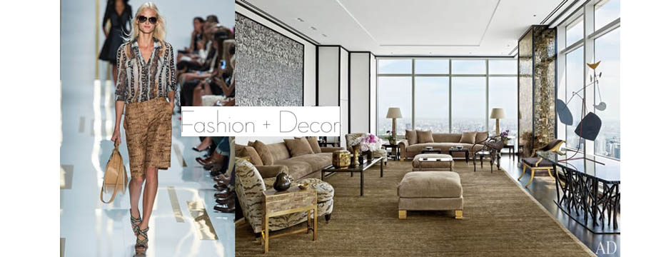
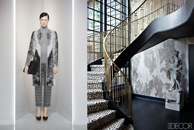
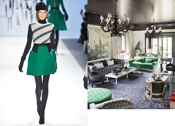
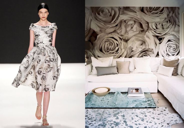
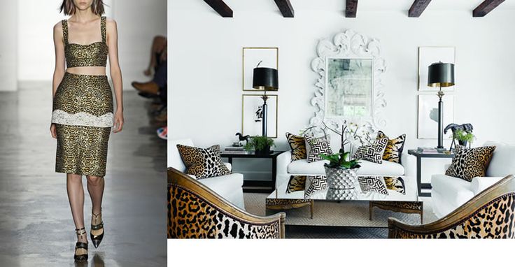
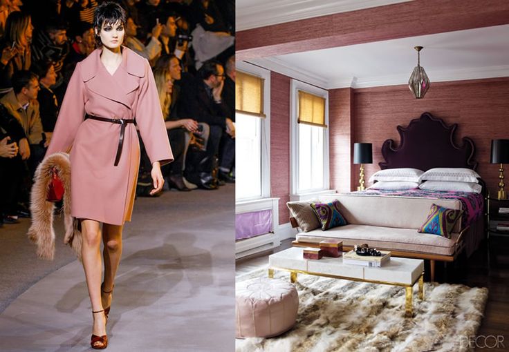
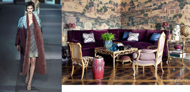
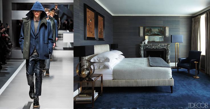
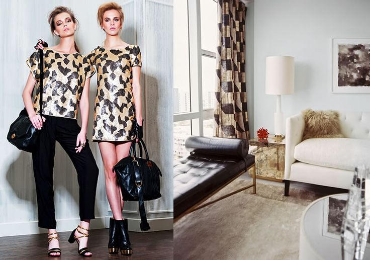
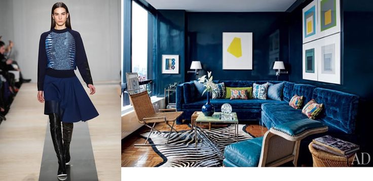
Fashion + Decor is the kind of inspirational site that I love.  The site’s contributors take a specific fashion look and translate it to an entire space.  It’s clever, resourceful,  and so interesting.

Fashion and Decor 8

Fashion and Decor 6

Fashion and Decor 7

Fashion + Decor appeals to me because it takes what I love (fashion) and turns it into what I do (interiors).  It’s also a great tool for introducing different looks to clients and expanding their imaginations.  It helps to push boundaries and break out of the typical box.

Fashion and Decor 5

Fashion and Decor 4

Fashion and Decor 2

One useful aspect of the site is the way you can filter by color, room, season, and more.  The navigational tools are really well done and the overall design of the site is really user friendly.  It’s just pure inspiration to me!

Fashion and Decor 9

Fashion and Decor 3

Fashion and Decor 1

It’s well worth the time to visit Fashion + Decor and explore the site.  You can also find them on Facebook and Twitter, as well as Pinterest.

Keith Granet

After starting his career as an architect and working with the notable firm Gensler, Keith realized that wasn’t where he wanted to be and started his own company with the goal of filling a need for business guidance in the design world.

I really like what Keith Granet is doing for the design industry.  After starting his career as an architect and working with the notable firm Gensler, Keith realized that wasn’t where he wanted to be and started his own company with the goal of filling a need for business guidance in the design world.

Keith Granet
Keith Granet

As a consultant, Keith has helped designers develop the knowledge, skills, and resources to successfully transform a passion for design into a thriving business.  With his book and online videos, Keith is a great guide to the industry.

The Business of Design
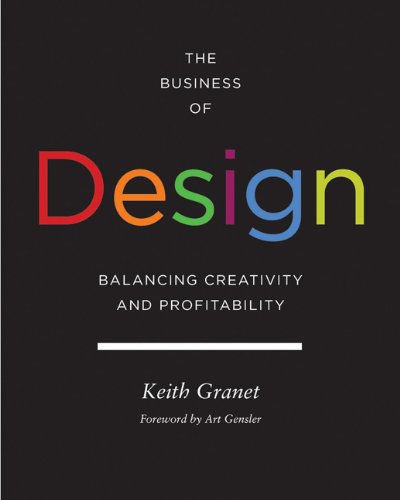
The Business of Design by Keith Granet

I like to listen to Keith’s videos while I work.  The people he interviews and works with are driving forces in the design industry and are so amazing and creative.  They have such talent, and Keith helps them expand their skills.  During the interviews, he asks very simple, approachable questions.  He makes you realize that no matter where your firm is, we all have the same obstacles.  He shows you how to move forward and use certain tools to build your brand and make it better, as well as how to handle different things and approach new projects.  I learn so much from Keith’s videos.

Keith Granet’s interviews with Bunny Williams and her words about clients were particularly memorable to me.  What I took from Bunny is to let clients buy things but help them put everything together.  Like other interviews and videos Keith has done, this one made me stop and think about how to better my business.  I face the same challenges as other designers.

You can see all of Keith’s great videos on his YouTube channel.  Or, visit his website to learn more about his services.


Color Obsession: Navy and Gray

Navy and gray make a great combination and are so satisfying during short, chilly days!

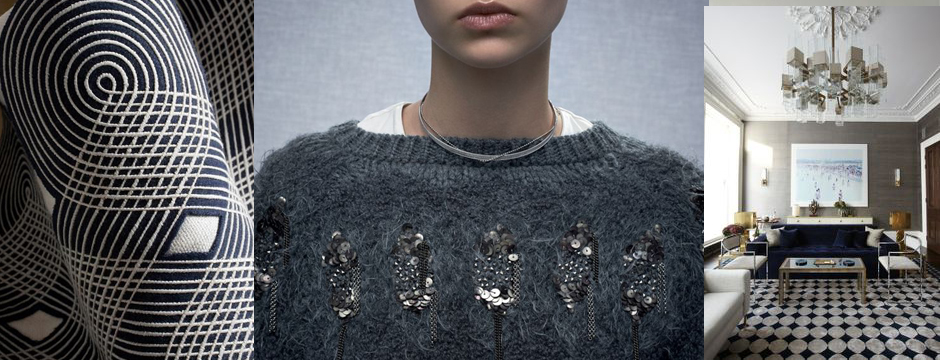
This time of year, with cold weather setting in, I begin to gravitate toward heavier, textural fabrics and colors.  I think of handsome, masculine hues and the pleasure of wrapping yourself in cashmere and wool.  Two colors that I associate with this season are navy and gray.  They make a great combination and are so satisfying during short, chilly days!

amy hirsch color board navy-blue

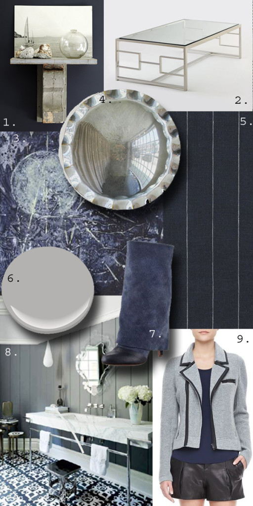
1.  Arrangements in Gray and White by New England Home Magazine

2.  H Cocktail Table by Holly Hunt

3.  Winter Solstice No 2 by Laura J. Wellner

4.  Laurel Convex Mirror from Downtown

5.  Walker Pinstripe in Navy from Ralph Lauren Home

6.  Benjamin Moore Silver Dollar

7.  See by Chloe Fold-Over Suede Mid-Calf Boot

8.  Bathroom by Daun Curry

9.  Rag & Bone Jacket, Tank, and Shorts

House of Eleven

I recently discovered House of Eleven, a new fashion line that I really love.

I recently discovered House of Eleven, a new fashion line that I really love.  Their urban designs are right up my alley!  Edgy but feminine with great use of leather and an appealing price point, this is clothing I could easily wear during the day and still be ready to go out at night.  Here are some of my favorite pieces from House of Eleven’s current line:

1.  Taylor Leather Rider Leggings:  So versatile, a must-have item.

House of Eleven

2.  Chantal Dress:  So chic!  You could add a blazer and some great jewelry.

House of Eleven 6

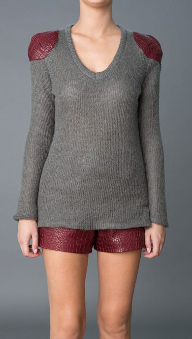
3.  Emma Mohair and Croc Leather:  Playful yet funky, I love the combination of textures.

House of Eleven 3

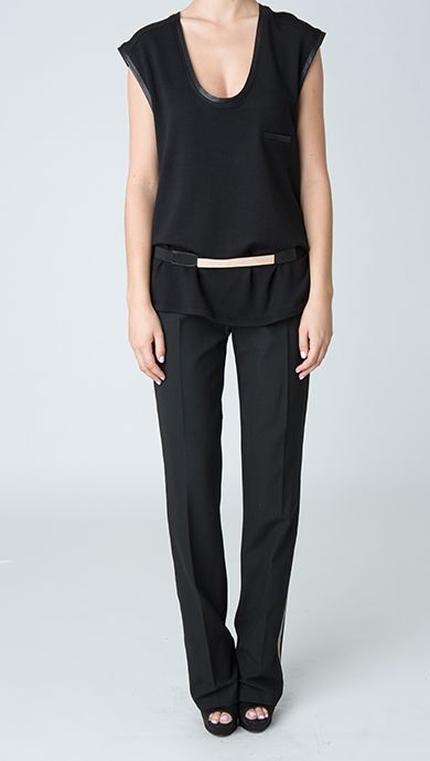
4.  Lola Boyfriend Muscle Tee:  You can dress this up or down.

House of Eleven 2

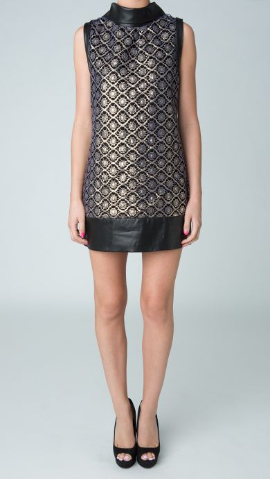
5.  Kelly Short Lace and Leather Dress:  A touch of glam with such a cool pattern.

House of Eleven 5

6.  Naomi Leather Bomber Jacket:  So great with a white shirt!

House of Eleven 4

What do you think of House of Eleven’s look?  You can view more of their styles by visiting their website.  House of Eleven is also on Facebook and Twitter.

Boca Raton Project

Designing a home that isn’t a primary residence is always nice because you have more flexibility.

I’ve been working on a project for an existing client’s second home in Boca Raton, Florida.  Designing a home that isn’t a primary residence is always nice because you have more flexibility.   When you don’t live in the home on a daily basis, you are more open to different ideas and styles.  In this case, the home started out with a really dismal interior.  In spite of the beautiful location, the original interior of the home was old and dated.  In contrast, my client’s family is young, active, and full of life.  I wanted the home to reflect that and was thrilled when I was given carte blanche with color.

I used the home’s sunny location as inspiration when designing for this project — warmth, brightness, and palm trees.  I decided to go with a bit of a retro throwback look and create a world of turquoise, full of vibrant color that suited my client’s young family and the lush surroundings.

Sara Pendant for the breakfast room.
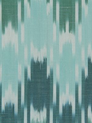
Sonia Ikat in Lagoon for the pillows.
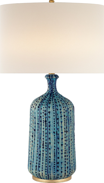
Culloden Table Lamp for the living room.
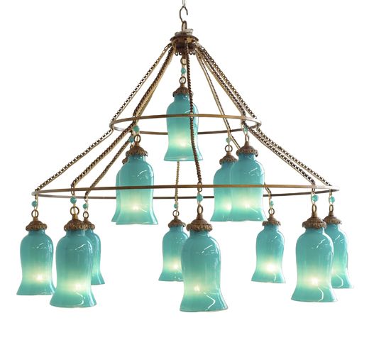
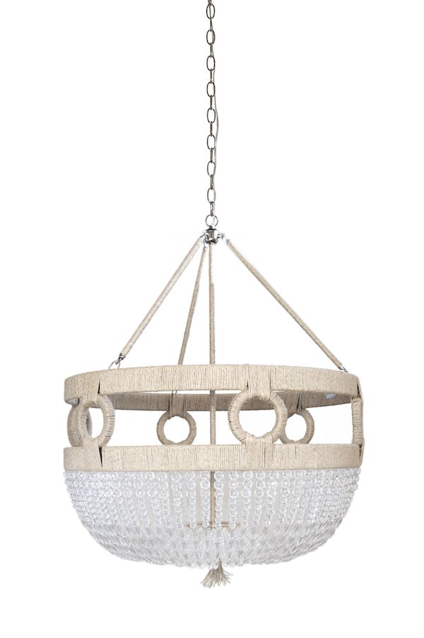
Frankie Chandelier from Ro Sham Beaux, installed with beads shown below.
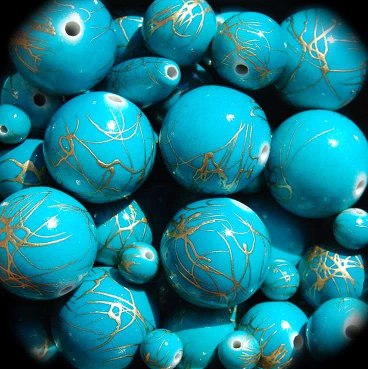
Turquoise Swirl beads for the Frankie chandelier.

Balancing the turquoise, I incorporated plenty of crisp white, keeping the home’s exiting tile because it reminded me of sand.  I wanted the home to look glamorous and have a polished, retro style but also be user-friendly.  I tested different fabrics by actually pouring red wine onto them!

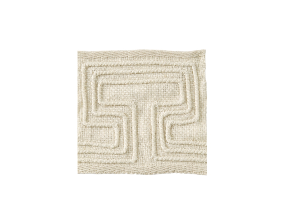
For the living room trim, Pathways from Kravet.
Brentano Perspective, fabric for the club chairs (below).
Club Chair, reupholstered in white.

My client likes mid-century pieces, so I kept that in mind when choosing furnishings.

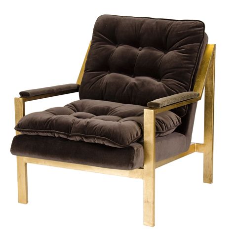
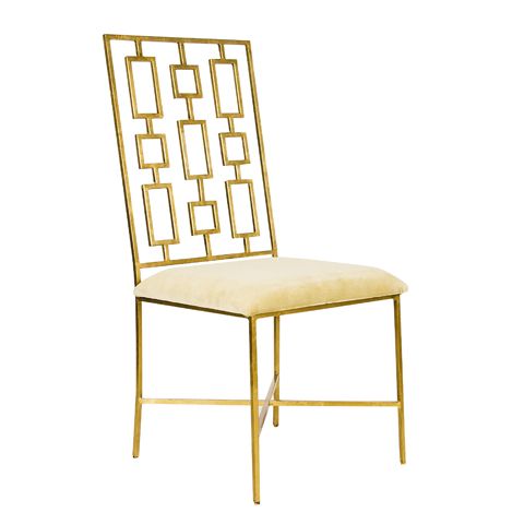
David Gold Leaf dining chair.
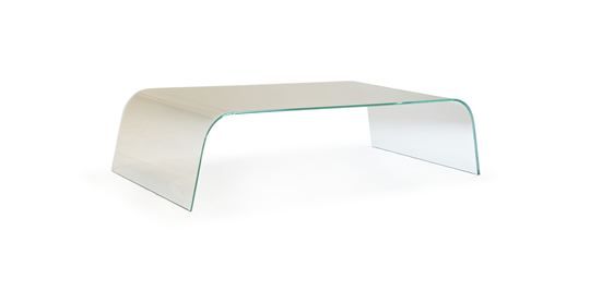
Claro Cocktail Table from Mitchell Gold + Bob Williams
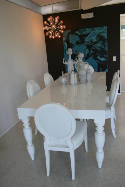
Hollywood Dining Table

For art, we went with bold choices that have a different vibe than you typically see here in Connecticut.  With the turquoise inserted everywhere, I am confident the final results of this project will be stunning!

Water Reflection
Water Reflection

Stay tuned for installations photos, coming soon!

Granny’s Meatballs

Of all of my childhood memories, one of the most vivid was being at my great grandmother’s house on a Sunday and eating her delicious meatballs.

Of all of my childhood memories, one of the most vivid was being at my great grandmother’s house on a Sunday and eating her delicious meatballs.  They would be piled high in a bowl and she would have them in the oven to stay warm.  I think every one of us will tell you Granny’s meatballs were the best!

meatballs 3

Her recipe has been handed down through the generations, and while I know the recipe has changed over time, what is most important is that it represents a tradition that has remained in my family to this day.

As a child, every Wednesday we had macaroni and meatballs, which I continued when I had my own family. To this day, I will keep a dish of meatballs in the oven after I cook them.  It is the first place everyone looks when it is pasta night at our house!

pasta with sauce

I learned how to cook these morsels at a very young age and I have never measured any of the ingredients!  I have done my best to give you estimates in measuring the ingredients.

I have also included my recipe for a marinara sauce that I use for pasta.  I start my sauce with sausage, which gives it a great flavor.  Whenever possible, use fresh ingredients.

Ingredients for Sauce:

1lb of Hot Italian sausage, cut into 2 inch pieces

1lb of Sweet Italian sausage, cut into 2 inch pieces

1 large onion, chopped

1 clove garlic, chopped

1 35 oz can of crushed tomatoes

2 6 oz cans of tomato paste

Salt to taste

Pepper to taste

1 cup fresh basil, chopped

½ cup fresh parsley, chopped

¼ cup fresh oregano, chopped

½ cup of water

Olive oil

1lb of dried pasta

In a large, heavy sauce pan or Dutch oven, heat olive oil.  Place sausage in pan and brown on all sides.  Add chopped onion and garlic and cook for a few minutes till translucent.  Add water to pan with tomatoes and tomato paste.  Fill one of the small and the large can with water, scraping any tomatoes from the can and add to pot, less water will give you a thicker sauce.  Add the salt, pepper, basil, parsley and oregano. Bring to a boil, then simmer for 1 1/2 to 2 hours.
Ingredients for Meatballs:

1 ½ lb of ground beef, veal, and pork (ground beef can be used alone if preferred)

2 eggs

½ cup grated Locatelli Romano cheese (adjust if needed)

4 to 5 slices white bread or Italian bread, ground in a food processor  (do not pulse into crumbs I like to keep them a little coarse)

Salt, to taste

Pepper, to taste

1 clove of garlic, or to taste

1 cup fresh parsley

½ cup fresh basil

¼ cup of water (or less)

Crisco oil

Place the ground meat mixture and eggs in a bowl.  Chop the parsley, basil, and garlic in a food processor and add to mixture.  Grind the bread in food processor and place in bowl.  Add the Romano cheese and season mixture with salt and pepper. Add some of the water and mix together; if needed, you can add more bread.  You do not want the mixture to get too soft or it will be hard to roll into meatballs.

In a large frying pan, add enough Crisco oil to cover the bottom of the pan.  If you like, you can use olive oil, though I feel olive oil makes the meatballs get too soggy.  Make sure the oil is hot as this will make a difference in how they cook.  Roll the meatballs with your hands, and place into hot oil.  Cook the meatballs until they are crusty, then turn.  If you do not want them to be crusty on the outside, you can turn them earlier.  Cook the meatballs until they browned all over and cooked through.

With a slotted spoon remove the meatballs from the frying pan.  If you want to, place a few meatballs in a bowl to keep warm in the oven until ready to serve.  Place the remaining meatballs in the marinara sauce until ready to serve.

Just before serving, cook your favorite pasta as directed and drain.  Use a slotted spoon to remove the sausage and meatballs from the sauce and place in a separate bowl to serve.  Ladle some of the marinara sauce into the bottom of a large pasta bowl, add the pasta and additional marinara sauce, and toss the pasta to coat.  Serve with the meatballs, sausage, grated Locatelli Romano cheese, crusty Italian bread, and a salad.

I hope you enjoy this meal as much as we have throughout the years!


The Big Reveal

I love working in this creative haven, surrounded by elements that both calm and inspire me.

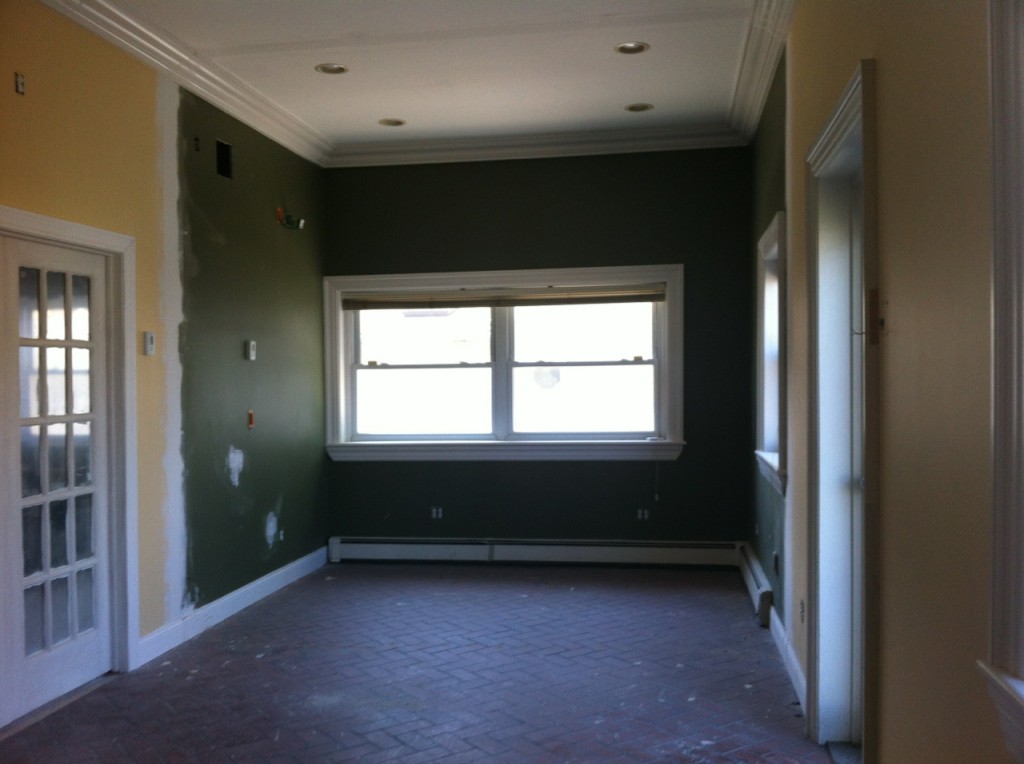
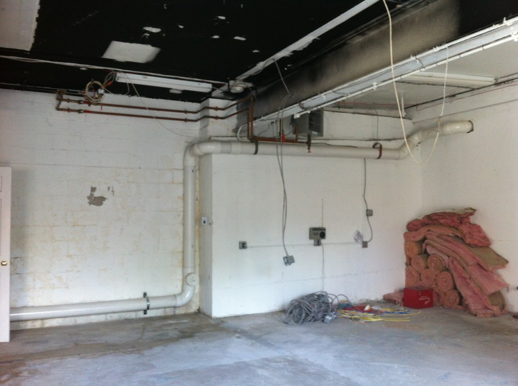
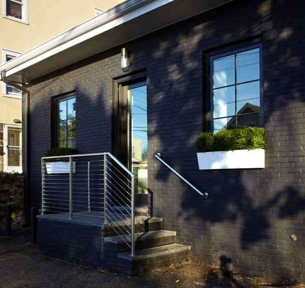
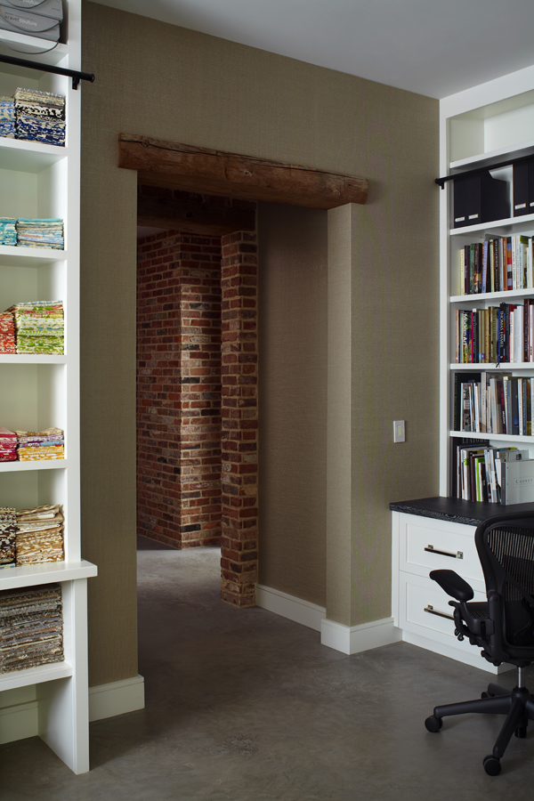
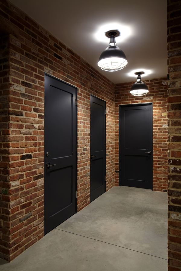
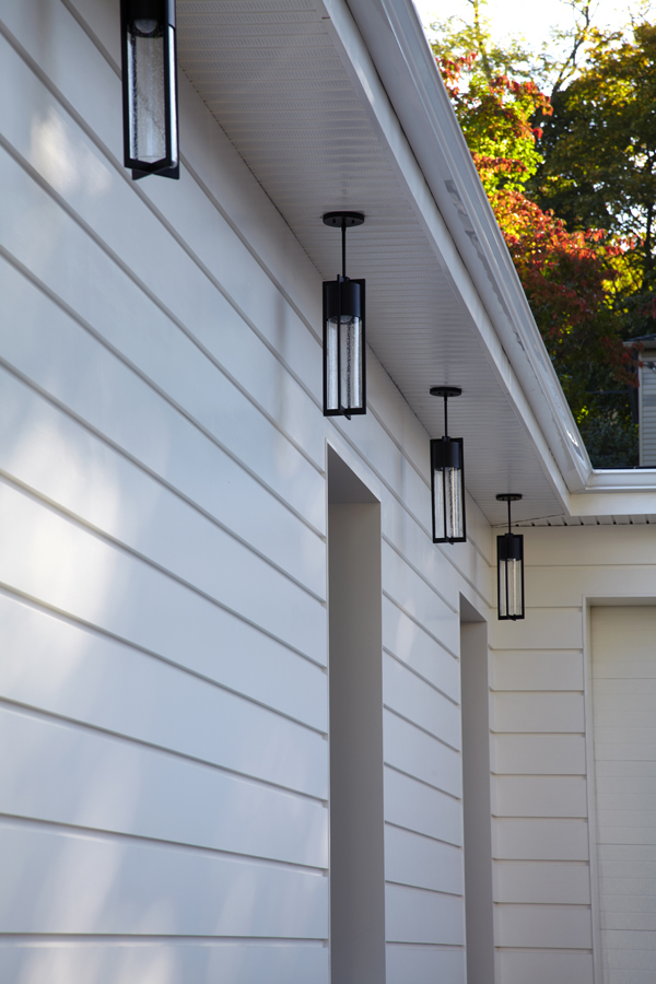
I am extremely thrilled to share with you my latest and greatest project, something that is very personal:  My new studio!  The building which houses my studio is truly sentimental; it has been in my family since 1983, when my father decided to purchase it for his company, Putnam Plumbing and Heating.  I remember visiting my dad’s business as a young girl, when the space was smogged with smoke and the typical grunge of pipe fittings, boilers and machinery.  The space was not pretty at all, as you can imagine, and I found myself fascinated by the idea of the potential of this place.  Photos of the interior and exterior before I started renovations show how great the transformation of this place has been.

Before Studio
Before Studio 1
Before Studio 2

After years of growing his own business, my dad moved to another location and this building remained.  Occupied by others through out the years, it eventually lay vacant for some time. Prior to my father’s ownership of the building, it was occupied by a machine shop during the 1950’s and, in the early 1930’s, the building was an automotive repair shop.  Over the course of almost 85 years, there were a few alterations to the building.  When we began to demo for the renovations, we actually found this really cool iron window frame with restoration glass buried in one of the walls.  I wish I could have salvaged it, but it was too decrepit.  I am truly grateful to my parents and their role in where I am today.  I love the family connection to this place and knowing that the building is part of my past lends it additional beauty.

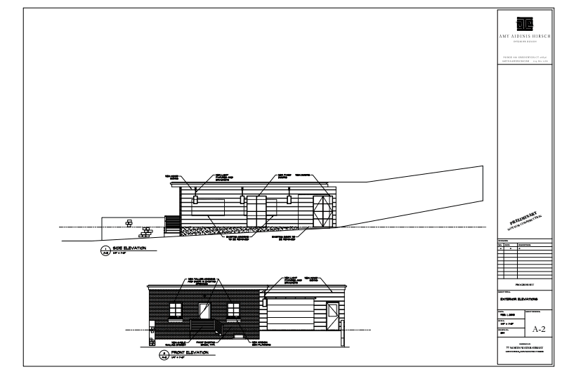
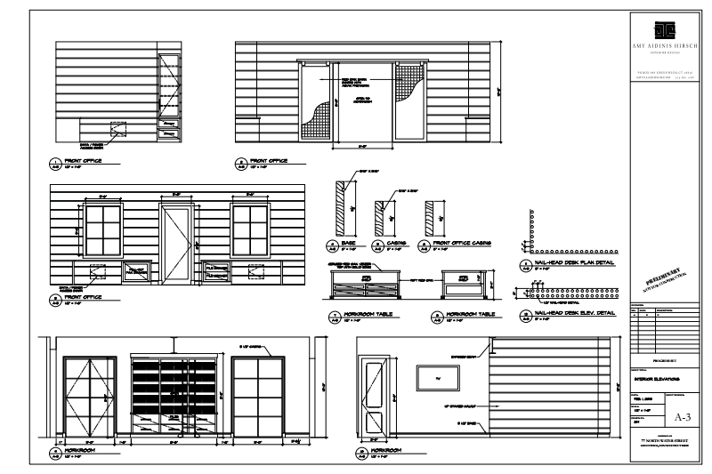
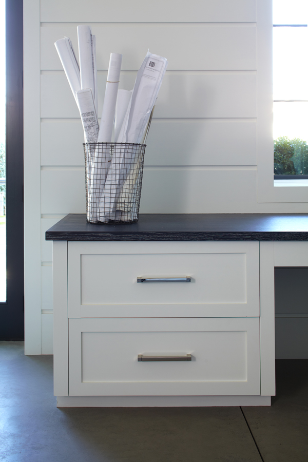
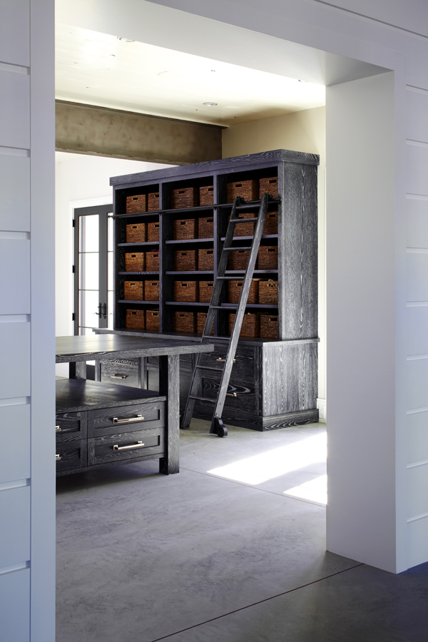
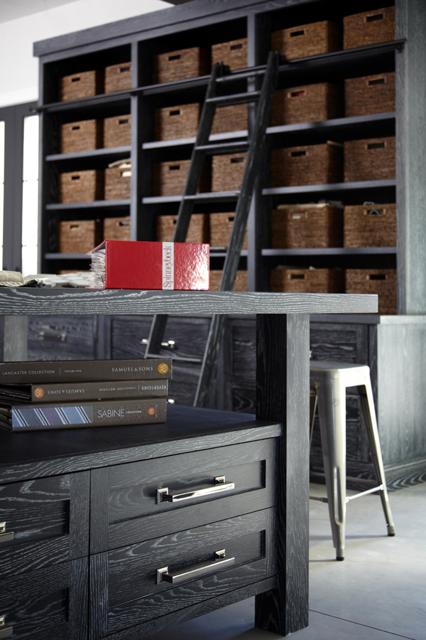
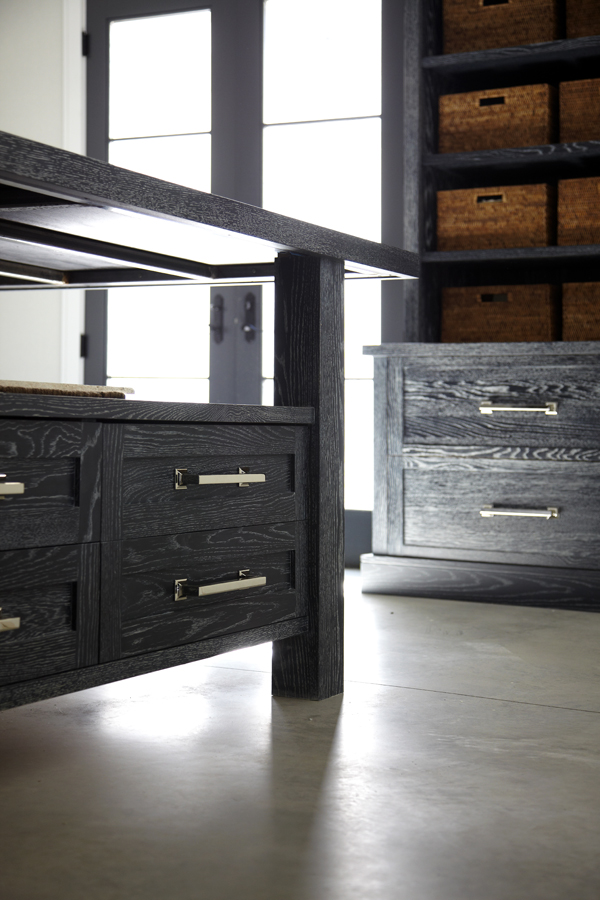
Growing out of the humble beginnings of my design firm’s starting point, I decided it was time to take on a project for myself.  Creating for others comes very naturally to me; however, for myself this process took more time than I expected.  Maybe because it’s more personal, or maybe because this project was different than most, given the fact that I had to factor in my clients’ perspectives as well as my own. The aesthetics needed to be beautiful as an interior, but I limited myself to a very simple palette of mainly black, grey and white, being thoughtful of the amount of color which saturates so many of our schemes.

Amy Hirsch Studio Plans 1Amy Hirsch Studio Plans 2Amy Hirsch Studio Plans 3

Putting pen to paper as I design always stirs up creative ideas and interesting selections.  I am proud to say that when I designed this space on paper and closed my eyes, every detail was executed exactly as I had envisioned it.  When I put on paper is what gets built 99% of the time, and seeing this come to life in my own space was an incredible experience.  Julio DiBiase of Dibico, Inc. is a person near and dear to me for the way he and his team perfectly executed my vision.  We have collaborated on projects for over 10 years and I am grateful for his insight and resources to create and engineer all of my thoughts.

15 Amy Aidinis Hirsch

14 Amy Aidinis Hirsch

13 Amy Aidinis Hirsch
12 Amy Aidinis Hirsch
3 Amy Aidinis Hirsch
2 Amy Hirsch Interior Design
1 Amy Hirsch Interior Design
11 Amy Aidinis Hirsch
10 Amy Aidinis Hirsch
9 Amy Aidinis Hirsch

8 Amy Aidinis Hirsch

7 Amy Aidinis Hirsch

5 Amy Aidinis Hirsch

4 Amy Aidinis Hirsch

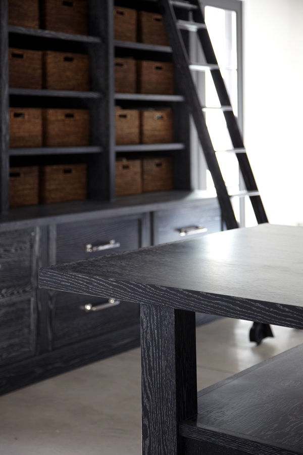
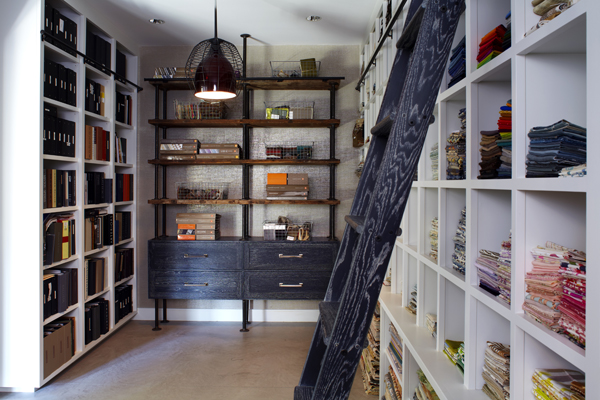
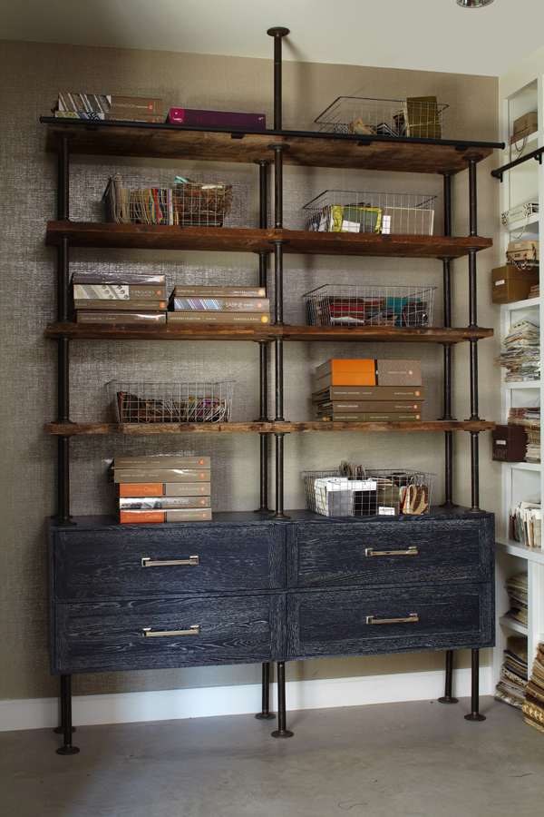
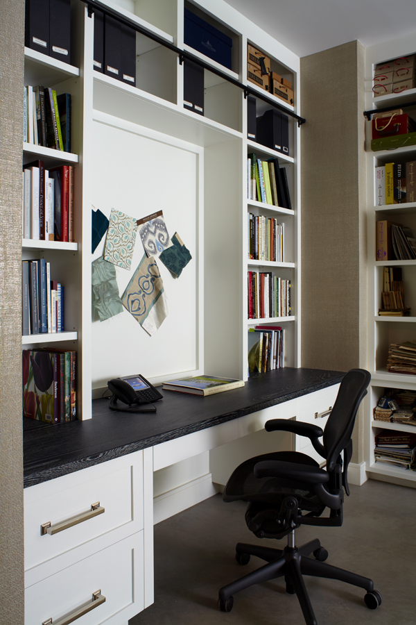
I am extremely grateful to be surrounded by the beauty of very simple elements. Walnut walls, ceruzed rift oak cabinetry, concrete floors, and brick, while simple in appearance, reflect my layered approach to design.  I love working in this creative haven, surrounded by elements that both calm and inspire me.  The materials in my new space were strategically selected and edited to create a simple but complete product.  My office space is a true representation of the process and structure I use when designing for clients with the ultimate goal of a completed product that reflects who they are.

Photos of finished project by Phillip Ennis Photography

Q & A with Connecticut Cottages and Gardens

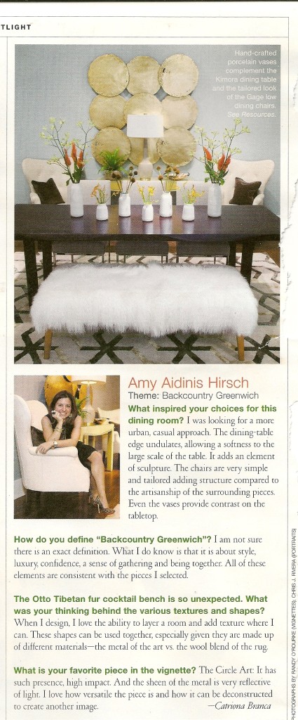
In the current issue of Connecticut Cottages and Gardens, I sit down for a Q&A regarding my vignette for the Mitchell Gold + Bob Williams showroom in Greenwich.

Last month, I created one of a series of vignettes for the Mitchell Gold + Bob Williams showroom in Greenwich for an event to launch their fall line.  As a sponsor of the event, Connecticut Cottages and Gardens invited each vignette designer to sit down for a Q&A.  My interview appears in the most recent issue of CTC&G.  Being a part of this event was a great experience!  I hope you enjoy reading about the design of the vignette.

Amy Aidinis Hirsch LLC

Visiting the Stone Yard

I find great inspiration and room for creativity when looking at all of the possible uses for so many beautiful types of stone.

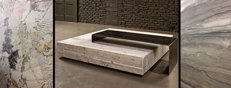
The past couple of weeks, I’ve been spending a lot of time at a couple of fantastic stone yards.  I find great inspiration and room for creativity when looking at all of the possible uses for so many beautiful types of stone.

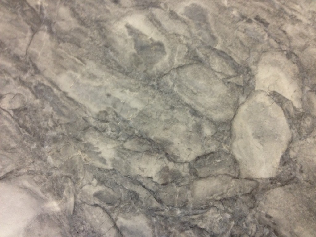
Royal Danby from ABC Stone
White Vermont
White Vermont
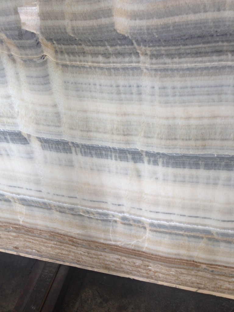
Onyx from ABC Stone
Onyx from ABC Stone
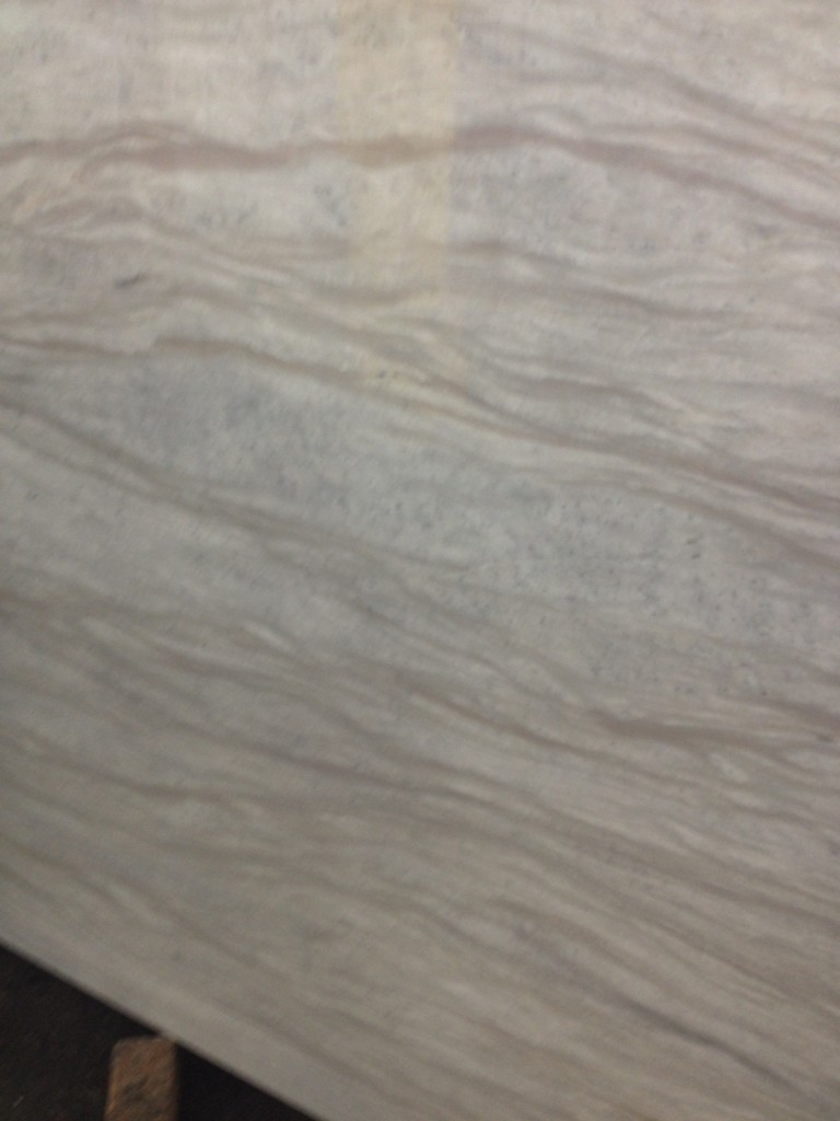
Siberian Sky from ABC Stone

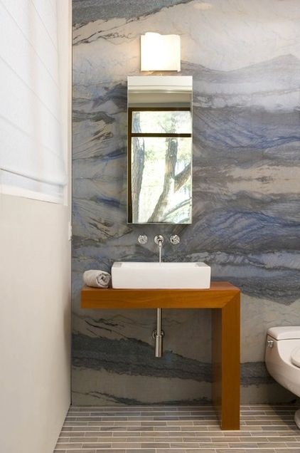
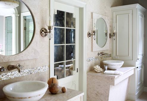
Most people think of counters, floors, and bathrooms when they consider using stone in their homes.  There’s no reason to limit stone to these applications; for the right client, I would love to sheath an entire bathroom in a gorgeous stone.

Bath featuring a stunning marble accent wall.


A bathroom I designed for client with limestone vanities and basins.
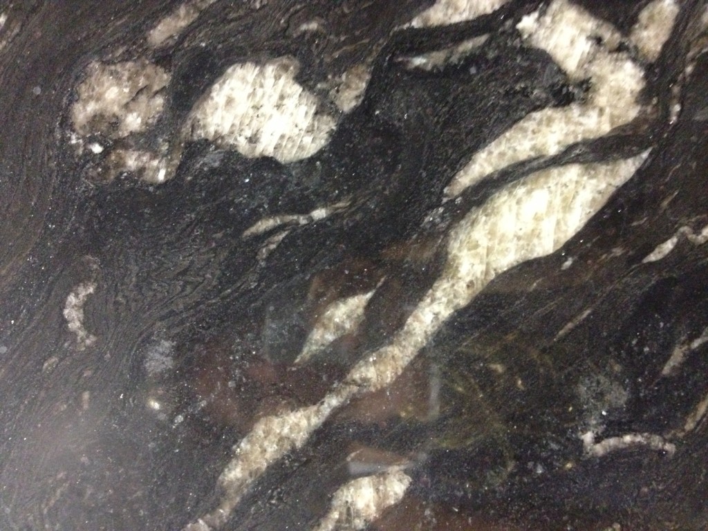
Titanium from Everest would be a dramatic choice.

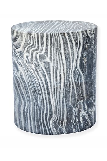
There are so many choices in pattern, color, and type of stone.  You don’t have to be locked into one popular, safe choice.  When I see all of the different stones, it makes me want to produce furniture from it.  Being surrounded by so many varieties of stone broadens my eyes and inspires me to try different things.

Marble stool by Kelly Wearstler.
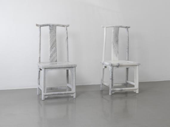
Marble chairs by artist Ai Weiwei.
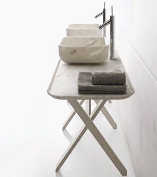
Marble basins and tray by Decormarmi.
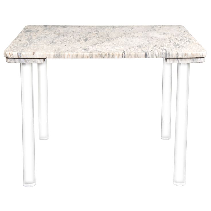
Marble and Lucite table.
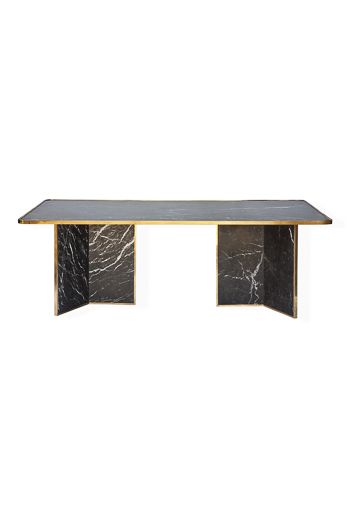
Marble table by Kelly Wearstler.

The potential for designing with stone is so intriguing!


New Design Books

Over the weekend, I picked up three great new design books.

Over the weekend, I picked up three great new design books.  I can’t wait to delve more deeply into them!

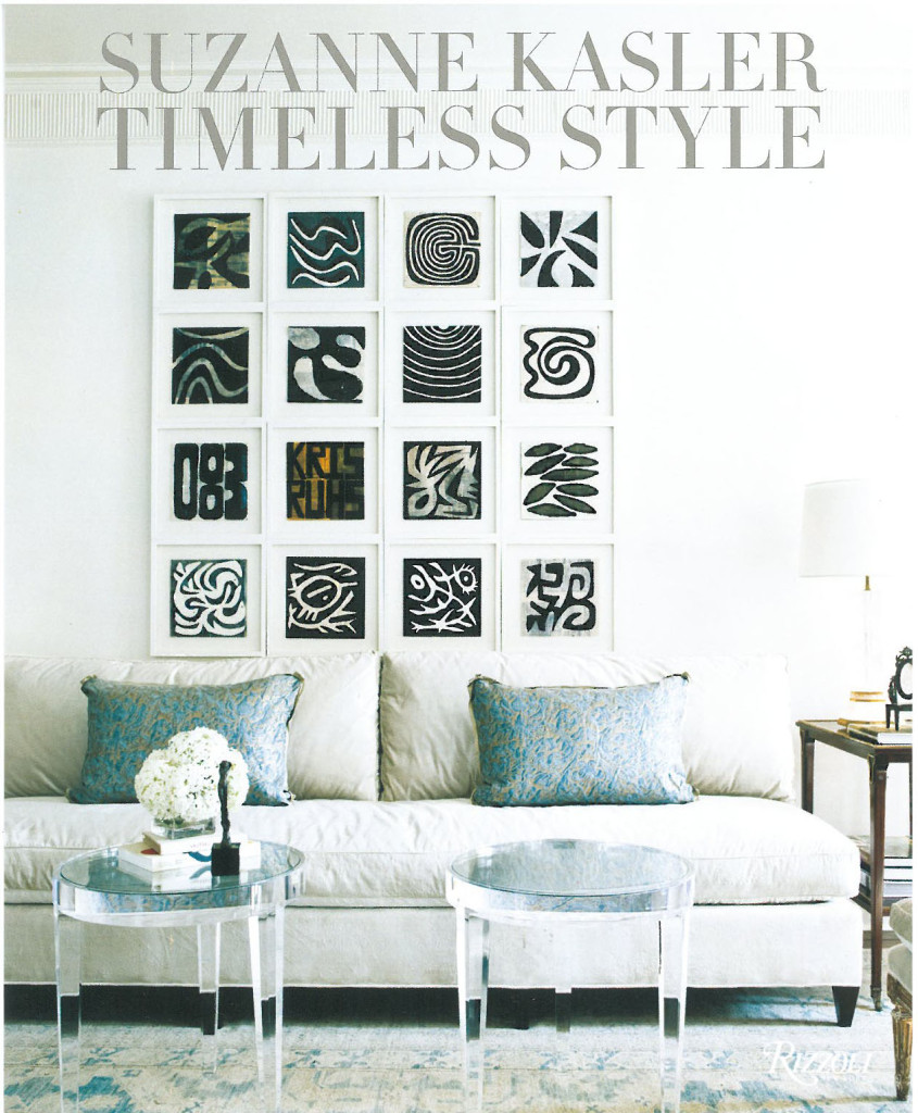
The first one is Suzanne Kasler: Timeless Style.  This is her second book and it beautifully demonstrates her skill at creating layered interiors with wonderful details.

Suzanne Kasler Timeless Style

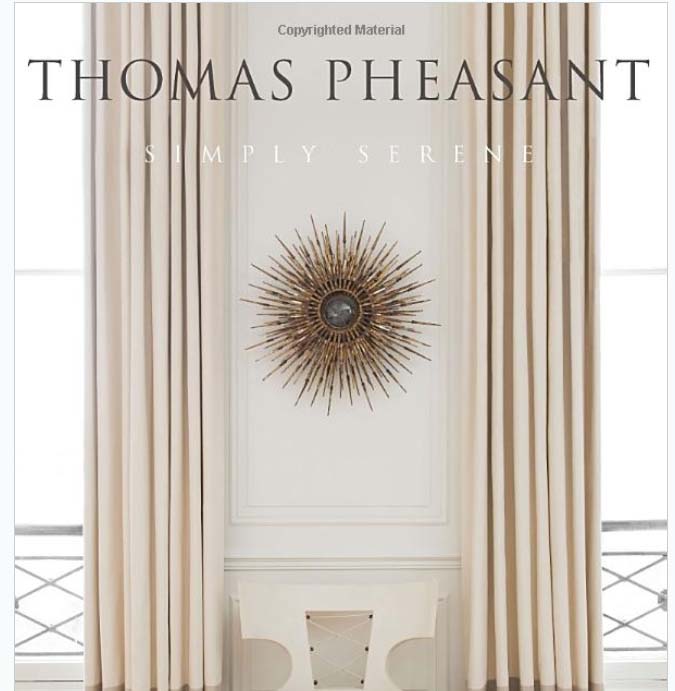
I also bought Simply Serene by Thomas Pheasant.  He has such a sophisticated way of designing!

Thomas Pheasant Simply Serene

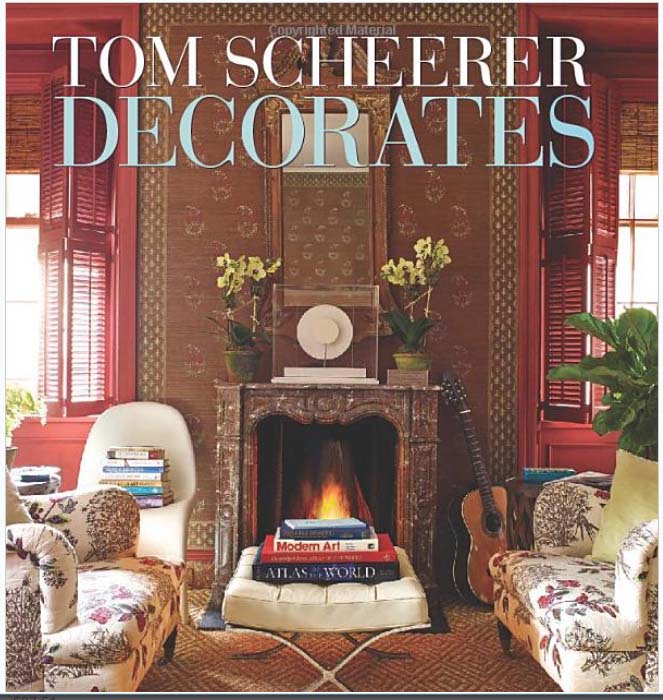
The third book I added to my collection is Tom Scheerer Decorates.  Tom Scheerer has such a relaxed approach to his interiors, illustrating a well-lived life with so many layers.

Tom Scheerer Decorates

Have you discovered any must-have design books lately?


Cover image via Burlap and Crystal