Designer Connection on Artisphere Online

I recently sat down with Patrick Ganino, the editor of Artisphere Online and an artist I’ve worked with in the past, to discuss the link between interior design and decorative painting.

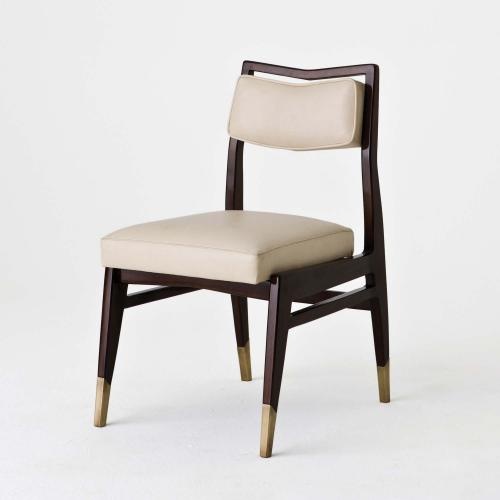
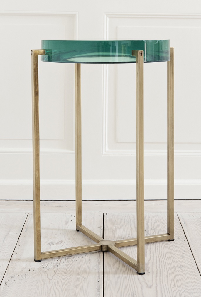
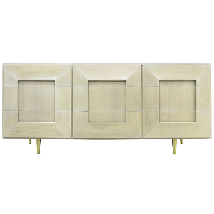
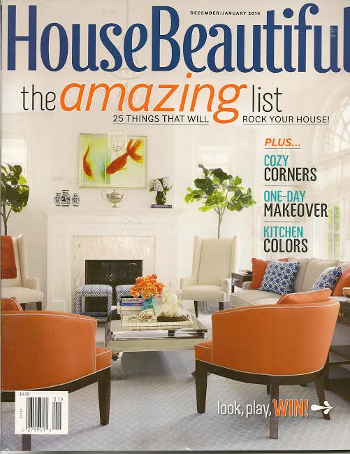
Artisphere Online is a digital magazine for decorative painting professionals.  Decorative artists are skilled artisans who specialize in creating custom murals and painted finishes, as well as restoration.  I recently sat down with Patrick Ganino, the editor of Artisphere Online and an artist I’ve worked with in the past, to discuss the link between interior design and decorative painting.  While there are benefits and conveniences to using ready-made wall applications, in some cases only a professional artist can achieve the desired effect.  Having a relationship with an experienced, talented artist can really expand a designer’s toolbox as well as a client’s options.

The Designer Connection

Written by Patrick Ganino

Amy Aidinis Hirsch
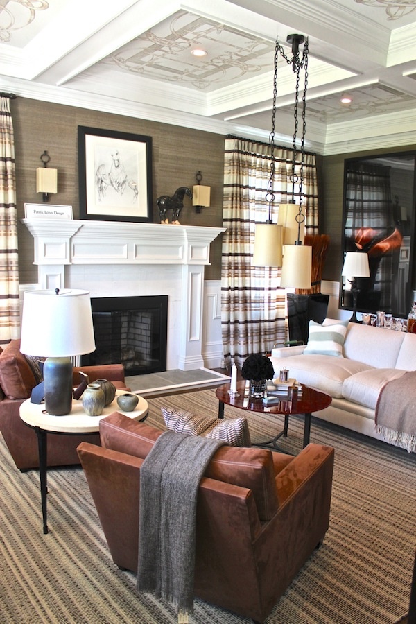
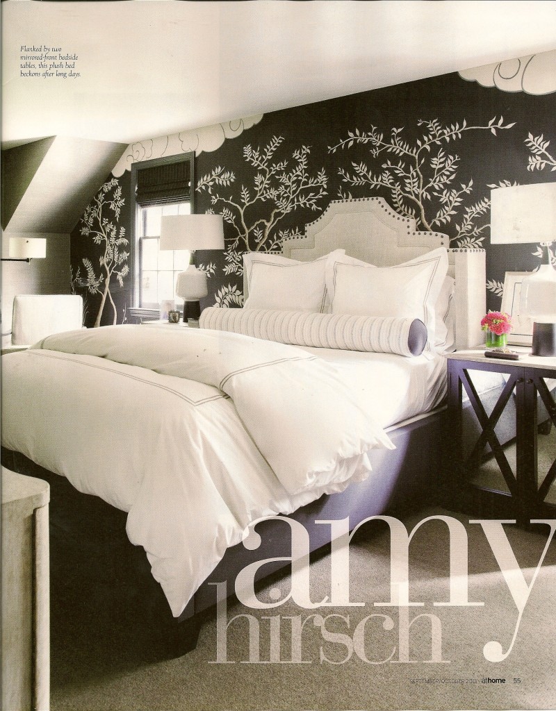
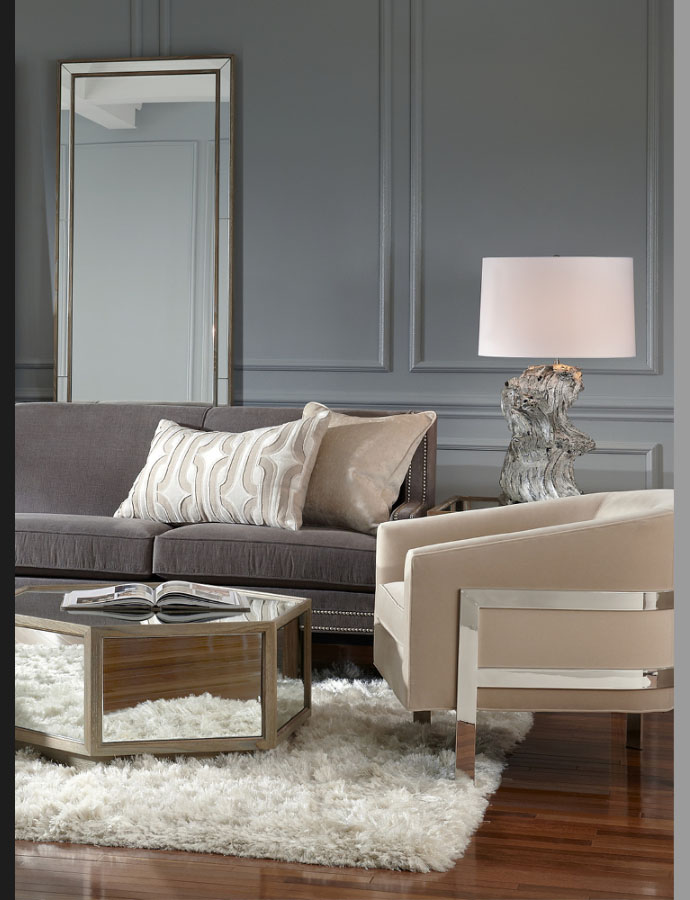
Amy Hirsch is an interior design located in Greenwich, CT   With a keen eye for timeless interiors and a nod towards an unexpected approach for modern details, Amy creates a balance of form and function.  Sophisticated, unusual palettes and resourceful selections define the comfortable nature of Amy’s interiors. Whether it is a project of grand scale or an intimate abode each project is comprehensive and collaborative. With great exuberance and an innovative perspective Amy creates environments that are inspired, yet uniquely you. I thought it might be fun to start getting insight from prestigious interior designers on their thoughts of our craft.

1.  How often do you use decorative painting in your design?Amy Aidinis Hirsch Interior Design

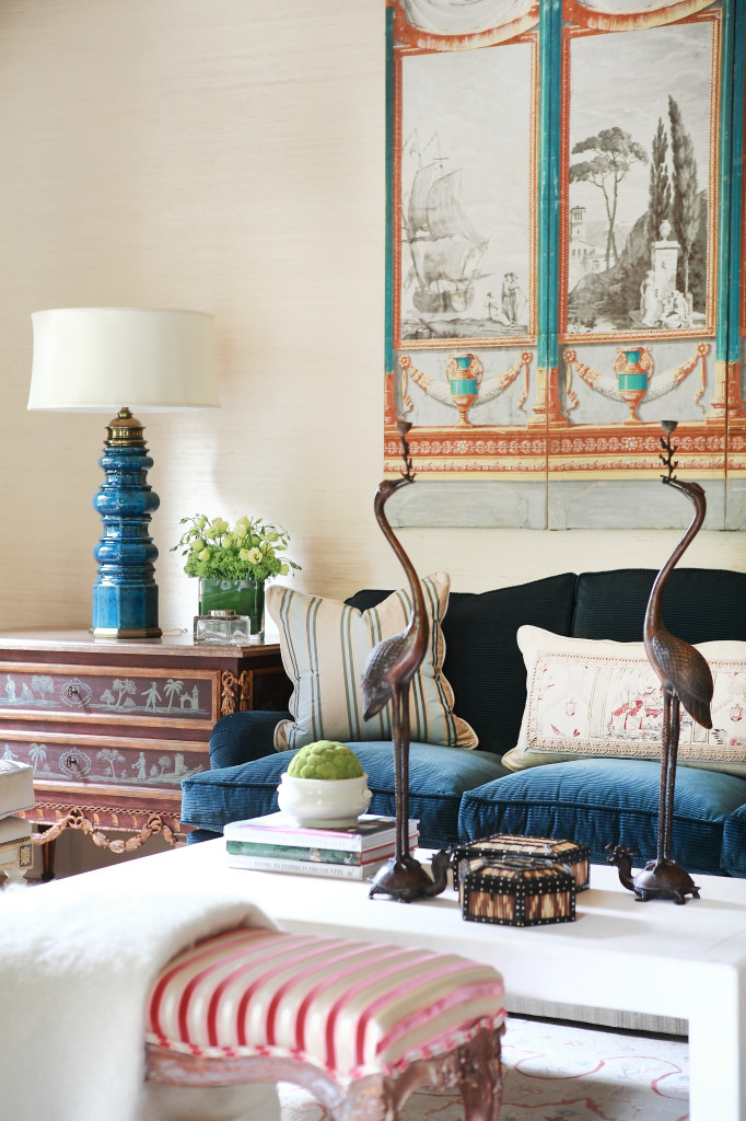
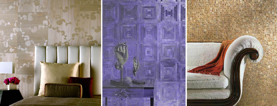
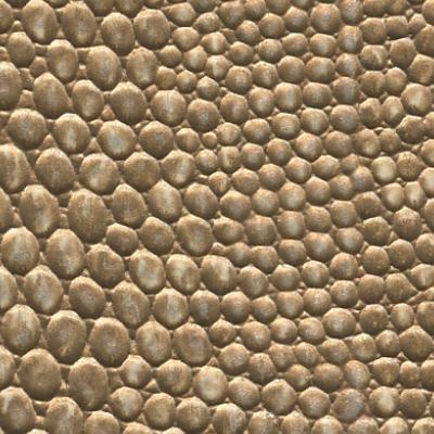
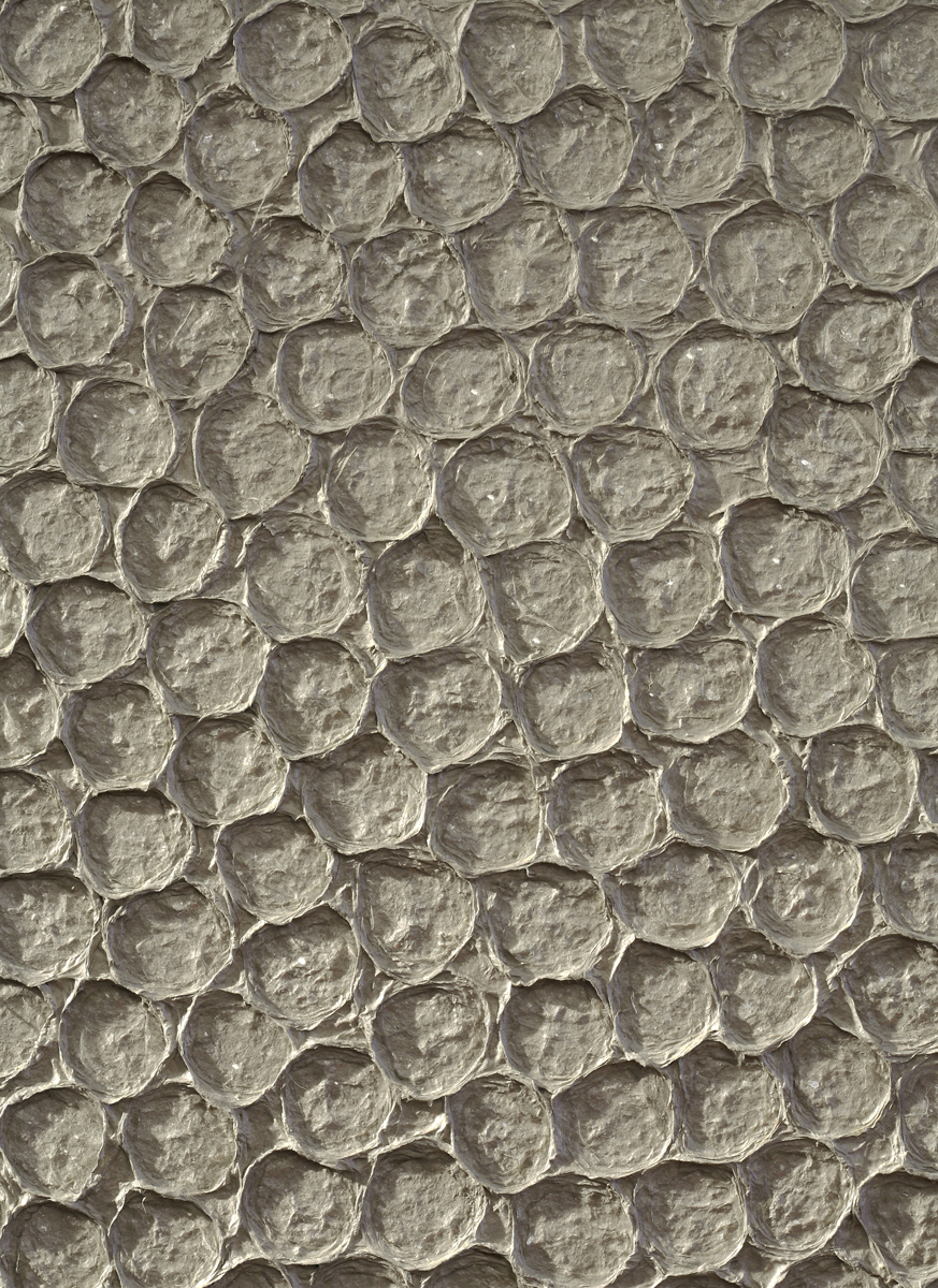
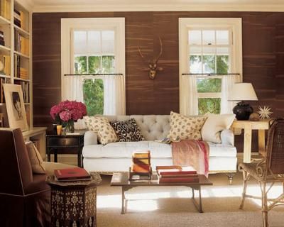
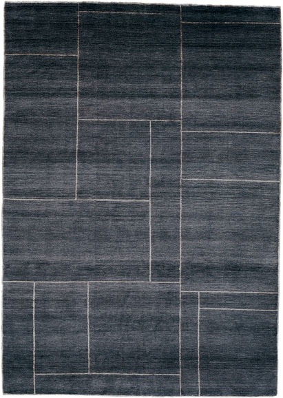
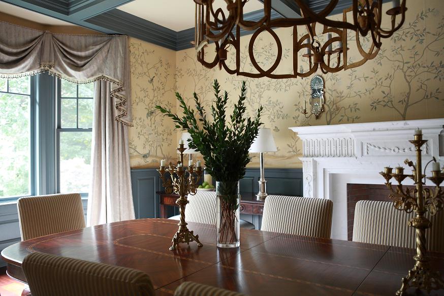
Quite often.  It really depends on what type of media is involved.   When I do call upon an artist it ranges from murals to leaf to simple glazes.  Times when I do not go with an artist is usually because of economic reasons.  Sometimes it is easier for the scope of the project to use textural wallpapers.

 2.  Is it easier because you take the artist out of the equation?

It is because it is instant gratification.  The product is already done and it is easier for the client to understand what they are getting creating a more viable end game.

3.   OK then, when do you use an artist?

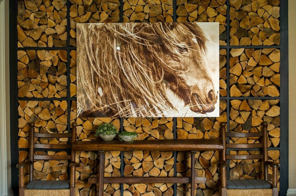
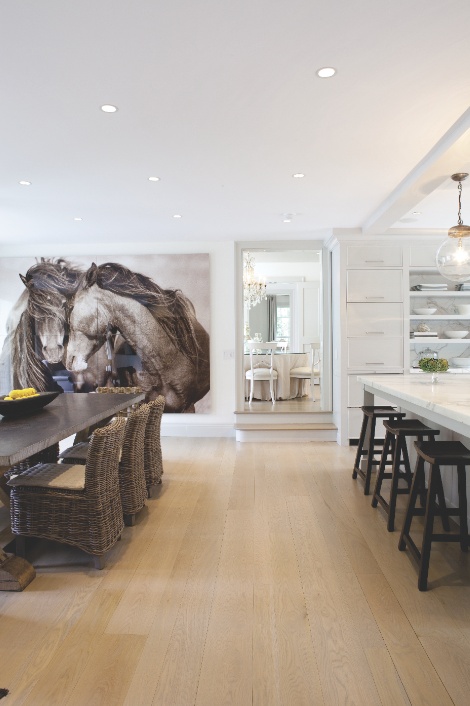
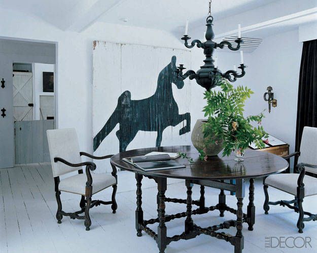
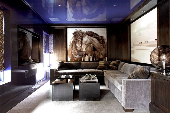
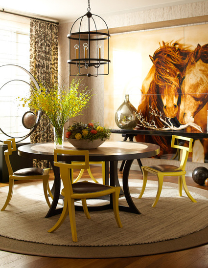
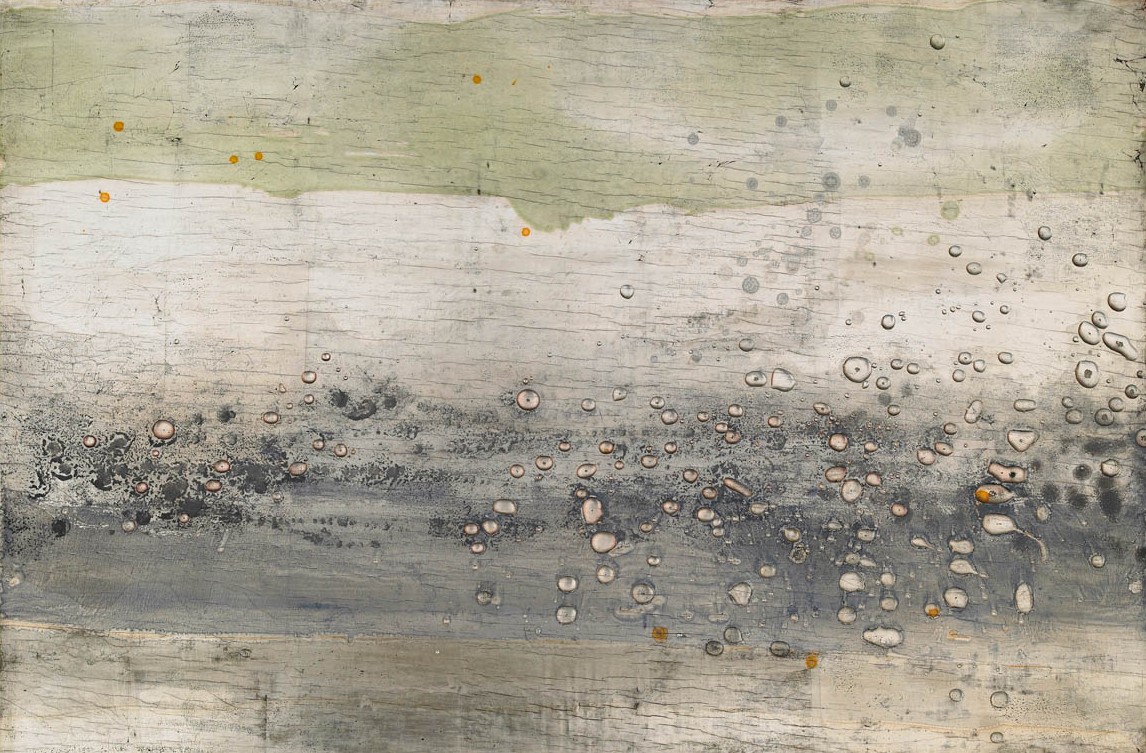
There is a beauty about using an artist.  With an artist your possibilities are endless.  You have no limitations when it comes to color or technique.  It is truly a custom product that is created.  Working with an artist takes patience which adds more time but there are certain applications that only an artist can create and there lies the value.

4.   What are your favorite techniques when hiring a decorative artist?

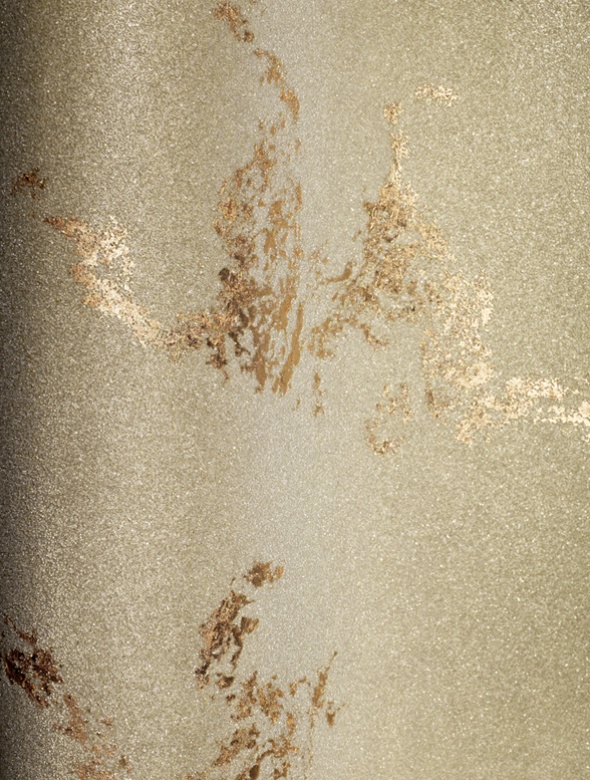
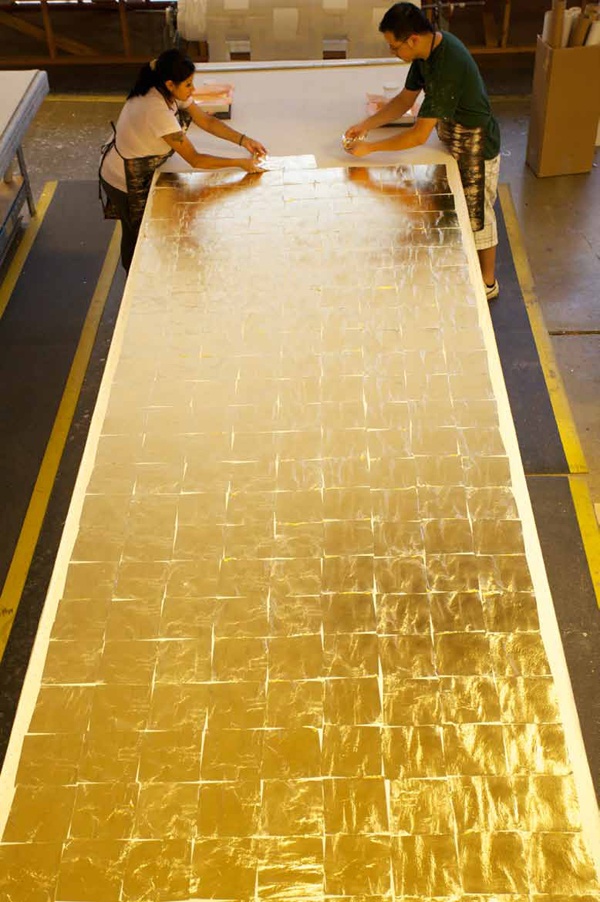
I am in love with silver leaf right now.

High polished venetian plaster.

Chinoiserie is a favorite of mine.  There is a sexiness of something clean and modern but I also love layers and details that go into creating that piece.

Amy Hirsch Greenwich Interior Design
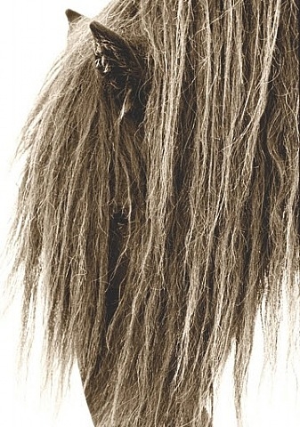
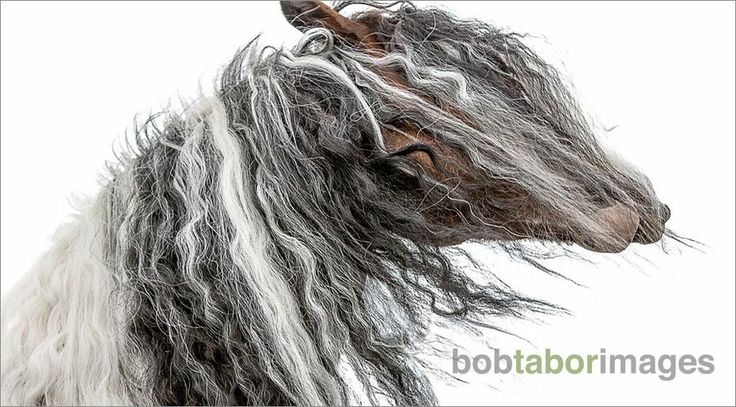
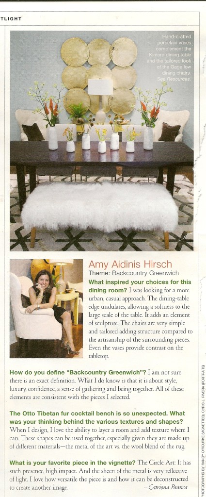
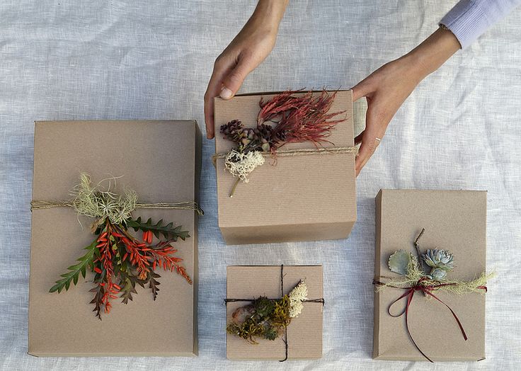
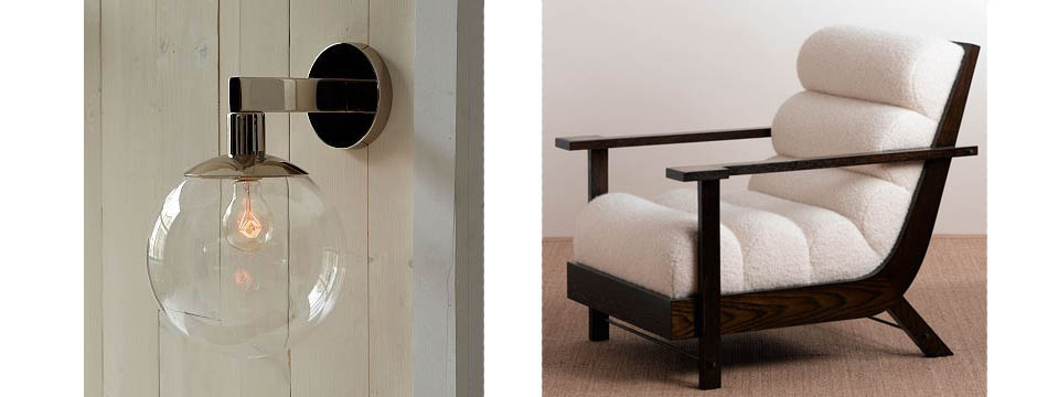
As a designer, I come across things that inspire my creativity almost constantly.  Whether it’s the vibrant color of moss growing on a stone wall or that perfect find at a local antique dealer, inspiration is everywhere.  Keeping an idea book of materials, references, photos, and sources isn’t at all a new concept among designers.  What’s amazing is how quickly the ideas accumulate, but I love having a wealth of inspiration to draw from as the need arises.  I think working with artists is a collaboration.  What I portray and then what the artist can simulate.  Each eye works hand in hand with each other and that is the beauty of it.

Pantone 2014 Color of the Year: Radiant Orchid

This year, Pantone chose Radiant Orchid as the Color of the Year.

This year, Pantone chose Radiant Orchid as the Color of the Year.  This color has a lot of saturation and really lends itself to pulling in both lighter and deeper hues of fuschia for balance.  Radiant Orchid is fearless and radiates femininity.  It also reminds me of a well dressed man in a beautiful suit with a gorgeous pop of color underneath.  That’s the true genius of this color; I think even a real guy’s guy can wear it and exude confidence.  This color is seductive.  While it isn’t a color everyone would immediately think of when designing an interior, it can be used very well.  I think Amanda Nesbit (see cover image) was ahead of her time in using this color in her designs.  This color sparks inspiration.  As Pantone describes it, “Radiant Orchid emanates great joy, love and health,” which we all wish for in a prosperous new year.  What do you think of Radiant Orchid?

pantone 2014 copy

1.  Floral art by Takaya Hanayuishi.

2.  Vintage Vogue with Audrey Hepburn.

3.  Tory Burch Priscilla Shoulder Bag

4.  Amazing piece of art, total saturation.  Image via The Suite Life Designs.

5.  Agate Coasters by Richard Mishaan

6.  Jimmy Choo

7.  Purple buttons, photo by Tony Hisgett.

8.  Berlin Dome, image via Shutterstock Blog.

Cover images, left to right: Knot and Pop, Pantone, and Amanda Nesbit Design.


2014: The Year of the Horse

Horses have long held the admiration and imagination of people.

Tomorrow night we’ll say goodbye to 2013 and welcome a New Year full of possibilities and new opportunities.  2014 will also be The Year of the Horse, according to the Chinese Zodiac.  Horses have long held the admiration and imagination of people.  These strong, beautiful animals and their close relationship to mankind throughout history are deservedly admired for their grace and their role in human history.  It’s no wonder that so many artists, including interior and fashion designers, turn to the horse for inspiration.  In the Chinese Zodiac, the horse is known for being warm-hearted, strong, and intelligent.  Incorporating equestrian themed designs into your home or style naturally conveys these same attributes.

I’ve featured some of this photography in the past, but I think it’s worth sharing again.  A stunning piece of horse photography is a dramatic art choice for any room.  Lisa Cueman, Bob Tabor, and Roberto Dutesco are three photographers whose horse images are simply incredible.

Photo by Lisa Cueman
Robert Dutesco
Roberto Dutesco
Lisa Cueman
Lisa Cueman
Robert Dutesco
Roberto Dutesco
Bob Tabor Images
Bob Tabor Images
Robert Dutesco
Roberto Dutesco

In interior design, using equestrian art or other horse-themed elements can add style to a room without being too overdone.  You can use items such as saddles or stirrups as accents, or go with a more subtle look by incorporating equestrian patterns.  Think of leather, warm tones, natural materials, and elegance.

A room I designed for a client.
By Leslie Cohen Design
From Elle Decor
From Elle Decor
Design by Mar Silver
Using equestrian elements as accents.  From Apartment Therapy.
Using equestrian elements as accents. From Apartment Therapy.
Design by Thom Filicia
A more subtle equestrian influence.  Design by Patrick Lonn.
A more subtle equestrian influence. Design by Patrik Lonn.

There are also a lot of great ways to add an equestrian flair to your wardrobe.  I love the idea of adding a really cool accessory to give your look just a hint of the equestrian without being over the top.

Iconic Hermes scarf.
Equestrian belt from Macy's.
Equestrian belt by Ralph Lauren.
Another gorgeous Hermes scarf.
Hermes Cuff
Hermes Cuff

How would you incorporate an equestrian feel to your home or wardrobe?

Cover photos by Bob Tabor Images.


2013 Year in Review

This past year was a great year of growth and opportunities for my design firm.

This past year was a great time of growth and opportunities for my design firm.  I loved working on so many amazing projects and meeting clients who were able to share my vision for the ideal design for their homes.  I loved the experience of designing my new studio and offices and am looking forward to seeing what incredible things wait for my business in 2014.  I’m fortunate to have a wonderful family and talented staff to support me on this journey.

During the past year, I really enjoyed seeing my work gain the attention of different publications.  That sort of recognition is so validating.  I’ve been reflecting on the past year lately and thinking about how I continue to grow as a designer.  Looking back on the press I received in 2013 is both humbling and exciting.  Here are the various publications which featured my work last year.  I can’t wait to see what 2014 has in store for Amy Aidinis Hirsch, LLC!

March 2013:  Seeing Red in At Home in Fairfield County Magazine

Seeing Red Amy Hirsch At Home Magazine

May 2013:  Natural Edge in At Home in Fairfield County Magazine

Natural Edge Amy Hirsch At Home Magazine

 May 2013:  Connecticut Cottages & Gardens Project of Note

Amy Hirsch CTC&G Project of Note

 August 2013:  Designers’ Houses in At Home in Fairfield County Magazine

Amy Hirsch At Home in Fairfield County Magazine

September 2013:  CTC&G’s Mitchell Gold + Bob Williams Fall Collection Launch

Amy Hirsch CTCG Mitchell Gold Bob Williams Fall 2013

November 2013:  Q&A with Connecticut Cottages and Gardens Magazine

Connecticut Cottages and Gardens Amy Hirsch

December 2013:  Kitchen Color in House Beautiful Magazine

Amy-Hirsch-House-Beautiful

Favorite Things: The Art of Wrapping

The only thing better than receiving a well wrapped gift, is giving a well wrapped gift.

The only thing better than receiving a well wrapped gift, is giving a well wrapped gift.  Beautiful wrapping shows care and thoughtfulness, whether you are presenting a gift to a cherished loved one or the hostess at a holiday party.  I love great wrapping paper and bows.  There are so many creative ways to wrap gifts with varying textures, layers, and materials.  When wrapping holiday gifts, you don’t need to feel constrained by typical colors and themes.  Not everything has to be red and green!  Think of less obvious elements that invoke the season and incorporate those into your gift wrapping instead.  Creating a uniquely pretty gift is definitely an art form, and certainly one that will be appreciated by your family and friends.  Here are some of my favorite paper products and inspirations for wrapping holiday gifts.

1.  Eclectic, but cohesive, gift wrap inspiration.  Photo by Max Kim-Bee.

Max Kim-Bee

2.  Peach Berries paper from Kate & Birdie Paper Company.

Kate and Birdie

3.  Chalkstock Tags from Paper Source.

Paper Source Chalkstock

4.  Vintage Trees paper from Paper Source.

Paper Source Vintage Tree

5.  Box of Gorgeous Ribbons from Cox & Cox.

Cox and Cox Ribbon

6.  Chevron paper from Paper Source.

Paper Source Chevron

7.  Burlap wrap and bow from May Arts.

May Arts Burlap

8.  Corner Peach Washi tape from Paper Source.

Corner Peach Washi Tape Paper Source

9.  Forest-Found Gift Tags from Anthropologie.

Gift Tags Anthropologie

10.  Gift wrapping inspiration with natural greenery by Flora Grubb Gardens.

Flora Grubb Wrapping Ideas

11. Chevron paper from ruffhouseart on Etsy.

Chevron Wrapping Paper

12.   Good Tidings paper from Anthropologie.

Good Tidings Anthropologie


Cheesecake

With the holidays here, I decided to bake a dessert that I have not made in quite a while.

With the holidays here, I decided to bake a dessert that I have not made in quite a while.  Going through my old recipes, I came across this delicious cheesecake.  This year I made it for Thanksgiving and it was a big hit.  My mother got this recipe from a friend of hers years ago and handed it down to me.  This is a great recipe that can be made in a variety of ways.  I have added crushed pineapples to the cake before baking it, which is always a favorite in our house.  Or, you can serve it topped with cherries, blueberries, raspberries, or strawberries.

Photo by Lina Widjaja of Crustables.

Ingredients:

Graham Cracker Nut Crust

1 ¾ cup fine graham cracker crumbs

¼ cup  finely chopped walnuts

½ tsp cinnamon

¼ cup melted margarine or butter

Combine all ingredients in a bowl and mix with a fork until moistened.  Reserve 3 Tbsp. of mixture.  Press remaining mixture in the bottom and 2 ½ inches up sides of a greased 10”spring form pan.

Mixing the crust.  Photo by Kona Gallagher
Mixing the crust. Photo by Kona Gallagher

Cheesecake:

3     eggs

2    8 oz packages of cream cheese softened

1 cup  sugar

¼ tsp  salt

2 tsp  vanilla

1 tsp  almond extract

3 cups  sour cream

1  capful of rum or brandy (optional)

1  can of cherries or blueberries in syrup (optional)

1    can crushed pineapples, drained (optional, see note)

Combine sugar and cream cheese; beat until smooth.  Add eggs one at a time, beating well after each addition.  Add the rest of the ingredients and beat well until smooth.  Blend in sour cream.  Add the capful of rum or brandy if using.  Pour mixture into prepared graham cracker crust and top with reserved crumbs if desired.  

Note: Pineapples can be spread over the graham cracker crust before pouring in the cheesecake mixture.

Preheat the oven to 375 degrees.  Place the cheesecake into the oven and bake for 35 minutes or until set.  Oven temperatures will vary, so your cake may take longer to bake.  To test for doneness, stick a toothpick in the middle.  It will come out clean when cake is done.  The cake should still have a little wiggle in it; do not overbake.  Once the cheesecake is done, let it sit for a few hours.  Run a knife around the rim of the pan to loosen it, then undo spring form and remove.  Cool the cake in the refrigerator for at least 5 hours, or overnight, before serving.

A finished cheesecake. Photo via Wikimedia

You can serve the cheesecake as-is or top it with cherries or berries in their syrup.

Topped with cherries. Image via Ken's Oven
Topped with cherries. Image via Ken’s Oven

I hope you enjoy this most delicious dessert!

Cover image via Better Homes and Gardens

Maya Romanoff Wallpapers

Lately I have been all about wallpaper, and Maya Romanoff is one of my favorites.

Lately I have been all about wallpaper, and Maya Romanoff is one of my favorites.  The designs are so unique and textural, with some really unusual pieces.  You can transform a room into something incredible with these luxurious wall coverings.

Maya Romanoff Slink
Slink Hand Painted Vinyl – I’ve used this on the face front of several interior entry doors. A clever way to spice up a plain flat door.
Maya Romanoff Meditations Ohm
Meditations Ohm. All of the colors are spectacular. Love the organic process of this paper.
Maya Romanoff Moon Lake
Moon Lake. Such interesting texture.

When I design a room, I always start with the walls.  For me, it’s all about the walls!  I love having so many stunning options, from papers with metals to beads.  Maya Romanoff has some papers, like their true metals, that would be great for a ceiling.

True Metals Basketweave -- One of my favorites. I love the sheen. So interesting for a ceiling.
True Metals Basketweave — One of my favorites. I love the sheen. So interesting for a ceiling.
For a bit of glam!
For a bit of glam!
Hamptons living room with Maya Romanoff paper, by Jeffrey Bilhuber. Image via Room Lust on Flickr.

The quality and craftsmanship of Maya Romanoff products is amazing.  Their handmade papers are so well executed, truly works of art in their own right.

Gilded Cloth:  Hand placed metal leaf on canvas.
Gilded Cloth: Hand placed metal leaf on canvas.
Blanket Zig Zag - I love the warmth and detail of this. Really looking forward to installing it in a library.
Blanket Zig Zag – I love the warmth and detail of this. Really looking forward to installing it in a library.

To see more examples of Maya Romanoff wall coverings, visit their website.  You can also follow them on Facebook, Twitter, Pinterest, and YouTube.

Favorite Things: Modern Elements

When it comes to interior design, the term “modern” can mean different things to different people.

When it comes to interior design, the term “modern” can mean different things to different people.  To me, it means using newer, refreshing elements.  These items can be mixed with more traditional design for a bit of added flair or an eclectic feel, or can be used on their own.  This list of my favorite pieces could be used to create a beautiful space, or individual items could be worked into a room to give it a bit of a modern edge.

1.  Blackened Brass Hans Pedestal Table by Jonathan AdlerModern Furniture Design2.  Lighthouse Oil Lamps from Menu

Modern Furniture Design 2

3.  R Augousti Jewelry Box Embossed In Snake Skin & Stingray

Modern Furniture Design 34.  Kubik by Michael Reeves.  Gorgeous ink color.

Modern Furniture Design 4

5.  Orly Console Table

Modern Furniture Design 7

6.  Landscape II, 2007.  Silver leaf, resin, pigment on panel.  By Nancy Lorenz.

Modern Furniture Design 5

7.  Side Table from Bungalo 5.

Modern Furniture Design 88.  Lighting from Ralph Pucci International

Modern Furniture Design 11

9.  Canyon Coffee Table from RobiCara.

Modern Furniture Design 10

10.  Bruno Dining Chair from Studio Van Den Akker.

Modern Furniture Design 12

11.  Side table with acrylic top and brass base, from The Apartment by McCollin Bryan.

Modern Furniture Design 9

12.  Driftwood Finish Dresser from Assemblage

Modern Furniture Design 14

Kitchen Color in House Beautiful Magazine

Various designers, including myself, share favorite kitchen paint colors and describe why we love those colors.

The December/January 2014 issue of House Beautiful contains a great article called Kitchen Color.  Various designers, including myself, share favorite kitchen paint colors and describe why we love those colors.  It’s a great way to remind yourself that the kitchen can be an expression creativity and doesn’t need be be limited to a typical palette.

Amy Aidinis Hirsch Designer House Beautiful

Amy Hirsch House Beautiful

Amy Hirsch Greenwich Design House Beautiful

Jewelry from J Crew

For a statement piece or to dress up an outfit, these are my favorite examples of J Crew’s current jewelry line.

I picked up a J Crew catalog the other day and saw this amazing jewelry.  Many of the pieces have a retro look with great colors and textures, a sort of Art Deco vibe that I find so appealing.  For a statement piece or to dress up an outfit, these are my favorite examples of J Crew’s current jewelry line.

1.  Compass Rose Necklace:  From the Lulu Frost line by Lisa Salzer, inspired by estate jewelry.  I love the modern twist to this retro style.

J Crew Jewelry 22.  Embroidered Cascade Necklace:  I love the rich tones of this asymmetrical piece.

J Crew Jewelry 33.  Compass Rose Earrings:  Great pairing of modern and vintage design.

J Crew Jewelry4.  Citron Stone Necklace:  Love the contrast of citron and darker hues.

J Crew Jewelry 45.  Fanned Leaf Necklace:  Great texture to this necklace.

J Crew Jewelry 5What would you pair these pieces with?