Work in Progress: My New Office/Studio

I’m involved in a very exciting project right now — designing my new office and studio space.

I’m involved in a very exciting project right now — designing my new office and studio space.  Besides the excitement of moving into a bigger place better suited to my business needs, I am so happy to have a place to do something for myself.  I can’t wait to see my own simplified, well-edited vision come to life.

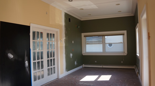
This is very much still a work in progress right now, as you can see from the “before” pictures.  One must have great vision to get through this mess!

The exterior.
Definitely a diamond in the rough!
Can you see the potential?

My goal for new new office space is to make my clients feel like they are in a showroom for a lifestyle rather than a product.  I see the overall design as minimal, not decorative.  I want it to be a neutral space, with quality products and craftsmanship, good lighting, and just the right details.  Everything will be functional, creating a great place for everyone to work.

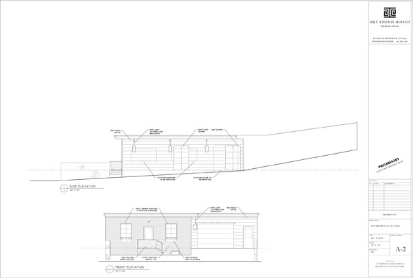
Plan for the exterior.
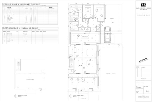
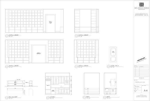
The plans give an idea of how the space will be utilized.
Plenty of open storage.

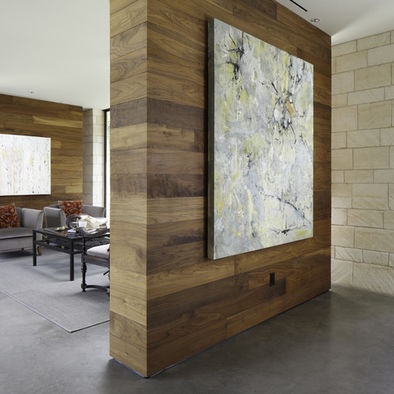
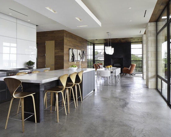
One important consideration I made when designing my office was to avoid distractions for my clients.  When I meet with a client to present designs for their projects, I don’t want the surroundings to compete with the samples and plans I show them.  I want the focus to be on their project, not my own office.  At the same time, I want to use elements that reflect the level of style and quality I appreciate in an interior.  I like the idea of wool window treatments with metal poles, reclaimed oak counter tops with nail heads, and walnut walls.  I love the idea of a concrete floor as well.

Walnut walls.
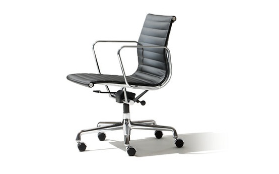
Sleek and functional Eames chair.
Concrete floor.
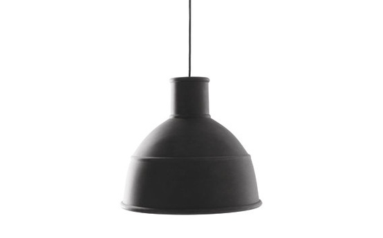
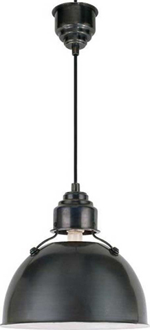
Unfold pendant light.
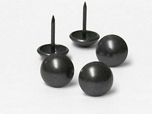
Nail heads.
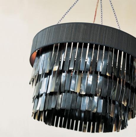
Wallpaper covered in transparent beads.
Ochre lighting.

I can’t wait to see how all of my plans come together!  Stay tuned for a future update on the finished office!

Windsor Smith

I adore Windsor Smith’s designs, from her interiors to her own home line.

I adore Windsor Smith’s designs, from her interiors to her own home line.  She’s an amazing designer and very clever about choices, making the success of her many ventures no surprise.

One of my favorite projects involving Windsor Smith was her collaboration with Veranda magazine on the House of Windsor.  This first ever Veranda concept house, located in Los Angeles, California, featured Windsor Smith’s architectural design as well as the skills of several other notable designers such as Martyn Lawrence Bullard, Kathryn M. Ireland, Richard Hallburg, and others.  The creation of this dream house was a very cool concept.  Proceeds from the open house ticket sales and VIP events benefited two charities for children, the Children’s Action Network and P.S. Arts.

Veranda’s website about the House of Windsor is really interesting.  It shows the floor plan of the concept house as well as 360 degree tours of each room in the home, including exterior areas like the courtyards and stables.  You can even browse specific designers involved with this project and watch videos featuring each designer’s thoughts and experiences.  The House of Winsdor was a huge undertaking based on a truly grand vision.  Veranda’s unveiling of the home showed it to be very well executed.

House of Windsor floor plan.
Entry hall, designed by Windsor Smith, is wide enough to serve as a dining room for entertaining on a grand scale.
A graceful room with back to back sofas for increased seating and entertaining.
Geometric pattern on the carpet offsets the chinioserie on the walls.
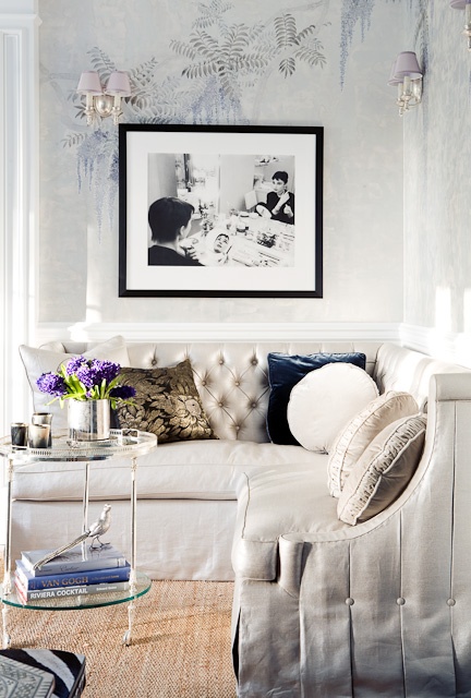
The use of a corner sofa is very smart, and the wallpaper is beautiful!

Windsor Smith uses beautiful products in her designs.  I love the way her rooms are layered and how everything looks perfectly collected.  She can be bold, but her interiors never look too decorated.  They seem effortless and timeless.  Windsor Smith’s own collection reflects her design style, featuring furnishings that are as well thought out and executed as all of her other projects.

Samantha scroll arm chair.
Moroccan ottoman: Great style and size.
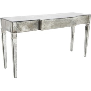
Mirrored console: Super chic!
Colony breakfront.
Insignia printed pattern: Great for window treatments. Check out all of the color ways.

To see more of Windsor Smith’s designs, visit her website.  You can also see her Collection, find her on Facebook, and follow her on Pinterest.


Peter Beard

I fell in love with Peter Beard’s photography when I saw his work in a client’s home.

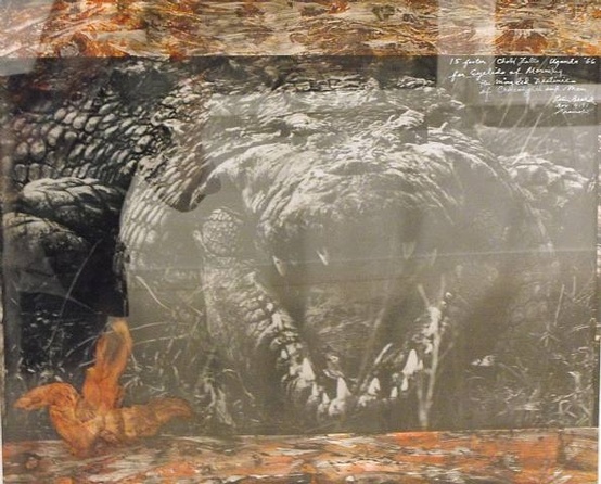
I fell in love with Peter Beard’s photography when I saw his work in a client’s home.  The images themselves are beautiful and striking, but each piece is surrounded by a fascinating collage of handwritten memories, found objects such as feathers, and colorful, dramatic swatches of ink.  His work elicits excitement at the thought of being so close to these incredible animals.

Born in New York in 1938, Peter Beard traveled to Africa as a young man first in 1955 and again in 1960.  He later returned to Kenya and worked in Tsavo National Park, photographing the demise of thousands of elephants and rhinos.  Dismayed at the mass hunting of these animals for sport and the lack of conservation and regulation at the time, Beard published two The End of the Game books.  He was ahead of his time in drawing attention to hunting for sport without limit or consequence.  The End of the Game is a great collection of images and a book I love to put on coffee tables.

Peter Beard’s work appeals to me not only because it is real, but because the layered, collage effect of mixed mediums brings a textural experience to his art.  His use of these mediums is clever and fascinating to me, making each image seem like a personal memory from his own journals.  Although the photos are mainly from the 1960’s and 1970’s, his work is still prominent and quite impressive.  You could curate a room room around this stunning photography.

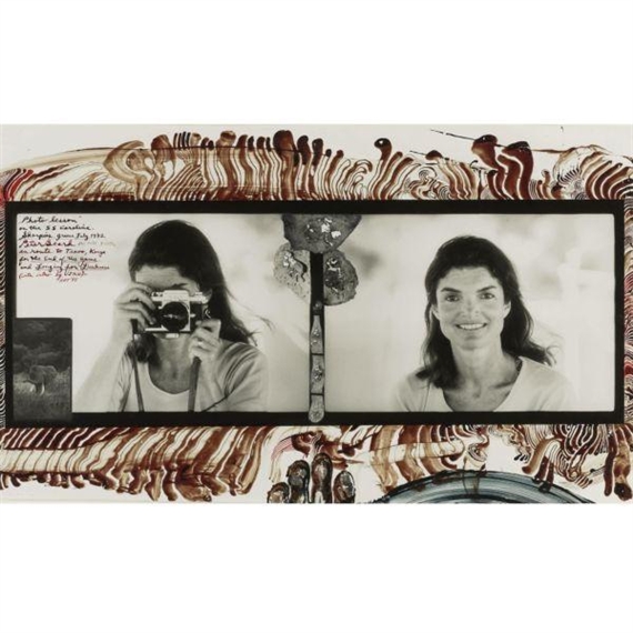
Not all of Peter Beard’s photos focus on animals and people he encountered during his time in Africa.  A rather privileged young man with a trust fund and host of interesting celebrities as friends (including Karen Blixen, author of Out of Africa), he once turned his lens on the iconic Jacqueline Kennedy in Greece where, he says, he taught her how to properly use a camera. To see more examples of Peter Beard’s work and publications, or to learn more about his fascinating life, visit his website or find him on Facebook.

Jeffrey Bilhuber

I adore Jeffrey Bilhuber for so many reasons.

Since founding Bilhuber and Associates in 1984, Jeffrey Bilhuber has earned his place as one of the world’s top interior designers.  He’s been published in more than 50 design books and been featured in every nation and international design magazine.  He’s completed projects from New York to London and exudes such an accessible philosophy that he’s been invited to appear on shows such as The View and Conan O’Brien as well as HGTV.  His Bilhuber Basics line for Stark Carpets increased his name recognition as did the success of his first book, Jeffrey Bilhuber’s Design Basics, as well as his next two books, Defining Luxury and The Way Home:  Reflections on American Beauty.  Jeffrey is known for blending traditionalism with modern sensibilities to produce beautiful and practical interiors uniquely suited to each client.  His career and clientele so far have been really amazing so far!

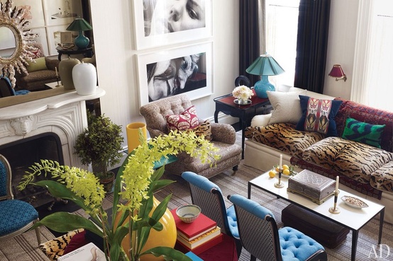
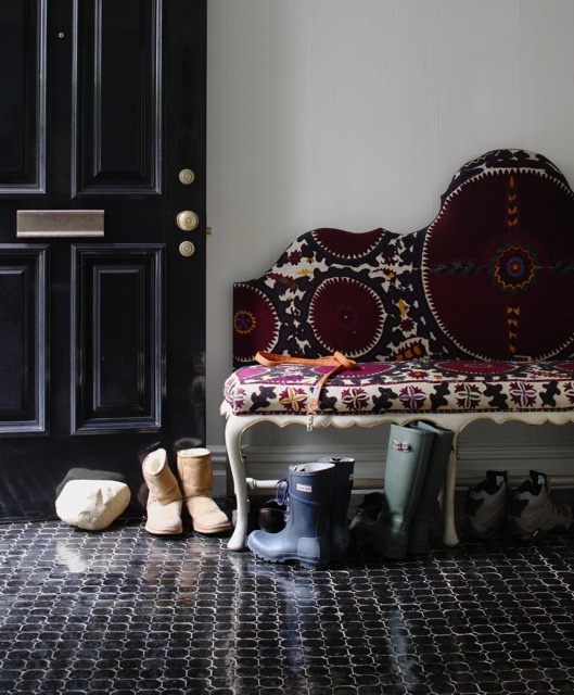
Love the suzani and the black floors.
More layers and textiles. Great combinations!

I adore Jeffrey Bilhuber for so many reasons.  Each of his spaces is the perfect collected mix of details and fearless, unexpected, fascinating touches.  His designs feature vivacious colors and timeless, sophisticated beauty.  He implements top-notch finishes and creates these layered interiors that I really admire.  Everything from his color selections to the way he uses big plants or bunches of grapes to bring a human element to a room resonates with me and certainly inspires me.  When I find a stack of new design magazines in my mail box, I can’t wait to see Jeffrey Bilhuber designs among the pages.

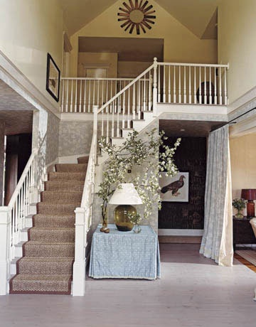
I love this foyer: light, simple, and comfortable.
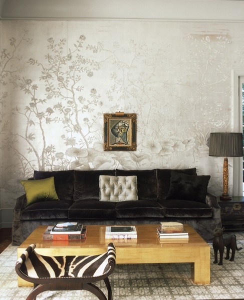
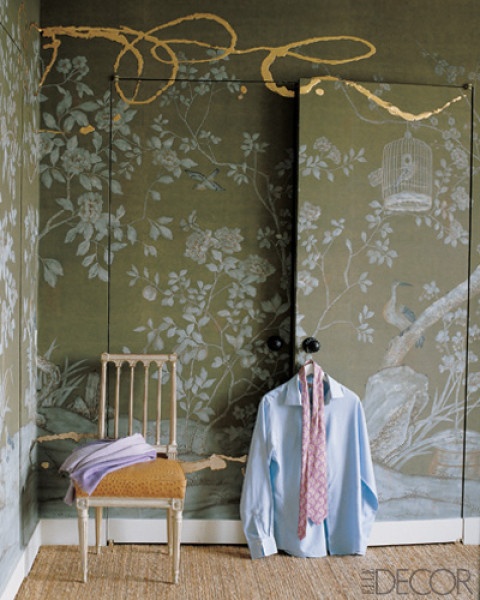
Truly a bold statement with the gilt paint on the de Gournay panels.

My own designs have definitely been influenced by Jeffrey’s work.  He inspires me to use the unexpected but still be timeless.  I know when I give my clients examples from Jeffrey’s designs, we build a relationship of trust and confidence to maybe take design risks they might not otherwise have considered.  I wouldn’t copy Jeffrey’s ideas, of course, but reinterpret elements and make them my own.  The magnitude of his design is so big, other designers can learn so much just from just from taking a bit here and there to adapt to their own style and their clients’ needs.

The color combination is luscious with a stunning hand-painted detail on the floor.
The backdrop of the black against the light sisal area rug is a great contrast.


5 Under 40: Designers to Watch New England Home

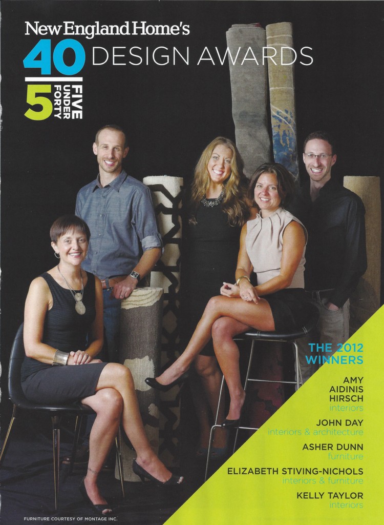
New England Home Magazine hit the news stands today, running a great article on the 5 Under 40 Awards.  I am so honored to be included in this talented group!
Text by Kaitlyn Madden

Amy Aidinis Hirsch

Interiors

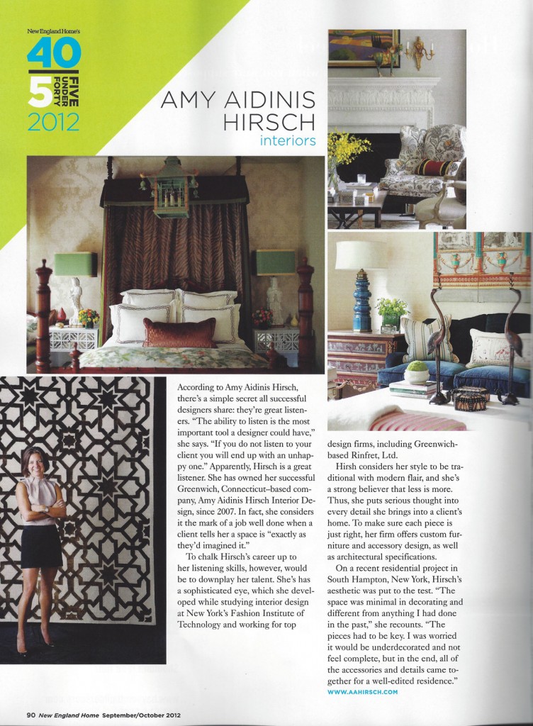
According to Amy Aidinis Hirsch, there’s a simple secret that all designers share: they’re great listeners. The ability to listen is the most important tool a designer could have,” she says. “If you don’t listen to your client you will end up with an unhappy one.” Apparently, Hirsch is a great listener. She has owned her successful Greenwich, Connecticut-based company, Amy Aidinis Hirsch Interior Design, since 2007. In fact, she considers it the mark of a job well done when a client tells her a space is “exactly as they’d imagined it.”
To chalk Hirsch’s career up to her listening skills, however, would be to downplay her talent.  She has a sophisticated eye, which she developed while studying interior design at New York’s Fashion Institute of Technology and working for top designer firms, including Greenwich-based Rinfret, Ltd.

Hirsch considers her style to be traditional with a modern flair, and she’s a strong believer that less is more. Thus, she puts serious thought into every detail she brings into a client’s home.  To make sure each piece is just right, her firm offers custom furniture and accessory design, as well as architectural specifications.

On a recent residential project in South Hampton, New York, Hirsch’s aesthetic was put to the test. “The space was minimal in decorating and different from anything I had done in the past,“ she recounts. “The pieces had to be key.  I was worried it would be under decorated and not feel complete, but in the end, all of the accessories and details came together for a well-edited residence.”

New England Home is proud to present the third annual 5 under 40 awards, honoring top emerging talent in residential architecture and design in New England. The winners – all five of whom and under the age of forty – were nominated by their peers and then selected by a committee of design leaders who considered four categories: architecture, interiors, furniture and home design products and accessories.  Take note: 5 Under 40 winners are the people to watch, produce some of the most beautiful and innovative work available today.
This year’s panel of judges is comprised of top professionals representing different facets of the New England design community, including interior designer Sally Wilson, architect Bradford C. Walker, interior designer Jill Goldberg, who also owns the acclaimed home boutique, Hudson, and New England Home’s editor in chief Kyle Hoepner.

Sally Wilson commented on her 5 Under 40 experience, saying, “Judging up and coming young talent was a rewarding experience. It was fun to see their projects and review how they put their message together. The future world of design is in good hands.”

The judges assembled to review scores of nominations and select this year’s winners, who will be honored at a celebratory reception on September 13th, 2012 at the Galleria at 333 Stuart Street in Boston. As a part of the festivities, each winner designed a custom rug that will be auctioned off at the reception to benefit the Cambridge, Massachusetts-based charity, Barakat.  Be sure to keep an eye on what comes next from this talented group of design stars!


Warhol at the Met

One of the most iconic artists of all time, Andy Warhol’s work is easily recognizable to almost anyone.

Andy Warhol

One of the most iconic artists of all time, Andy Warhol’s work is easily recognizable to almost anyone.  His dynamic images made statements that influence artists still today and demonstrate the genius of his art.  On the surface, Warhol’s work conveys simple thoughts, one idea at a time, and yet still manages to speak volumes about American culture during the 60’s and 70’s.

Grevy’s Zebra
Shoes
Camouflage

From September 18 to December 31, New York City’s Metropolitan Museum of Art will explore Andy Warhol’s far-reaching influence on contemporary artists.  According to the Met’s website, “Regarding Warhol: Sixty Artists, Fifty Years juxtaposes prime examples of Warhol’s paintings, sculpture, and films with those by other artists who in key ways reinterpret, respond, or react to his groundbreaking work. What emerges is a fascinating dialogue between works of art and artists across generations.”  Presented in five thematic sections, the exhibition highlights themes from celebrity to human identity, from daily life to business.

Blue Marilyn
Jacqueline Kennedy II

The Jackie Kennedy portrait is one of my all-time favorites.

To learn more about the exhibit or plan a visit to the Met, go to their website or follow them on Facebook.


Work in Progress: Potting Shed

I’m currently working on a unique project for client who loves to tend his beautiful gardens: a potting shed!

Just before this past Father’s Day, I met with a client whose beautiful home I’d been contracted to accessorize.  The home itself is really lovely and well done, and only needed to be enhanced with further details.  While we were discussing the house project, we started talking about the beautiful gardens surrounding the home.  The gardens are completely tended by the husband and he has created just a spectacularly gorgeous environment.

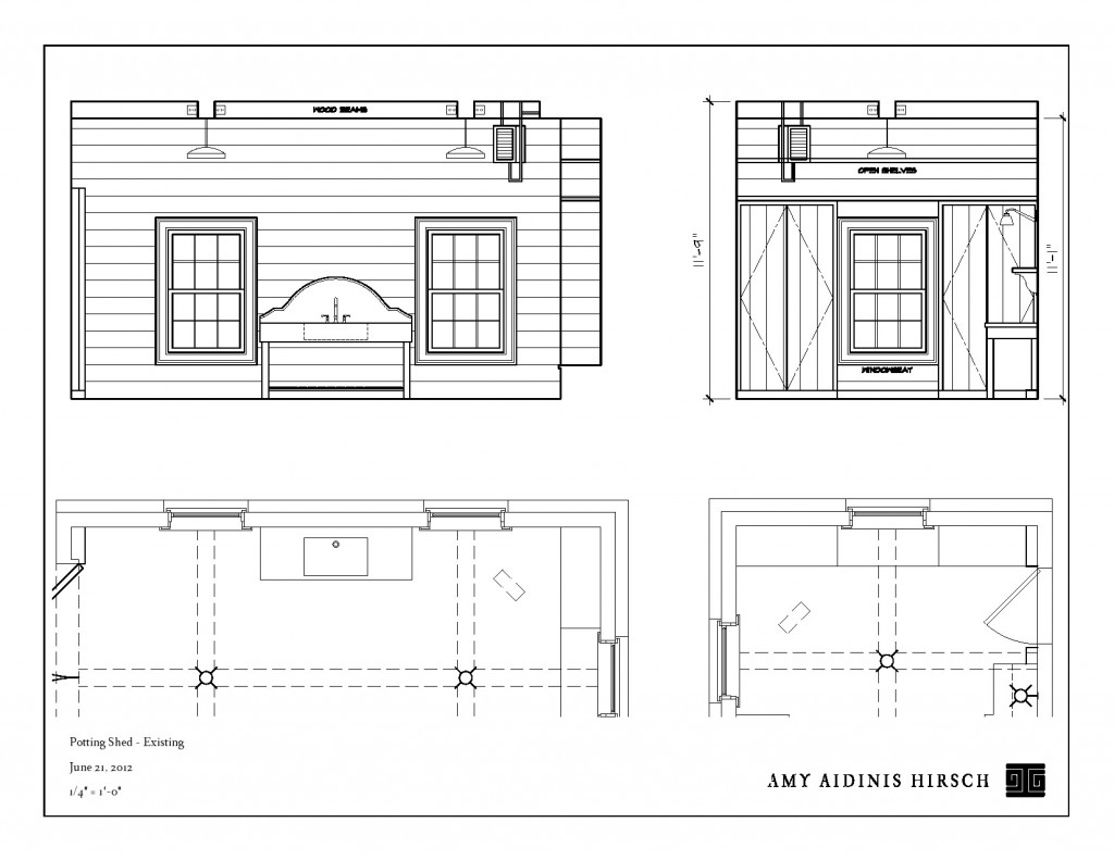
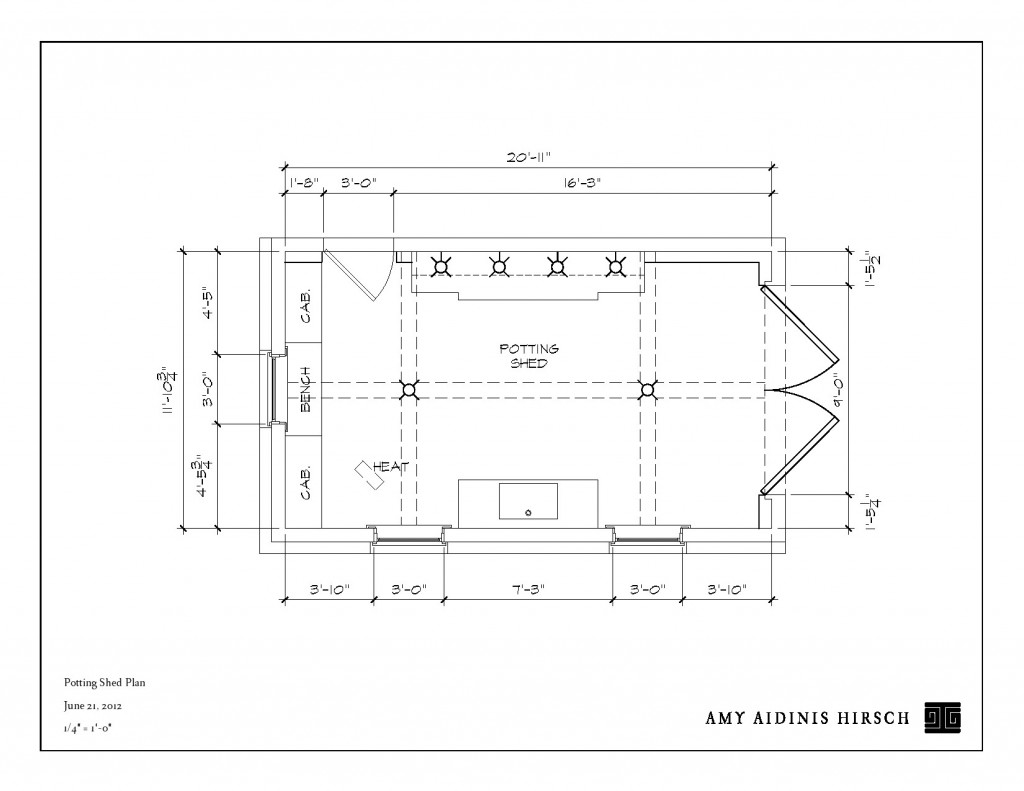
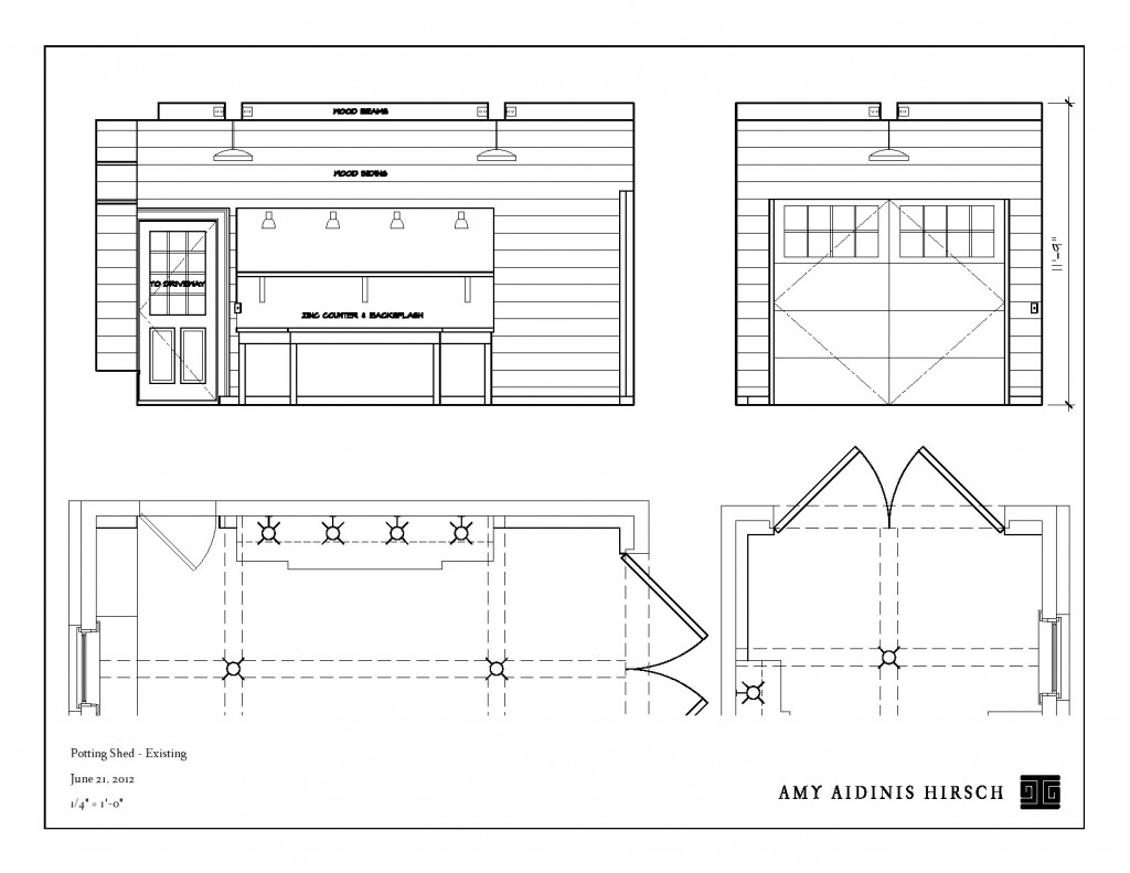
Looking at the set up of the garage area, I saw a potential use for the space that just begged to come to life for this particular client.  The home has three garage bays, one of which is separated from the others by a breezeway.  This space had only a small bench for a workspace and my client expressed his wish for a true potting shed.  As we talked about the possibilities, I could see my clients becoming excited by the idea.  In the end, they gave me carte blanche to transform this garage into the ideal working potting shed for a enthusiastic gardener.  Creating renderings of the space with a layout designed to cater to an avid gardener was the first step in this exciting project.

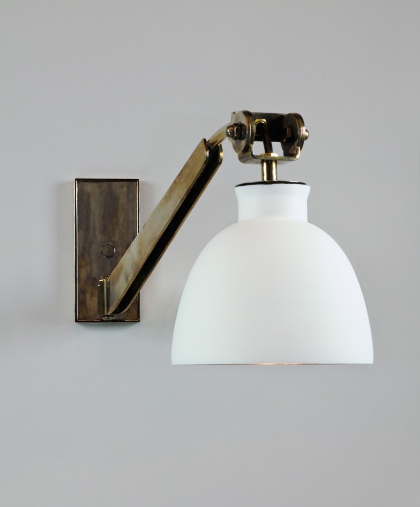
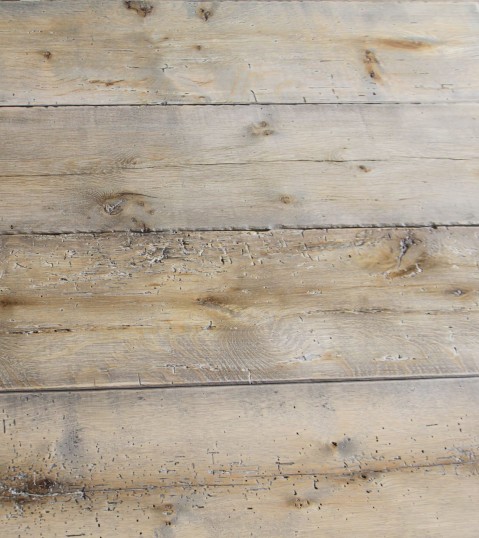
We then worked out what features should be part of the perfect potting shed.  A large bench for work space, plenty of storage, light to work by and grow lights for germinating seeds, drainage in the floor, and a deep sink large enough for watering cans and large pots.  Aesthetically, I wanted to incorporate a lot of texture and take advantage of the high ceilings.  With these things in mind, I decided to sheath the walls and ceiling in reclaimed oak and install a beautiful, deep soapstone sink with a really tall back splash.  The potting bench will have a zinc top and back splash for a touch of an industrial feel.    As for the lighting, I really love the idea of using beautiful sconces.  Can we get grow bulbs to fit these great lights?  I don’t know, but I certainly plan to do whatever it takes to make that idea work!

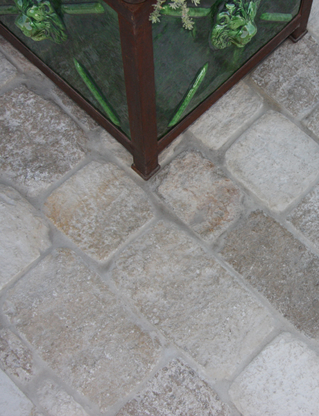
The flooring presented it’s own challenge.  We needed something durable and appropriate to the space, but also with a look suited to the rest of the elements in the potting shed.  I explored ceramic stone and antique pavers, but ultimately concluded that a blue stone floor would be ideal.  It’s a simple, worry-free element with great texture and large scale.  It also echoes the use of blue stone from the nearby pool.

 All of these grand designs will be built by my clients’ amazing handyman.  The gardens around this home are so divine, my client truly deserves this space and I am really excited to watch this project take shape.  Stay tuned for a future update when I’ll post a final reveal of the finished potting shed!

Restoration Hardware, Spring 2012

When I recently received Restoration Hardware’s hefty Spring 2012 catalog in the mail, the understated, monochromatic cover gave little hint of the incredible products displayed inside.

When I recently received Restoration Hardware‘s hefty Spring 2012 catalog in the mail, the understated, monochromatic cover gave little hint of the incredible products displayed inside.  I was completely blown away by so many of the pieces — right now, nothing else can compete.  They nailed it!  Restoration Hardware’s current lines have so much to offer to many clients on many levels.  I could easily see myself doing a whole house with these pieces!

I believe the Spring 2012 catalog signals the pinnacle of Restoration Hardware’s shift over the years from a focus on authentic period hardware to true furniture gallery offerings suited to a luxury lifestyle.  When Gary Friedman became CEO in 2001, Restoration Hardware was still being affected by multiple store closings and restructuring of the company.  They began to expand their offerings to include bathware, textiles, furniture, and lighting and gradually moved away from such items like toys, books, and gadgets.  The core of the company now seems dedicated to fine, historical design as well as updated classics, all with superior quality.  If this most recent catalog is any indication, Restoration Hardware has truly come into its own as a distinctive and responsive source for home decor.

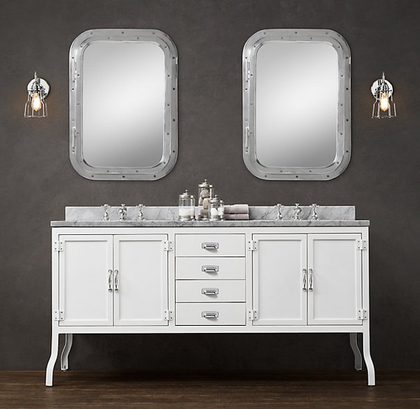
The bath furniture is just genius.
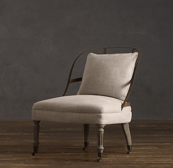
Couturiers Chair - love the metal frame. Really charming!
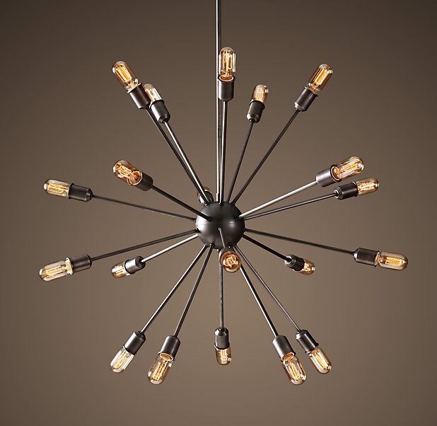
Sputnik Filament - a great nod to the mid century!
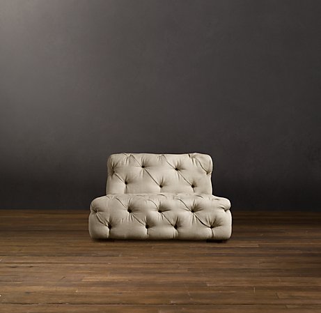
Soho Tufted Chair - Think about grouping two near a fireplace.
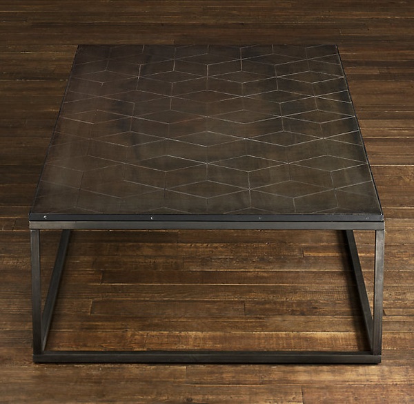
I love the idea of the metal with the geometric pattern.
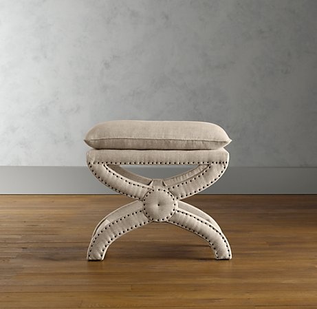
My all time favorite nail head ottoman. So reasonable!
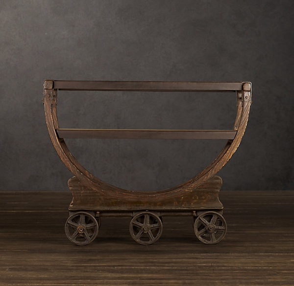
Vintage factory bar cart - it looks like an antique!
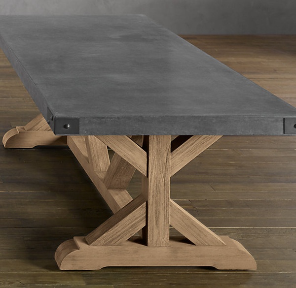
Concrete dining table, in 2 sizes! I can't wait to install this in my next project.

Have you seen this Restoration Hardware catalog?  If so, what do you think and do you have a favorite piece or line?  I know I am really looking forward to incorporating a lot of these furnishings in my own projects!


5 Under 40, New England Home Magazine

I am so honored and pleased to announce that I was chosen as a 2012 New England Home Magazine 5 Under 40 Award Winner for Interior Design!

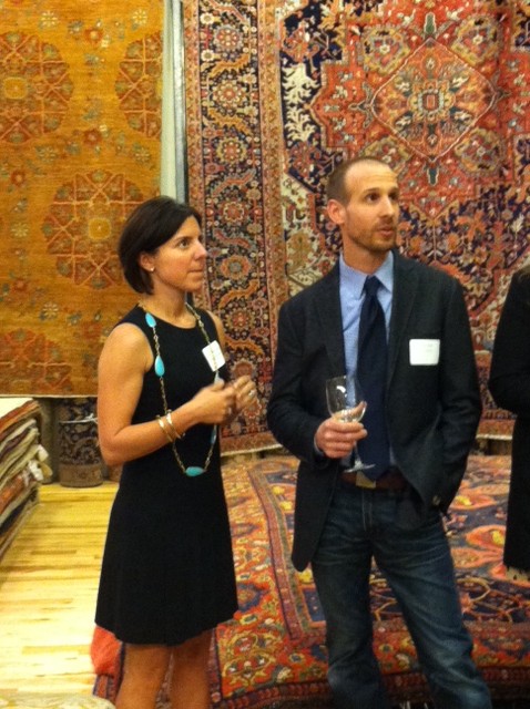
I am so honored and pleased to announce that I was chosen as a 2012 New England Home Magazine 5 Under 40 Award Winner for Interior Design!  Receiving this recognition from one of my favorite publications has certainly been a highlight of my year.  Thursday night I attended a special winners’ reception at the Landry and Arcari Showroom in Boston and felt very humbled to find myself in great company!

Each year, the 5 Under 40 award focuses on up and coming talent in the areas of architecture, interiors, furniture, and home design products and accessories.  Winners are chosen by a committee of regional design leaders, and are “people to watch, producing some of the most innovative and beautiful work available today.”  At a celebratory event in Boston on Thursday, April 26, the winners were officially announced.

John Day and Me

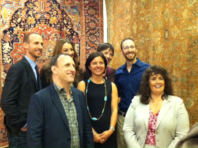
Winners with NEH Editor-in-Chief Kyle Hoepner and Publisher Kathy Bush-Dutton

New England Home Magazine’s July/August issue will also announce the complete winners list and the September/October issue will feature profiles of the 2012 winners in a special magazine section as a prelude to the September 13 awards celebration.

As part of the awards celebration in September, an auction will be held featuring custom rugs designed by each of the 5 Under 40 winners.  Proceeds from the auction benefit Barakat, Inc., a Cambridge, Mass.–based charity promoting educational opportunities for women and children in central and south Asia.  Sponsored by Landry and Arcari, the auction promises to be a really fun event showcasing some extremely creative designs.

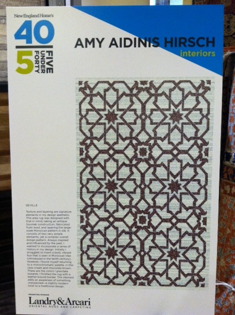
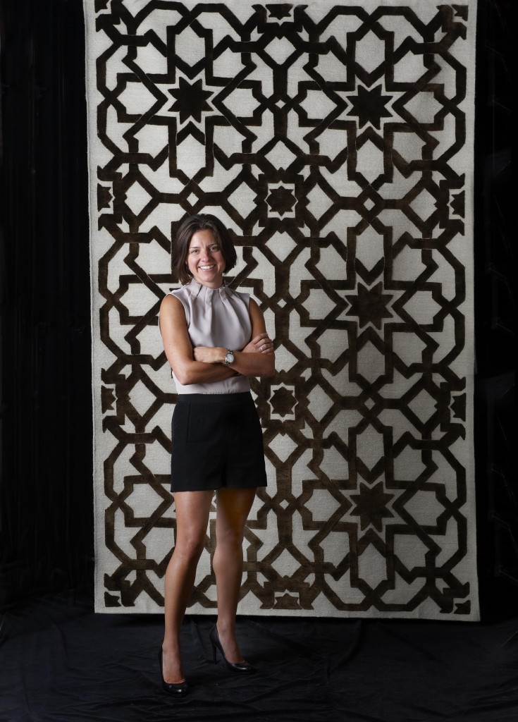
Display of my rug design

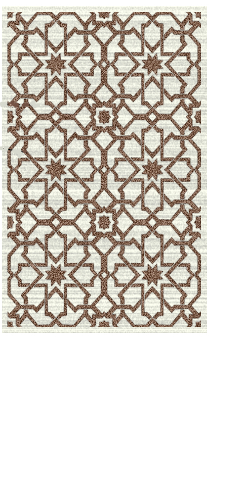
Texture and layering is a signature element of my design aesthetic. The area rug was designed with that in mind, taking an antique sumac construction fabricated from wool and layering the large scale Moroccan pattern in silk. Two very simple elements, yet a complex overall design pattern. The Moroccan tile originated in the 10th century; always inspired and influenced by the past, I wanted to incorporate a sense of history in my design choice.  The rug is made up of two colors, cream and chocolate brown. Initially, I struggled to insert a bold, vibrant hue which is familiar with the Moroccan tiles, however, I always found myself returning to a monochromatic palette. This color selection is a true representation of what I gravitate towards. I decided to finish the rug with a leather bound border. This added element makes you aware of something unexpected and adds a slight modern twist to a traditional design.