Jeffrey Bilhuber Lecture and Luncheon

Earlier this week I had an incredible time at the Jeffrey Bilhuber Lecture and Luncheon, hosted by the Greenwich Historical Society.

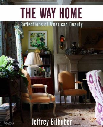
Earlier this week I had an incredible time at the Jeffrey Bilhuber Lecture and Luncheon, hosted by the Greenwich Historical Society and exclusive media sponsor Connecticut Cottages and Gardens.  Jeffrey Bilhuber has long been one of my all-time favorite designers.  I find his style so inspirational, with his use of amazing color combinations and his knack for layers.  He has such an extravagant, eccentric design flair and a fascinating personal story.  When I heard about this event to benefit the Historical Society, I knew I couldn’t pass up the opportunity to hear Jeffrey Bhilhuber speak and showcase his new book, The Way Home: Reflections on American Beauty.

Jeffrey’s lecture demonstrated his mastery of design and set my mind spinning with ideas and possibilities.  His creative design concepts never fail to amaze me.  One particular highlight of the luncheon was the chance to meet Jeffrey and speak to him face-to-face.  If you’ve ever had the opportunity to meet someone you’ve long looked up to as an inspiration and icon, you can imagine how I felt at that moment!

Photo by Neil Landino

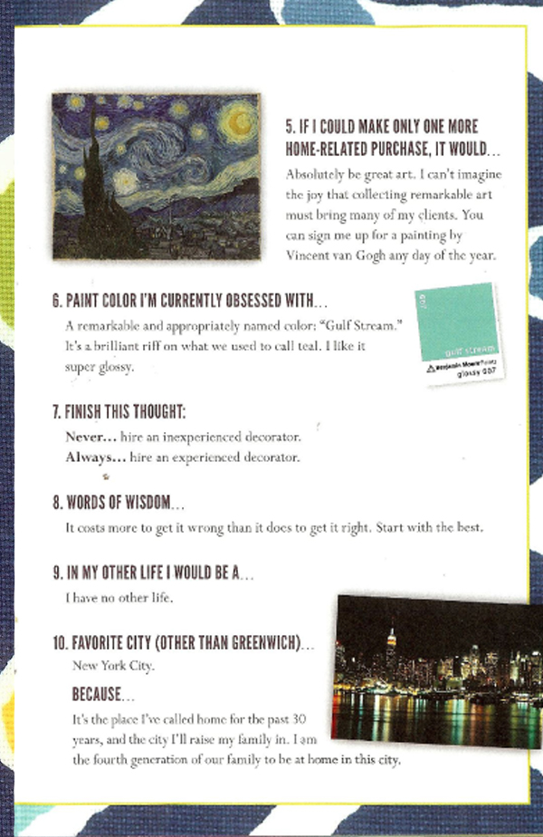
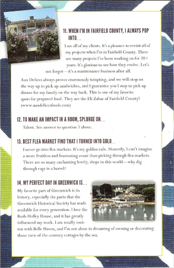
I loved this brochure handed out at the luncheon.  Titled “Jeffrey Bilhuber Unedited,” it listed Jeffrey’s responses to 14 prompts about his favorite things and places, featured a very cool design,  and included references to unique Greenwich spots!


Eclectic Family Room

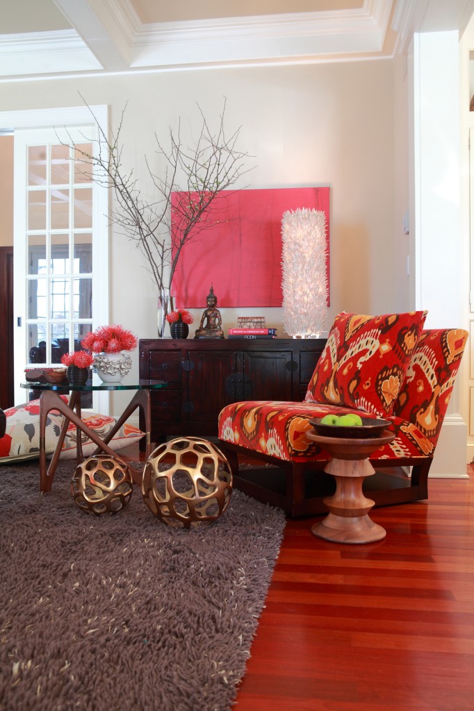
This family room was such a fun space to create.

This family room was such a fun space to create.  It has an edgier vibe with a punch of color, definitely a modern room.  The palette and design approach allowed for so much creativity and the use of fantastic accents.

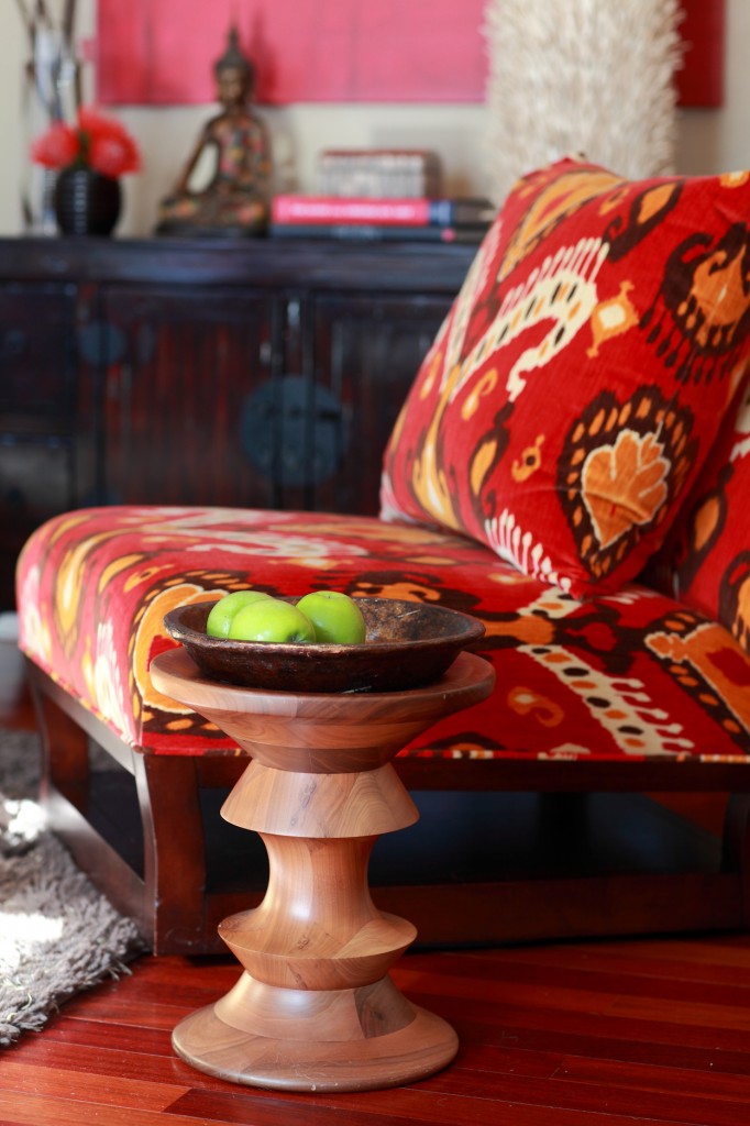
One piece that instantly sets the mood for the entire space is the Donghia swivel chair upholstered in F. Schumacher Ikat Velvet.  I just adore Ikat patterns!

The shag carpet from Patterson, Flynn & Martin is another favorite element of this family room.  Shag carpets can be a hard sell to present to a client, with its reminders of the 1970’s, but this carpet is hip and urban, especially with the dark grey hue.

Other important pieces for the room include the Pottery Barn storage cabinet and coffee and side tables from Design Within Reach.  All are solid and anchor the space  without detracting from the room’s modern lines.

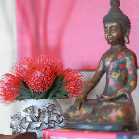
Finally, the accessories really make this space speak.  The hint of gold adds contrast to the furniture pieces.  The artwork is abstract and grounds the use of the dominating red hue of the room.  The unusual wood lamp and touch of Buddha spirit add a decorative element as well.  These are the kinds of essential details that make a project into something more than just a decorated room!


Grand Entry

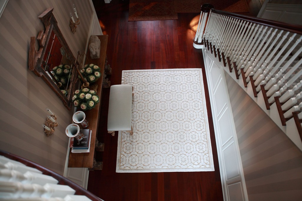
The entry is always the central core of a residence. It sets the mood for the first impression when a guest enters your home.

The entry is always the central core of a residence.  It sets the mood for the first impression when a guest enters your home.  This entry is vast in height with a grand stairway open to the upper floor.

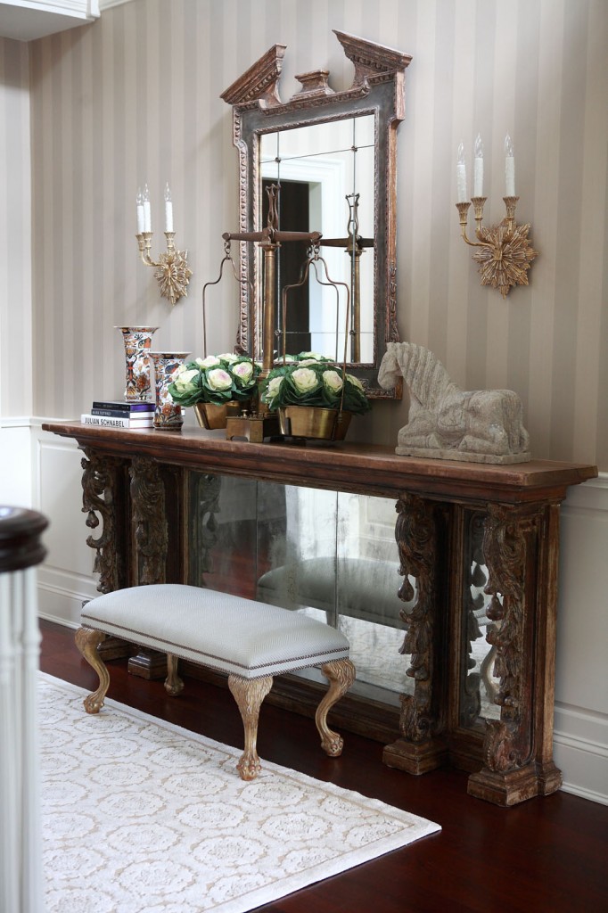
Finding the perfect entry table here turned into a real scavenger hunt.  Initially, I began sourcing antiques because I needed such a long table for this area.  Bored with the typical consoles and frustrated that the most spectacular pieces had been used by other designers, I thought, “Why not start the search from scratch?”  What I found was a table that originally formed part of an 1800’s bar that originated in the south of France.

I remember the day I presented the piece via email to the client and they said “Yes!”  I must have danced around the office like a silly child, so thrilled to have something authentic and aged in a newly refurbished space.

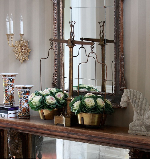
Another component I really like in this entry is the brass scale on top of the console table.  I have these moments where I speak up and conjure some crazy idea but have no idea where I’m going to locate what I’m presenting.  Somehow I always manage to figure it out, and the scales are a perfect example of that.  I wanted something of substance and not your typical accessory.  What I love about the scale is the way it functions as a vase for filling with flowers or other arrangements.

The console itself is a beautiful piece of art, but the accessories that adorn the top are so unique and strategically balanced.  The stone horse weighs a ton!  It was almost impossible to get it up there.

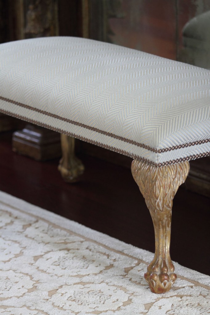
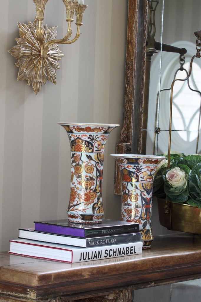
Being able to add so many custom elements to this entry also made it a memorable project.  The  gorgeous Buton area rug by JD Staron Galleries, light fixture in brass and dark bronze patina by Charles Edwards, and mirror and bench from Dennis & Leen, all complement each other and the grandness of the entry to form an overall atmosphere of impressive sophistication.  Finally, strie wall paper by Farrow & Ball cover the walls to provide subtle background texture and complexity.

Cozy Chic Family Room

Our goal here was to create a comfortable, cozy environment in a livable space with absolutely nothing pretentious.

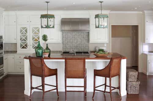
An open floor plan offers unique challenges and opportunities.  For this client, the family room opened to both the kitchen and dining area so all three spaces needed to tie together.  Our goal here was to create a comfortable, cozy environment in a livable space with absolutely nothing pretentious.  The rooms already had good flow from that open floor plan as well as lots of natural light and simple
architecture.  With these things in mind, we set out to create this cozy chic living room.

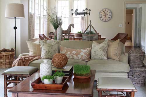
The primary color selection for this project was green.  Combined with all that wonderful light, the natural, organic color palette allows the influence of the outdoors to pour into the interior.  The resulting effect is inviting and has a simple influence but layers of warmth.   To achieve this, I chose materials like wicker, iron, walnut, and a hint of bamboo.  Since the space holds three different actions — eating, cooking, and lounging — elements had to not only compliment each other but also almost repeat to tie everything together.  For example, walnut in both the island and coffee table, bamboo on the ottomans and bar stools, and wicker chairs echoed by baskets.

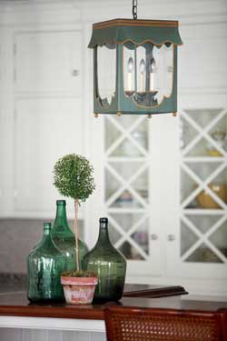
Some of the items and materials used here were really enjoyable to work with.  The tile back splash warms up the white cabinetry of the kitchen while the Lamplight Designs lanterns over the island draw in that soft green color seen throughout the space.  The chenille sofa fabric from Cowtan & Tout, for example, or the John Rosselli & Associates bamboo ottomans upholstered in leather.  One of my favorite accents, however, is the Vaughan standing lamp in iron!

I think the finished room really lives up to all of its potential.  This is a great gathering area where everyone feels connected and part of the open communication of living together in a wonderfully habitable space.

A Jewel of a Powder Room

My goal with this project was to create a jewel of a powder room; a whimsical experience in a smaller space.

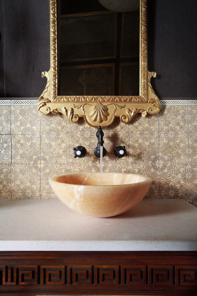
Bathrooms and powder rooms can be the best places to design.  Since the room isn’t usually directly in sight, you can be more extreme, take risks, and play with more unusual materials.  My goal with this project was to create a jewel of a powder room; a whimsical experience in a smaller space.

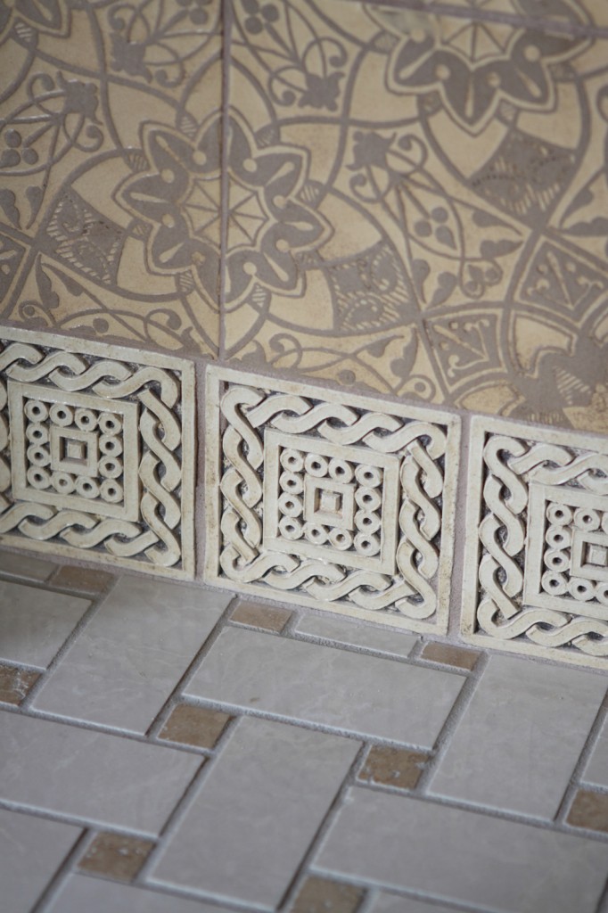
To start, the mohair for the wall upholstery sets a luxurious backdrop balanced nicely by the lighter colors of the hand kiln tiles by Country Floors and the Honey Onyx sink vessel by Ann Sacks.  The console table is a custom piece from English Looking Glass.

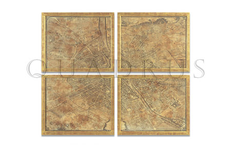
In addition, some of the wonderful products from this powder room are not visible in the photos.  A hand-antiqued map of Paris, George I Gilt Gesso Pier Mirror,  and a Piccolo Sconce by Gregorius Pineo, round out the bathroom nicely.  Finding just the right details and accents such as these is what makes a project for me!


An Unusual Wreath

When a client asked me to create a wreath for the New York Junior League’s Winter Wreath Celebration and Auction, I immediately knew I wanted to do something risky to set my design apart from all the others.

When a client asked me to create a wreath for the New York Junior League‘s Winter Wreath Celebration and Auction, I immediately knew I wanted to do something risky to set my design apart from all the others.  I felt totally against creating a typical, round, preserved green wreath.   This was a risky, absolutely unsafe approach, but I wanted something authentic and unusual that would get people talking.  Plus, I had only two weeks to pull of the entire project!  Working under pressure helps me focus pure creativity, so the time crunch actually worked in my favor.

My first and biggest hurdle involved convincing my husband to part with a trophy item from his past!  His European mounted deer skull became the centerpiece of the wreath.  I upholstered the skull in plaid fabric, leaving the antlers bare and natural.

Surrounding the European mount are real white birch branches and a combination of real and silk pheasant feathers.  McArdle’s Florist and Garden Center in Greenwich did an excellent job of providing materials to help me create my design vision.

The finished wreath completely lived up to my goal of building something unexpectedly beautiful.

 I was not at the Junior League auction, but from what I heard this wreath was the talk of the event!  Bidding over the wreath was fierce, which only goes to show that taking risks and not conforming to common expectations can really pay off!

Guest Entry Nook

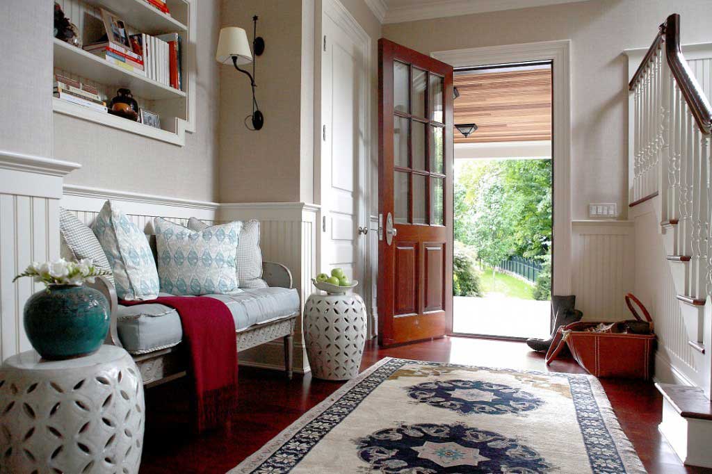
As a secondary, unused entrance for guests, this small space had no defined meaning. My goal was to give this entry nook a purpose of its own.

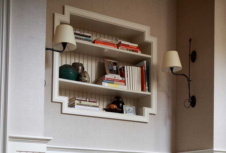
As a secondary, unused entrance for guests, this small space had no defined meaning.  In addition, this area ended up as a landing space for the mudroom below.  My goal was to give this entry nook a purpose of its own.

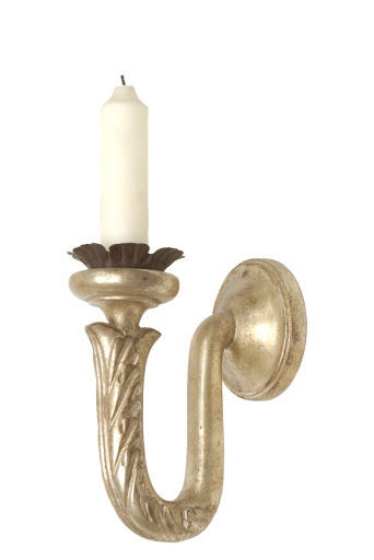
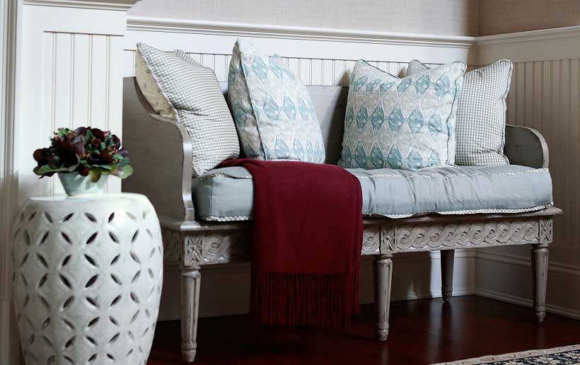
This family loves to cook but had no bookshelf option for their cookbooks.  Incorporating a bookshelf into the niche provided not only storage for the cook books but an additional area to add visual interest with accessories.  Framed by sconces by Objet Insolite and with a beautiful Swedish style settee, the unappreciated nook becomes a very comfortable place!

The bead board around the lower half of the nook, repeated behind the book shelves for continuity, is a great option for a secondary place.  It is also easy to wipe down for a busy family!  An antique Chinese rug ties the space together with with an additional warm, comfortable influence.  The finished nook now serves an inviting purpose.  It’s the perfect visual vignette and quiet place to read.

Breakfast Room

This sunny breakfast room became such an ideal spot for a relaxing start to the day.

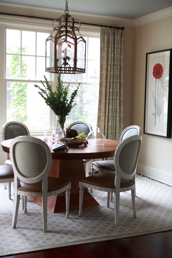
When designing this breakfast room for a client, I fell in love with their round dining table.  It has such a simple form but with an unexpected shape to the base.  The client asked more than once if we should find an alternative table, but I truly felt it was not necessary.  The table was already an ideal reflection of their style and personality.

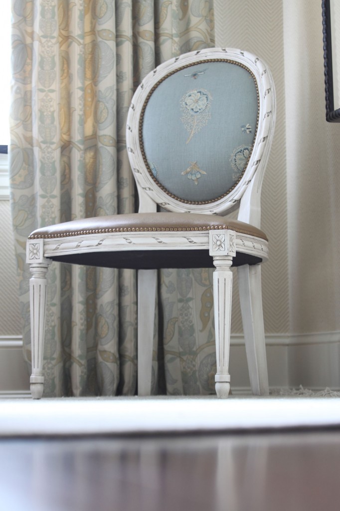
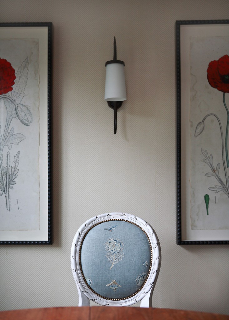
With the table as a starting point, we matched it with lovely chairs from Oly, upholstered in three different fabrics:  Edelman Leather for the seat, Chelsea Editions for the back rest, and Carleton V Ltd on the back of the chair for contrast.  When arranged around the table, the chairs add so much visual interest to the room simply from the combination of fabrics.  To soften the room and tie it all together, we added a rug from Patterson, Flynn, and Martin.  The chevron wall covering by Ralph Lauren provides background texture and the flower prints bring an unexpected pop of bright color.   At first glance, the breakfast room looks sophisticated but charming and welcoming with a simple palette.  However, the variety of complementary patterns and textures actually creates a more complex environment that draws the eye around the room to take in every carefully-placed detail.

The photo above includes many of the details I particularly like in this breakfast room.  The subtle pattern of the wall covering, the way the nail heads in the chair are mimicked on the nearby frames, and the shape of the flower on the chair back corresponding to the shape of the flowers in the prints.  This sunny breakfast room became such an ideal spot for a relaxing start to the day.

Formal Living Room

The vibrant colors and sumptuous textures of this living room work together to create such a treat for the eye!

This client lives in a very grand, 1920s brick Georgian home.  Her tastes run to the traditional, with a love for French antiques and feminine elements.  With all of this in mind, I set out to create a formal living room exactly tailored to my client’s wishes.

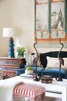
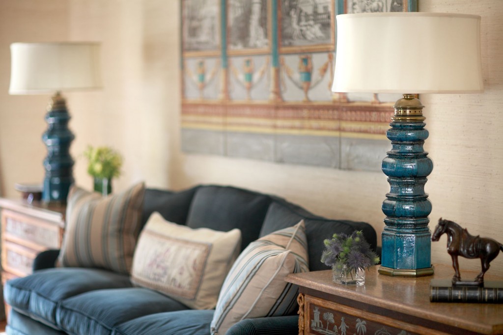
With formality as our ultimate goal, I chose important and significant antique and art pieces.  The stunning antique blue lamps are from Carlos de la Puenta and set the overall tone for the room.  They also anchor the lovely vignette of the sofa with the antique Dufar screen.  This living room is saturated with Neoclassical elements, from the hand-painted commodes to the antique ribbon and metal elements at the base of the sofa.

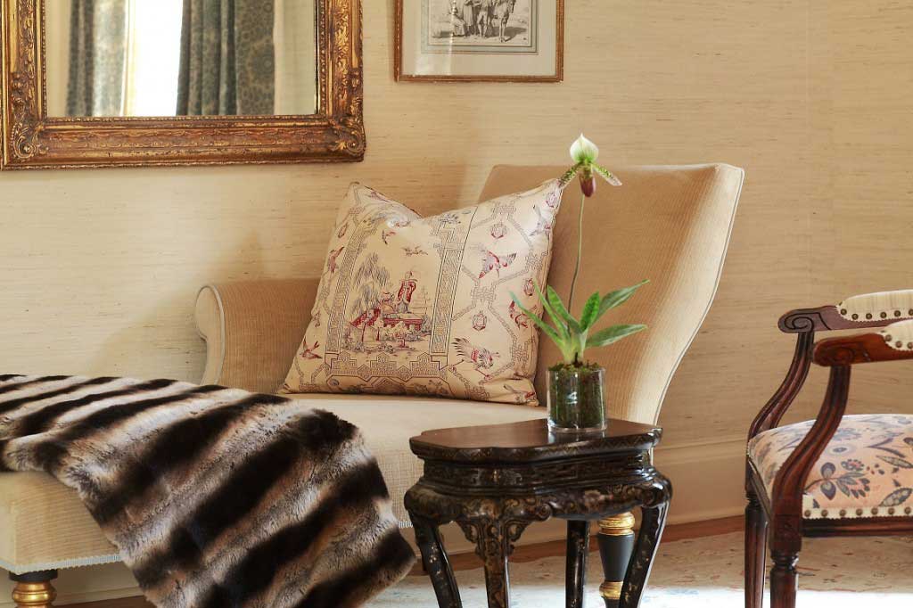
I really enjoy the contrast of luscious velvets against the creme grasscloth wall covering from Philip Jeffries.  The vibrant colors and sumptuous textures of the living room work together to create a complex, multi-layered experience.

Home Theater

The client asked for a place to enjoy watching old movies with large gatherings of friends, so I set out to create a haven for just that.

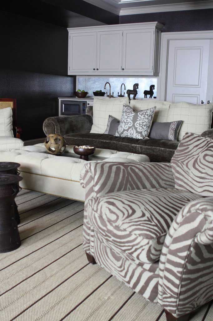
This space started out as your typical vanilla box basement with no character.  In fact, the long, narrow room with two awkward access points presented a challenge right from the start.  The client asked for a place to enjoy watching old movies with large gatherings of friends, so I set out to create a haven for just that.

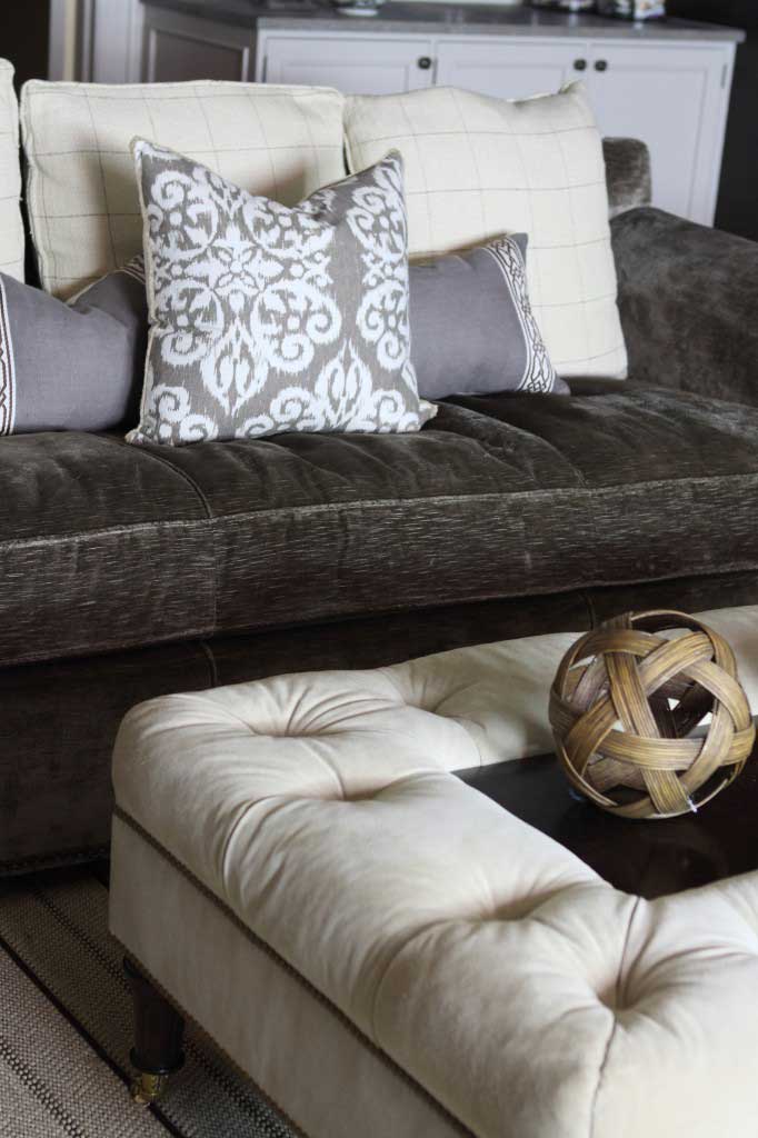
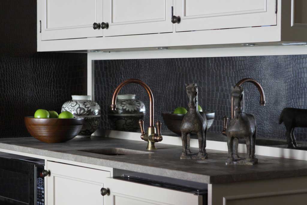
I covered the walls in Mahogany Yacare Crocodile by Ralph Lauren.  This rich, textured backdrop set the stage for the rest of the room.  To alleviate heaviness from the dark walls and lack of windows, I chose a zebra pattern chair and two-toned sofa.  Along with the light cabinetry and striped wool carpet, these choices keep the walls from overpowering the space.

The rug is from Turabian and Sariyan, a local carpet vendor whom I absolutely adore!  I chose this particular ottoman because it serves as both a foot rest and a convenient place to rest drinks or snacks.  The combination of materials and textures in this room ties the entire space together with an intimate, cozy feel:  suede, velvet, crocodile, and wool.  The variations in patterns, from the zebra chair to the sofa pillows, add complexity and interest.

Finally, to suit the main purpose of the room, we installed a wet bar to either side of the main entrance to the basement.  It contains necessities such as a fridge and microwave for the all-important popcorn.  The brushed counter is from Walker Zanger and is a continuation of the chocolate feeling from the walls.  As an added interesting touch, I used antique mirror for the wet bar back splash.  Not only does it look fantastic, it works to reflect light in a dark space.

The final transformation of the basement proved everything my clients hoped for and was a project I completely enjoyed!