1 Hotel South Beach

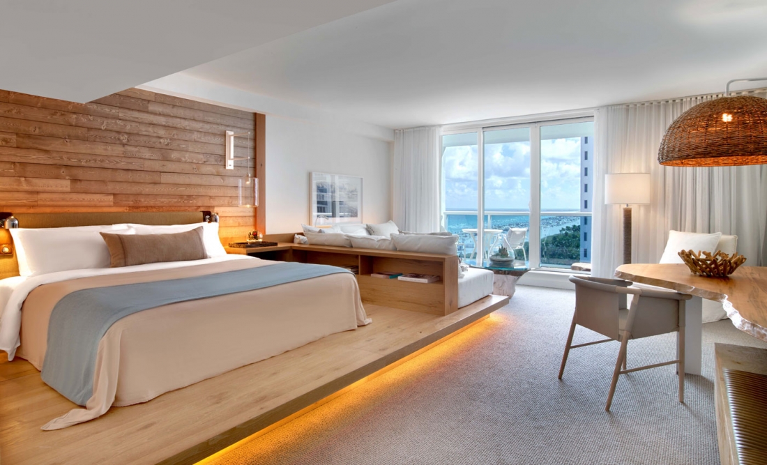
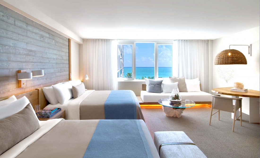
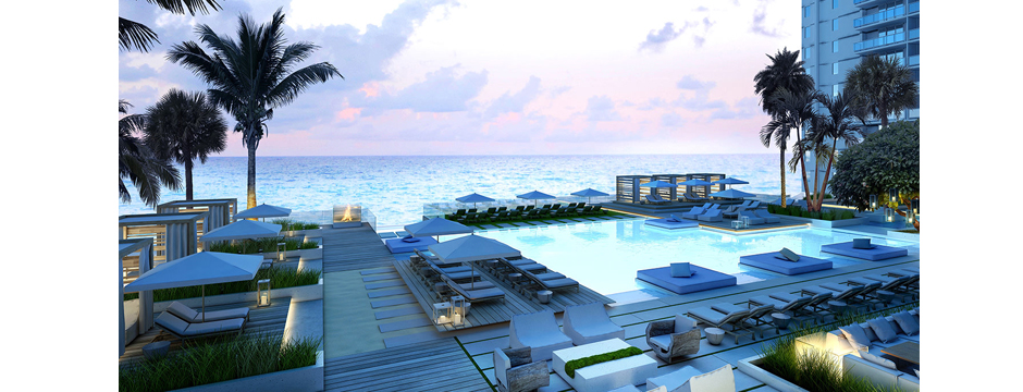
1 Hotel South Beach is a gorgeous beachfront hotel in Miami.

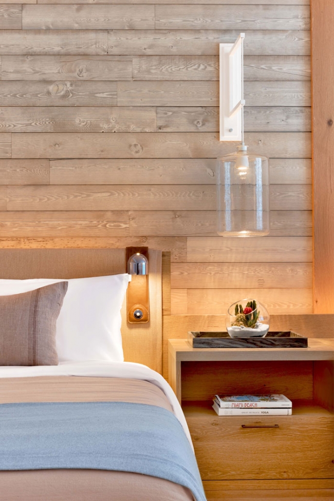
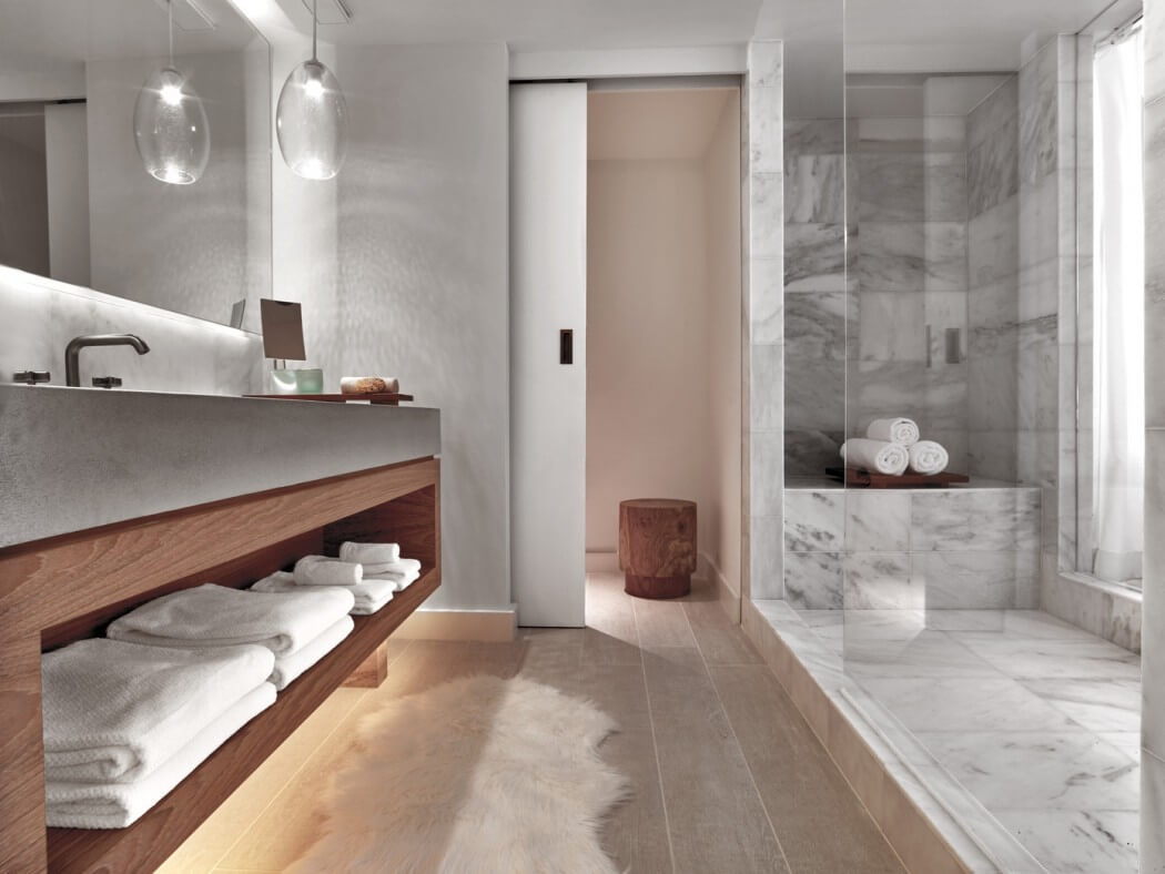
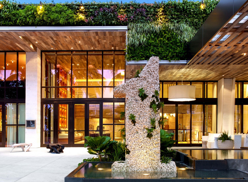
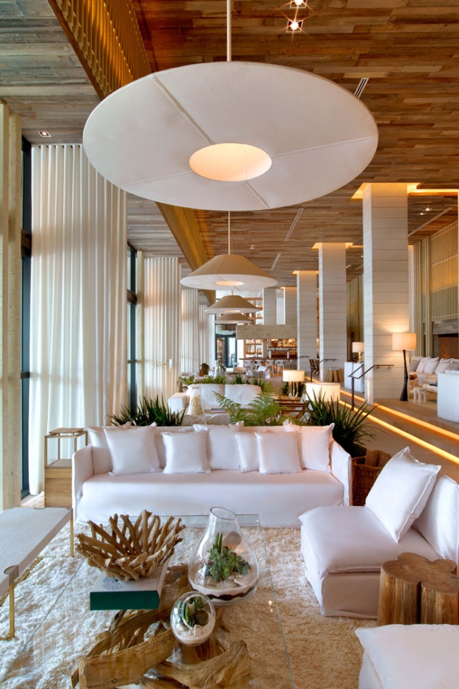
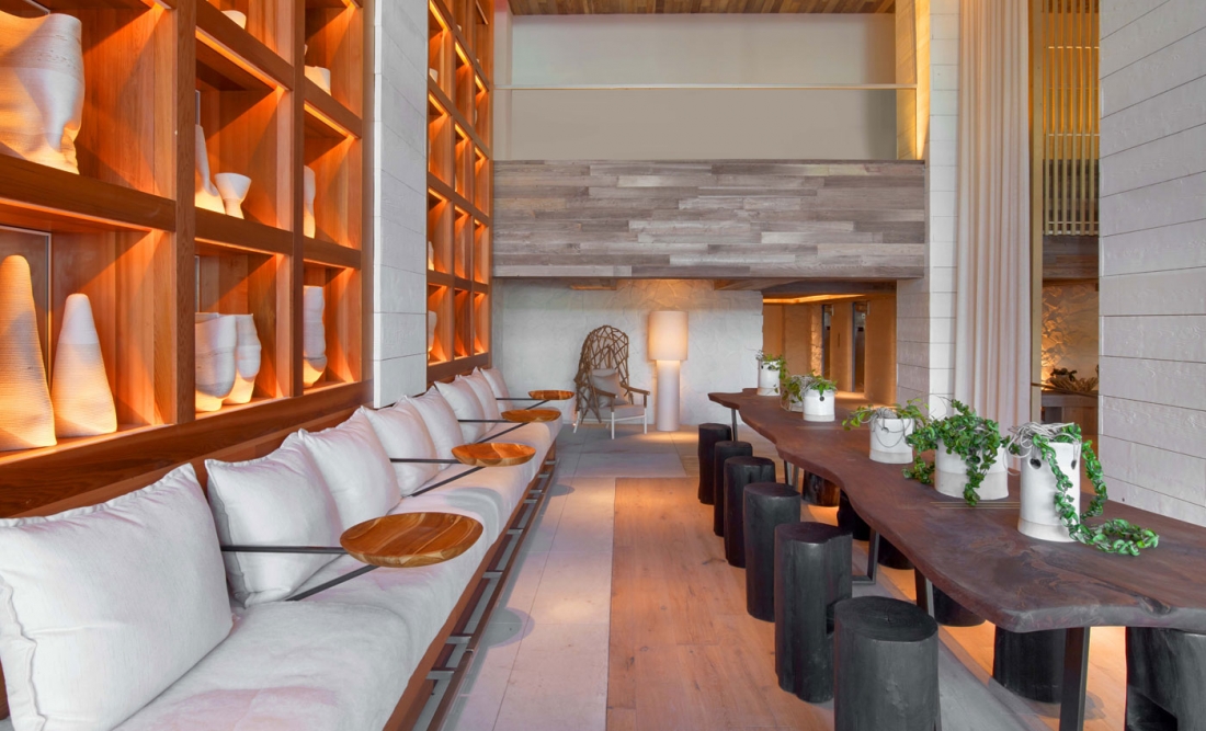
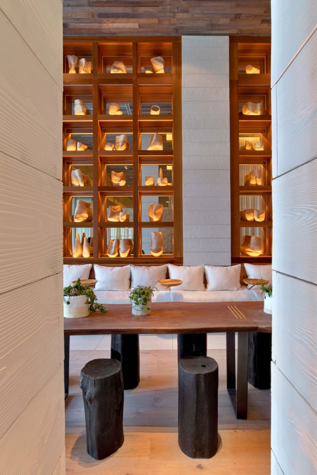
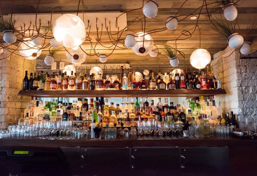
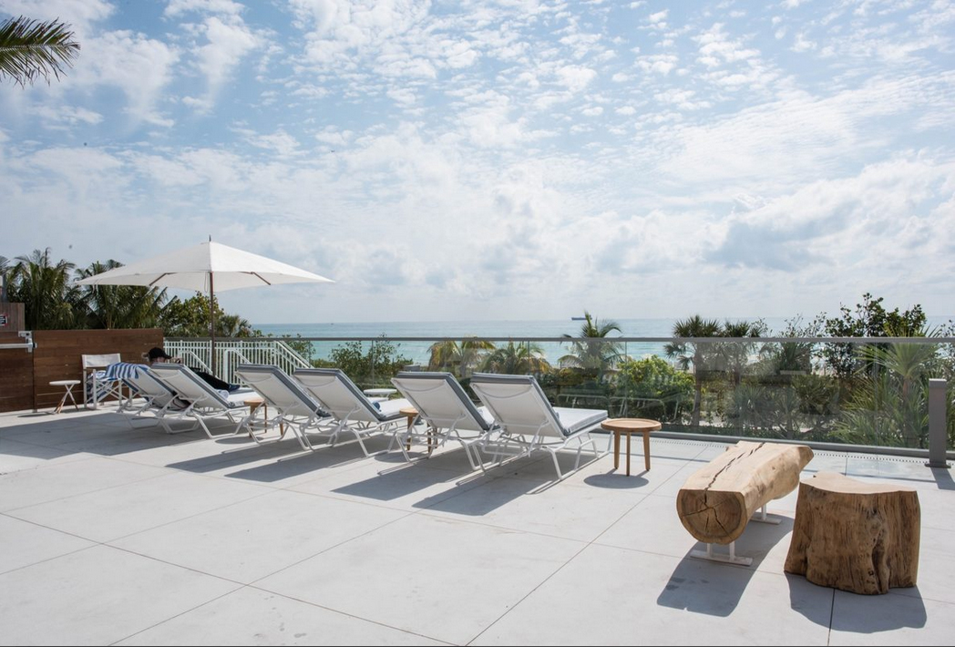
1 Hotel South Beach is a gorgeous beachfront hotel in Miami.  Throughout the interior, natural materials such as stone and curving driftwood create a reflection of the stunning ocean view, all the time maintaining a look of luxury.  The neutral palette is accented by subtle nods to the water with pale blues and hints of green in the guest rooms.  Water views are the artwork of each room, while the public areas of the hotel are warmed up by different types of wood and thoughtful lighting choices.

1 Hotel South Beach 51 Hotel South Beach 61 Hotel South Beach 71 Hotel South Beach 81 Hotel South Beach 9

Originally, the building was a hotel called the Gansevoort, but when the building was taken over by a partnership between Starwood Capital Group and LeFrak property, the hotel was gutted and completely revamped.  Meyer Davis Studio created their designs with an eco-friendly focus, using reclaimed wood as well as wood from trees felled by mountain pine beetles.  Other “green” touches include filtered water in the rooms rather than plastic bottles, mini chalkboards in guest rooms instead of notepaper, low flow water fixtures, hangers and key cards made from recycled boxes, and guest access to Tesla vehicles for local travel.  Even the hotel greenery is less wasteful, consisting of terrariums rather than cut flowers and a massive living wall in front of the building.

1 Hotel South Beach 121 Hotel South Beach1 Hotel South Beach 31 Hotel South Beach 21 Hotel South Beach 4

The New York design firm Meyer Davis Studio created the breezy look of the hotel’s guest rooms and public areas, including the restaurant.  Called Beachcraft, the restaurant is overseen by chef Tom Colicchio.  Nikola Gradinski of NGNY designed the stunning rooftop area.  The overall look of 1 Hotel South Beach is very organic and not what you might expect in a posh place like Miami.  I love the idea of something like this nestled in the city — natural, peaceful, and serene, but also luxe and beautiful.

1 Hotel South Beach 111 Hotel South Beach 11 Hotel South Beach 10

Exterior Furniture: Janus et Cie

Janus et Cie is one of my favorite sources of exterior furniture.

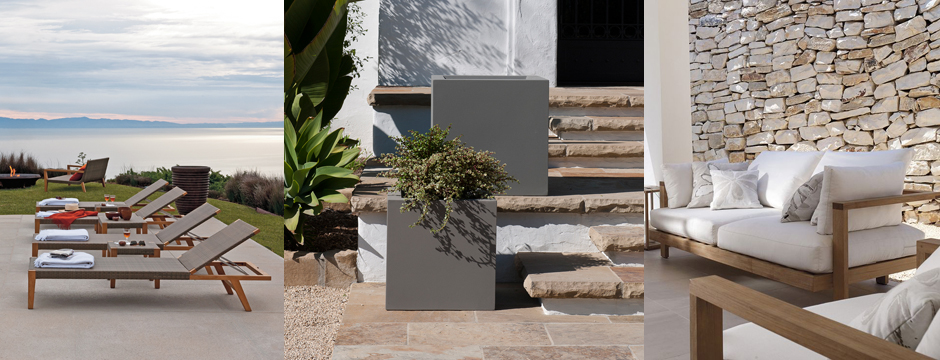
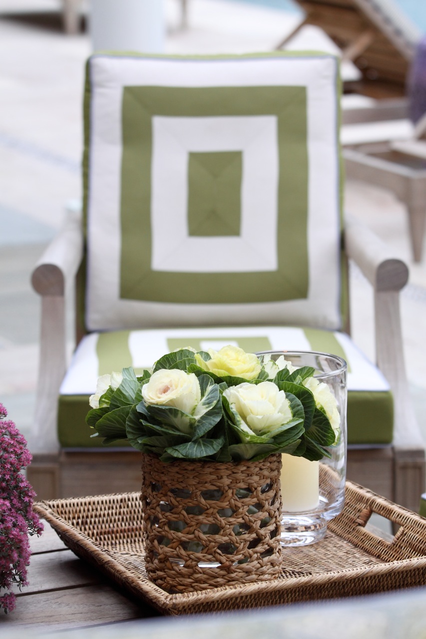
Creating an outdoor oasis for relaxing with family or entertaining friends is an important way to extend your home’s interior to the exterior.  Exterior furniture should be a comfortable reflection of the interior, making it possible to enjoy a seamless transition from the living room to the patio or poolside without sacrificing comfort, luxury, and style.

Janus et Cie is one of my favorite sources of exterior furniture.  Many of the pieces are essentially functional sculpture, as substantial as they are beautiful.  Others feature a great mix of material, such as resin with teak or elements of stone.  I love this kind of mixing!  The overall feel is urban and relaxed, not something formal.  I am over the moon for the Hopper table — genius, and it’s available in different finishes.
Hopper Table
Hopper Table
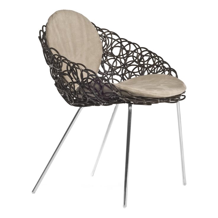
Noodle Armchair
Noodle Armchair
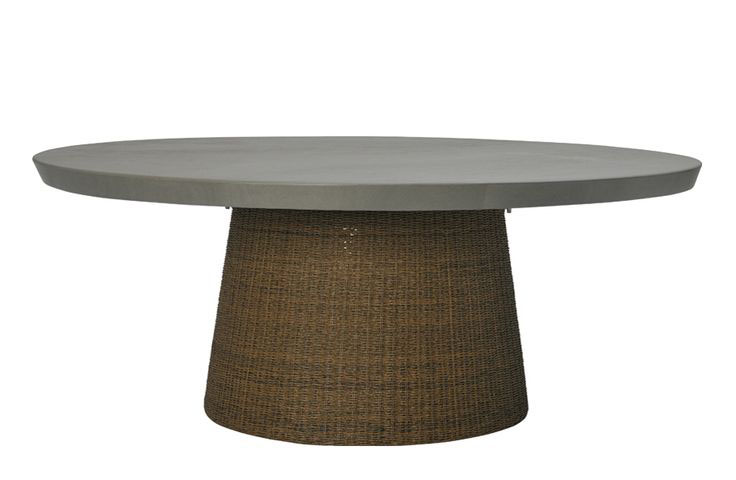
Strada Stone Top Dining Table
Zeya Grande Ottoman/Table
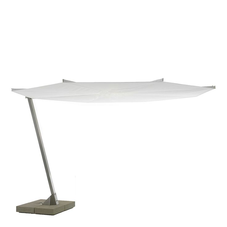
Kosmos Umbrella
Kosmos Umbrella

Many of the Janus et Cie pieces are perfect for clients who come to me wanting something simple for the outdoors.  Choosing items without cushions allows for less maintenance, and I really like that Janus et Cie has these options without compromising looks or comfort.

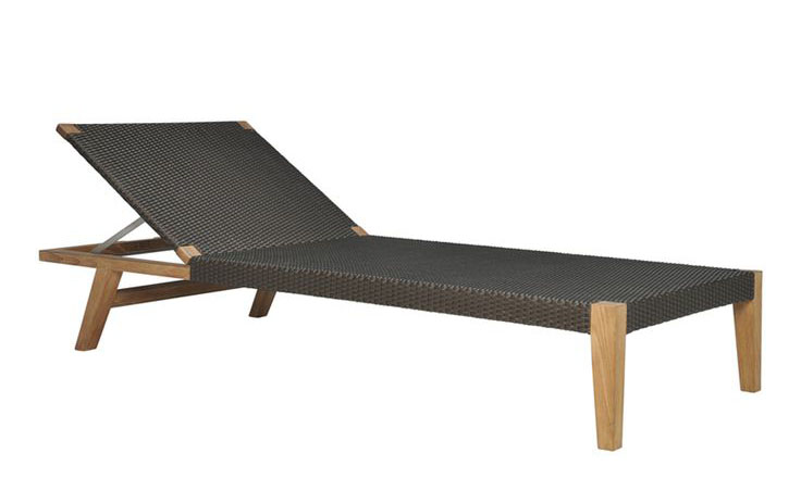
Quinta Teak and Woven Chaise Lounge
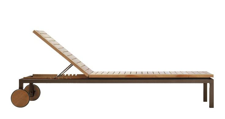
Natal Alu Teak Chaise Lounge

With the various thoughtful accessories also available from Janus et Cie, it’s easily possible to create an entire environment.  Textiles, planters, and other details add the finishing touch to an exterior that is as carefully curated as any room inside the home.

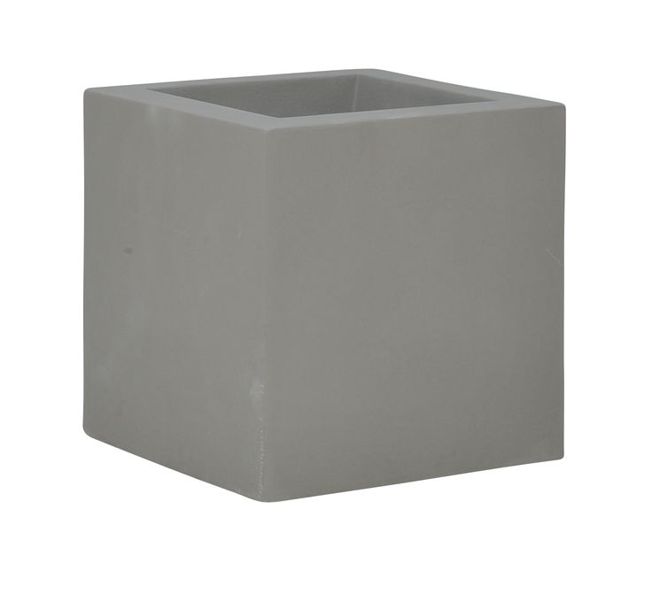
Box Planter
Box Planter
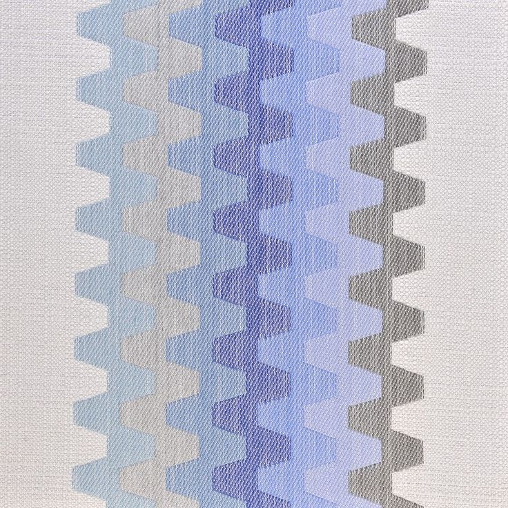
Zip fabric, so weather resistant.
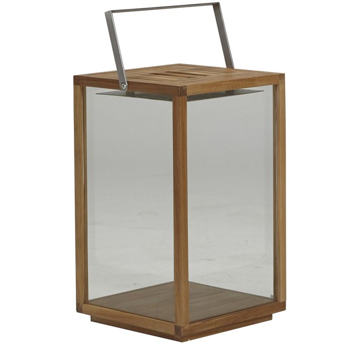
Teak Lantern
Teak Lantern
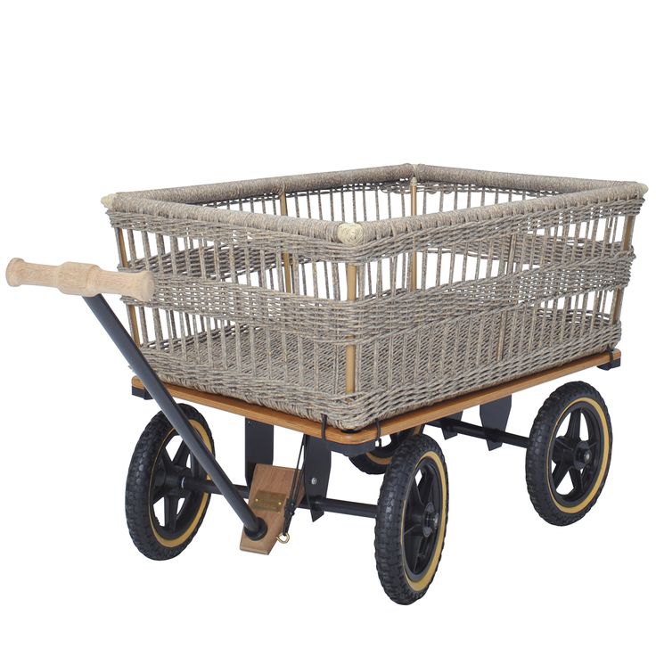
Garden Woven Wagon
Garden Woven Wagon


Eskayel

Eskayel is an innovative Brooklyn, NY based design studio founded by artist and designer Shanan Campanaro.

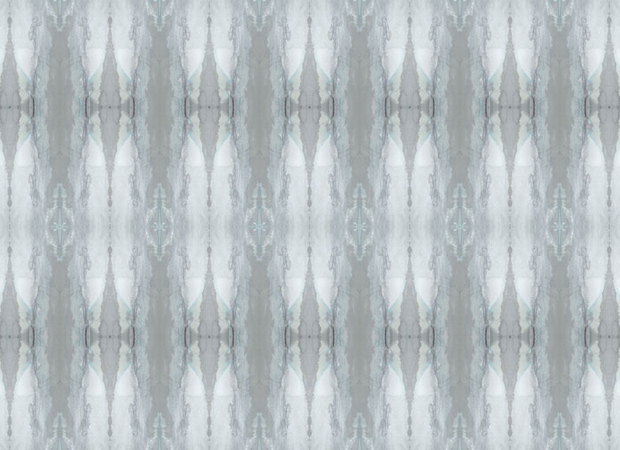
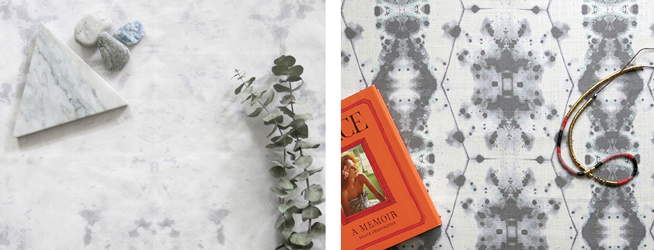
Eskayel is an innovative Brooklyn, NY based design studio founded by artist and designer Shanan Campanaro.  Along with her partner Nick Chacona, Shanan designs print-to-order fabrics and wallcoverings.  In addition to their hundreds of colorways and patterns, Eskayel can provide custom designs or adjust one of their patterns to suit your needs.  They have a strong focus on sustainability, using eco-friendly materials and practices.  Eskayel is a fabulous textile company.

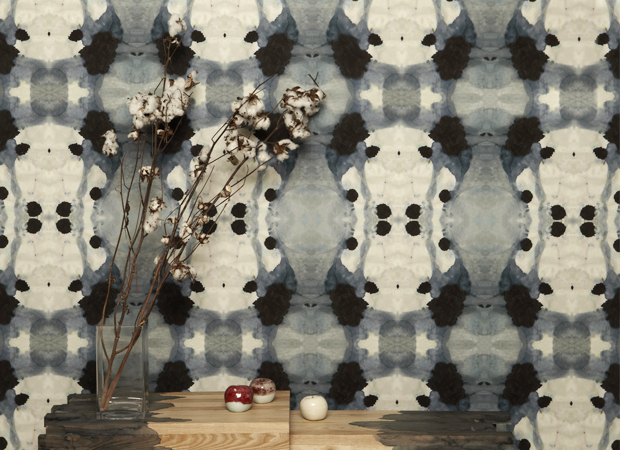
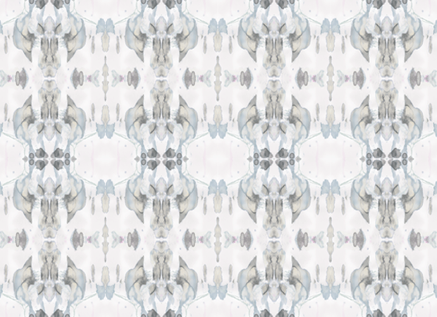
Eskayel Dynasty SlateEskayel Madagascar MistEskayel Nairutya Citron

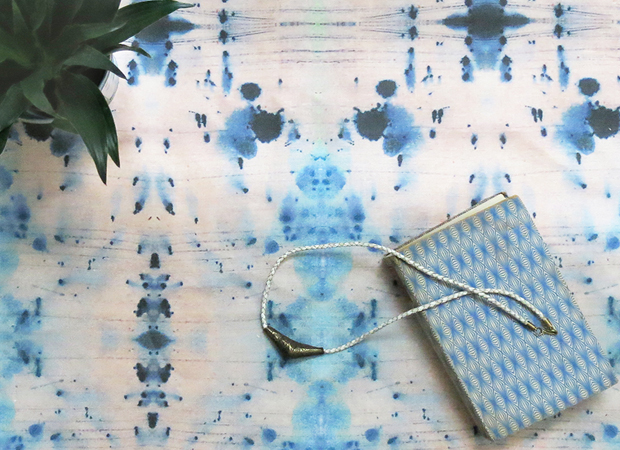
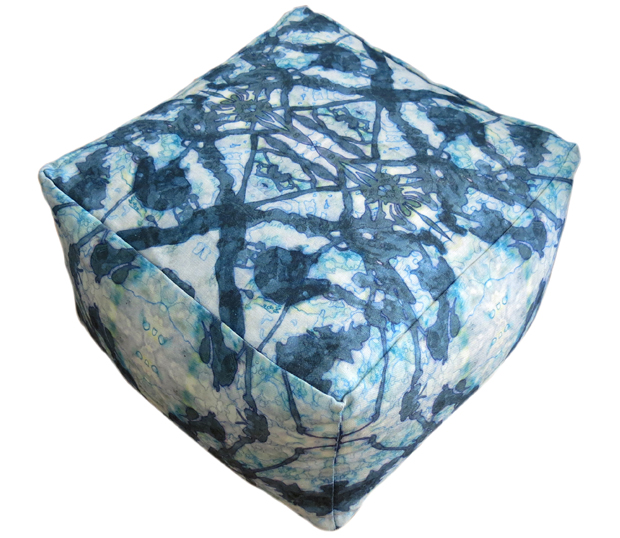
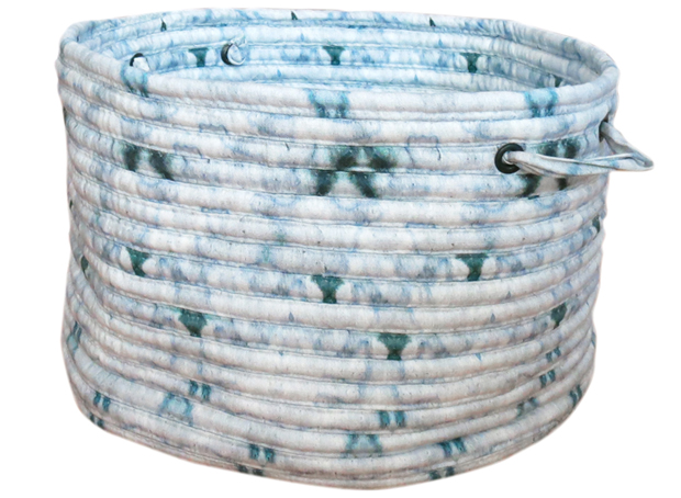
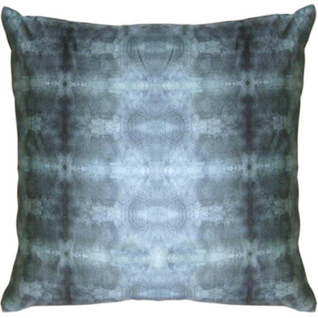
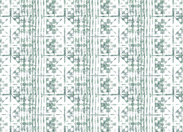
What I find interesting about Eskayel is that they have put a twist on the traditional, like a modern form of tie-dye.  It’s very fresh and versatile — the fabric can be applied to anything from pillows to poufs.  Eskayel also produces wallcoverings.  I love that one pattern can be generated into so many things.  You can use this as an accent or an all-over application.

Eskayel Feudal Face Lt SlateEskayel The Gypsy Pesto PoufEskayel The Knitting OceanI’m working on a project for a client’s Montana home and am using an Eskayel pattern to cover an accent wall in a bunk room.  I’m so excited to use this product in an environment that is expected to be rustic — the scale is so big and blown up.  Eskayel also offers more traditional styles for safer, less risky options.

Eskayel Banda ChlorosEskayel Kusafiri Slate Pillow


Cafe Clover

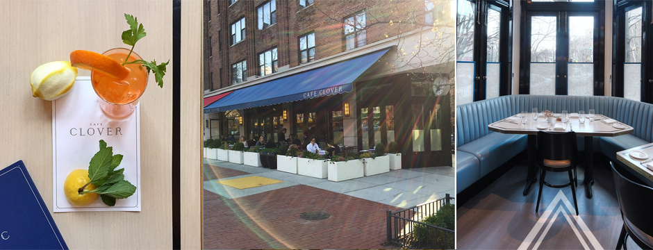
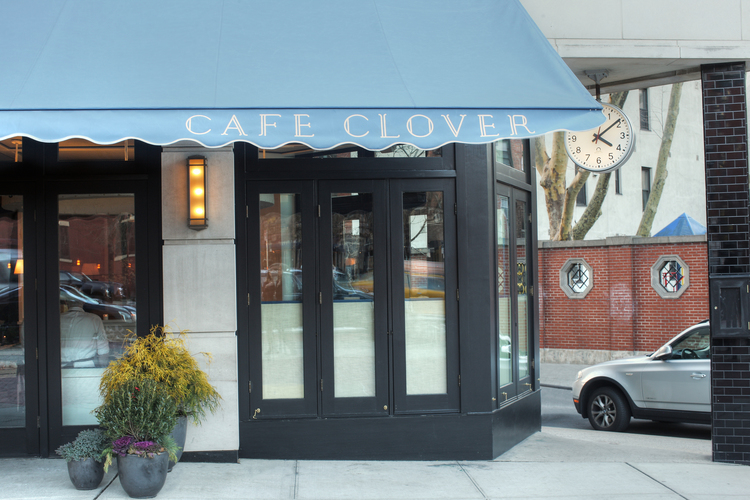
I recently took my team to lunch at Cafe Clover, a quaint restaurant in West Village, to see Steven Gambrel’s design and enjoy some down time and good food.

I have always been a big fan of designer and creative genius Steven Gambrel.  I recently took my team to lunch at Cafe Clover, a quaint restaurant in West Village, to see Gambrel’s design in person and enjoy some down time and good food.

Cafe Clover 2

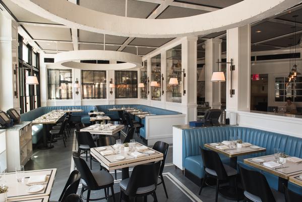
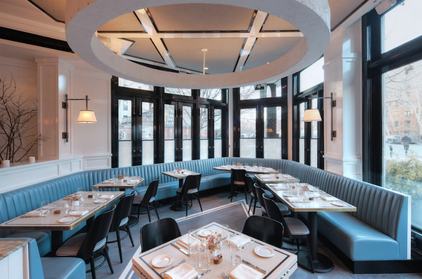
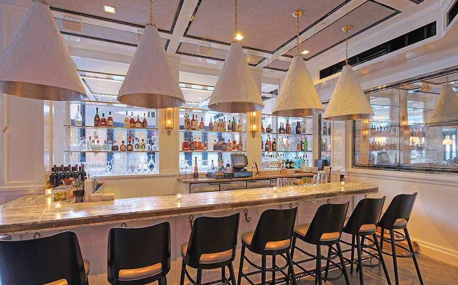
The interior blend of robins egg blue, iconic black, greige and white encompass the space with fabulous lighting fixtures throughout.  The walls look amazing, featuring custom millwork inset with smokey antique mirrors with eglomise bordered detail.  The curved upholstered banquette has a rolled detail at the back rest.  There’s an echo of the bordered concept on the table tops which is also reflected in the ceiling.   I love the play on geometric shapes – rectangular, square, and even circular in the oversized ceiling sculpture.  Check out how the stunning bar!

Cafe Clover 1Cafe Clover 3

Cafe Clover 4Cafe Clover 5

From our table, we had a perfect view of the entire space.  All of the doors and windows were open, making this great connection between the inside and out.

It’s nice to explore and appreciate places right in your own back yard.  I’m so drawn to the idea of learning from interesting design and being inspired by what I see.  What beautiful places are near your home?

Serendipity Design Market Digest

Each year, Serendipity magazine creates a special Design Market Digest to showcase the latest styles in textiles, products and interiors in the Westchester County area.

Each year, Serendipity magazine creates a special Design Market Digest to showcase the latest styles in textiles, products and interiors in the Westchester County area.  I was happy to submit a Q&A for this featured issue and am pleased to be able to share it below.  You can see the original piece in the recent Serendipity Design Market Digest, along with many other great products, projects, and designers.

SerendipityAmy Aidinis Hirsch

For over a decade, Amy Aidinis Hirsch has been designing elegantly crafted interiors.  Each design begins with a deep understanding of architecture and the history of each site and the ability to listen and understand a client’s needs.  The resulting interiors are always sophisticated and original, and have been featured in magazines including House Beautiful, At Home, and New England Home.

What inspired you to become a designer?Serendipty 2

My father works on high-end residential homes as a plumbing and heating contractor.  As a young girl, I was fortunate to always see the floor plans and walk through impressive and large caliber homes designed by great designers such as Tony Ingrao, Thierry Despont, and David Easton.  At the time they were under construction, but you could see the craftsmanship, reclaimed materials and history within the spaces.  I fell in love immediately with the thought of collaborating and building something from the ground up.

What influences your designs the most?

Fashion is a huge influence.  I love looking ahead at the color forecast an dhow pieces are tailored, and I appreciate the intricate attention to detail in couture pieces.  I love the idea of curating collections.

What’s your design process like?

Honestly, I am a tornado.  I try to bring in as much product as possible — carpets, fabrics, tiles, etc. — that I feel is appropriate for a project and then I begin to edit.  I have to make sure I explore every possible element.  I am constantly hunting, sourcing and reading to find out what is in the industry.

Any particular places you turn for inspiration?

The beach — it’s a safe heaven and peaceful.  It recharges my energy and spirit and allows me to focus on what I am trying to create.
Do you have a design icon?

David Collins, S. R. Gambrel, Jean Louis Denoit, and David Kleinberg — gifted architects and designers who exemplify impeccable taste.

What colors do you love now?

Sultry, saturated colors that have depth and are rich in pigment, like persimmon, ink, plum.  I am interested in integrating unusual colors together in a way that is unexpected and out of the ordinary.

What are three key pieces that every home should have?

Pillows, books, and artwork.

What are your top three design rules?

I honestly do not have rules.  Rules can get tricky and establish a barrier.  As a designer, my best tool is to listen to our clients’ needs and particulars.

What one thing do you always keep in mind?

Scale/proportion:  It’s essential when making selections and pairing furnishings together.


What Inspires Me: Feathers

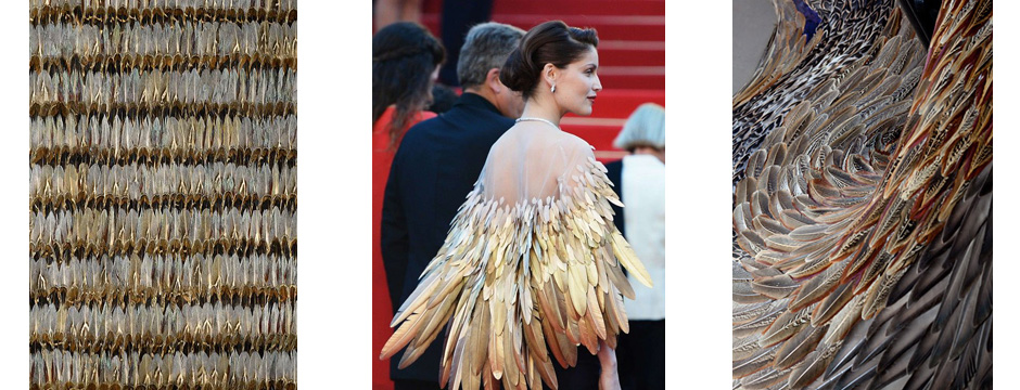
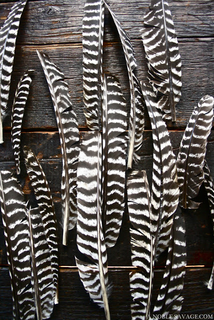
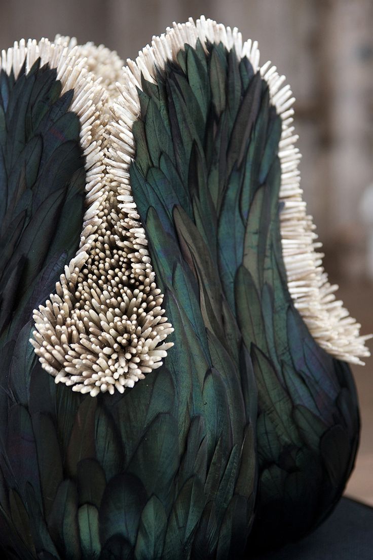
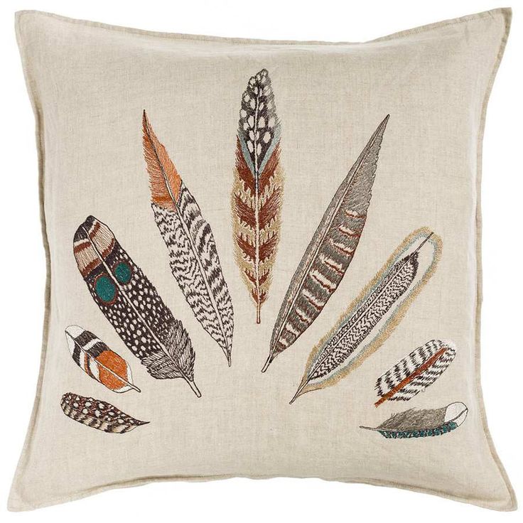
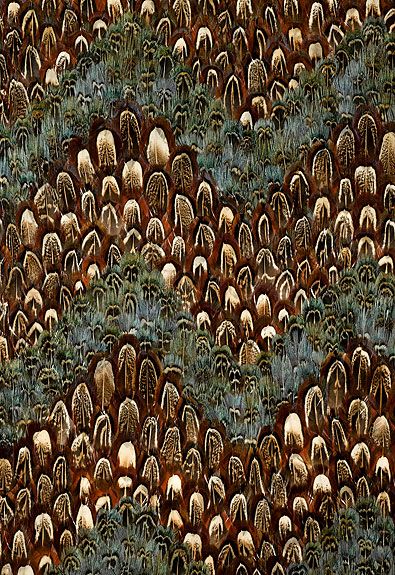
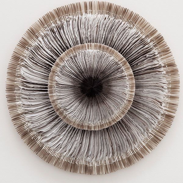
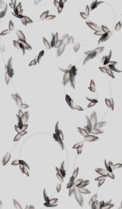
I love the look of feathers, especially how intricate and saturated the colors can be.

I love the look of feathers, especially how intricate and saturated the colors can be.  You get such a sultry, silky feel with feathers.  When I think of feathers, I think layers, texture, and tonality.

FeathersFeathers 10Feathers 3Imagine how thrilled I was when a client who is building a home in Montana brought up the idea of incorporating feathers into her interior!  Sometimes it’s funny the way things come full circle.

Feathers can be present in small doses as an accent, such as a lampshade.  It would make a dynamite back wall for a bookcase, or in a piece of art.

Feathers 5Feathers 4Feathers 6Feathers 7Feathers 9

Method Monday

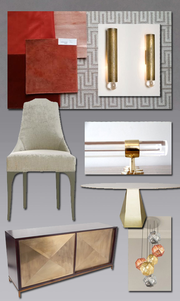
This design scheme came about while I was working with an existing client, brainstorming ideas for their dining room.

This design scheme came about while I was working with an existing client, brainstorming ideas for their dining room.  I wanted to do something glamorous.  The adjacent family room and kitchen included a lot of yellow, so for the dining room I decided to insert some brass for a touch of glimmer.  The room is somewhat small and intimate, so I wanted to smother it in saffron.  I thought of silk walls, saturated drapes, and a pure gradation of the same tone.  The light fixture is something I really fell in love with.  Because the plan for the walls and window treatments is monochromatic, the rug provides contrast.  The resulting scheme has a depth of color reminiscent of summer and happiness.

Amy Aidinis Hirsch Interior Design