At Home Magazine: Take a Seat

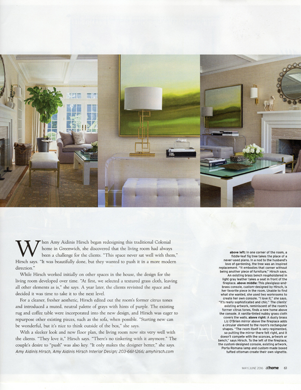
I’m so happy to be part of a feature in At Home Magazine called Room Service: Take a Seat.

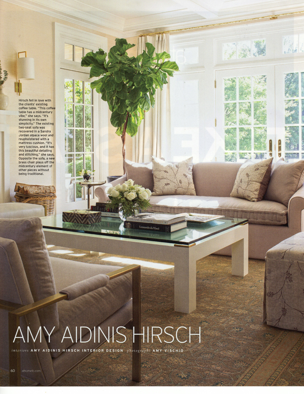
I’m so happy to be part of a feature in At Home Magazine called Room Service: Take a Seat.  The feature demonstrates how five designers approach living room design in ways to perfectly suit their clients.  My featured living room design is for a Colonial in Greenwich.  The client wanted to give the room a modern feel, keeping some existing elements while adding new items and changing the color palette.  To read more about this project and to see how other designers work their living room designs, pick up the May/June 2016 issue of At Home in Fairfield County!

Amy Aidinis Hirsch 2Amy Aidinis Hirsch 3Amy Aidinis Hirsch 4

Library Design: Before and After

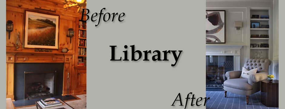
This particular library design, part of a whole-house remodel, involved a dramatic transformation that completely changed the mood and feel of the space.

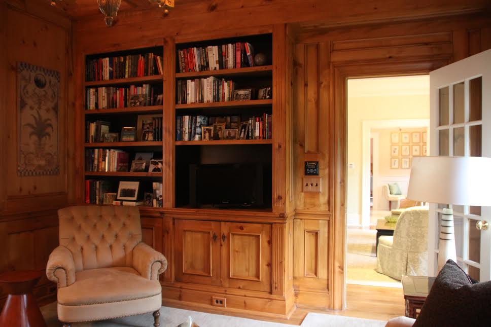
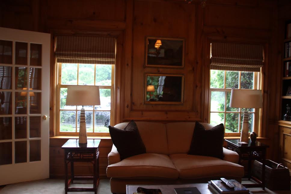
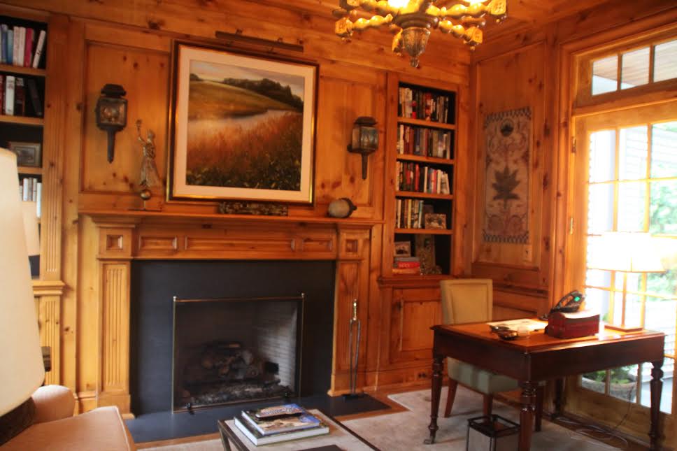
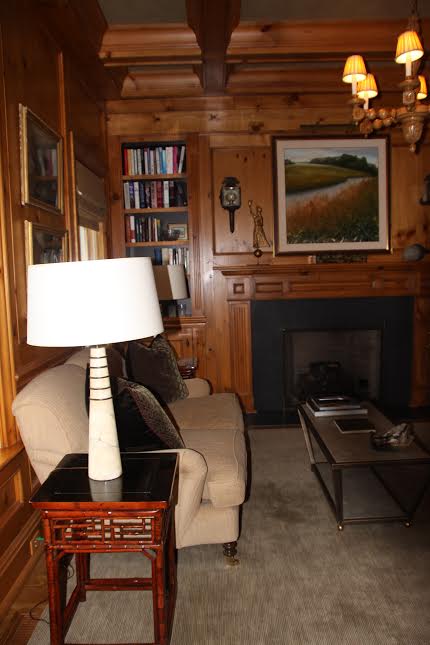
The journey of a project from start to finish always fascinates me.  This particular library design, part of a whole-house remodel, involved a dramatic transformation that completely changed the mood and feel of the space.  The library originally had knotty pine ceilings and walls that darkened the room and detracted from some of the more desirable features, such as the built in shelves and the fireplace.  Here’s what the library originally looked like:

library 1library 2library 3library 4

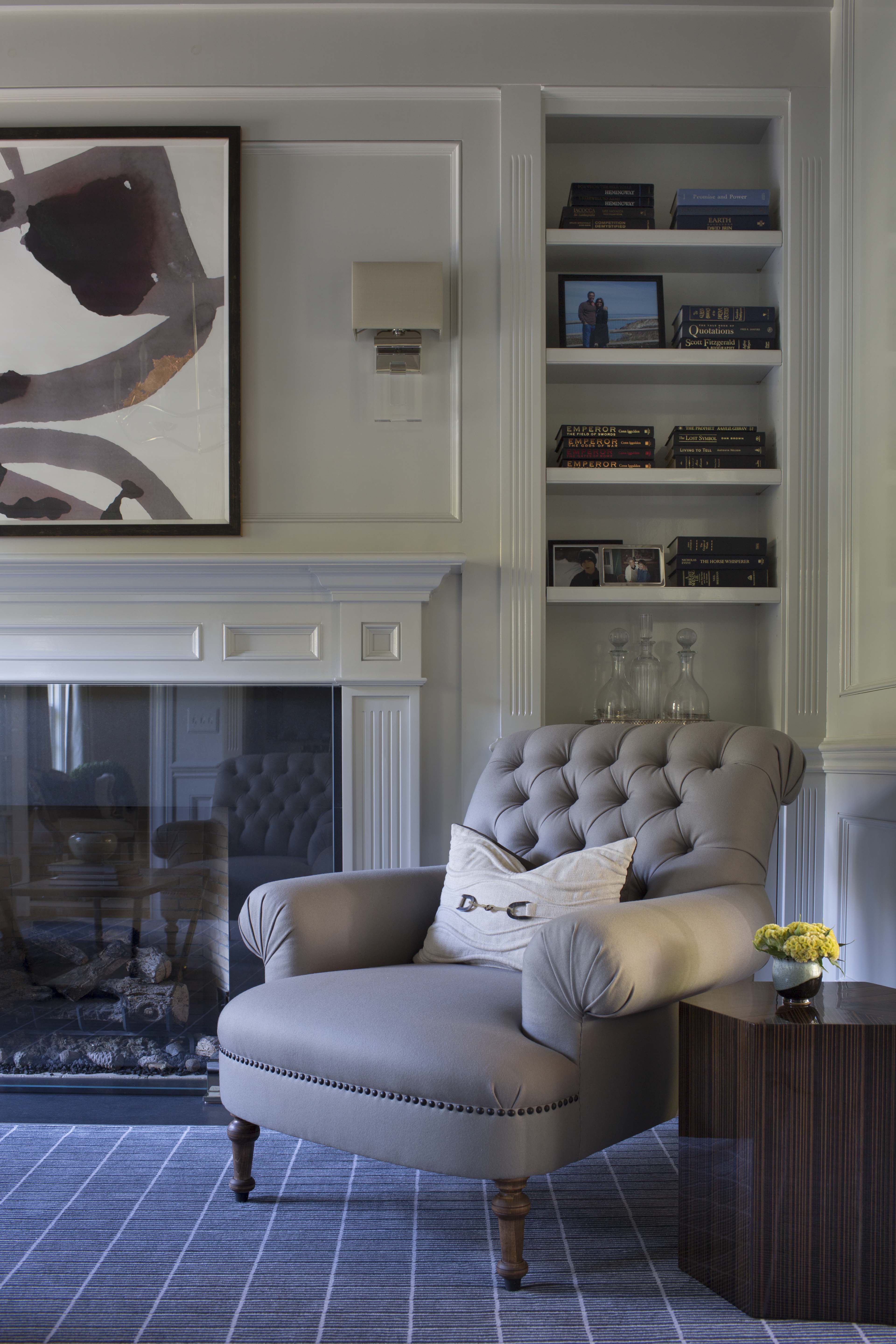
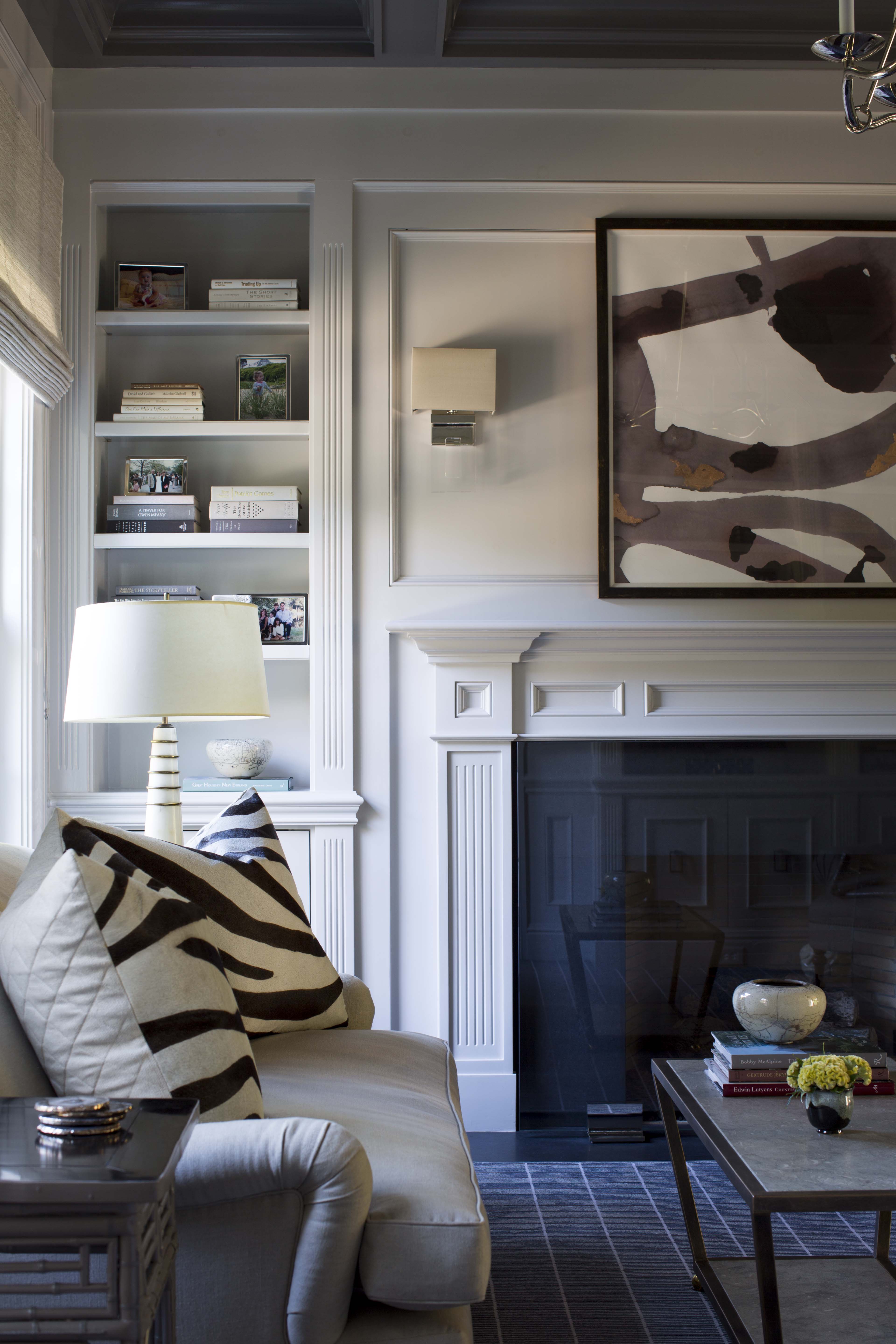
We lightened up the library by painting the walls a light grey.  We chose a custom medium charcoal grey lacquer for the ceiling, reupholstered the furniture, and updated the lighting.  For the floor, we chose a rug with an all over pattern that mirrors the hue of the ceiling.  Complimentary artwork and carefully edited accessories round out the finished library.

Hirsch_Lismore9947Hirsch_Lismore9946Greenwich CT Amy Aidinis Hirsch Interior DesignThis project is a great example of how a room doesn’t need a complete remodel to achieve a new look!


Splatter

I had an idea for a Pollack-like, splatter look for a client’s wall that was inspired by some very cool splatter designs I’d been seeing.

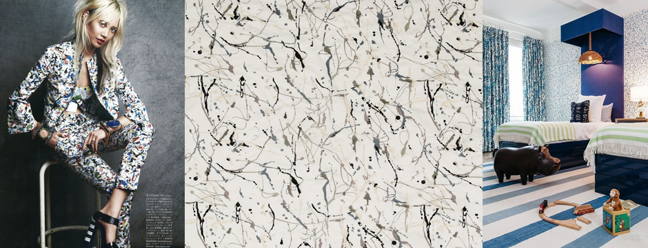
I’m often fascinated by what comes up during the course of a project.  I had an idea for a Pollack-like, splatter look for a client’s wall that was inspired by some very cool splatter designs I’d been seeing.  I like how the splatter can be condensed or  loose.

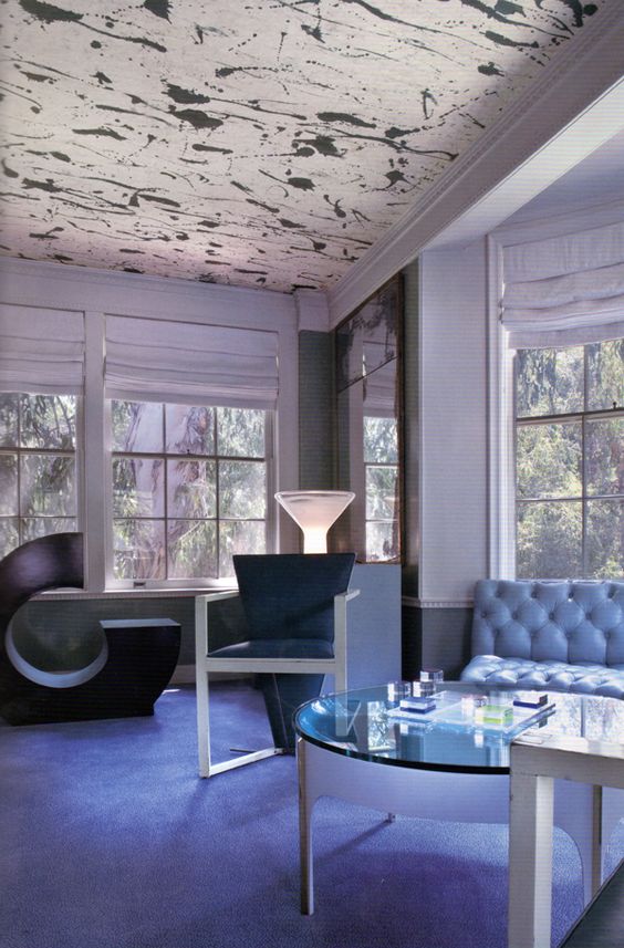
Splatter ceiling.  Design by Kelly Wearstler.
Splatter ceiling. Design by Kelly Wearstler.
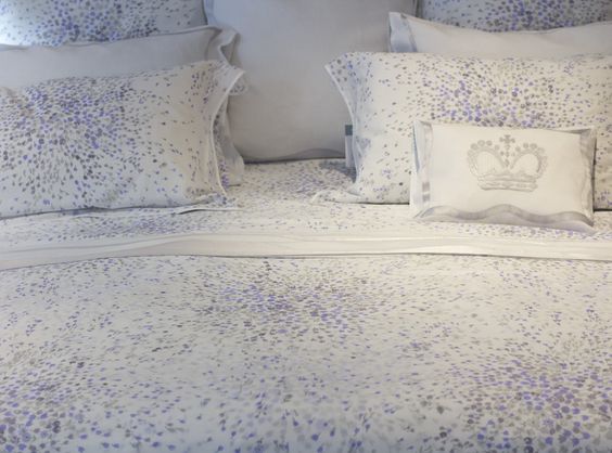
Splatter bedding from D. Porthault.
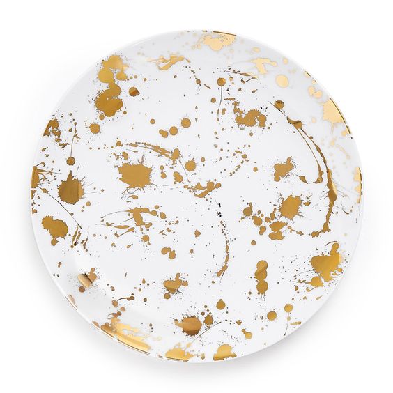
Jonathan Adler dinner plate.

When coming up with a splatter design for my client, I worked with an artist to develop not only the look I wanted, but the correct consistency of paint.  The key was to use a paint that would splatter on the wall, but not drip.  It took some trial and error to concoct just the right mixture.

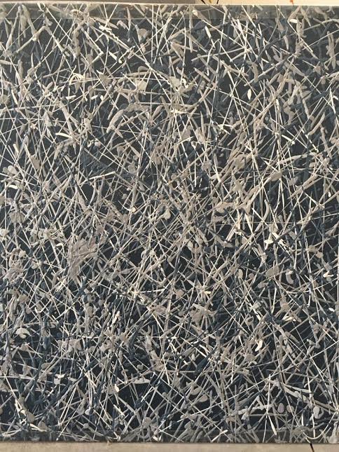
One of the splatter sample panels I designed.
Another, looser, splatter panel I showed my client.

Even though the client chose not proceed, it is all about the process and the journey. Working with the artisan to understand the process and the selection of the correct color palette to make the masterpiece come together was a great experience.  It’s also fun looking forward to the moment of being inspired by that client who opens the door for exploration into something unique.

Hotel Murmuri, Barcelona

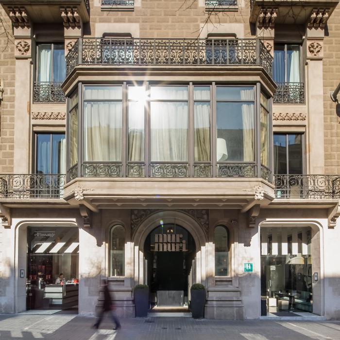
Known for art, food, history, and shopping, Barcelona is definitely on my list of must-see places. There’s a hotel I’d love to stay in — Hotel Murmuri.

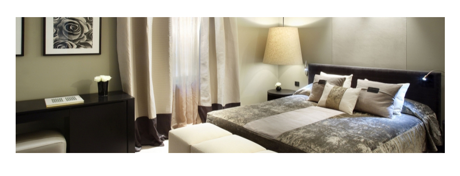
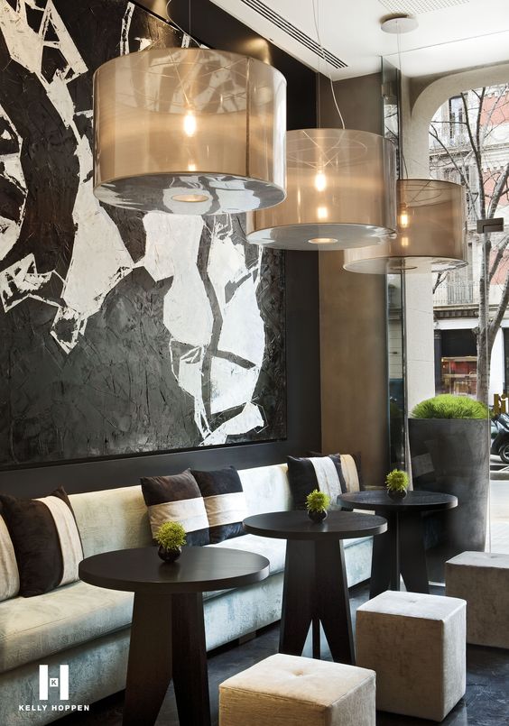
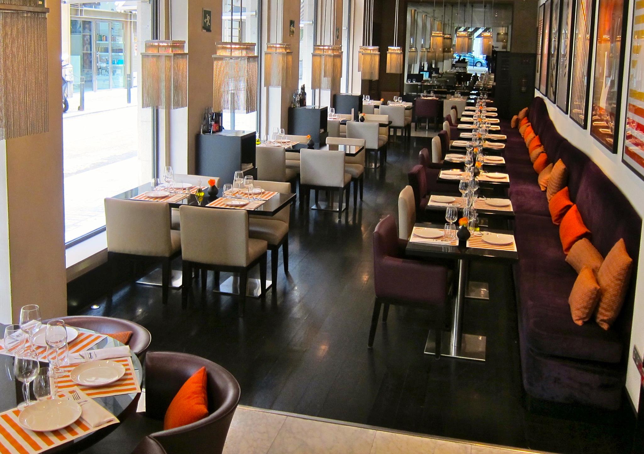
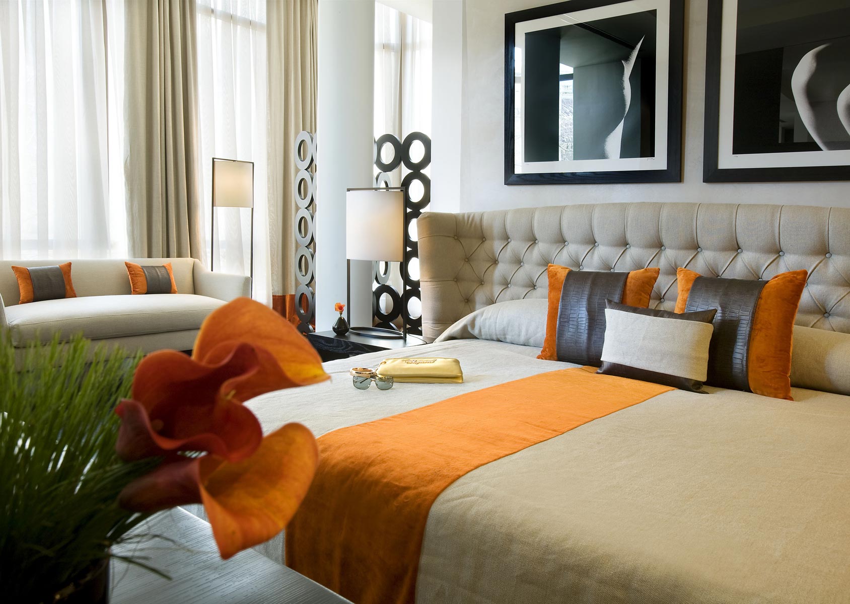
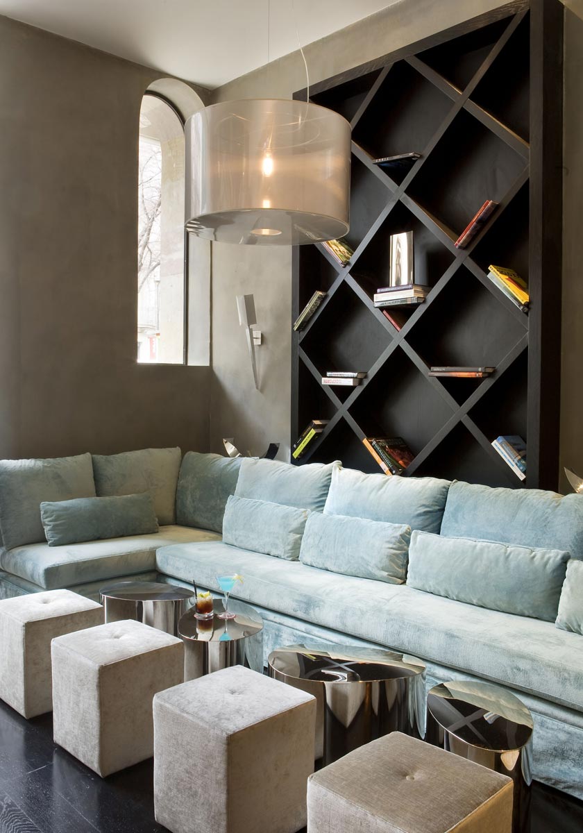
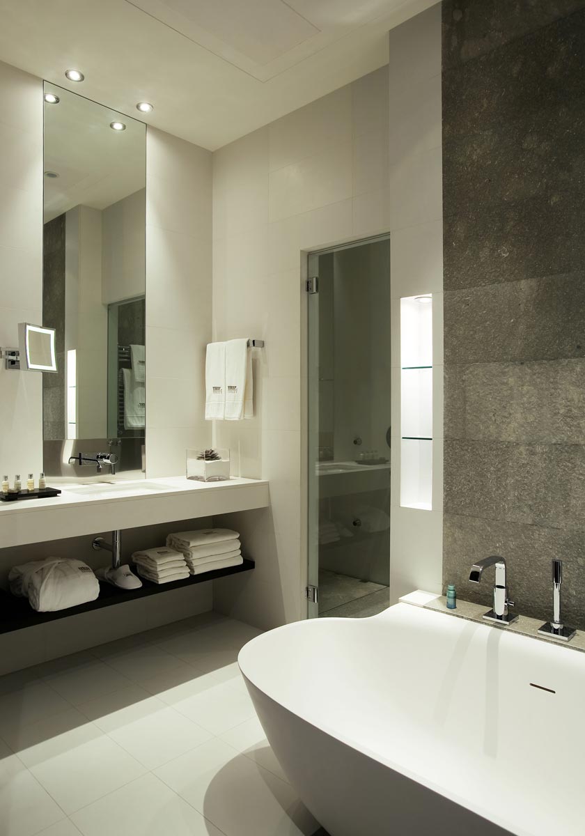
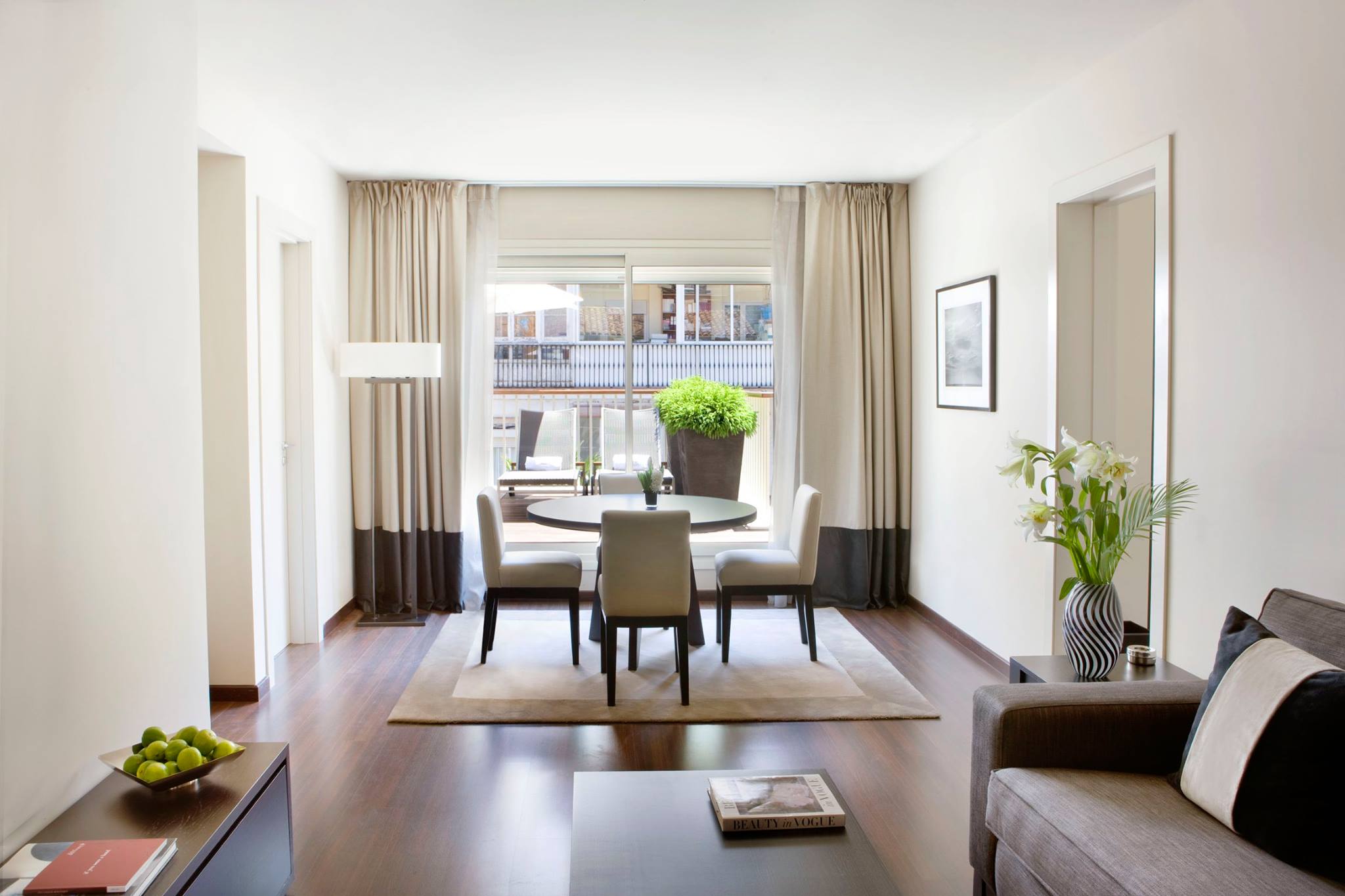
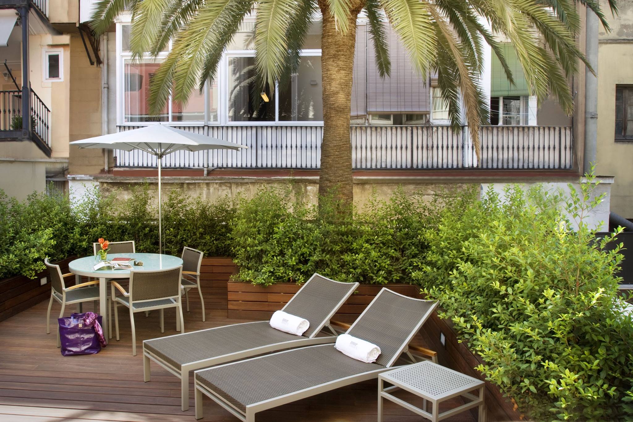
Known for art, food, history, and shopping, Barcelona is definitely on my list of must-see places.  There’s a hotel I’d love to stay in — Hotel Murmuri.  It’s a posh, boutique hotel with an intimate feel.  There are such incredible details throughout the design, from the rooms to the restaurant and bar.

Hotel-Murmuri-Barcelona-0hotel murmuri barcelona 6hotel murmuri barcelona 8hotel murmuri barcelona barhotel murmuri barcelona 2

Hotel Murmuri’s interior was designed by the London-based firm of Kelly Hoppen Interiors.  Known for her clean lines, neutral tones, use of texture, and warm opulence, Kelly created a look for Hotel Mururi that is both chic and comfortable.  These are rooms you can feel luxurious in, all while surrounded by everything Barcelona has to offer.  One of Kelly’s design goals is to have her clients surrounded by gorgeous pieces.  I can easily imagine sitting in one of these rooms and feeling cocooned in luxury.

murmuri hotel barcelona kelly hoppenhotel murmuri kelly hoppenhotel murmuri barcelona 4hotel murmuri barcelona kelly hoppenhotel murmuri barcelona 7hotel murmuri barcelona 3hotel murmuri barcelona 5For more information about Murmuri, visit their website.  You can also find them on Facebook.


Serendipity Feature & Design Market Honoree

I’m so pleased to have an entryway I designed featured in the April 2016 issue of Serendipity Magazine!

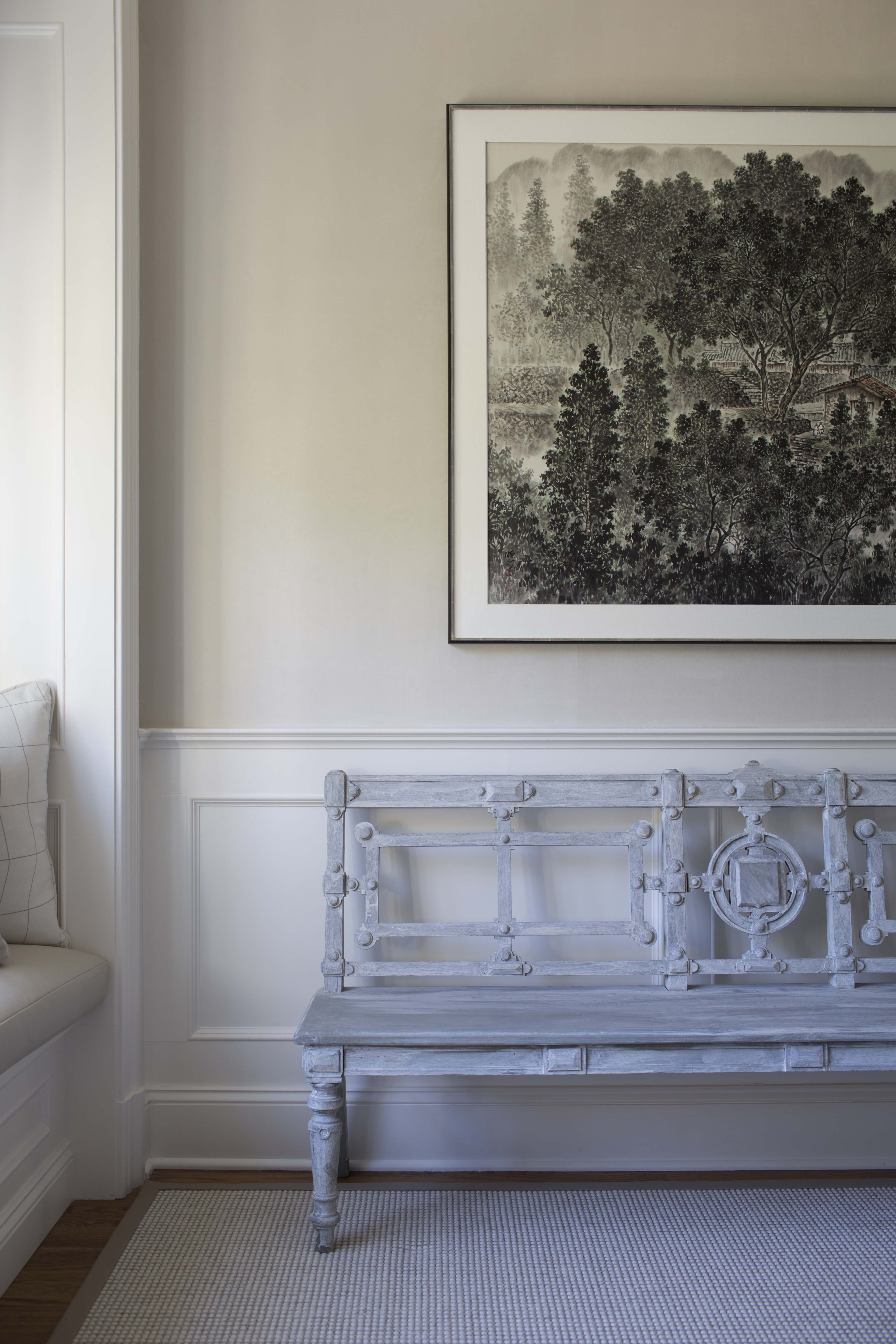
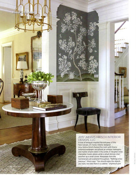
I’m so pleased to have an entryway I designed featured in the April 2016 issue of Serendipity Magazine!  This entry was designed for a home in New Canaan, CT, and was inspired by the client’s love of antiques.

Amy Aidinis Hirsch Interior Design LLC 2Also in this issue is an invitation to a cocktail reception celebrating the 4th annual Serendipity 2016 Design Market Digest.  This May 11 event will take place from 6:30 to 8:30 P.M. and will feature industry experts, including two Market Honorees.  I am very happy to be one of this year’s Honorees along with architect Douglas VanderHorn.  The cocktail reception will be held at Lillian August in Greenwich.  You can RSVP to events@ungerpublishing.com.  I hope to see many of you there!

Amy Aidinis Hirsch Interior Design LLC 3

Kitchen Organization

The key to a great looking kitchen is organization.

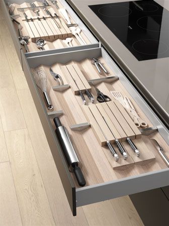
The key to a great looking kitchen is organization.  In order to have uncluttered counters and tabletops, your storage solutions must be smart, suited your lifestyle, and designed to avoid wasting space.
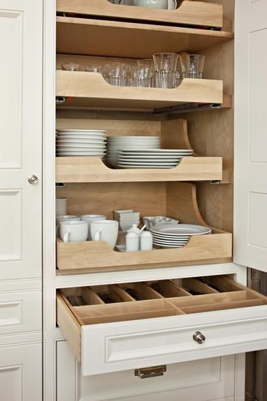
kitchen storage

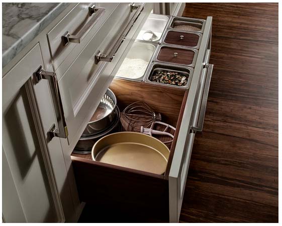
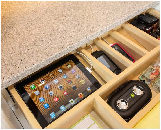
A kitchen takes about 12 to 14 weeks to build.  It’s important to consider how the space will be used so the design includes strategic storage solutions.  Think about where you cook, how you clean, and where you can store specific items.  How close to the range do you want spices, oils, and utensils?  Which kitchen items do you need close at hand, and which do you only use rarely?  When designing a kitchen, I look for storage and organization solutions that work for each client’s needs.
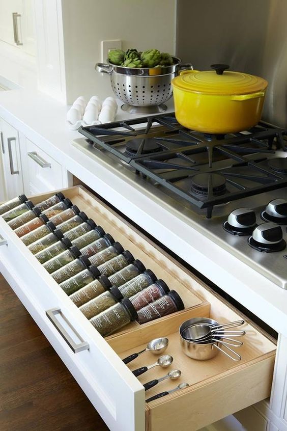
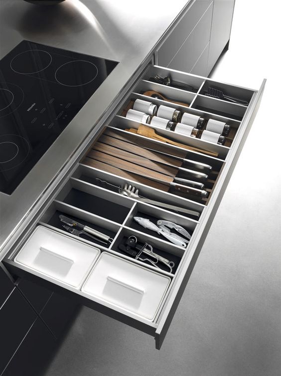
spice storagebulthaup

Part of designing a kitchen involves editing out superfluous items.  It’s more difficult to be organized if you have too much of everything.  Do you need five wine openers?  Focus on the basics, not on overabundance.  I also plan for the client’s storage needs in terms of dinnerware.  Today’s plates are big, sometimes 12 or 13 inches in diameter.  Typical kitchen cabinets may not work for oversize dishes, so I find a 14 inch clearance is ideal.  I also love it when the insides of cabinets and drawers are finished.  They should look beautiful when you open them!
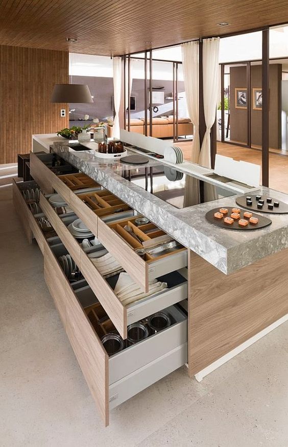
porcelanosabulthaup drawer system

If you plan to renovate your kitchen or are building a home, think beyond the surface beauty of kitchen design and explore organization solutions that will allow you to truly enjoy the space.  Think about how you use your kitchen — are you a baker, an entertainer, an accomplished home chef?  Thoughtful design is essential!
hobson woodworks incheartwood kitchens baking drawer