Tag: kitchen
Favorite Kitchens
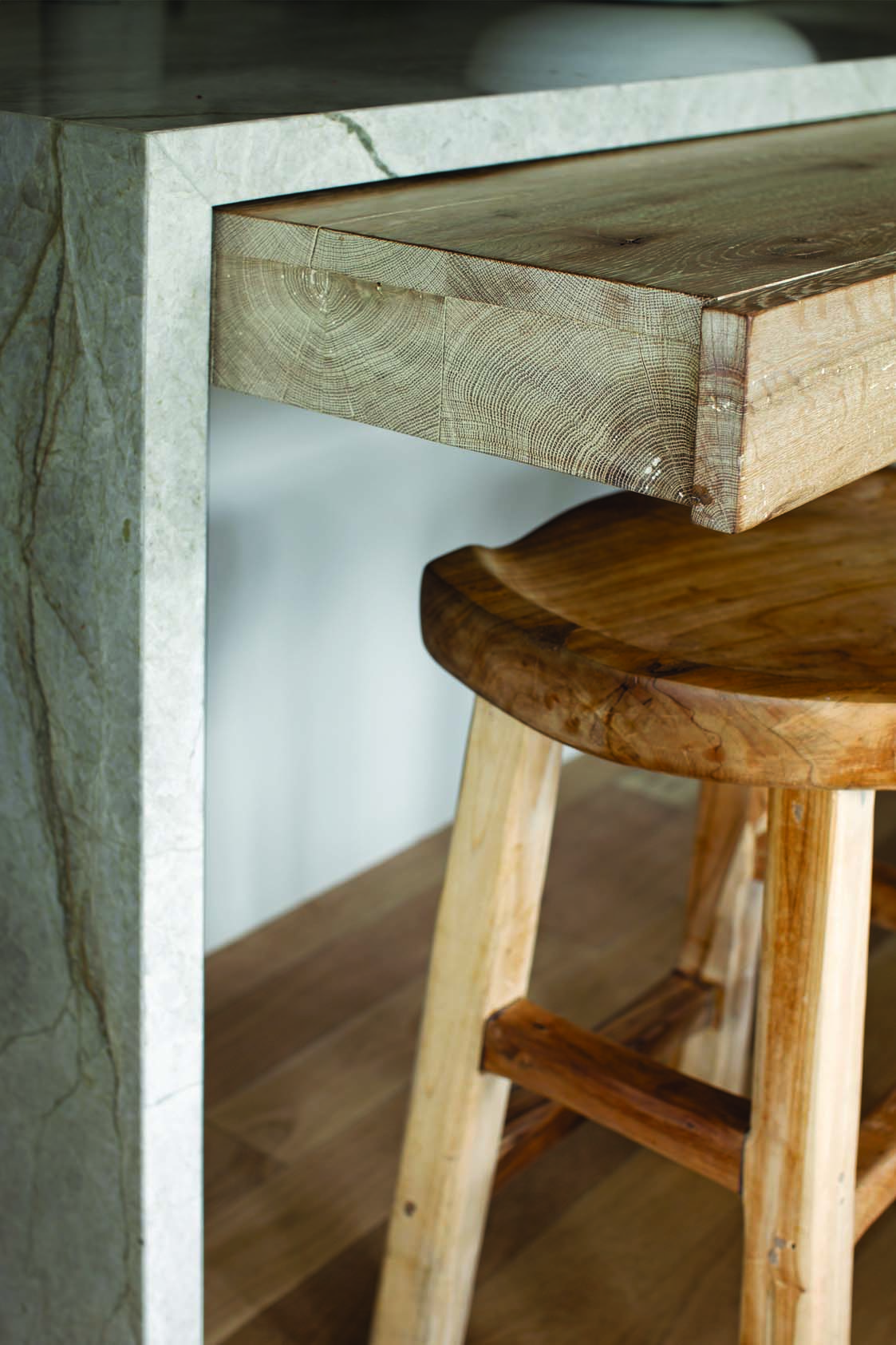
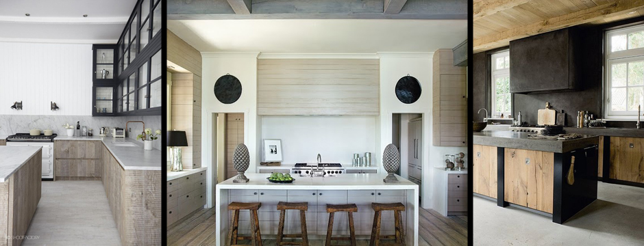
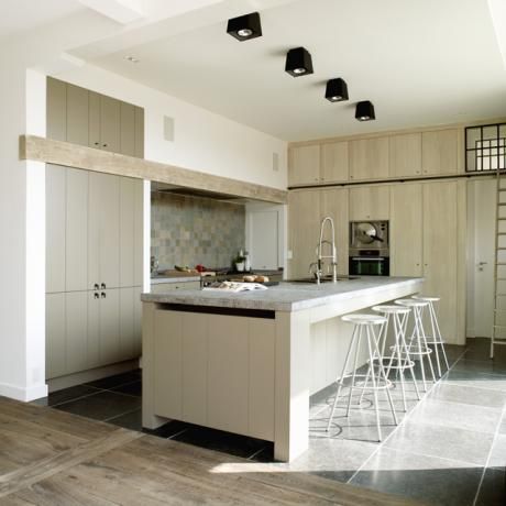
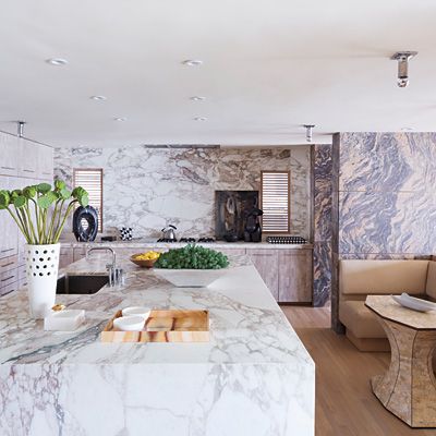
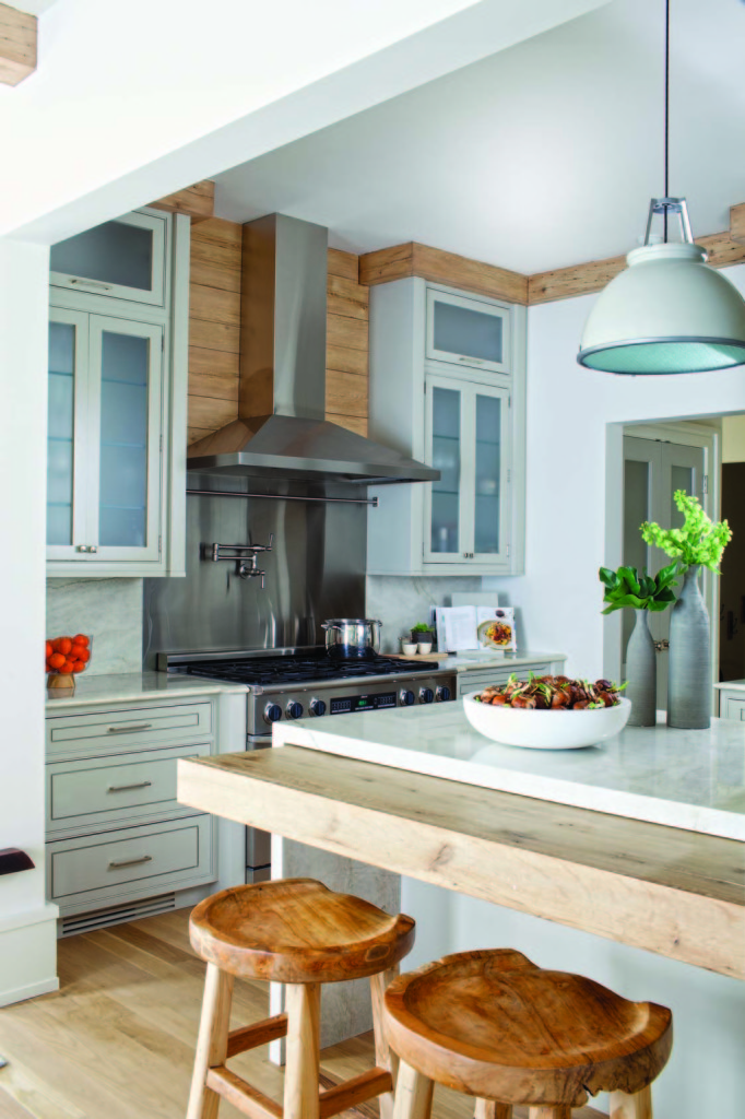
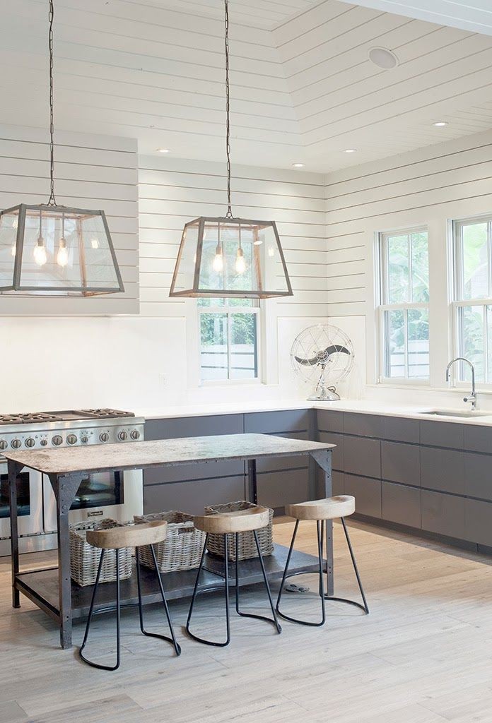
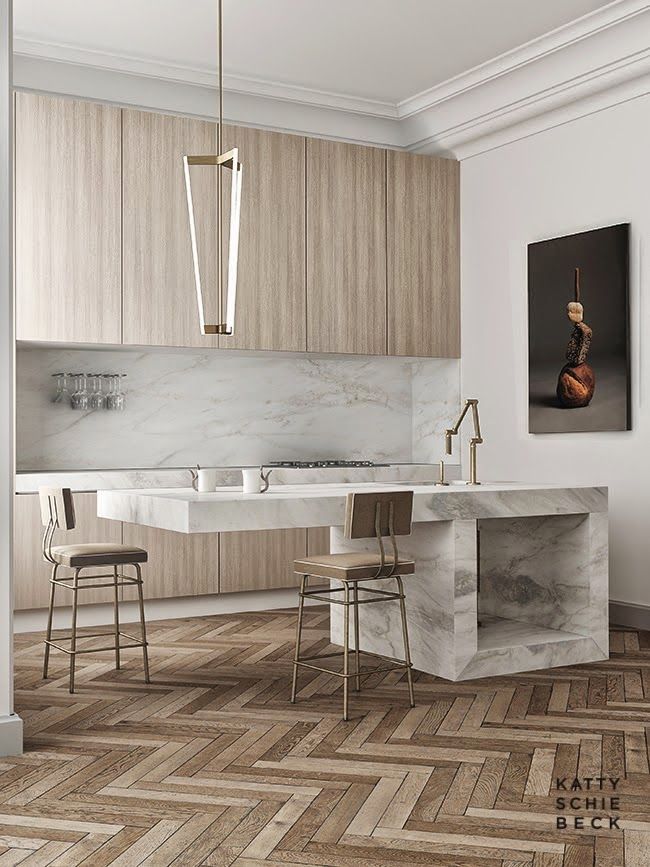
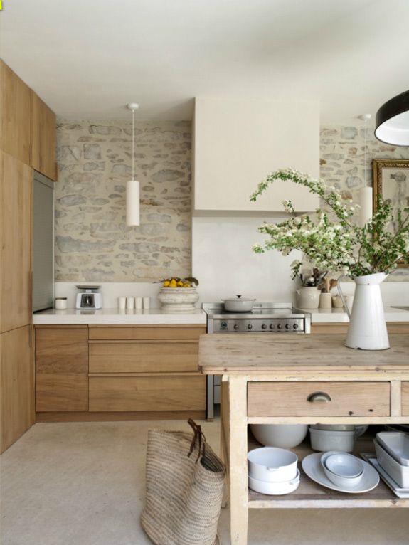
I really like kitchens that have a modern edge with a rustic vibe.
The kitchen is, for a lot of people, the core of the house. It’s a place where families tend to gather, so it must be welcoming and comfortable. On the other hand, a kitchen also serves an important function and must meet a family’s needs for cooking and entertaining. Finding a balance between style and livability means making thoughtful choices for flooring, fabrics, and wall treatments, making the space easy to clean and maintain according to the family’s lifestyle.
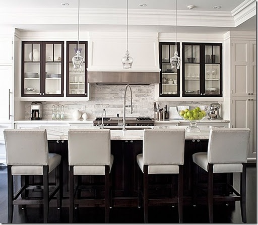
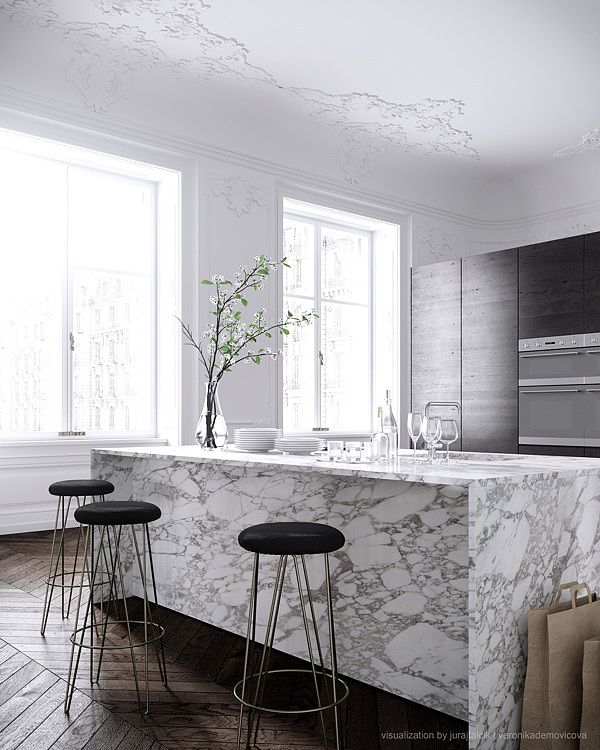
No matter how big or small the kitchen is, it has to contain certain elements. When planning a kitchen, you need to take those necessary elements and figure out how to achieve that ideal balance of function and aesthetics. You have to be mindful of how heavily the kitchen will be used and the best placement of each item. There are a lot of factors to be aware of, from comfort to organization. Right now we’re seeing a trend toward modern, simplistic kitchens with very clean lines. Counters often have mitered edges and we see big, expansive spaces. The cabinetry tends to be simpler, without a lot of details, molding, or hardware. When you remove something, like storage, you have to also incorporate a new solution in order to maintain the kitchen’s functionality.
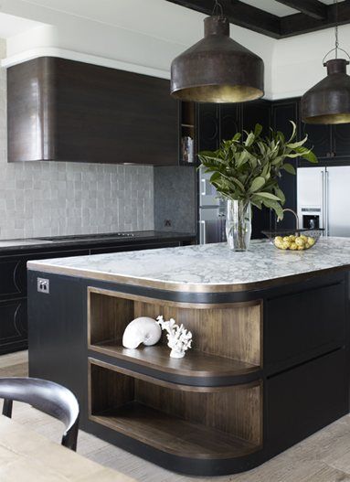
I really like kitchens that have a modern edge with a rustic vibe. Stripping elements down to a simpler form while maintaining comfort and practicality is an art form I truly appreciate.
Waterworks Kitchen
Almost every element of the kitchen is part of the Waterworks Kitchen line, creating a complete design experience.
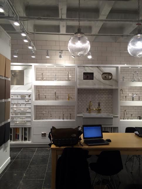
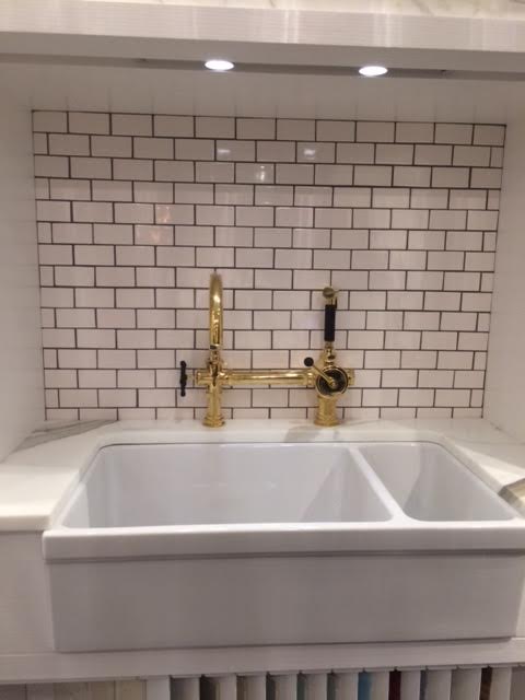
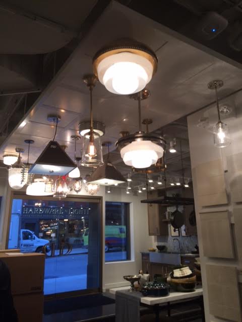
I was in NYC recently for an appointment, rushing because I was late. I stopped short when I saw a new Waterworks storefront with a beautiful vignette and just had to go inside even though I was running late. This Waterworks show room is not massive in scale, but what they fit in was so impressive. The line includes everything from sinks and fittings to cabinets and work tables. Everything has been designed with an eye toward both form and function, using the finest materials.
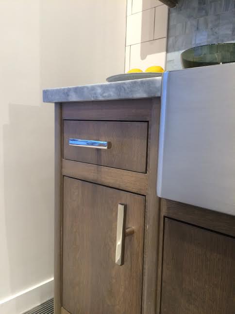
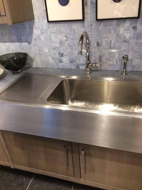
Almost every element of the kitchen is part of the Waterworks Kitchen line, creating a complete design experience. I saw simple lines and super approachable products that a wide range of people will gravitate toward. The cabinets are simple but come in sultry, interesting colors with smokier tones, not your typical white kitchen. I find the way they displayed kitchen sinks so interesting, showcasing vast array of ways to use them. One sink I loved was immense at 54 in long with two drying boards set underneath — so clever and really inventive.
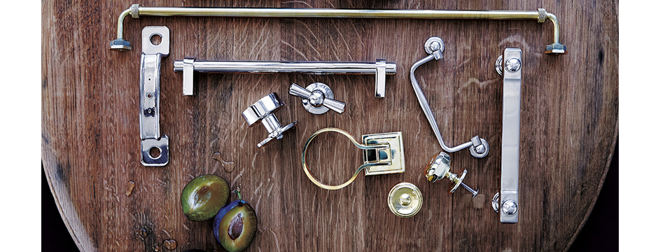
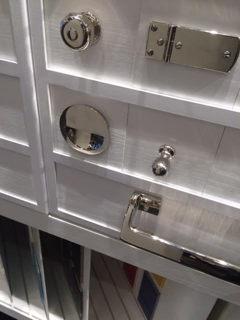
Waterworks has expanded plumbing fixtures to the point where they have a grand scale and such a presence. The new lines are not typical and show an insightful reinvention of fixtures and other kitchen elements. Waterworks has turned a product that was already great into something really thoughtful. This is such beautiful hardware. I really appreciate how they’ve taken an element we all believe in at its simplest form and developed on it. Today’s clients don’t want a lot of hardware in a modern setting, which is why the Waterworks recessed options are so smart. The light fixtures are also quite modern and appealing with an industrial vibe, definitely something for everyone.
I walked out wanting to design whole Waterworks kitchen with all of the accoutrements that go with it. The Waterworks showroom is so well presented, it makes it easy for a client to envision their own kitchen design, and that in itself is a success.
Design Dose
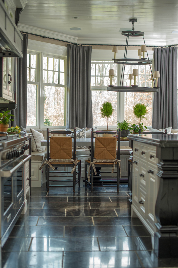
A welcoming kitchen.
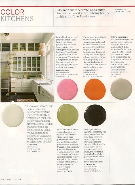
Kitchen Color in House Beautiful Magazine
Various designers, including myself, share favorite kitchen paint colors and describe why we love those colors.
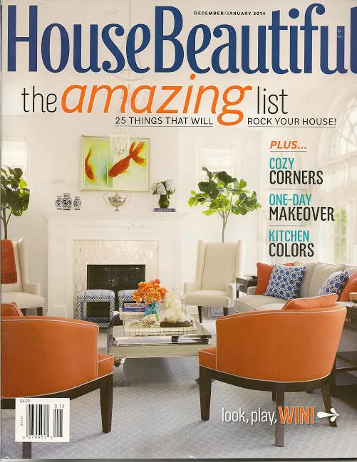
The December/January 2014 issue of House Beautiful contains a great article called Kitchen Color. Various designers, including myself, share favorite kitchen paint colors and describe why we love those colors. It’s a great way to remind yourself that the kitchen can be an expression creativity and doesn’t need be be limited to a typical palette.
Design Dose
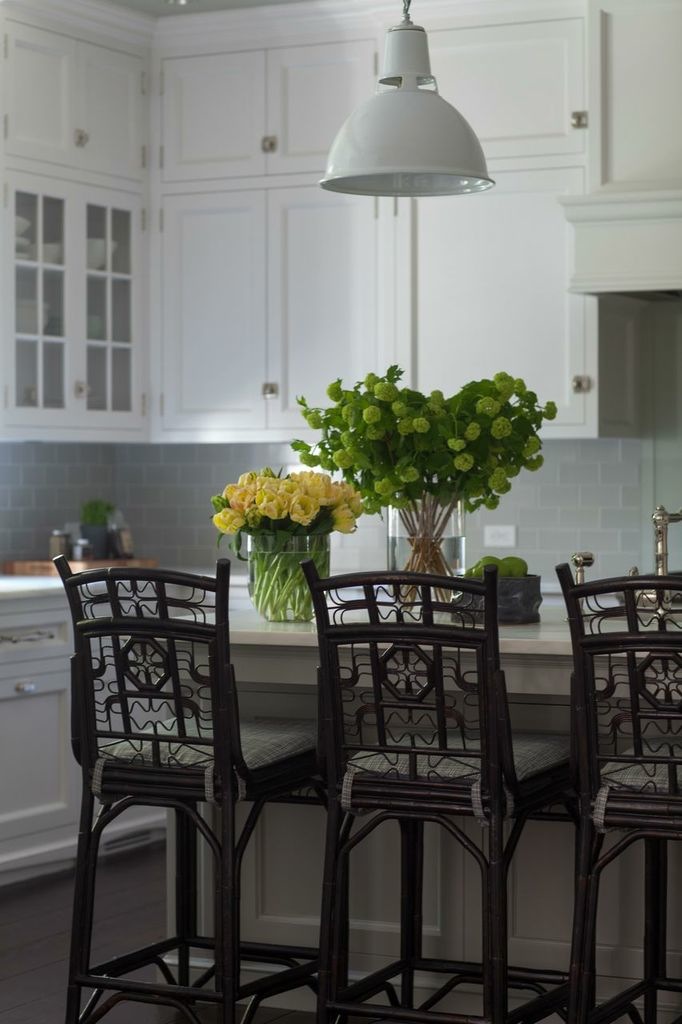
Spice up the kitchen with some whimsical chairs!
The Butler’s Pantry
You have a great opportunity to create a whimsical, playful space with a butler’s pantry.
Traditionally, a butler’s pantry served an essential function in large, wealthy, European estate homes. In these homes, the butler’s pantry was the domain of the home’s butler, who used this area as both an office and a place to store and inventory valuable silver and china. In this space, the butler would keep track of household matters, oversee staff, and carry out his many responsibilities. In fact, the butler’s pantry was so crucial to the running of the household that the butler often slept there.
A modern butler’s pantry serves a similar purpose, giving the home additional storage space and staging area. It’s a nice alternative to storing china and serving pieces in a large hutch, allowing you to minimize furniture in the dining room and free up space in the kitchen. It can act as an extension of the kitchen, providing more counter space for prep and clean up when entertaining. The butler’s pantry is also a good place for a wine cellar, giving you ease of access whether you choose to install a small wine refrigerator or something more extensive. When entertaining, it’s nice to not have to go far to select a bottle of wine.

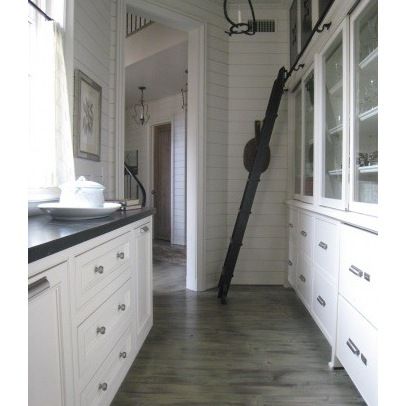
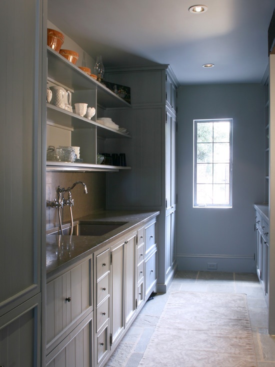
The butler’s pantry doesn’t have to be strictly utilitarian. You have a great opportunity to create a whimsical, playful space. Consider taking risks with this smaller, less public part of the kitchen by using different materials. Elements such as tiles, stone, and colors don’t have to match the rest of the kitchen. The butler’s pantry can be a jewel box of a room!
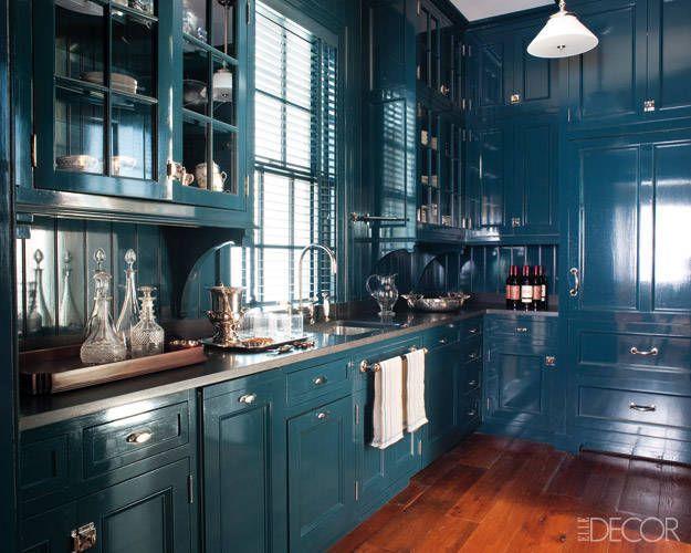
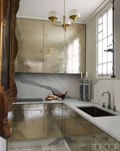
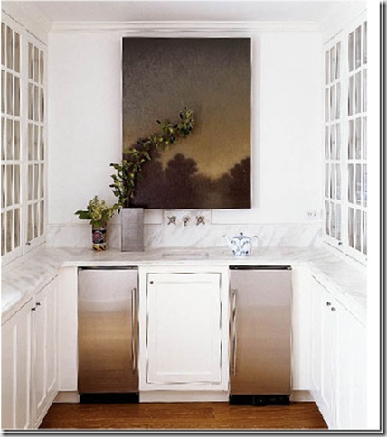
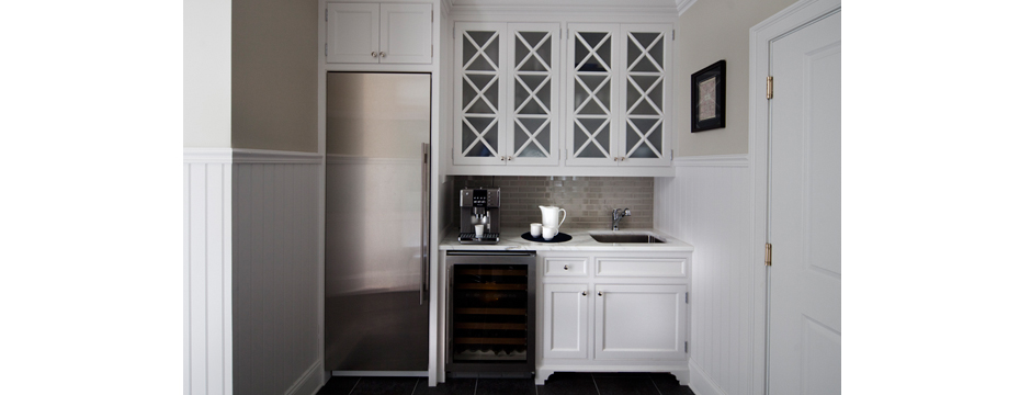
Lastly, I’d like to share images of butler’s pantries I’ve designed for my own clients. There’s something so appealing about taking a traditional, functional space like this and incorporating it into a modern home. The goal is to keep the feel and usefulness of the room but make it relevant to the homeowner’s lifestyle.
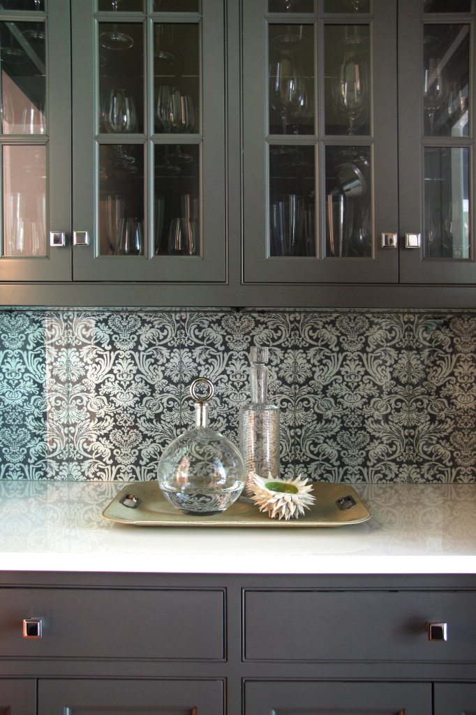
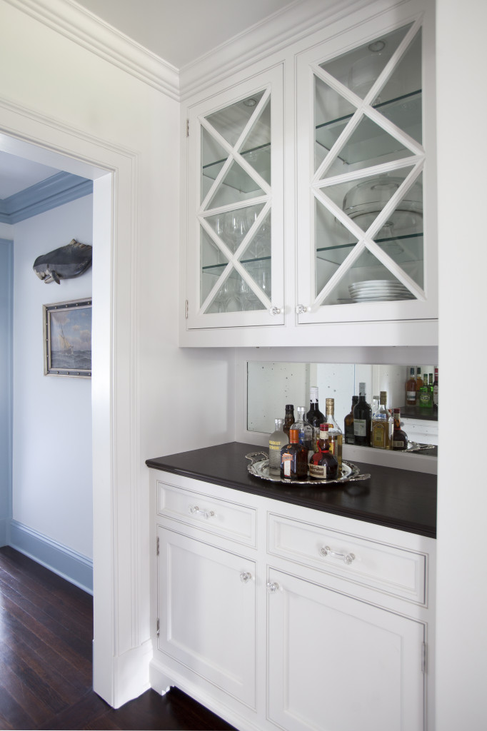
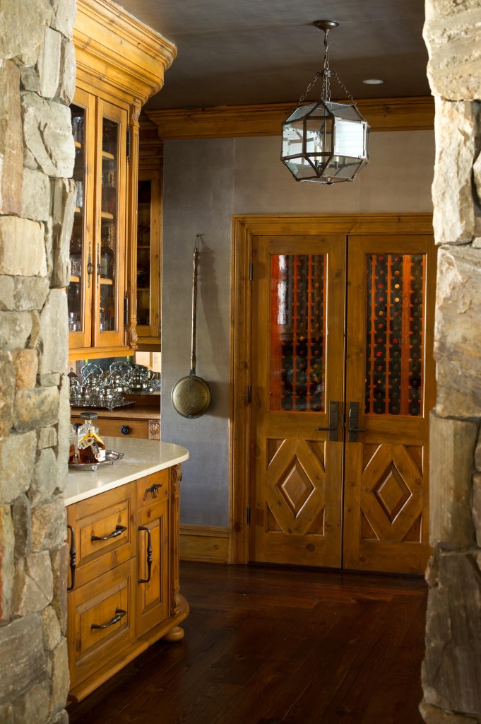
What would your ideal butler’s pantry look like?
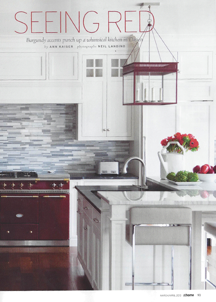
Seeing Red: Kitchen Feature in At Home Magazine
The current issue of At Home in Fairfield County features a kitchen I designed for a client in Darien.
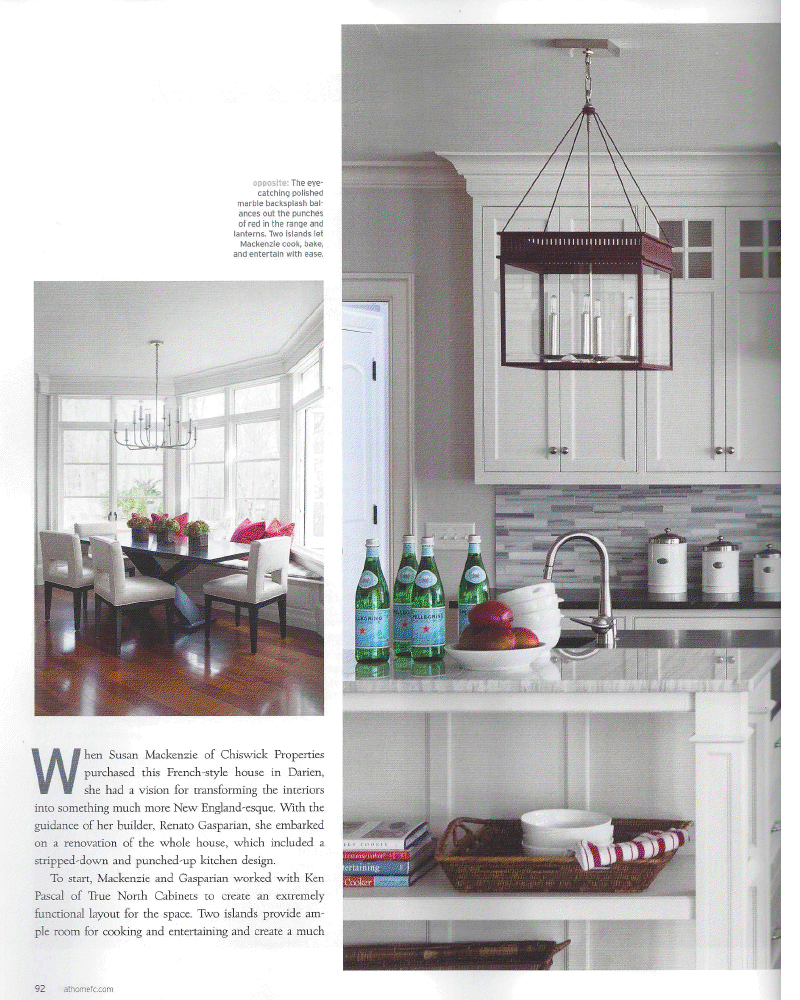
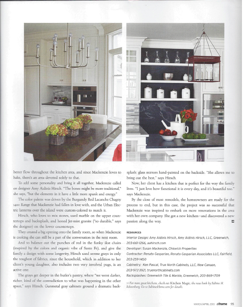
The current issue of At Home in Fairfield County features a kitchen I designed for a client in Darien. This was a great project with so many fantastic elements. The goal was to design a functional, yet beautiful, kitchen, suited to the owner’s love of cooking and family life with a young child and two dogs. With that in mind, we chose materials that look great but are durable and easy to maintain. In addition, we opened up the area so the owner could enjoy conversation with friends and family while cooking. The kitchen features two islands, a polished marble backdrop, and a gorgeous butler’s pantry. If you haven’t seen this issue, pick up a copy today!
Cooking with Williams-Sonoma
On those evenings when I do have some more free time to plan and prepare a nice dinner, I usually turn to my Williams-Sonoma cookbooks.
I’m sure I’ve mentioned this before, but cooking is not something I often find time for in my busy schedule. As a matter of fact, I do so little cooking that I’ve been teased about burning water! The truth is, I can cook, I just can’t usually fit it into my daily routine of family and work.
On those evenings when I do have some more free time to plan and prepare a nice dinner, I usually turn to my Williams-Sonoma cookbooks. I love the imagery in these books as well as the recipes themselves.

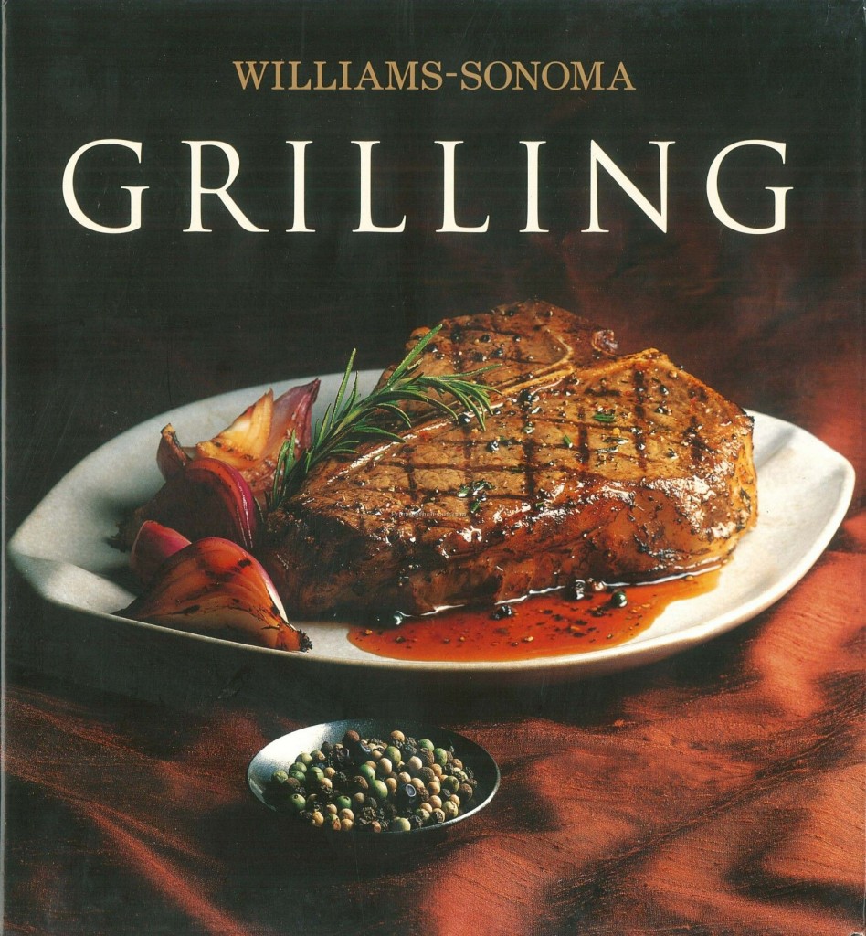
These dishes can be prepared by anyone and really make you feel like an accomplished cook. There’s such a nice sense of satisfaction that comes with presenting your family with a meal that looks and tastes amazing! Williams-Sonoma has a great brand in general, from the cookbooks to cookware to prepared foods, they offer high quality products that both look great and perform very well.

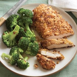
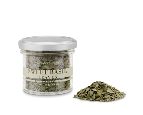
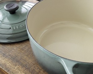
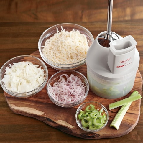
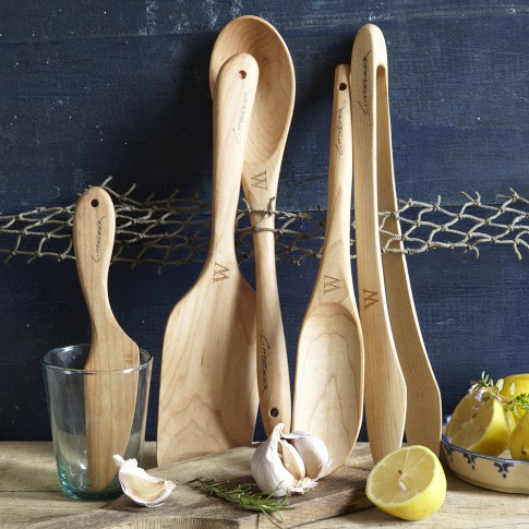
Browsing through all of the gadgets and kitchen products offered by Williams-Sonoma just makes you crave the idea of cooking. From a design perspective, I can easily imagine filling a kitchen with these great items. They are thoughtful and smart, and just so well presented.
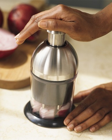
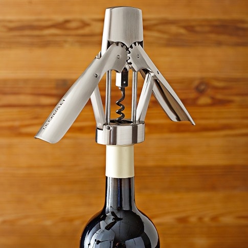

Do you have a favorite source for recipes and/or kitchen gadgets?
Lunch with Barbara Sallick of Waterworks
A couple of weeks ago, I had the fantastic opportunity to have lunch with Barbara Sallick, owner of Waterworks.

A couple of weeks ago, I had the fantastic opportunity to have lunch with Barbara Sallick, owner of Waterworks. It was really nice to meet someone so inventive and to be able to pick her brain. I found sitting with her and talking woman to woman to be so delightful. As someone who focuses on creating interiors, it’s fascinating to me to speak to someone who instead focuses on creating a product. What Waterworks does is very specific, constructing items that must be precise down the the millimeter while maintaining the high standards of elegance for the product. They really must think of everything throughout this clever process.
Waterworks was founded as a plumbing supply company in 1925 by Sam Grogins, Barbara Sallick’s father. In 1978, Barbara and her husband Robert set out to bring their vision of beauty and perfect performance to a part of home design that often lacked attention. Their son Peter later joined the company and Waterworks became an industry leader with a well-deserved reputation for craftsmanship and design. With the growth of Waterworks, the company hasn’t lost its vision or mom and pop feel. They truly listen to designers and have honed in on an ideal balance of functionality and gorgeous design, inspired by history rather than trends.
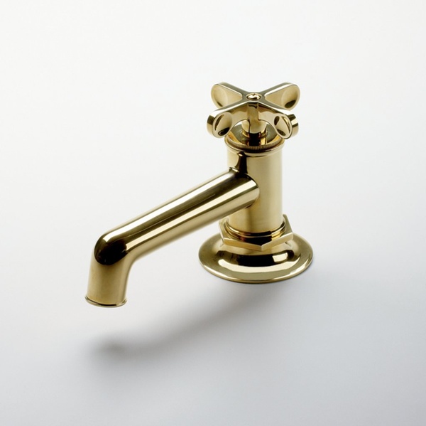
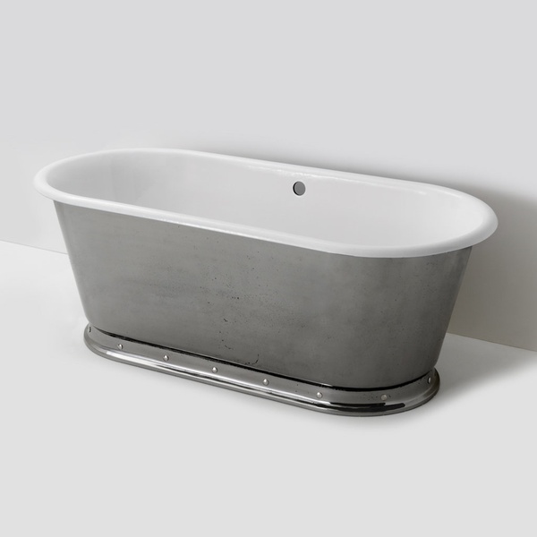
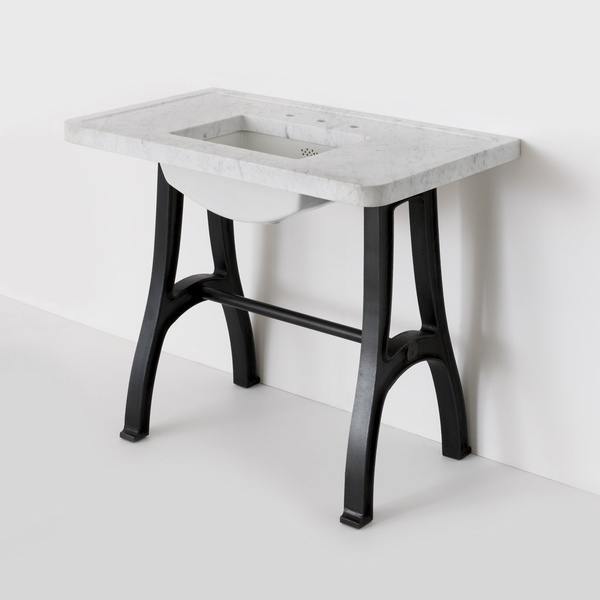

What I love about Waterworks is the diverse styles they offer. They don’t just offer fittings, they offer an entire bath experience that truly has something for everyone. The Studio Line, for example, is very accessible and well done. The Henry line is designed so beautifully, with so many different facets. Honestly, I can see uses for Waterworks elements in the kitchen and beyond.
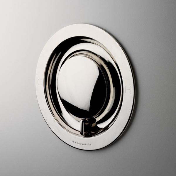

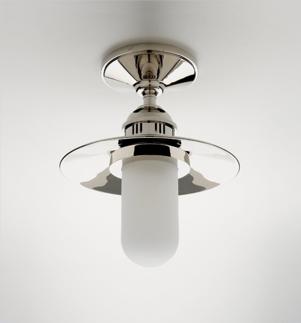
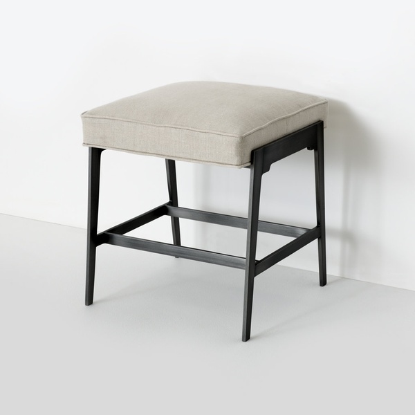
If you want to also pick Barbara’s brain about her thoughts on design you can access her excellent ideas through her blog, The Perfect Bath. Barbara is also the author of two books: The Definitive Guide to Designing the Perfect Bath (self published, 2006) as well as Waterworks: Inventing Bath Style (Clarkson Potter, 2001).

