Details: Nail Head Trim

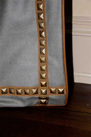
Typically seen on leather upholstered furniture, nail head trim imparts a look of finished sophistication and style.

Nail head trim dates back to the advent of French Country Style in the 16th century.  Typically seen on leather upholstered furniture, nail head trim imparts a look of finished sophistication and style.  Nail heads come in a variety of shapes and finishes for a custom look that’s traditional and modern at the same time.  Whether their use is decorative or strictly functional, nail heads are like subtle jewelry for your home.

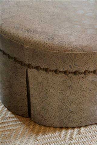
Ottoman with nail head trim
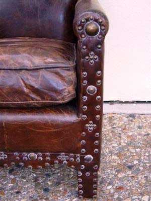
Gorgeous library chair from Mecox Gardens
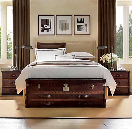
Bedroom furniture with nail head accents

Why limit such a fantastic look to furniture?  Nail head trim makes a wonderful accent for other pieces in the home.  Inspired by fabulous designer Miles Redd, I’ve used nail heads in unexpected places with beautiful results.

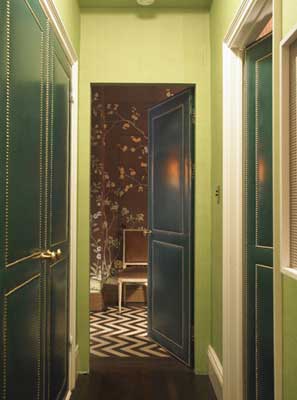
A Miles Redd project that inspired me
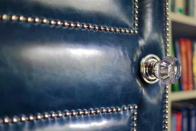
Detail of leather door for my client


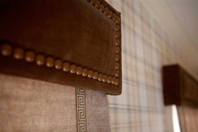
Nail head cornice

Try experimenting with different shapes and finishes of nail heads as well as various fabrics, colors, and textures.  Nail head trim isn’t only for leather furniture, or even just furniture for that matter.


Tortoise Shell Boxes

I love tortoise shell boxes. When placed around a room, these beautiful accessories add warmth and richness to the environment.

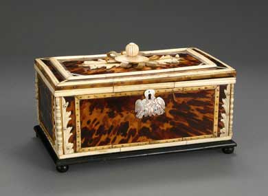
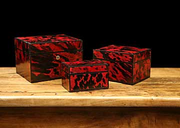
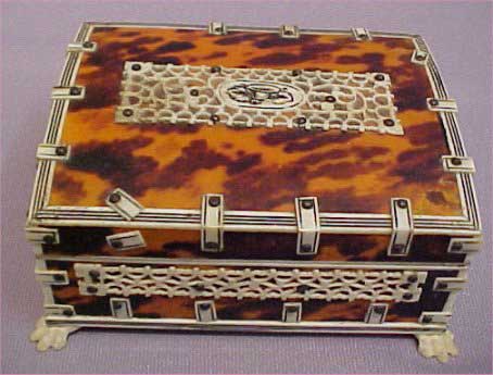
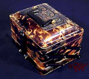
I love tortoise shell boxes.  When placed around a room, these beautiful accessories add warmth and richness to the environment.  They seem to absorb light and exude their own golden glow.  Tortoise shell boxes come in many shapes and sizes and may have elaborate ivory, silvery or gold decorations.

I’d suggest looking for these pieces with your favorite antique dealer.  True tortoise shell was primarily produced from the shell of the hawksbill turtle.  Prized for it’s beauty and durability, this material hasn’t legally been available since the 1970’s when worldwide trade of tortoise shell was banned under the Convention on International Trade in Endangered Species.  Real shell is naturally able to command a higher price than imitation shell, but both can give a space the same look.

Tortoise shell, ivory, and mother of pearl


Set of nesting tortoise shell boxes
Carved bone and tortoise shell box
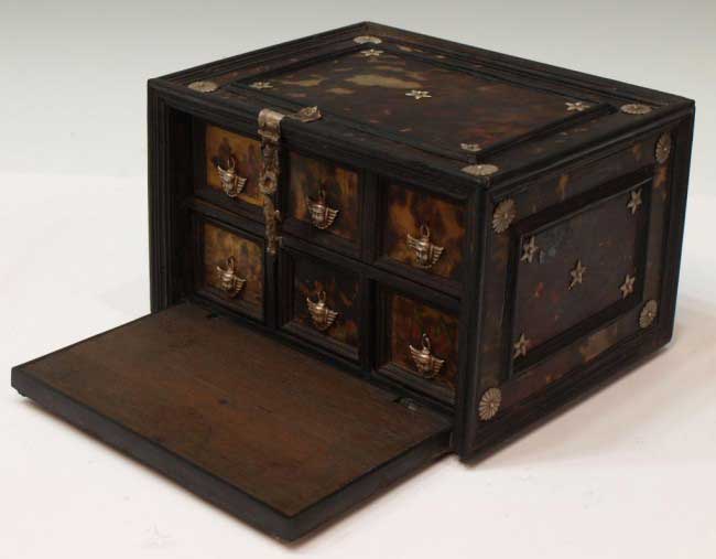
Indo-Portuguese tortoise shell and ebony table box


Mah Jong tile storage box


The Sofa, Reimagined

One surprising design trick I really love is mixing fabrics on a sofa.

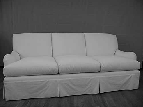
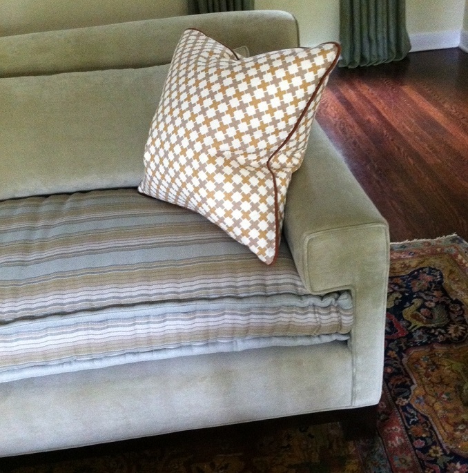
Some of the best ideas in interior design are things that catch people off guard and challenge their ideas of the way things are “supposed to” look.  One surprising design trick I really love is mixing fabrics on a sofa.  It’s not something you typically see, but it adds true visual interest and contrast.

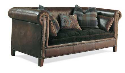
Brompton Sofa by Ralph Lauren
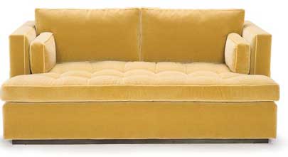
Central Park by Duralee Furniture

Perhaps the ideal way to find your perfect sofa is to have it custom-upholstered.  You start with the style of sofa you prefer and use it as your blank canvas.   What do you imagine for this sofa?

Custom upholstery by Luther Quintana

Another detail I love:  a mattress cushion on a sofa!

Cover Source

Zebra Print

If you’re looking for something bold and dramatic to add to your home, zebra prints certainly fit the bill.

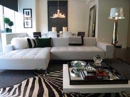
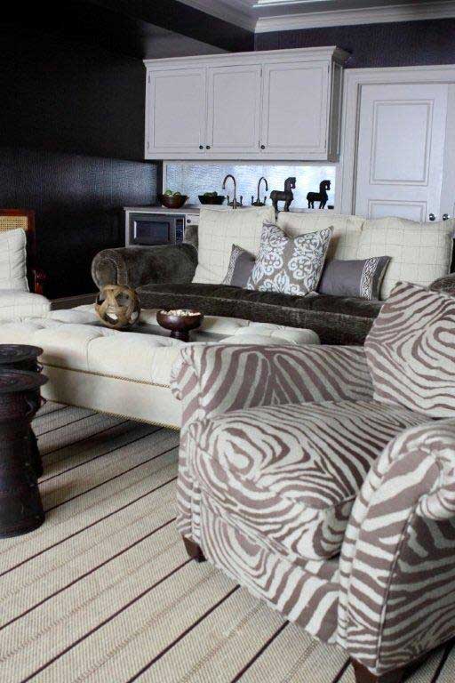
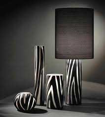
If you’re looking for something bold and dramatic to add to your home, zebra prints certainly fit the bill.  It’s difficult to open any design magazine these days and not see a zebra print area rug.  The black and white contrast goes well with many color palettes and looks modern and exotic at the same time.

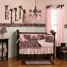
Zebra stripes don’t have to stay on the floor, and they don’t only come in black and white.  Take a look at this nursery featuring zebra patterns in pink and brown.


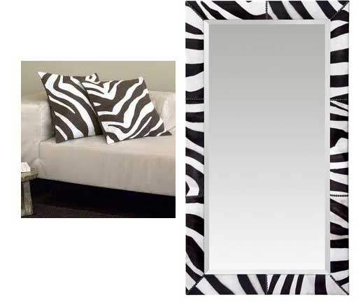
Accents in a zebra print, like pillows or this mirror from Oly Studio, are another great way to incorporate zebra prints into a room.

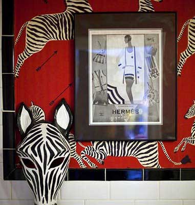
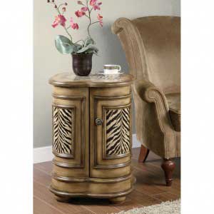
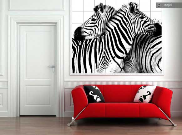
It’s certainly possible to use zebra patterns in a space in other ways as well, from wall art to accent pieces.  Finding unique ways to show off this trend is a challenge that also allows you to personalize a space and make it into something unique.

Decorology

When it comes to design blogs full of eye candy and inspiration, you can’t beat Decorology.

When it comes to design blogs full of eye candy and inspiration, you can’t beat Decorology.  Featuring photos from magazines, blogs, and suppliers, Decorology has everything from do-it-yourself tips to luxury accessories to environmentally friendly design ideas.

Here are some photos from Decorology to give you an idea what the blog has to offer.  I encourage you to then visit the site yourself and browse around the many pages of gorgeous photos.

Paris, France

Few places inspire images of romance, class, and beauty like the great city of Paris, France.

Few places inspire images of romance, class, and beauty like the great city of Paris, France.   Think aged buildings, gold, painted ceilings, a wealth of antiques, and an attitude of gracious living.  Parisians have turned everyday living into an art form.


Designer Betty Burgess created this room, inspired by her clients’ years living in France.


This gorgeous hand-painted ceiling graces the ceiling of a private dining room in Paris.


Adding details that evoke thoughts of Paris takes only a bit of imagination.  Look for prints, accessories, and antiques to evoke emotions and thoughts of Paris.

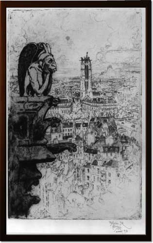
Framed print of Notre Dame gargoyle
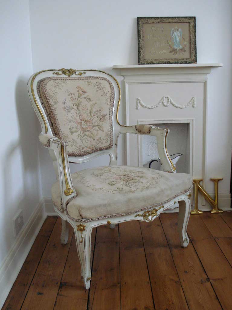
Antique French chair
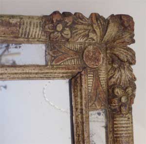
18th century French mirror

Wallpaper, Off the Wall

There’s no hard and fast rule that says wallpaper can only go on your walls.

There’s no hard and fast rule that says wallpaper can only go on your walls.  Applying wallpaper to the ceiling instead adds color and interest to an often-ignored part of the room.  Most people spend a lot of time considering how they want to decorate their floors and walls but neglect the ceiling.  Think of it as a potential canvas, blank and usually bare of obstacles.  Why leave it white and bare when we have access to an infinite world of wall coverings that work just as well on a ceiling?


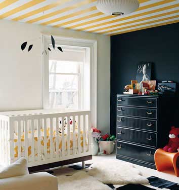
Here, a colorful striped paper on the ceiling of a nursery gives warmth to the black and white color theme.


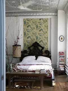
This bedroom ceiling, with its pressed metal style wallpaper, has a stunning, classic look that works perfectly with the room’s interesting architectural elements.


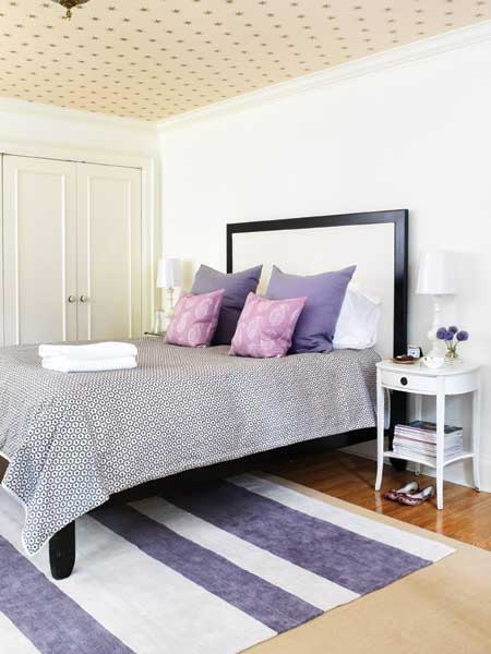
This starry paper makes a lovely bedroom ceiling for a child or teen to fall asleep under.


Applying wallpaper to a ceiling isn’t only beautiful, but can be functional as well.  It’s an easy solution to cracked paint or other flaws that paint alone can’t cover.  If the idea of papering the ceiling of a large bedroom or living room is too intimidating, consider a smaller space like a stairway, closet, or bathroom.

A Luxurious Guest Room

Being nestled away from the main section of the residence, this small room offered a place where we could be more whimsical and theatrical with the design elements and colors.

For this project, I designed a beautiful third-floor guest room.  Being nestled away from the main section of the residence, this small room offered a place where we could be more whimsical and theatrical with the design elements and colors.  I wanted people to walk up the stairs and feel pleasantly surprised by this hidden jewel of a room.

I loved working with so many material in this room that it’s difficult to talk about just one or two favorites.  Our color palette of yellow, grace, and sienna gave me ample room to explore the capricious style of the room.  I covered the walls with a gorgeous Brunschwig & Fils chinoiserie grass cloth left over from the client’s previous residence.  I hadn’t the heart to discard it and was so pleased to use this amazing paper again.
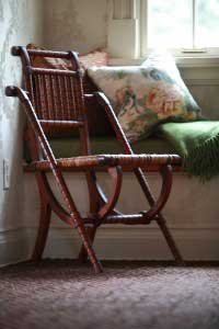
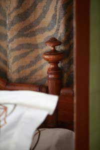
One striking aspect of the guest room is the overabundance of elements that work so nicely together.  From the solid cotton velvet fabric of the canopy to the leather window seat and tortoise shell window shades, details such as the unusual guacamole color of the seat and the amazing tiger print silk on the interior of the canopy make this room a real treat for the client’s guests.
You know you have a great client when that client truly lets you shop.  Finding wonderful items for this guest room made it such a fun experience.  I found these amazing Chinese male and female lamps, the final piece added to tie the room together.  They both wear custom green silk shades with a yellow trim accent.  Initially, the client had a different, extremely heavy and massive bed allocated for this room.  We decided it overwhelmed the small space.  Instead, I found an antique bamboo bed at United House Wrecking.  The bed was a true diamond-in-the-rough, needing to be cut down to Queen size and missing several turnings.  I was so excited when I found it, and even more so when the client was also able to see the bed’s potential.  After refurbishing the entire piece, we couldn’t be happier to have such a gorgeous bed as the main focus of this guest room.
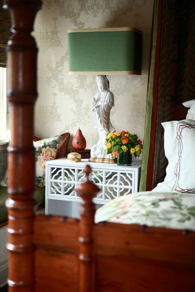
Designing a room like this takes a certain willingness to take risks.  Don’t be afraid to add multiple color combinations.  Sienna ingested with yellow and lime green adds warmth and striking contrast to this room.  Mirrors on the side tables add reflection at a completely different level and are an unexpected touch to the room.  Be careful not to overdress every window, as a simple and inexpensive tortoise shell works equally as nice.  Finally, invest in at least one set of high thread count sheets.  You (or your guests) will sleep better for it!


Design Therapy by Brad Ford

One of my favorite designers, Brad Ford, writes an incredible blog called Design Therapy.

Brad Ford

One of my favorite designers, Brad Ford, writes an incredible blog called Design Therapy.  Having been involved in the world of interior design for 13 years, Brad uses his blog to share sources of inspiration with his readers.  His blog showcases everything from images to other designers in his desire to give others some of passion for design.  In his own words, Brad is “drawn to a more modern sensibility that’s equally warm and soulful.”  Readers of Brad’s blog see this immediately in the wonderful variety of images in each blog entry.  For inspiration, resources, and ideas, take a look at Design Therapy and enjoy some blissful browsing time!


Garden Stools

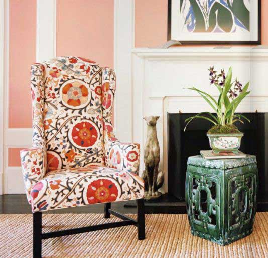
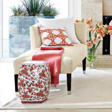
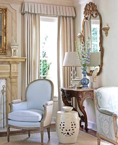
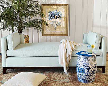
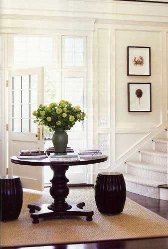
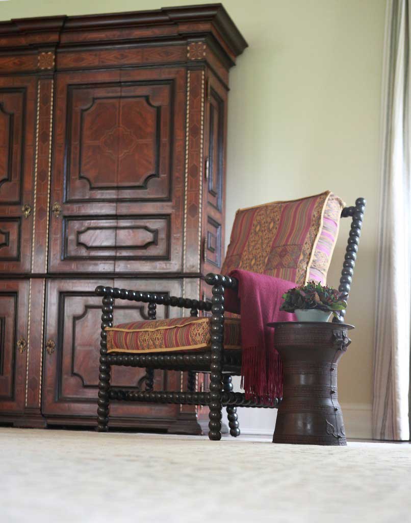
Who says garden stools have to stay in the garden? This is a perfect example of a functional object transformed into something beautiful and given a new purpose.

Who says garden stools have to stay in the garden?  This is a perfect example of a functional object transformed into something beautiful and given a new purpose.  As a place to sit, a place to rest a book or drink, or to add a spunk of color, garden stools come in a surprising array of colors and styles.  Take a look at these fantastic garden stools and the many ways they can be used in the home.

Cover photo source