Maharam Fabrics

Maharam Fabrics began as a theatrical textile production company and evolved through the decades to become a source of high quality fabrics.

Maharam Fabrics began as a theatrical textile production company and evolved through the decades to become a source of high quality fabrics.  Maharam makes a good choice for both commercial and residential areas.  The product is thoughtful of use and doesn’t look contracted.

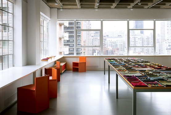
Maharam space in NYC.

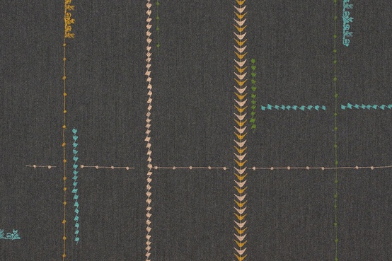
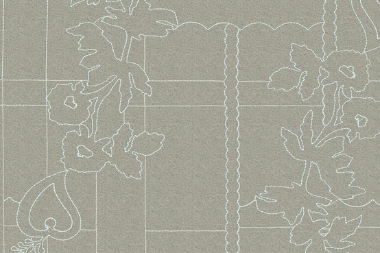
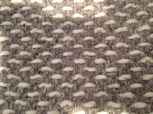
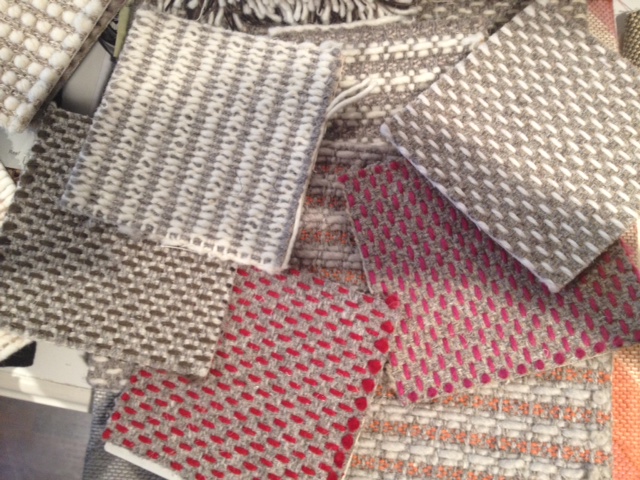
I am a huge fan of Maharam’s wool fabrics, especially the wool with embroidery.  When I design, I go for quality over quantity, and Maharam exhibits superb quality.  The fabric has a great weight, with quiet and simple designs that aren’t too heavy or traditional.  I love the palette and stitching.  It’s really well executed.

Borders by Hella Jongarius in Charcoal. Great pillow fabric!
Layers Park in Mineral/Sky by Hella Jongerius.
Park in Copper/Timber by Hella Jongerius.
Layers Garden Double by Hella Jongerius.

The durability of Maharam’s wool products make it a good option for families with kids.  The solids are available in every spectrum of the rainbow.  In addition to being user-friendly and practically indestructible, Maharam fabrics are reliably in stock, making it a fantastic go-to product.

Divinia by Kvadrat. Yummy color!
Another great color. I love using this for large bolsters on a bed.

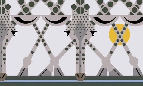
Maharam also produces these digital projects for large-scale wall installations.  Something like this takes just the right client, but I can’t wait to use this giraffe print!  It’s so unique, charming, and sweet!

Perfect for a child’s playroom!

To see more of Maharam’s products, visit their website or find them on Facebook.

Houzz

The beauty of Houzz, for me, is being able to accurately share my ideas and visions with general contractors, architects, and clients.

A few years ago, Adi Tatarko and Alon Cohen started a remodeling project that sparked a unique idea.  After spending countless hours clipping ideas from magazines and books to plan their remodel, Tatarko and Cohen decided there must be a better way to gather ideas and plans in one place.  Their desire for such a place led to the launch of Houzz, a website devoted to interior design, architecture, and home improvement.   Since its launch in 2009, Houzz has grown to a collection of over half a million photos which have been used by members to create nearly two million idea books.  The site has grown to include products, discussions, and networking to connect home owners with design professionals.  Tatarko and Cohen certainly realized their goal of creating the perfect inspirational tool.

The beauty of Houzz, for me, is being able to accurately share my ideas and visions with general contractors, architects, and clients.  It’s the perfect resource for articulating exactly the look, colors, and products I’m thinking of.  It’s an unbelievable resource for finding inspiration and communicating ideas.  It’s also user-friendly and simple to translate from an online idea to real-world use.

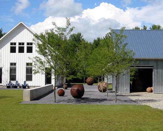
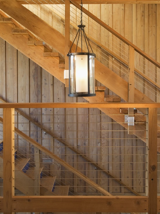
My own office will soon be renovated, and Houzz will definitely make it easier to share my ideas with my contractor.  The office was originally home to a heating company and really has no character to speak of.  I plan on using modern barns as an inspiration, creating an environment that isn’t overdone or distracting for clients, something subdued and tactful in design.

Modern farmhouse inspiration.
More farmhouse-inspired ideas.
A great work space!
Another modern barn look.

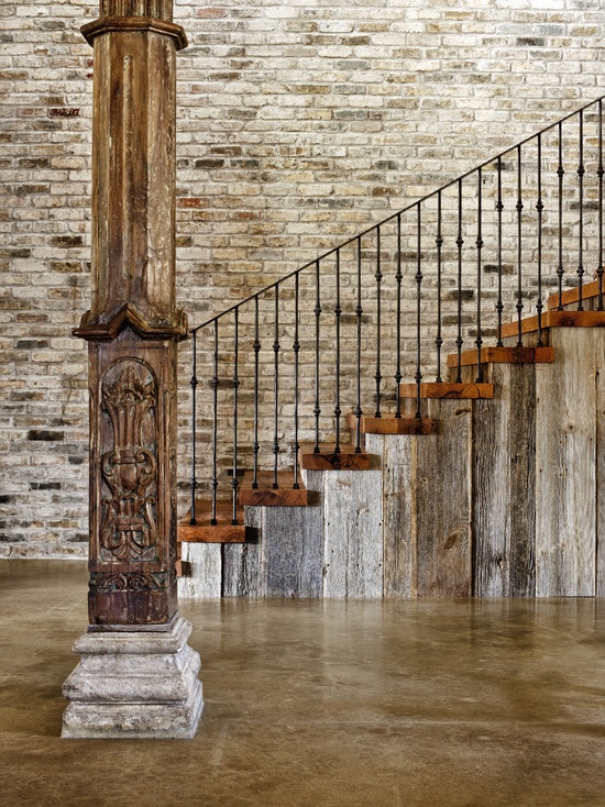
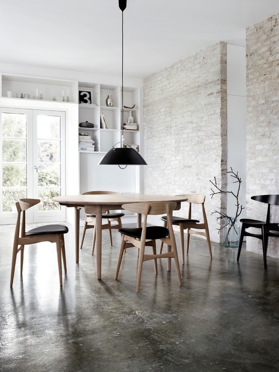
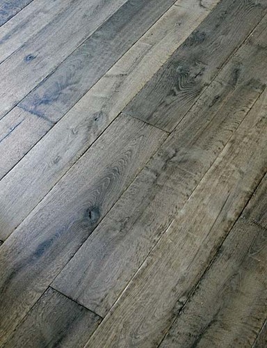
I’m trying to decide between a concrete floor and a beautiful, traditional wood floor.  Adding both to my Houzz idea book makes it easy to go over options with the contractor as well as see how my various ideas play off each other.

Concrete floor.
Additional concrete floor design.
Manior gray custom aged French oak floors.

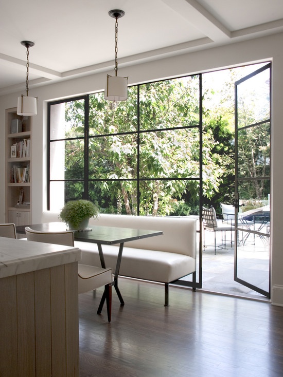
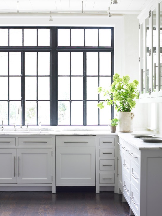
I love the idea of using steel windows.  It will definitely keep with the modern feel of my office while adding a unique touch and different texture to the space.  I found great examples on Houzz!

Steel windows design.
Another steel window idea.

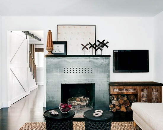
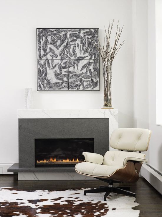
For my fireplace, I want to go with a slab design.  Each of the fireplace ideas I found on Houzz is very different in color, material, and texture, but they each convey the same smooth feeling from sleek lines.  The truly difficult part is choosing between them!

Farmhouse inspired fireplace.
Slab fireplace design.
Another slab fireplace inspiration.

Houzz even inspires accessories.  Products listed on Houzz often include pricing and link directly to sources for buying.  An idea book can include even small details or specific products, like these amazing shelves.

Old Candlemakers Steel Storage Shelf

What would be in your Houzz idea book?

Lisa Cueman Photography

I was at the Samuel Owen Gallery in Greenwich recently where the incredible photography of Lisa Cueman caught my eye.

I was at the Samuel Owen Gallery in Greenwich recently where an incredible photographer caught my eye.  Her name is Lisa Cueman and her photography is centered around her lifelong love of horses.

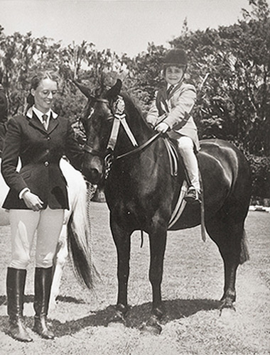
Lisa Cueman, age 4, at her first horse show.

Cueman grew up on the island of Bermuda, learning to ride and care for horses from a very early age.  She grew through the ranks of the British Pony Club and devoted much of her life to riding and showing horses.  As an adult, Cueman relocated to Ontario, Canada, to focus completely on training and riding.  After several years, Cueman retired from riding and began instead to pursue an interest in photography.  Quite naturaly, her photographic work focuses on the horses she’s loved throughout her life.

Bath Time
Winter Profile
Born to be Wild

I love Lisa Cueman’s equine portraits for the beautiful stories they tell.  Her photos, printed on acrylic, have an almost abstract quality from their slightly askew viewpoint.  They have such a peaceful nature, captured in black and white or sepia, made more appealing through Cueman’s own take on this subject she clearly adores.  I would love to have her photographs in my own office when I renovate!

Eye Contact
Mane Motion
Snow Dance

To learn more about Lisa Cueman or to see more examples of her photography, visit her website and blog or find her on Facebook.


Color Obsession: Brown

With the approach of fall and cooler temperatures, the rich earth tone of brown becomes a color I naturally gravitate toward.

With the approach of fall and cooler temperatures, the rich earth tone of brown becomes a color I naturally gravitate toward.  It lends itself well to the season, being a great color for boots and coats as well as a warm and inviting interior color.  It’s definitely one of my favorite go-to colors!

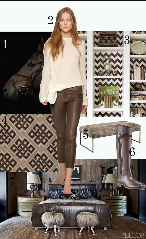
1.   Photograph by Julia Hetta:  Luscious color and true to the hue.

2.  A.L.C.:  Brown leather pants.  Yummy!

3.  Photo via House Beautiful:   Great graphic use of chocolate brown and a chevron without being too dark.

4.  Beauvais Carpets:  Great woven carpet with chocolate brown accent.

5.  Rectangular stool by Andrew Martin.

6.  Tory Burch Alaina  Logo-Detailed Boot:  My go-to boot for the fall.

7. Brown bedroom, designed by Kelly Wearstler.  Image from Elle Decor.

More Must-Have Books

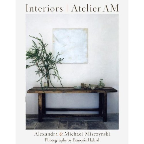
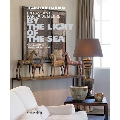
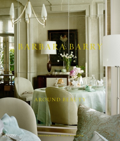
Earlier this year, I blogged about must-have books on interior design. Today I’d like to present a second list of must-have books!

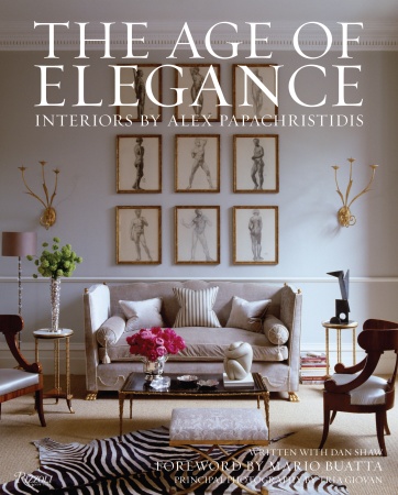
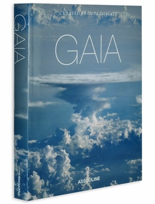
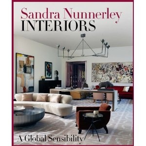
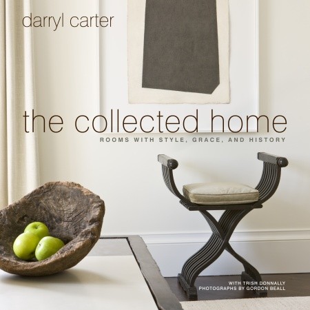
Earlier this year, I blogged about must-have books on interior design.  Today I’d like to present a second list of must-have books!  These are great books for fall, mainly featuring iconic designers offering up new inspiration.  Others, like GAIA, are beautiful coffee table books to dress up a room or give as gifts.  Some of these are new and some are available for pre-order.

I’m sure as the new year arrives and trends come and go, I’ll have more fabulous titles to add to my must-have list!  What’s on your reading list or coffee table right now?

Interiors Atelier AM
By the Light of the Sea
Cy Twombly: Fifty Years Of Works On Paper
Barbara Barry, Around Beauty
The Age of Elegance: Interiors by Alex Papachristidis
GAIA
Thom Filicia: American Beauty: Renovating and Decorating a Beloved Retreat
Sandra Nunnerley Interiors: A Global Sensibility
Darryl Carter: The Collected Room: Rooms with Style, Grace, and History

Ram’s Gate Winery

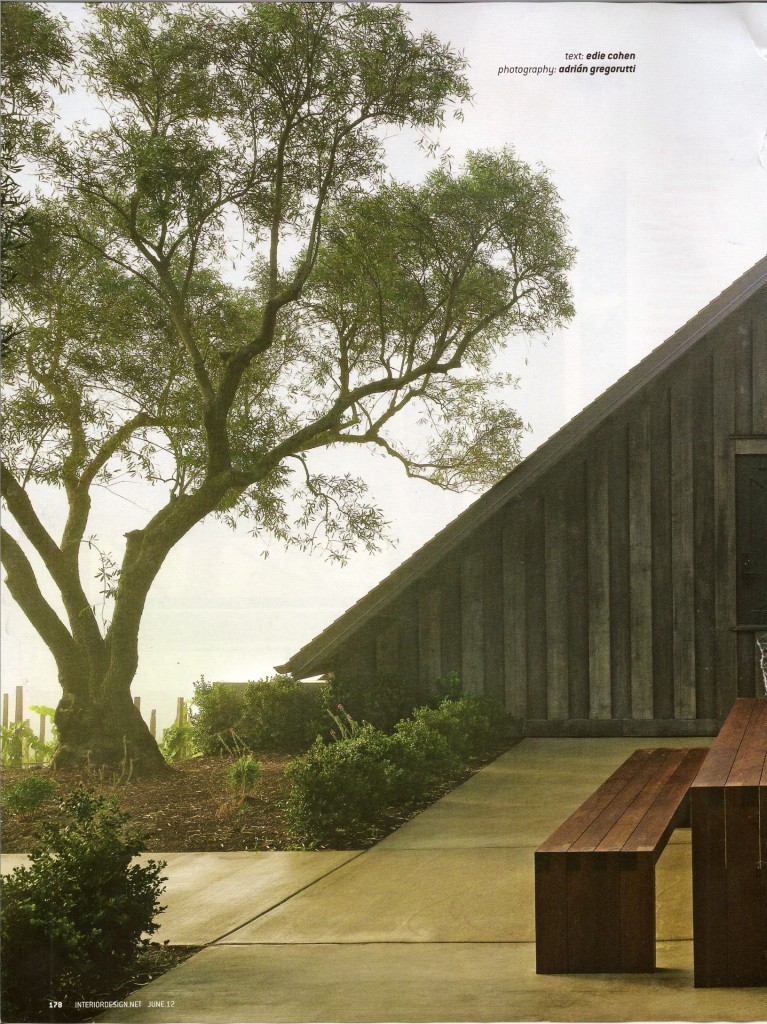
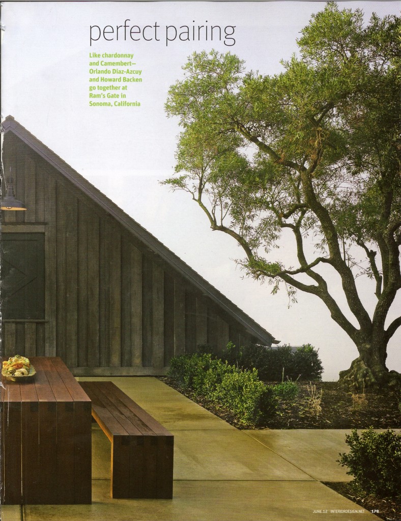
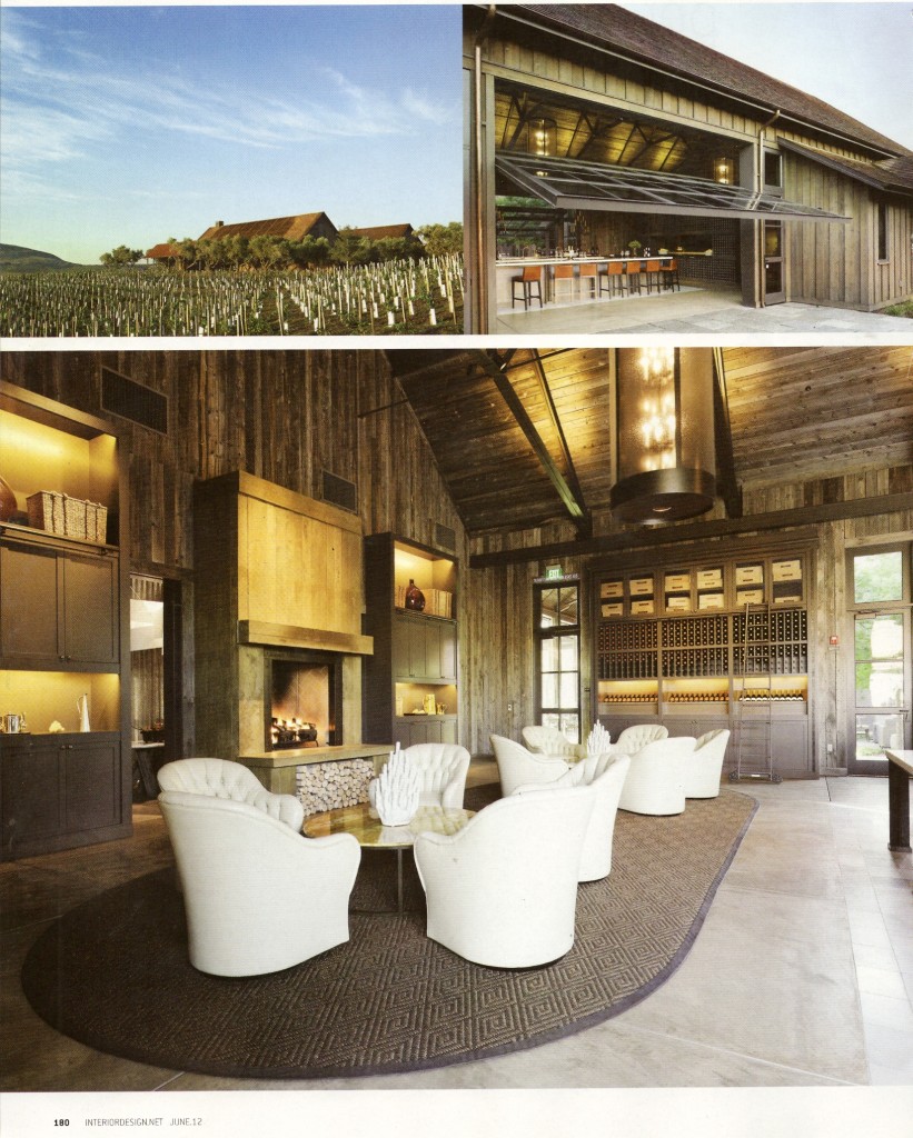
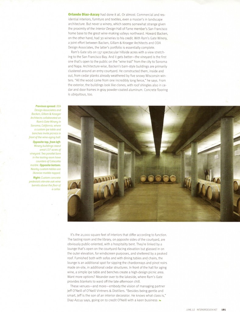
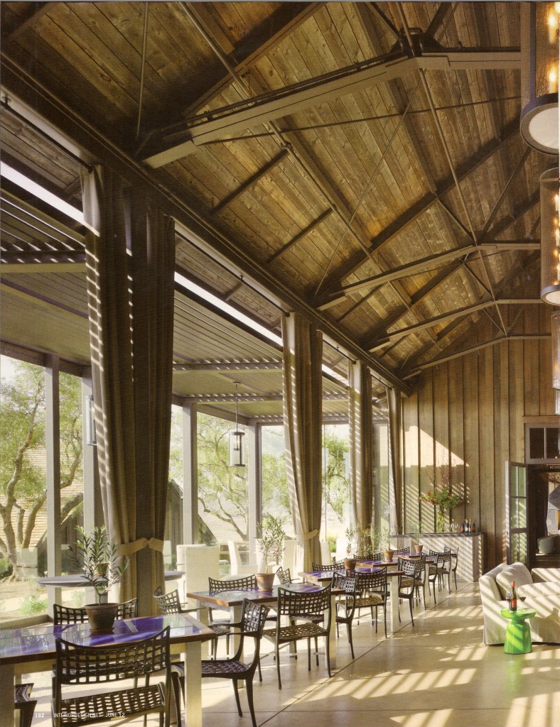
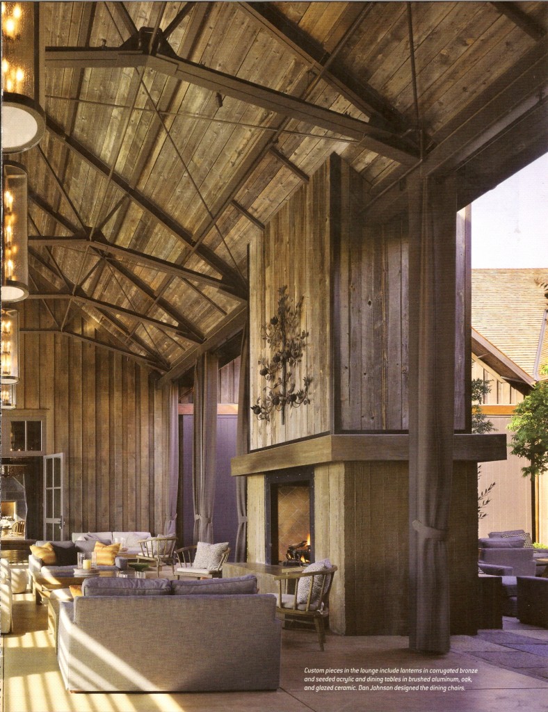
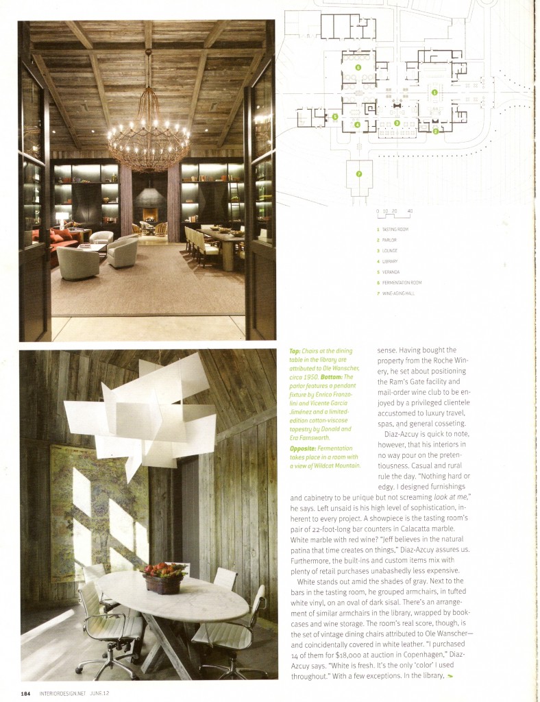
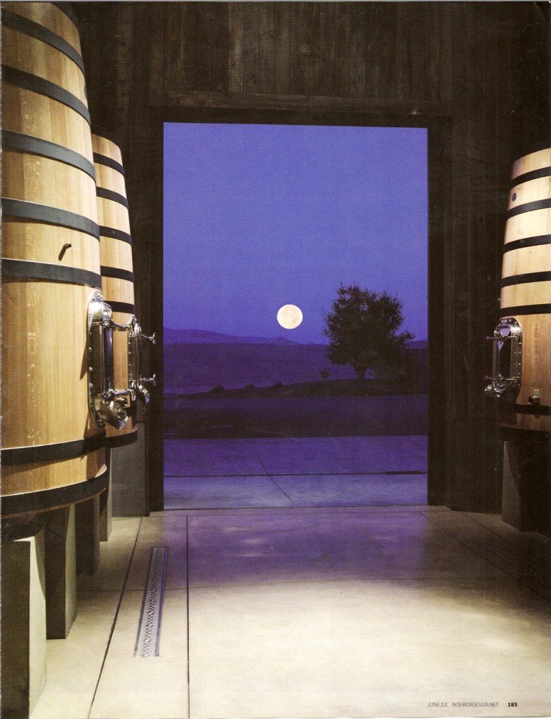
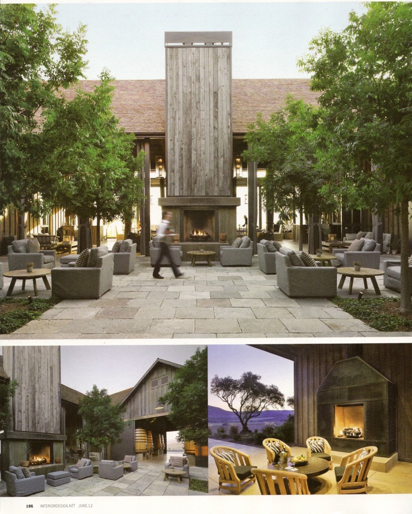
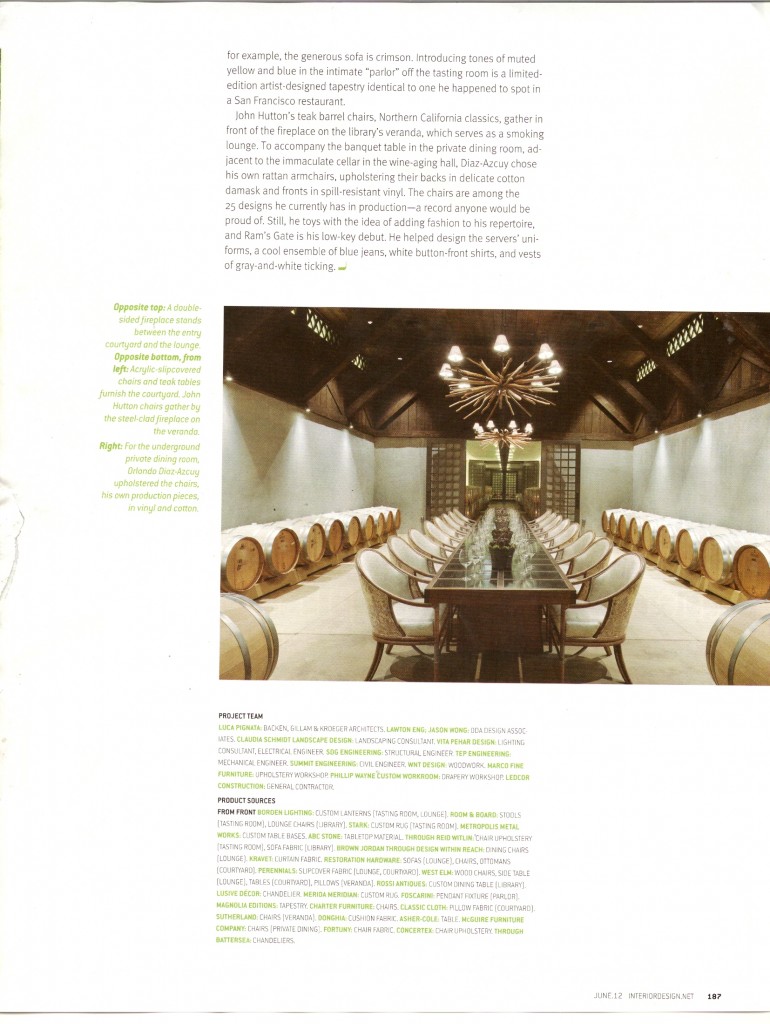
I came across a spread in the June 2012 issue of Interior Design magazine featuring Ram’s Gate Winery in Sonoma, California, and was immediately struck by the beauty of the place.

I came across a spread in the June 2012 issue of Interior Design magazine featuring Ram’s Gate Winery in Sonoma, California, and was immediately struck by the beauty of the place.  A collaboration between designer Orlando Diaz-Azcuy (of ODA Design Associates) and Backen, Gillam, and Kroeger Architects, Ram’s Gate Winery sits right at the entrance of of famed Sonoma Valley and features a stunning design worthy of its location.  It is just so beyond gorgeous, inside and out.  Diaz-Azcuy wonderfully embodied the vision of winery manager Jeff O’Neill when creating these sophisticated interiors that retain a casual, rural feel.

Merida

I recently met with a Merida sales rep and became even more impressed with what they have to offer.

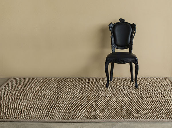
Merida area rugs are a great product that have been around for a while.   They’re a solid choice for using sisal flooring and I’ve long been a fan of their sea grass carpet (even on walls!).  I recently met with a Merida sales rep and became even more impressed with what they have to offer.

Founded in 1978, Merida is committed to providing a beautiful, quality product while practicing sustainable methods and partnering with suppliers and manufacturers who share their responsible priorities.  Their headquarters are in Boston, and while some of their products are made with fibers from around the world, many of their rugs are woven at a mill in Fall River, MA.  Their products are known for being as durable as they are attractive.

Merida’s rugs are also customizable, which is something I learned when meeting with their sales representative.  Considering their reasonable price point, the level of customization is truly impressive.  Being able to make this kind of product entirely your own is a fact I really like.  The simple, natural colors and designs of many of the rugs give them all kinds of decorating possibilities.

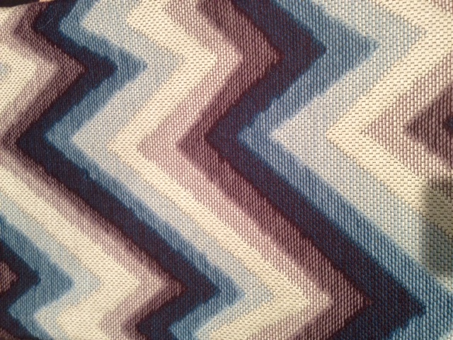
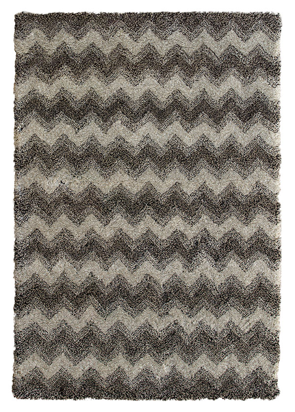
Also exciting is Merida’s recent partnership with designer Celerie Kemble.  Her rug designs are so vibrant.  Many of them have just the right jolt of color or a very graphic pattern.  This collection “has everything from colorful flat-woven and tufted wools, intricately woven designs of sisals, chunky alpacas and textural jute.”  My personal favorite is the Catalyst line, a chevron pattern available in six different color palettes.

Here in the Greenwich area, I’d suggest going through Turabian and Sariyan for Merida products.  If you aren’t in Connecticut, Merida’s website includes a search feature for finding showrooms in your area.  You can also find Merida on Facebook and Pinterest or follow their Blog.

New York International Gift Fair

Twice a year, every year, NYC is host to the New York International Gift Fair.

Twice a year, every year, NYC is host to the New York International Gift Fair.  This fair is so huge, it can’t be contained to one venue and sprawls across Piers 92 & 94 as well as the Javits Convention Center.  This year’s fair ran from August 18-22 and included a huge range of vendors displaying new products and lines for the upcoming year.

The Gift Fair just has to be experienced in order to have an idea of the magnitude of the event, but I can tell you, I was like a bat out of hell at this year’s fair!  There’s such a crush of people, all wanting to be the first to spot that must-have, hot item or trend.  Everyone from designers to retailers flocking from vendor to vendor so that I had to suppress the urge to yell at everyone to get out of my way because I had some serious looking to do.  It’s a lot of contagious energy, creativity, and enthusiasm for the incredible world of design that just permeates the atmosphere and inspires you to see and experience everything!

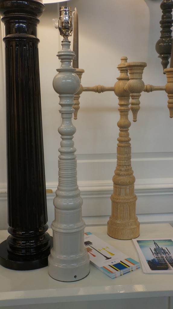
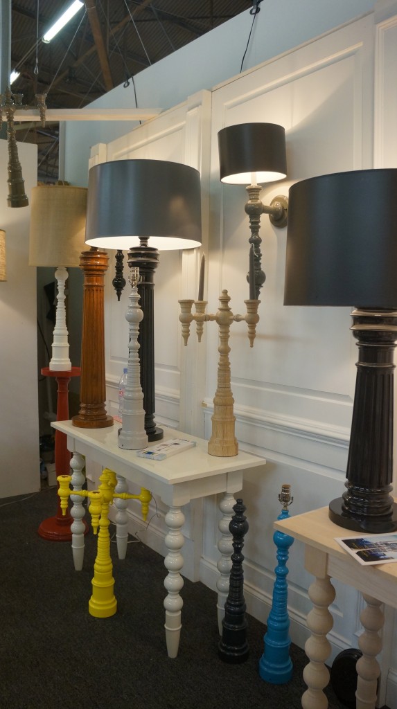
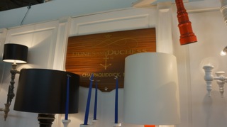
This year I stumbled across some really great things at the Gift Fair.  Some of the first vendors to catch my eye were Michael Partenio and Stacy Kunstel with Dunes and Duchess.  What I love about their line is that they focused on an idea and let that idea evolve.  Dunes and Duchess creates these stunning candelabra pieces, all made in Connecticut.  Used as-is or with a shade, the pieces are substantial with great shapes and a beautiful, high lacquer with so much sheen.  The colors are beautiful, but they can customize products using your own color choices.   They also make incredible tables in almost any size that are practical but very chic!
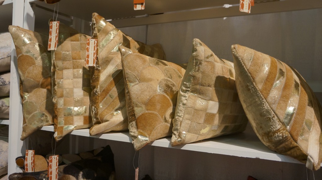
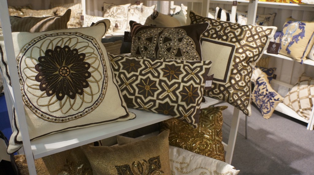
Another aspect of the Gift Fair I love is that it’s a great source for pre-made pillows.  There are a lot of great designs without having to go the custom route and sometimes a bit of instant gratification is really nice!  I found some wonderful pillows from Design Accents and their sister company NBR Home.  From Design Accents, these cowhide pillows with a hint of gold really present well in a room.  The quality is good and the metallic hint is subtle enough to avoid being gaudy.
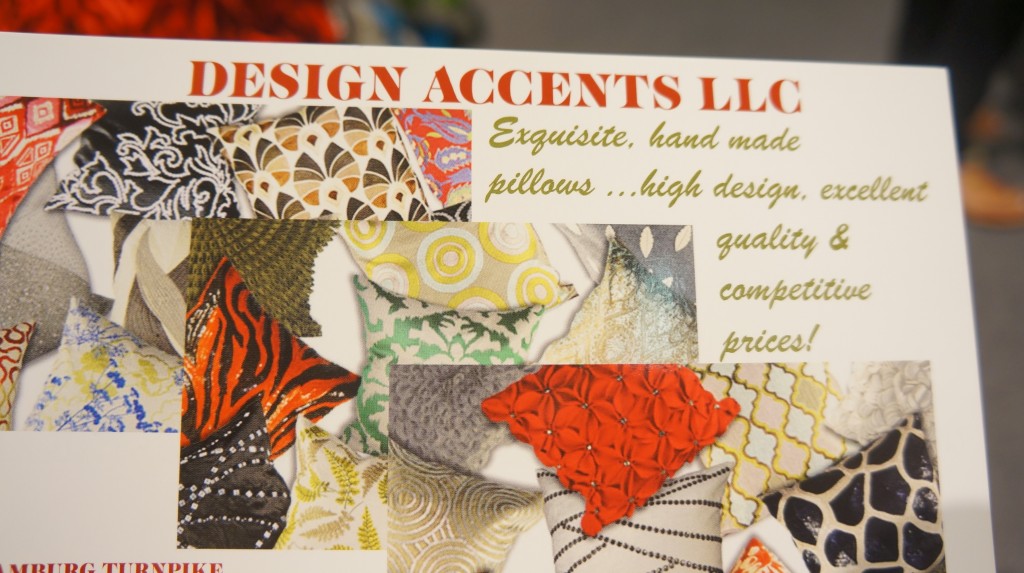
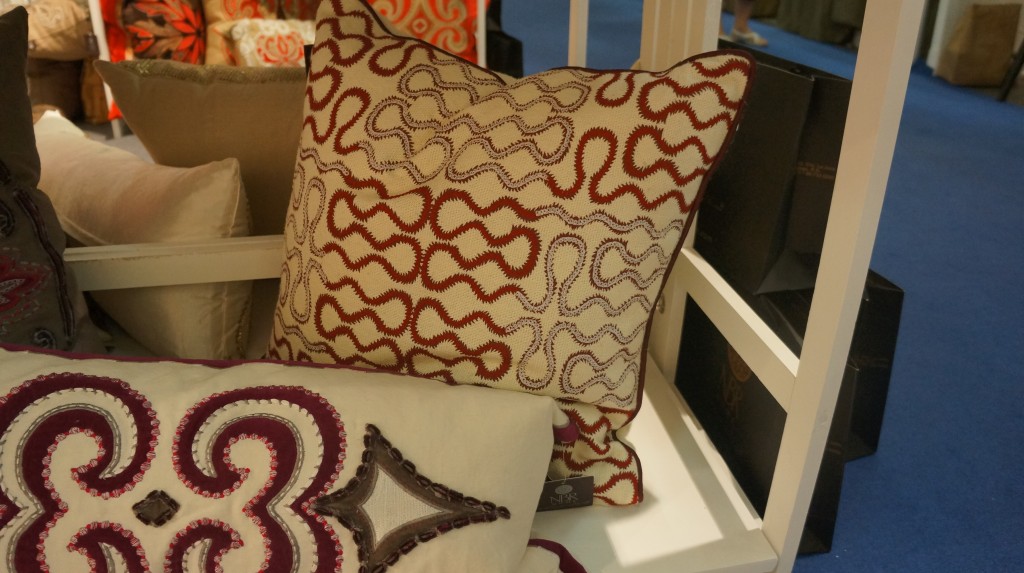
NBR Home offers a more upscale product with some very cool designs and colors.
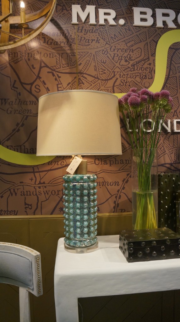
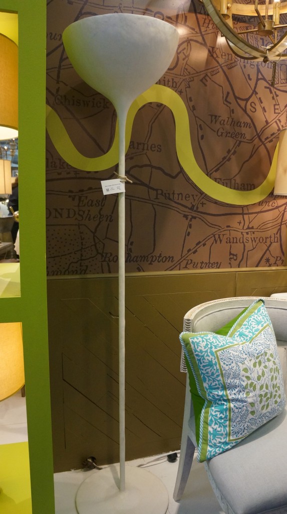
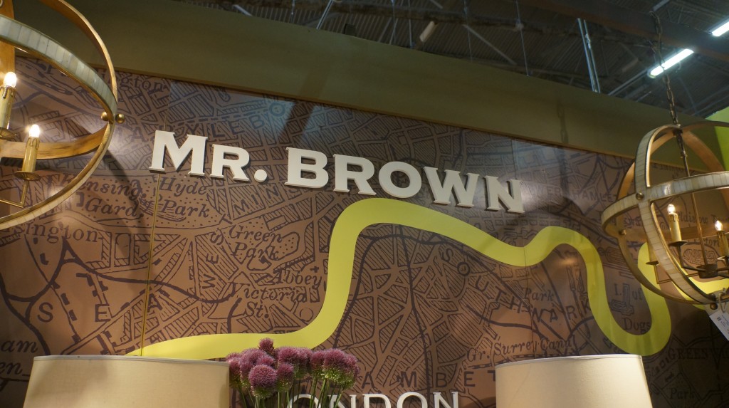
I definitely went a little lamp happy at this year’s Gift Fair.  Mr. Brown, a division of Julien Chichester, has these lamps with a mid-century vibe, just really stunning pieces.  I’m a big fan of the turquoise lamp.  It has a Kelly Wearstler, high-impact feel to it.  I also love the standing lamp.  It looks like a piece of sculpture and would make a great choice for ambient light.
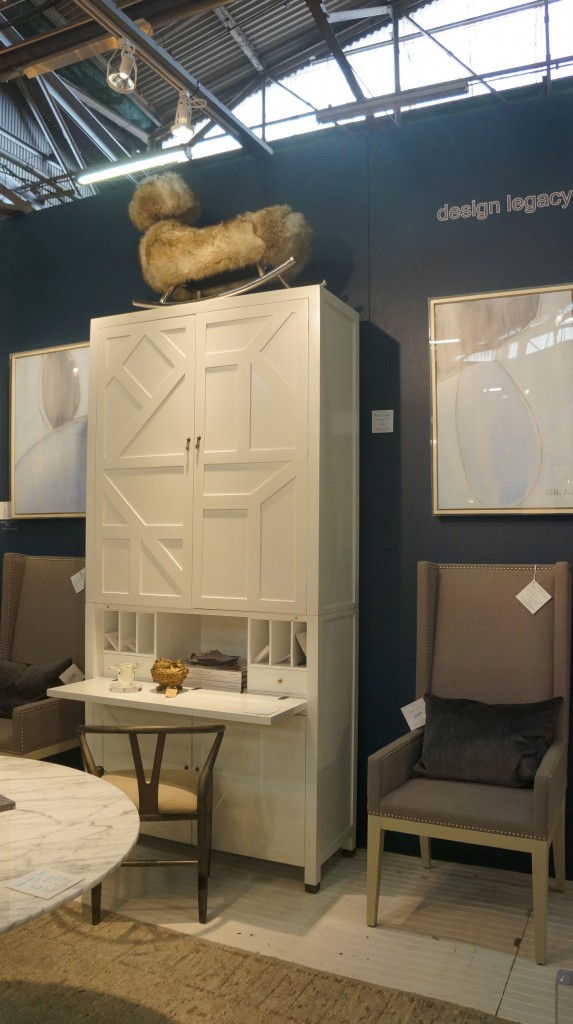
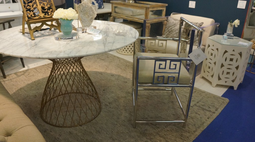
As for furniture, I saw some pieces I love from Design Legacy.  They have a transitional kind of furniture that is really unique.  I am head over heels for the secretary desk.  It has great height and scale and a geometry on its face that I love.  With storage and a flip down desk, it’s a wonderful piece.  I also really like the table and the chair with a nod to one of my favorite designs, the Greek key.  These pieces are an ideal way to freshen up a space.

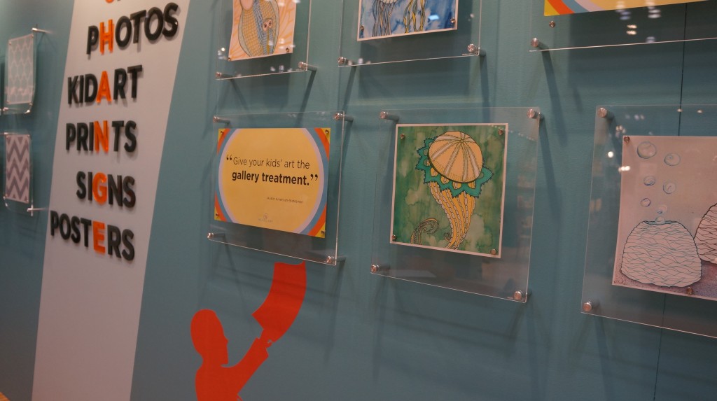
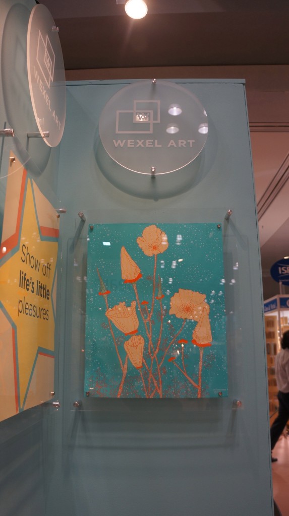
My last find at this Gift Fair actually involves a search that started a year ago.  While at the New York Gift Fair last August, I found a product that I knew would be perfect for a client.  I was so excited about it, but I somehow misplaced the information and could not find it anywhere.  This year, I went to the Gift Fair with a mission.  I was determined to find this one product again, even while knowing my search amounted to looking for a needle in a haystack.  I knew this product would be in an area of the fair with everything from tabletop items to Christmas decor, from kids’ stuff to books.  I made my way as closely as possible to where I remembered seeing this particular product last time and finally found what I was looking for!  It was the best moment of the Gift Fair for me!  What I’d been looking for were these amazing frames from Wexel Art.  Made of plexiglass and magnets, the frames are a contemporary way to display art or photographs.  Changing the art in the frame is a quick and easy process, making it particularly suited to displaying kids’ artwork or family photos.  The frames come in all sizes, including custom measurements.  I can’t wait to use these to create a whole gallery for a client.  This time, I absolutely won’t lose the information!
Color Obsession: Gold

The metallic luster of gold is something I think of as a texture, more of an accent than an overall color.

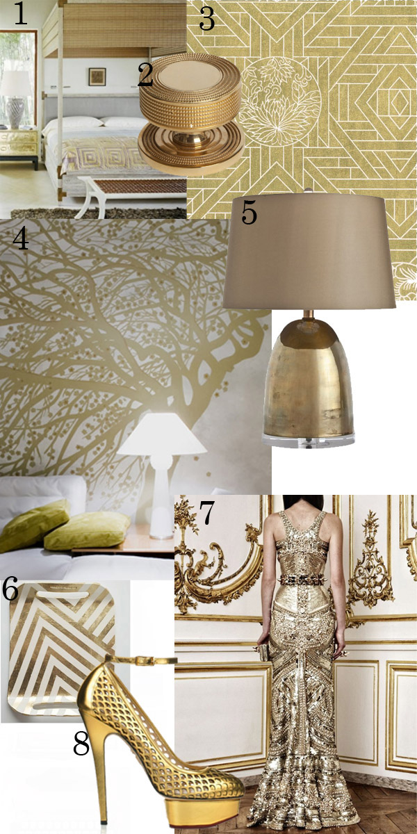
The metallic luster of gold is something I think of as a texture, more of an accent than an overall color.  In a lamp or light fixture, gold tea leaf on a ceiling, gold brings a really beautiful, monochromatic bit of glam to a room.  Gold is  a warm, reflective way to jazz up a space and my particular choice for jewelry!

1.  Bedroom by Kelly Wearstler

2.  Beaded Handle by Collier Webb

3.  Grace Studios Metallic Wall Papers

4.  de Gournay Wall Paper

5.  Ryder Small Vintage Lamp from Arteriors

6. Zig Zag Tray

7.  Dress by Givenchy

8.  Charlotte Olympia : Lorelei Shoes

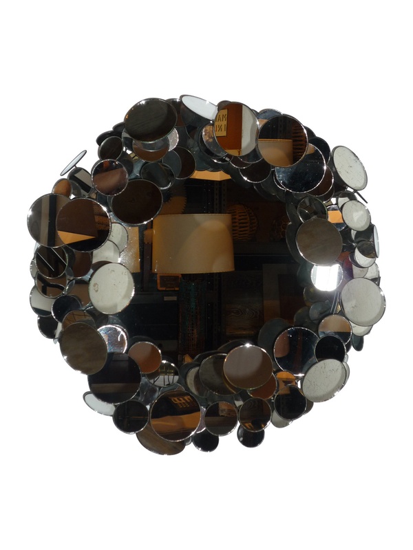
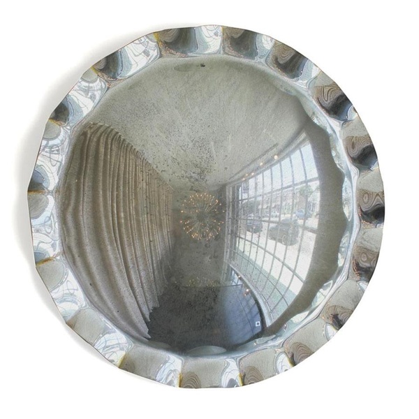
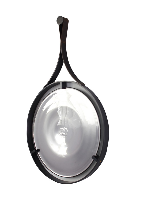
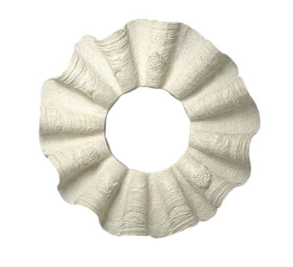
Favorite Things: Mirrors

Here are some of my favorite examples of mirrors in all shapes, sizes, and styles.

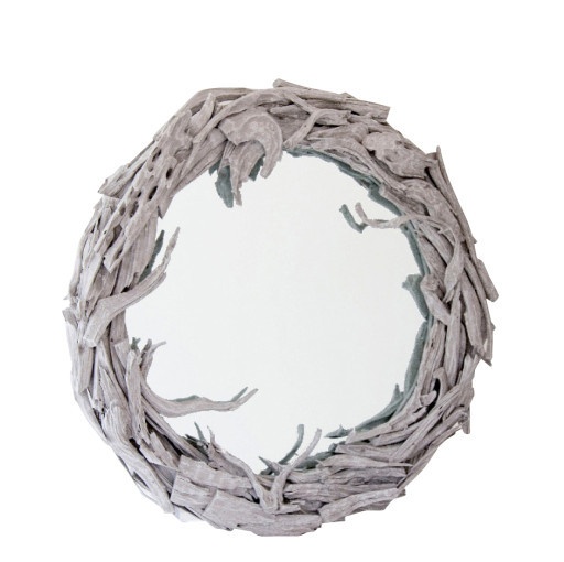
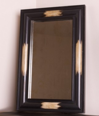
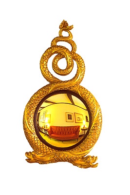
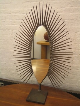
Mirrors make essential home accents.  They provide reflection and lighten a space and can even make a room appear larger.  I even really like the distortion of a convex mirror!  Here are some of my favorite examples of mirrors in all shapes, sizes, and styles.

1.  JS Driftwood Mirror2.  Pampa Mirror by Edwina Hunt3.  JT Mirror by Mclain Wiesand

4.  Ramo Mirror

5.  Entwined Dolphins Wall Mirror

6.  Octagon Bullseye Mirror

7.  Starburst Mirror from Mondo Cane

8.  Bubble Mirror – Tower 20

9.  Downtown – Laurel Convex Mirror 

10.  Moxham Mirror

11.  Shell Mirror

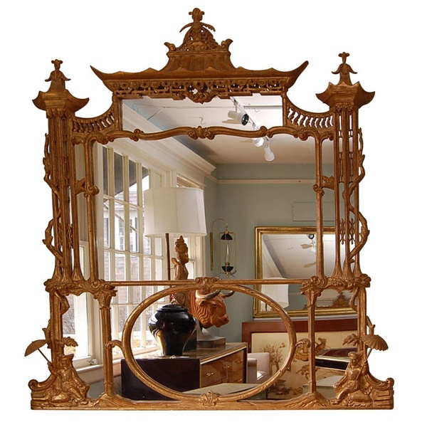
12.  Chinoiserie Mirror