Wild Reindeer Centre Pavilion, Norway

When I first came across photos of the Wild Reindeer Centre Pavilion in Norway, the images took my breath away.

When I first came across photos of the Wild Reindeer Centre Pavilion in Norway, the images took my breath away.  It is such a visually amazing place, just a rectangular box within this vast, gorgeous land.  The scene is almost too far-fetched to be believed, like nothing I’ve ever seen.

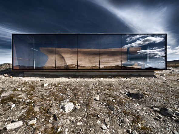
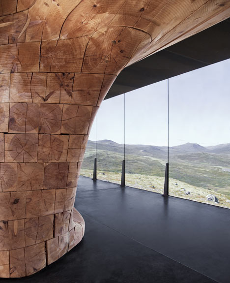
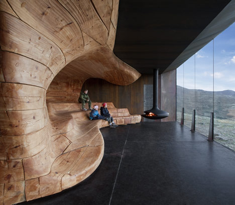
The pavilion is used by the Wild Reindeer Foundation, a charity which acts to protect Europe’s last wild reindeer herd.  Set against the backdrop of the Dovre Mountains in Norway, the Wild Reindeer Centre was designed by architectural firm Snohetta.  The exterior is constructed of a rectangular steel frame with one wall of glazed glass forming an observation point from which the entire sweeping landscape can be viewed.  The pavilion’s interior is dominated by an organic wood core built from pine beams by Norwegian ship builders.  Visitors reach the pavilion by way of a mile-long nature path.  Once they arrive, they can sit on the wooden form and be warmed by a hanging furnace.
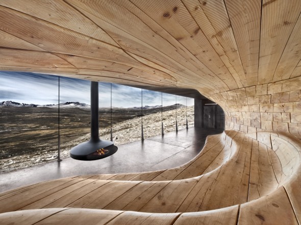
When discussing the building’s formation, the architects state, “This unique natural, cultural and mythical landscape has formed the basis of the architectural idea. The building design is based on a rigid outer shell and an organic inner core. The south facing exterior wall and the interior create a protected and warm gathering place, while still preserving the visitor’s view of the spectacular panorama.”  I find it fascinating how the pavilion’s shape exudes a sense of permanence while the sweeping curves of the interior reflect the mountainous lines of the distant Dovre.  What an incredible place this must be to visit in person!

Cover image by Klass Van Ommerman.  Other images by Ketil Jacobsen and Diephotodesigner

Aviator Style

Lately I have been loving aviator-inspired style!

Lately I have been loving aviator-inspired style!  It’s such a classy blend of retro and modern, representing a chic period of American history when people were adventurous, optimistic, patriotic, and willing to take risks.  Amelia Earhart embodied all of these traits, smashing stereotypes and becoming a symbol to the world that the role and image of the American woman had changed forever.  Aviator style brings all of these various ideas to mind and, at the same time, looks fantastic.

AVIATOR FASHION, created by ffpava on Polyvore.
Aviator fashion -- beautiful!
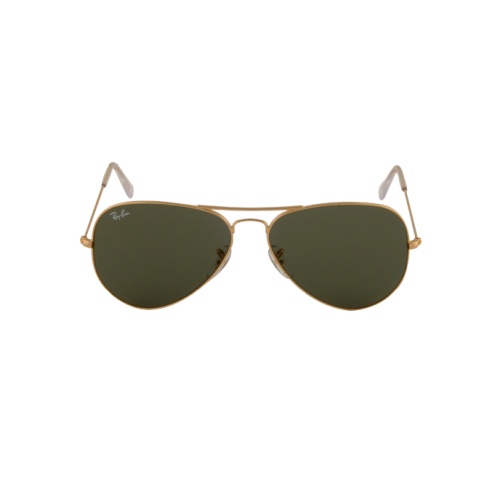
Ray-Ban Aviator Large Sunglasses - Never leave home with out them.
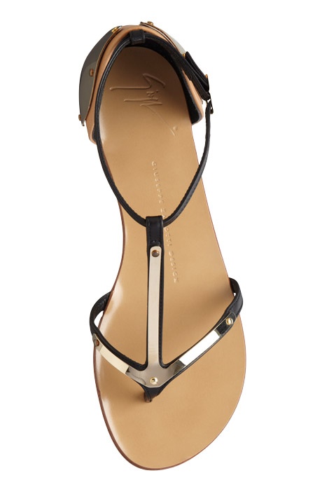
Leather flat, Giuseppe Zanotti Design. Love the aviator-style details.

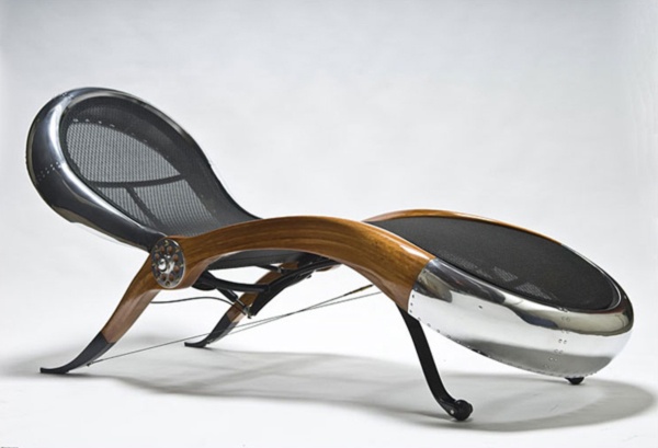
Aviator style doesn’t have to be limited to fashion; it can also inspire interior design.  Aged leather, sleek metallics, and details such as rivets create a look that is retro, chic, and memorable.

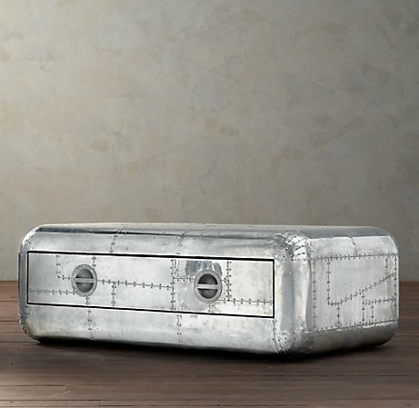
Blackhawk Coffee Table by Restoration Hardware
Phillip Jeffries Aviator Wall Covering
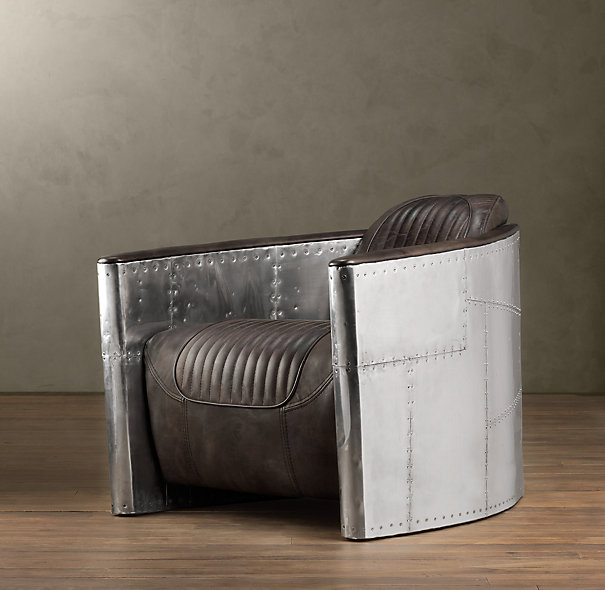
Aviator Chair by Restoration Hardware
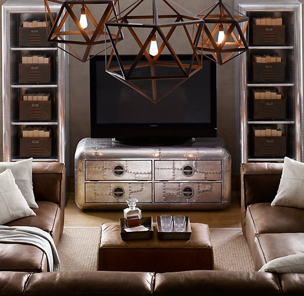
Aviator Interior from Restoration Hardware
Aviator Chair by David Catta
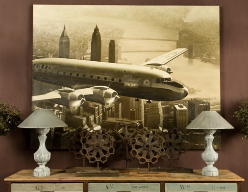
Plane Over New York from Bobo Intriguing Objects


*cover images via Harper’s Bazaar

Color Obsession: Ink

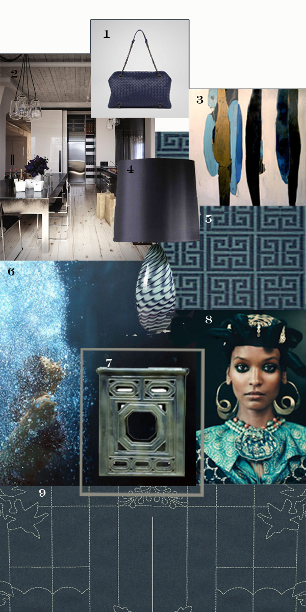
This deep inky color, just shy of black, is a shade I really love right now.

This deep inky color, just shy of black, is a shade I really love right now.  I can see so many uses for it, from accents to wall coverings to fashion.

Cover Image: Photos by (left to right):  Blue Pool Road, Pia Ulin, and Kate Mathis

1.  Indigo Intrecciato Nappa Duo Bag

2.  Beautiful industrial-chic kitchen with rustic touches by Richard Powers

3. Totem V by Meredith Pardue

4.  Porta Romana Glass Slinky Lamp

5.  F. Schumacher Greek Key Sisal

6.  Surfacing by Eric Zener
7.  Glazed Garden Stool by Dennis and Leen

8.  Liya Kebede

9.  Maharam


Michael Dweck’s The End: Montauk, NY

Photographer Michael Dweck often turns his lens toward Montauk, NY.
Photographer Michael Dweck often turns his lens toward Montauk, NY.  His Montauk photos so perfectly represent the mood and feel of the area that simply looking at them evokes all of the feelings of my family summers spent in this old fishing village perched on the farthest point of Long Island.
Waiting
Calm Before the Storm
Wave 12
Surfing the Break

When Dweck published his collection titled The End: Montauk, NY in 2004, it was featured in several art fairs and exhibits that year.  The work is so chic and sexy.  I really like the black and white photography and am especially drawn to Dweck’s nudes.  I think the human body is a work of art, and the way Dweck exhibits it is so free and casual.  These images really symbolize summer, especially the summer of the young and carefree, full of potential and excitement.

Sonya Poles
Lilla 3
Surfs Up
Jacqueline and Friend 2

Michael Dweck’s photo collections, including his images of Montauk, are available in book format.   His website also contains stunning galleries of his work as well as essays on his collections that beautifully describe his photographs.

Fashion

It probably comes as no surprise that fashion and interior design are closely linked. A passion for one usually includes a strong interest in the other and we can see overlapping trends in color and texture.

It probably comes as no surprise that fashion and interior design are closely linked.  A passion for one usually includes a strong interest in the other and we can see overlapping trends in color and texture.  I know I’m not alone in my love of both fashion and interior design!

What is it about fashion that appeals to designers?  I think it’s the creativity and individual expression allowed by both.  Fashion designers often take risks, combining materials and colors in unconventional ways.  They focus on details, on creating a certain mood or feel, and typically have their own signature style.  Like interior design, fashion often includes unique uses of materials, layers of textures, and important accessories.  You don’t see a model sauntering down the runway without jewelry, makeup, a hand bag, and a gorgeous hairstyle.  For the same reasons, a thoughtfully designed room has its own accessories that are crucial to the overall design.

Being both a mother and a busy designer, actually wearing the fashions I love on a daily basis is sadly impractical.  As much as I’d adore spending my days looking fabulous, some styles just aren’t meant for grade school concerts, installs at new construction, or afternoons at the playground.  If I could have my way, however, these are some of the gorgeous fashions I’d be seen in!

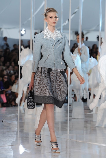
LV - The skirt reminds me of a laser cut leather pillow I just installed.
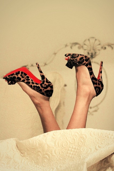
Louboutins.
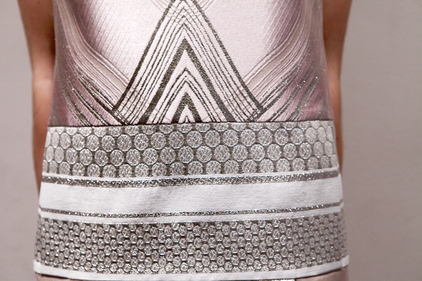
Love the metallic embroidered detail.
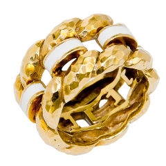
Enamel hand hammered ring - so cool!
Chanel
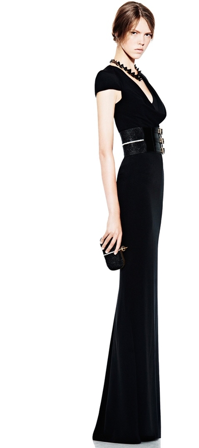
Alexander McQueen - Absolutely love the structure!
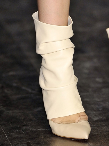
Victoria Beckham - Fabulous shoe!
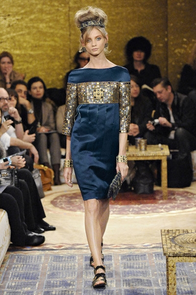
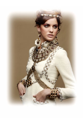
Chanel - Arabian Nights

I may not be able to spend my days dressed as a runway star, but I do love my high heels.  Anyone who knows me, knows I wear heels every day.  It actually becomes comical sometimes when I visit new construction.  The contractors comment on the heels and occasionally have to improvise platforms as we tour the site!  I can’t run around in high fashion, but at least I still have my high heels!


*Cover image via Felicity Brown


Margaritas!

With the arrival of summer, many of us start planning summer parties, cook outs, or even lazy days relaxing by the pool, at the beach, or lounging in a shady back yard hammock. Scenes such as these aren’t complete without a colorful cocktail, and nothing fits the bill like a margarita.

With the arrival of summer, many of us start planning summer parties, cook outs, or even lazy days relaxing by the pool, at the beach, or lounging in a shady back yard hammock.  Scenes such as these aren’t complete without a colorful cocktail, and nothing fits the bill like a margarita.

The origin of the classic margarita remains something of a mystery.  Some sources claim it was created by a bartender in Mexico in 1941, while others say the first margarita hails from Galveston, Texas.  Another possibility is that Americans crossing the border for alcohol during Prohibition simply adapted a brandy-based drink called the Daisy by substituting tequila for the brandy.  It probably isn’t coincidence that margarita is the Spanish word for daisy.

Whatever its origins, the classic margarita’s combination of tequila, orange liqueur, and lime juice served up in a cocktail glass rimmed with salt has been an enduring favorite for more than just its flavor.  Perhaps more than any other drink, the margarita symbolizes everything we love about a hot summer day, whether you prefer them frozen, over ice, or straight up.

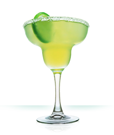
The classic margarita, instantly recognizable.

If you’re a margarita purist, sticking with the classic lime version might be your ideal.  But, creative bartenders and margarita lovers have adapted on the original to create all kinds of tempting flavors and colors.  I’m not talking about your typical frozen strawberry margarita!  Why not surprise your guests — or treat yourself — with one of these more unexpected margarita varieties?

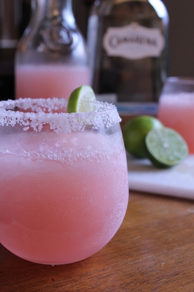
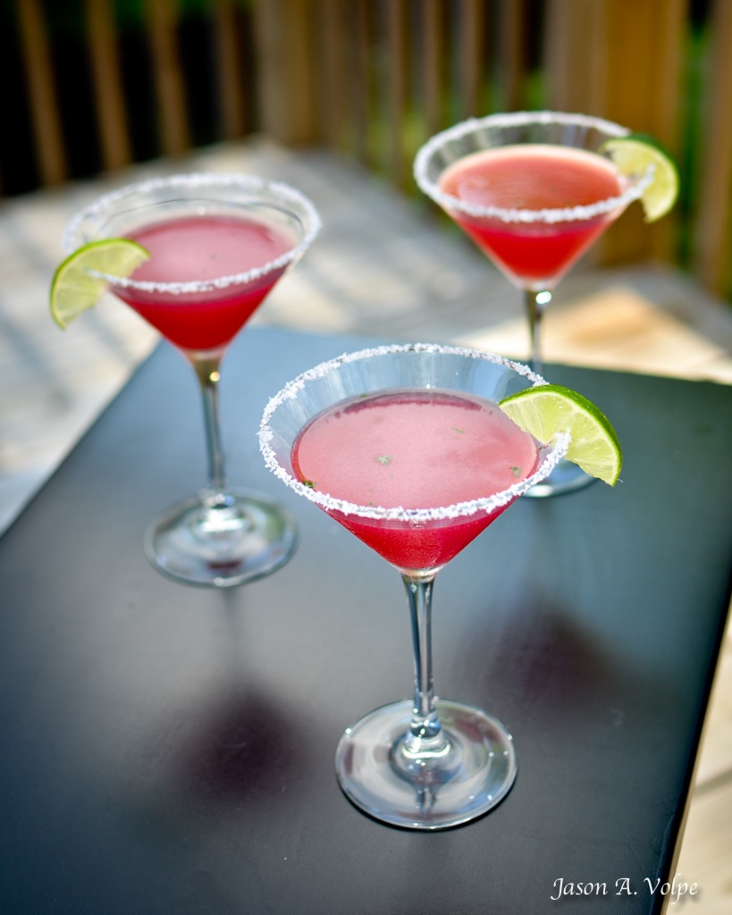
Pink Grapefruit Margarita
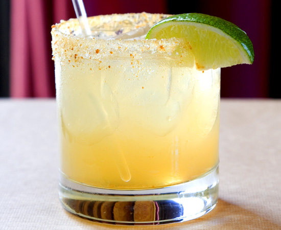
Ginger Margarita
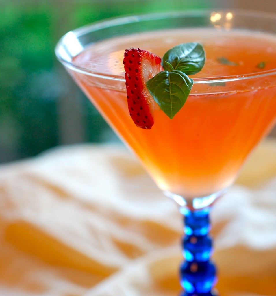
Strawberry Basil Margarita
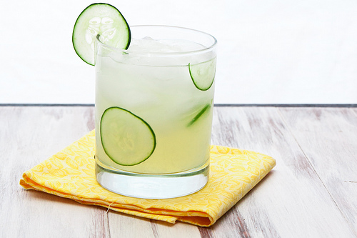
Jalapeno Cucumber Margarita
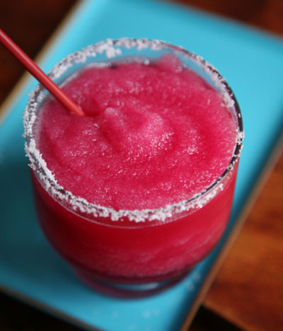
Prickly Pear Margarita
Pomegranate Mint Margarita

Clicking on any of the delicious images above will take to you recipes for each margarita.  You can get creative with glassware and avoid using traditional margarita glasses for serving or lime slices for garnishing.  Take inspiration from the flavors and colors of each margarita and experiment with different salts and sugars for rimming the glasses.  Whether you make a single drink for yourself or a pitcher for guests, your efforts will certainly be appreciated!

Uruguay

I think most people have a bucket list of places around the world they dream of exploring. I’ve been so fortunate to visit some beautiful places, but there are still many sights I’d love to see in person. Once such place is Uruguay.

I think most people have a bucket list of places around the world they dream of exploring.  I’ve been so fortunate to visit some beautiful places, but there are still many sights I’d love to see in person.  Once such place is Uruguay.

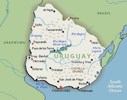
Uruguay may not be an obvious choice, or even a spot on the map most people can immediately point out.  When you think of South American destinations, it’s probably not the first place that comes to mind.  However, for me Uruguay seems like such  an interesting combination of development and wildness.  Its rolling plains and low hill ranges form a striking geography completely independent of the beautiful coastline.

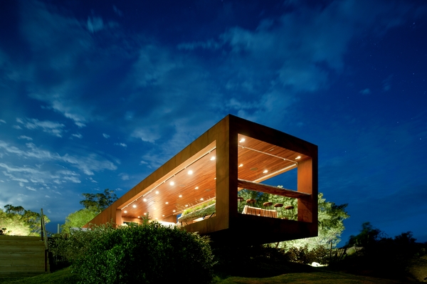
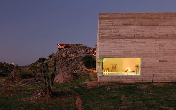
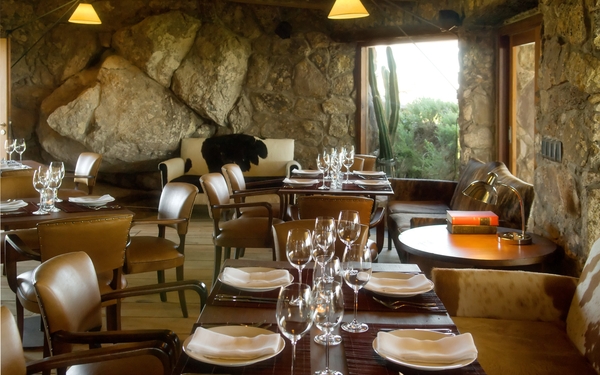
The appeal of Uruguay for me lies in the contrast between the wild beauty of the landscape and the architectural lines of places like Fasano Las Piedras in Punta Del Este.  This is an experience I would love to have, walking up through this dramatic greenery with the clean lines of the modern buildings that still manage to look like an organic part of the area.  There’s no commercialized clutter, just this stunning architecture among a rugged landscape.

Fasano Las Piedras is a luxurious estate comprised of 32 bungalows designed by renowned Brazilian architect Isay Weinfeld.  Weinfeld combines natural materials and sophisticated textures, weaving together the sensual and the severe.  His modern style has produced an artistically beautiful environment at Fasano Las Piedras.  Almost all of the color comes from the surrounding plants, a perfectly landscaped area that still feels casual and true Uruguay’s unique beauty.  It seems perfectly fitting that this resort is comprised of private bungalows instead of traditional hotel suites. The privacy and isolation of the bungalows simply reinforces the dwarfing effect of Uruguay’s sweeping skies.

What’s the most unusual travel destination on your bucket list?

Restoration Hardware, Spring 2012

When I recently received Restoration Hardware’s hefty Spring 2012 catalog in the mail, the understated, monochromatic cover gave little hint of the incredible products displayed inside.

When I recently received Restoration Hardware‘s hefty Spring 2012 catalog in the mail, the understated, monochromatic cover gave little hint of the incredible products displayed inside.  I was completely blown away by so many of the pieces — right now, nothing else can compete.  They nailed it!  Restoration Hardware’s current lines have so much to offer to many clients on many levels.  I could easily see myself doing a whole house with these pieces!

I believe the Spring 2012 catalog signals the pinnacle of Restoration Hardware’s shift over the years from a focus on authentic period hardware to true furniture gallery offerings suited to a luxury lifestyle.  When Gary Friedman became CEO in 2001, Restoration Hardware was still being affected by multiple store closings and restructuring of the company.  They began to expand their offerings to include bathware, textiles, furniture, and lighting and gradually moved away from such items like toys, books, and gadgets.  The core of the company now seems dedicated to fine, historical design as well as updated classics, all with superior quality.  If this most recent catalog is any indication, Restoration Hardware has truly come into its own as a distinctive and responsive source for home decor.

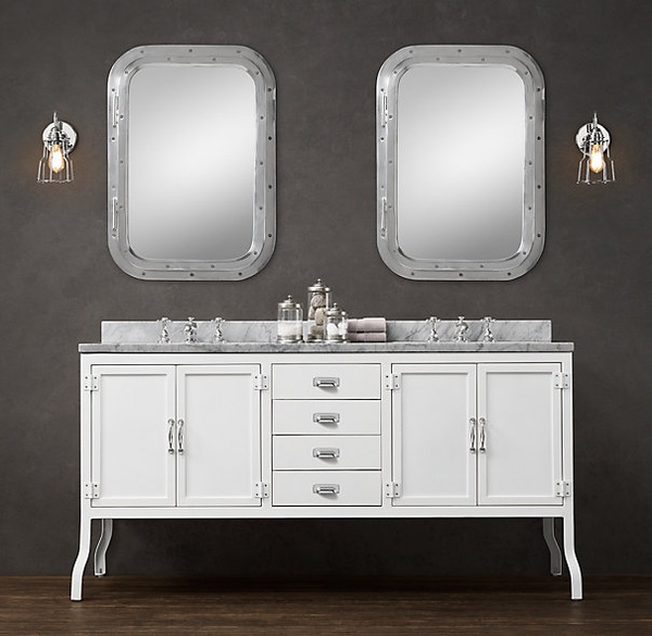
The bath furniture is just genius.
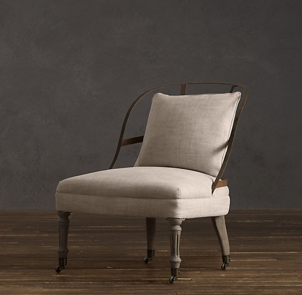
Couturiers Chair - love the metal frame. Really charming!
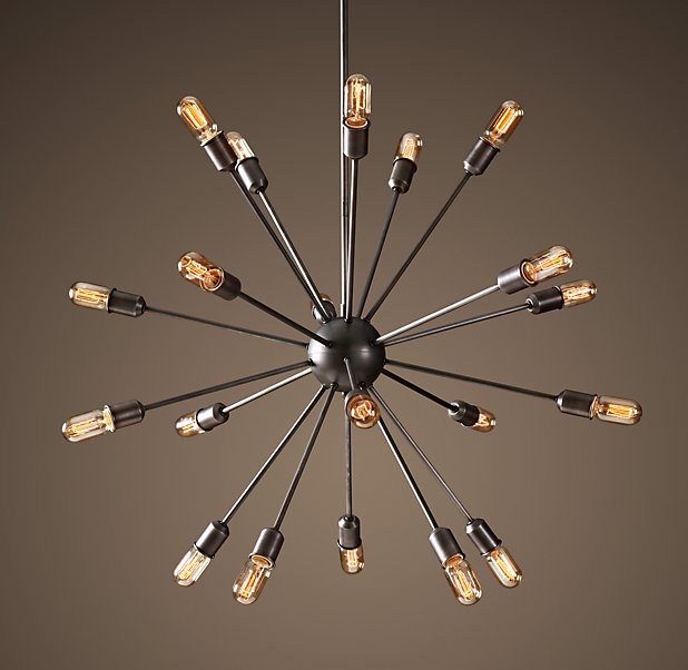
Sputnik Filament - a great nod to the mid century!
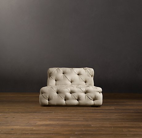
Soho Tufted Chair - Think about grouping two near a fireplace.
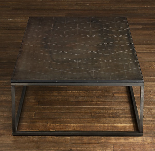
I love the idea of the metal with the geometric pattern.
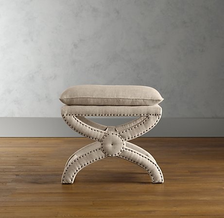
My all time favorite nail head ottoman. So reasonable!
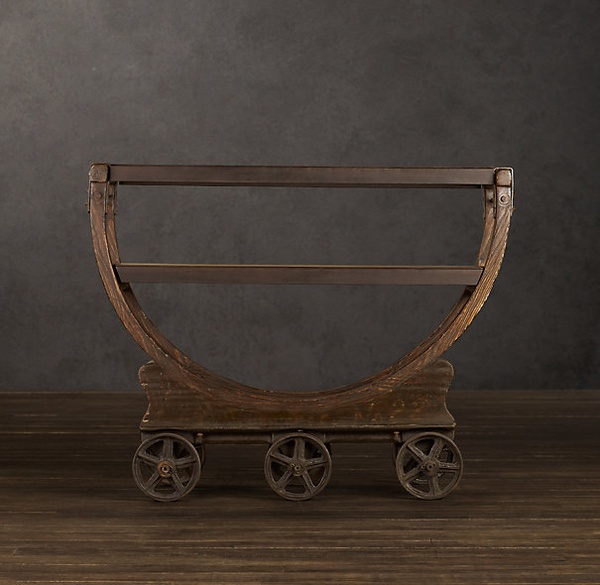
Vintage factory bar cart - it looks like an antique!
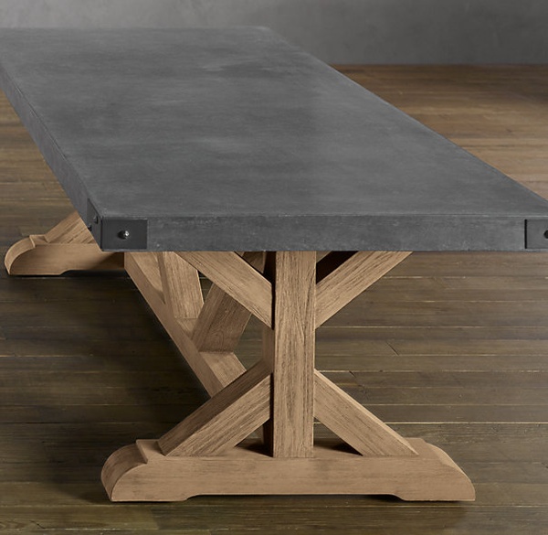
Concrete dining table, in 2 sizes! I can't wait to install this in my next project.

Have you seen this Restoration Hardware catalog?  If so, what do you think and do you have a favorite piece or line?  I know I am really looking forward to incorporating a lot of these furnishings in my own projects!


Beds to Adore

A bedroom is a special retreat in your home.

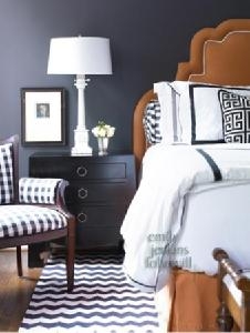
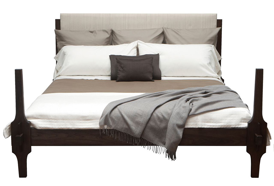
A bedroom is a special retreat in your home.  Your own private space to start and end each day, a relaxing and personalized place that should be a reflection of what each of us finds most attractive and calming.  Naturally, the bed tends to be the centerpiece to any bedroom.  Like other pieces of furniture, beds come in a vast array of styles, from traditional to modern to completely fanciful.

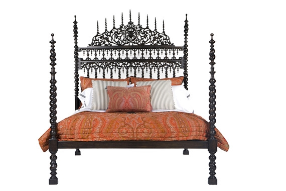
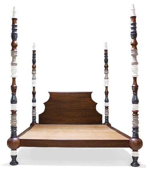
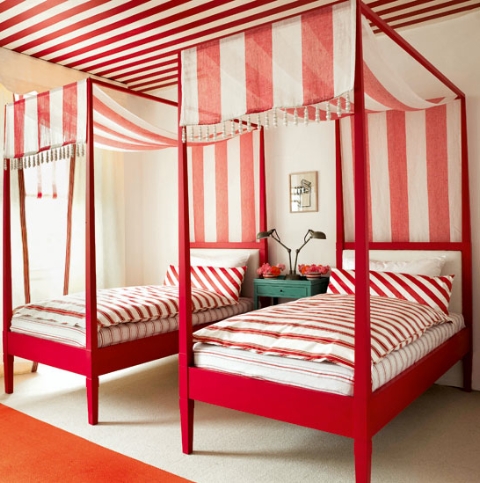
I’ve collected some examples of beds that caught my attention.  Each of them appeals to me for different reasons, but what they all have in common is beautiful, unique design.

Silk bed by Cisco Brothers.
Yum.
Lisbon Bed by Martyn Lawrence Bullard
Spindle Bed by Lawson-Fenning
Great canopy idea.
Greydon Bed

How does your bed compare?  Is it an afterthought still waiting for a headboard, or is it exactly the right piece for your bedroom?


Viceroy Anguilla, Caribbean Beach Resort

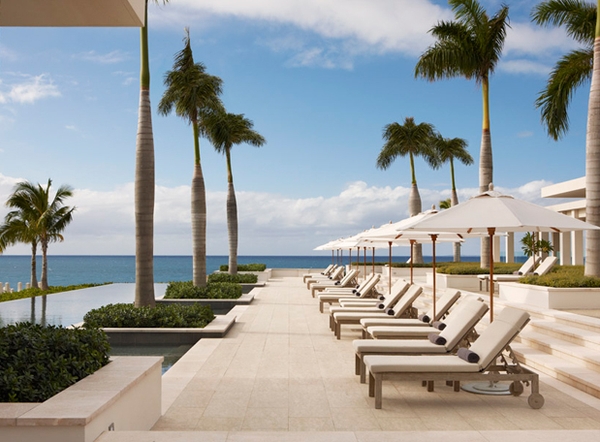
With its white sand beaches, lush landscape, and luxury accommodations, it’s difficult to imagine a more sumptuous and relaxing destination than the Viceroy Resort at Anguilla.

With its white sand beaches, lush landscape, and luxury accommodations, it’s difficult to imagine a more sumptuous and relaxing destination than the Viceroy Resort at Anguilla.  The most stressful part of a vacation here could be deciding how to spoil yourself rotten.  Snorkeling, swimming in picture-perfect pools, treating yourself to an incredible spa day, enjoying drinks at the cliff side beach bar, experiencing authentic local culture, or playing at water sports are just some of the ways guests can while away their tropical days.

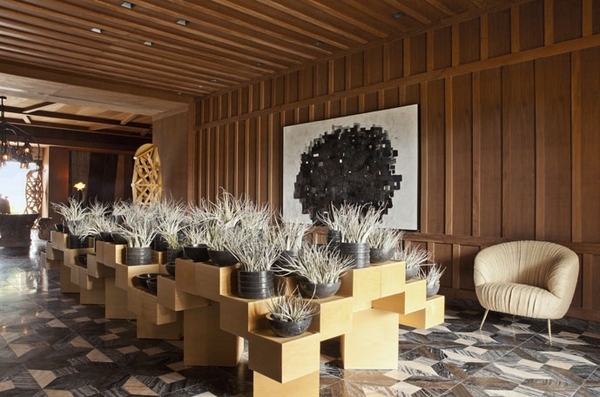
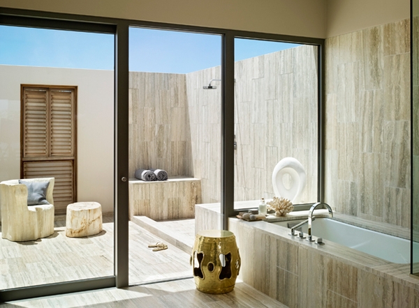
But what makes the Viceroy Resort so stunning is the  incredible design of the resort and its guest accommodations.  The 116 guest spaces, from private villas to bluff top guest rooms, showcase amazing design by Kelly Wearstler.  The resort’s modern architecture interacts seamlessly with the surrounding nature, while the interiors feature organic, locally-inspired palettes, and textures.  Sophisticated and contemporary, with natural, complex textures, everything about the decor immerses guests in luxury.