Golden View Firenze
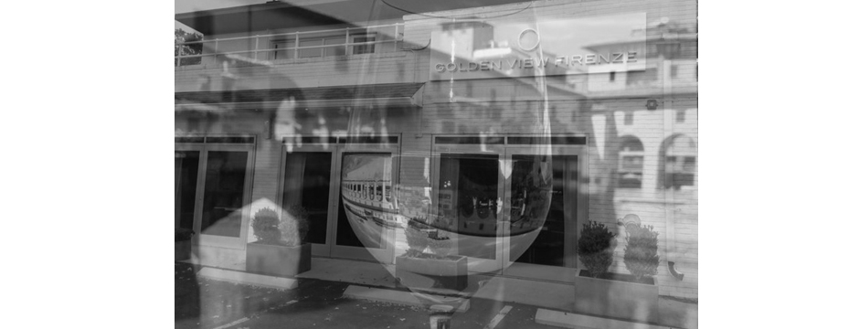
I recently visited a new restaurant in Greenwich called Golden View Firenze and was really impressed with everything from the food to the decor.
I recently visited a new restaurant in Greenwich called Golden View Firenze and was really impressed with everything from the food to the decor. From the start of my visit to Golden View Firenze, I loved the fresh, exciting atmosphere of this very chic restaurant.
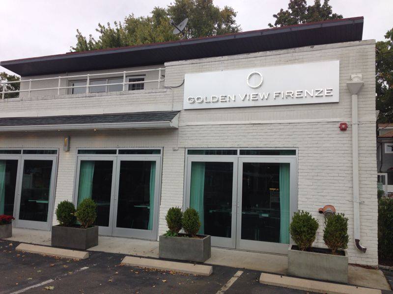
Owner Tommaso Grasso also has a restaurant in Florence, Italy. He decided to open a second restaurant in Connecticut after a visit to the area. Tommaso brought chef Francesco Casu with him from Florence, ensuring the food at Golden View Firenze would be a true representation of authentic Tuscan cuisine.
The decor at Golden View Firenze is intimate and based in a clean white palette. The view to the kitchen is open, letting diners watch the chefs prepare fresh dishes, including hand-made pastas. Shelves of wine are a prominent feature of the restaurant’s interior, but it isn’t all for show. The staff are very knowledgeable about the wine and well prepared to offer suggestions.
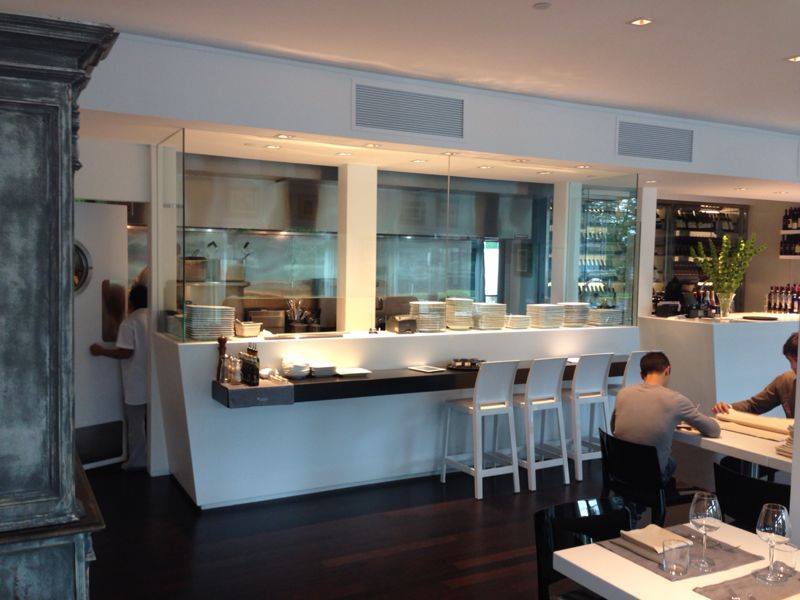
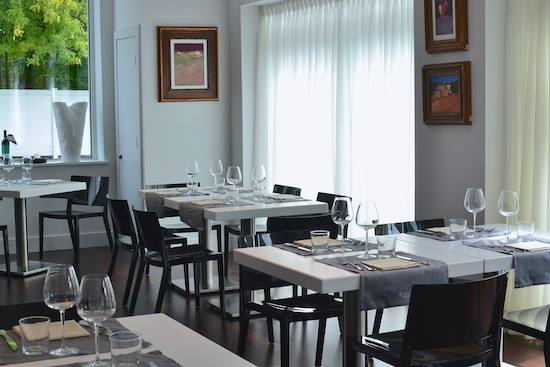
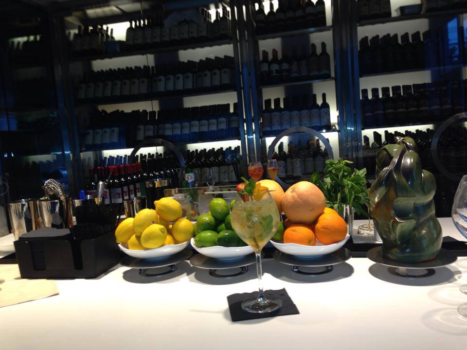
Just like in any really good restaurant, the food must be the star of the show. Everything we tasted was excellent! I started with a wine mojito, which was delicious. We had a cheese plate and I tried the veal dish as well as an incredible four cheese pasta. My husband had the filet with an amazing dipping sauce. Even the bread was perfect. It really was like eating in Italy. The menu is very well done and I look forward to going back soon!
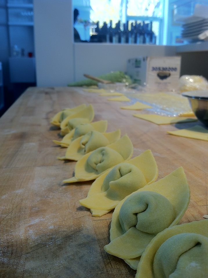
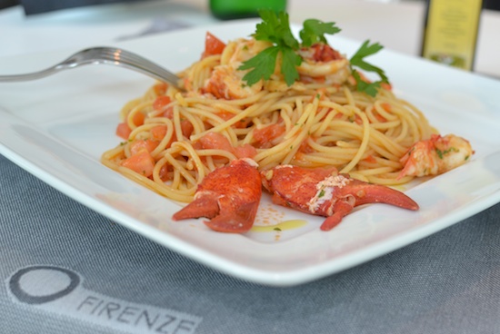
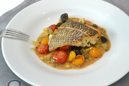
A review on Ilovefc.com by Mary Kate Hogan mirrors the fantastic experience we had at Gold View Firenze and describes some of the other perfect dishes. You can learn more about Golden View Firenze by finding them on Facebook.
NEH Design in Depth: A New Studio in Greenwich
Last week, I was happy to host New England Home’s networking event for designers, builders, and architects at my Greenwich studio.
Last week, I was happy to host New England Home‘s networking event for designers, builders, and architects at my Greenwich studio. We had a wonderful evening! My friend Stacy Kunstel – talented stylist, writer, producer, and editor – wrote a great feature about this event for the NEH blog. What a great start to a new year in my new studio.
Design in Depth: A New Studio in Greenwich
By Stacy Kunstel
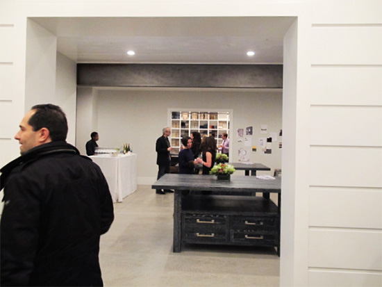
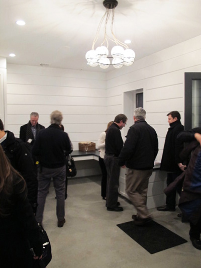
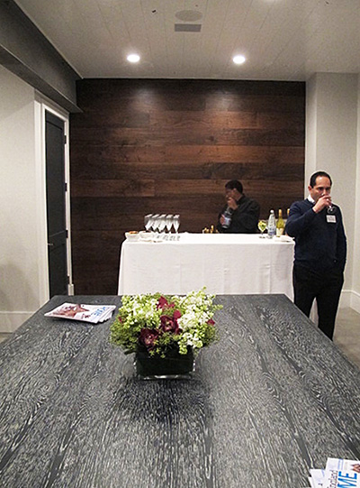
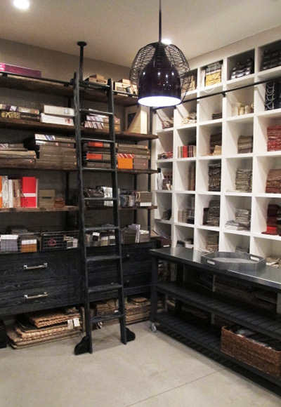
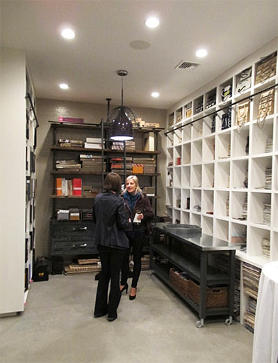
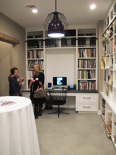
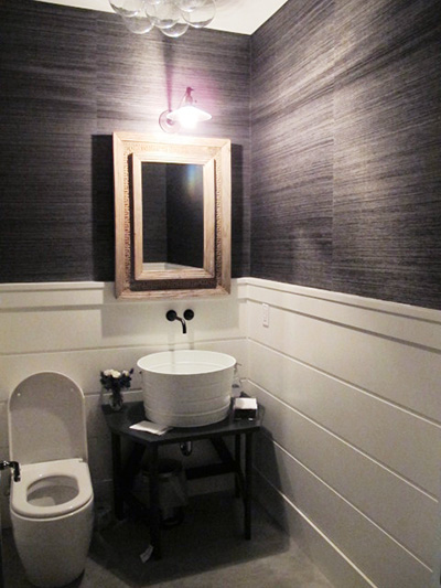
Last Thursday night New England Home kicked off its networking events for 2014 in Greenwich at the new studio of Amy Aidinis Hirsh Interior Design. Having published Amy’s work before in our Connecticut edition, and having recognized her with a 5 Under 40 design award,* we of course expected it to be a wonderful space. I, for one, was unprepared for how much I absolutely loved this interior design studio. Here are a few photos of the space before it started to fill up with people.
Photos by Stacy Kunstel
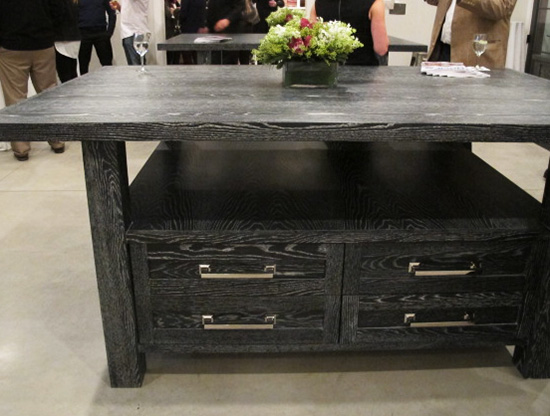
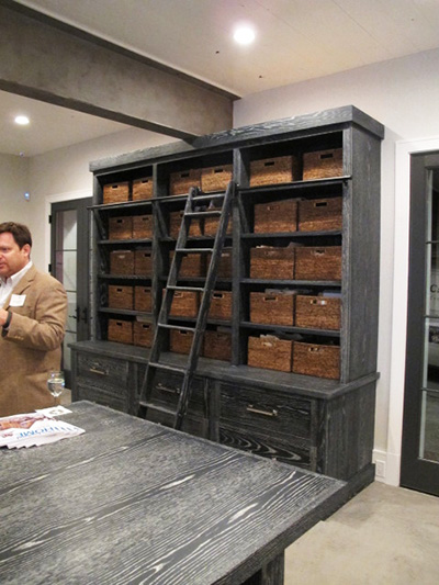
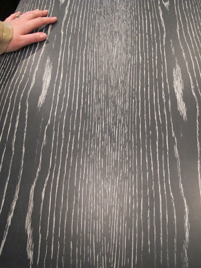
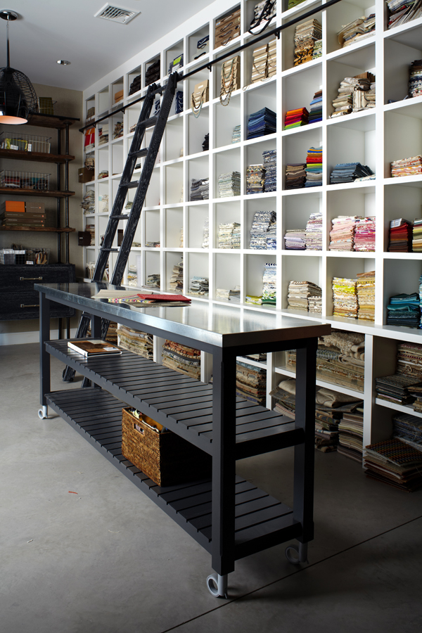
As with her residential designs, details are so important and play such a crucial role. These cerused tables and baskets serve as stylish markers and organizational tools.
More than once during the evening I heard other designers mention how much they wished their own samples room looked like Amy’s.
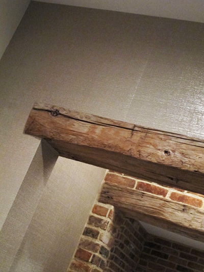
Equal measures rough and glam balance the studio, such as this combination of rough-hewn beams and shimmering paper.
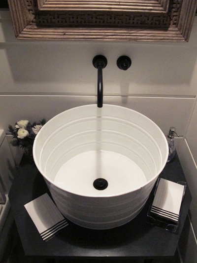
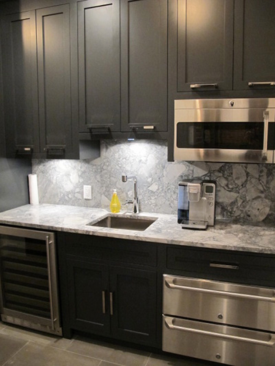
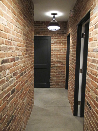
Check out the powder room, break room, and back hall.
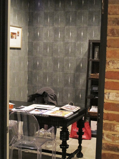
Amy’s own office is just as chic.
Congratulations, Amy, on your new space, and thanks for making it such a great party!
* Editor’s note: It’s not too late to be one of 2014’s 5 Under 40 award winners—however, all nominations and supporting material are due next Monday, February 10. Click here for more information.
Design Dose
Sheer organization.
Giambotte: Sausage, Chicken, Peppers, and Potatoes
This is a great dish to make on a cold night!
I found this recipe in a cookbook my mom gave me years ago. The cookbook is Elodia Rigante’s Italian Immigrant Cookbook and it is filled with many wonderful recipes. She also shares stories and pictures of her family throughout the book. Many of the dishes are from her mother, whom she calls Mammanon. She says Giambotte is from Bari, her father’s hometown in southern Italy.
 The word Giambotte means mixture and is a peasant dish. The original recipe calls for boneless chicken breasts, but I like to use bone-in pieces as they tend to stay moist when cooking. I also add chicken stock to the recipe, which creates a delicious sauce. If you use sweet sausage, you may want to add hot red pepper flakes to make a spicy Gambotte. If you use hot sausage, the dish will be spicy enough. Either way, it is a great dish to make on a cold night!
INGREDIENTS
1 lb sweet sausage
1 lb hot sausage
or
2 lbs of either hot or sweet sausage
4 whole boneless, skinless chicken breasts, sliced in 2 inch pieces
or
2 whole chicken breasts, bone in, skin removed, cut in half, then each half cut again
4 to 6 drumsticks
¼ cup olive oil
1 bag small yellow creamer potatoes, halved
1 red pepper, sliced
2 Italian green peppers, sliced
1 large onion, sliced
chicken stock (optional)
1 teaspoon oregano
½ cup each chopped fresh basil and parsley
2 whole bay leaves
salt and pepper to taste
hot red pepper flakes (optional)
Serves 4 to 6
In a large skillet, add some of the olive oil. Add the sausage and sauté over medium heat until browned. Remove the sausage and set aside in bowl.
Sauté the chicken pieces in the oils from the sausage in the skillet. Season with black pepper and cook until brown. Reduce the heat to low; add the sausage back to the skillet and simmer.
In a separate skillet, heat up some olive oil and add the peppers, onions and potatoes. Season with salt and pepper, brown the vegetables and cook until tender. Transfer the vegetables to the skillet with the sausage and chicken. If using the chicken stock, add to the mixture. Add the chopped parsley and basil, the whole bay leaves, and season with salt and pepper to taste. Simmer until all flavors are mixed together. For additional spiciness, add ¼ tsp of hot red pepper flakes; adjust accordingly. Remove whole bay leaves before serving.
Serve the Giambotte with warm, crusty Italian bread and your favorite salad!
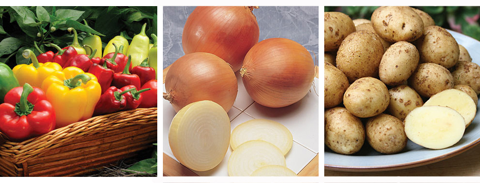
Cover images courtesy of Burpee
Feature in Greenwich Magazine
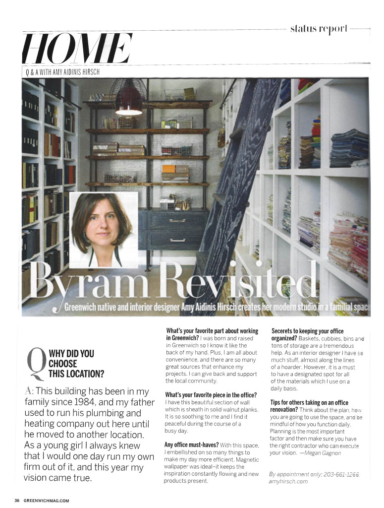
I recently sat down with Greenwich Magazine to talk about my new studio and office space.
I was recently interviewed by Greenwich Magazine to talk about my new studio and office space. It was a great opportunity to express why this building is so special as well as the process of creating my ideal working office and I was so excited to see their feature in this month’s issue.
Design Dose
Traditional beauty.
Pretty Rooms
The Merriam-Webster dictionary defines pretty as, “attractive to look at, usually in a simple or delicate way.”
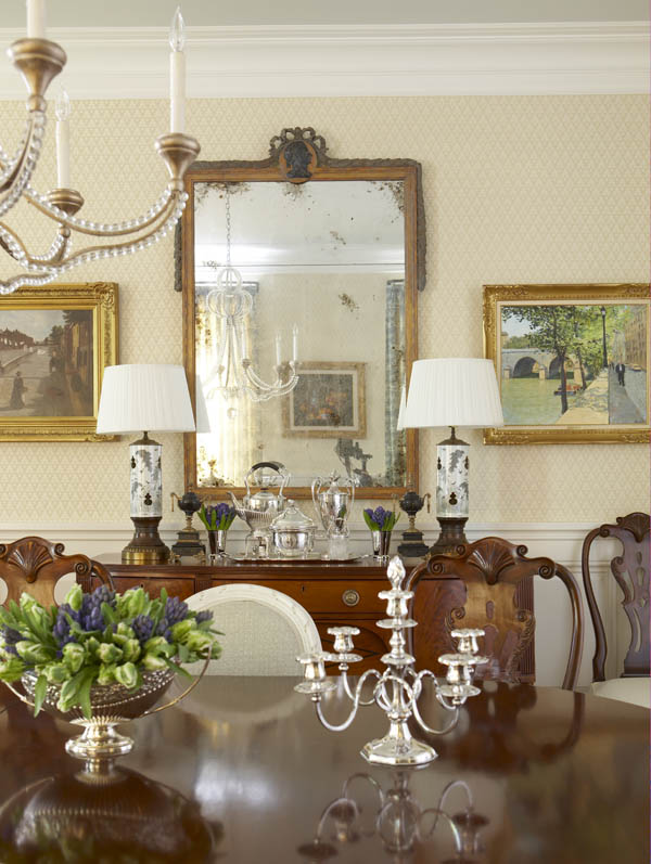
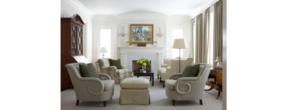
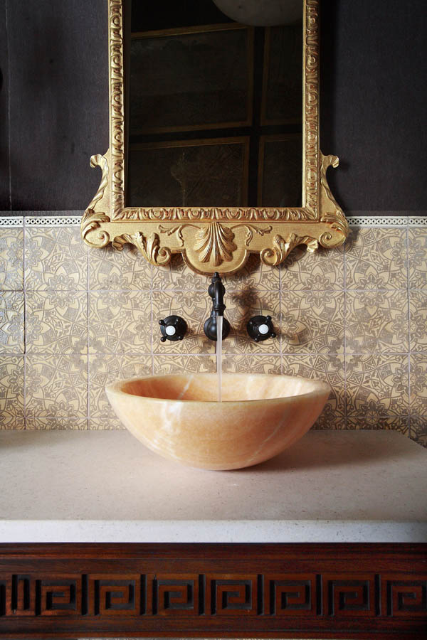
The Merriam-Webster dictionary defines pretty as, “attractive to look at, usually in a simple or delicate way.” When I’m sourcing for inspiration, I sometimes come across rooms that just strike me as being so pretty. When all of the elements of a space come together to create a pretty environment, the room looks so welcoming and pleasant.
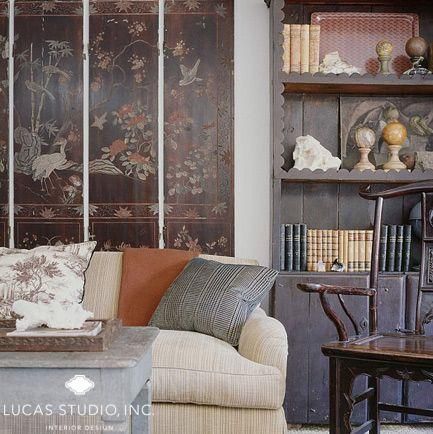
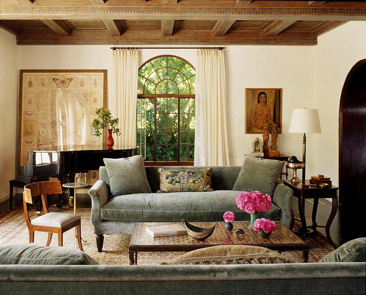
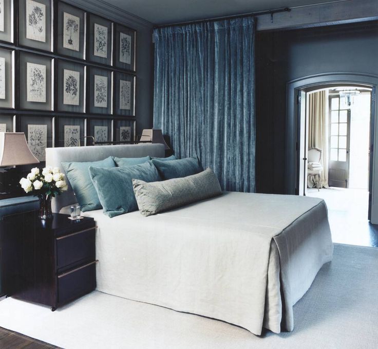
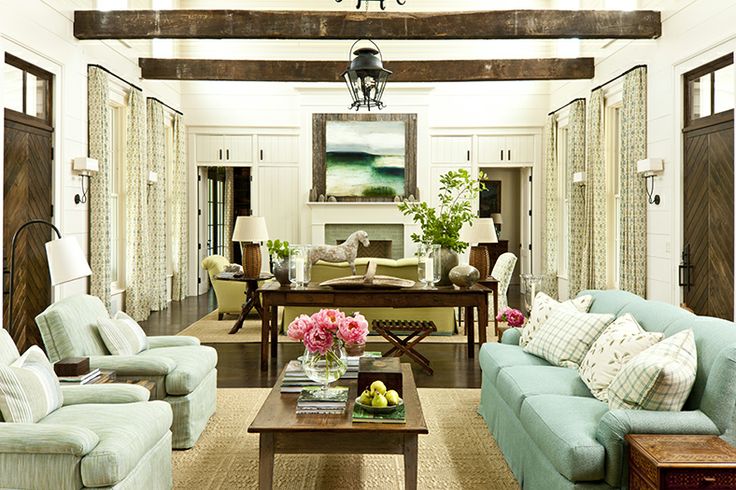
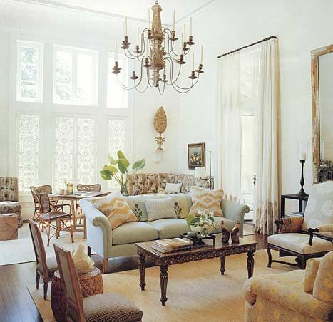
When a room is soft and warm, it is naturally inviting. Pretty rooms are comfortable and charming without being boring or run-of-the-mill. A bright, cheerful room makes a relaxing sanctuary. Making small statements with lighting, accessories, or additional color saves a pretty room from being too cloying. The overall effect is clean, simple, and appealing.
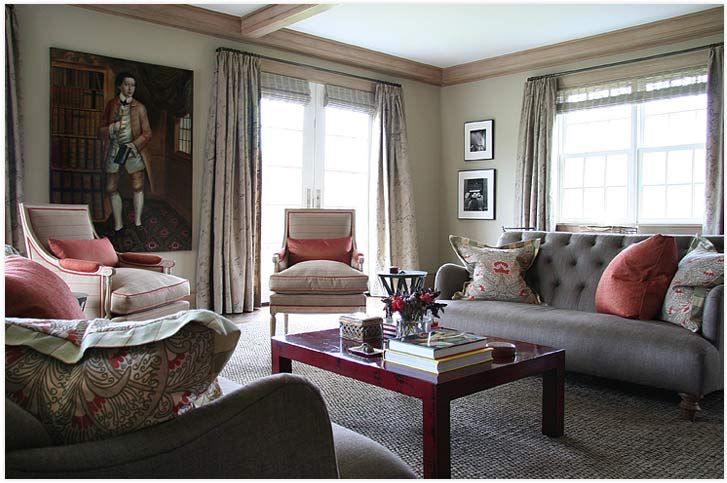
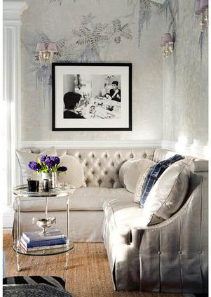
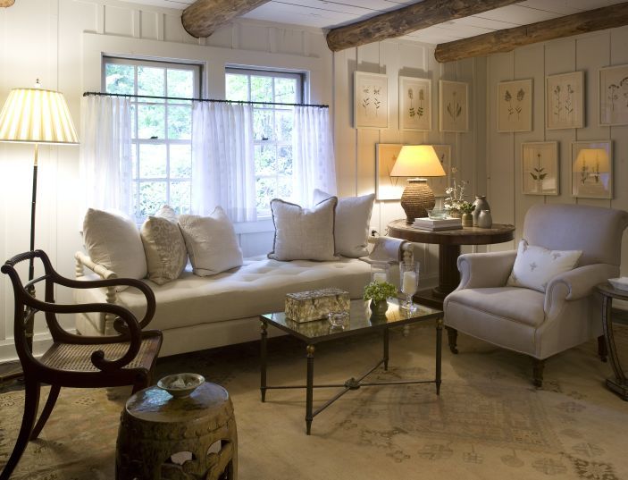
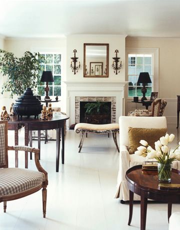
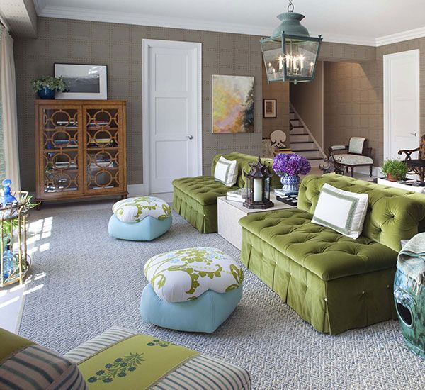
What’s your idea of a pretty room?
Design Dose
Dynamically simple.
Great Articles in Feb 2014 House Beautiful
The current issue of House Beautiful, February 2014, included some really great features.
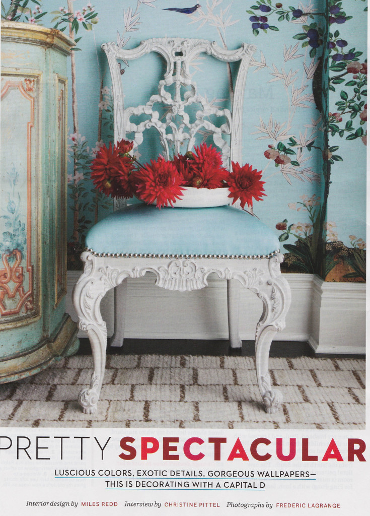
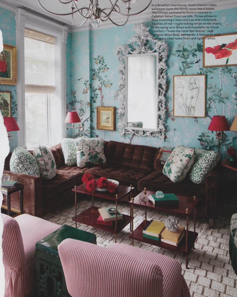
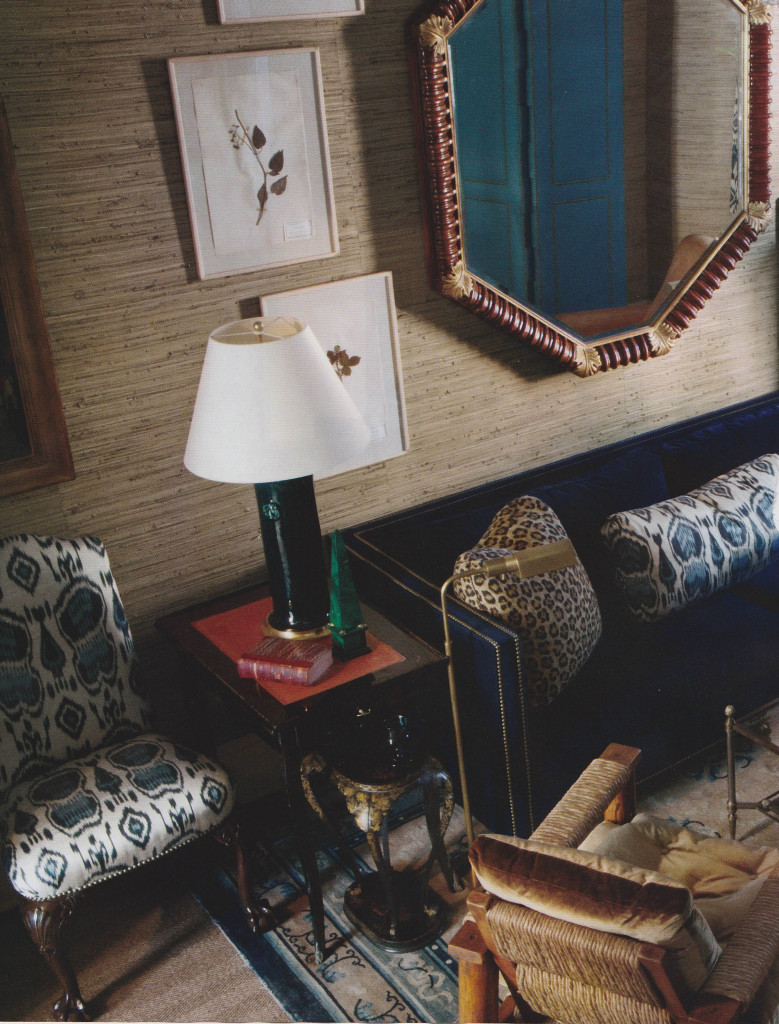
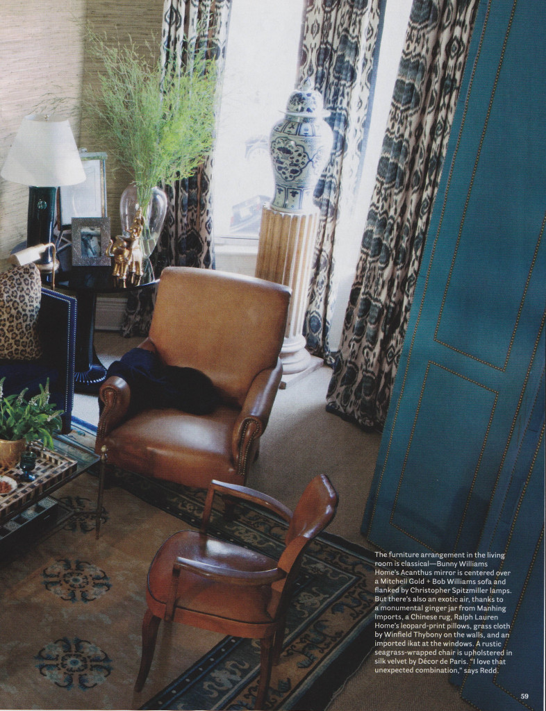
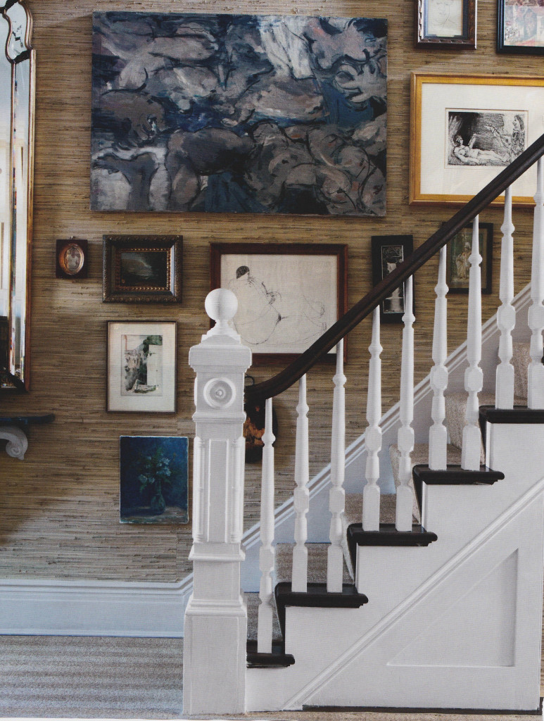
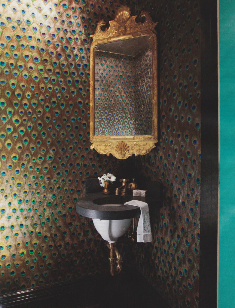
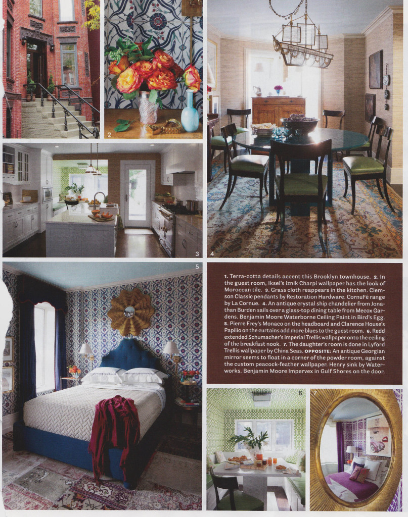
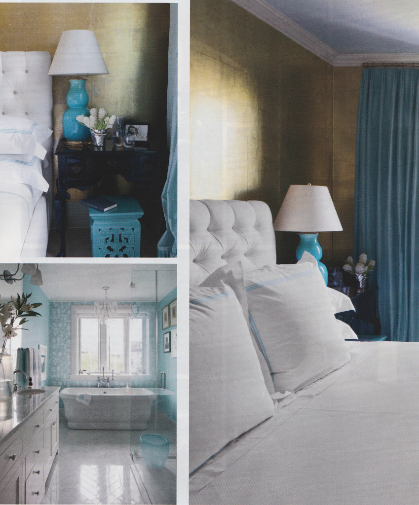
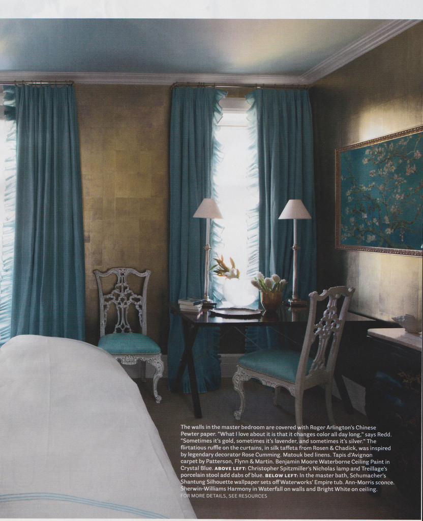
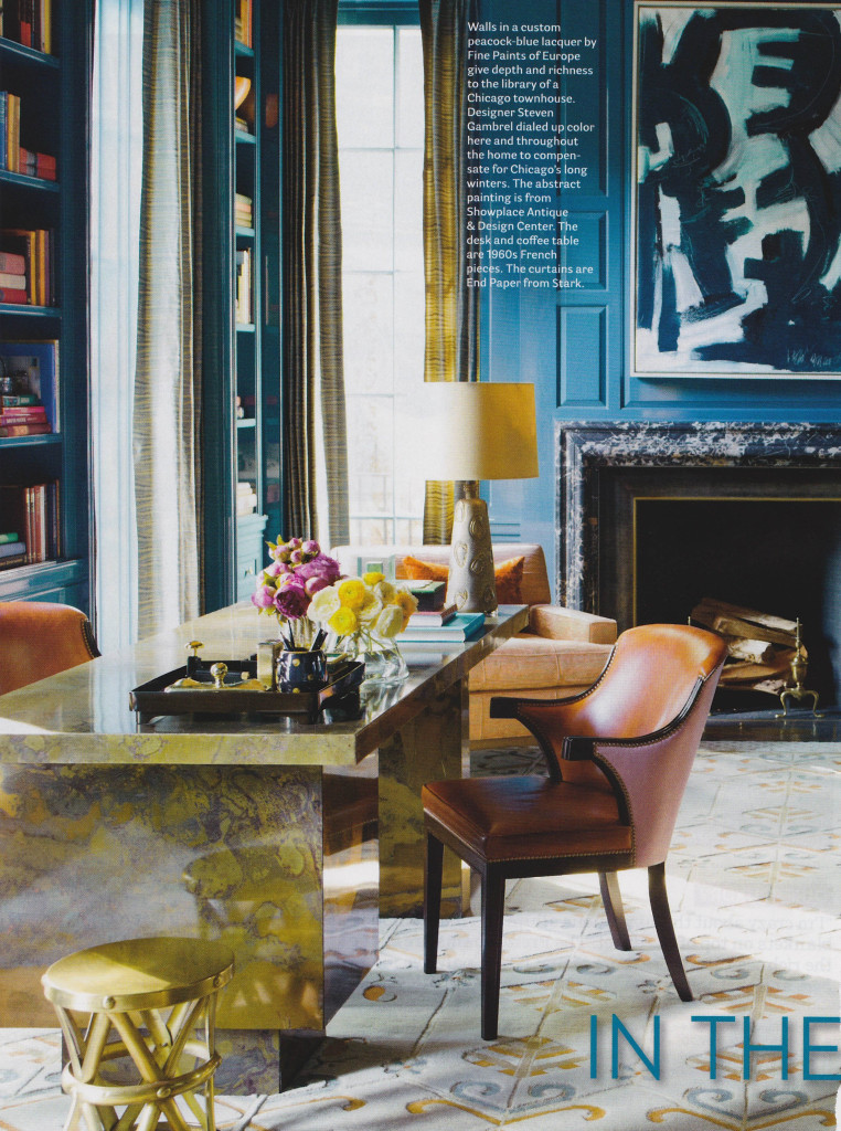
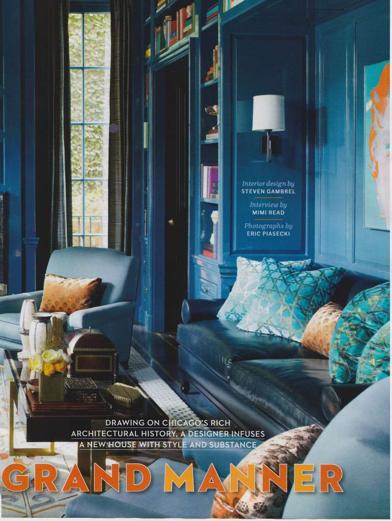
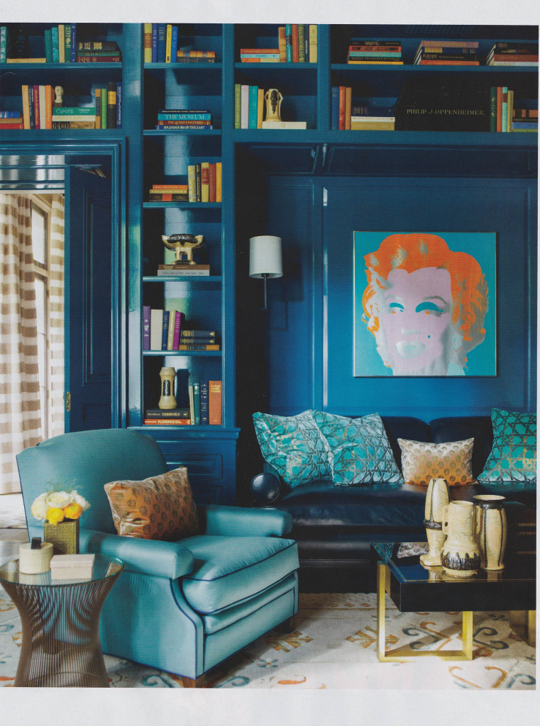
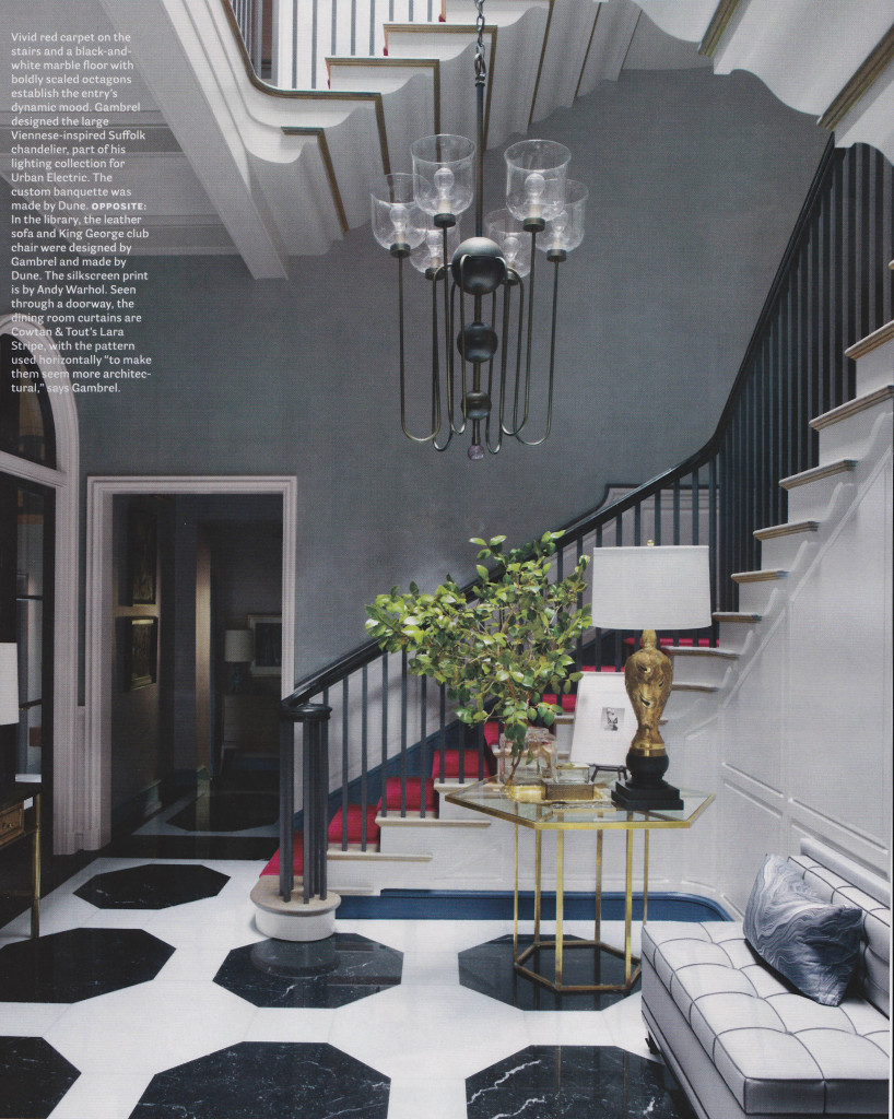
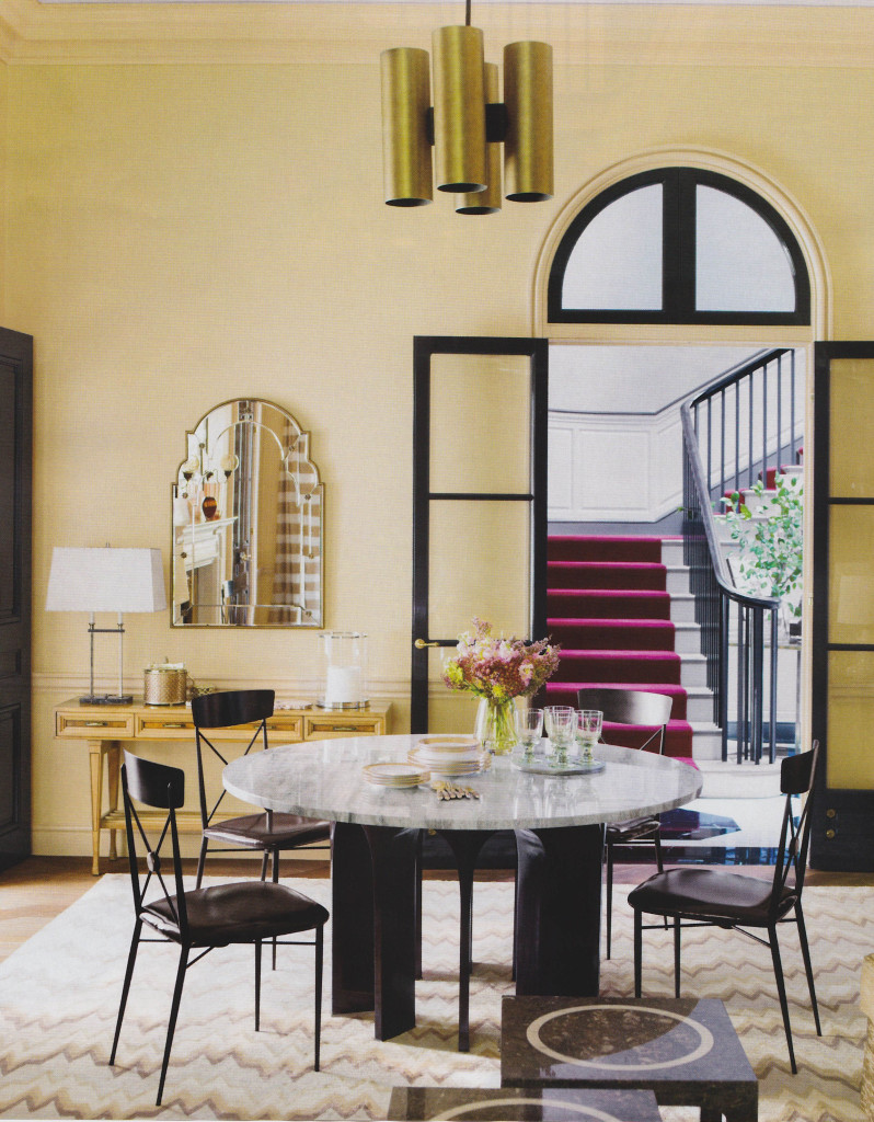
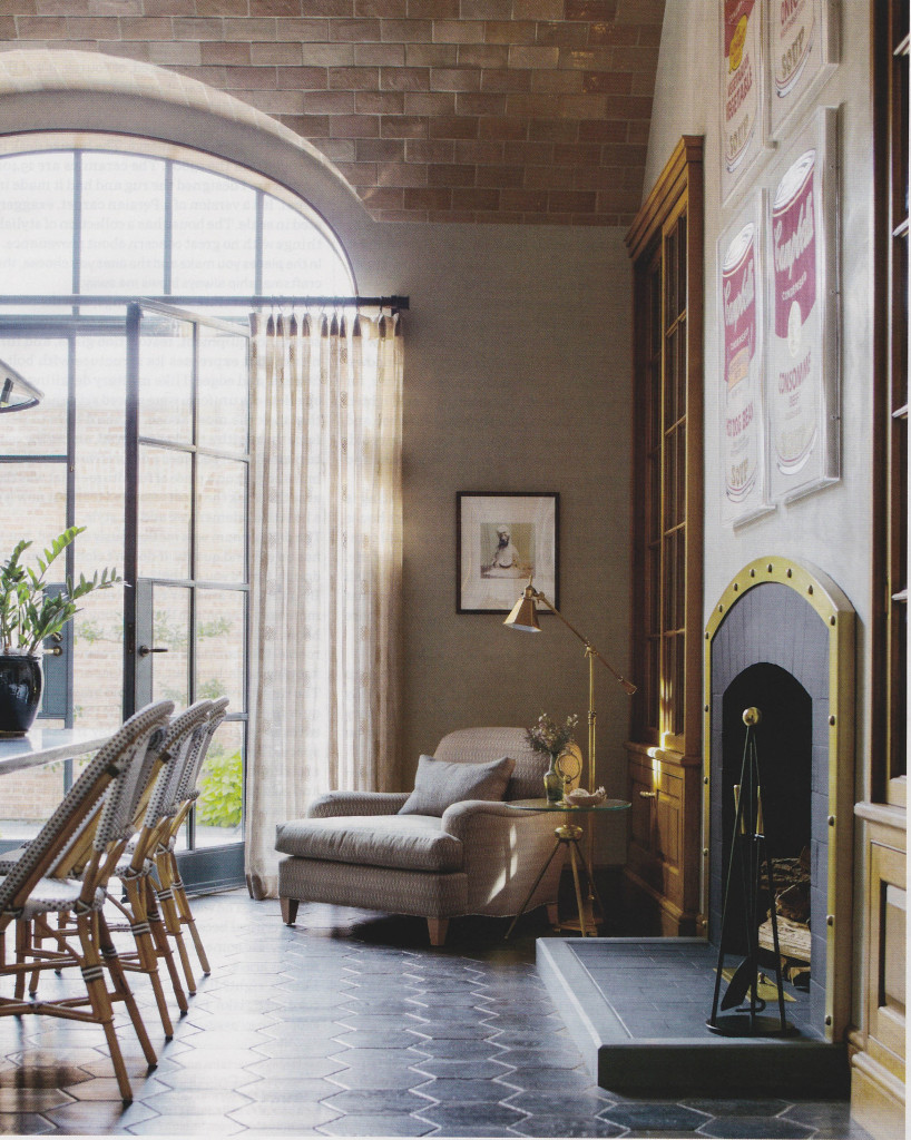
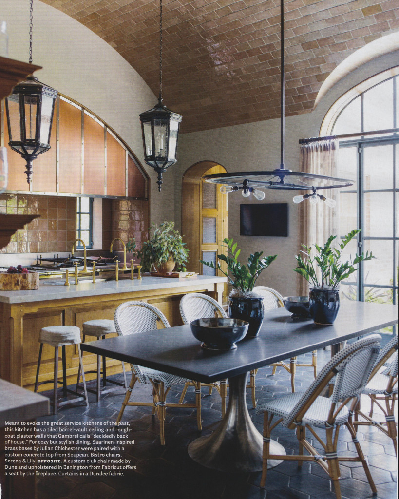
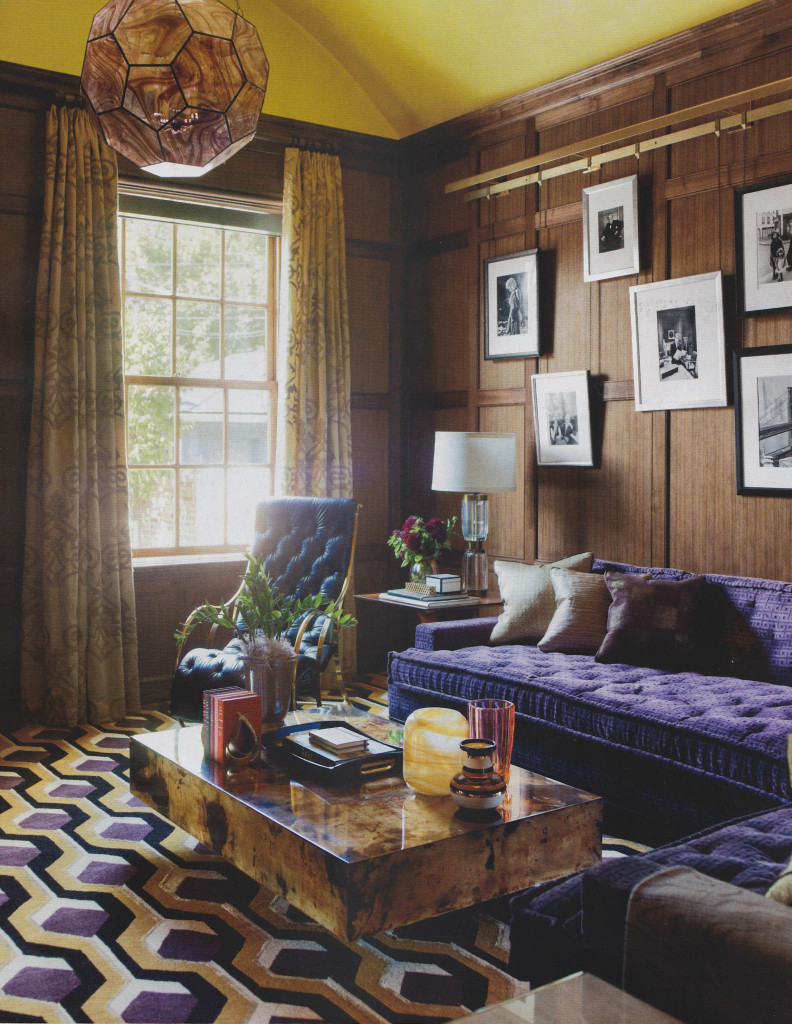
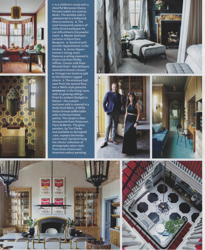
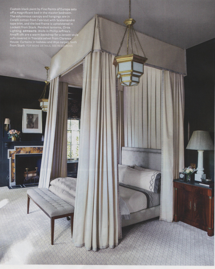
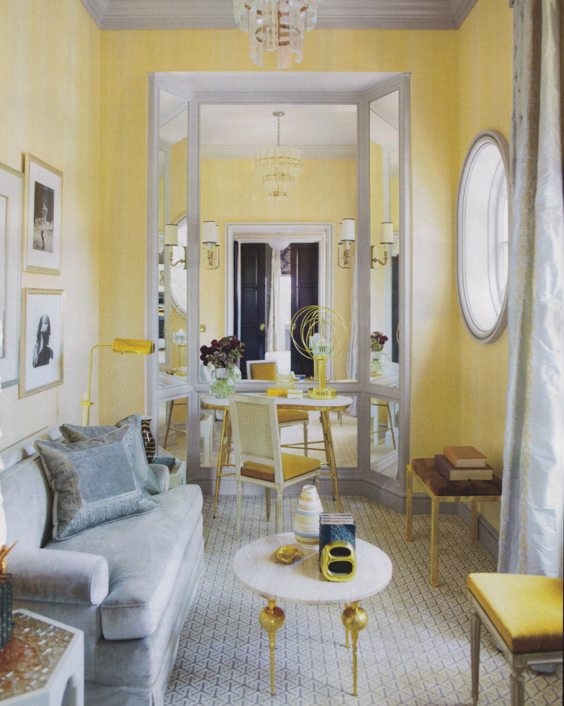
The current issue of House Beautiful, February 2014, included some really great features. Two articles in particular stood out for me; Pretty Spectacular, featuring design by Miles Redd, and In the Grand Manner, featuring design by Stephen Gambrel. Both articles showed how these wonderful designers used an amazing amount of color. From Gambrel’s use of peacock blue lacquer to Redd’s bursts of bold colors throughout a Brooklyn residence, the rich color stands out in these beautiful spaces. The effect is so textural and rich. The saturated colors create warmth and pure decoration, with tons of pattern upon pattern.
When I design for clients, I sometimes struggle between days of preferring clean, sleek interiors, and then days when I love layering with color and just inundating a room with detail. What I love about these features in House Beautiful is how they show that Redd and Gambrel don’t sacrifice on quality and their clientele understand that something so perfectly orchestrated can be comfortable and livable. It is really inspiring! I walked away from this issue wanting to shake off the winter doldrums and do something bold.
Pretty Spectacular
By Christine Pittle. Photos by Frederic Lagrange.
In the Grand Manner
By Mimi Read. Photos by Eric Piasecki.

