AtHome in Fairfield County: French Twist

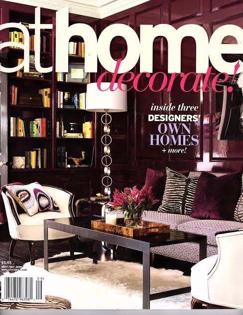
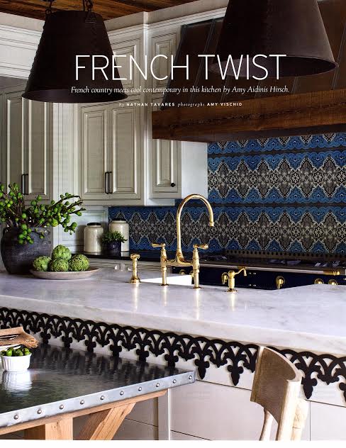
I am so pleased to share an editorial featuring a recent project in At Home in Fairfield County’s September/October 2015 issue.

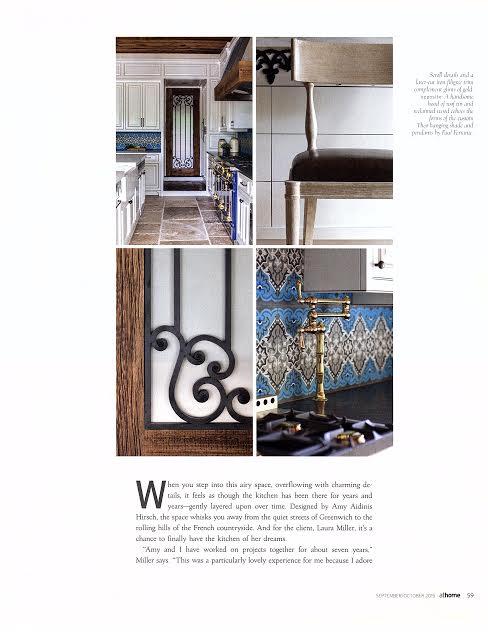
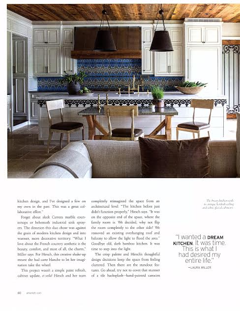
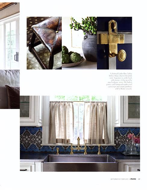
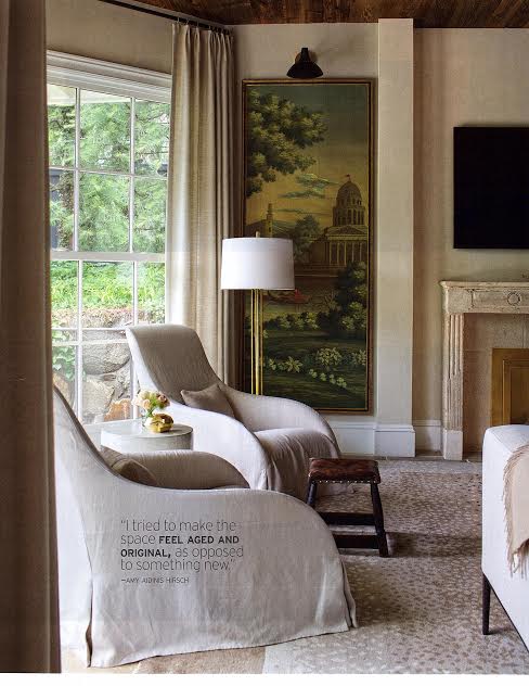
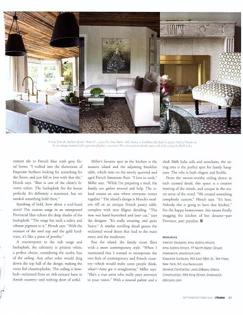
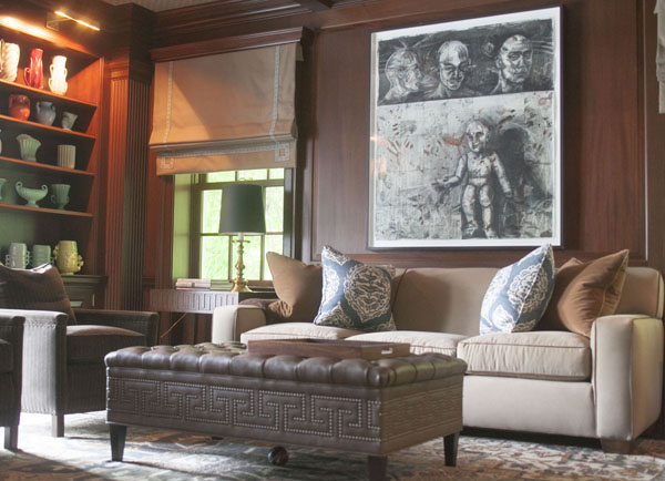
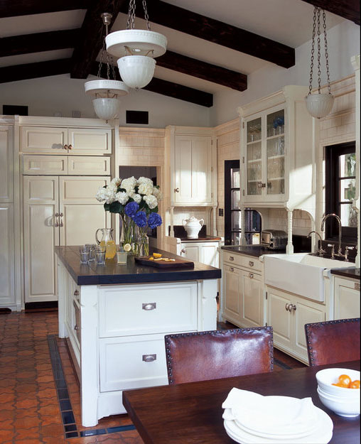
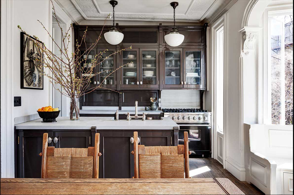
I am so pleased to share an editorial featuring a recent project in At Home in Fairfield County‘s September/October 2015 issue.  This editorial features a kitchen I designed for a long time client, someone who’s been with me since I started my career over eight years ago.  The benefit to a long term client relationship is that I’ve already earned their trust.  When we first talked about the kitchen, the client turned to me to say, “This is what we want,” gave me their wish list, and let me have carte blanche.  They were so open to everything I presented that there was very little tweaking between what came out of my head and the final design.  It’s so nice to see what’s possible when you develop a great client rapport over time.  Many thanks to At Home magazine for the feature!


AtHome in Fairfield County Amy Aidinis HirschAmy Aidinis Hirsch 1Amy Aidinis Hirsch 2Amy Aidinis Hirsch 3Amy Aidinis Hirsch 4Amy Aidinis Hirsch 5Greenwich Interior Design

Housepad App

I really appreciate the Housepad App as a communication tool and an all-in-one resource for seamlessly maintaining a home on so many levels.

When touring this year’s Kips Bay Showhouse, one of the things I found really interesting was a display on the new Housepad App.  Developed by Michael Bruno, founder of 1st Dibs, the Housepad app is an excellent tool for homeowners who want to stay organized and take a proactive approach to running their household.  It puts a number of resources at your fingertips.
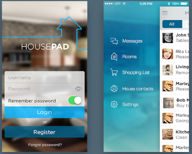
Housepad App 1I know when I leave a client’s home after completing a project, it won’t look the same the next time I return.  Little things like the arrangement of cushions or the placement of accessories may be off and I find myself wanting to fluff pillows or tweak other details.  With the Housepad App, the homeowner can create room by room lookbooks so everyone from the kids to the cleaning staff knows how a room is meant to look.  It’s a simple way to communicate in order to consistently have your home looking its best.
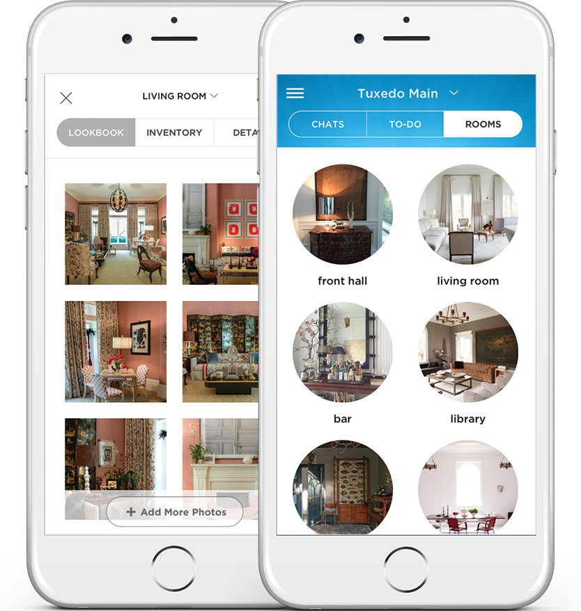
Housepad App 2 copyAnother feature of the Housepad App is the ability to create to-do lists.  These lists can be shared and assigned to family and staff who are then able to send notification when each task is complete.  For a large household or one with an extensive staff, this can be a valuable time saver that keeps everyone on the same page and ensures important tasks are finished on schedule.
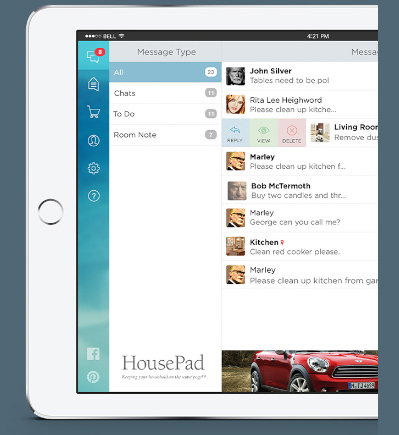
Housepad App 4One of the most thoughtful features of the Housepad App is the ability to create a catalog of household items and appliances complete with invoices, warranty information, and instructions.  So much more efficient than searching through files or binders if an appliance needs repairs!  Additionally, you can store household emergency contact information, including details such as the location of shut off valves and fire extinguishers.  The App even allows you to control a Nest thermostat, schedule maintenance calls with Handy, and keep a master shopping list with one-click Amazon ordering or just as a reference.  All of these tools can be shared with members of the household from family to pet sitters to cleaning staff.

I really appreciate the Housepad App as a communication tool and an all-in-one resource for seamlessly maintaining a home on so many levels.  It’s such a smart solution!

Matt Story

I was first introduced to Matt Story’s paintings on a visit to Samuel Owen Gallery.

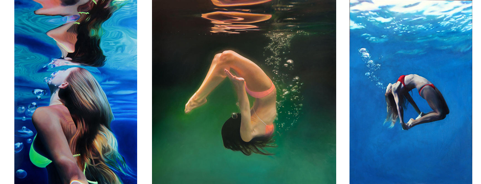
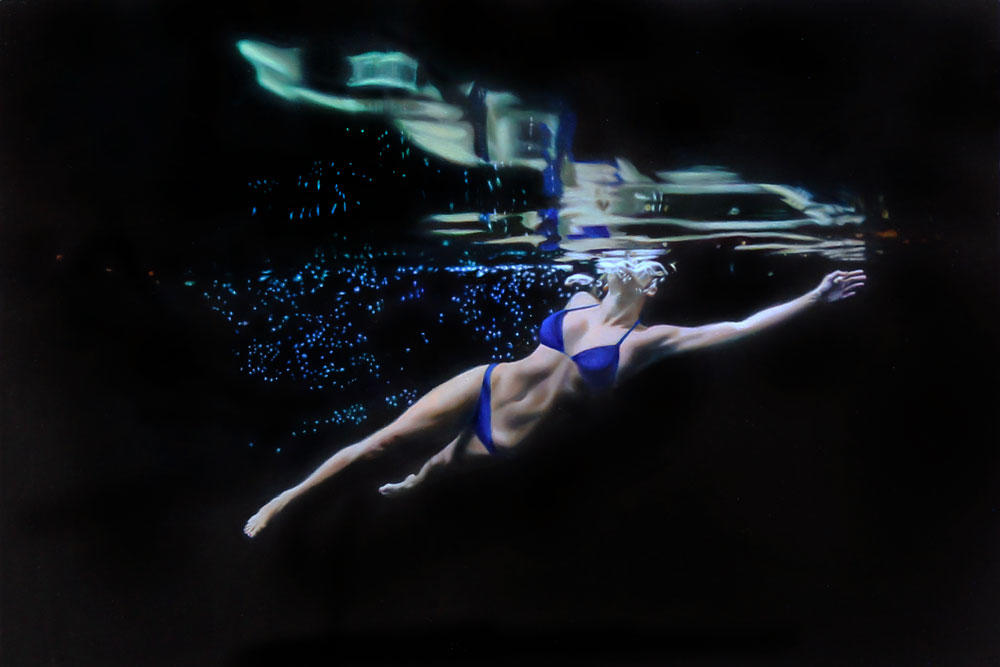
I was first introduced to Matt Story‘s paintings on a visit to Samuel Owen Gallery.  He paints beautiful landscapes, but his water series is what really caught my eye.

Pacific Dream Floating
Green Velvet Rising
Green Velvet Rising
Red Bubble Down
Red Bubble Down

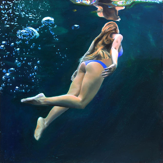
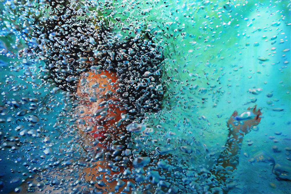
To create these paintings, Story first captures dozens of images during a photoshoot in a pool with a model.  He then goes through the photos to develop a concept for a painting.  This process may involve cropping the image in the photo, determining a the width to height ratio, and carefully choosing references among thousands of photos of bubbles.  After blocking the painting and transferring a scaled-up drawing to the canvas, he begins to add colors, tweaking the image and adding layer after layer of colors.  The final touch involves a complicated glazing of each bubble to achieve a perfect reflective look.

A Bubble in Hand
A Bubble in Hand
Blue Twist Black
Blue Twist Black
Blue Bubble Cruise
Blue Bubble Cruise

I find these paintings so bold and graphic.  They are both sensual and playful.  In person, Matt Story’s paintings are just so energetic, I could stare at them forever.

To see more of Story’s paintings, visit his website.  You can also find him on Facebook.

Petta Thompson

When browsing Donghia, I kept seeing this great art — I loved it.  Later, when I visited ICFF, I came around a corner and saw all these gorgeous wall coverings by Petta Thompson.  I realized we had samples of theirs around my studio but never made the connection between them and the artwork that had caught my eye.

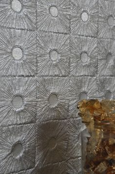
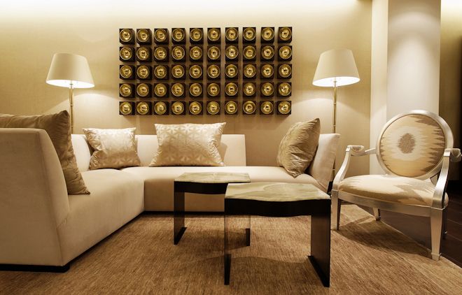
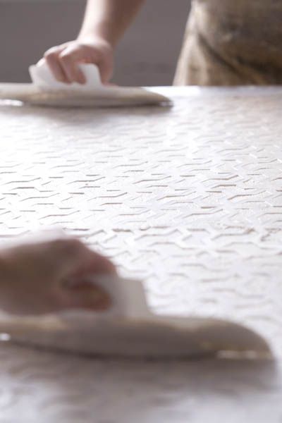
Petta Thompson 4Petta Thompson 8Petta Thompson 11Petta Thompson 5Founded in 2007 by artists Rita Petta and Rebecca Thompson, the studio embodies the idea of a continual exploration of beautiful things.  Each piece in their collection features incredible craftsmanship and attention to detail.  They work with a team of artisans to create wall coverings, art, and truly stunning decorative objects.

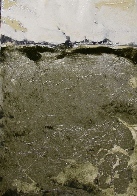
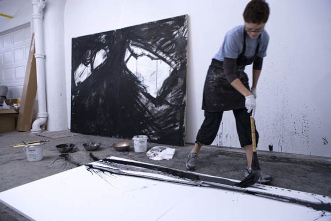
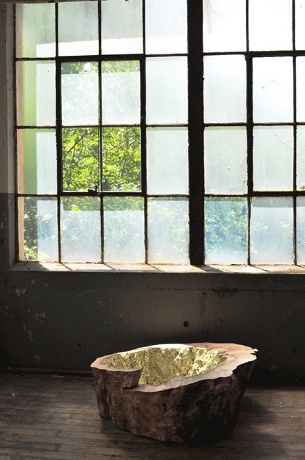
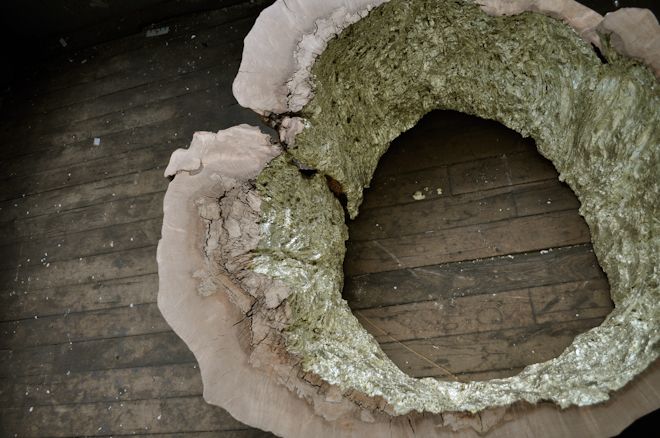
Rebecca Thompson and her paintings in Oakville, CT.  Petta - Thompson Studios.Rebecca Thompson and her paintings in Oakville, CT.  Petta - Thompson Studios.Petta Thompson 1Rebecca Thompson and her paintings in Oakville, CT.  Petta - Thompson Studios.I really dig the vibe of these creative women and am so happy they are right here in Connecticut.  When I met them at ICFF, I found them so approachable and easy going.  When you really love a product and the people behind it, it makes you want to use it even more.  Petta Thompson’s work is beautiful, so raw and organic.  The wood pieces coated with gold look very awe-inspiring.

Petta Thompson 3Petta Thompson 12Petta Thompson 13Petta Thompson 10To see more of Petta Thompson’s designs, visit their website.  They are also on Facebook.


Design Seeds

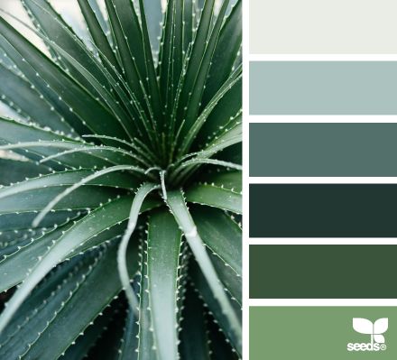
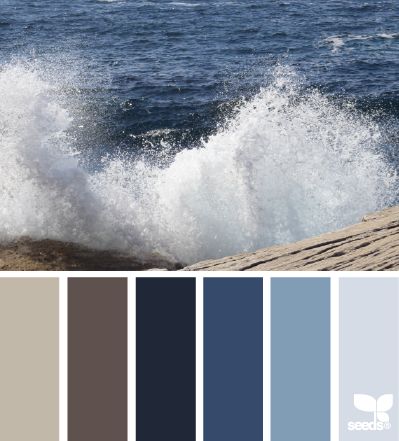
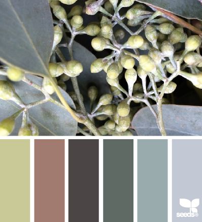
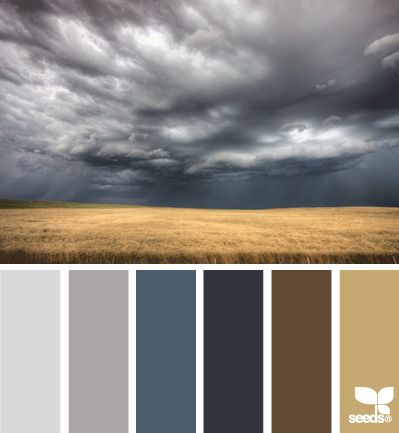
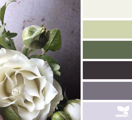
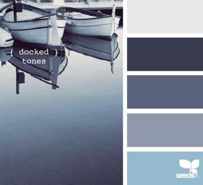
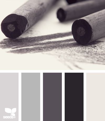
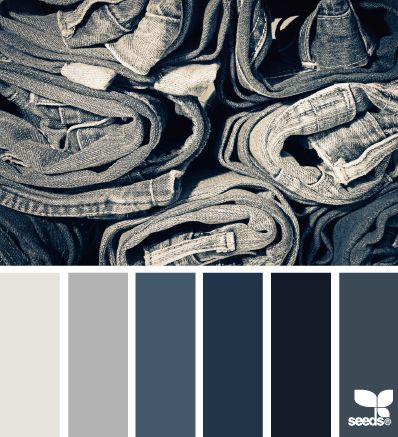
Design Seeds is a site that celebrates colors found in nature.

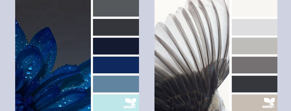
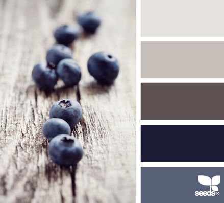
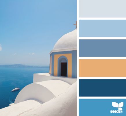
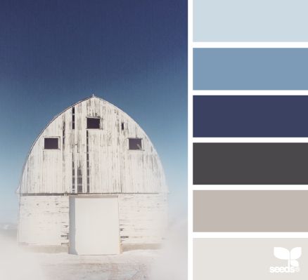
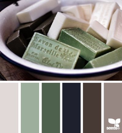
Design Seeds is a site that celebrates colors found in nature.  Created by Jessica Colaluca, Design Seeds is a unique site that lets you explore color palettes based on stunning photos of everything from flowers to interior vignettes.  Jessica uses her own photos or images submitted to her and creates custom color palettes based on those photos.  Unlike automatic color generating programs, Jessica digitally creates each hue herself.Design Seeds 14Design Seeds 13Design Seeds 12Design Seeds 11

In addition to being visually quite beautiful, Design Seeds is a great resource for a variety of applications.  Comparing the many palettes is really inspiring.  It’s fascinating to see the images deconstructed to individual colors and to think of the many ways to incorporate them into an interior or other color scheme.  Jessica has made the HEX code (a way of specifying color using hexadecimal values) available for each color, making it easier to digitally recreate a hue you may want to use.  A good paint store should be able to match shades printed with a well calibrated printer.

Design Seeds 10Design Seeds 8Design Seeds 9Design Seeds 6

Design Seeds is a great resource.  I love to browse through the site and feel inspired by how different colors are paired.  It’s a fascinating way to create a palette as well as a helpful visual tool to exemplify a vision to a client.

Design Seeds 7Design Seeds 3Design Seeds 2Design Seeds 1


Roman and Williams

Roman and Williams is a New York based design firm with an interesting back story.

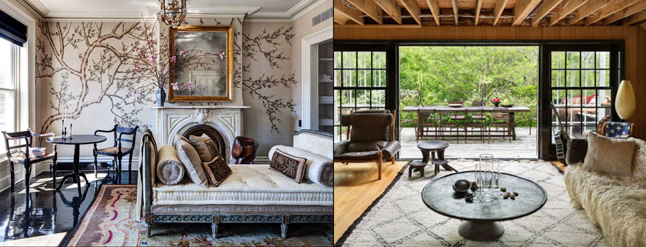
Roman and Williams is a New York based design firm with an interesting back story.  Robin Standefer and Stephen Alesch spent ten years designing sets for Hollywood films before taking on their first residential project, a home in Los Angeles.  Together they formed Roman and Williams (named for their grandfathers) in 2002 and in 2004 relocated the firm to New York.  Since then, they’ve completed an impressive scope of projects including homes, restaurants, hotels, and retail locations.

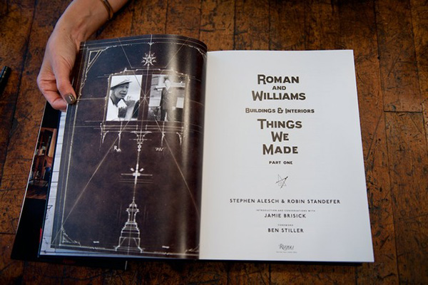
Roman and Williams 6 I have a book of work by Roman and Williams called Things We Made, given to me by a cousin who is studying architecture.  She thought I’d be interested in their projects, and she was right.  I really appreciate what they do and how they do it.  Roman and Williams have a different approach than I do, but I like the moodiness and industrial vibe of many of their projects.

Things We MadeRoman and Williams 7Roman and Williams 5Roman and Williams 14Roman and Williams 13

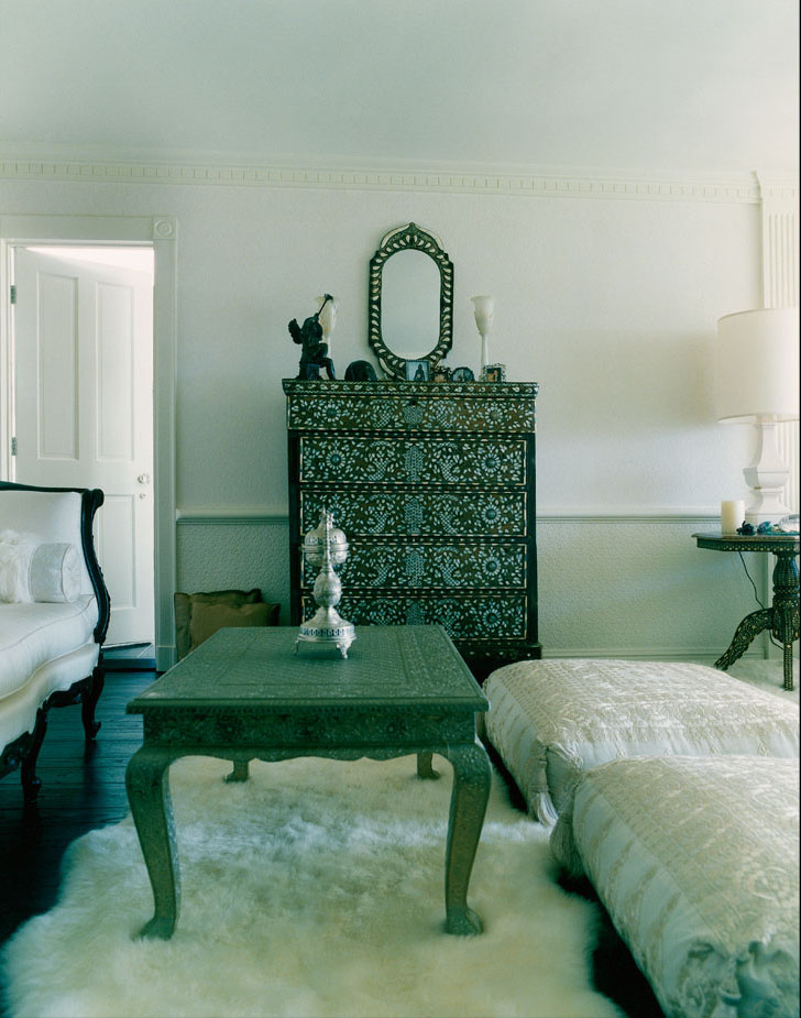
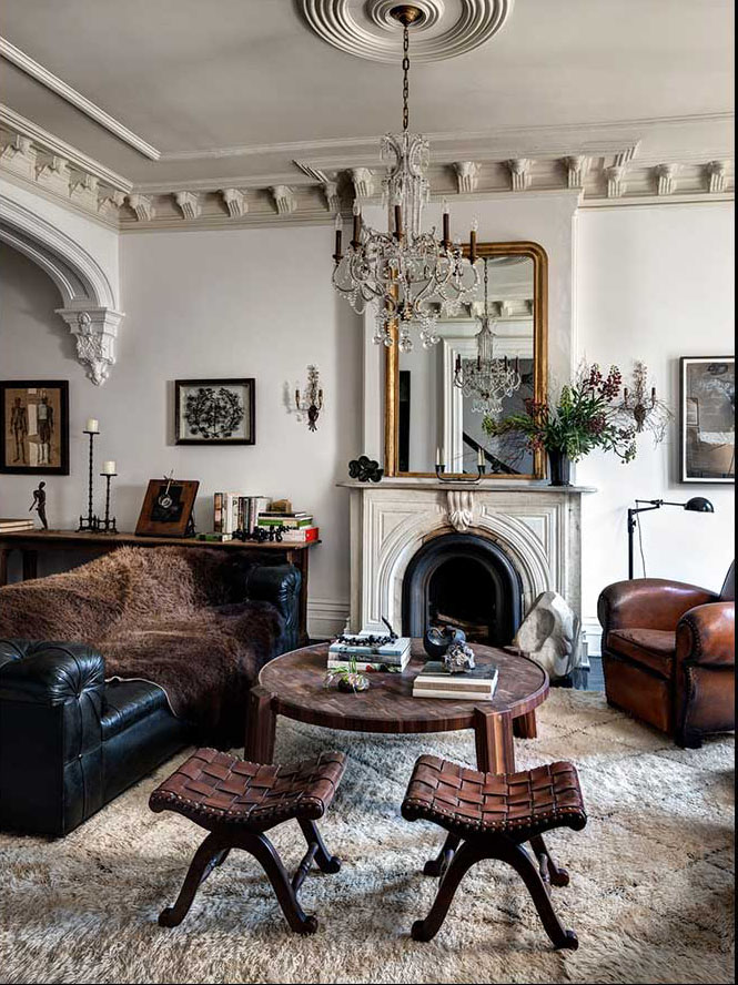
I find it interesting how they mix materials.  Their interiors feature so many collected items — it takes skill to make this look effortless.  They can take dilapidation and expand on it, creating a memorable environment.  Roman and Williams has a huge design range, everything from industrial to clubby.

Roman and Williams 10Roman and Williams 1Roman and Williams 2 - CopyRoman and Williams 12Roman and Williams 11I recall seeing a kitchen years ago and remembering it was in actor Ben Stiller’s home.  I was enchanted by the use of 3×6 tiles all over the kitchen walls and not just allocated to the back splash. It’s funny how certain things stay with you, and once I found out the kitchen was a Roman and Williams design, I was even more impressed with the the space and their work.

Color Obsession: Nautical Blue

To me, Nautical Blue brings to mind a more lush, sophisticated take on summer.

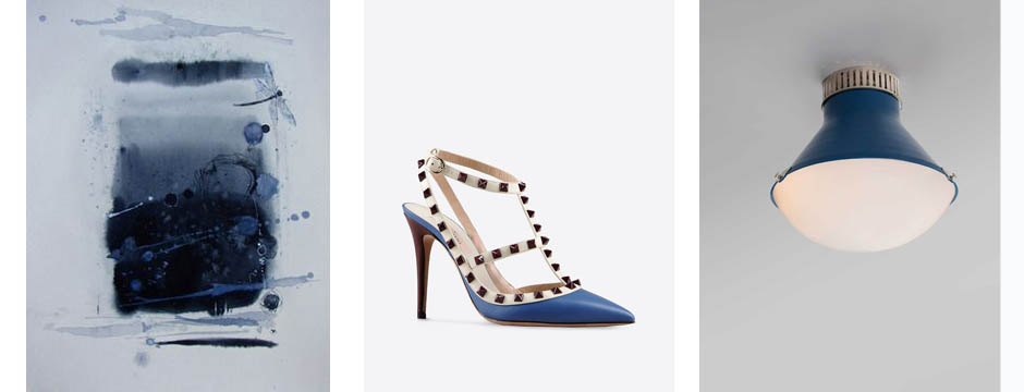
The word nautical typically conjures up images of novelty items like anchors, gulls, and sailboats.  To me, Nautical Blue brings to mind a more lush, sophisticated take on summer.  It’s a strong, bold color that reminds me of growing up on the water.  Nautical Blue makes me think of the ocean, reflections, and the places where I find inspiration.  As part of an interior, you can do a play on a nautical theme in a subtle way by using nubby fabric or a blue and white stripe.  The interpretation of this shade and theme doesn’t have to be literal.

Amy Aidinis Hirsch Nautical Blue

1.  Togo Sofa from Ligne Roset

2.  Commodore by Sherwin Williams

3.  Cushion cover by Shibori

4.  Chanel

5.  Hexagon Range from Geometric Carpets

6.  Blue Note Blonde, oil on canvas, Matt Story

7.  Fabric by Ferrick Mason

8.  Shoulder bag by Prada