Serendipity: Women in Business
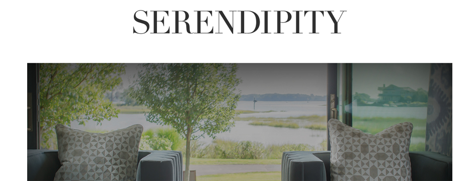
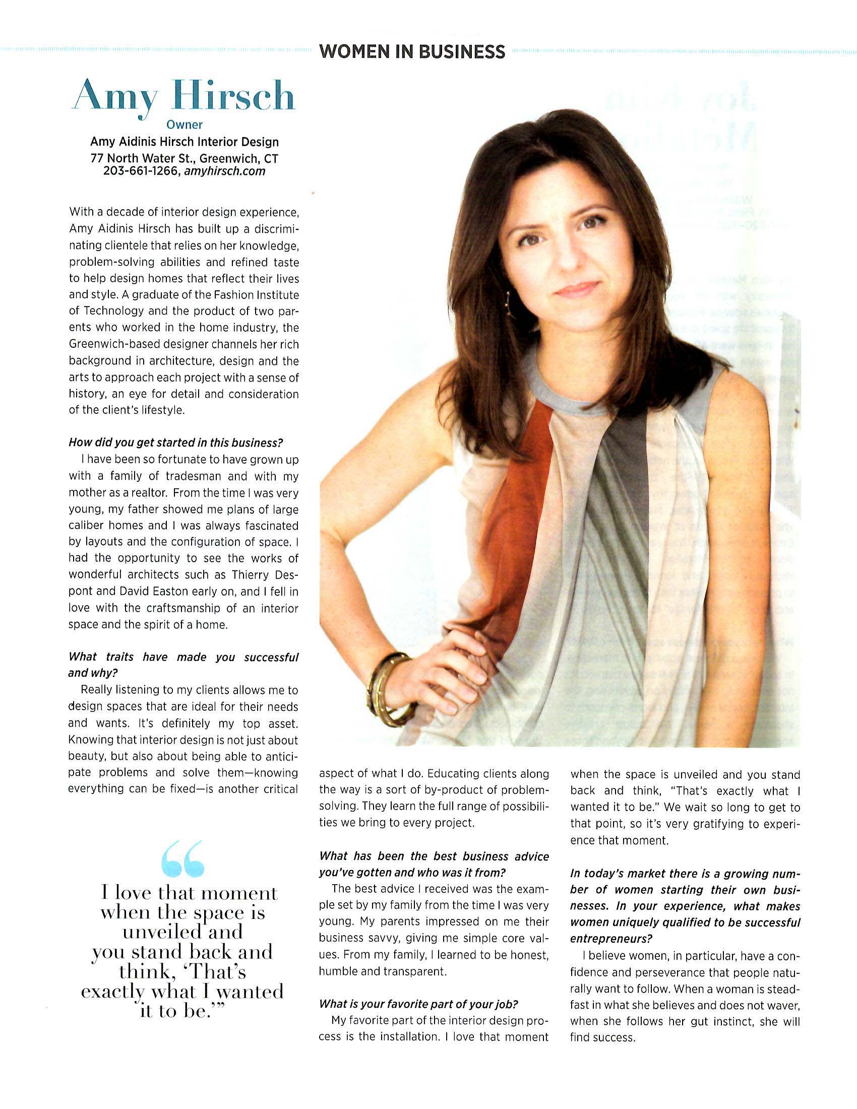
I’m really proud to be part of Serendipity Magazine’s Women in Business feature.
I’m really proud to be part of Serendipity Magazine’s Women in Business feature. It’s humbling to be included in this group of inspiring and talented businesswomen! You can see the full editorial in the June 2016 issue. Enjoy!
Design Dose
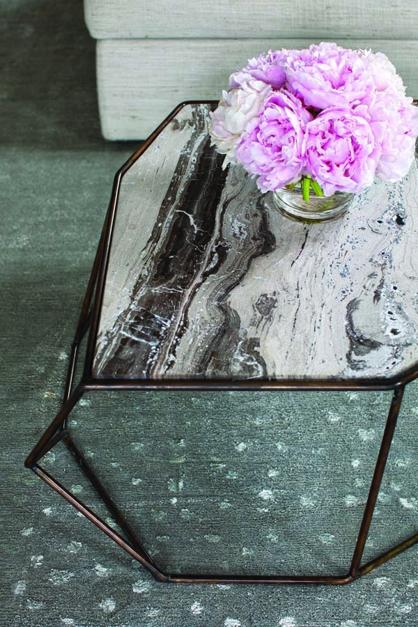
Peonies – my all time favorite flower!
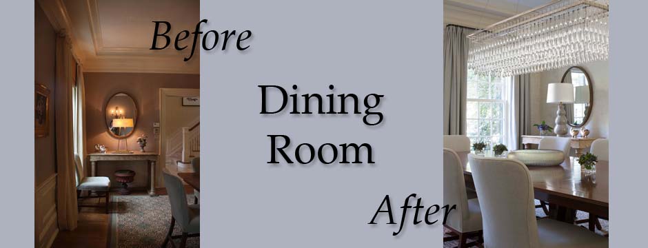
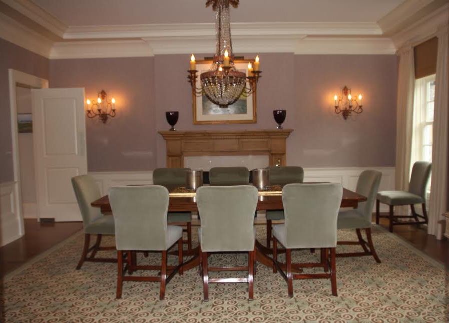
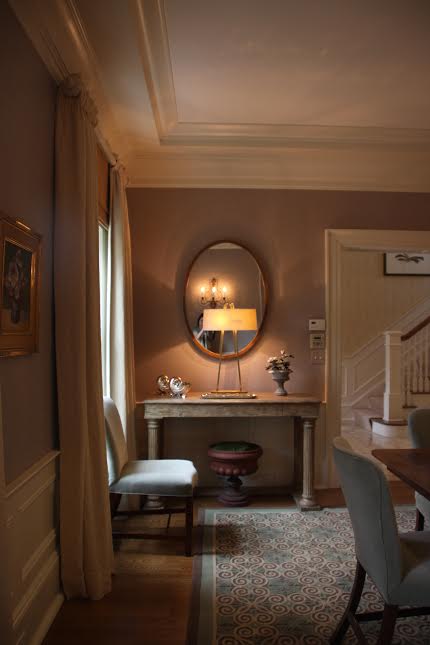
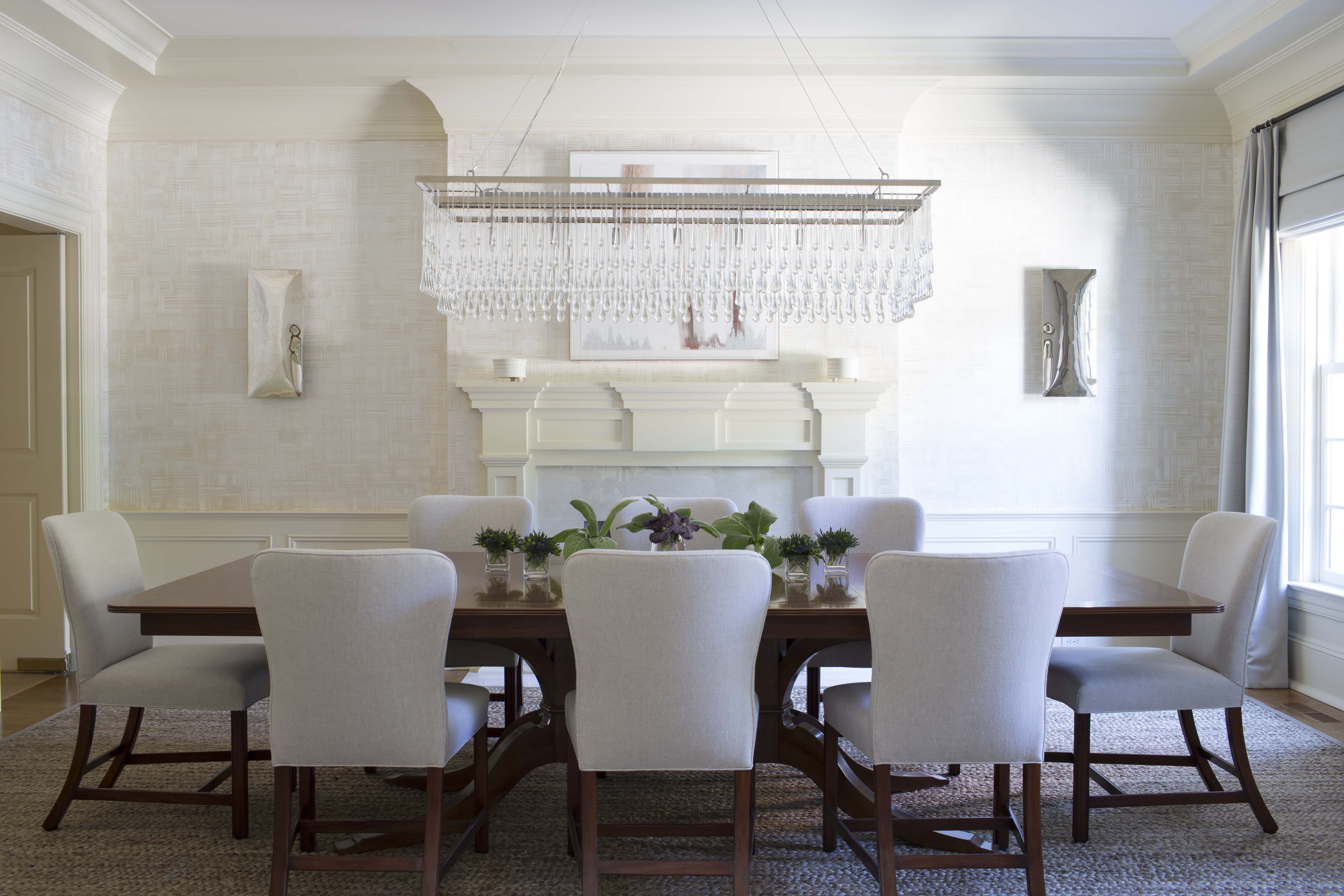
Dining Room: Before and After
While this dining room was a good size and had some nice features, it lacked a cohesive, finished design.
Last week, I shared some before and after photos of a library we designed for a client. Today’s before and after features another room in that same home — this time, the dining room. Like the library, the dining room needed a facelift to brighten and update the space. While the dining room was a good size and had some nice features, it lacked a cohesive, finished design.
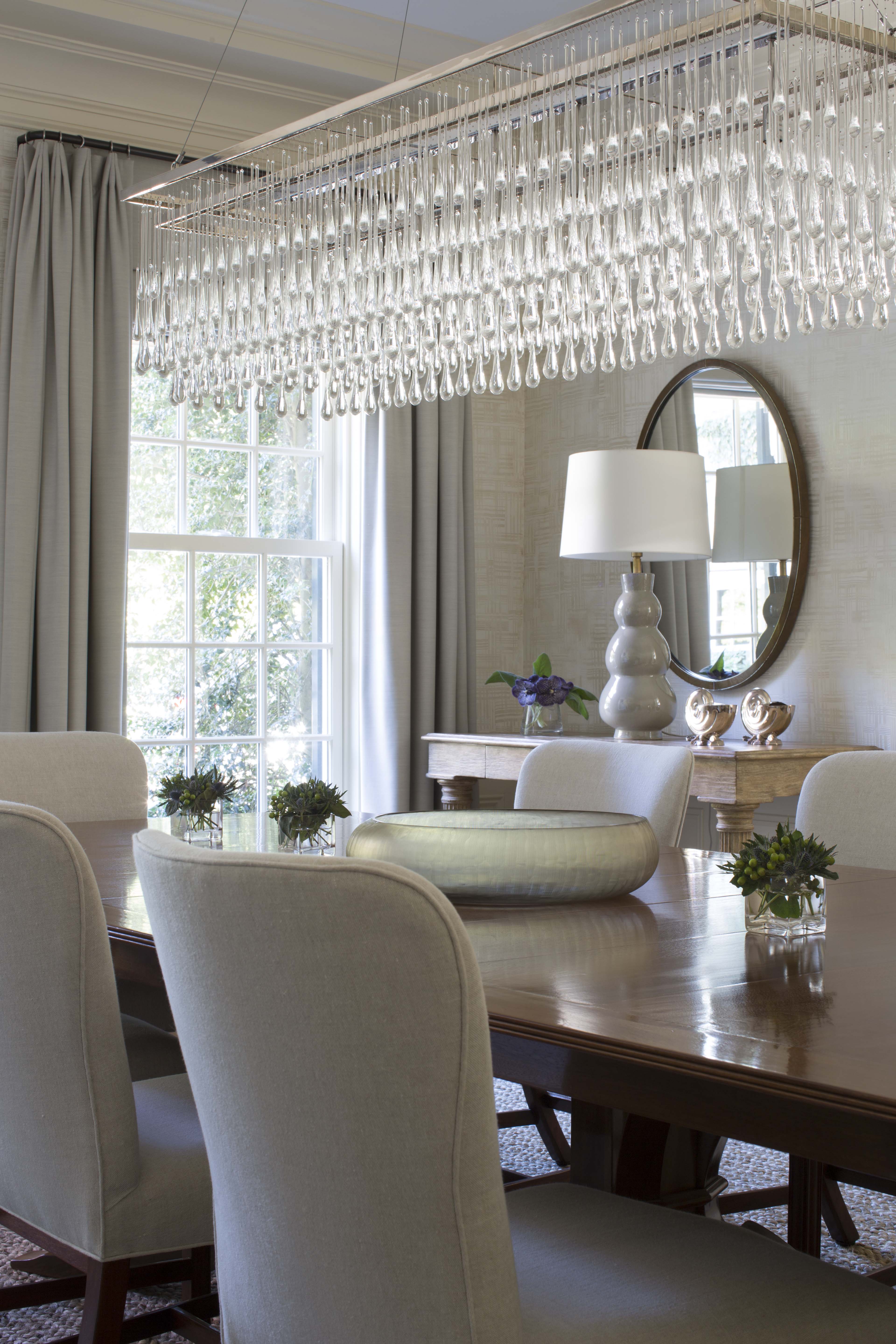
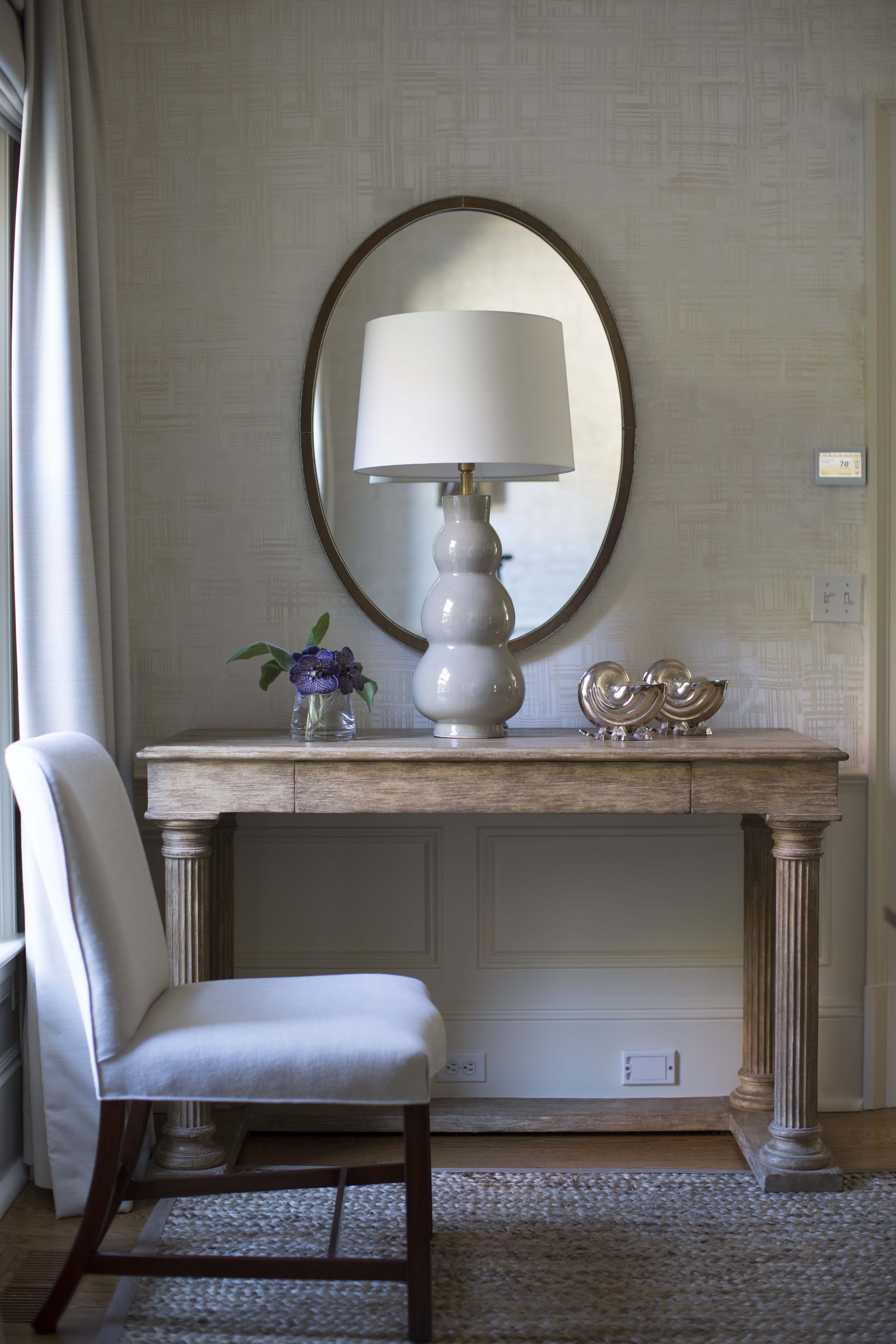
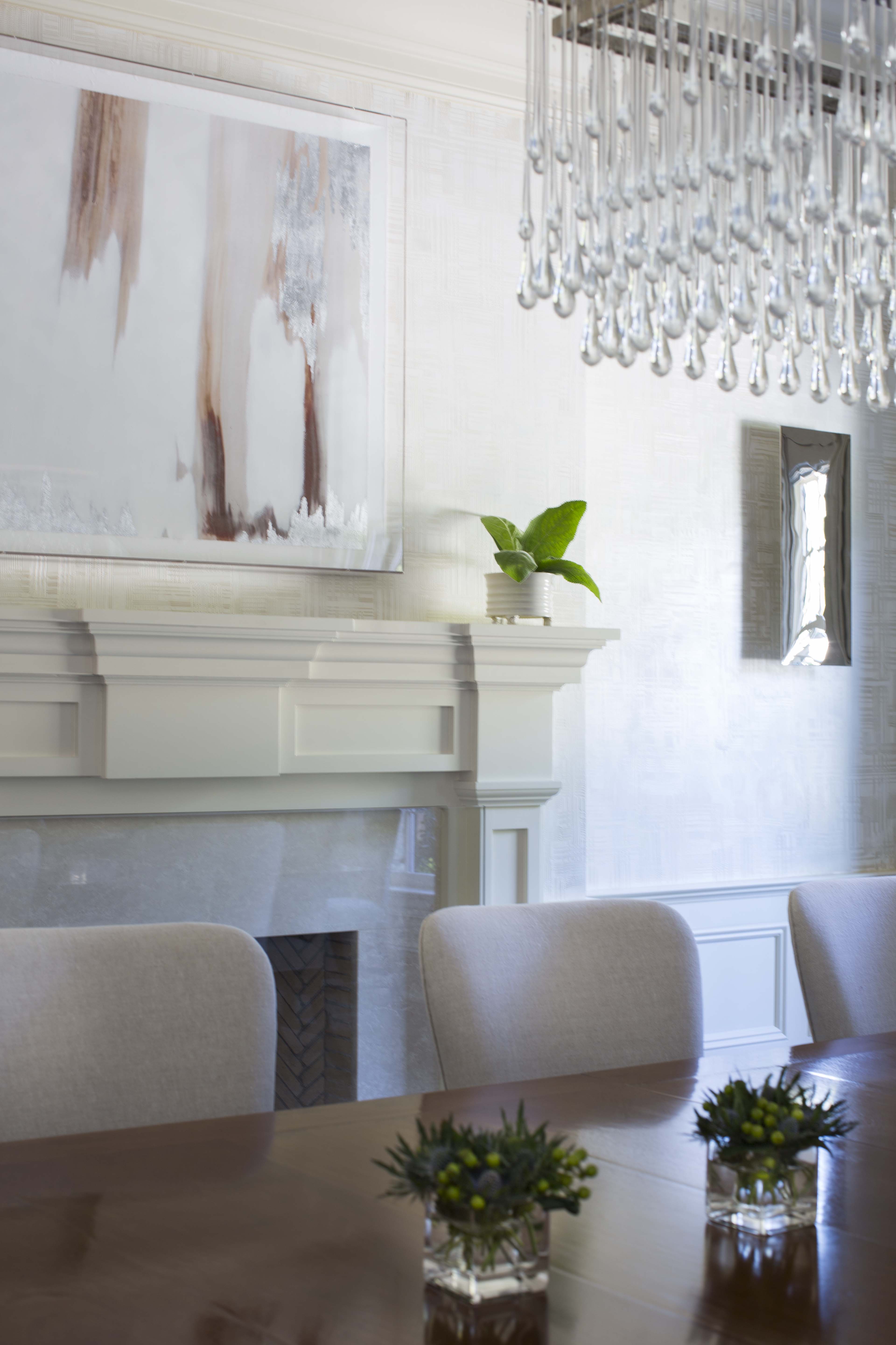
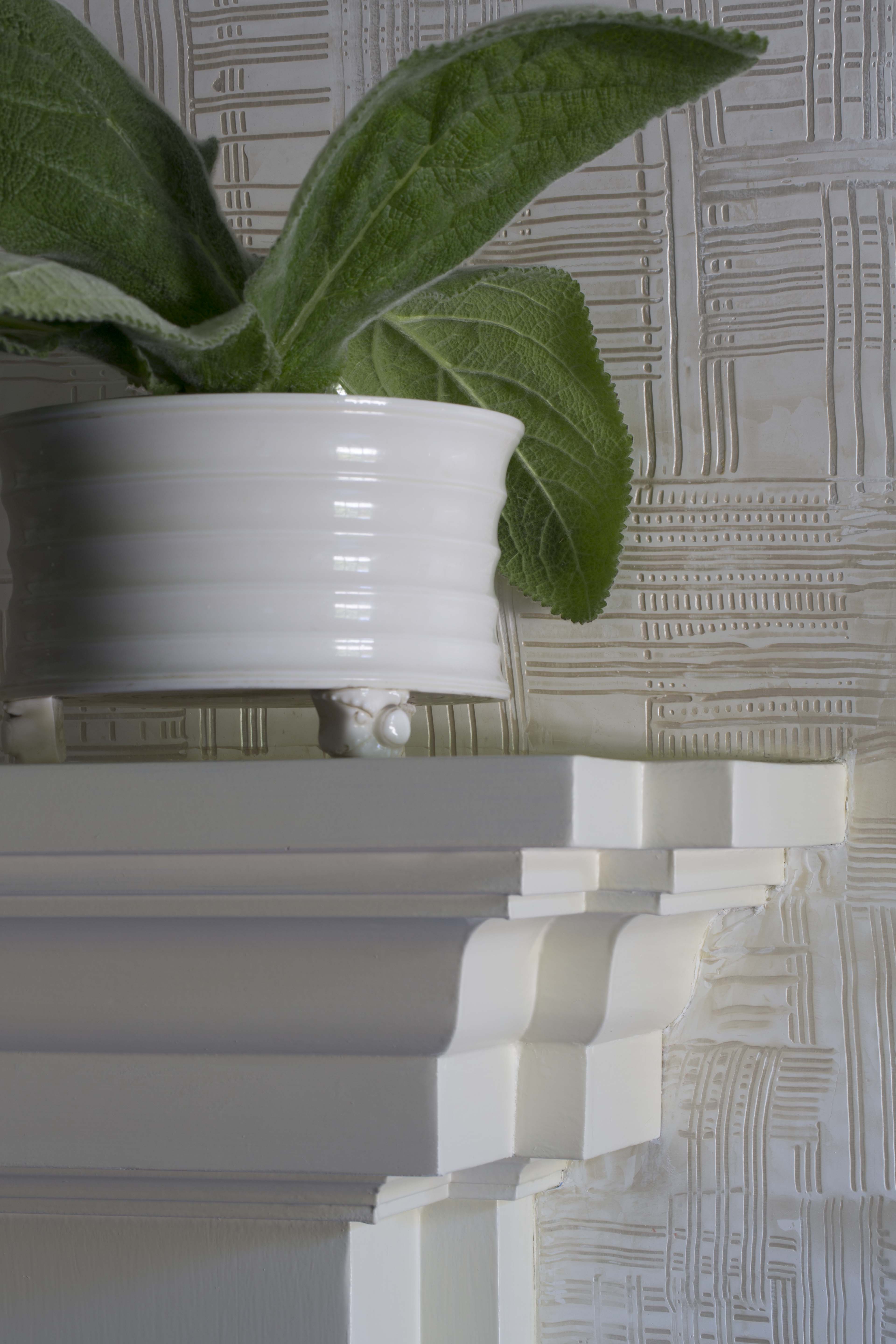
To see more photos of our design projects, visit my website or my Houzz profile.
Meet the Design Market Digest 2016 Honorees
I’m very excited to be a Serendipity Design Market Digest Honoree!
I’m very excited to be a Serendipity Design Market Digest Honoree! Tonight is the cocktail celebration for this year’s Design Market Digest and I am really looking forward to it. I’d like to thank Serendipity for this great write up by Amy Levin Epstein about my approach to interior design and why I was chosen as this year’s Honoree.
Meet the Design Market Digest 2016 Honorees: Amy Aidinis Hirsch Interior Design
by Amy Levin Epstein
When the founder of Amy Aidinis Hirsch Interior Design, LLC, takes on a new project, she first reflects on a home’s past. “Every house has a history or a story, even if it is brand new. The architecture is my primary focus, as well as the land which the house is nestled in,” says Hirsch. She will examine the details, from paneling to wood flooring to original ceiling treatments, and identify ways to enhance them. With the house in these photos, she focused her work around existing water views. “Everyday is a changing back drop so I wanted to embrace the interior, capture moments of the exterior, yet add a bit of femininity which reflects the home owner,” says Hirsch.
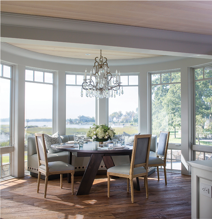
The designer’s path started as a student at the Fashion Institute of Technology in Manhattan, where many of her professors were architects rather than designers. “I feel my foundation was more structured than a painterly, artsy approach,” says Hirsch. Even then, she had her eye on building her brand. “I always knew I wanted to own my own business, but never thought it would happen so fast.”
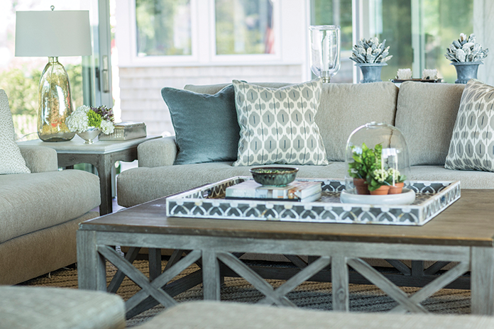
Hirsch is well known in Fairfield and Westchester counties, as well as farther flung locales like Boca Raton and Montana, for her style, which she describes as “tailored and masculine, subtle and unexpected.” Those unique characteristics take time to pull together and Hirsch says she makes it a priority to speak with new clients about realistic timelines. “This is an investment and should be about the longevity, not about instant gratification. The creative process has to be organic and fluid. Everyone is excited, however, the process needs time to curate,” says Hirsch.
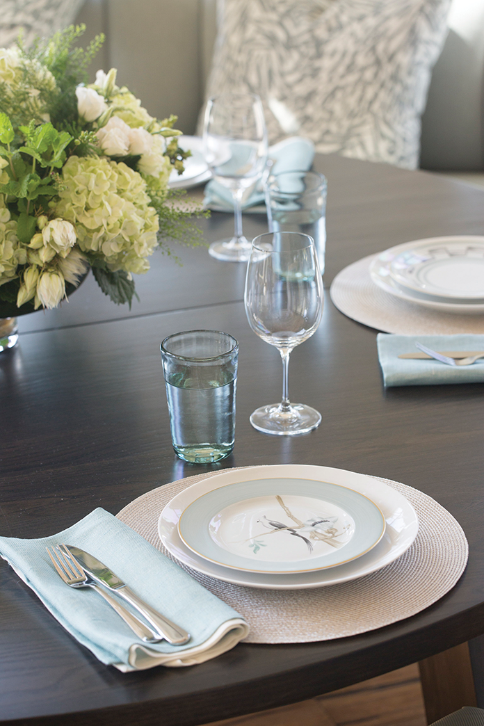
Part of the process, of course, is inspiration—and Hirsch finds it everywhere. “I believe you have to be open and sensitive to every sensation you encounter. I take so much from the architecture, land and the client,” says Hirsch. “They are the initial start to the entire process.”
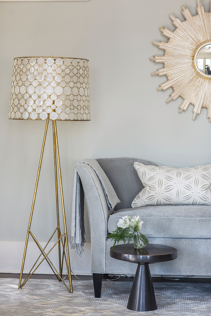
Listening to those clients, says Hirsh, is ultimately paramount. “If I am not listening, then the clients’ expectations will not be met. It’s simple: The design should not be about the interior designer and her style, it has to be a reflection of the clients and their needs,” says Hirsch. “It’s critical to pay attention to simple things a client says at any given moment.”
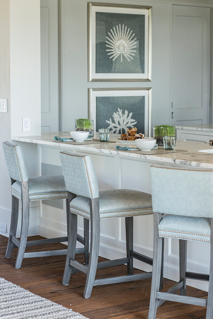
While she particularly loves working on second homes—“the design is more liberating and you may do things differently then you would in your primary house”—her dream project would be her own, “a home which is expressive of myself and my family.” This future endeavor, she says, will be a compilation of all that she has seen and done in her illustrious career. “I see so many beautiful things in the world and it will be interesting to see how I edit and focus on the right selections from the ground up,” says Hirsch. “You would think it would be easy—but I think it will be the most challenging of projects yet.”
Speed round with Amy Aidinis Hirsch
One word that describes you: Edgy
Your top design tip: Push the envelope.
What you’d do, if not in the design world: Fashion or photography
Favorite restaurant in the area: Winfield’s—but you need a ferry to get there!
Favorite cocktail: Margarita with lots of salt
People would be surprised to know: I love art deco.
A home should be filled with: Laughter
Favorite room in your home: We are house hunting—so I will let you know!
What you enjoy most about your work: Creative independence
Best design book: ABCDCS: David Collins Studio, by David Collins
Save the Date!
You’re invited to a cocktail recption celebrating our 4th annual 2016 Design Market Digest. Meet industry experts and the 2016 Design Market honorees, designer Amy Aidinis Hirsch and architect Douglas VanderHorn.
Wednesday, May 11th from 6:30p.m. to 8:30p.m at Lillian August, Greenwich, CT with Marcia Selden Catering
RSVP to events@ungerpublishing.com
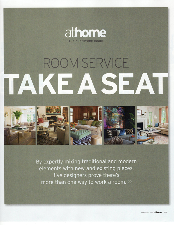
At Home Magazine: Take a Seat
I’m so happy to be part of a feature in At Home Magazine called Room Service: Take a Seat.
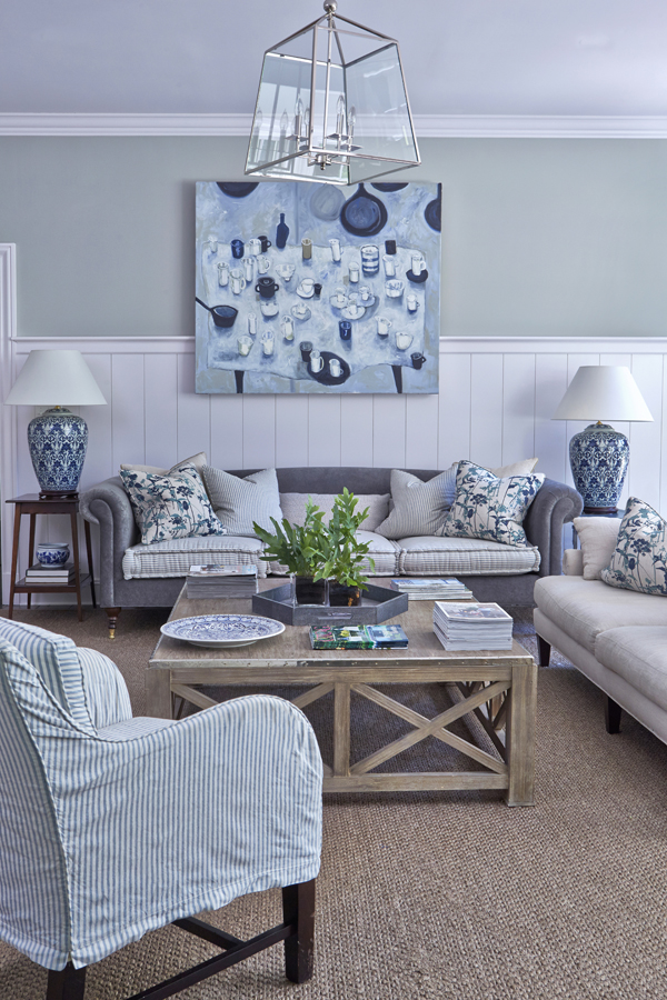
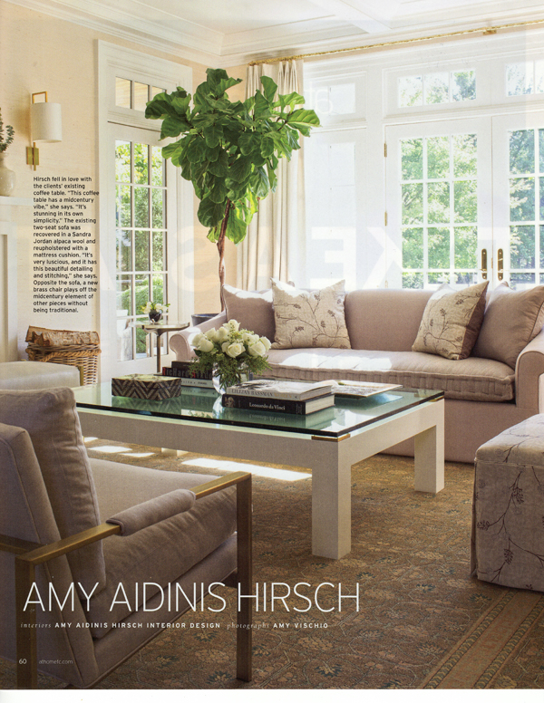
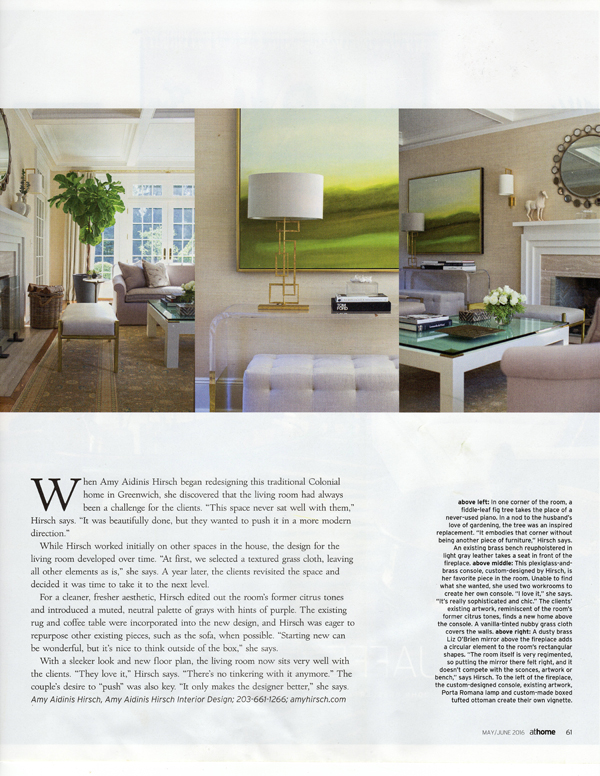
I’m so happy to be part of a feature in At Home Magazine called Room Service: Take a Seat. The feature demonstrates how five designers approach living room design in ways to perfectly suit their clients. My featured living room design is for a Colonial in Greenwich. The client wanted to give the room a modern feel, keeping some existing elements while adding new items and changing the color palette. To read more about this project and to see how other designers work their living room designs, pick up the May/June 2016 issue of At Home in Fairfield County!
Design Dose
Retro inspired.
Library Design: Before and After
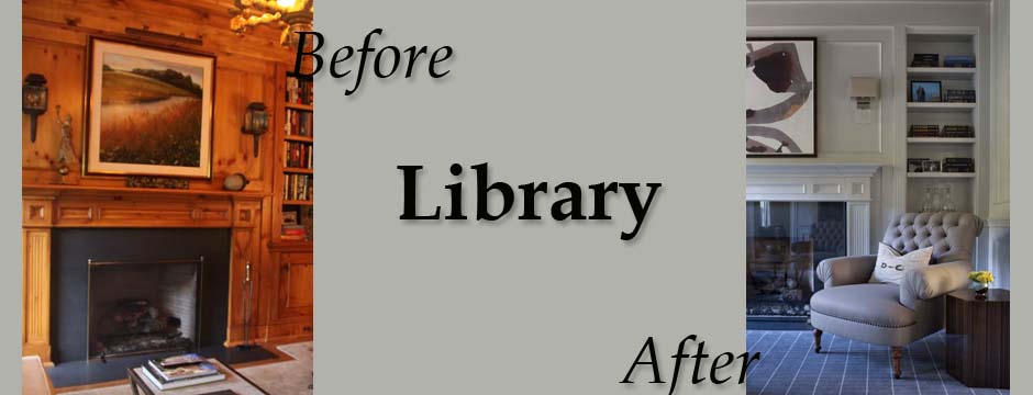
This particular library design, part of a whole-house remodel, involved a dramatic transformation that completely changed the mood and feel of the space.
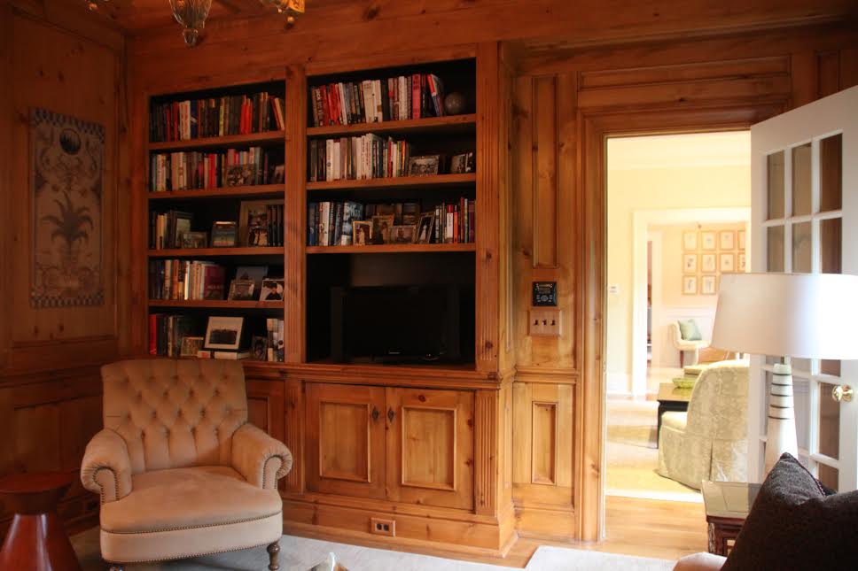
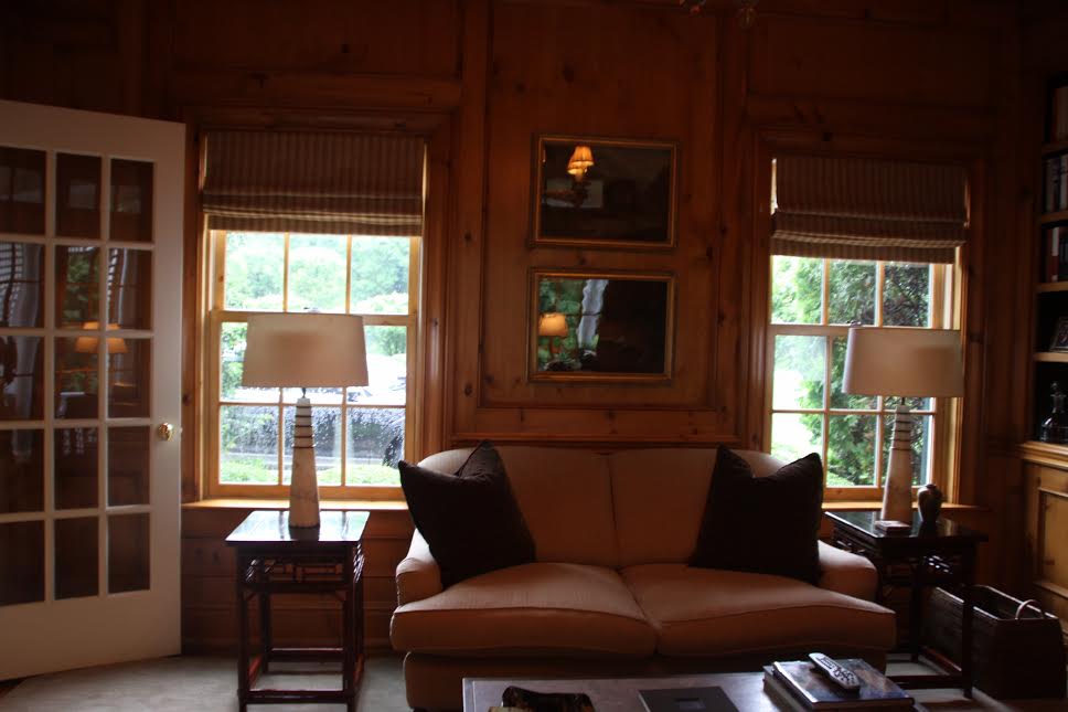
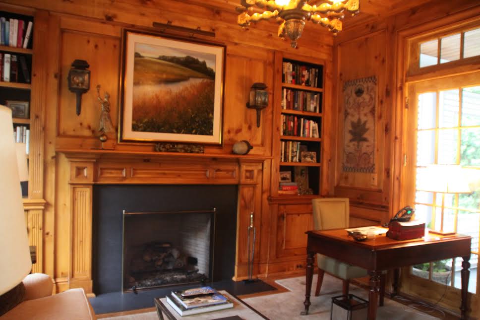
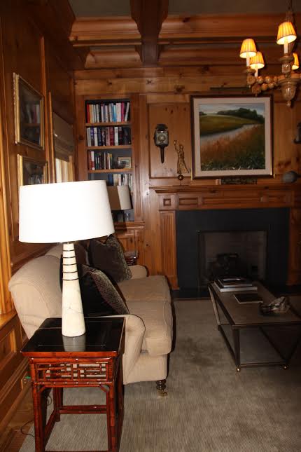
The journey of a project from start to finish always fascinates me. This particular library design, part of a whole-house remodel, involved a dramatic transformation that completely changed the mood and feel of the space. The library originally had knotty pine ceilings and walls that darkened the room and detracted from some of the more desirable features, such as the built in shelves and the fireplace. Here’s what the library originally looked like:
We lightened up the library by painting the walls a light grey. We chose a custom medium charcoal grey lacquer for the ceiling, reupholstered the furniture, and updated the lighting. For the floor, we chose a rug with an all over pattern that mirrors the hue of the ceiling. Complimentary artwork and carefully edited accessories round out the finished library.
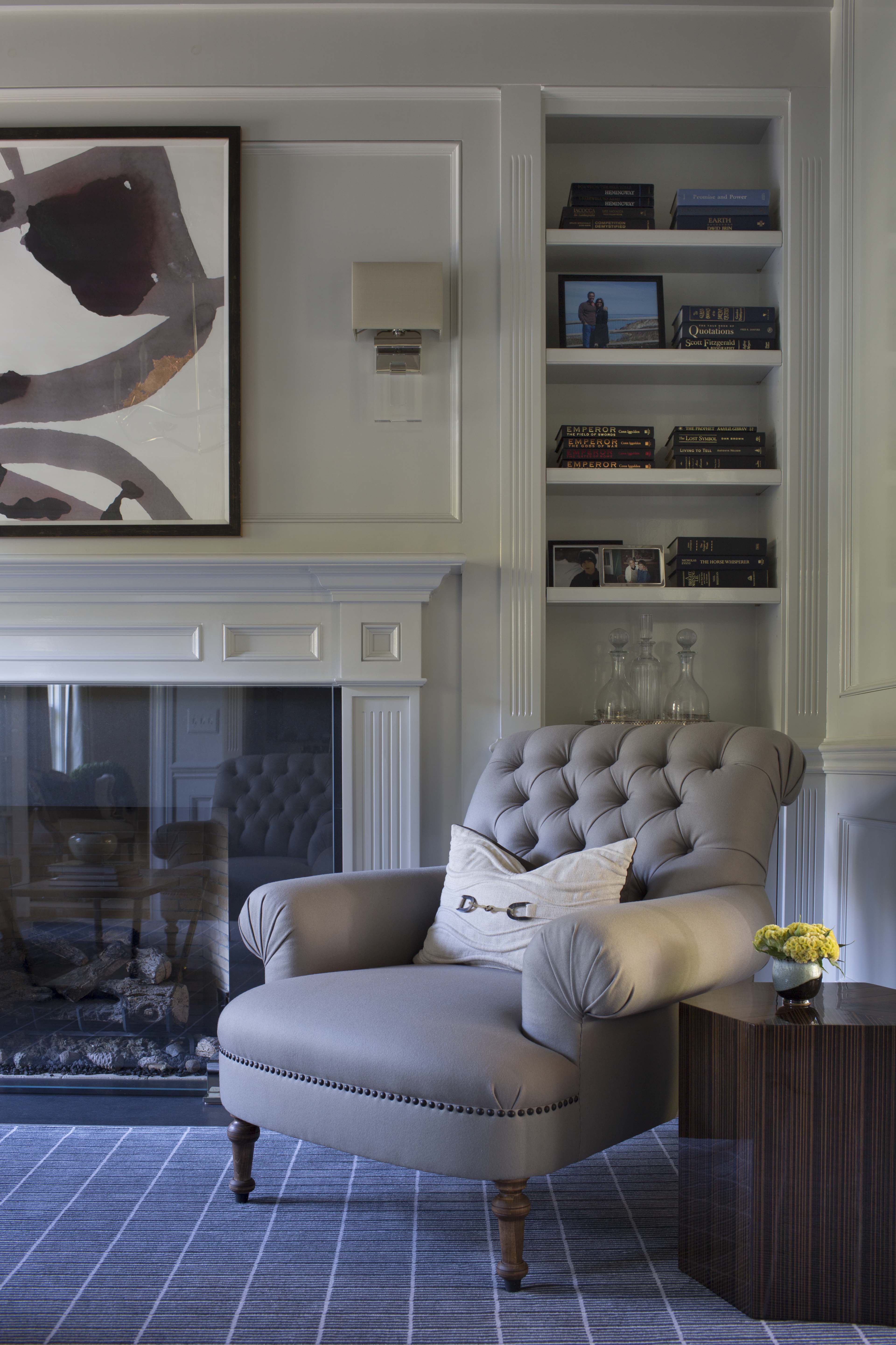
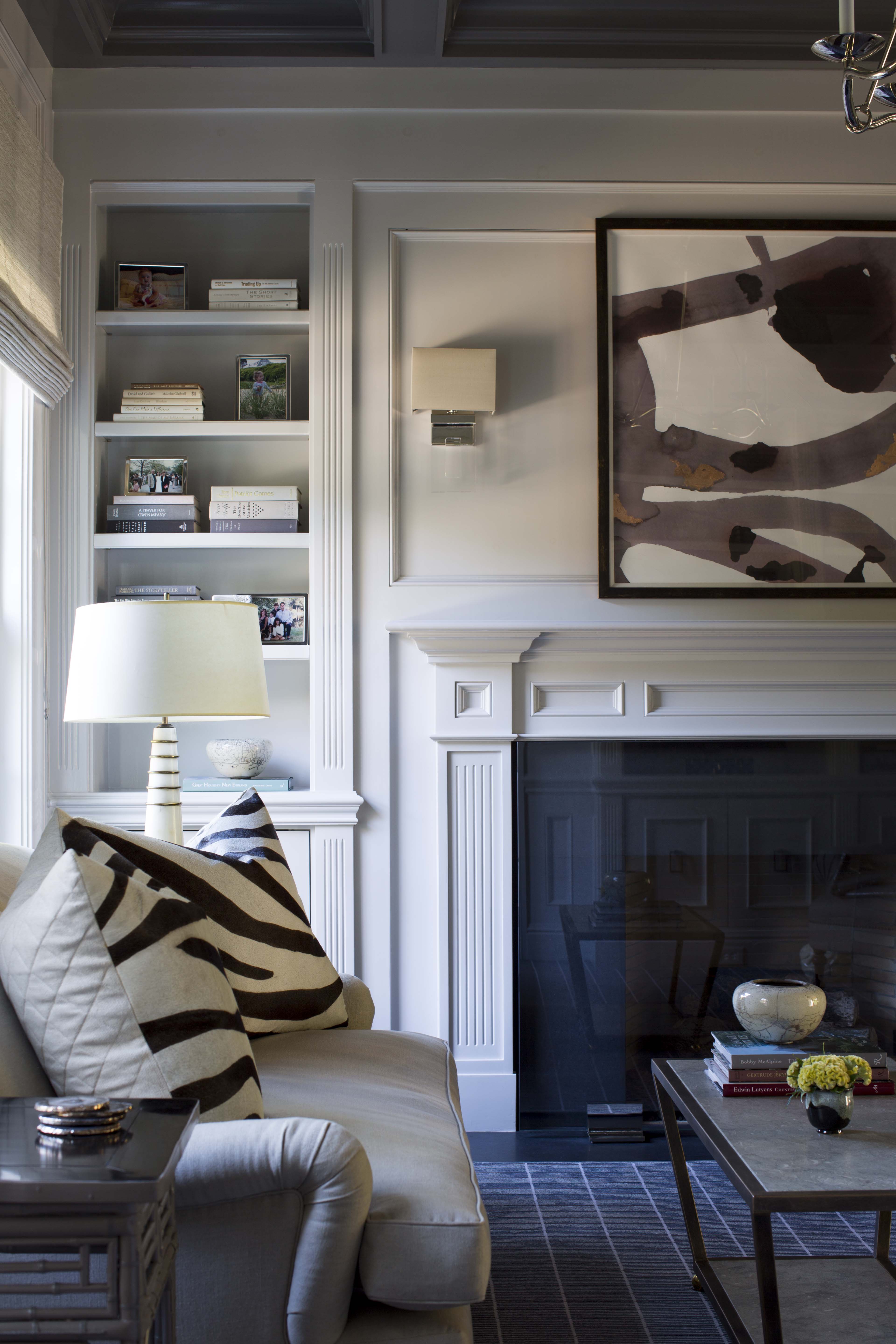
 This project is a great example of how a room doesn’t need a complete remodel to achieve a new look!
Design Dose
Embrace the existing.
Splatter
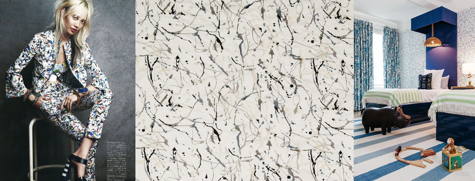
I had an idea for a Pollack-like, splatter look for a client’s wall that was inspired by some very cool splatter designs I’d been seeing.
I’m often fascinated by what comes up during the course of a project. I had an idea for a Pollack-like, splatter look for a client’s wall that was inspired by some very cool splatter designs I’d been seeing. I like how the splatter can be condensed or loose.
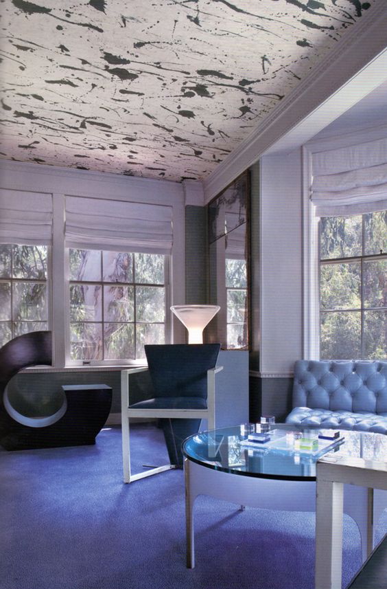
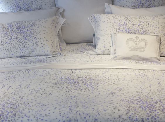
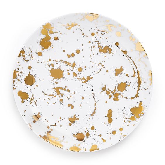
When coming up with a splatter design for my client, I worked with an artist to develop not only the look I wanted, but the correct consistency of paint. The key was to use a paint that would splatter on the wall, but not drip. It took some trial and error to concoct just the right mixture.
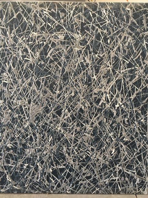
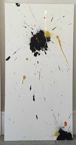
Even though the client chose not proceed, it is all about the process and the journey. Working with the artisan to understand the process and the selection of the correct color palette to make the masterpiece come together was a great experience. It’s also fun looking forward to the moment of being inspired by that client who opens the door for exploration into something unique.

