Category: Features
Boca Raton Project
Designing a home that isn’t a primary residence is always nice because you have more flexibility.
I’ve been working on a project for an existing client’s second home in Boca Raton, Florida. Designing a home that isn’t a primary residence is always nice because you have more flexibility. When you don’t live in the home on a daily basis, you are more open to different ideas and styles. In this case, the home started out with a really dismal interior. In spite of the beautiful location, the original interior of the home was old and dated. In contrast, my client’s family is young, active, and full of life. I wanted the home to reflect that and was thrilled when I was given carte blanche with color.
I used the home’s sunny location as inspiration when designing for this project — warmth, brightness, and palm trees. I decided to go with a bit of a retro throwback look and create a world of turquoise, full of vibrant color that suited my client’s young family and the lush surroundings.
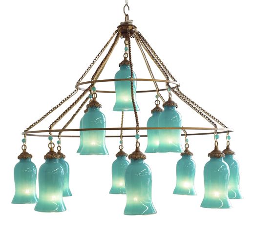
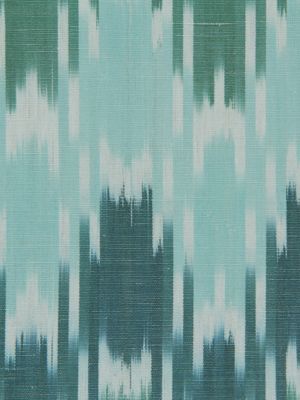
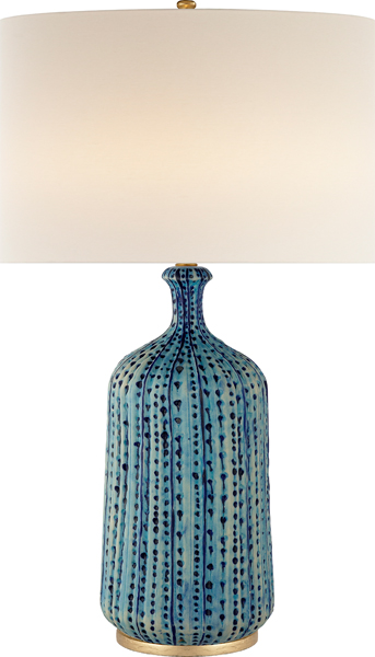
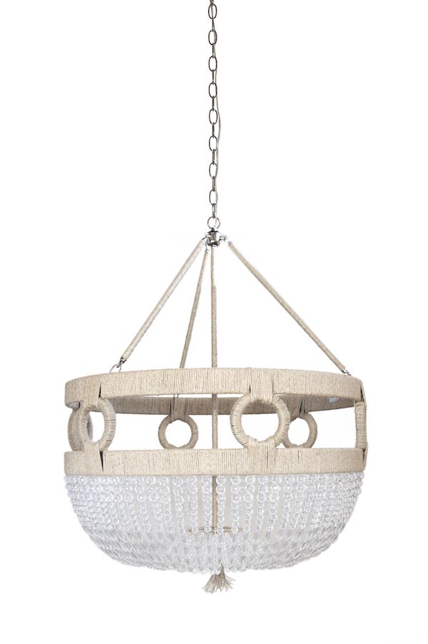
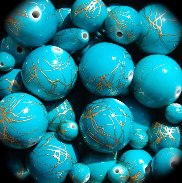
Balancing the turquoise, I incorporated plenty of crisp white, keeping the home’s exiting tile because it reminded me of sand. I wanted the home to look glamorous and have a polished, retro style but also be user-friendly. I tested different fabrics by actually pouring red wine onto them!
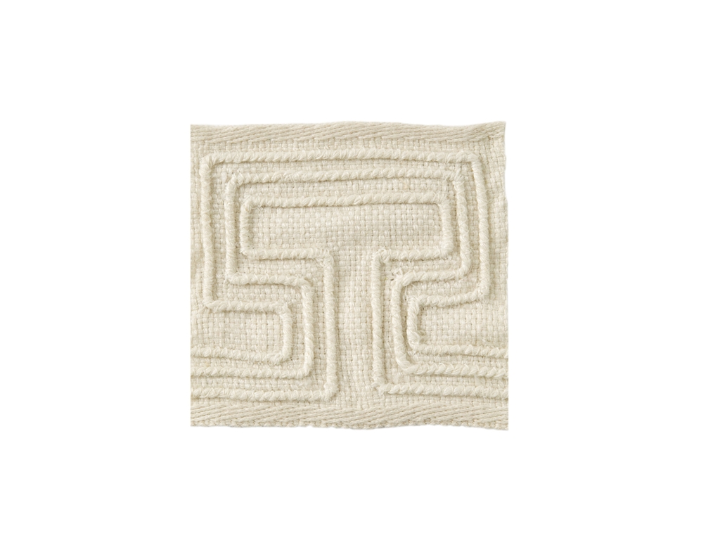
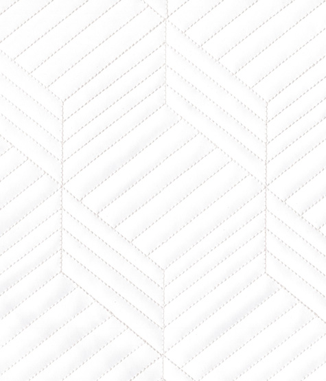
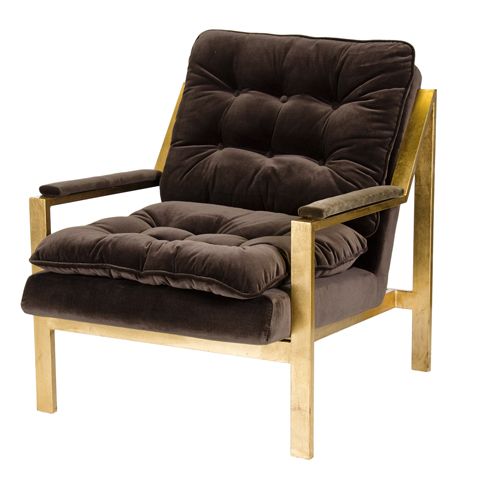
My client likes mid-century pieces, so I kept that in mind when choosing furnishings.
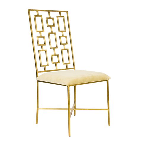
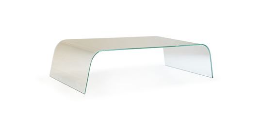
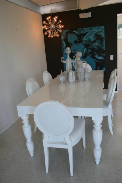
For art, we went with bold choices that have a different vibe than you typically see here in Connecticut. With the turquoise inserted everywhere, I am confident the final results of this project will be stunning!

Stay tuned for installations photos, coming soon!
The Big Reveal
I love working in this creative haven, surrounded by elements that both calm and inspire me.
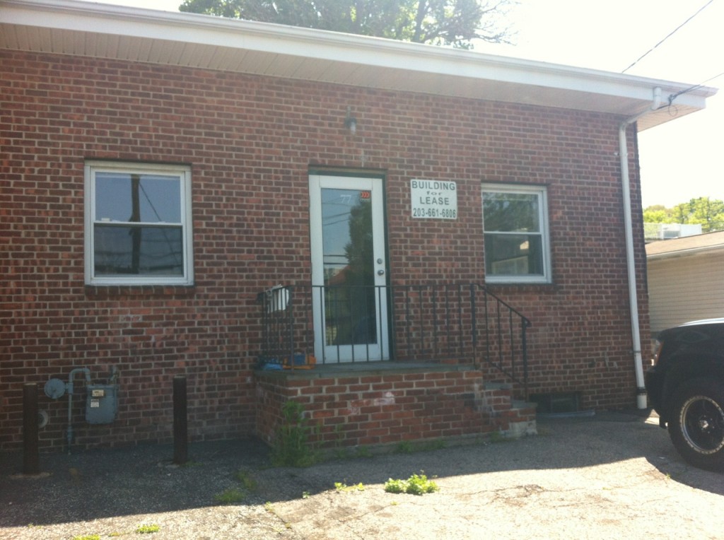
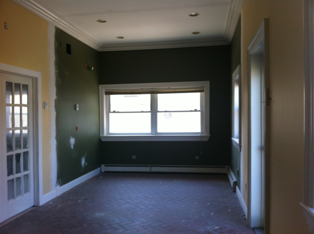
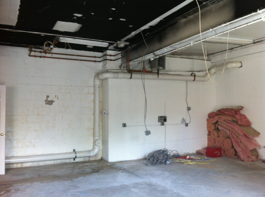
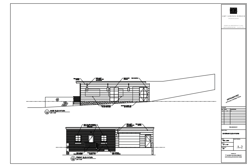
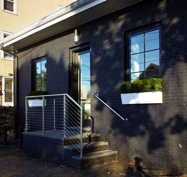
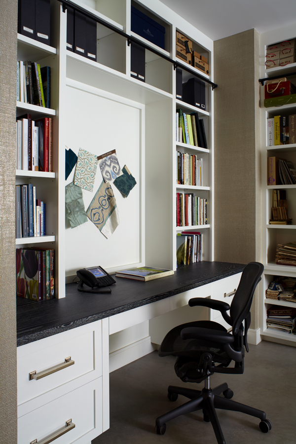
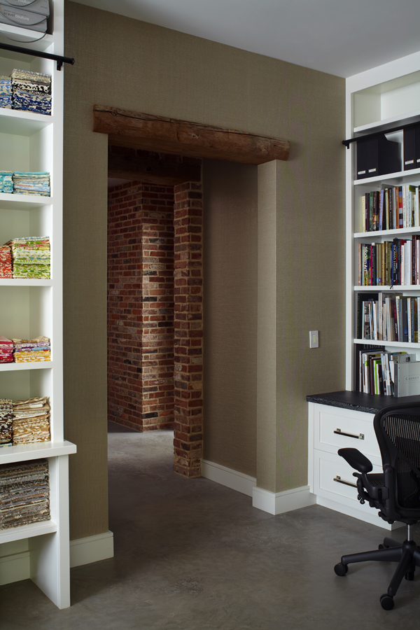
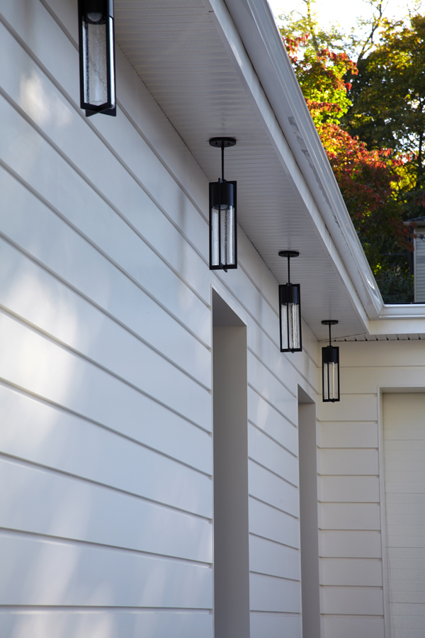
I am extremely thrilled to share with you my latest and greatest project, something that is very personal: My new studio! The building which houses my studio is truly sentimental; it has been in my family since 1983, when my father decided to purchase it for his company, Putnam Plumbing and Heating. I remember visiting my dad’s business as a young girl, when the space was smogged with smoke and the typical grunge of pipe fittings, boilers and machinery. The space was not pretty at all, as you can imagine, and I found myself fascinated by the idea of the potential of this place. Photos of the interior and exterior before I started renovations show how great the transformation of this place has been.
After years of growing his own business, my dad moved to another location and this building remained. Occupied by others through out the years, it eventually lay vacant for some time. Prior to my father’s ownership of the building, it was occupied by a machine shop during the 1950’s and, in the early 1930’s, the building was an automotive repair shop. Over the course of almost 85 years, there were a few alterations to the building. When we began to demo for the renovations, we actually found this really cool iron window frame with restoration glass buried in one of the walls. I wish I could have salvaged it, but it was too decrepit. I am truly grateful to my parents and their role in where I am today. I love the family connection to this place and knowing that the building is part of my past lends it additional beauty.
Growing out of the humble beginnings of my design firm’s starting point, I decided it was time to take on a project for myself. Creating for others comes very naturally to me; however, for myself this process took more time than I expected. Maybe because it’s more personal, or maybe because this project was different than most, given the fact that I had to factor in my clients’ perspectives as well as my own. The aesthetics needed to be beautiful as an interior, but I limited myself to a very simple palette of mainly black, grey and white, being thoughtful of the amount of color which saturates so many of our schemes.
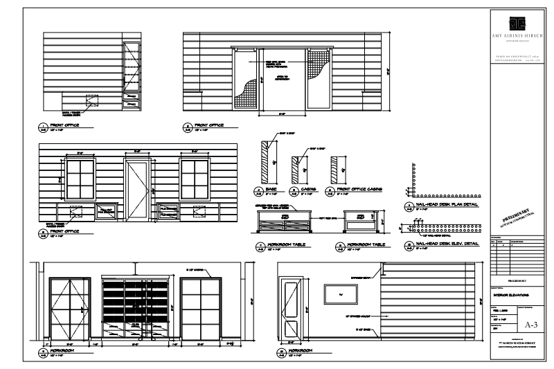
Putting pen to paper as I design always stirs up creative ideas and interesting selections. I am proud to say that when I designed this space on paper and closed my eyes, every detail was executed exactly as I had envisioned it. When I put on paper is what gets built 99% of the time, and seeing this come to life in my own space was an incredible experience. Julio DiBiase of Dibico, Inc. is a person near and dear to me for the way he and his team perfectly executed my vision. We have collaborated on projects for over 10 years and I am grateful for his insight and resources to create and engineer all of my thoughts.
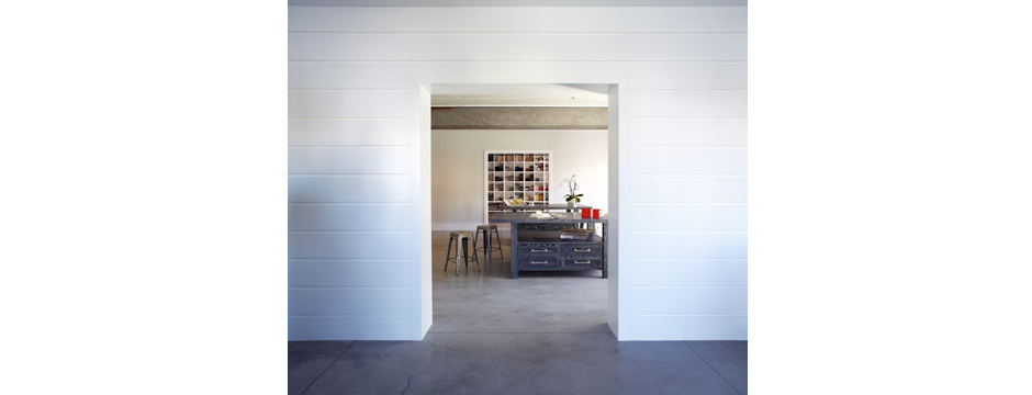
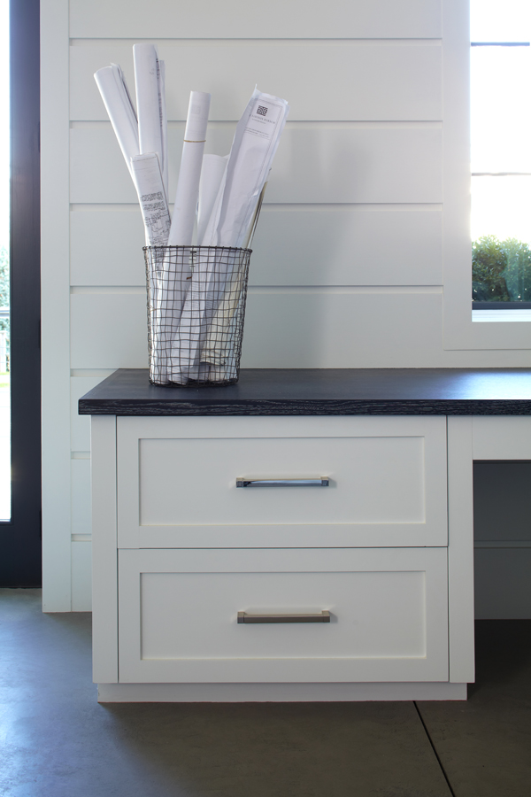
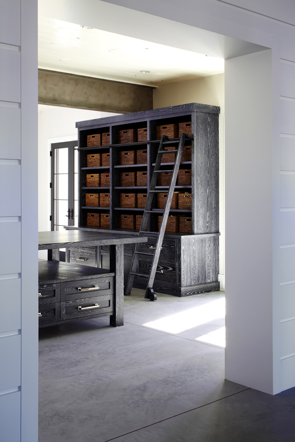
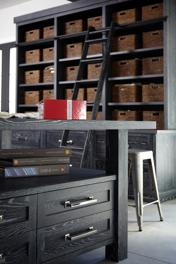
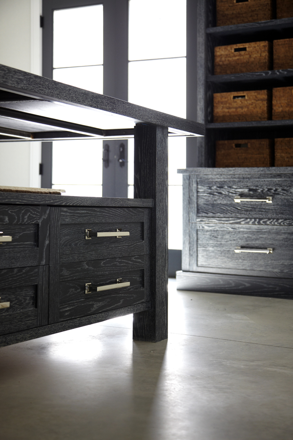
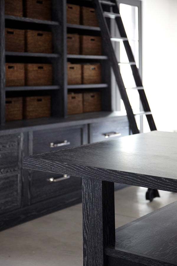
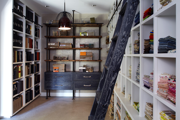
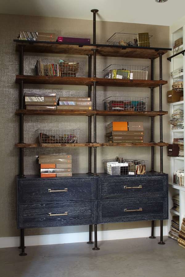
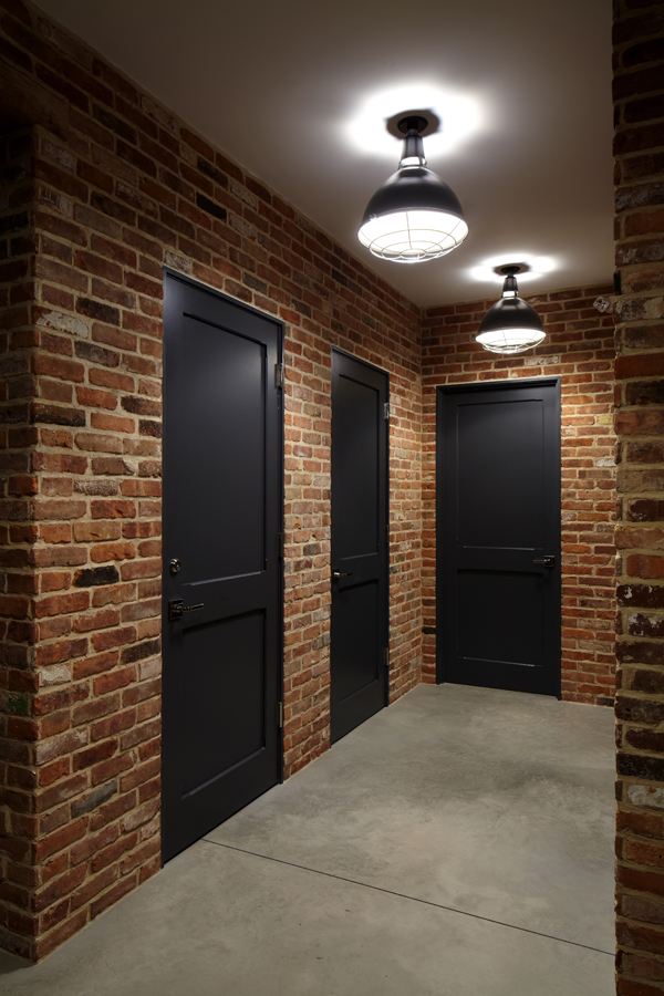
I am extremely grateful to be surrounded by the beauty of very simple elements. Walnut walls, ceruzed rift oak cabinetry, concrete floors, and brick, while simple in appearance, reflect my layered approach to design. I love working in this creative haven, surrounded by elements that both calm and inspire me. The materials in my new space were strategically selected and edited to create a simple but complete product. My office space is a true representation of the process and structure I use when designing for clients with the ultimate goal of a completed product that reflects who they are.
Photos of finished project by Phillip Ennis Photography
Q & A with Connecticut Cottages and Gardens
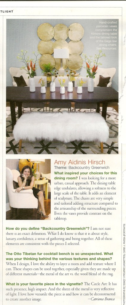
In the current issue of Connecticut Cottages and Gardens, I sit down for a Q&A regarding my vignette for the Mitchell Gold + Bob Williams showroom in Greenwich.
Last month, I created one of a series of vignettes for the Mitchell Gold + Bob Williams showroom in Greenwich for an event to launch their fall line. As a sponsor of the event, Connecticut Cottages and Gardens invited each vignette designer to sit down for a Q&A. My interview appears in the most recent issue of CTC&G. Being a part of this event was a great experience! I hope you enjoy reading about the design of the vignette.
Design Dose
How kick ass is this?
I’ve decided to add a new weekly feature to my blog. Each Wednesday, I’ll share one of my favorite photos from my own portfolio, showcasing a design element, style, or detail that I particularly love. I hope that by sharing my own work and love of design, I can also inspire others. Enjoy!
Visiting the Stone Yard
I find great inspiration and room for creativity when looking at all of the possible uses for so many beautiful types of stone.
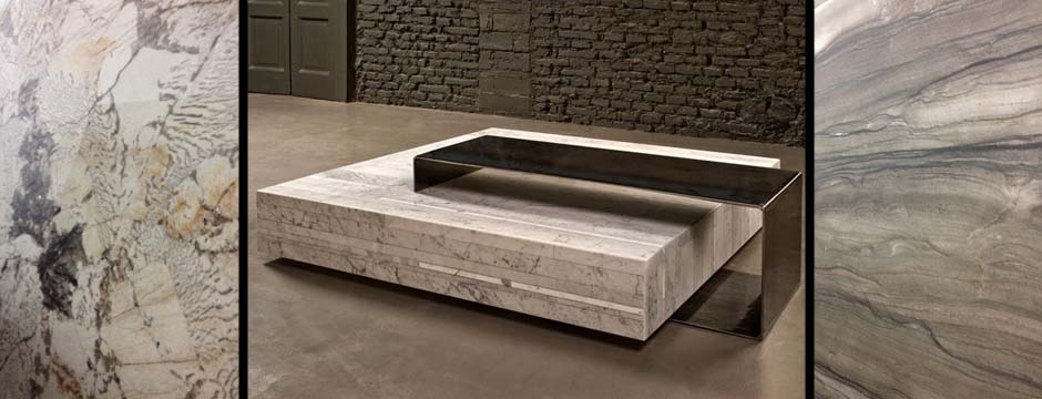
The past couple of weeks, I’ve been spending a lot of time at a couple of fantastic stone yards. I find great inspiration and room for creativity when looking at all of the possible uses for so many beautiful types of stone.

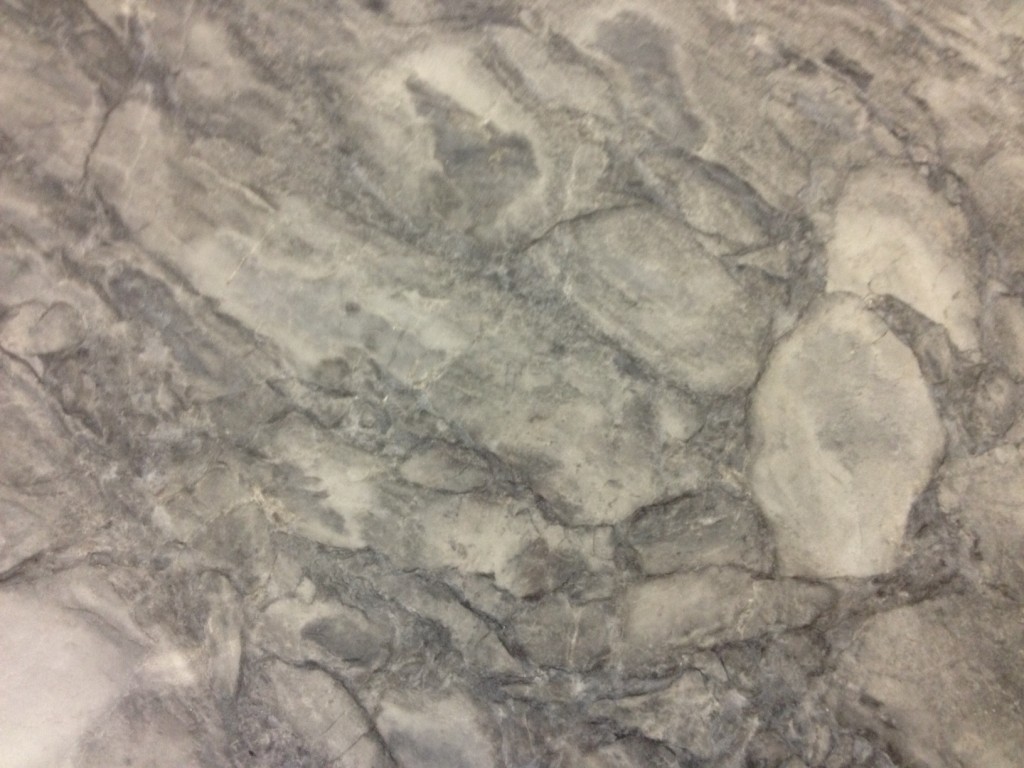
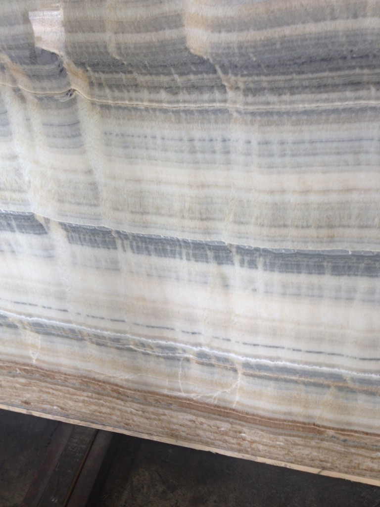
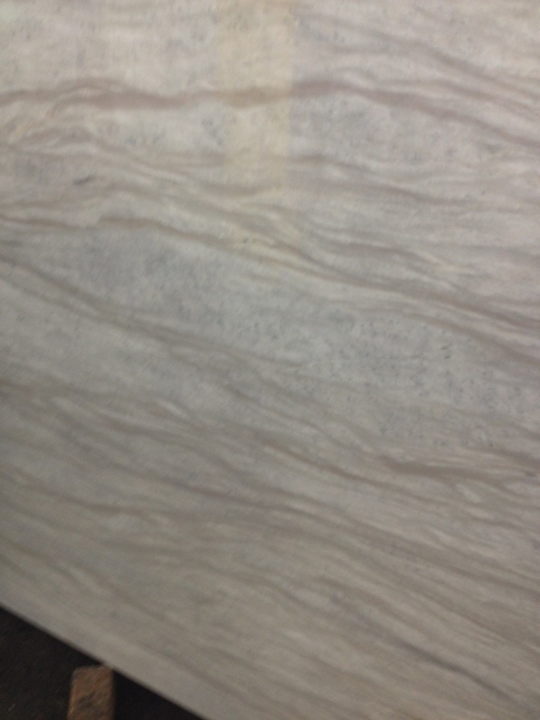
Most people think of counters, floors, and bathrooms when they consider using stone in their homes. There’s no reason to limit stone to these applications; for the right client, I would love to sheath an entire bathroom in a gorgeous stone.
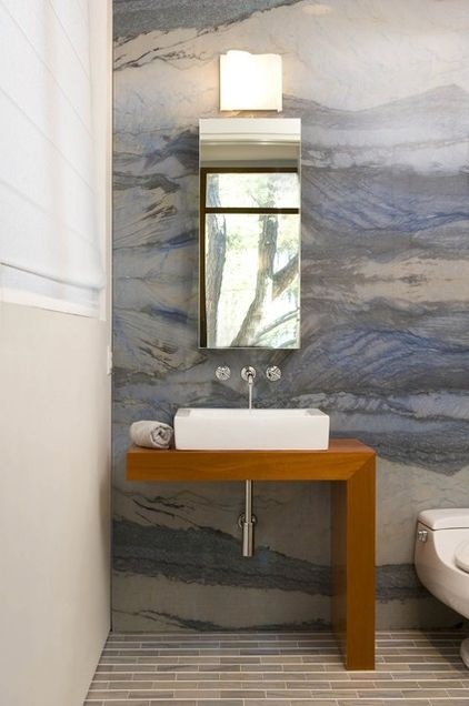
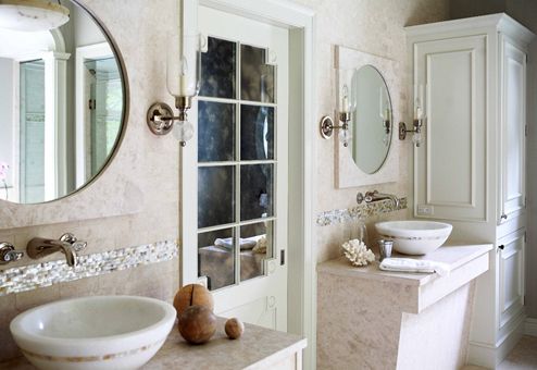
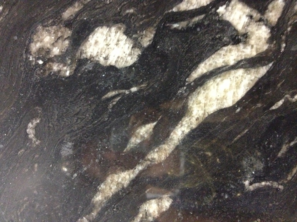
There are so many choices in pattern, color, and type of stone. You don’t have to be locked into one popular, safe choice. When I see all of the different stones, it makes me want to produce furniture from it. Being surrounded by so many varieties of stone broadens my eyes and inspires me to try different things.
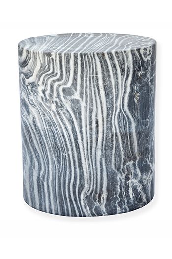
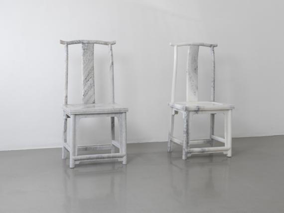
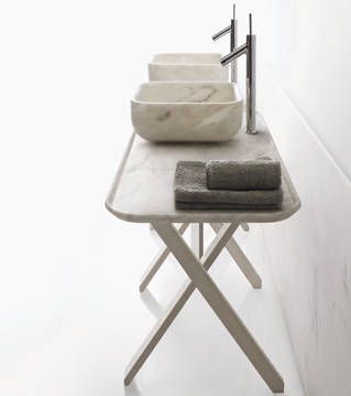
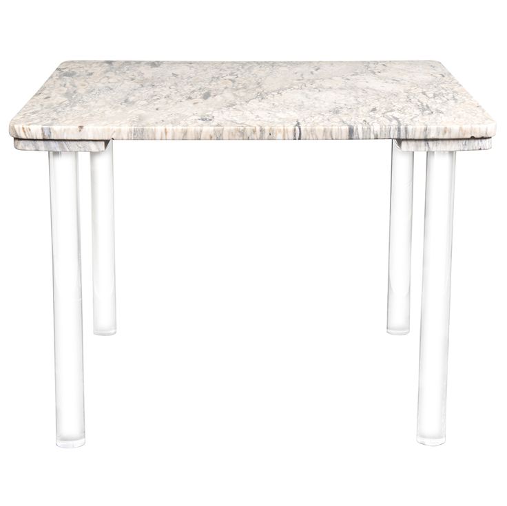
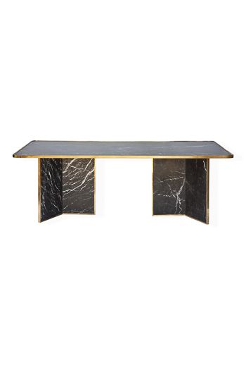
The potential for designing with stone is so intriguing!
New Design Books
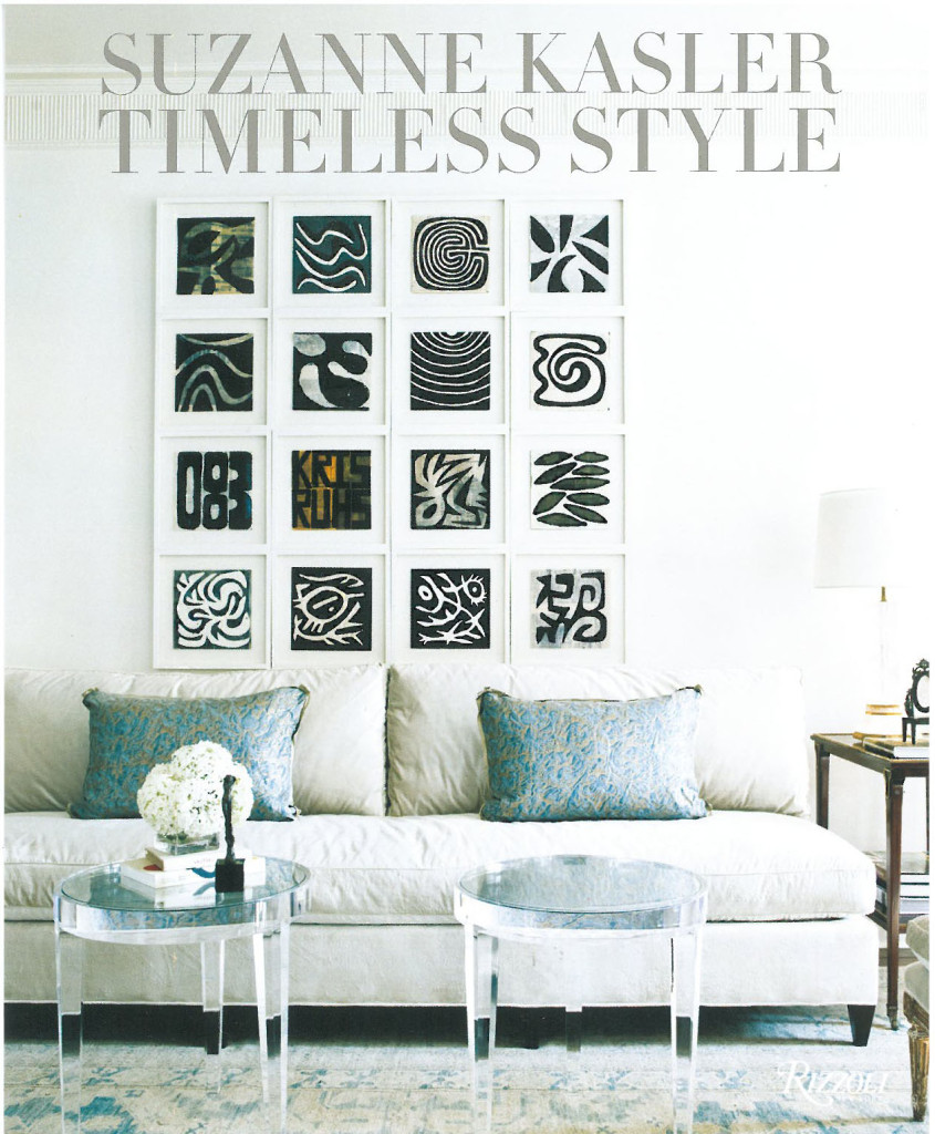
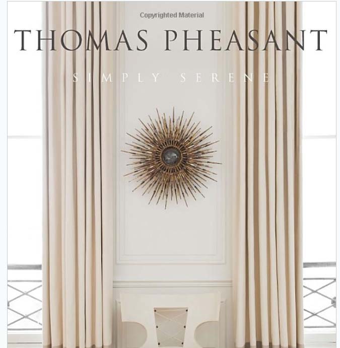
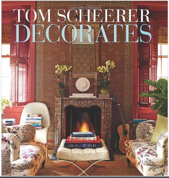
Over the weekend, I picked up three great new design books.
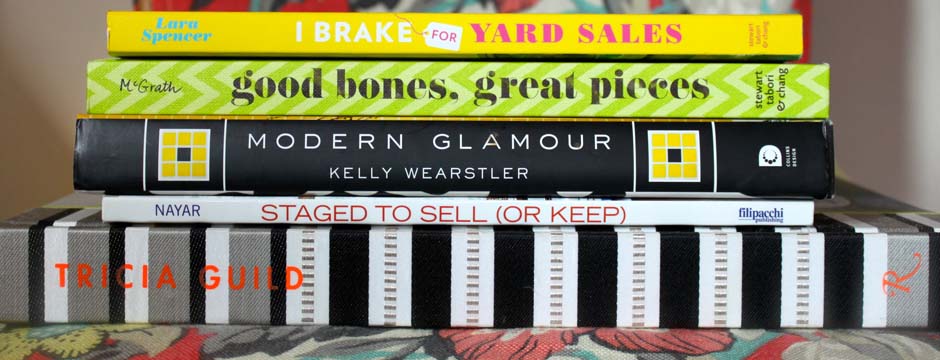
Over the weekend, I picked up three great new design books. I can’t wait to delve more deeply into them!
The first one is Suzanne Kasler: Timeless Style. This is her second book and it beautifully demonstrates her skill at creating layered interiors with wonderful details.
I also bought Simply Serene by Thomas Pheasant. He has such a sophisticated way of designing!
The third book I added to my collection is Tom Scheerer Decorates. Tom Scheerer has such a relaxed approach to his interiors, illustrating a well-lived life with so many layers.
Have you discovered any must-have design books lately?
Cover image via Burlap and Crystal
Top Designers Revamp Long Island Ronald McDonald House
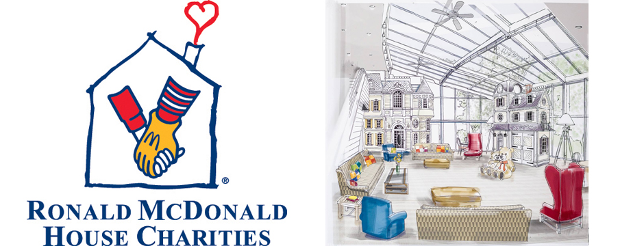
Recently, a group of top designers participated in a special show house event called Project Design to revamp the Long Island Ronald McDonald House.
One of the most difficult challenges a family can face is the serious illness of a child. Families often travel far from home to get the best possible care from specialists at state-of-the art hospitals. Being far from home, family, and friends makes the situation more stressful. Ronald McDonald House Charities seeks to support the families of sick children by giving them a home-like place to stay. Every Ronald McDonald House provides meals, playrooms, and private bedrooms. Being near their child and medical team without worrying about day-to-day tasks allows families to focus on the healing process and stay in touch with hospital staff. With 59 local RMH Chapters around the world, this important charity is such a worthy cause.
Recently, a group of top designers participated in a special show house event called Project Design, sponsored by The Ronald McDonald House of Long Island, Kravet, Inc., and New York Cottages and Gardens Magazine. These designers didn’t revamp just any home, but the Long Island Ronald McDonald House. This particular RMH services over a thousand families a year, providing much needed stability and support for parents and siblings of sick children. The many rooms of this RMH needed to be updated; turning the project into a show house served to bring additional funds to the charity. Participating designers included Amanda Nisbet, Anthony Baratta, Bunny Williams, Danielle Colding, Kerry Delrose, Jamie Drake, Drew McGukin, Dwell Studio, Elaine Griffin, Eric Cohler, Kate Singer, Kim E. Courtney, Mabley Handler, Margreet Cevasco, Mathew Patrick Smyth, Meg Braff, Jennifer Mehditash, Michael Herold, Michael Tavano, Jon Call, Nick Olsen, Pappas Miron, Suzanne Costa, Vasi Ypsilantis, Tilton Fenwick, and Young Huh. As the home’s original designer, Anthony Baratta served as Creative Director of Project Design. Unlike most show houses where the designers’ rooms are dismantled after the event, the work done at the Long Island Ronald McDonald House will stay in place to provide a beautiful environment for families who need a special home away from home.
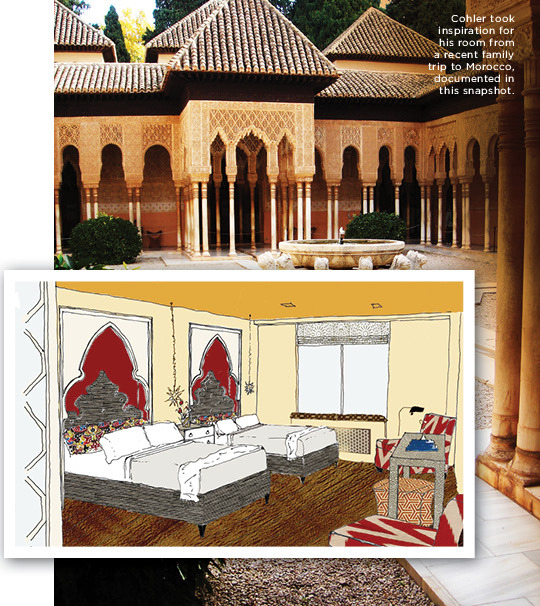
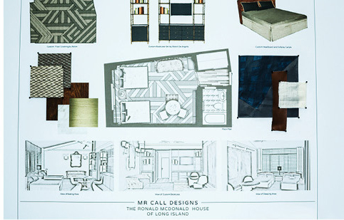
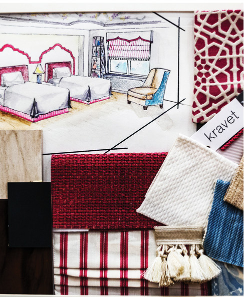
The finished results of Project Design will be revealed at a Designer Showcase Gala on October 10. The evening will include a tour of the newly designed rooms, silent auction, fine dining, cocktails, and entertainment. From Friday, Oct 11 to Monday, Oct 14, visitors can tour the home for Open House Weekend. If you’re in the area, support the Ronald McDonald House by visiting for a tour!
Contemporary Dining Room
This dining room became one of my favorite projects.
When I meet with a client to present my ideas for a design project, I come prepared with samples, tear sheets, and specific products. This way, the finished room is true to the original vision. When working on this dining room, I was so fortunate to have a client who was open to unexpected ideas. While her style was reserved in many ways, she had a contemporary edge that particularly shows in the completed dining room. By giving me carte blanche with this room, my client pushed me to be creative in designing a strong, confident room that combines traditional elements for a funky effect.
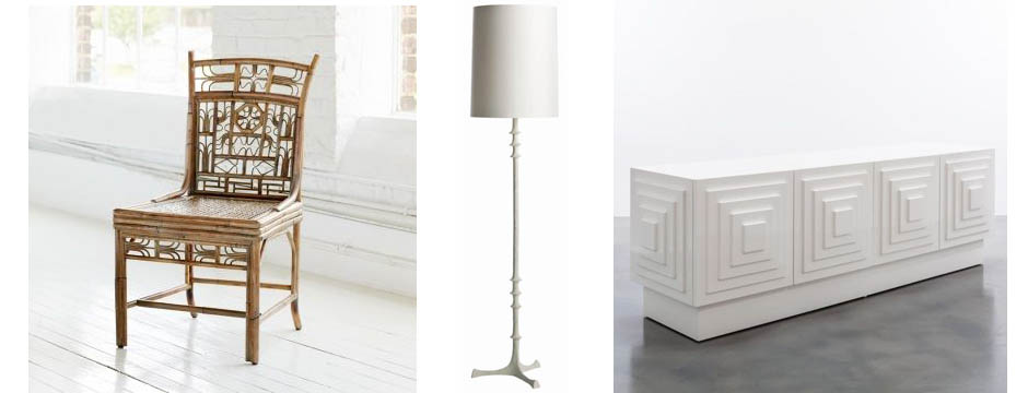
After getting to know this client by asking questions and spending time learning about her lifestyle and tastes, I went back to my studio to put together a presentation. These are some of the individual elements I presented. Sometimes it can be difficult for clients to look at these separate pieces and create a mental image of how they will come together in the finished room, but in this case we had a perfectly shared vision.
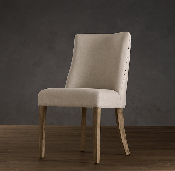
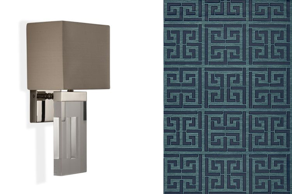
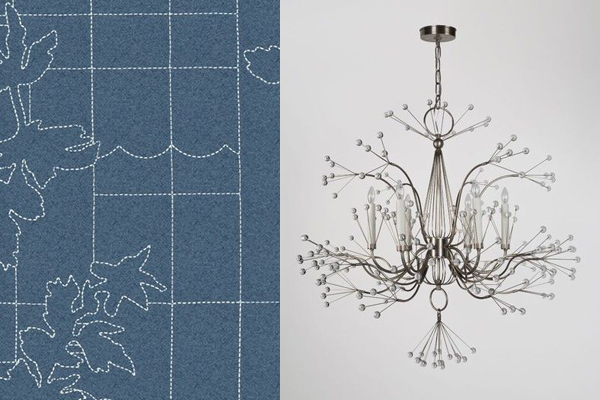
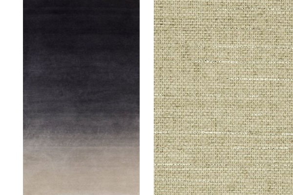
When I presented my ideas for the window treatments and ceiling, as well as the cool digital printing on the chairs, my client had faith in me that the installation would be cohesive. When a client and I work together like this, the outcome is always a truly special interior. That level of trust when working together produces the ideal collaboration. Seeing the dining room bring together so many eclectic parts and become a wholly unique, exciting room was a testament to the relationship between client and designer.
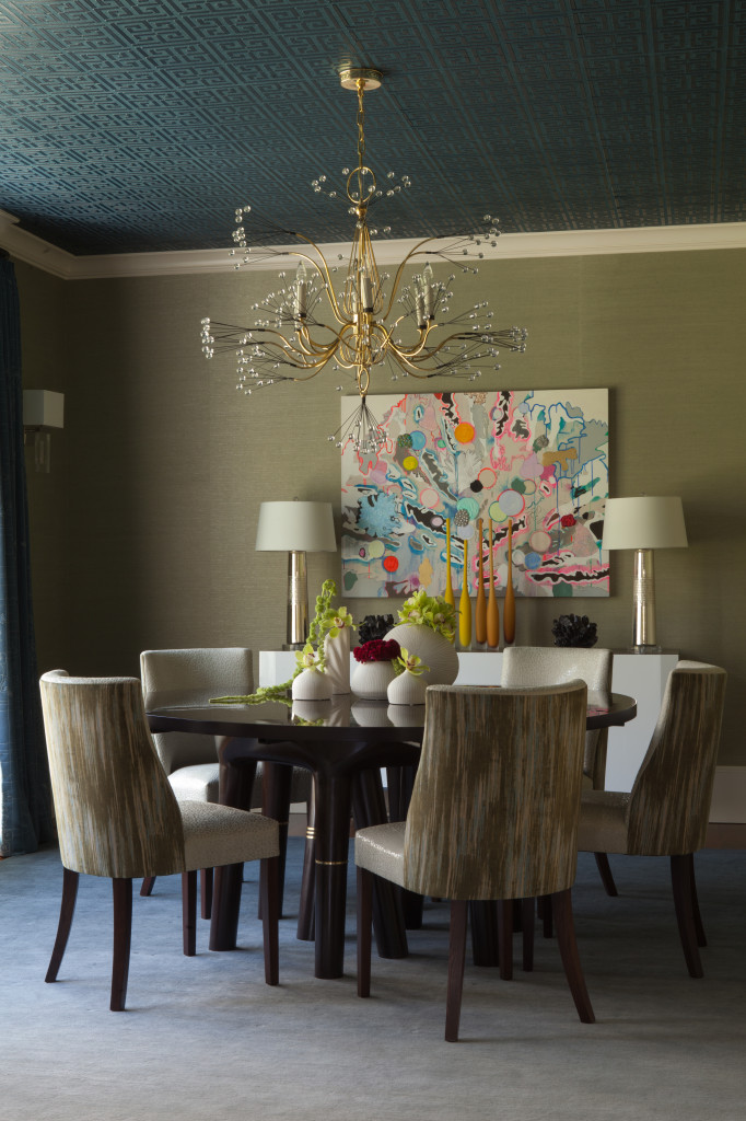
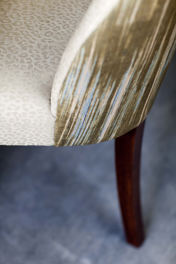
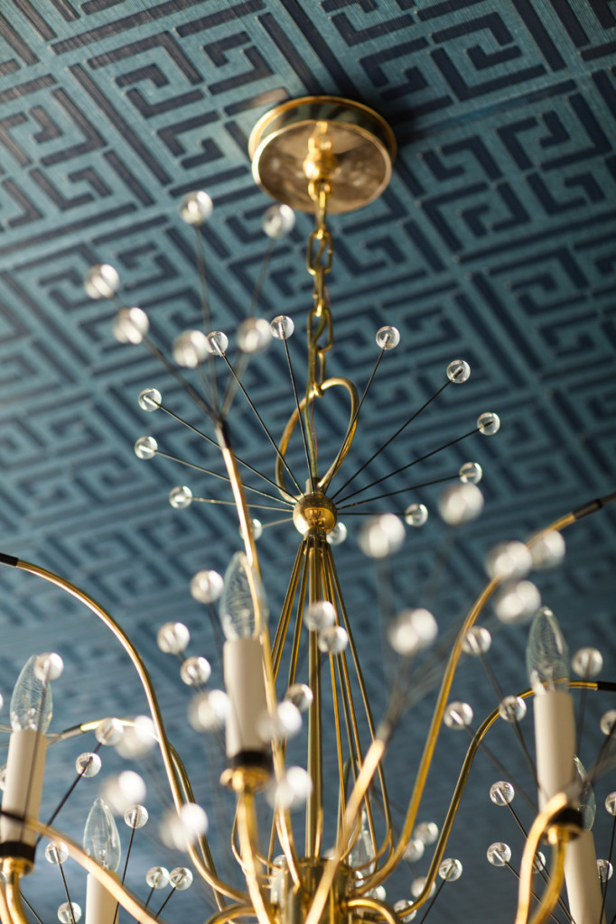
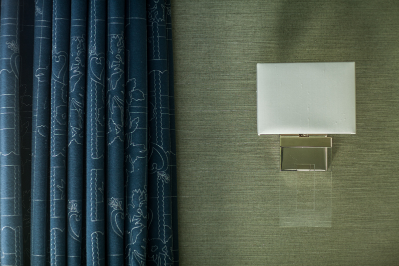
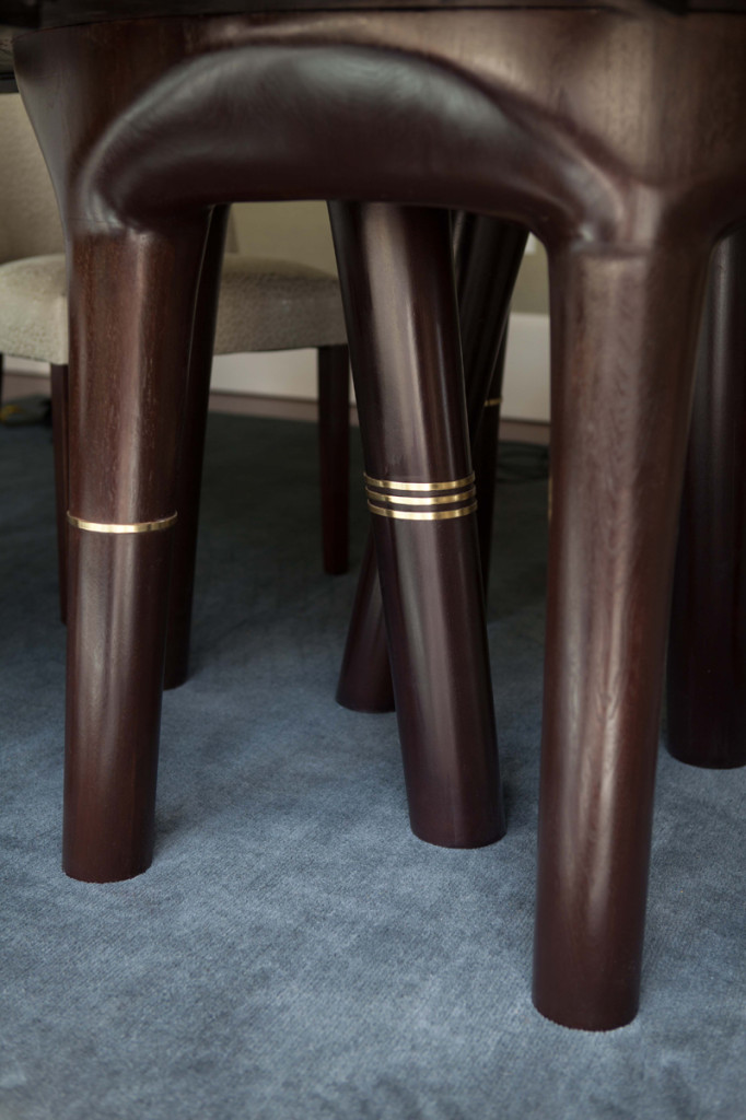
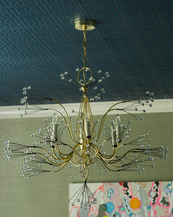
One of the challenges in designing this room was finding the right dining table. My client wanted a table with versatility that would also give the room needed weight. After an exhaustive search, we were able to design a table similar to another style we liked, but using different materials to achieve exactly the right look. Brass bands were added to the table legs at the last minute to give the piece some needed jewelry. The chandelier by Tony Duquette adds a bit of glam to the dining room.
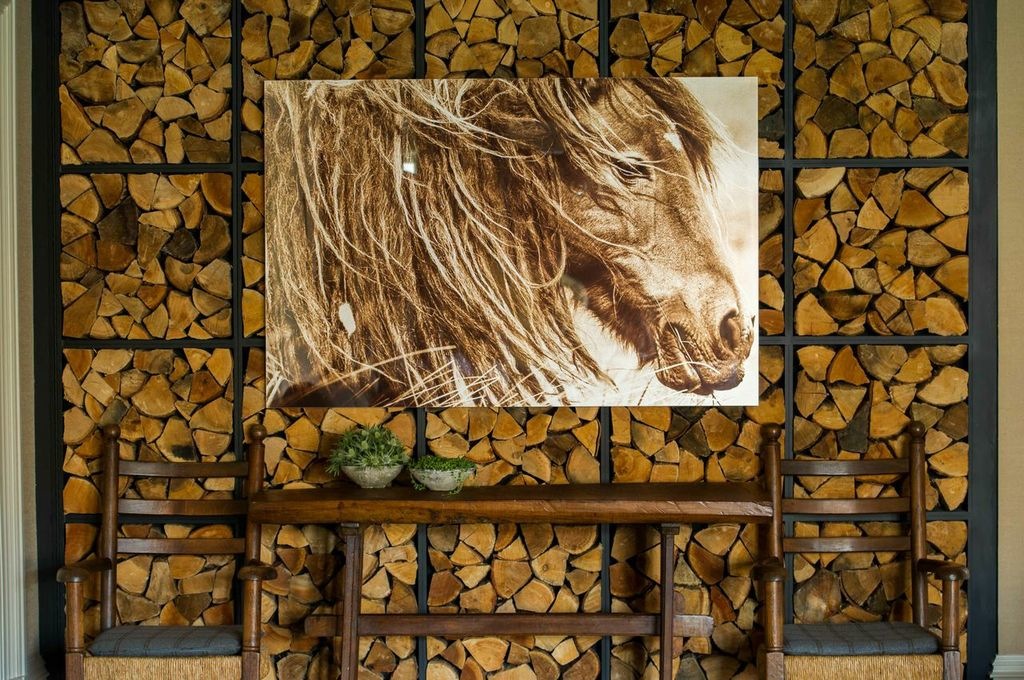
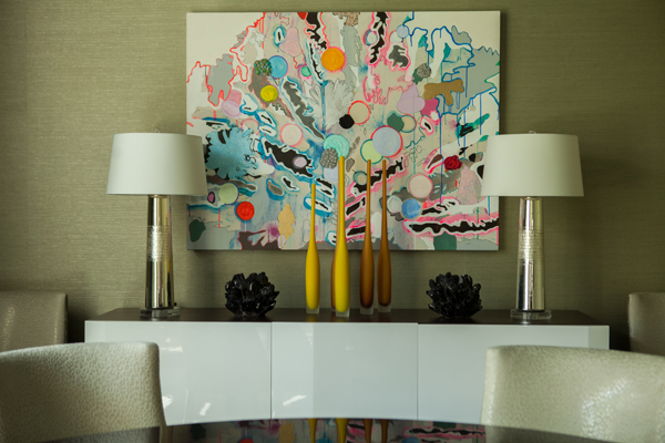
One focal point of this whimsical room is the art, a piece the client found. I love it when my clients discover artwork; it’s such a personal, emotional choice and when the client has a hand in choosing the artwork, the room is a truer reflection of their taste and style. This piece enhances the room’s art deco edge with whimsy.
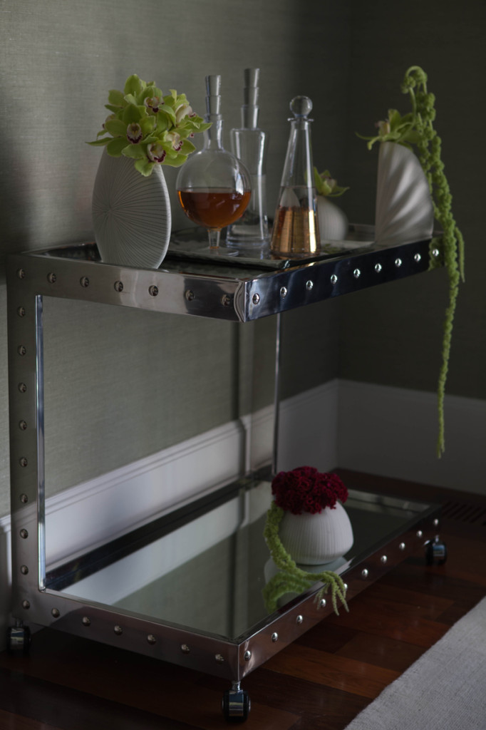
Other fun details add to the personality of the dining room, giving it added color and visual interest.
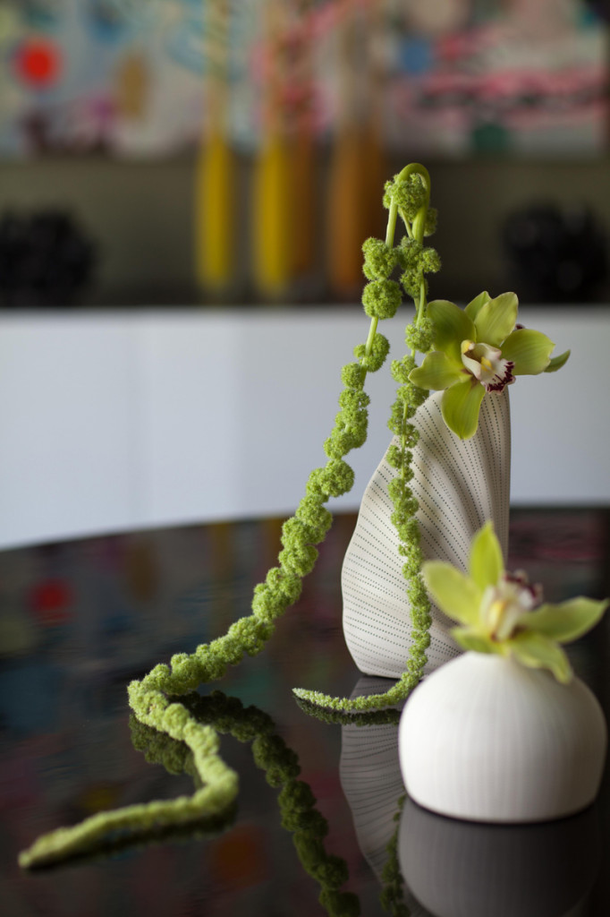
This dining room became one of my favorite projects. It is more artistic than most rooms I’ve designed and really shows the voice of the client as well as the result of an ideal collaboration between designer and homeowner.
Eddie Borgo’s Fall Jewelry Collection
I’ve always found Eddie Borgo’s jewelry designs very inspirational.
I was reading through the most recent issue of Harper’s Bazaar over the weekend and was so glad to see a feature on Eddie Borgo, one of my favorite jewelry designers. I’ve always found his designs very inspirational.

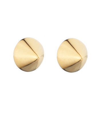
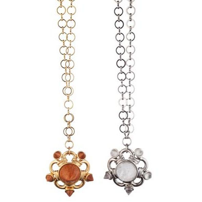
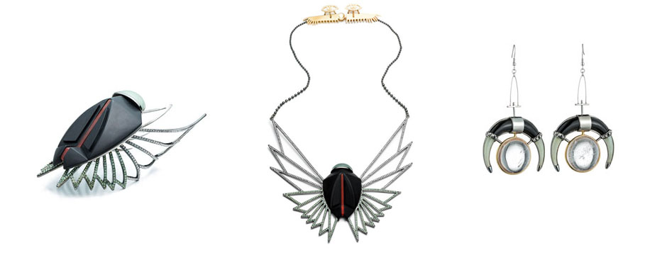
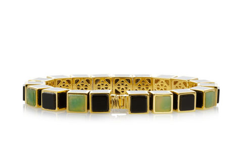
For the Fall 2013 collection, Borgo found inspiration from the ancient Egyptian world of Cleopatra. As with his past designs, Borgo spent time carefully researching designs and themes before creating his own interpretation of Egyptian jewelry, visiting the Metropolitan Museum of Art many times to study examples from this fascinating, lush time period. I love the story of Cleopatra and think every girl at one time or another wishes to live that kind of lavish life – I know I did. To see Borgo take his inspiration from Cleopatra is really exciting.
With mixed metals and stones such as jade, howlite, and onyx combined with Egyptian iconography such as the eye of Horus, this jewelry line presents a modern, graphic style while still paying homage to the fascinating and mysterious life and times of Cleopatra.
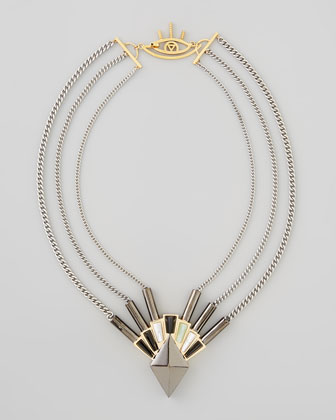

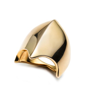
To see more of Eddie Borgo’s designs or to find a retailer, visit his website.

