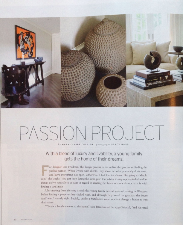
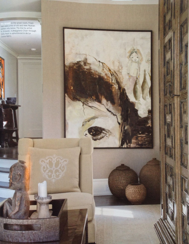
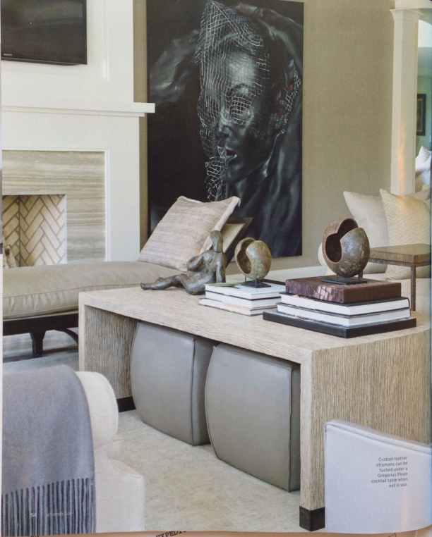
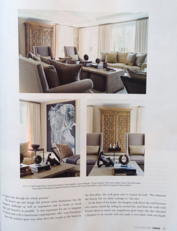
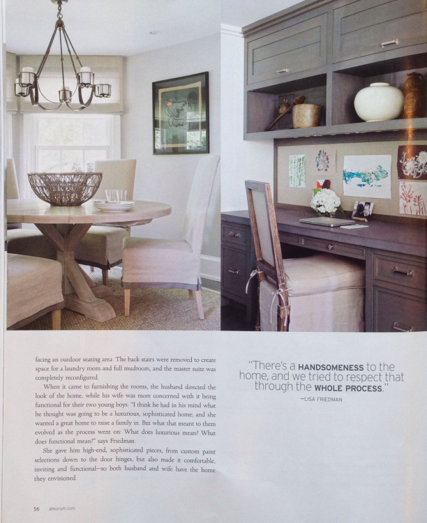
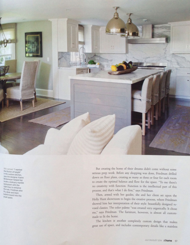
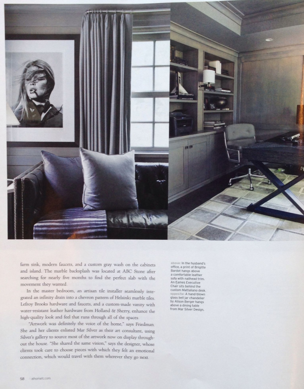
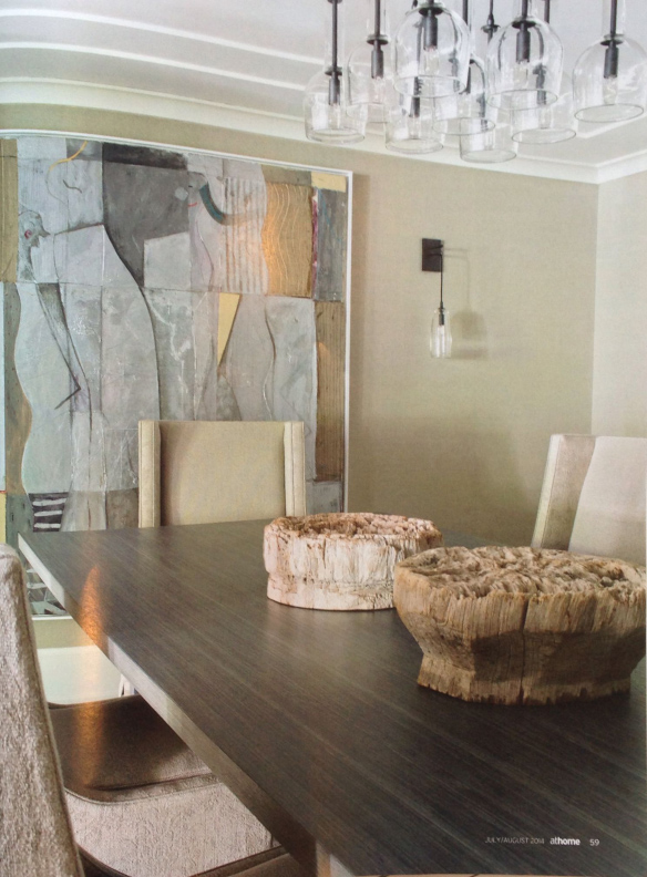
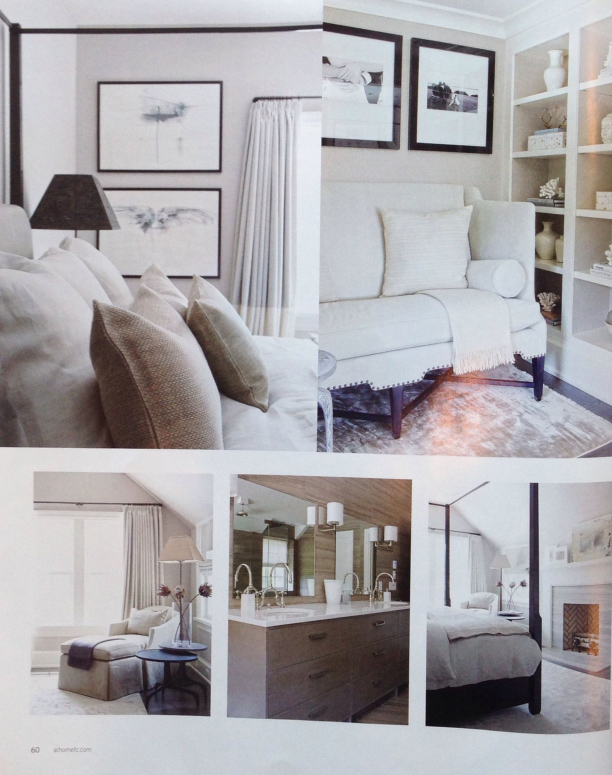
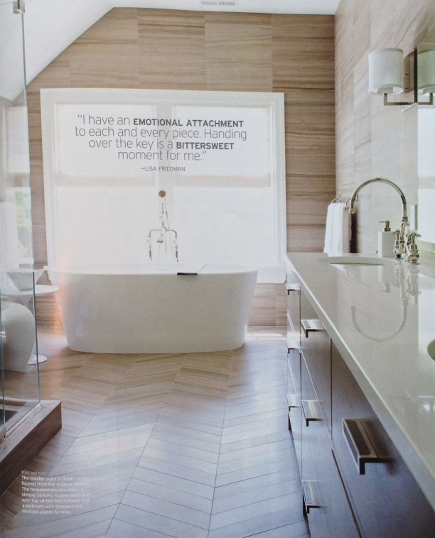
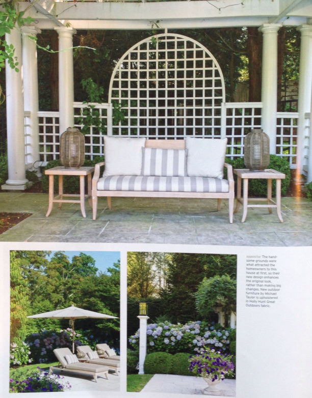
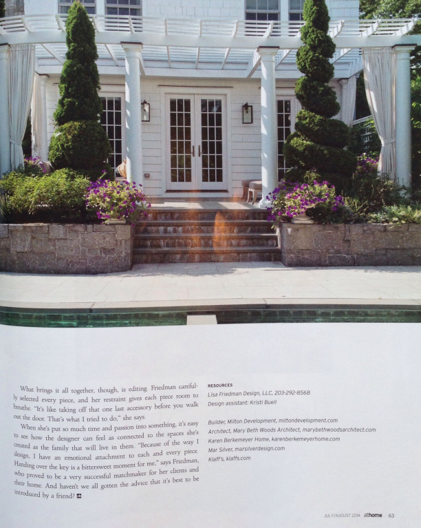
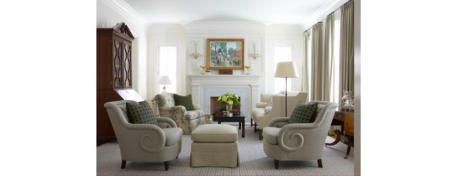
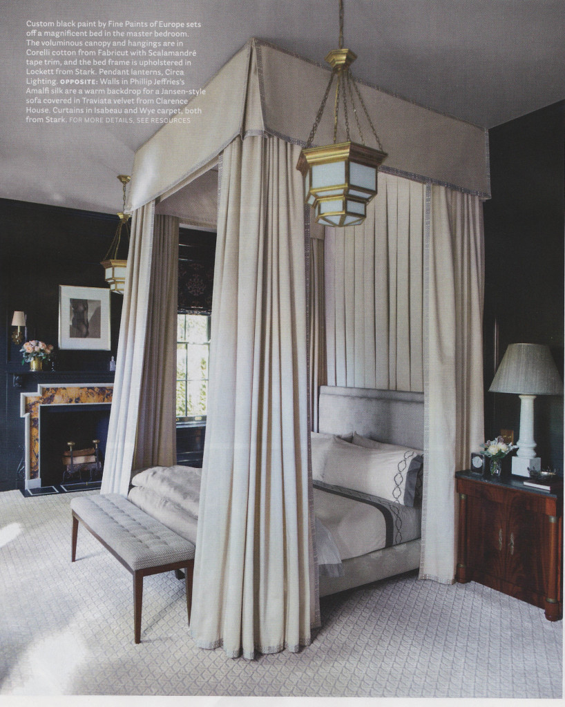
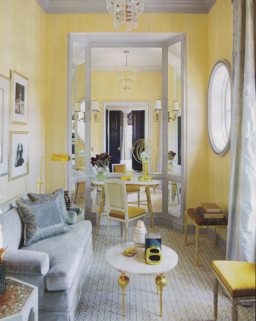
I saw an editorial in the most recent At Home in Fairfield County that I loved. The article featured a 1939 Colonial designed by Lisa Friedman with incredible art sourced by Mar Silver. When looking at the photos of this beautiful interior, I felt like I could easily live in this home. The neutral palette and use of high end, sophisticated vendors in rooms with great proportions and scale lead to a timeless, well executed look.
Category: Features
Stephen Antonson
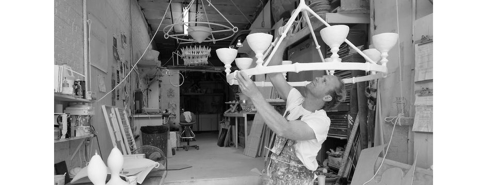
Stephen Antonson is a true artist, creating beautiful and unique items with plaster at his Brooklyn, NY, atelier.
Stephen Antonson is a true artist, creating beautiful and unique items with plaster at his Brooklyn, NY, atelier. His furnishings, lighting, and accessories are sculpted by hand using a meticulous process that results in objects with an incredible combination of simplicity and elegance.
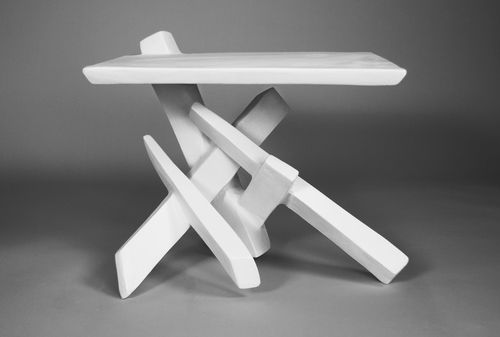
I’ve seen Antonson’s work in interiors by other designers, and it always catches my eye. It reminds me of Giacometti’s techniques, with the iconic white color reminiscent of John Dickinson’s work in the 1970s. A trained painter and sculptor, Antonson’s Brooklyn studio is a place I would love to see. I am fascinated by the places where people tinker, explore, and create.
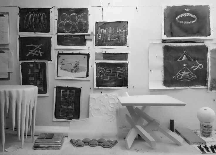
I find Antonson’s designs invigorating and innovative. To me, plaster is a peaceful medium and adds a smooth texture to the space. It is completely different medium to add to an interior.
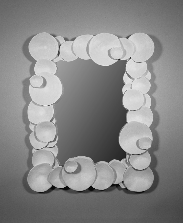
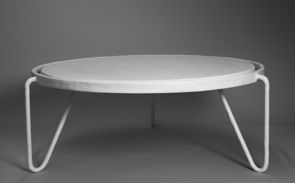
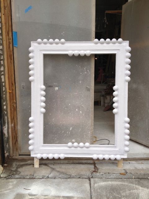
With a medium like plaster, the sky is the limit. I love the idea of taking something you see and like, then adapting it to plaster. Antonson’s lighting designs perfectly exemplify the potential of plaster. They are so clever.
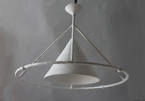
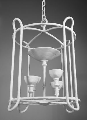
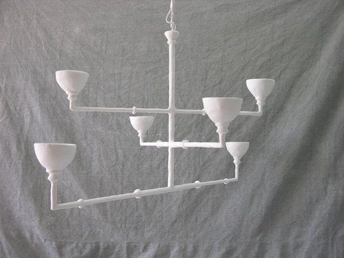
In addition to his plaster work, Antonson creates art for his home and his family. He authored a book with his wife titled Home from the Hardware Store which demonstrates how to build household goods from common hardware store purchases. You can also see more of Antonson’s plaster work on his website or find him on Facebook.
Amanda Nisbet
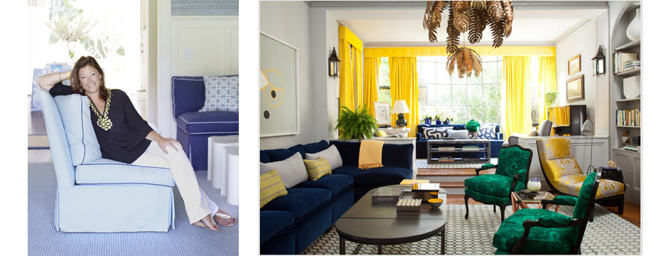
Amanda Nisbet is a true powerhouse in the world of interior design.
Amanda Nisbet is a true powerhouse in the world of interior design. She is full of energy, with an exuberance that shows in her interiors.
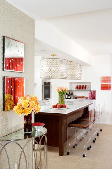
Born in Montreal and educated in the U.S., Amanda Nisbet now lives in New York. Early in life, she aspired to be an actress. After a couple of commercials and small roles in smaller plays, she changed direction. Acquaintances who loved the style of her apartment often asked for her help in decorating their own homes. Amanda’s interior design skills come purely from talent — she did not go to design school or receive any formal training. I’ve been fortunate enough to see her speak twice and find her work to be so inspiring.
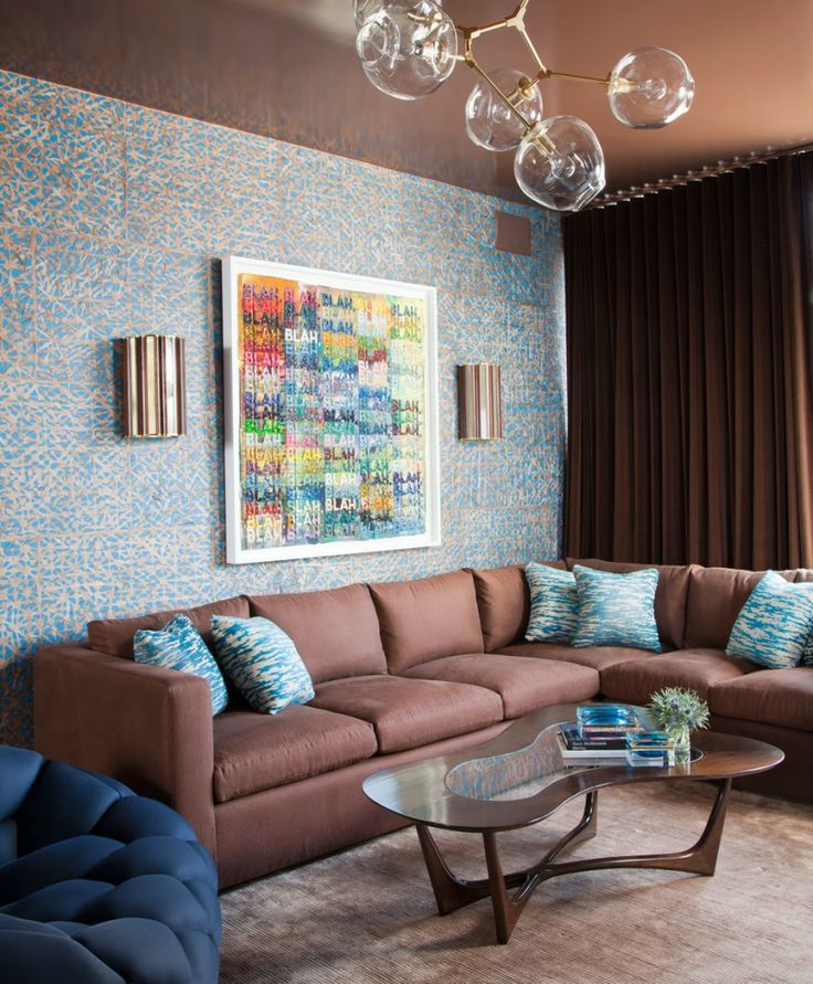
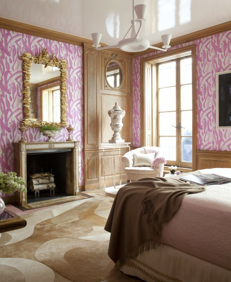
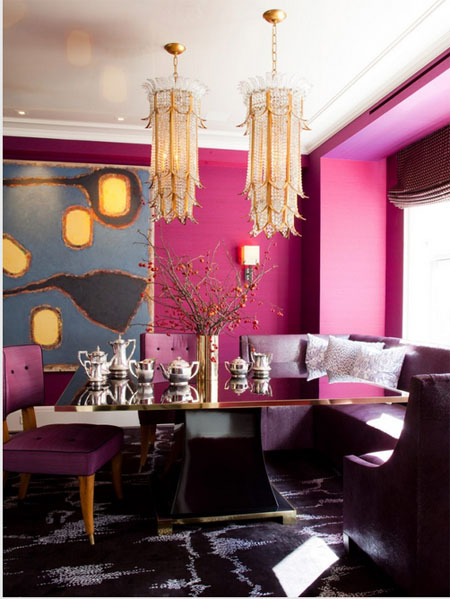
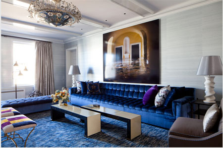
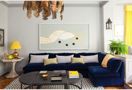
What I like about Amanda Nisbet’s design style is the fearlessness of her work. Her designs are saturated with color in combinations that are really empowering. She has a great sense of scale with art and a playful, avant garde feel. You can see her personality in her interiors. I really identify with her love of color.
To see more of Amanda Nisbet’s work, visit her website. You can also find her on Facebook.
Better Homes and Gardens: Storage
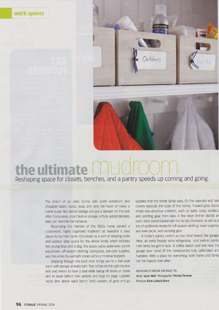
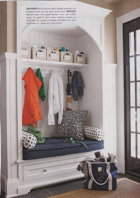
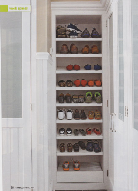
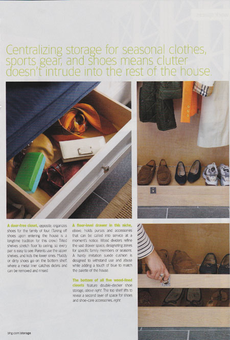
In the Spring 2014 issue of Better Homes and Gardens’ special Storage publication you can see a great mudroom project I completed for one of my clients.
In the Spring 2014 issue of Better Homes and Gardens’ special Storage publication you can see a great mudroom project I completed with Julio DiBiase of Dibico Construction for one of my favorite clients. This mudroom is a perfect example of how a functional space can be beautiful without sacrificing utility. This client has a strict no-shoes-in-the-house rule, so incorporating plenty of accessible shoe storage in the mud room was a big priority. Other storage spaces allow for maximum organization, keeping the mudroom tidy and creating the perfect waystation for the family when coming and going. Extra closets allow for convenient storage of everything from seasonal outerwear and sports equipment to camping gear and picnic accessories. Easy to clean surfaces and materials are another key element to this mudroom. I hope you get a chance to pick up a copy; there are a lots of great storage ideas throughout the issue!
Artist: Paul Hunter
One of my project managers recently introduced me to the work of New York artist Paul Hunter.
One of the most beautiful things about my office is the way everyone contributes new ideas. From furniture and color palettes to lighting and art, we are always sharing new finds. Jess, one of my project managers, recently introduced me to the work of artist Paul Hunter, whose paintings she’d seen when meeting with a curator.
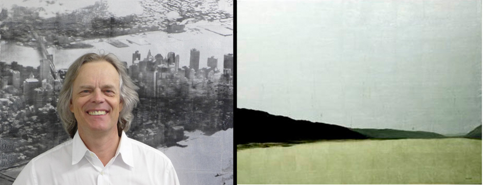
Paul Hunter, a Canadian native who moved to New York City in the 1980s, creates his unique paintings by using applying various types of metal leaf to the canvas and painting on the metal. The result is a luminous quality from the reflective nature of the metal, a striking and beautiful effect.

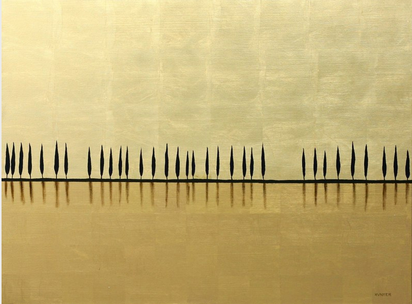
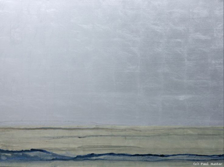
I really love the medium Hunter uses. The resulting color and texture of the paintings is so appealing. I also like how he uses this complicated process of marrying tissue-thin sheets of metal leaf with paint in order to create paintings that appear simple and subtle. Even before learning about how Hunter creates his work, however, I was drawn to the modern, almost abstract nature of the paintings.

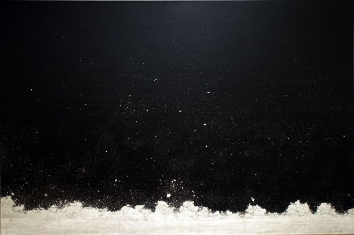

Even the size of the artwork is great. I like the idea of arranging the smaller pieces in a vignette. Many of the paintings are so pretty, while others are saturated with color. With this kind of scope, Hunter’s art really has something for everyone.

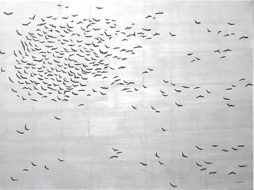
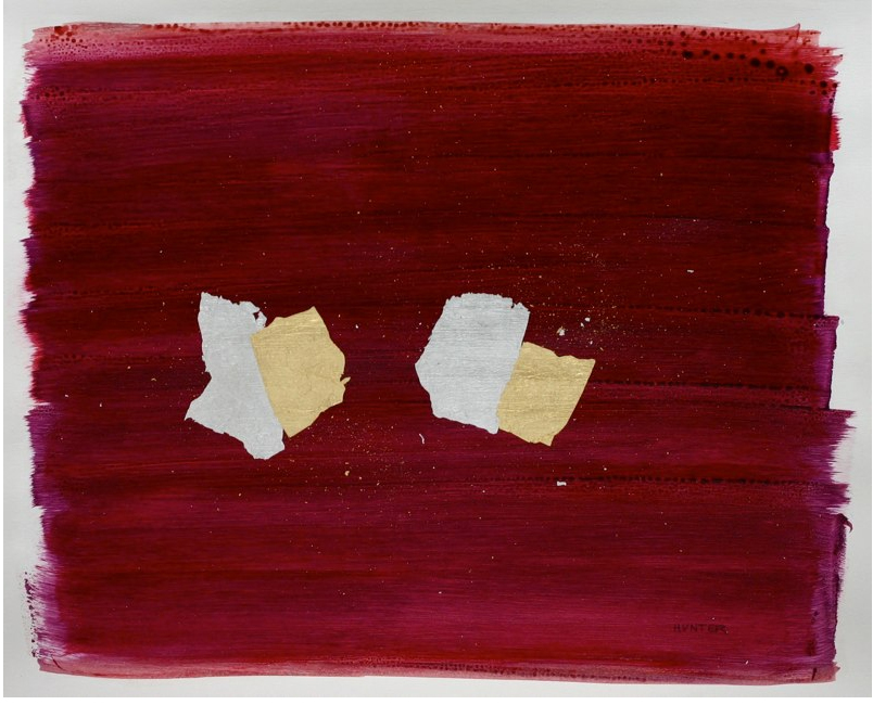
To learn more about Paul Hunter and view his many other paintings, visit his website.
Color Obsession: Blueberry and Yellow
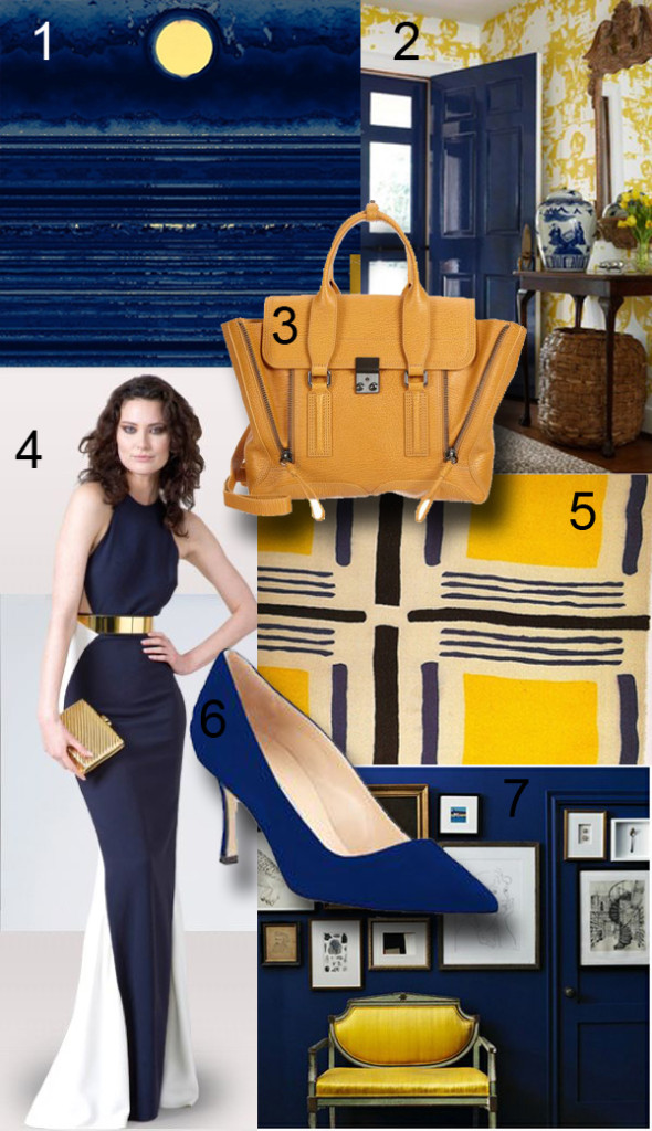
Blueberry and yellow is one color combination I really love.
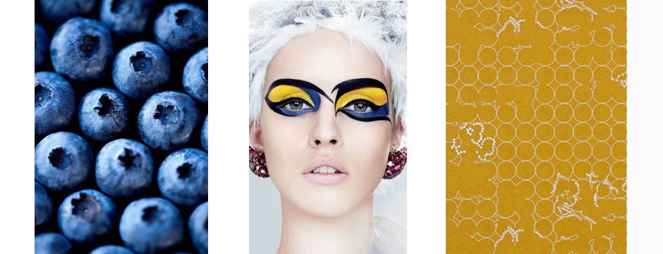
A few days ago, I saw some freelance work my Project Manager Jess was working on. She makes beautiful cards, and was testing colors for her creations. One of her palettes used blueberry and yellow, and it struck me as so appealing. The next day, Krystal, another project manager, came in dressed in a really great outfit with the same blueberry and yellow palette. I love how inspiration can come in tiny ways like this; a lovely card or a striking outfit. Inspiration doesn’t have to come from some grand scheme but can be found in so many places. These colors became the inspiration for an entire family room design.
The contrasting shades of blueberry and yellow bring out the best in each other and provide such a bright, rich hue. It’s a graphic and eye-catching combination, with the darker blue bringing out the sunniness of the yellow. It brings to mind warm summer days, something most of us are looking forward to this time of year. In both interior design and fashion, blueberry and yellow are so uplifting.
2. Suellen Gregory Interior Design
4. Dress by Stella McCartney
5. Swatch by artist Sonia Delaunay
7. Design by Joel Bray
Pretty Rooms
The Merriam-Webster dictionary defines pretty as, “attractive to look at, usually in a simple or delicate way.”
The Merriam-Webster dictionary defines pretty as, “attractive to look at, usually in a simple or delicate way.” When I’m sourcing for inspiration, I sometimes come across rooms that just strike me as being so pretty. When all of the elements of a space come together to create a pretty environment, the room looks so welcoming and pleasant.
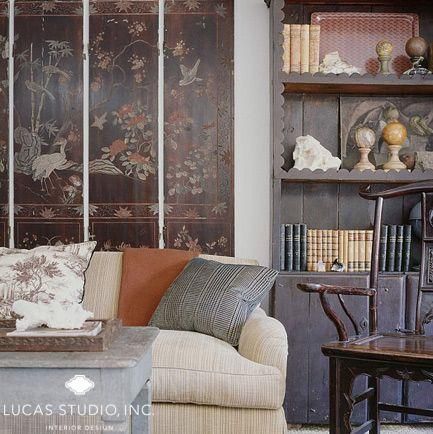
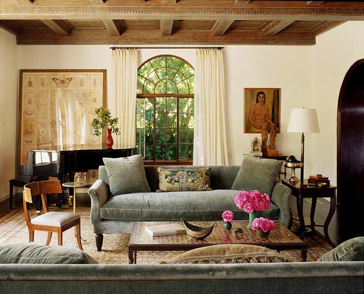
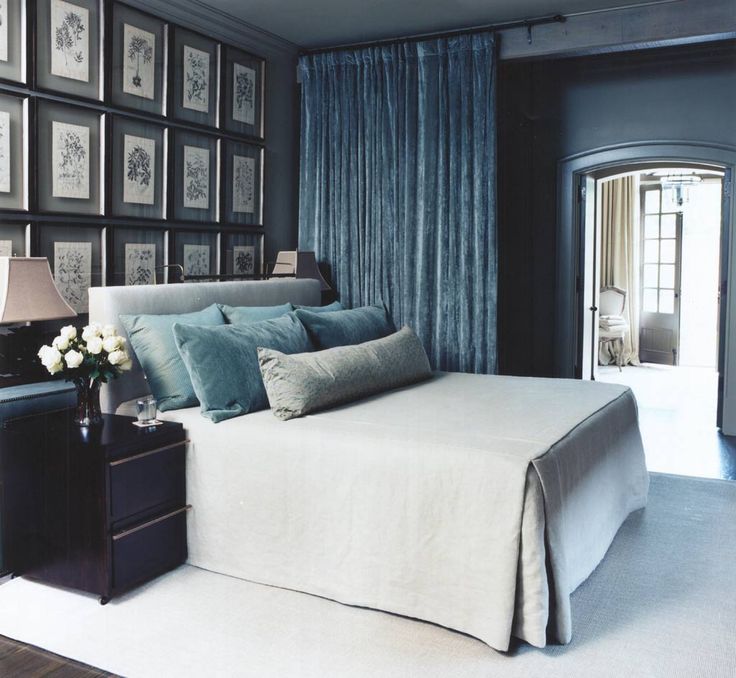
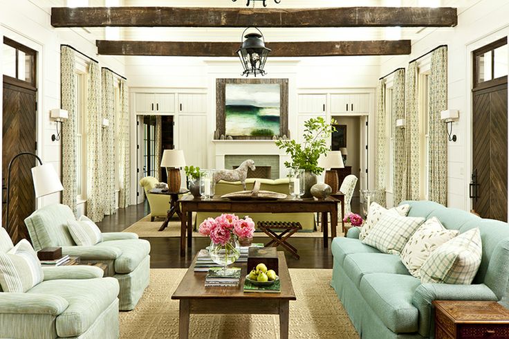
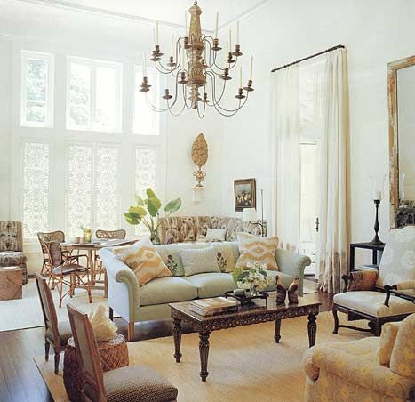
When a room is soft and warm, it is naturally inviting. Pretty rooms are comfortable and charming without being boring or run-of-the-mill. A bright, cheerful room makes a relaxing sanctuary. Making small statements with lighting, accessories, or additional color saves a pretty room from being too cloying. The overall effect is clean, simple, and appealing.
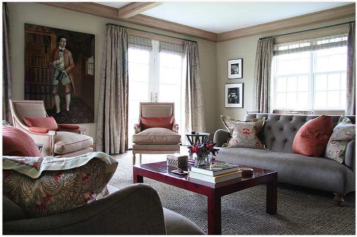
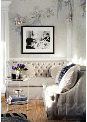
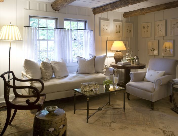
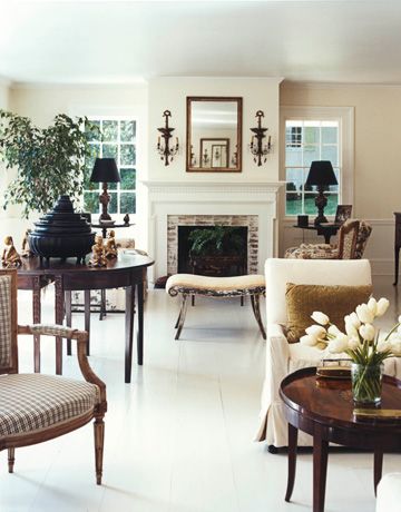
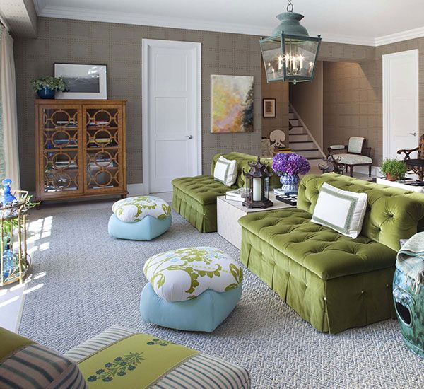
What’s your idea of a pretty room?
Great Articles in Feb 2014 House Beautiful
The current issue of House Beautiful, February 2014, included some really great features.
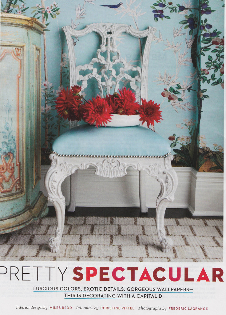
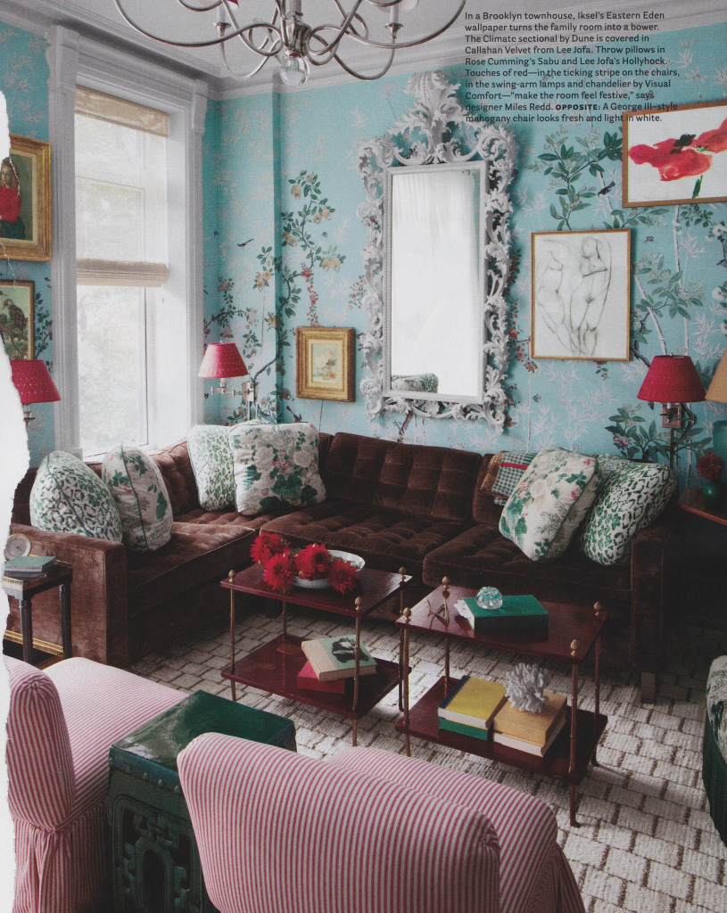
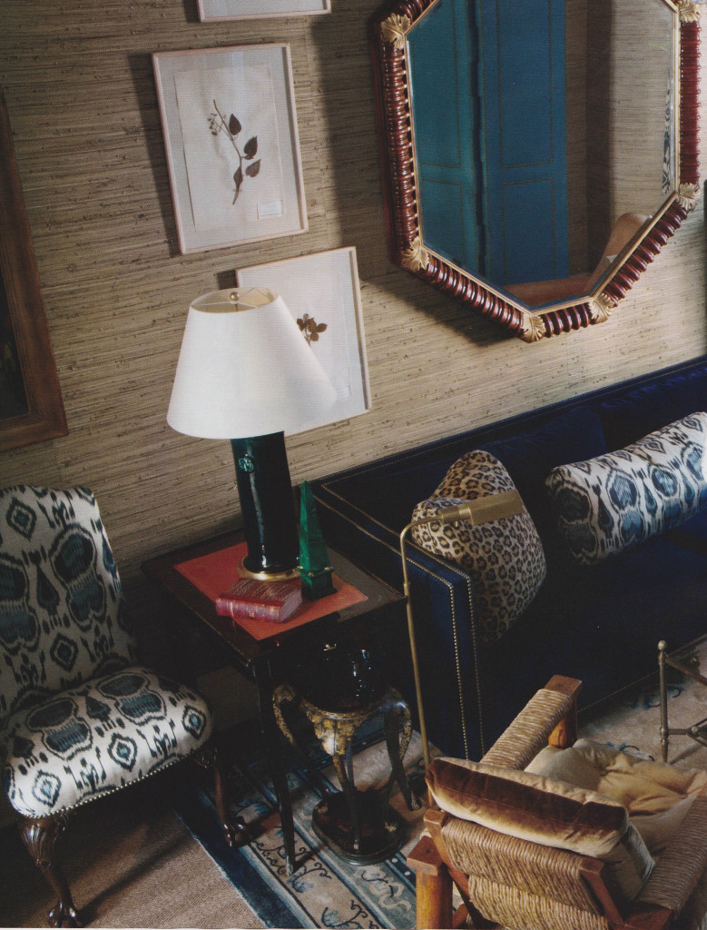
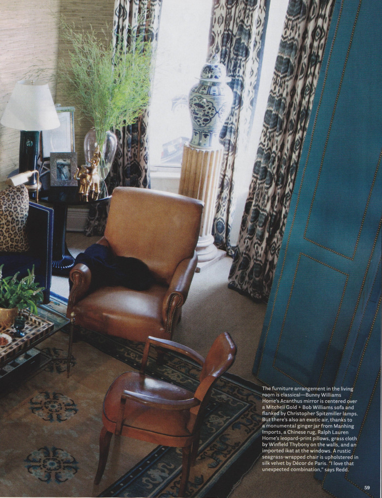
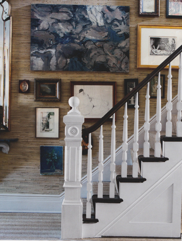
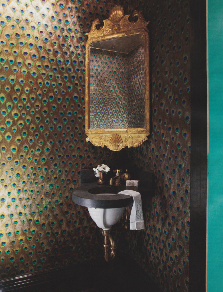
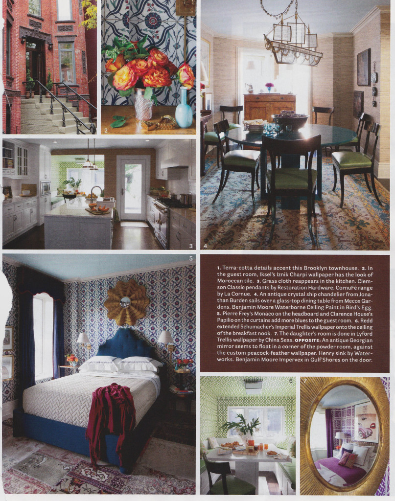
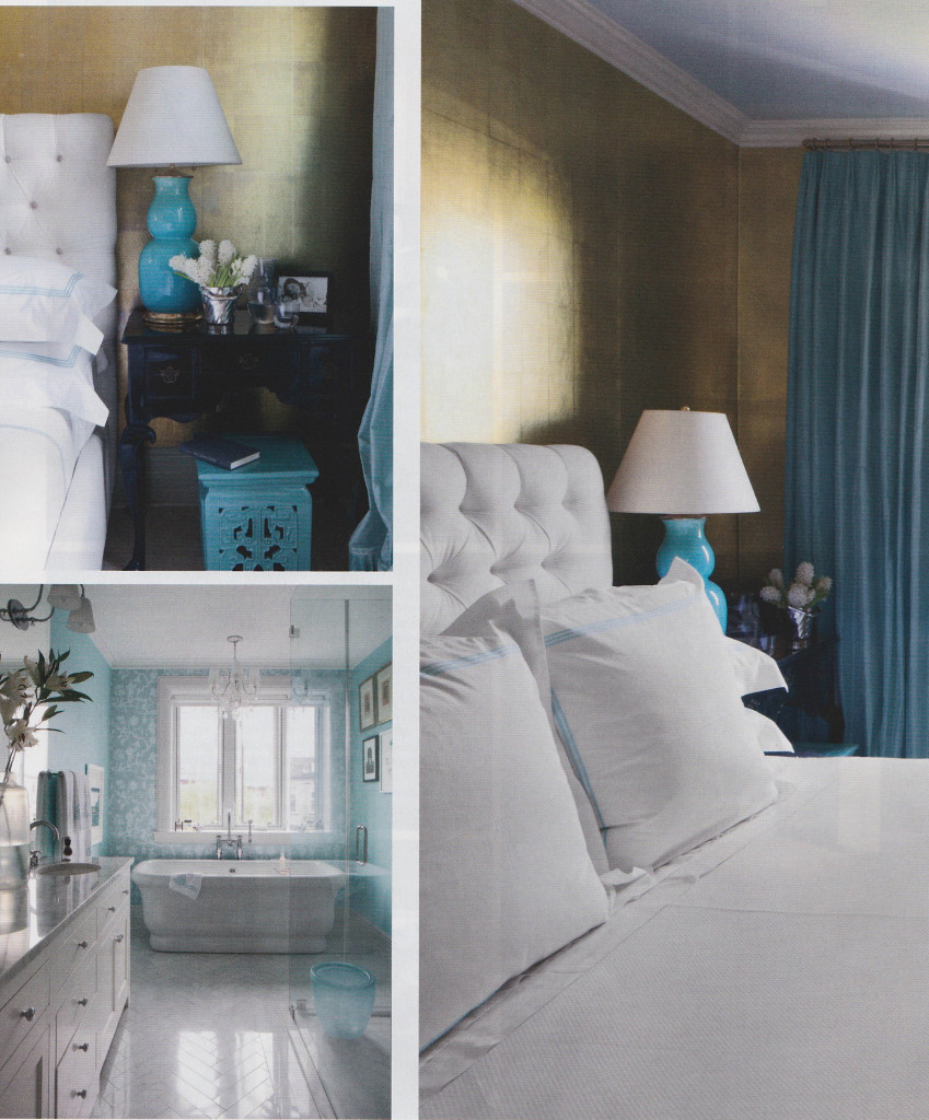
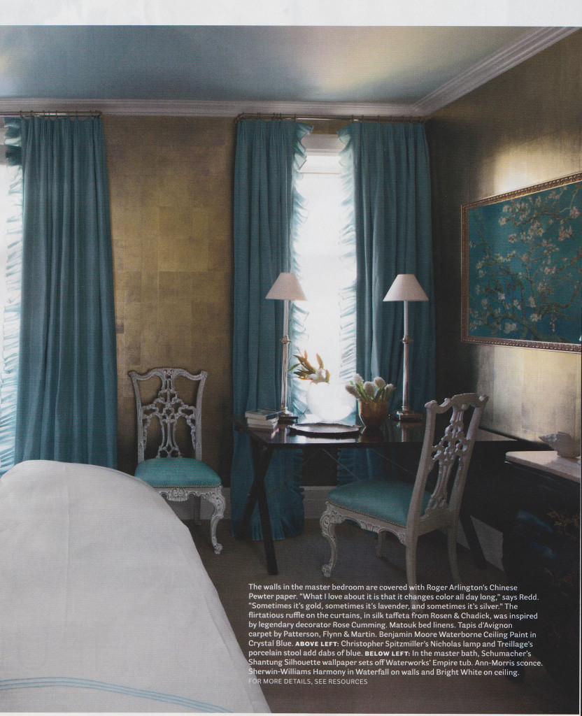
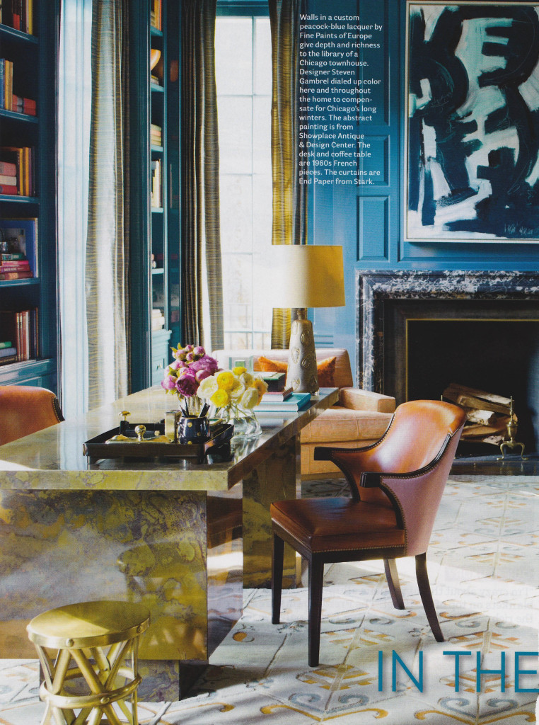
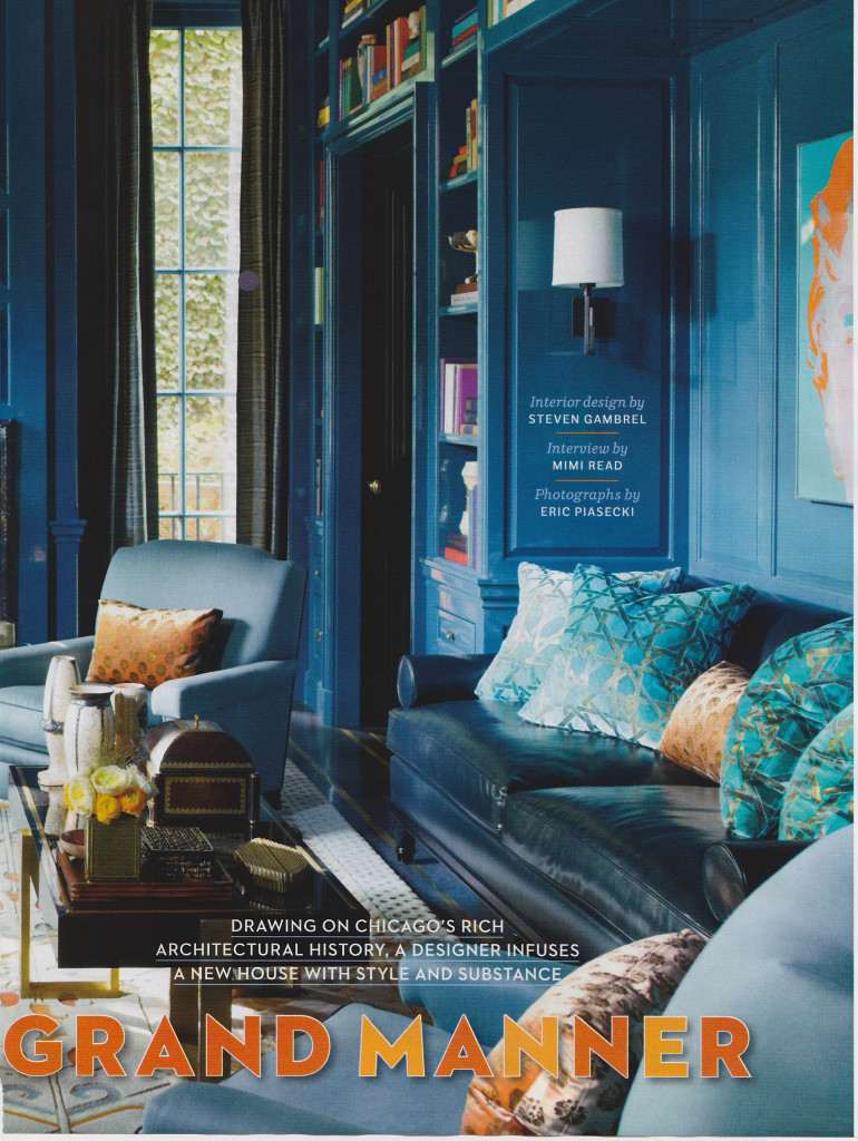
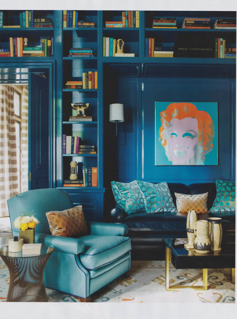
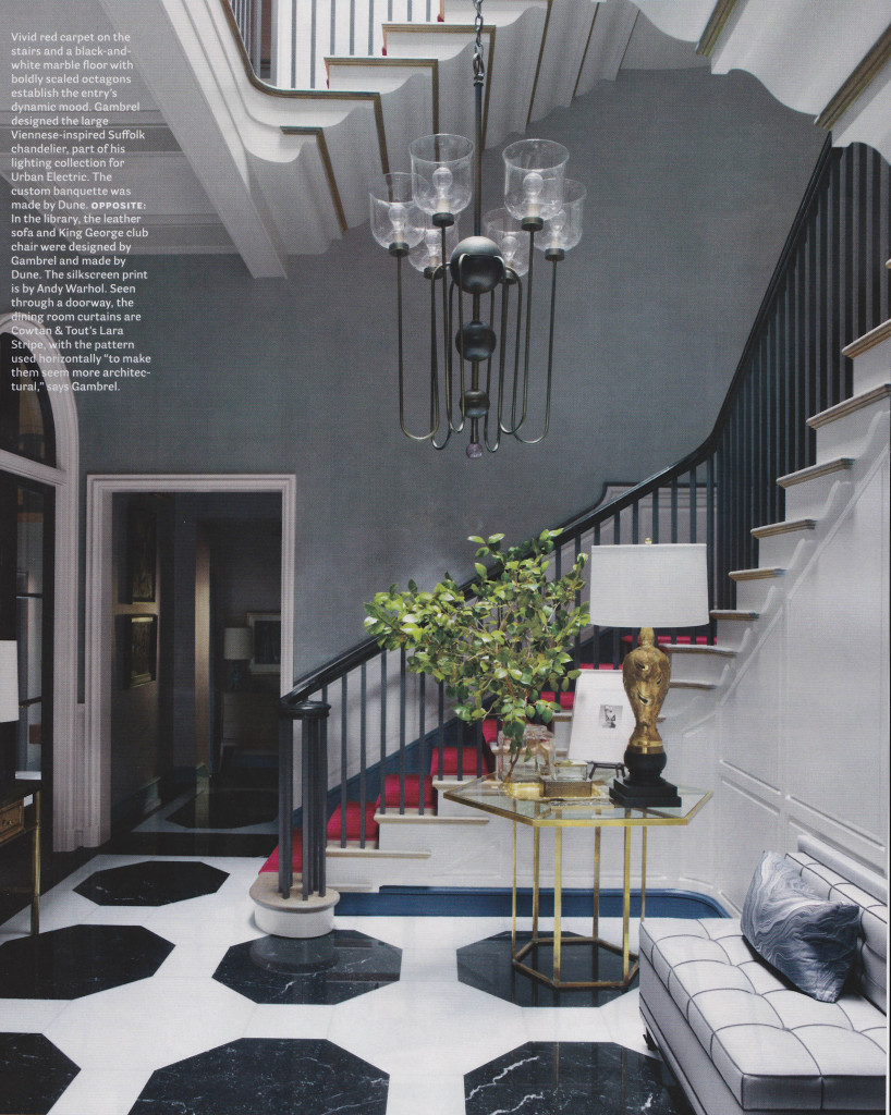
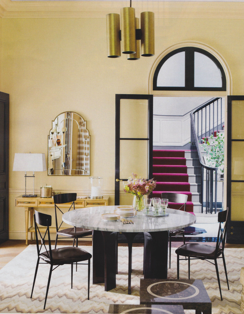
The current issue of House Beautiful, February 2014, included some really great features. Two articles in particular stood out for me; Pretty Spectacular, featuring design by Miles Redd, and In the Grand Manner, featuring design by Stephen Gambrel. Both articles showed how these wonderful designers used an amazing amount of color. From Gambrel’s use of peacock blue lacquer to Redd’s bursts of bold colors throughout a Brooklyn residence, the rich color stands out in these beautiful spaces. The effect is so textural and rich. The saturated colors create warmth and pure decoration, with tons of pattern upon pattern.
When I design for clients, I sometimes struggle between days of preferring clean, sleek interiors, and then days when I love layering with color and just inundating a room with detail. What I love about these features in House Beautiful is how they show that Redd and Gambrel don’t sacrifice on quality and their clientele understand that something so perfectly orchestrated can be comfortable and livable. It is really inspiring! I walked away from this issue wanting to shake off the winter doldrums and do something bold.
Pretty Spectacular
By Christine Pittle. Photos by Frederic Lagrange.
In the Grand Manner
By Mimi Read. Photos by Eric Piasecki.
Favorite Things: Modern Elements
When it comes to interior design, the term “modern” can mean different things to different people.
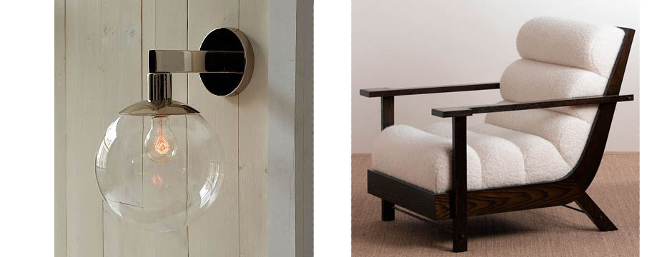
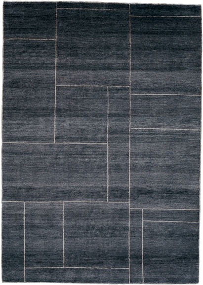
When it comes to interior design, the term “modern” can mean different things to different people. To me, it means using newer, refreshing elements. These items can be mixed with more traditional design for a bit of added flair or an eclectic feel, or can be used on their own. This list of my favorite pieces could be used to create a beautiful space, or individual items could be worked into a room to give it a bit of a modern edge.
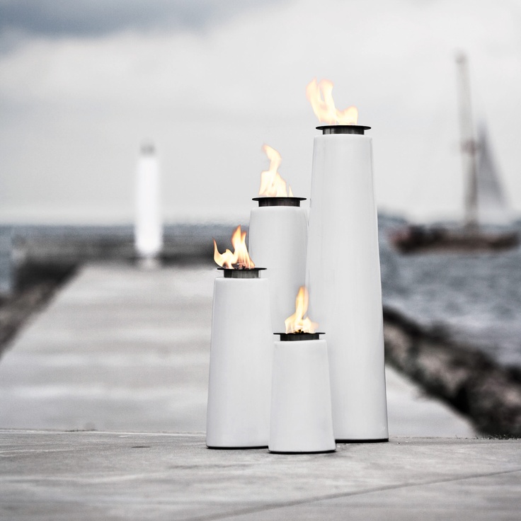
1. Blackened Brass Hans Pedestal Table by Jonathan Adler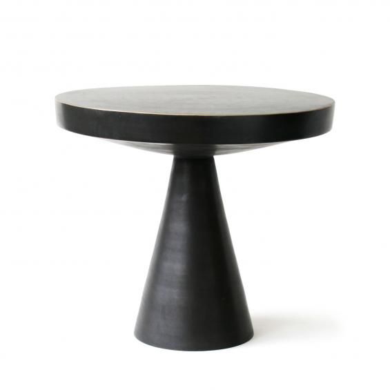 2. Lighthouse Oil Lamps from Menu
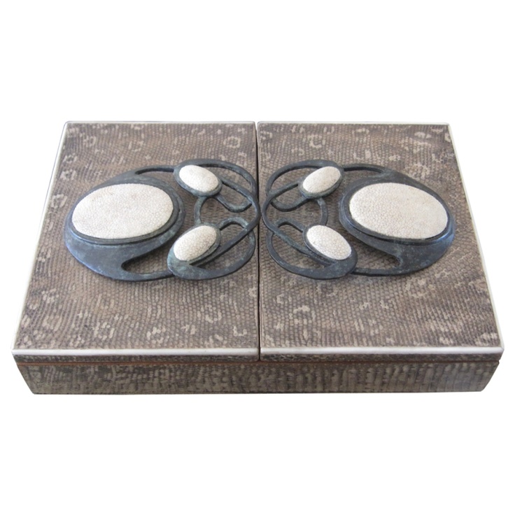
3. R Augousti Jewelry Box Embossed In Snake Skin & Stingray
 4. Kubik by Michael Reeves. Gorgeous ink color.
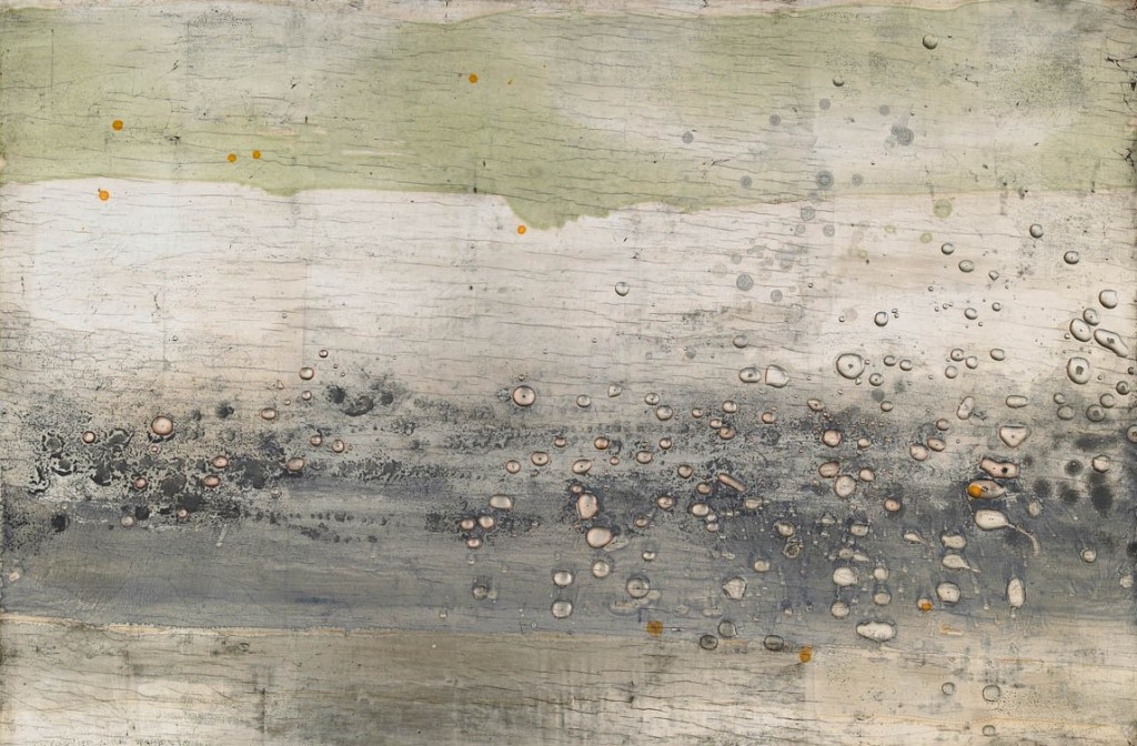
6. Landscape II, 2007. Silver leaf, resin, pigment on panel. By Nancy Lorenz.
7. Side Table from Bungalo 5.
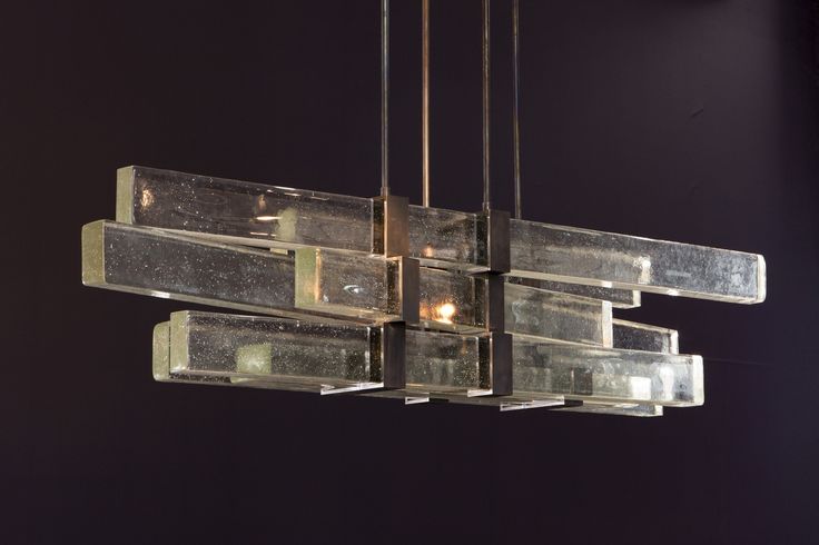
 8. Lighting from Ralph Pucci International
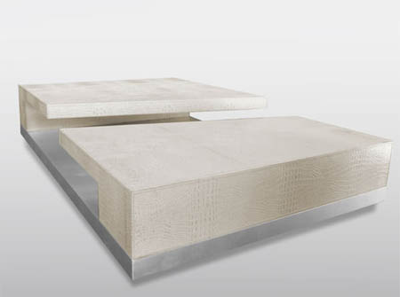
9. Canyon Coffee Table from RobiCara.
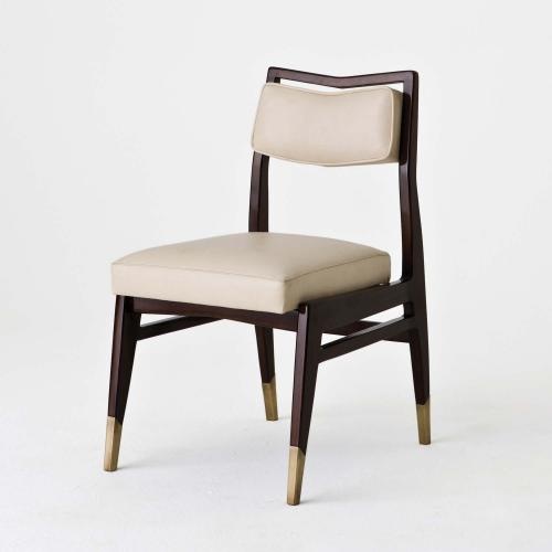
10. Bruno Dining Chair from Studio Van Den Akker.
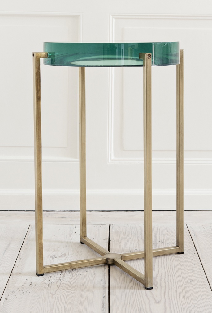
11. Side table with acrylic top and brass base, from The Apartment by McCollin Bryan.
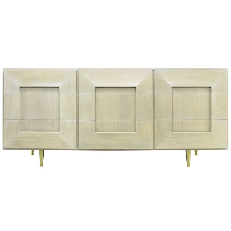
12. Driftwood Finish Dresser from Assemblage
Keith Granet
After starting his career as an architect and working with the notable firm Gensler, Keith realized that wasn’t where he wanted to be and started his own company with the goal of filling a need for business guidance in the design world.
I really like what Keith Granet is doing for the design industry. After starting his career as an architect and working with the notable firm Gensler, Keith realized that wasn’t where he wanted to be and started his own company with the goal of filling a need for business guidance in the design world.

As a consultant, Keith has helped designers develop the knowledge, skills, and resources to successfully transform a passion for design into a thriving business. With his book and online videos, Keith is a great guide to the industry.
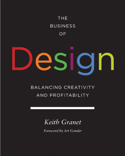
I like to listen to Keith’s videos while I work. The people he interviews and works with are driving forces in the design industry and are so amazing and creative. They have such talent, and Keith helps them expand their skills. During the interviews, he asks very simple, approachable questions. He makes you realize that no matter where your firm is, we all have the same obstacles. He shows you how to move forward and use certain tools to build your brand and make it better, as well as how to handle different things and approach new projects. I learn so much from Keith’s videos.
Keith Granet’s interviews with Bunny Williams and her words about clients were particularly memorable to me. What I took from Bunny is to let clients buy things but help them put everything together. Like other interviews and videos Keith has done, this one made me stop and think about how to better my business. I face the same challenges as other designers.
You can see all of Keith’s great videos on his YouTube channel. Or, visit his website to learn more about his services.


