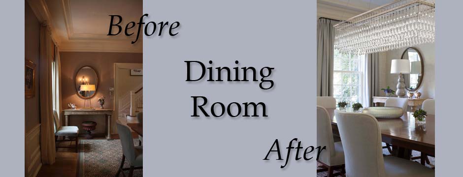
Last week, I shared some before and after photos of a library we designed for a client. Today’s before and after features another room in that same home — this time, the dining room. Like the library, the dining room needed a facelift to brighten and update the space. While the dining room was a good size and had some nice features, it lacked a cohesive, finished design.
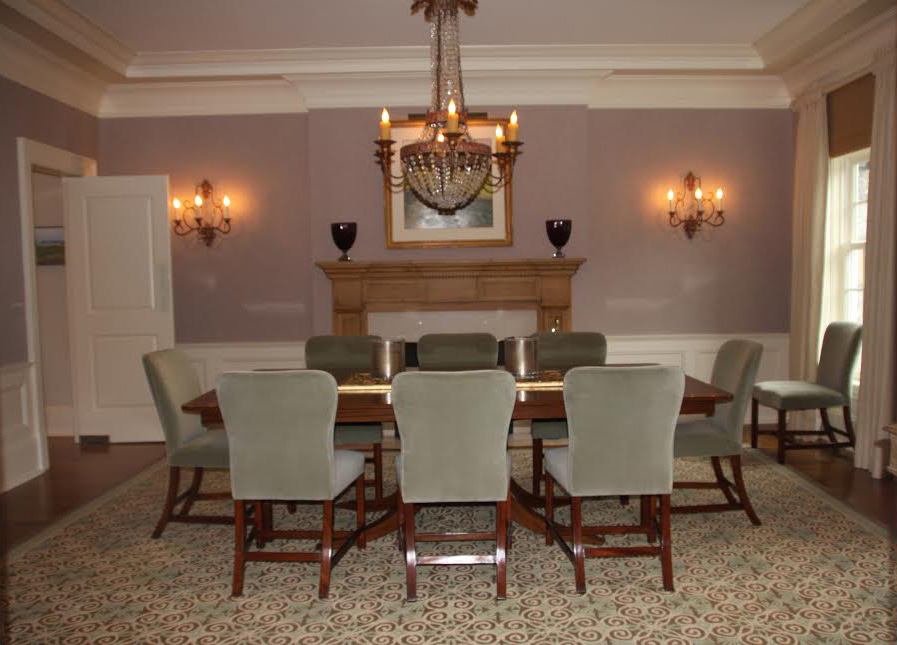
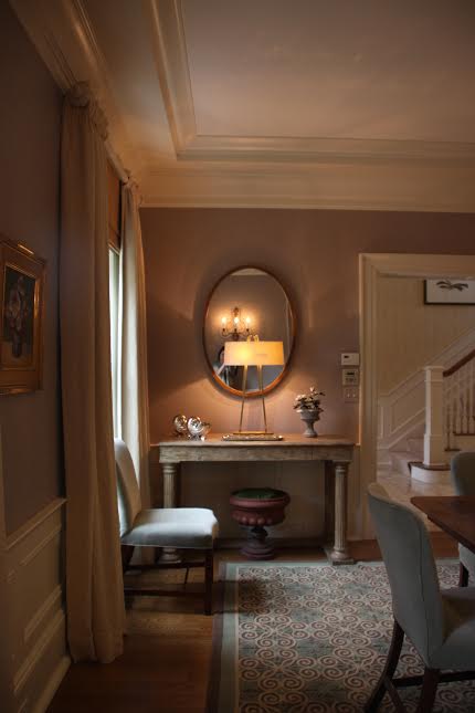
While the dining room provided proportionate and generous space for large gatherings, the overall feel of the room started to look dark and dim compared to the adjacent rooms which echoed a whiter, brighter approach.
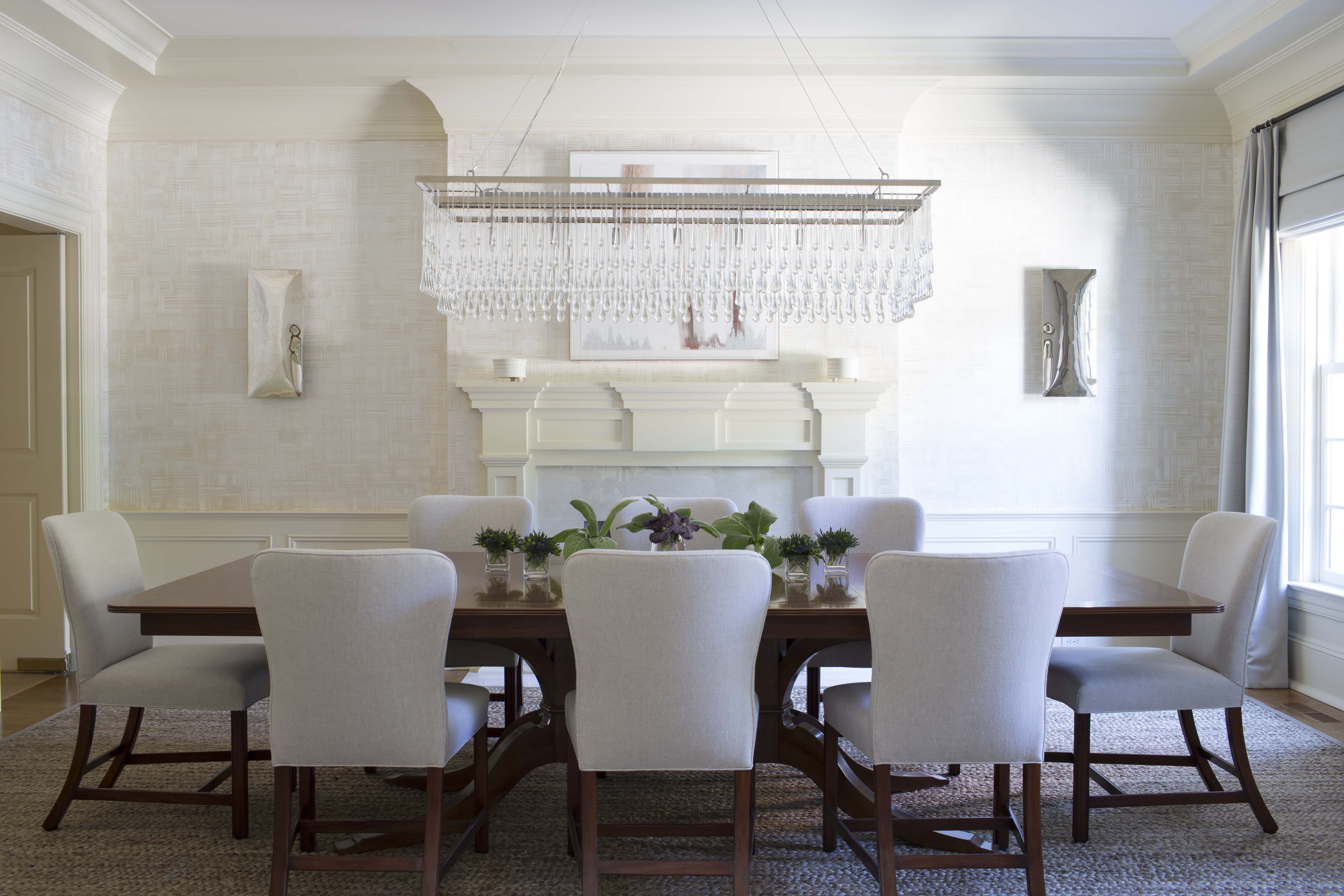
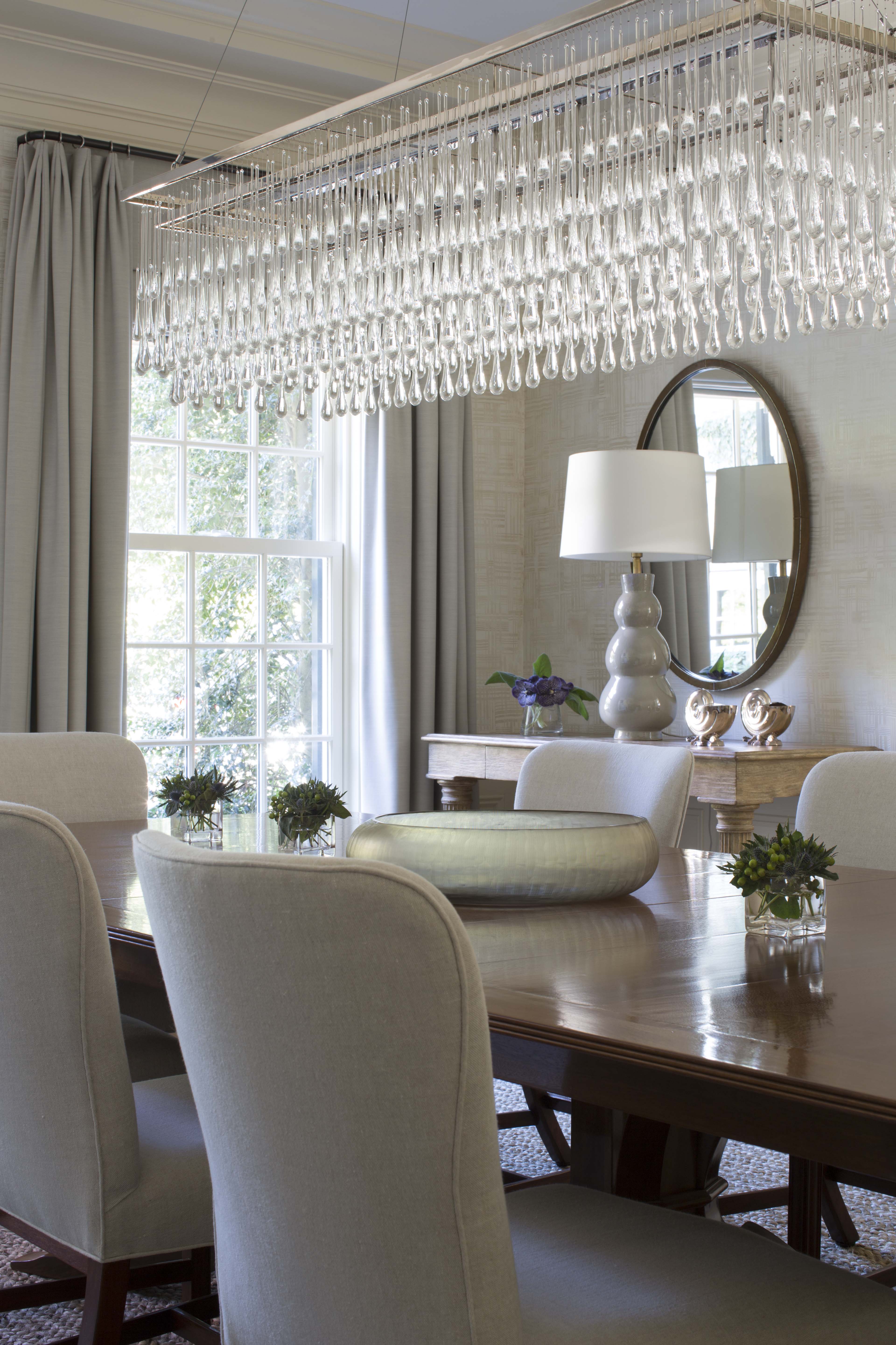
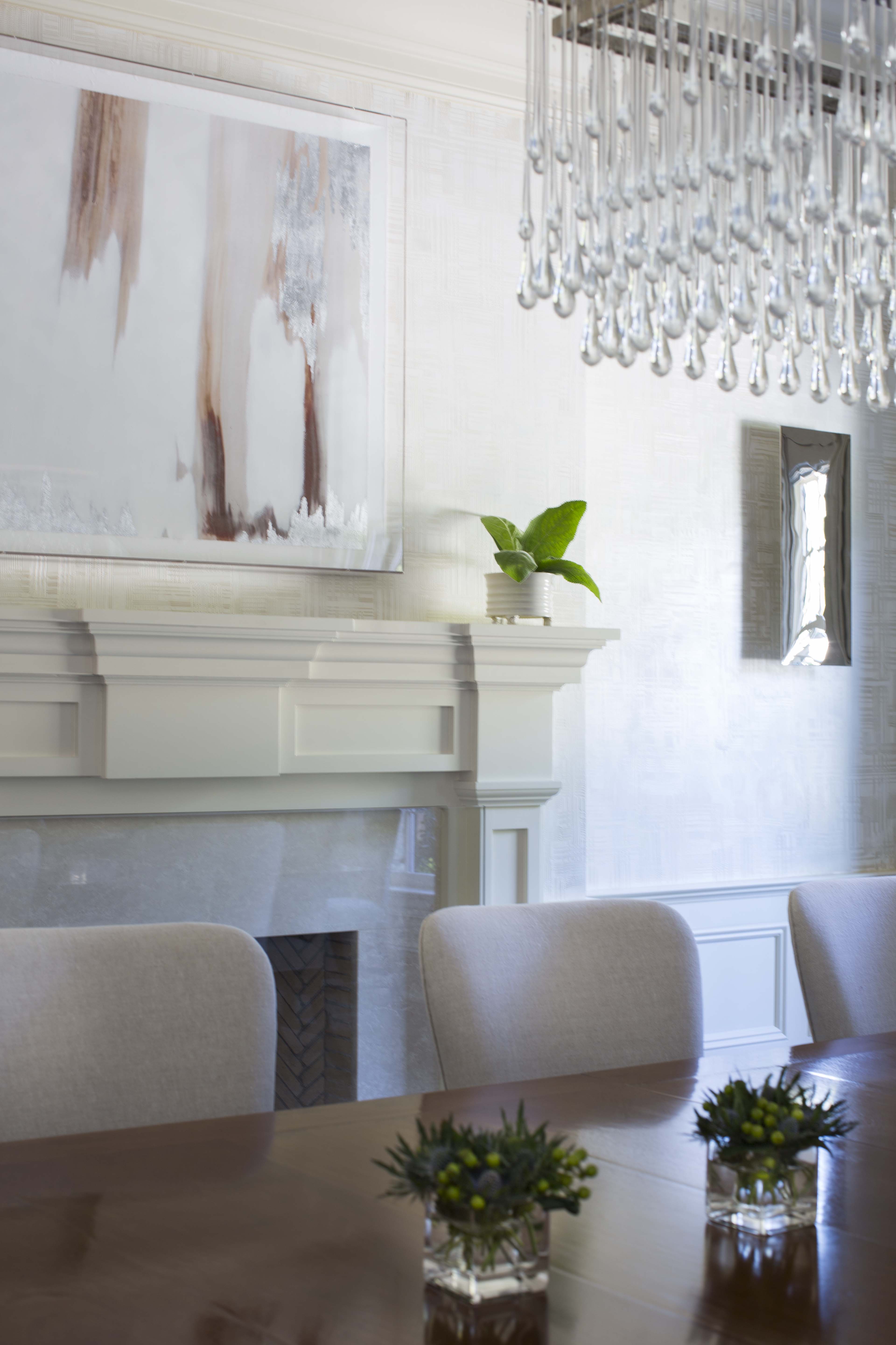
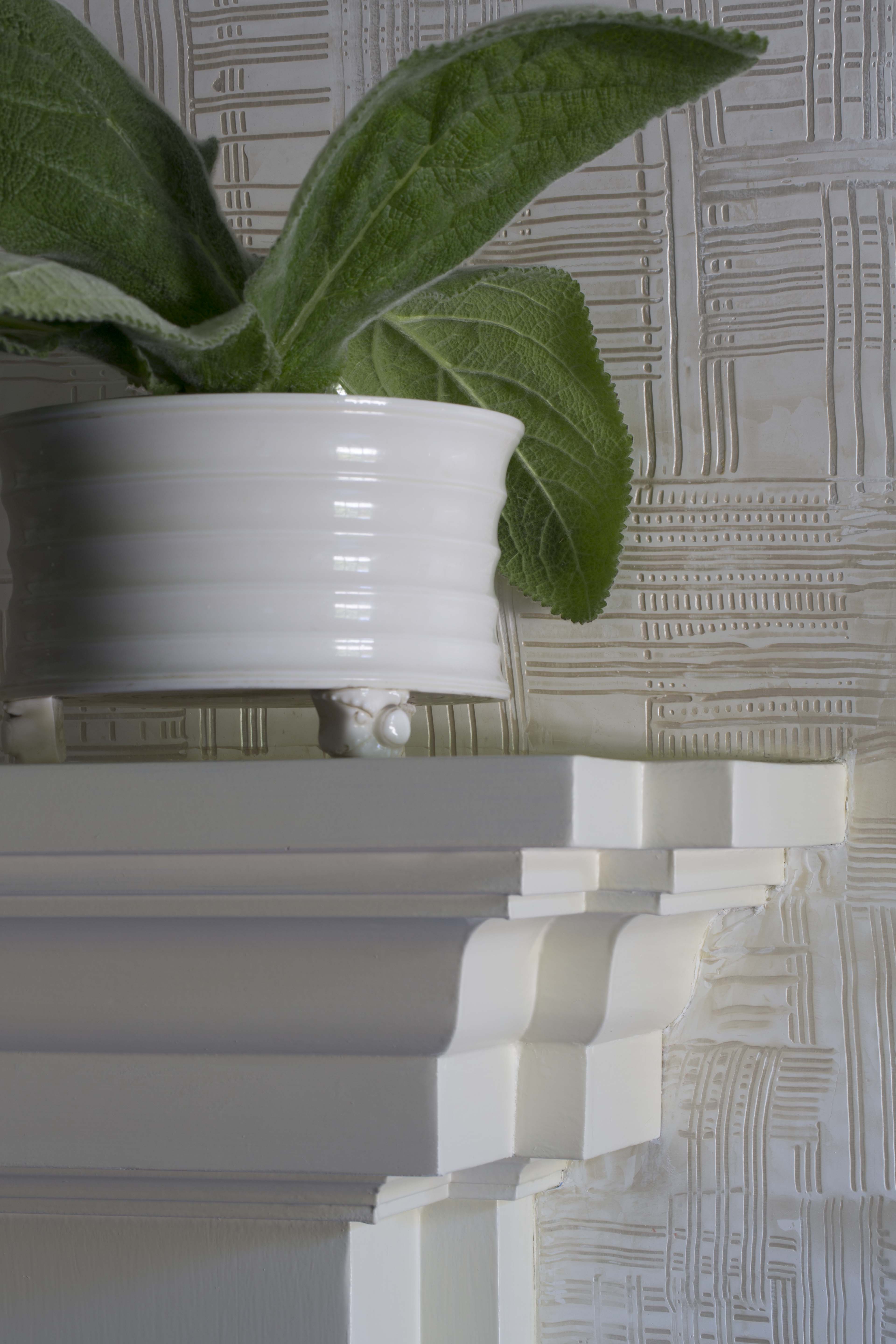
We were so lucky to have a great dining table which remained untouched. We reupholstered the Rose Tarlow dining chairs in a simple linen. Our objective was to eliminate the purple and green palette that saturated the room. A custom white plaster was applied to the walls and the pine mantel was painted a white to match the existing trim. The plaster adds a more modern edge and allows texture within the space. The window treatments became unified with a beautiful wool fabric for both the roman and drapery panels. The drapery hardware is understated, yet the contrast of the nickel rings adds the right amount of detail to the space.
Lighting is jewelry to any space, and these pieces are so impressive in scale that they finish the room properly. Initially, the custom chandelier was allocated for another space within the house, but sometimes an unexpected surprise turns into a happy reallocation!
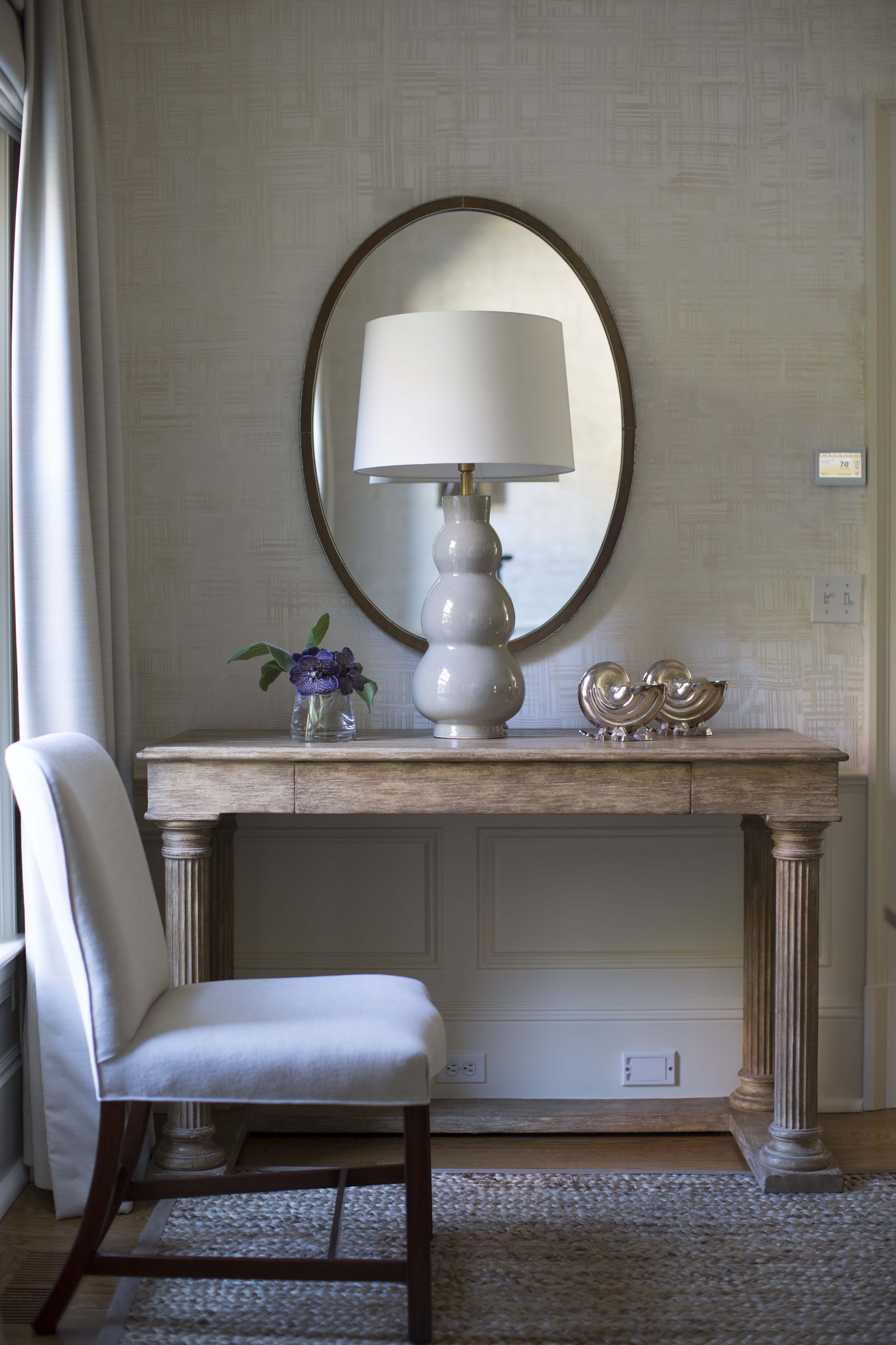
The existing console table and mirrors remained, but we added the braided sisal rug, modern art, and ceramic lamps. The natural light filtered throughout the dining room adds a whisper of grace; the finished room has such presence now.
To see more photos of our design projects, visit my website or my Houzz profile.

