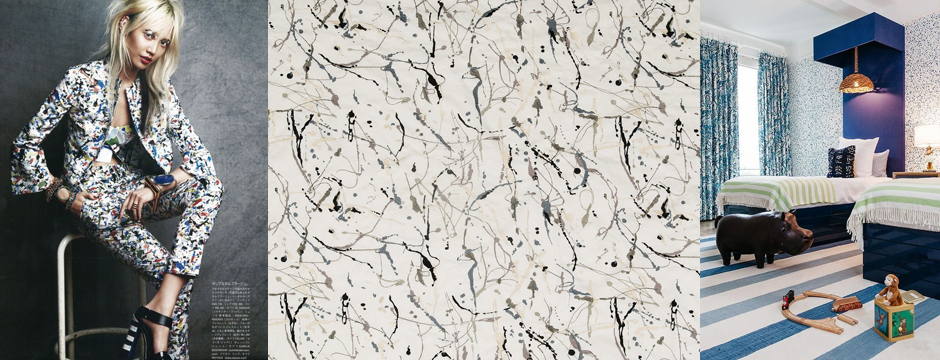
I’m often fascinated by what comes up during the course of a project. I had an idea for a Pollack-like, splatter look for a client’s wall that was inspired by some very cool splatter designs I’d been seeing. I like how the splatter can be condensed or loose.
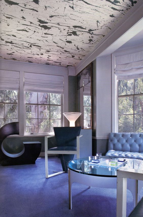
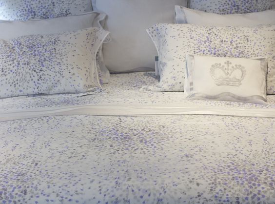
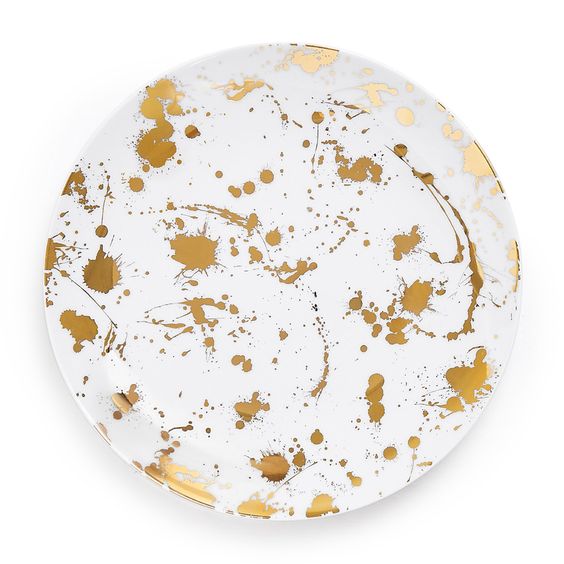
When coming up with a splatter design for my client, I worked with an artist to develop not only the look I wanted, but the correct consistency of paint. The key was to use a paint that would splatter on the wall, but not drip. It took some trial and error to concoct just the right mixture.
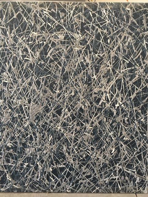
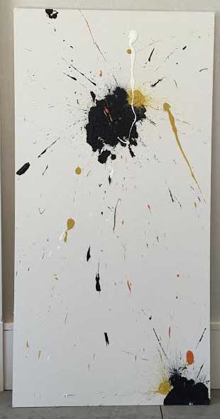
Even though the client chose not proceed, it is all about the process and the journey. Working with the artisan to understand the process and the selection of the correct color palette to make the masterpiece come together was a great experience. It’s also fun looking forward to the moment of being inspired by that client who opens the door for exploration into something unique.

