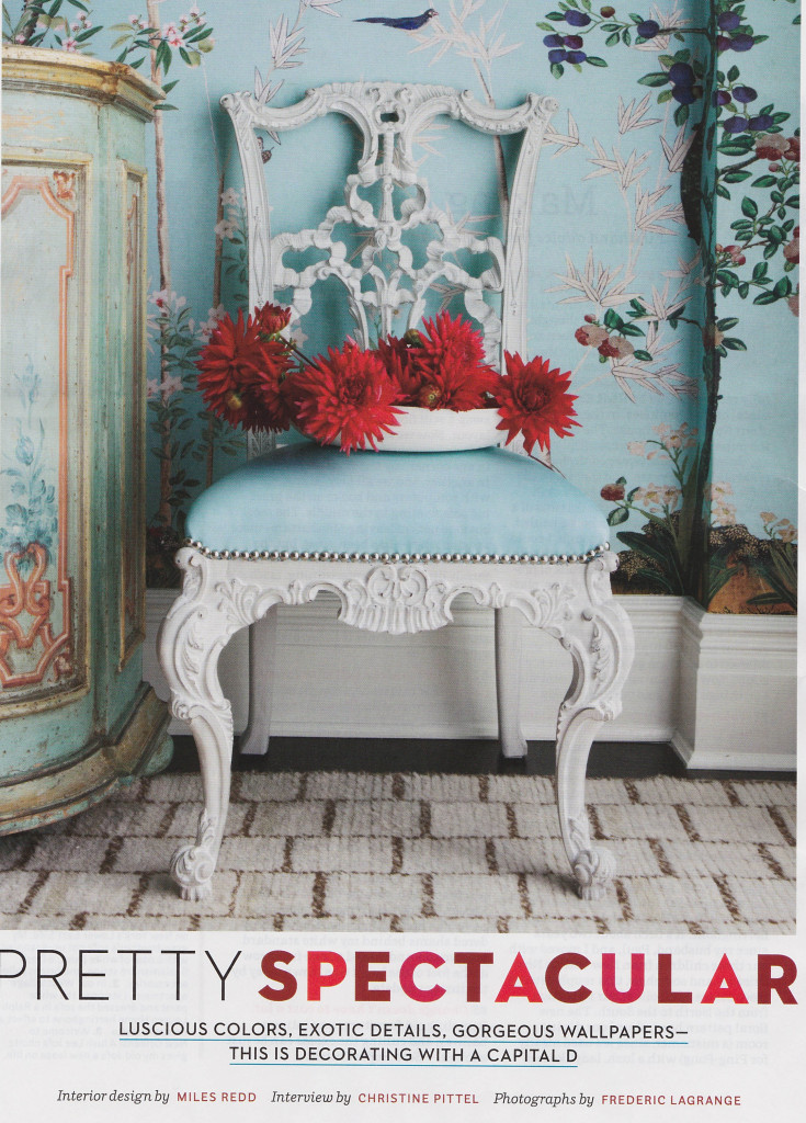
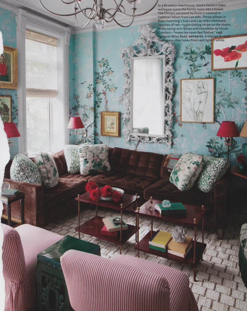
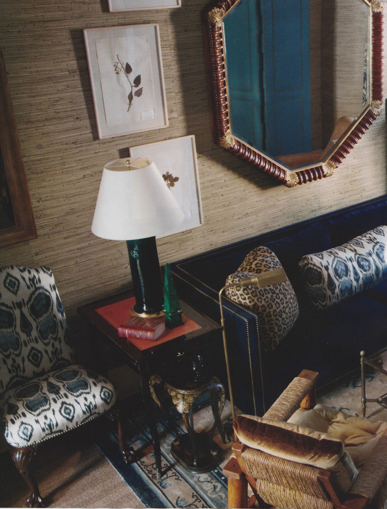
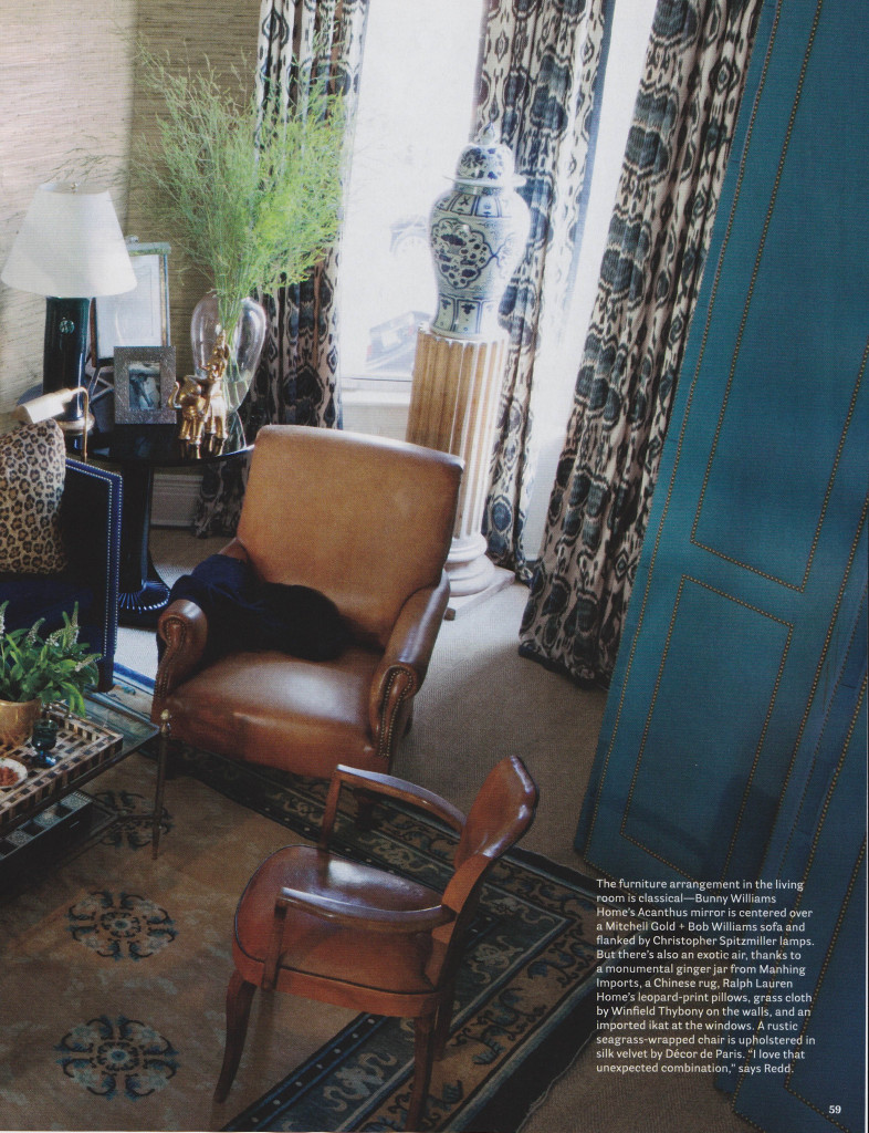
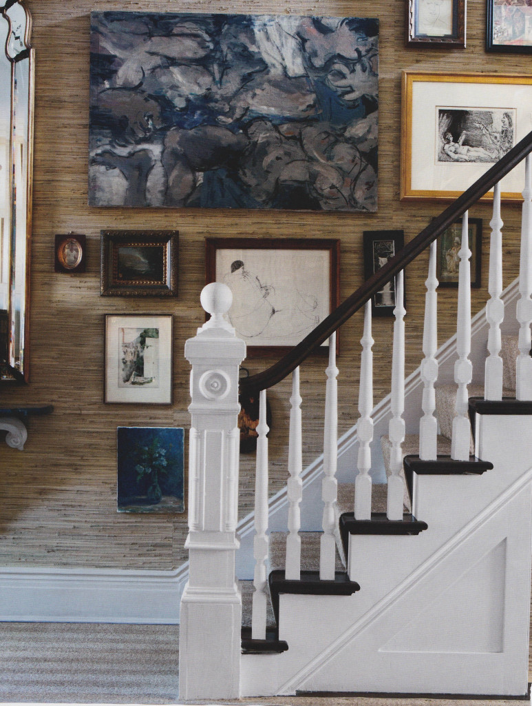
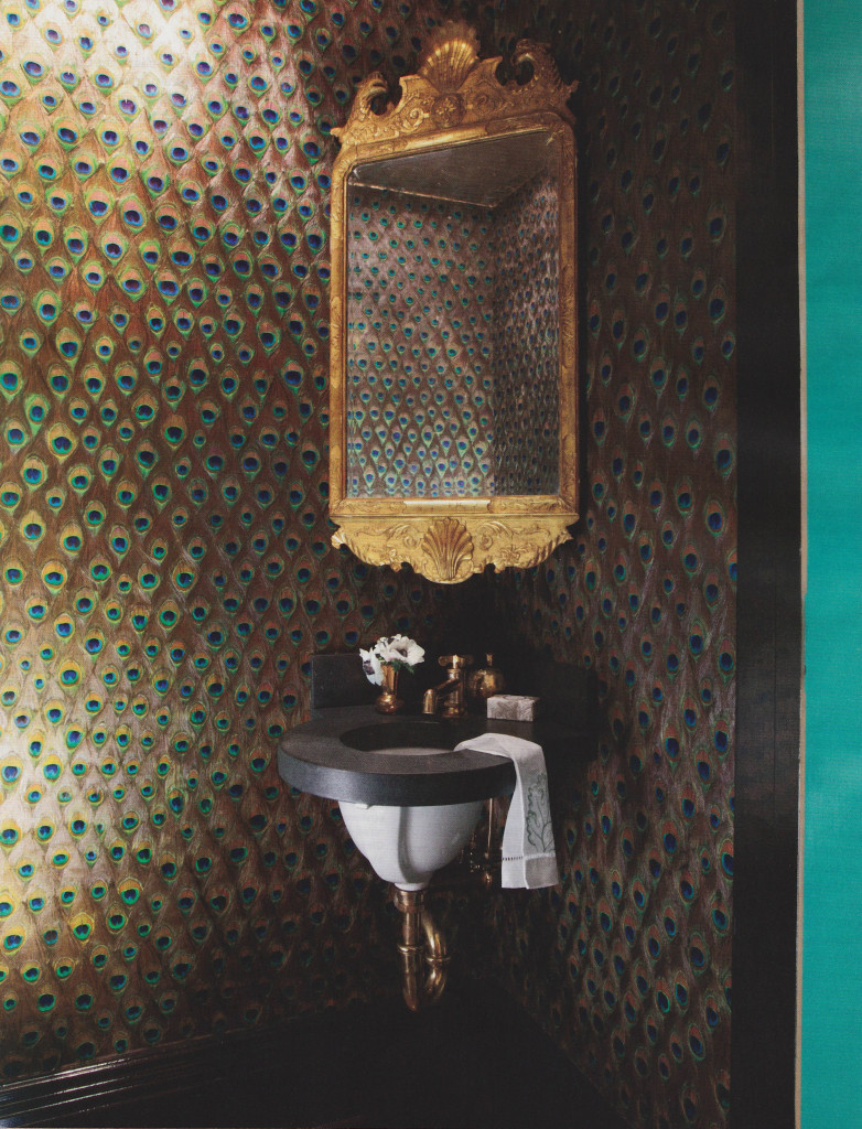
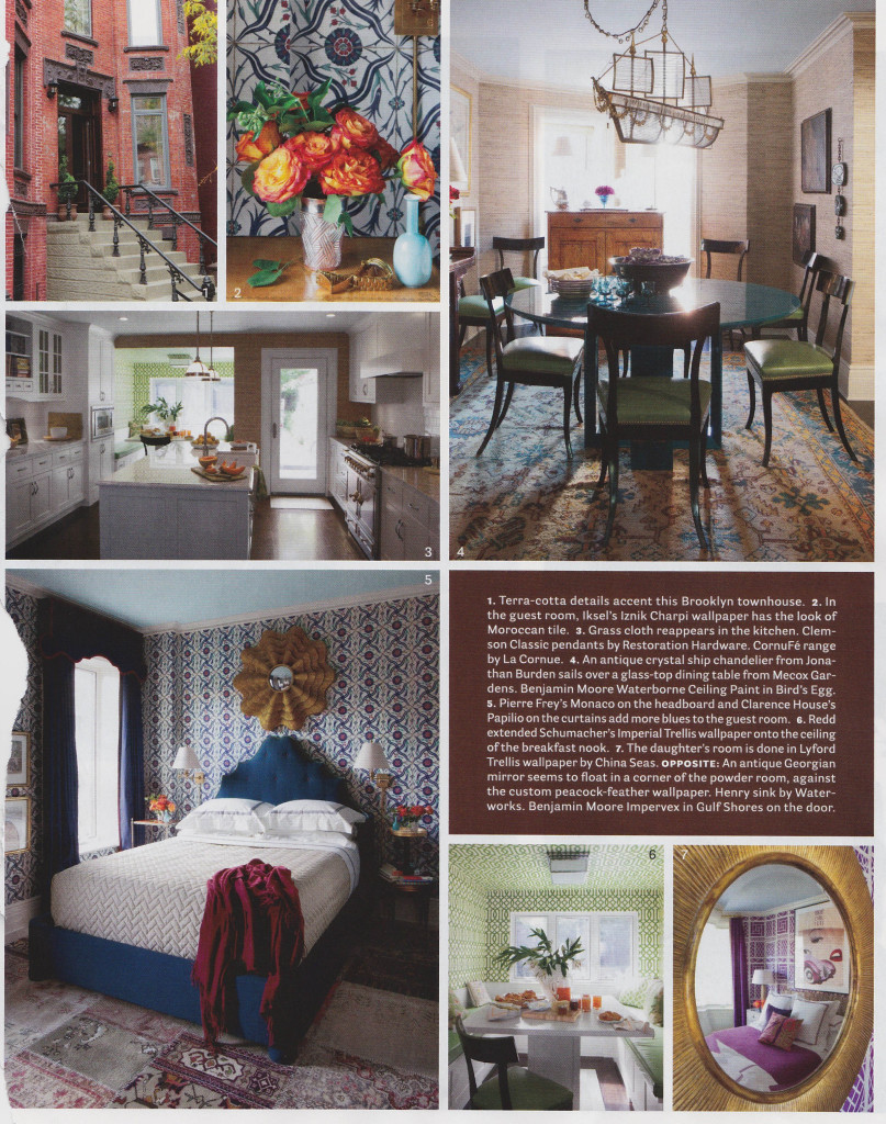
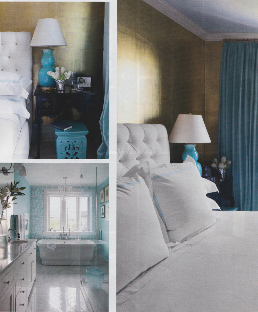
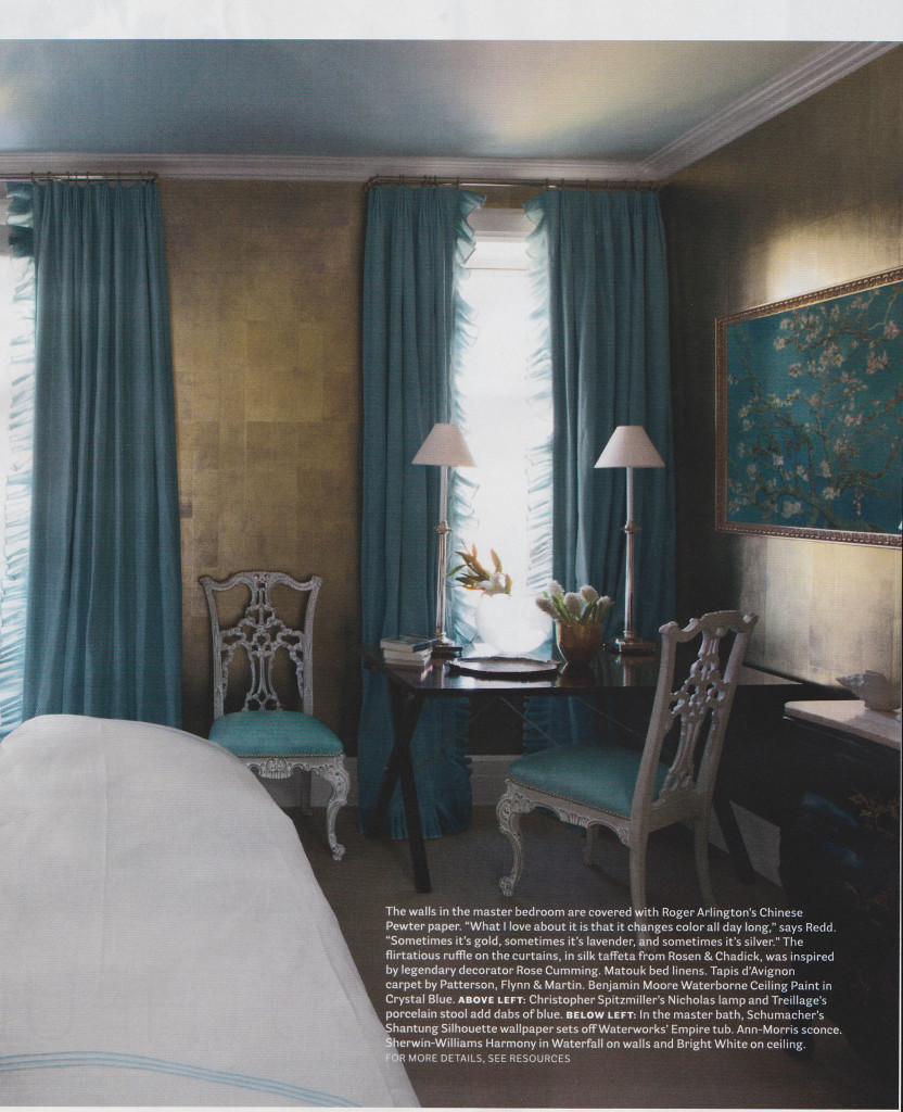
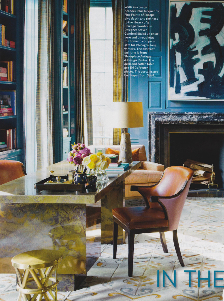
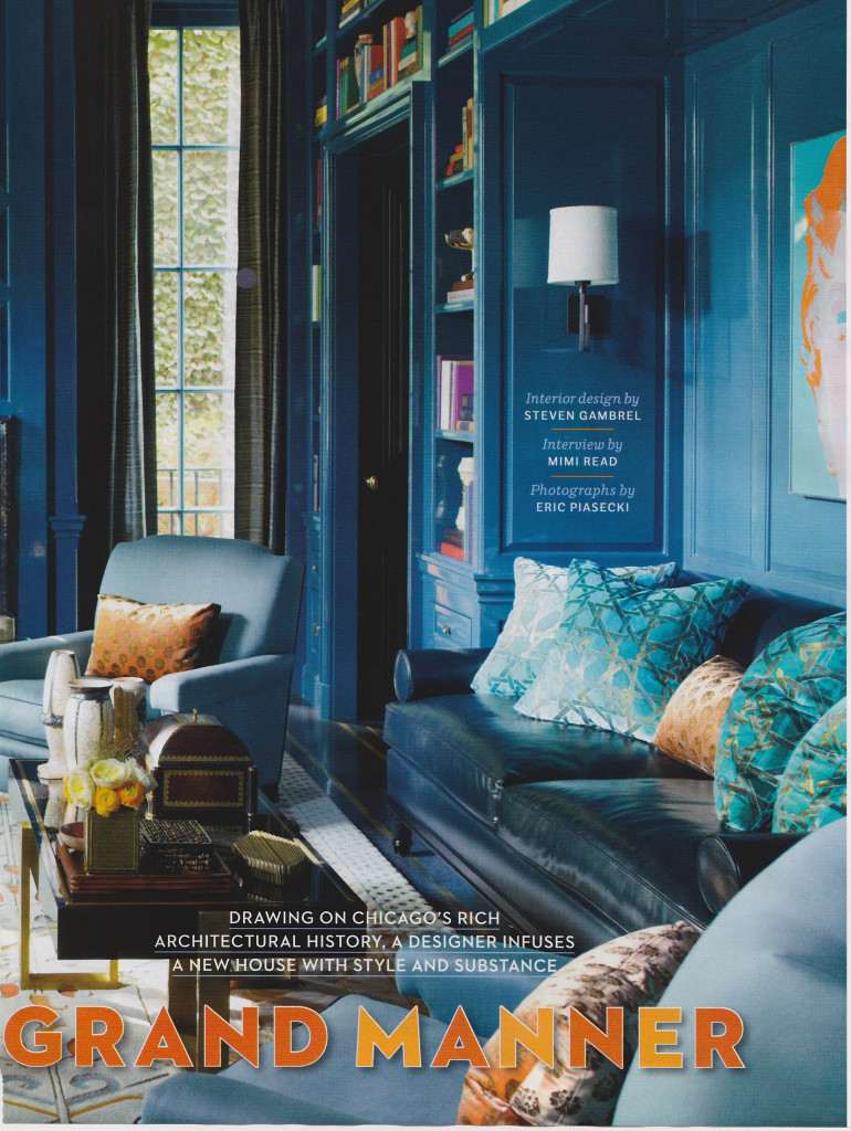
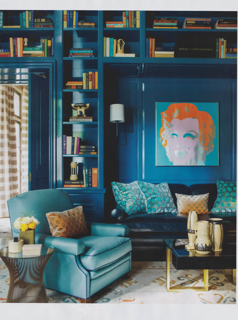
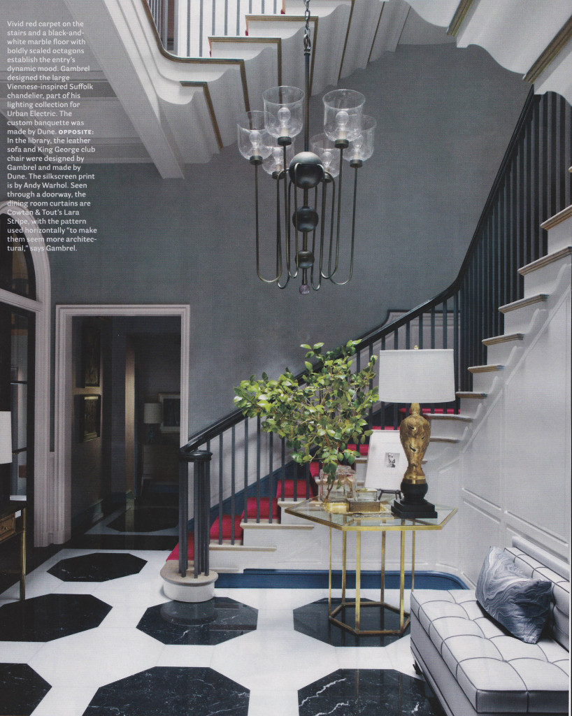
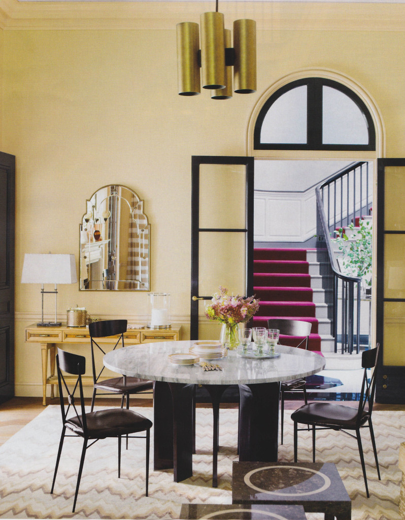
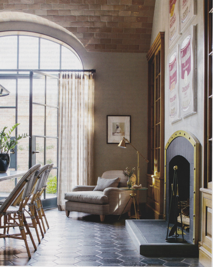
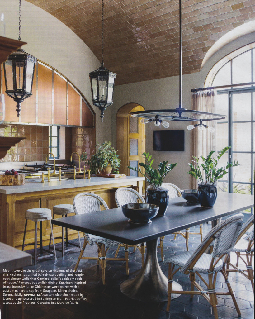
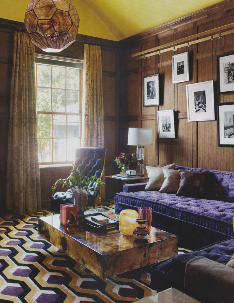
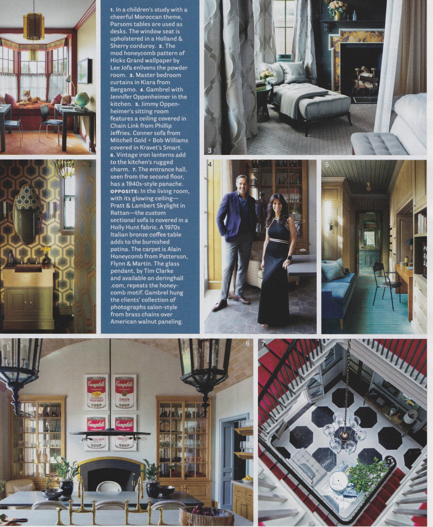
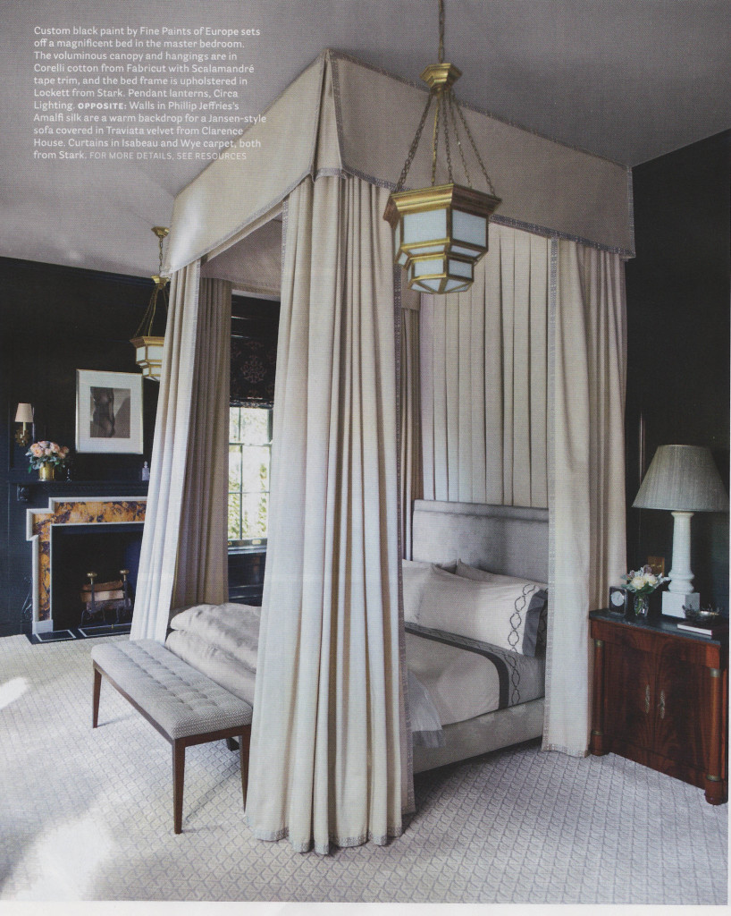
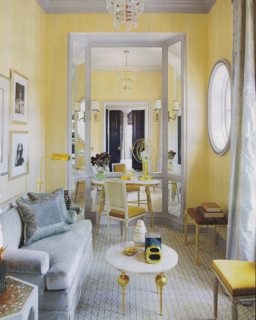
The current issue of House Beautiful, February 2014, included some really great features. Two articles in particular stood out for me; Pretty Spectacular, featuring design by Miles Redd, and In the Grand Manner, featuring design by Stephen Gambrel. Both articles showed how these wonderful designers used an amazing amount of color. From Gambrel’s use of peacock blue lacquer to Redd’s bursts of bold colors throughout a Brooklyn residence, the rich color stands out in these beautiful spaces. The effect is so textural and rich. The saturated colors create warmth and pure decoration, with tons of pattern upon pattern.
When I design for clients, I sometimes struggle between days of preferring clean, sleek interiors, and then days when I love layering with color and just inundating a room with detail. What I love about these features in House Beautiful is how they show that Redd and Gambrel don’t sacrifice on quality and their clientele understand that something so perfectly orchestrated can be comfortable and livable. It is really inspiring! I walked away from this issue wanting to shake off the winter doldrums and do something bold.
Pretty Spectacular
By Christine Pittle. Photos by Frederic Lagrange.
In the Grand Manner
By Mimi Read. Photos by Eric Piasecki.


