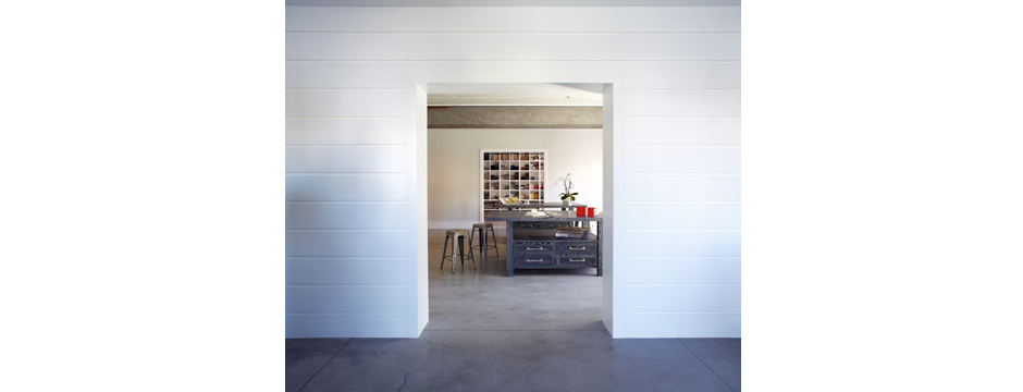
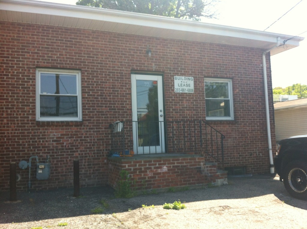
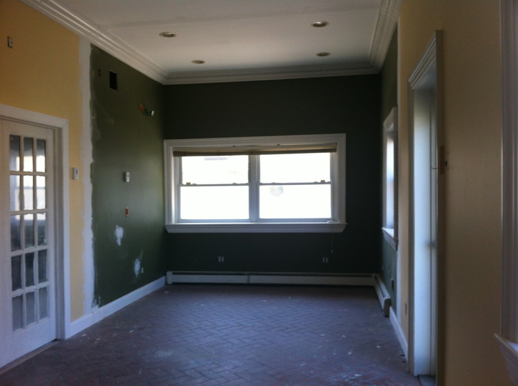
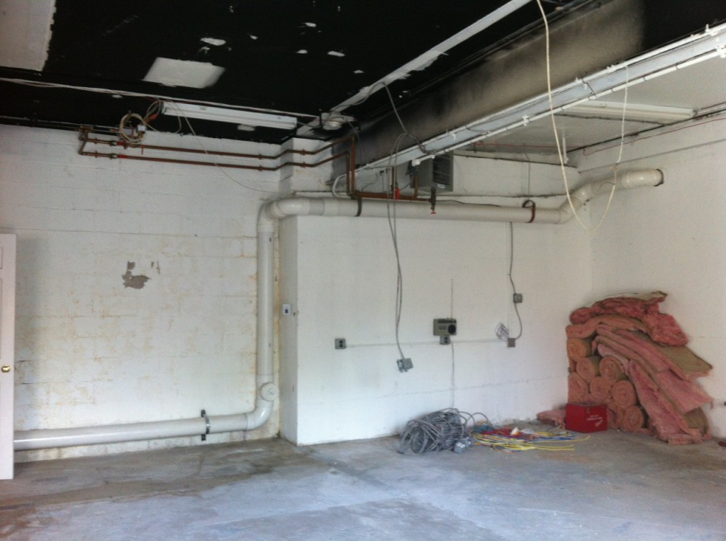
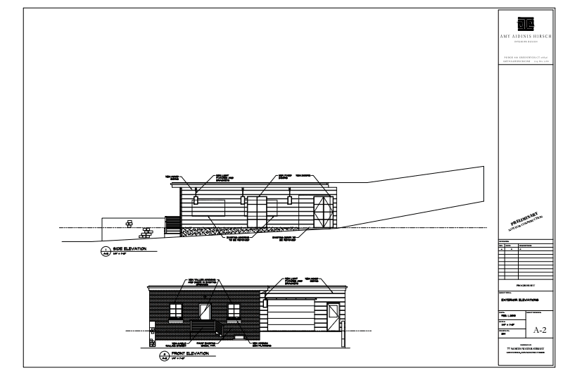
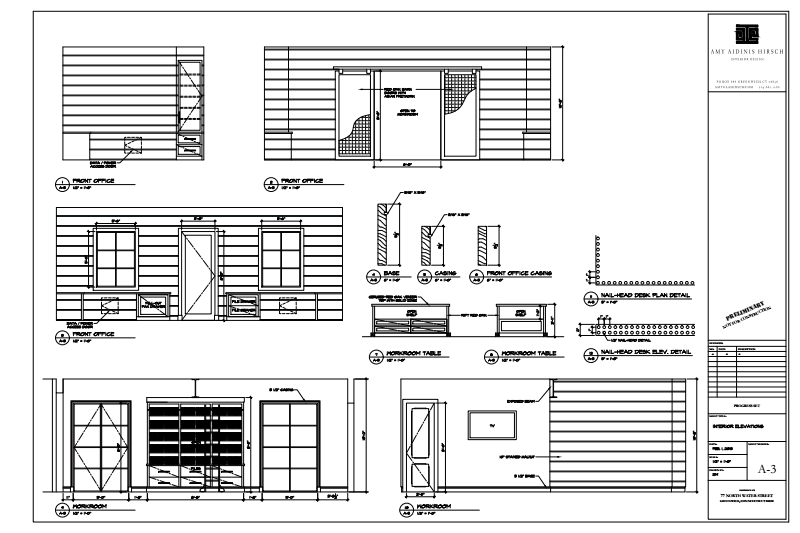
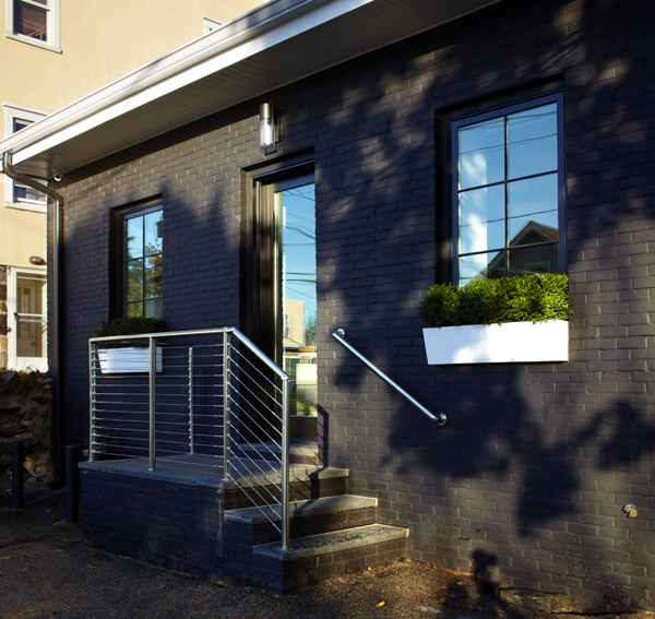
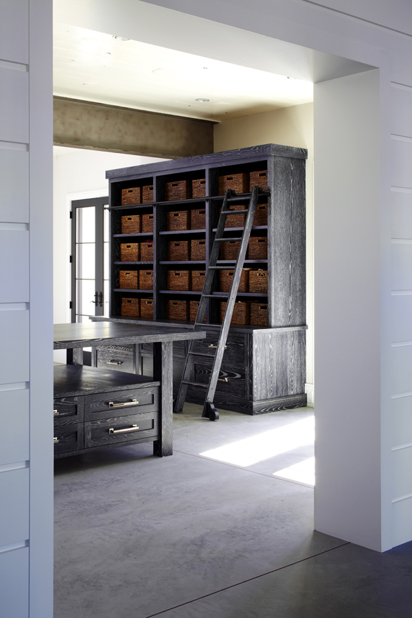
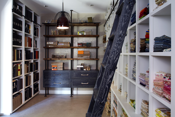
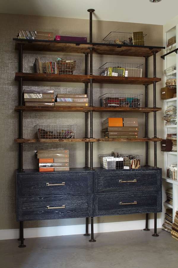
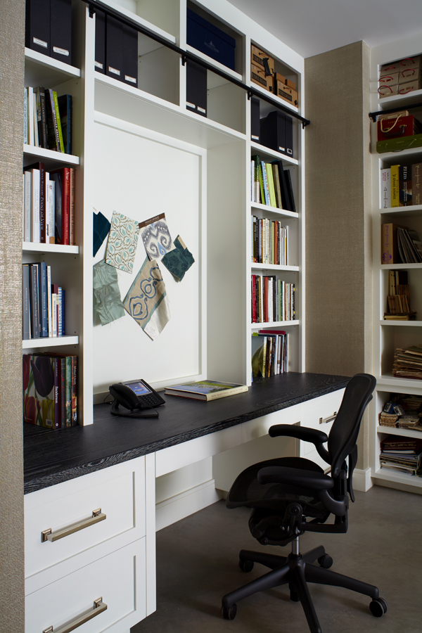
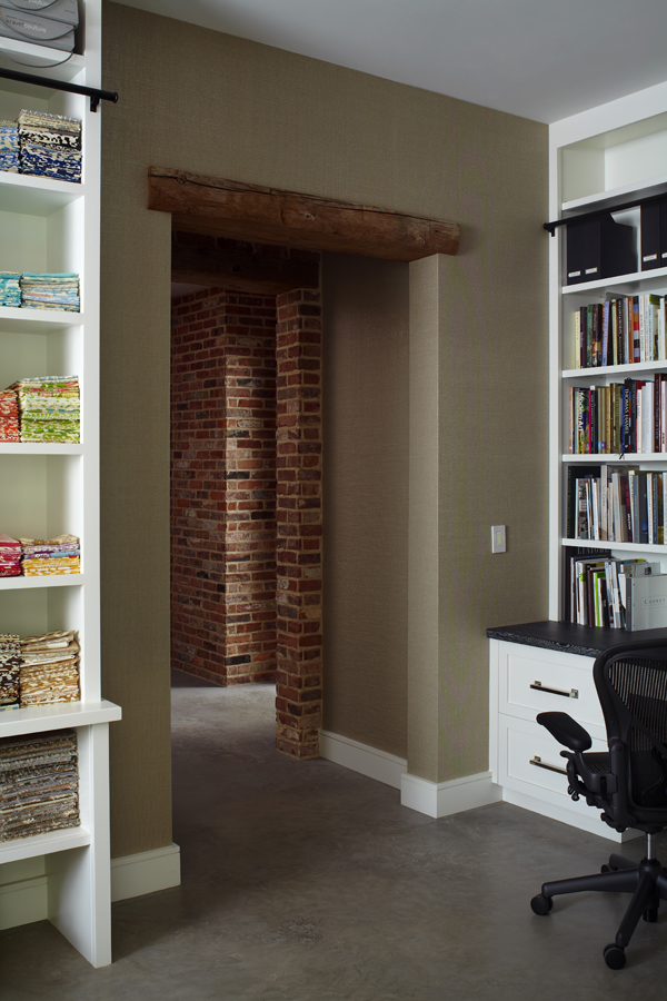
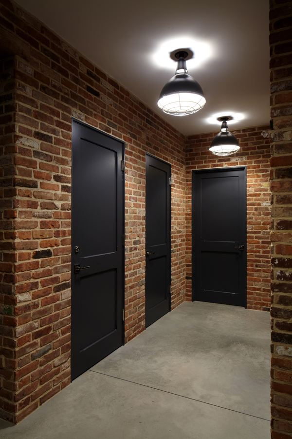
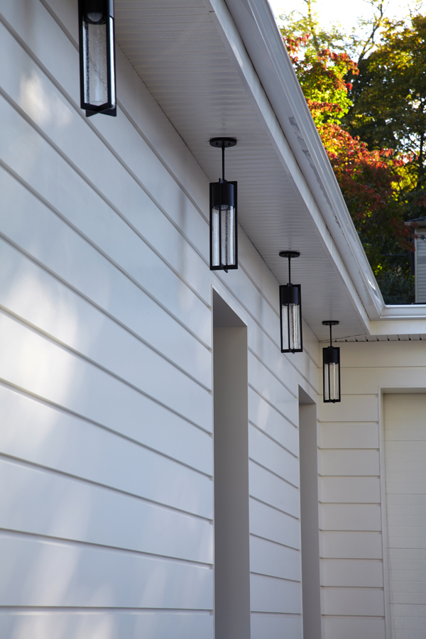
I am extremely thrilled to share with you my latest and greatest project, something that is very personal: My new studio! The building which houses my studio is truly sentimental; it has been in my family since 1983, when my father decided to purchase it for his company, Putnam Plumbing and Heating. I remember visiting my dad’s business as a young girl, when the space was smogged with smoke and the typical grunge of pipe fittings, boilers and machinery. The space was not pretty at all, as you can imagine, and I found myself fascinated by the idea of the potential of this place. Photos of the interior and exterior before I started renovations show how great the transformation of this place has been.
After years of growing his own business, my dad moved to another location and this building remained. Occupied by others through out the years, it eventually lay vacant for some time. Prior to my father’s ownership of the building, it was occupied by a machine shop during the 1950’s and, in the early 1930’s, the building was an automotive repair shop. Over the course of almost 85 years, there were a few alterations to the building. When we began to demo for the renovations, we actually found this really cool iron window frame with restoration glass buried in one of the walls. I wish I could have salvaged it, but it was too decrepit. I am truly grateful to my parents and their role in where I am today. I love the family connection to this place and knowing that the building is part of my past lends it additional beauty.
Growing out of the humble beginnings of my design firm’s starting point, I decided it was time to take on a project for myself. Creating for others comes very naturally to me; however, for myself this process took more time than I expected. Maybe because it’s more personal, or maybe because this project was different than most, given the fact that I had to factor in my clients’ perspectives as well as my own. The aesthetics needed to be beautiful as an interior, but I limited myself to a very simple palette of mainly black, grey and white, being thoughtful of the amount of color which saturates so many of our schemes.
Putting pen to paper as I design always stirs up creative ideas and interesting selections. I am proud to say that when I designed this space on paper and closed my eyes, every detail was executed exactly as I had envisioned it. When I put on paper is what gets built 99% of the time, and seeing this come to life in my own space was an incredible experience. Julio DiBiase of Dibico, Inc. is a person near and dear to me for the way he and his team perfectly executed my vision. We have collaborated on projects for over 10 years and I am grateful for his insight and resources to create and engineer all of my thoughts.
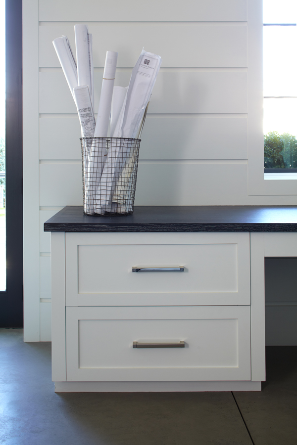
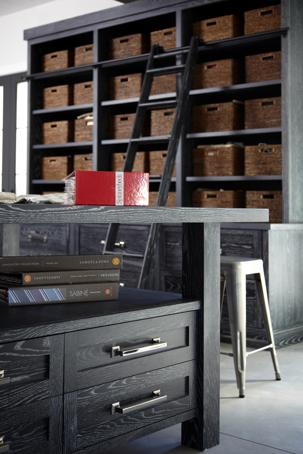
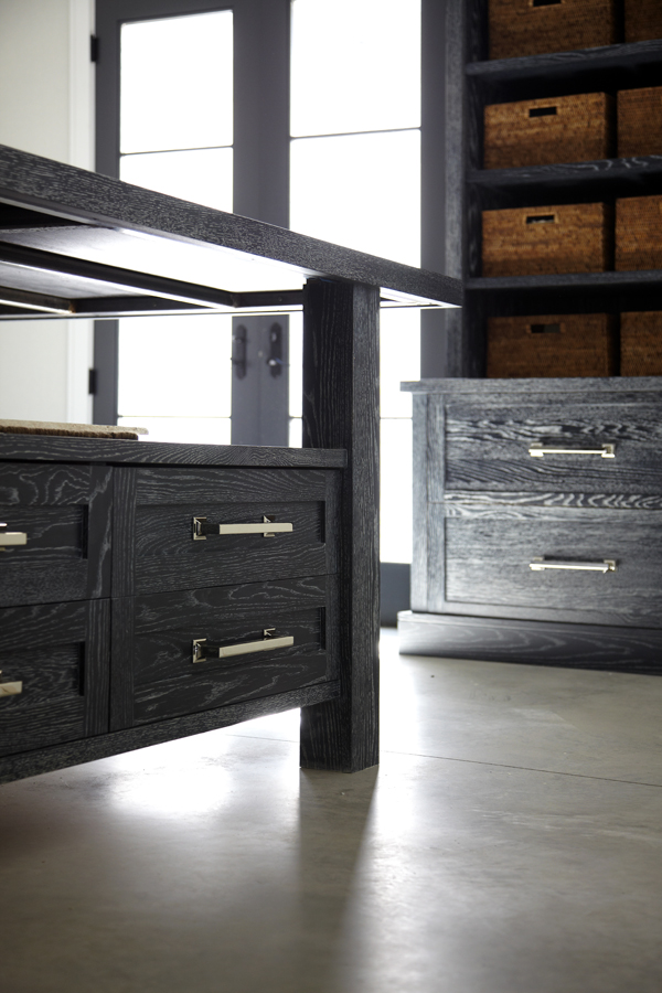
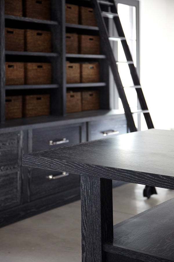
I am extremely grateful to be surrounded by the beauty of very simple elements. Walnut walls, ceruzed rift oak cabinetry, concrete floors, and brick, while simple in appearance, reflect my layered approach to design. I love working in this creative haven, surrounded by elements that both calm and inspire me. The materials in my new space were strategically selected and edited to create a simple but complete product. My office space is a true representation of the process and structure I use when designing for clients with the ultimate goal of a completed product that reflects who they are.
Photos of finished project by Phillip Ennis Photography

