New Office/Studio Update!

While we still have plenty of work to do, I thought I’d take the time to post an update on how the office is coming along!

A few months ago, I shared the plans for my new office and studio space.  Since then, a lot of progress has been made!  While we still have plenty of work to do, I thought I’d take the time to post an update on how the office is coming along!

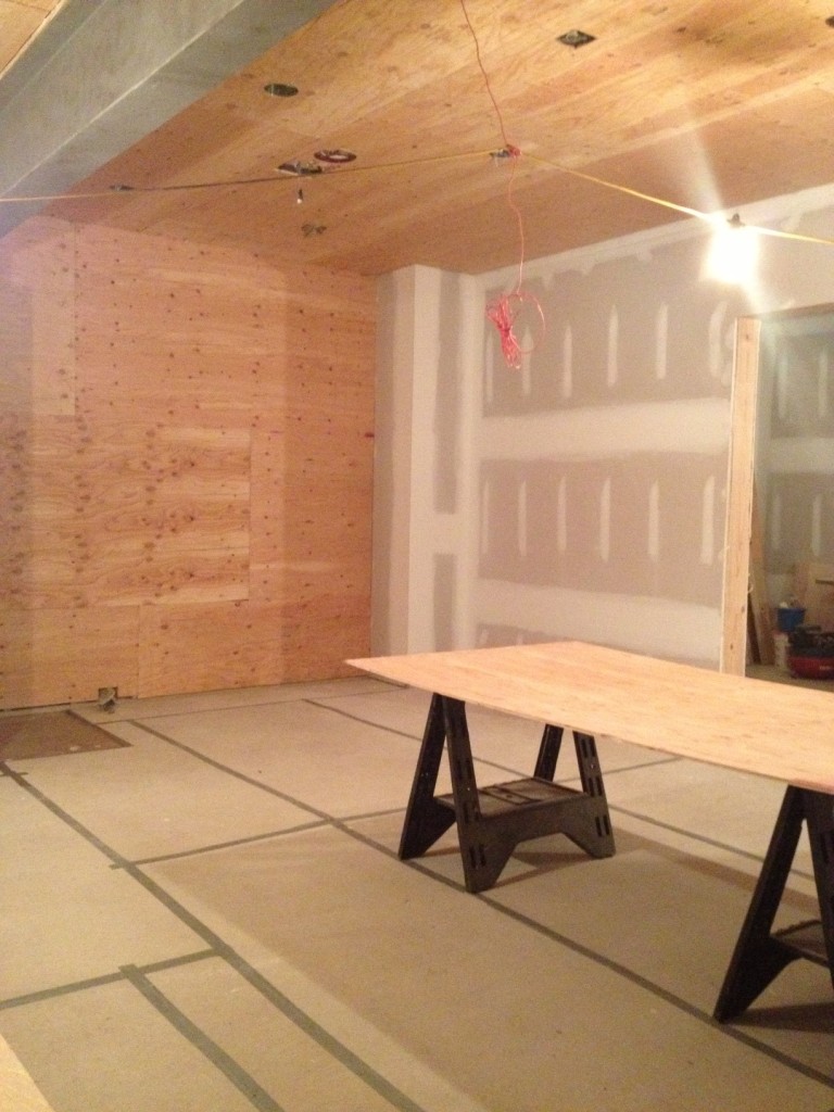
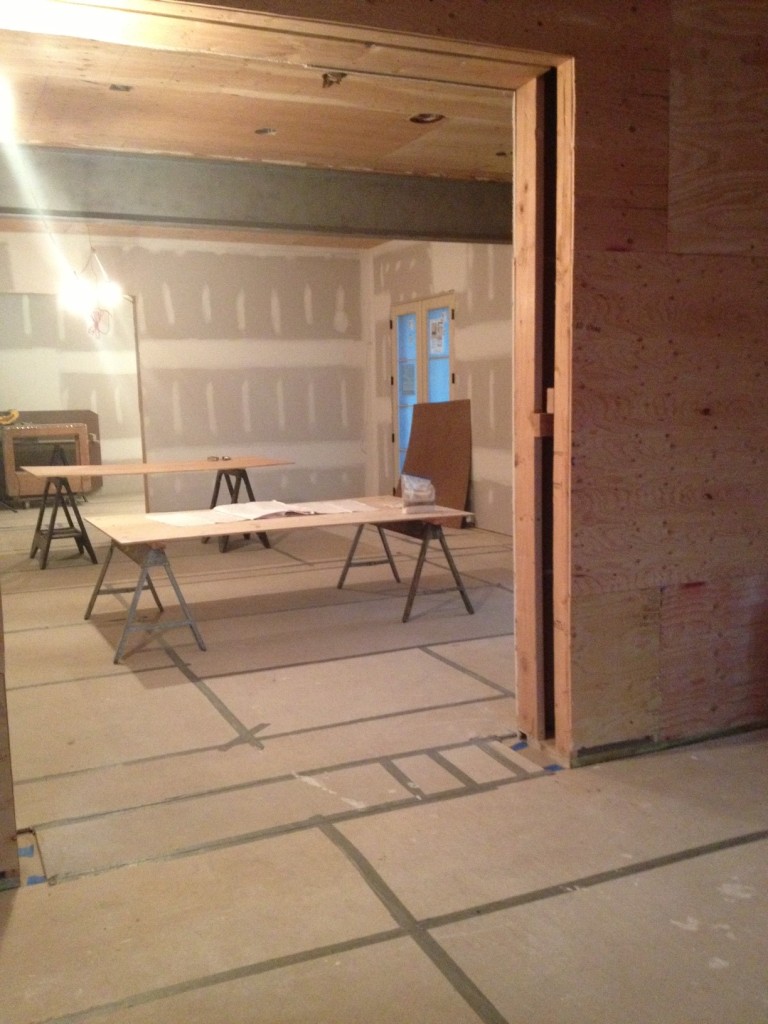
We’re in an interesting stage right now —  so exciting, because I can see the foundation for the space really taking shape.  We’ve had a lot of supplies delivered and the mock-ups are done.  The sheet rock and plywood have been installed and prepped for the entry’s paneling.  Next week the majority of the cabinetry gets installed, so we are definitely getting to a stage where I can see plans becoming a reality!

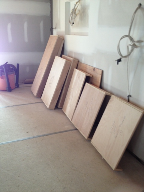
Cabinet boxes to be installed.
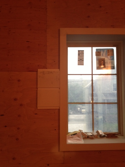
A mock up of the wall paneling for the main entry.
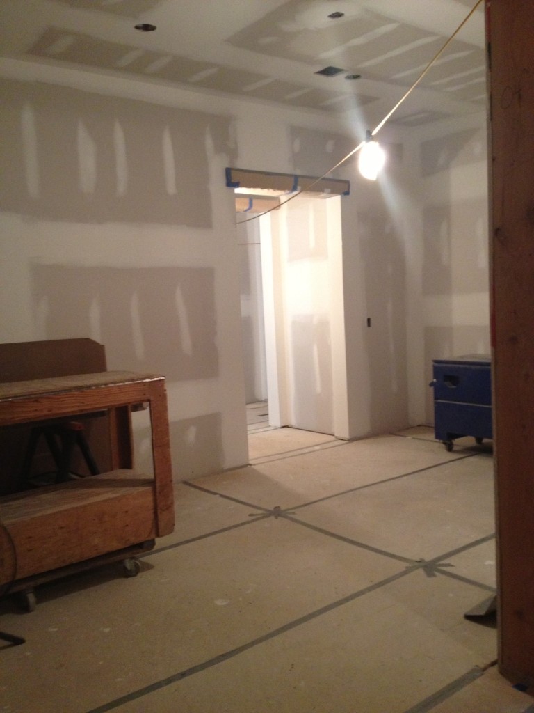
Sheet rock prepped and ready for wall treatments.
Sheet rock prepped and ready for wall treatments in the sample room.

As we progress with the plans, it’s inevitable that things should change.  What works on paper sometimes isn’t quite right in the reality of the space so you have to feel things out, adjust, and be open to adapting plans as you go.  Once I actually saw the space and the lighting coming together, there were elements that had to be changed.  For example, I originally wanted to install two lighting fixtures over my work table.  Once I saw the mock up of the table in the space, I knew it wouldn’t work and the light fixtures were nixed.

Another glimpse of the sample room.
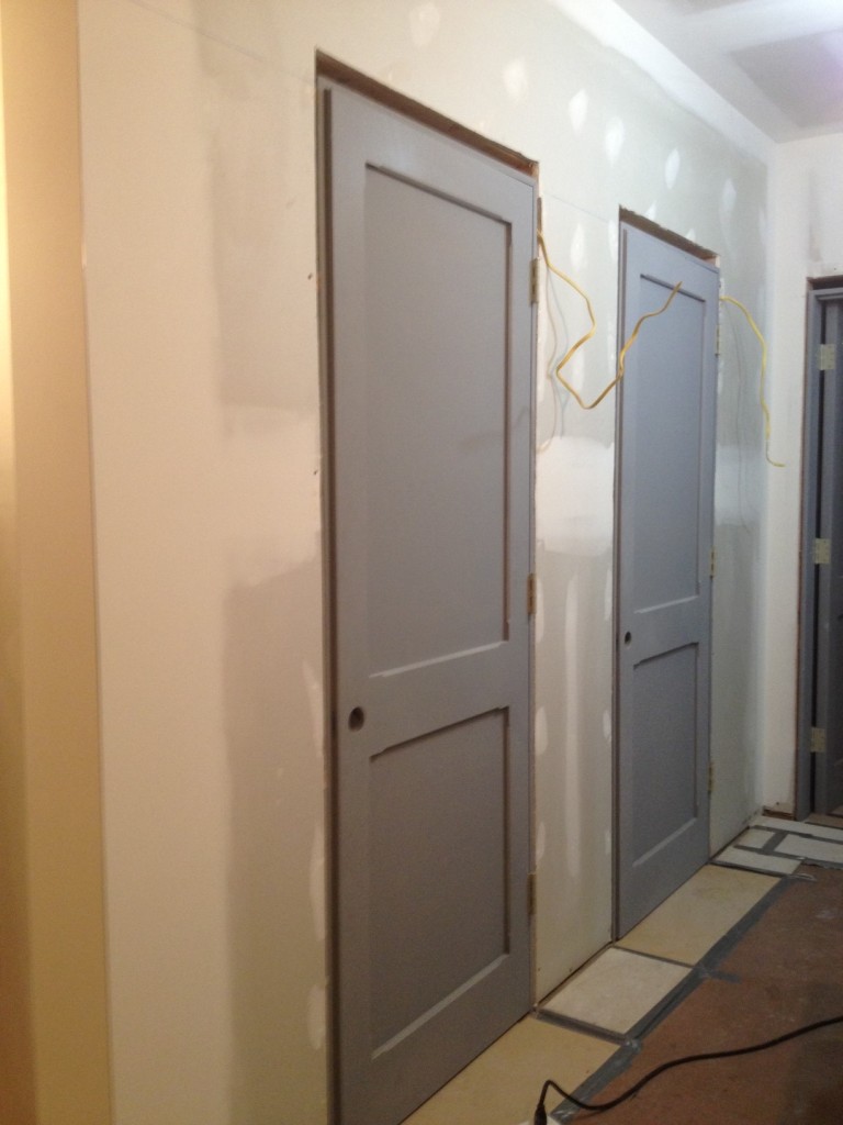
Custom doors are up and I can’t wait to see them painted in black.
Main work station with templates of a work table.
Another view of the workstation.

It is so exciting for me to see the basis of my new office and studio coming together!  I am really looking forward to sharing the final results of this project soon!

A Bedroom to Grow With

My goal is to create a handsome room that will be suitable for my client’s son for many years to come.

I recently worked on an interesting project for a client who asked me to design eight bedrooms.  The rest of the home had already been decorated by another talented designer, so I had to be conscious and respectful of the work that had previously been done while at the same time designing for eight different personalities.  Sometimes it can be harder to adapt to a style already in place than to start with your own vision from the beginning!  One of the bedrooms belongs to a young boy and has been particular pleasure to work on.

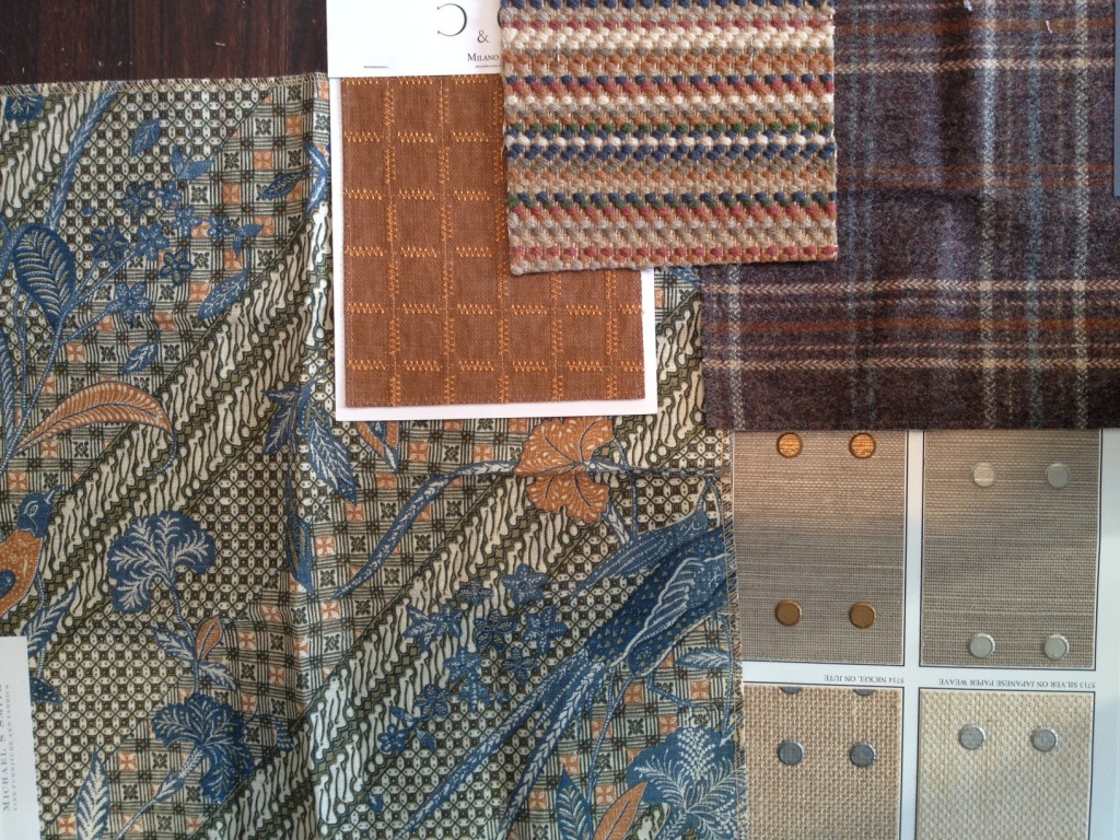
The goal is to create a handsome room that will be suitable for this boy for many years to come.  I’m planning a room he can grow in, for the rest of his childhood and into his teens and early adulthood.  For that to happen, the bedroom has to contain elements that will appeal to the young boy as well as the person he will grow into.  I started with a palette of colors and patterns that are masculine without being too adult.

Sophisticated rather than juvenile.

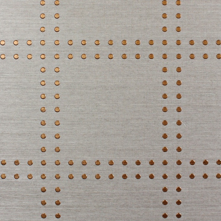
For the walls, I chose a paper from Phillip Jeffries that I’d been wanting to use for a long time!

Rivets in Copper on Elephant Manila Hemp

The furnishings and accessories also fit the idea of creating a handsome room for this young man.  With leather accents, plaid, and other boyish touches, the furniture had to be solid and strong without overpowering the space.

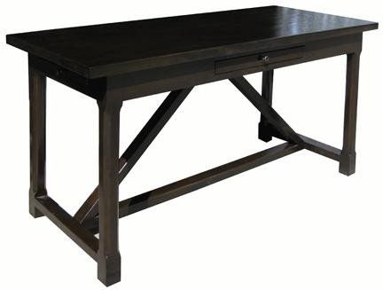
Sutton Desk from Noir Furniture
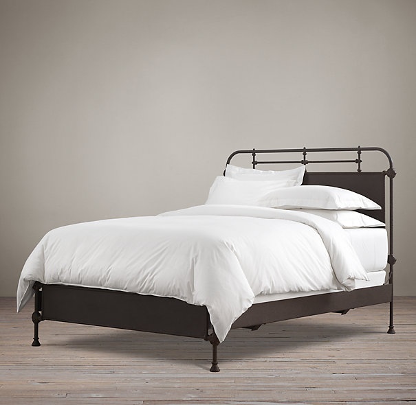
French Academie Iron Bed from Restoration Hardware
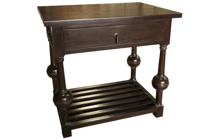
Redhill Side Table from Noir
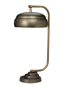
Steam Punk table lamp by Jamie Young

Another nice accent I used in this room is this leather braid for the window treatments.

Samuel and Sons Woven Italian Leather Braid

I can’t wait to see all of these elements come together to create a fantastic room!


Work in Progress: My New Office/Studio

I’m involved in a very exciting project right now — designing my new office and studio space.

I’m involved in a very exciting project right now — designing my new office and studio space.  Besides the excitement of moving into a bigger place better suited to my business needs, I am so happy to have a place to do something for myself.  I can’t wait to see my own simplified, well-edited vision come to life.

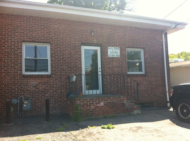
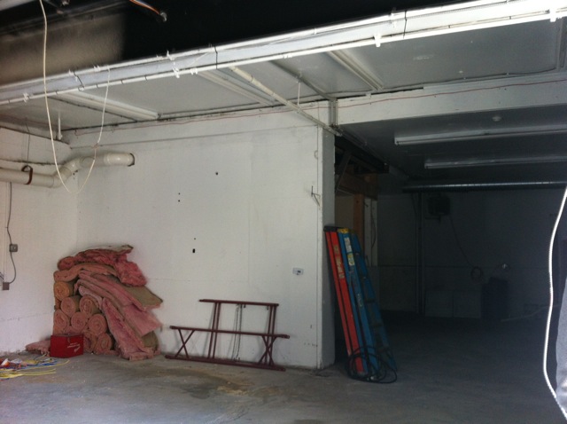
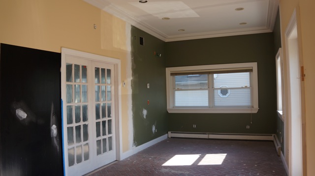
This is very much still a work in progress right now, as you can see from the “before” pictures.  One must have great vision to get through this mess!

The exterior.
Definitely a diamond in the rough!
Can you see the potential?

My goal for new new office space is to make my clients feel like they are in a showroom for a lifestyle rather than a product.  I see the overall design as minimal, not decorative.  I want it to be a neutral space, with quality products and craftsmanship, good lighting, and just the right details.  Everything will be functional, creating a great place for everyone to work.

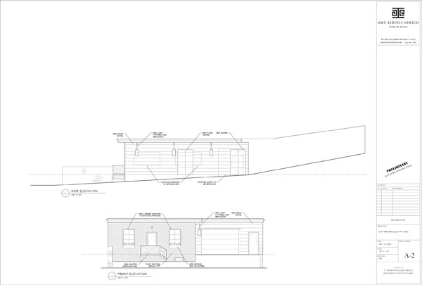
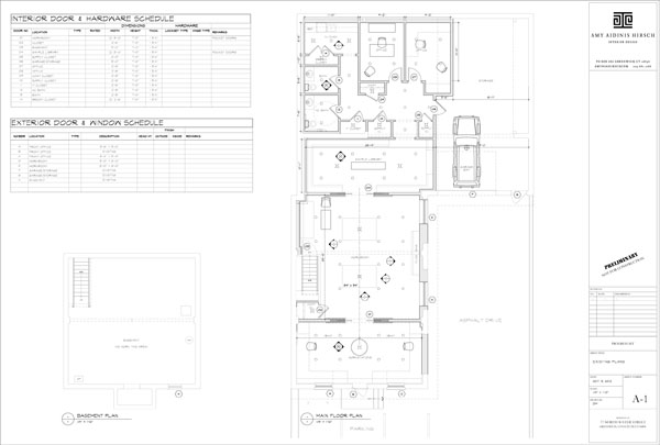
Plan for the exterior.
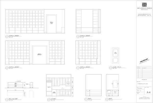
The plans give an idea of how the space will be utilized.
Plenty of open storage.

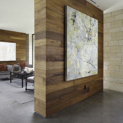
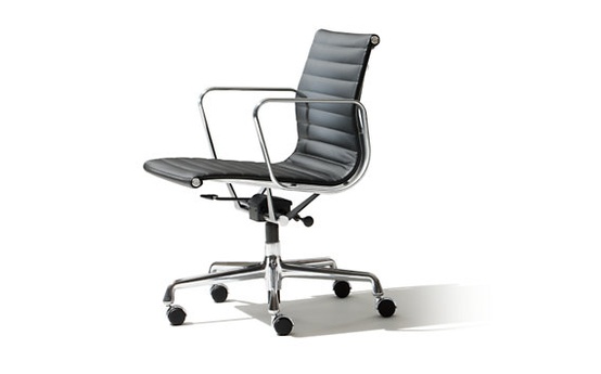
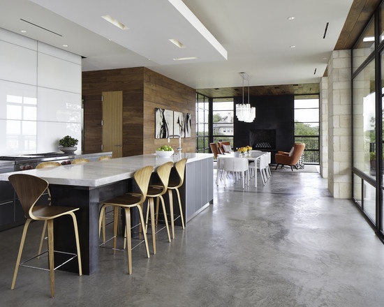
One important consideration I made when designing my office was to avoid distractions for my clients.  When I meet with a client to present designs for their projects, I don’t want the surroundings to compete with the samples and plans I show them.  I want the focus to be on their project, not my own office.  At the same time, I want to use elements that reflect the level of style and quality I appreciate in an interior.  I like the idea of wool window treatments with metal poles, reclaimed oak counter tops with nail heads, and walnut walls.  I love the idea of a concrete floor as well.

Walnut walls.
Sleek and functional Eames chair.
Concrete floor.
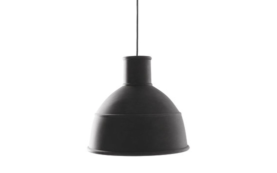
Unfold pendant light.
Nail heads.
Wallpaper covered in transparent beads.
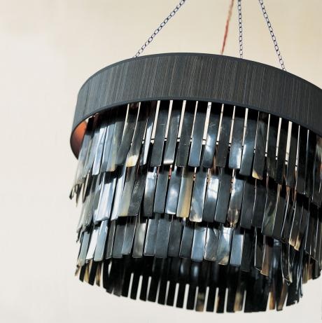
Ochre lighting.

I can’t wait to see how all of my plans come together!  Stay tuned for a future update on the finished office!

Work in Progress: Potting Shed

I’m currently working on a unique project for client who loves to tend his beautiful gardens: a potting shed!

Just before this past Father’s Day, I met with a client whose beautiful home I’d been contracted to accessorize.  The home itself is really lovely and well done, and only needed to be enhanced with further details.  While we were discussing the house project, we started talking about the beautiful gardens surrounding the home.  The gardens are completely tended by the husband and he has created just a spectacularly gorgeous environment.

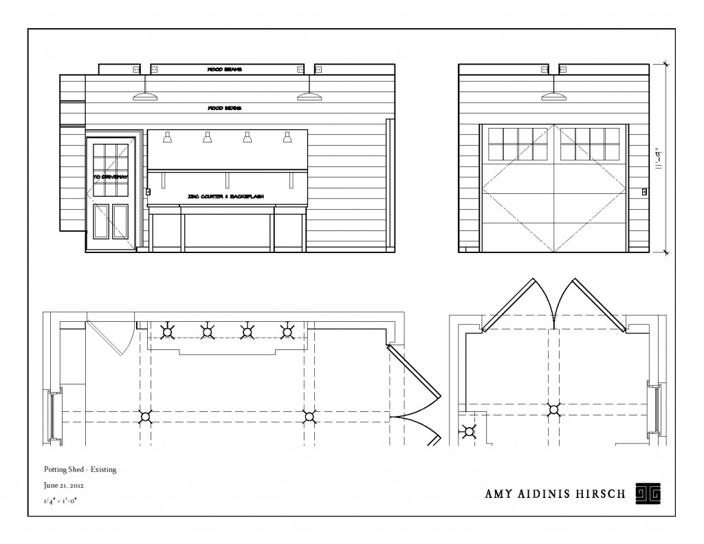
Looking at the set up of the garage area, I saw a potential use for the space that just begged to come to life for this particular client.  The home has three garage bays, one of which is separated from the others by a breezeway.  This space had only a small bench for a workspace and my client expressed his wish for a true potting shed.  As we talked about the possibilities, I could see my clients becoming excited by the idea.  In the end, they gave me carte blanche to transform this garage into the ideal working potting shed for a enthusiastic gardener.  Creating renderings of the space with a layout designed to cater to an avid gardener was the first step in this exciting project.
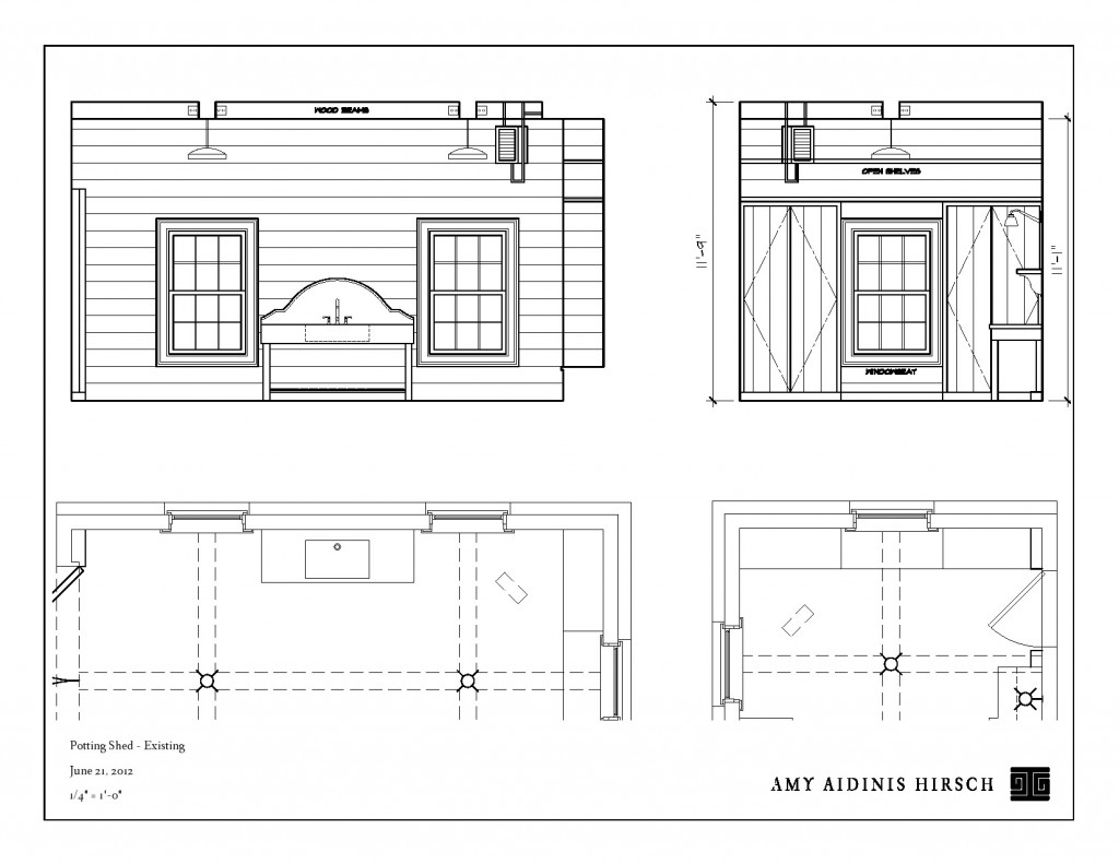
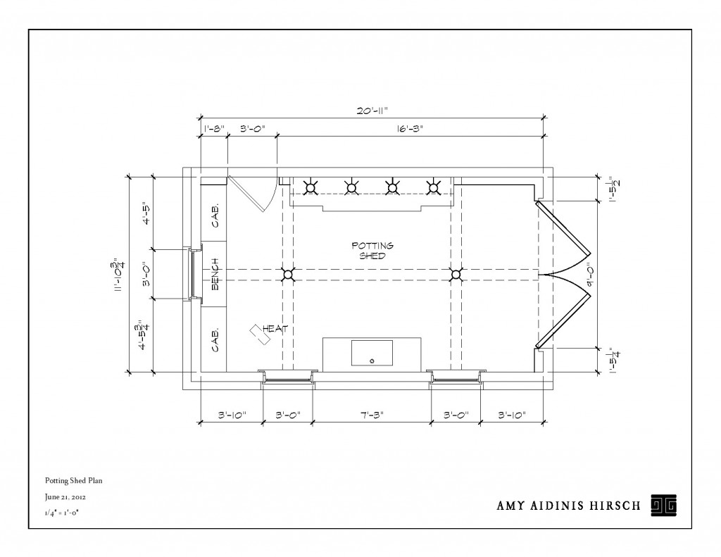
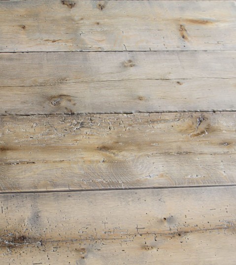
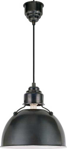
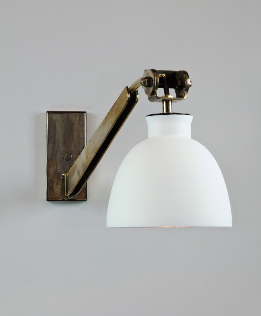
We then worked out what features should be part of the perfect potting shed.  A large bench for work space, plenty of storage, light to work by and grow lights for germinating seeds, drainage in the floor, and a deep sink large enough for watering cans and large pots.  Aesthetically, I wanted to incorporate a lot of texture and take advantage of the high ceilings.  With these things in mind, I decided to sheath the walls and ceiling in reclaimed oak and install a beautiful, deep soapstone sink with a really tall back splash.  The potting bench will have a zinc top and back splash for a touch of an industrial feel.    As for the lighting, I really love the idea of using beautiful sconces.  Can we get grow bulbs to fit these great lights?  I don’t know, but I certainly plan to do whatever it takes to make that idea work!

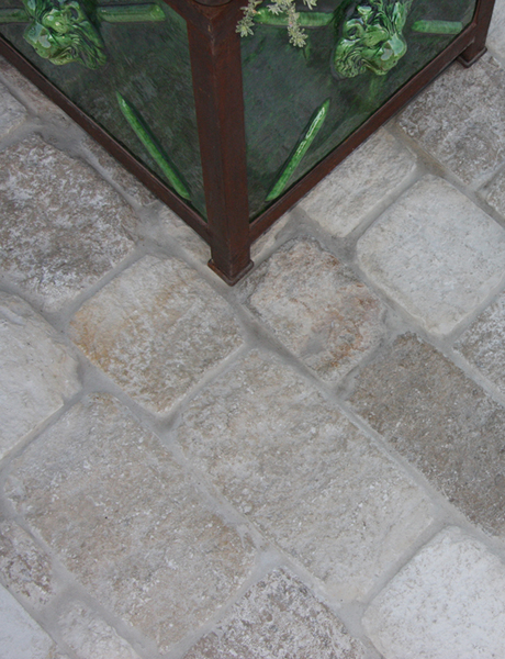
The flooring presented it’s own challenge.  We needed something durable and appropriate to the space, but also with a look suited to the rest of the elements in the potting shed.  I explored ceramic stone and antique pavers, but ultimately concluded that a blue stone floor would be ideal.  It’s a simple, worry-free element with great texture and large scale.  It also echoes the use of blue stone from the nearby pool.
 All of these grand designs will be built by my clients’ amazing handyman.  The gardens around this home are so divine, my client truly deserves this space and I am really excited to watch this project take shape.  Stay tuned for a future update when I’ll post a final reveal of the finished potting shed!