Grand Entry

The entry is always the central core of a residence. It sets the mood for the first impression when a guest enters your home.

The entry is always the central core of a residence.  It sets the mood for the first impression when a guest enters your home.  This entry is vast in height with a grand stairway open to the upper floor.
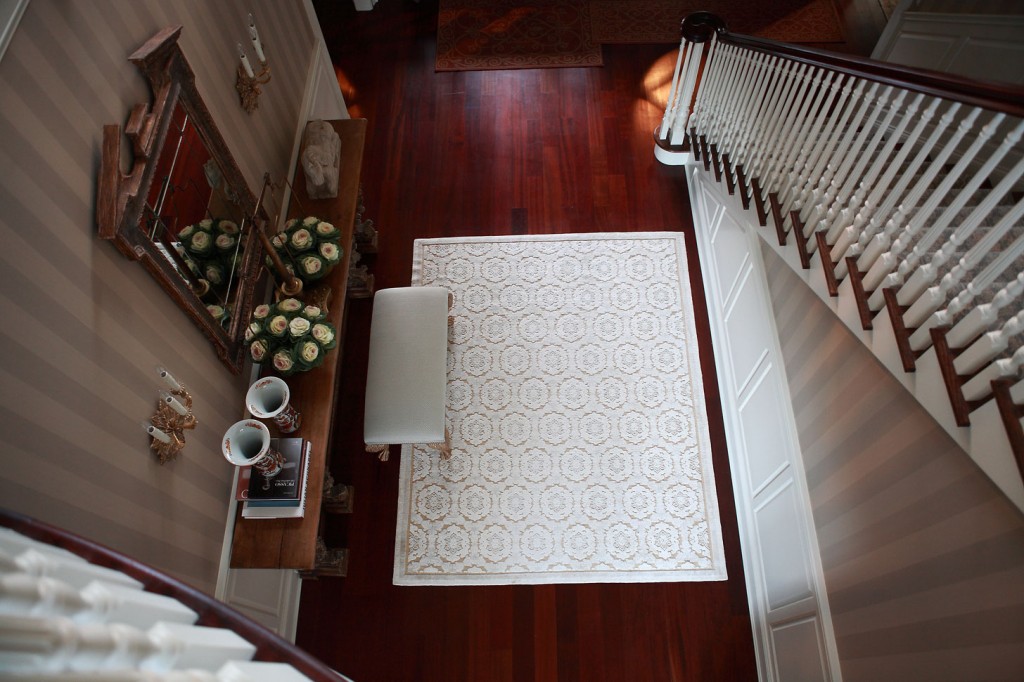
Finding the perfect entry table here turned into a real scavenger hunt.  Initially, I began sourcing antiques because I needed such a long table for this area.  Bored with the typical consoles and frustrated that the most spectacular pieces had been used by other designers, I thought, “Why not start the search from scratch?”  What I found was a table that originally formed part of an 1800’s bar that originated in the south of France.
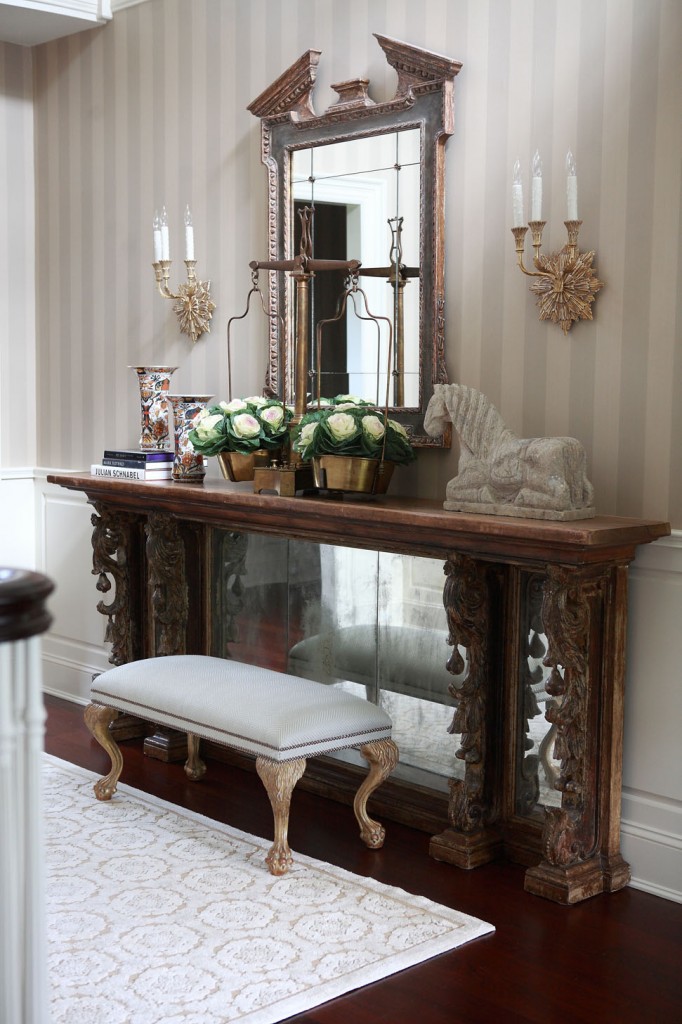
I remember the day I presented the piece via email to the client and they said “Yes!”  I must have danced around the office like a silly child, so thrilled to have something authentic and aged in a newly refurbished space.

Another component I really like in this entry is the brass scale on top of the console table.  I have these moments where I speak up and conjure some crazy idea but have no idea where I’m going to locate what I’m presenting.  Somehow I always manage to figure it out, and the scales are a perfect example of that.  I wanted something of substance and not your typical accessory.  What I love about the scale is the way it functions as a vase for filling with flowers or other arrangements.
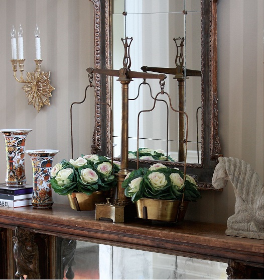
The console itself is a beautiful piece of art, but the accessories that adorn the top are so unique and strategically balanced.  The stone horse weighs a ton!  It was almost impossible to get it up there.

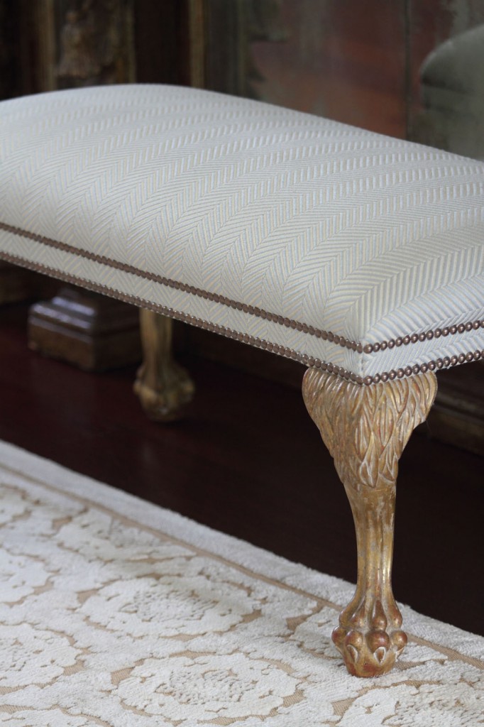
Being able to add so many custom elements to this entry also made it a memorable project.  The  gorgeous Buton area rug by JD Staron Galleries, light fixture in brass and dark bronze patina by Charles Edwards, and mirror and bench from Dennis & Leen, all complement each other and the grandness of the entry to form an overall atmosphere of impressive sophistication.  Finally, strie wall paper by Farrow & Ball cover the walls to provide subtle background texture and complexity.

Tabletop Inspirations

Don’t underestimate the ability of fine dinnerware to add a special or unique touch to the table.

What do you use your dishes for?  Are they simply utilitarian, something to toss on the table at dinner, then clean up and store out of sight once the meal is over?  On most nights of the week, dinner time is more about reconnecting with family after a busy day or fitting in a quick dinner between soccer and homework than about transforming your table into a masterpiece of a tablescape.

When you have guests, however, don’t underestimate the ability of fine dinnerware to add a special or unique touch to the table.  Dinnerware can add color, interest, and style to the table.  There’s no reason why you can’t use the dinnerware as another interesting element to make your guests feel special.

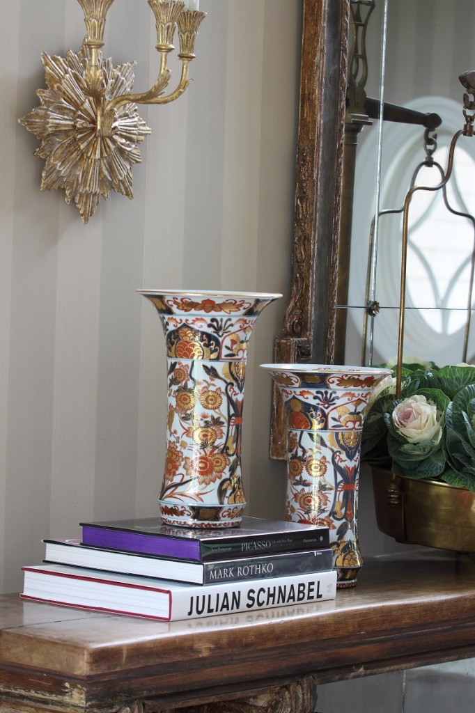
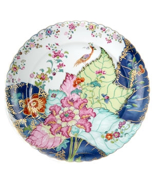
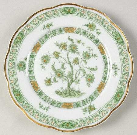
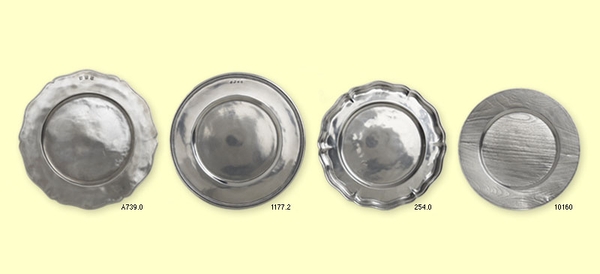
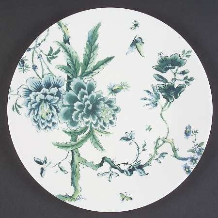
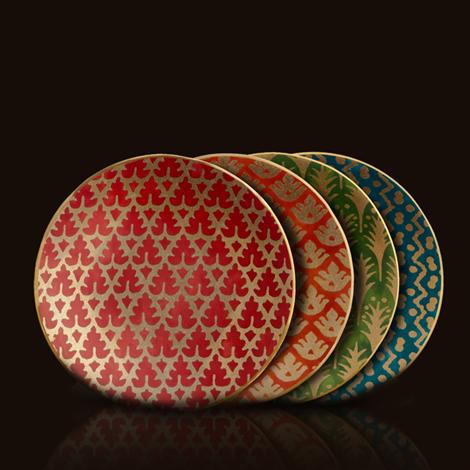
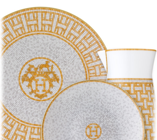
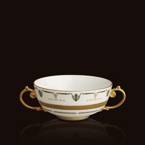
Here are some examples of dinnerware I love.  They represent a variety of colors and styles, but what they have in common is a heightened level of interest or detail that can easily be carried into other accent pieces for the table.

Decorate your table with this over the top tobacco leaf plate. Keep everything else simple.
This is my mother's china - Tree of Life. I have always loved the tree of life motif - inspiration from my mother!
Match - Pewter Table Top
Jasper Conran Chinoiserie


Fortuny & L'Objet - Fabulous!
Haviland
Classic Hermes
L'objet - Mythologie

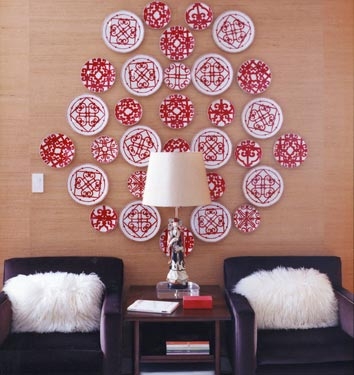
And of course, who says fabulous dinnerware has to be confined to a tabletop?

Cozy Chic Family Room

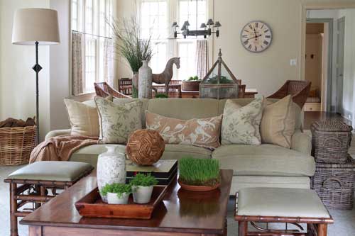
Our goal here was to create a comfortable, cozy environment in a livable space with absolutely nothing pretentious.

An open floor plan offers unique challenges and opportunities.  For this client, the family room opened to both the kitchen and dining area so all three spaces needed to tie together.  Our goal here was to create a comfortable, cozy environment in a livable space with absolutely nothing pretentious.  The rooms already had good flow from that open floor plan as well as lots of natural light and simple
architecture.  With these things in mind, we set out to create this cozy chic living room.

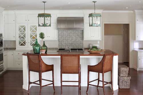
The primary color selection for this project was green.  Combined with all that wonderful light, the natural, organic color palette allows the influence of the outdoors to pour into the interior.  The resulting effect is inviting and has a simple influence but layers of warmth.   To achieve this, I chose materials like wicker, iron, walnut, and a hint of bamboo.  Since the space holds three different actions — eating, cooking, and lounging — elements had to not only compliment each other but also almost repeat to tie everything together.  For example, walnut in both the island and coffee table, bamboo on the ottomans and bar stools, and wicker chairs echoed by baskets.

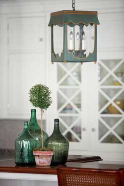
Some of the items and materials used here were really enjoyable to work with.  The tile back splash warms up the white cabinetry of the kitchen while the Lamplight Designs lanterns over the island draw in that soft green color seen throughout the space.  The chenille sofa fabric from Cowtan & Tout, for example, or the John Rosselli & Associates bamboo ottomans upholstered in leather.  One of my favorite accents, however, is the Vaughan standing lamp in iron!

I think the finished room really lives up to all of its potential.  This is a great gathering area where everyone feels connected and part of the open communication of living together in a wonderfully habitable space.

Artist Marc Harrold

I found myself mesmerized by the sleekness of Marc Harrold’s photography at the Samuel Owen Gallery.
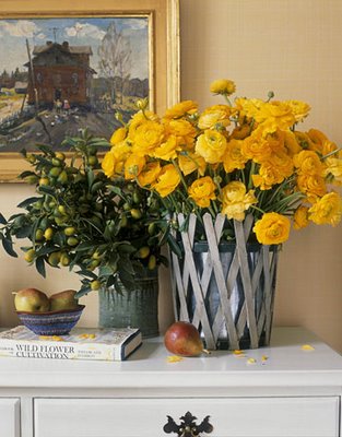
Typically, I am late for everything and recently on my mad dash to get lunch I stumbled into the Samuel Owen Gallery. With absolutely no time to spare, I found myself mesmerized by the sleekness of some photography at the gallery.  I knew the artwork would be perfect for a project I’m working on in Southampton.
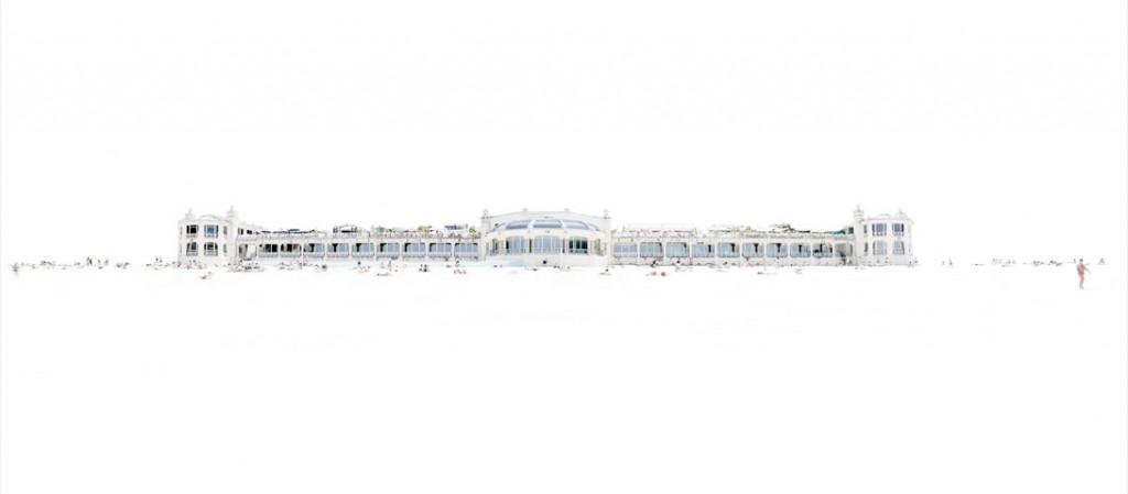
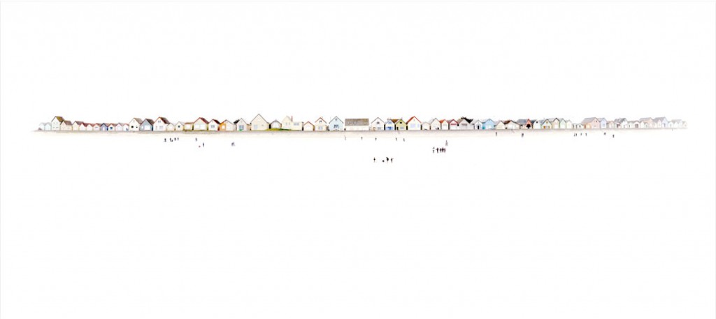
From the gallery I learned the artist behind these fascinating images is Marc Harrold from Paris, France.  To create his photos, Marc purposely overdevelops the images then selectively adds color back into the images.  The photographs are back mounted with 1/4″ UV acrylic with an aluminum backing to hold them rigid.  On the back of each photo is a cleat with a coordinating wall piece which allows the photo to rest flat against the wall.  The resulting artwork appears to float over the wall.

Marc primarily photographs beach scenes in his native France.  The wide spaces in his large-format prints combine with the brightness of the over-exposure, and prominent and sweeping horizon line, truly evoke the feeling of being at the beach with the sun in your eyes and feeling that you can see all the way to the edge of the world.

Later that day I actually had a meeting with my Southampton client and expressed my interest in the artwork of Marc’s I had seen earlier.  She perked right up and said, “I saw the same thing!” and we both were totally excited like two 5 year old children!

Art is so difficult to choose for a client.  It is just one of those things people have a very visceral  reaction to, sentimental and expressive of one’s personal reflection.  I can’t wait to install this artwork for my client; it is going to totally set the overall feeling of the house!
Beach 1

Of his own work, Marc says, “‘I take photos of places at different times of the day, sometimes randomly, to emphasize the interaction between the light and the shade, the effect of time on the beauty of the instant. This way, probable or more unlikely encounters unveil the invisible from the visible. My photos are a reflection on the fickleness of people, of things. Signs that draw their way through light and shadow. Aestheticism is important to me to carry my thoughts and feelings.  My work is not intended to carry any specific message, but rather to share an emotion that is magnified by the experience of the observer.”

Beach 46
Beach 37
Beach 62

It’s difficult to do this artwork any justice on a computer screen!  To see more examples of Marc Harrold’s photography, including detailed images, visit Samuel Owen Gallery or look them up on Facebook.

House Beautiful: Bath of the Month

Being one of my favorite design publications, I was thrilled to have a bath I designed chosen as Bath of the Month!

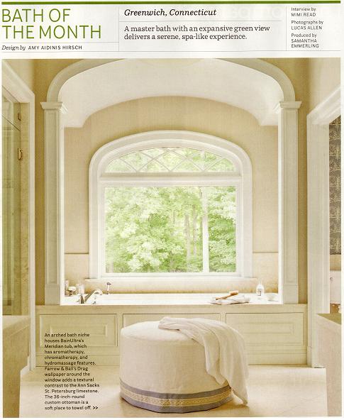
House Beautiful magazine’s March 2012 issue just arrived in my mailbox.  Being one of my favorite design publications, I was thrilled to have a bath I designed chosen as Bath of the Month!  Here is my interview, done by Mimi Read, with photographs by Lucas Allen.  It was a true pleasure working with them and seeing the article in print!

Here is the article in full, but I suggest you pick up an issue to enjoy from cover to cover!

Mimi Read:  You do know how to frame a view.

Amy Aidinis Hirsch:  We wanted an expansive window to fill the room with natural light, and to make the exterior part of the interior.  We didn’t use a window treatment because it would have blocked the view.  Those lush green woods are like a painting for the space.

That’s a brave move, putting a tub right in front of a huge uncovered window.

The house is at the end of a cul-de-sac — my clients have total privacy here.  That’s a dual soaking tub, so it accommodates two people.  They wanted a bathroom for both of them to enjoy together — a perfect symmetry of his-and-hers everything.  He travels a lot, and it was particularly important to him to have a tranquil space to retreat when he comes home.  It’s their Zen haven.

Cladding the walls and floor in all this honey-vanilla limestone creates such a spa-like feeling.

We chose vanilla limestone because we were going for warm and simple, understated.  Marble would have had too much movement —  all that veining — and that would have competed with what we were trying to achieve here.  The driving force for choosing limestone was the previous floor.  It was Jerusalem gold marble, and it was jarring, not welcoming at all.  This is such a soft, calming color, very gentle on the eye, and also to the hand — it’s quite smooth, not pitted in any way.  And using it everywhere unifies everything.

You’ve even used tilted limestone slabs as vanities.  Why no drawers or cabinets under the sinks?

My clients didn’t want conventional vanities — they wanted something clean and minimal.  They were actually inspired by a tiny vignette of a bathroom they’d seen at Paris Ceramics.  They were there looking, and they really fell in love with the mother-of-pearl on the vessel sinks and the backsplash.  The way the light picks up on it is exquisite.  I repeated the mother-of-pearl tiles in the shower and made it thicker, right at eye level.  It’s definitely the bling.

It’s beautiful the way the mirrored door between the vanities reflects the woodsy view.

The details are so beautiful, too.  The panes frame antique mercury mirror, and the rosettes are hand-carved.  You really notice the beauty because of the sleek, angular simplicity of the vanities.  The door slides into the wall, so it never obscures either of the vessel sinks.  Those sinks are works of art.

–MR

A Jewel of a Powder Room

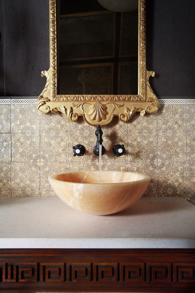
My goal with this project was to create a jewel of a powder room; a whimsical experience in a smaller space.

Bathrooms and powder rooms can be the best places to design.  Since the room isn’t usually directly in sight, you can be more extreme, take risks, and play with more unusual materials.  My goal with this project was to create a jewel of a powder room; a whimsical experience in a smaller space.

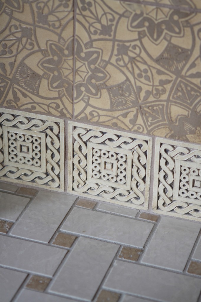
To start, the mohair for the wall upholstery sets a luxurious backdrop balanced nicely by the lighter colors of the hand kiln tiles by Country Floors and the Honey Onyx sink vessel by Ann Sacks.  The console table is a custom piece from English Looking Glass.

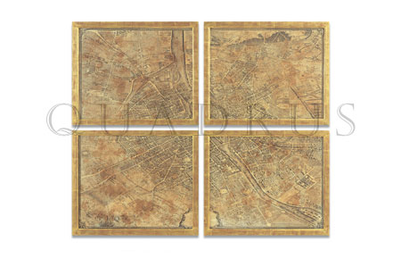
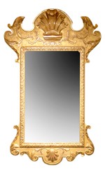
In addition, some of the wonderful products from this powder room are not visible in the photos.  A hand-antiqued map of Paris, George I Gilt Gesso Pier Mirror,  and a Piccolo Sconce by Gregorius Pineo, round out the bathroom nicely.  Finding just the right details and accents such as these is what makes a project for me!


Wicker Chairs

Natural wicker, formed of cane or rattan core stalks, willow switches, reed, or bamboo, is known for its strength, durability, beauty, and comfort.

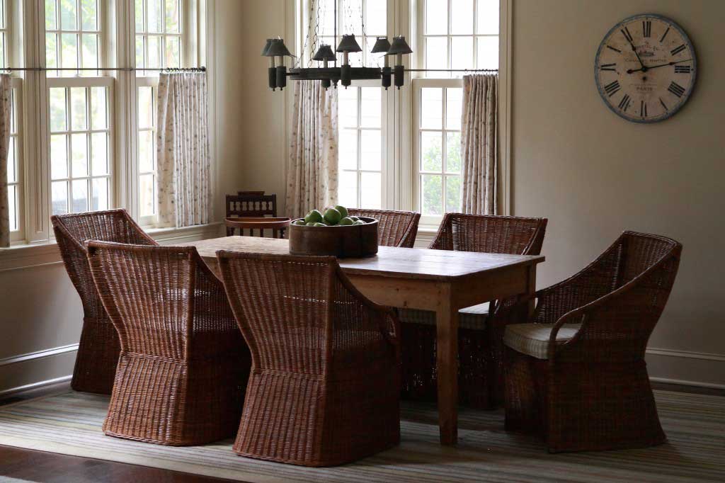
Wicker furniture has been around since the days of the ancient Egyptians.  Natural wicker, formed of cane or rattan core stalks, willow switches, reed, or bamboo, is known for its strength, durability, beauty, and comfort.  Synthetic wicker may be easier to maintain over time, but it cannot compete with natural wicker’s many superior qualities.

After the U.S. Civil War, wicker furniture enjoyed modest popularity as a comfortable, lightweight option for outdoor seating.  Toward the end of the 19th Century, wicker furniture makers had developed an elaborate Victorian style.  The height of these ornate wicker designs was reached in the late 1880s and early 1890s until styling became more austere during the Arts and Crafts movement.  Collectors today highly prize antique wicker pieces.

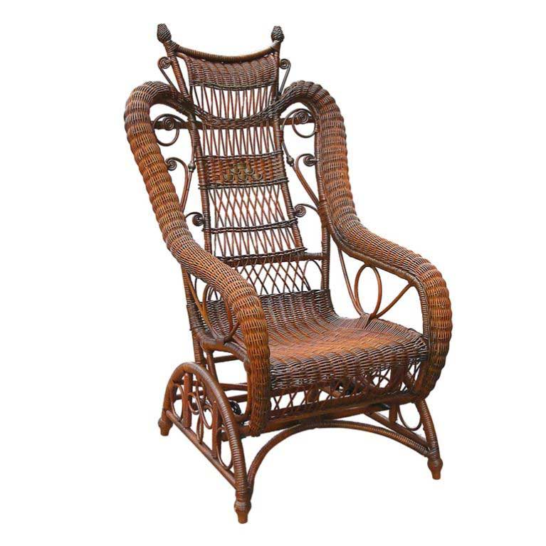
Victorian Wicker Platform Rocker
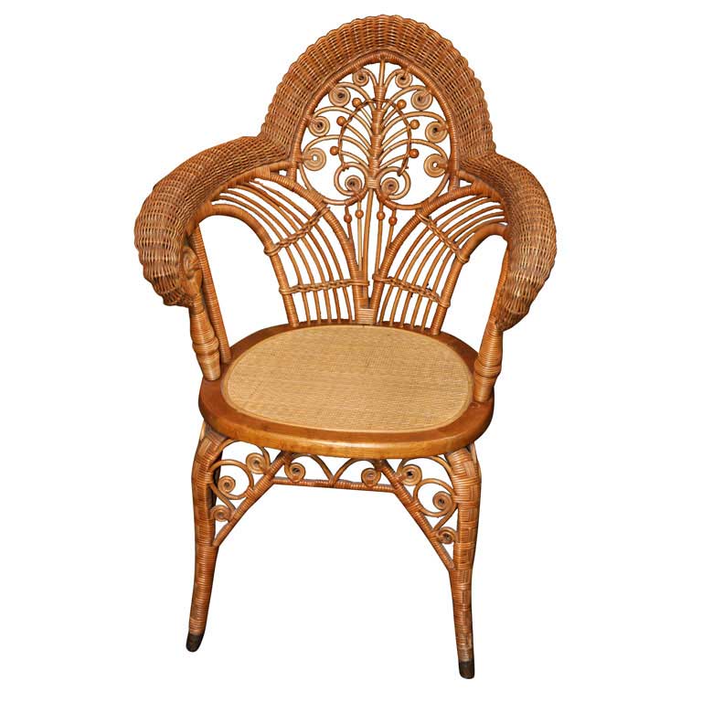
1890s Wicker Arm Chair

I like the unusual, eclectic look of these wicker chairs.  This style isn’t what typically comes to mind when you think of wicker chairs and I find the styling details unexpected and very interesting.  Indoors or out, wicker brings natural charm to a room.  It works with upholstered pieces and relaxes a room with polished wood features.


An Unusual Wreath

When a client asked me to create a wreath for the New York Junior League’s Winter Wreath Celebration and Auction, I immediately knew I wanted to do something risky to set my design apart from all the others.

When a client asked me to create a wreath for the New York Junior League‘s Winter Wreath Celebration and Auction, I immediately knew I wanted to do something risky to set my design apart from all the others.  I felt totally against creating a typical, round, preserved green wreath.   This was a risky, absolutely unsafe approach, but I wanted something authentic and unusual that would get people talking.  Plus, I had only two weeks to pull of the entire project!  Working under pressure helps me focus pure creativity, so the time crunch actually worked in my favor.

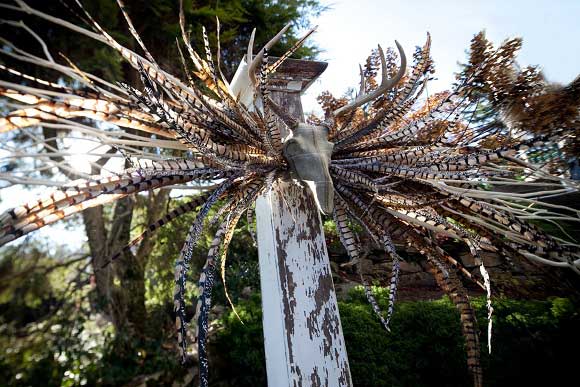
My first and biggest hurdle involved convincing my husband to part with a trophy item from his past!  His European mounted deer skull became the centerpiece of the wreath.  I upholstered the skull in plaid fabric, leaving the antlers bare and natural.

Surrounding the European mount are real white birch branches and a combination of real and silk pheasant feathers.  McArdle’s Florist and Garden Center in Greenwich did an excellent job of providing materials to help me create my design vision.

The finished wreath completely lived up to my goal of building something unexpectedly beautiful.

 I was not at the Junior League auction, but from what I heard this wreath was the talk of the event!  Bidding over the wreath was fierce, which only goes to show that taking risks and not conforming to common expectations can really pay off!

New England Home Design Blog

As a designer living and working in New England, a resource like New England Home Design Blog is an invaluable tool.

As a designer living and working in New England, a resource like New England Home Design Blog is an invaluable tool.  Featuring categories such as Notes from the Field and Sneak Peeks, this is one blog worth following.  New England Home highlights designers, homes, trends, and events specific to New England’s unique lifestyle traditions.  Each post contains links to companies, photographers, designers, architects, and artists so that browsing your way through the articles leads from one inspiration to the next.  Before you know it, you’ve wiled away the entire afternoon exploring all the wonderful things New England Home’s blog has to offer.

Here are some of the things you’ll find when you visit this incredible blog:

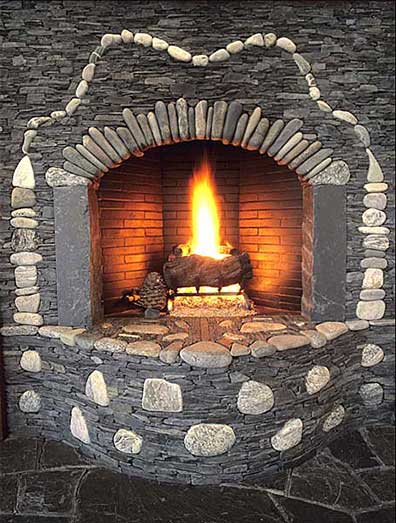
Fireplace by stone mason Lew French
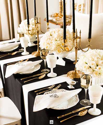
A table setting by Eddie Ross
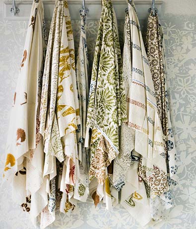
Photo courtesy of Les Indiennes
I loved this cover! Well done!

For even more inspiration or to be notified of new postings, be sure to visit New England Home on Facebook.


Looking Forward to Flowers!

There’s nothing like a bunch of colorful flowers or artful greenery to brighten any area, inside or out.

So far this winter, Mother Nature has spared us from a typical New England winter.  Even still, by the end of January it’s hard to avoid wishful thoughts of warmer breezes, green buds on trees, and those first flowers to signal the start of spring.  It’s the flowers in particular that I look forward to, not only for the season they symbolize but for the memories and sentiments they evoke.  There’s nothing like a bunch of colorful flowers or artful greenery to brighten any area, inside or out.

We can’t hurry spring along, but here are some examples of arrangements and flowers I love.

I love this floral composition.


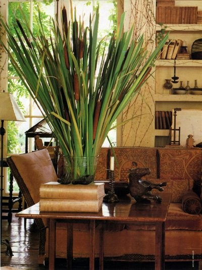
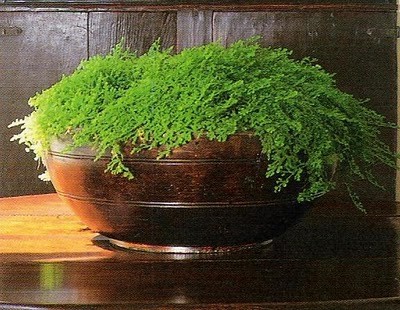
Just greens.
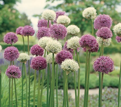
Alliums are the initial start of spring for me.
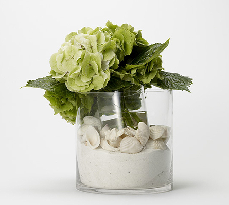
Hydrangia - all time favorite!
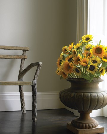
Sunflowers remind me of my first date with my husband.


Hearty yet simple.
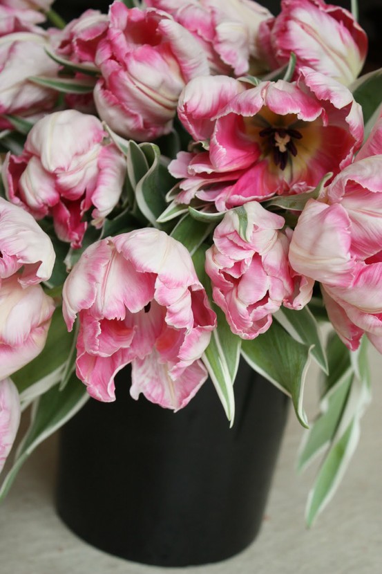
Tulips: One of my favorites in any color.

Odds are you live near a florist or flower shop, which means there’s no reason to wait until spring to enjoy a beautiful bunch of flowers.  Why not treat yourself to some cheerful blooms the next time you go out?

cover photo source