Tag: interior design
Veranda: Grand Traditions, Enduring Appeal
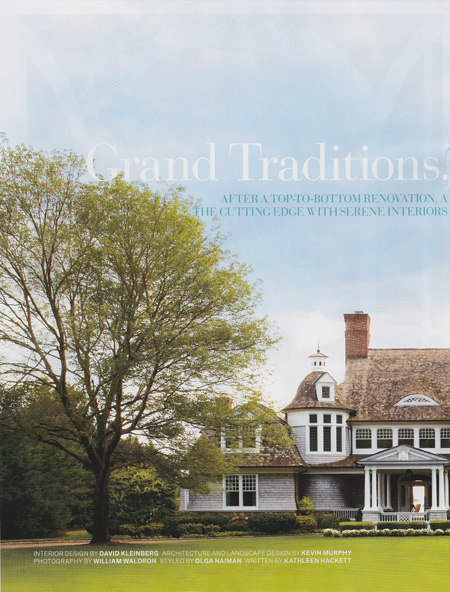
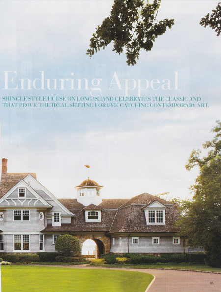
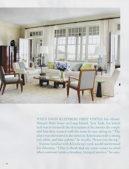
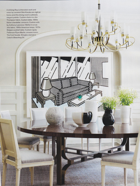
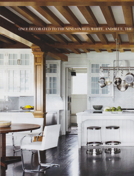
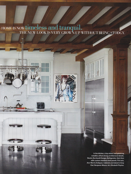
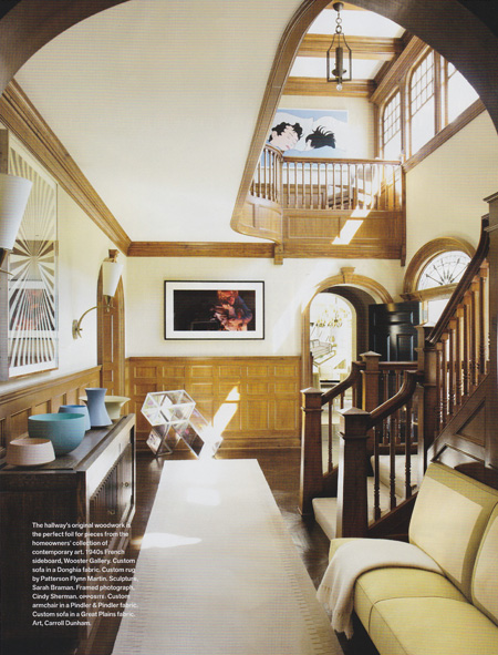
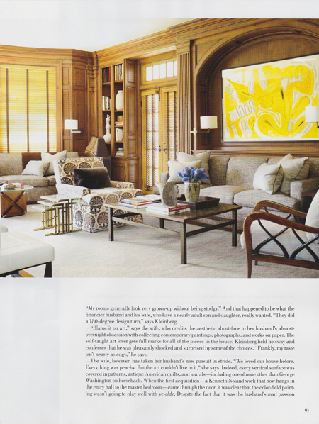
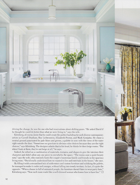
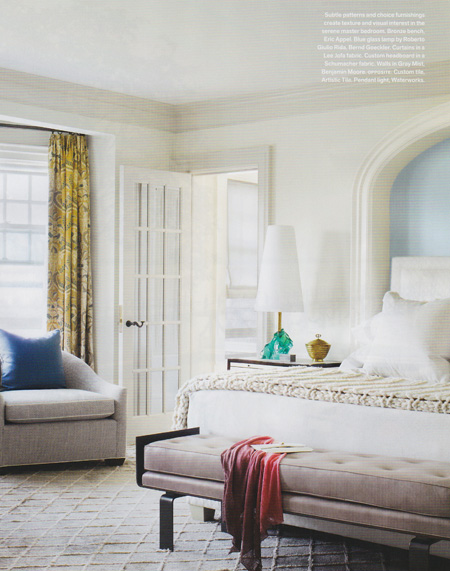
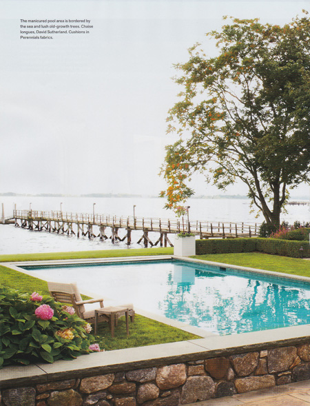
The latest issue of Veranda features a beautifully designed shingle style house on Long Island.
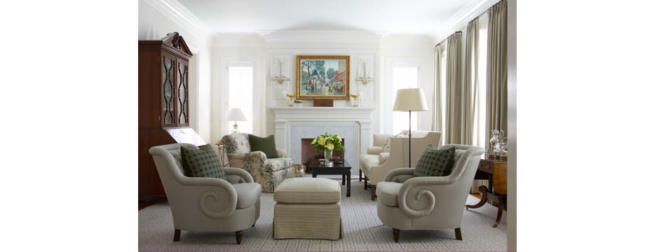
The latest issue of Veranda features a beautifully designed shingle style house on Long Island. Designed by David Kleinberg, this home was completely revamped to reflect the client’s art collection. I love the neutral palette of this home and how it really complements the great art. Every part of the interior is done with a refinement you can see if each detail. The execution of the design is very tailored and of high caliber.
New England Home: In a Perfect World
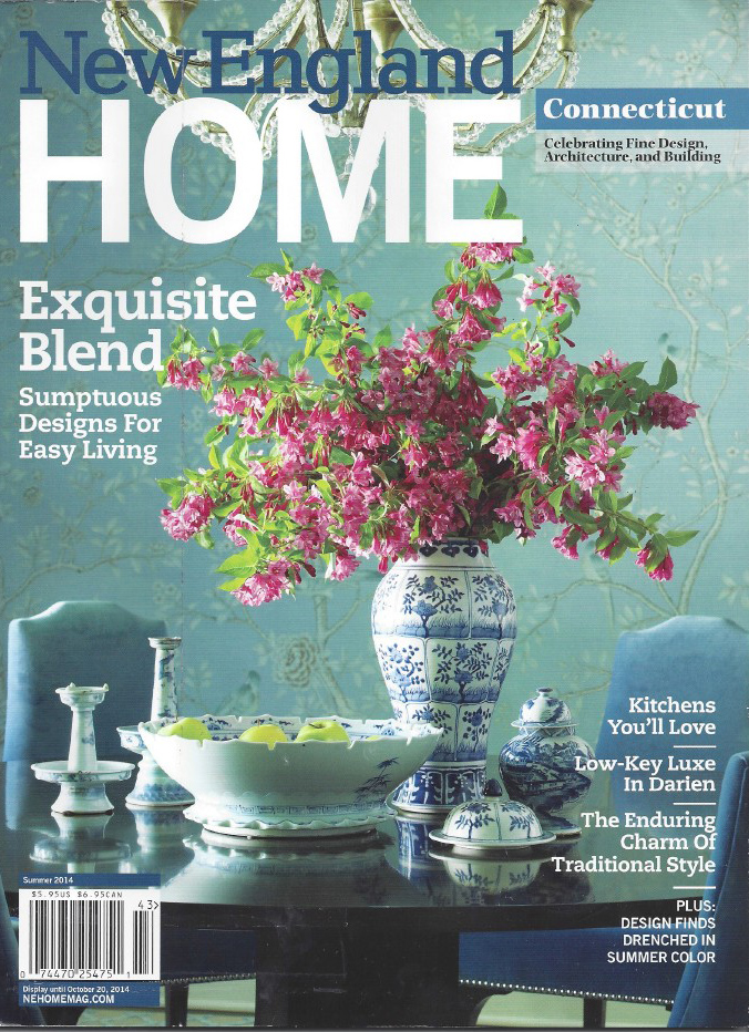
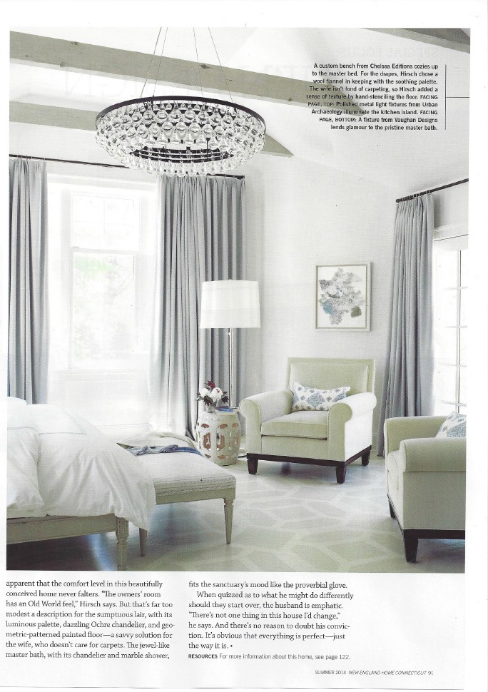
I am so pleased to share with you the current issue of New England Home, which features a recent project of mine.
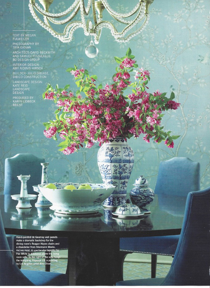
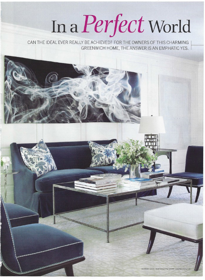
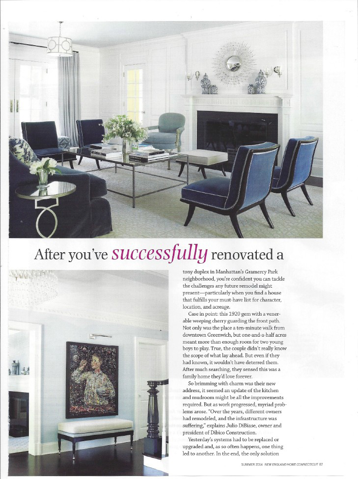
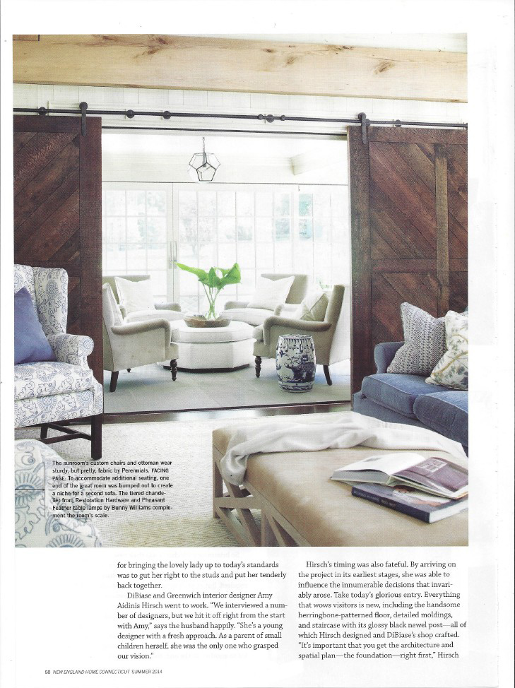
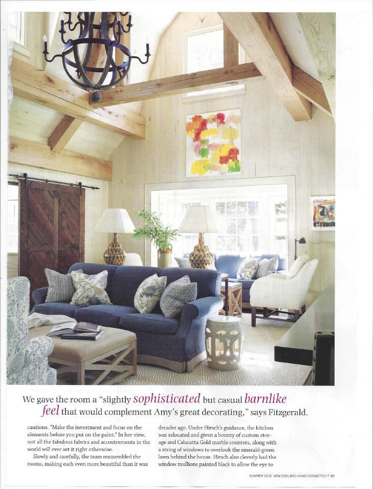
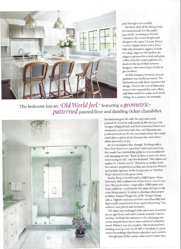
I am so pleased to share with you the current issue of New England Home, which features a recent project of mine on the cover and in a great editorial. I worked with Julio DiBiase of Dibico Construction and, as always, he was able to seamlessly execute my vision throughout this 1920’s era Greenwich home. Taking this home from its original condition to the gem it is today meant overhauling every room down to the studs before designing the ideal space for this young family. New England Home truly showcases the home well with this editorial, capturing the sophisticated but livable environment we created.
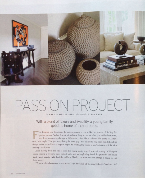
At Home in Fairfield County: Passion Project
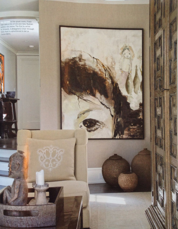
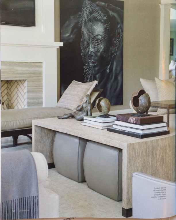
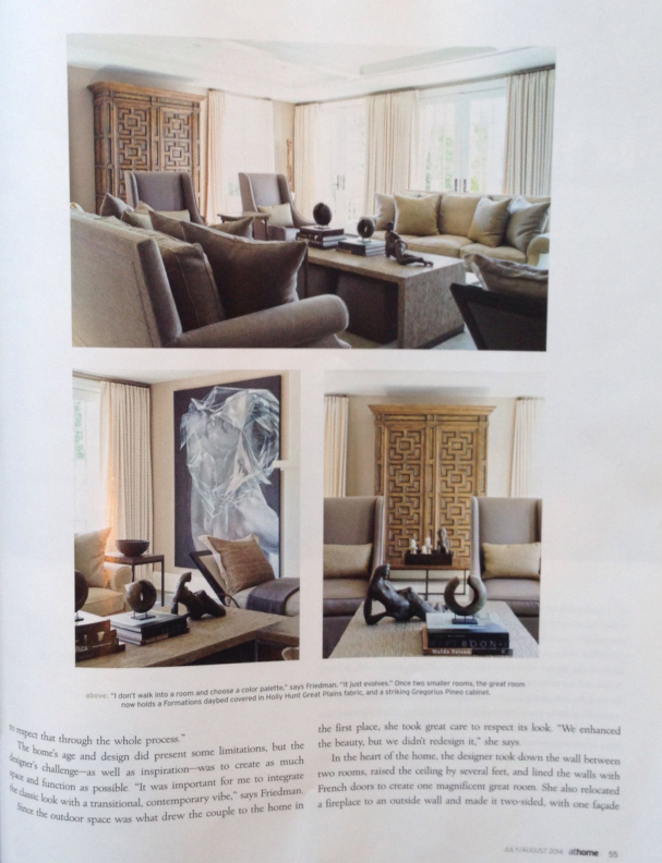
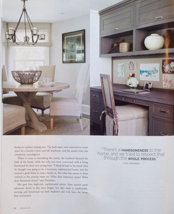
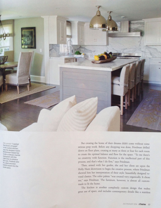
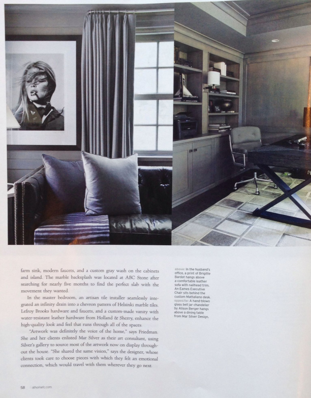
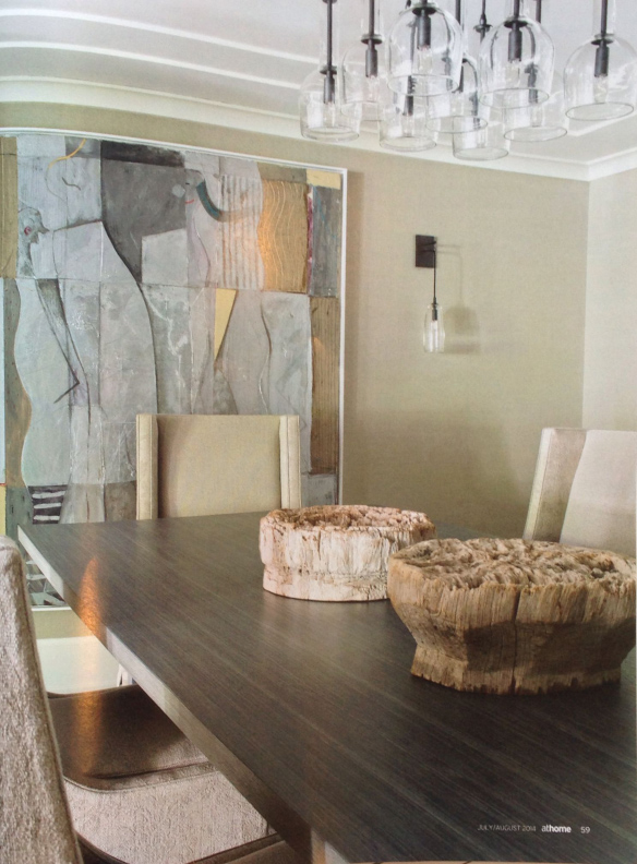
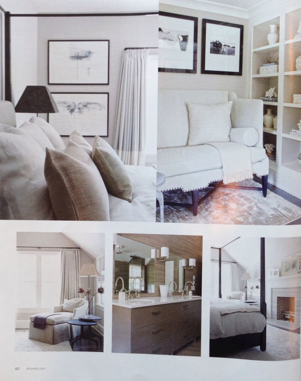
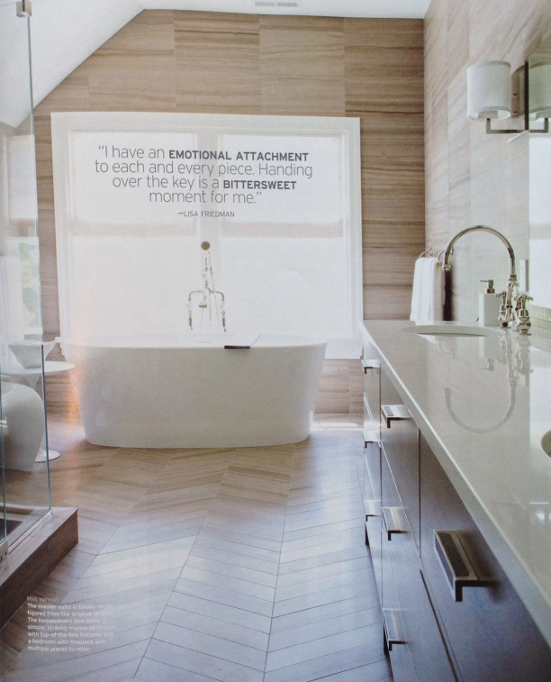
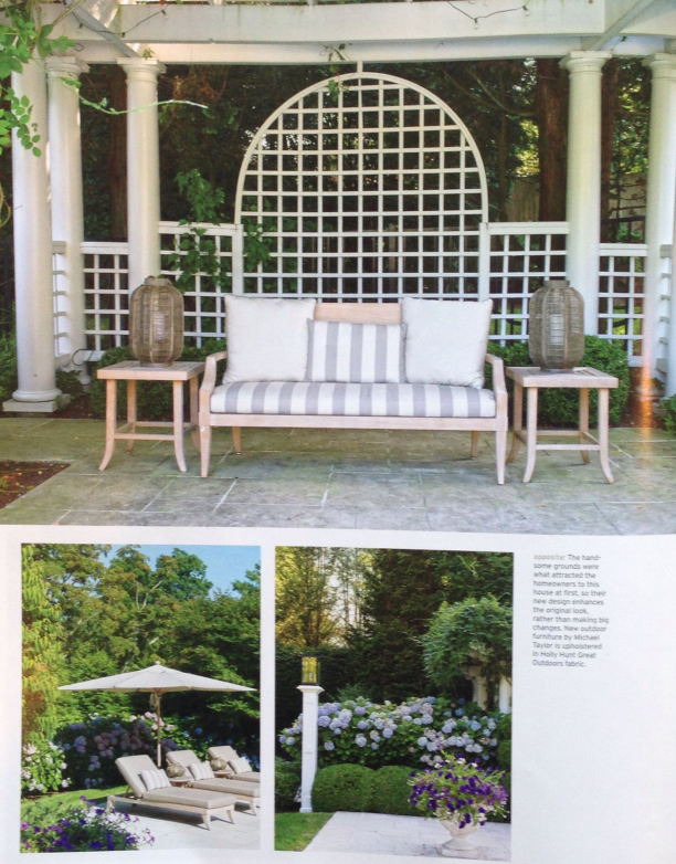
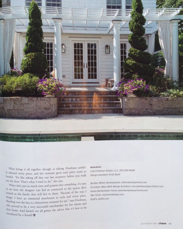
I saw an editorial in the most recent At Home in Fairfield County that I loved. The article featured a 1939 Colonial designed by Lisa Friedman with incredible art sourced by Mar Silver. When looking at the photos of this beautiful interior, I felt like I could easily live in this home. The neutral palette and use of high end, sophisticated vendors in rooms with great proportions and scale lead to a timeless, well executed look.
Design Dose
A mix of old and new.
Fabrics
Now that spring has finally arrived, I find myself really drawn to fresh, new styles.
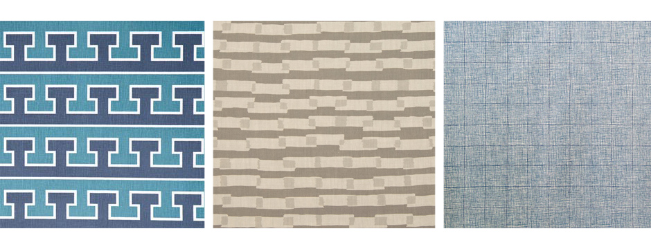
Now that spring has finally arrived, I find myself really drawn to fresh, new styles. My energy is focused on finding inspiring things no one else has, like fabrics that are totally not common styles from typical vendors. Bespoke items that no one will walk into a room, look at, and say, “I have that same fabric on my pillows,” is the kind of look I love.
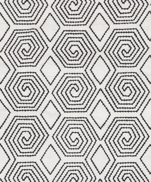
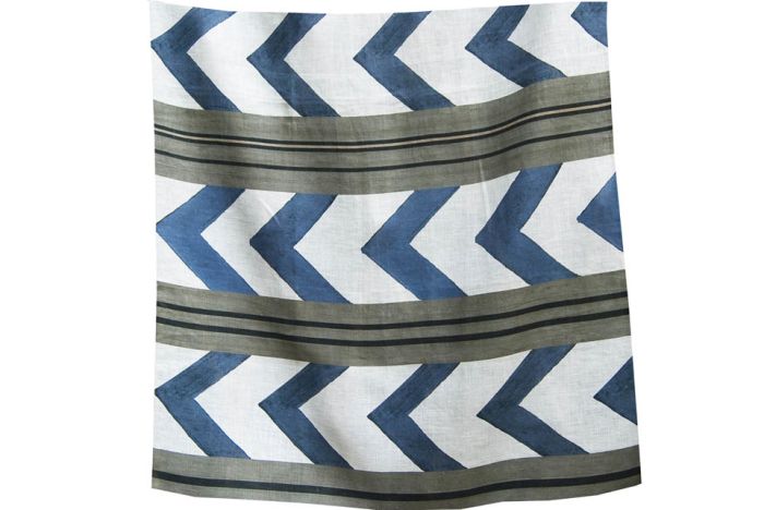
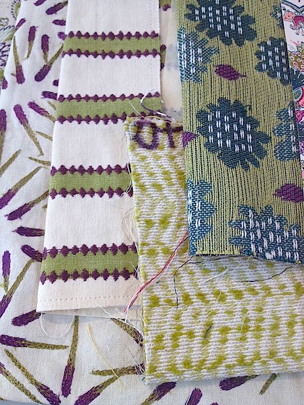
Choosing fabric is an integral part of what I do as a designer. Window treatments, pillows, and upholstery are essential elements of a space, providing opportunities to add color and texture. Fabrics let us explore creativity and embellish with unique details.
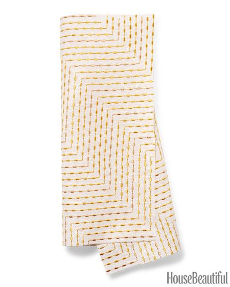
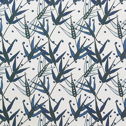
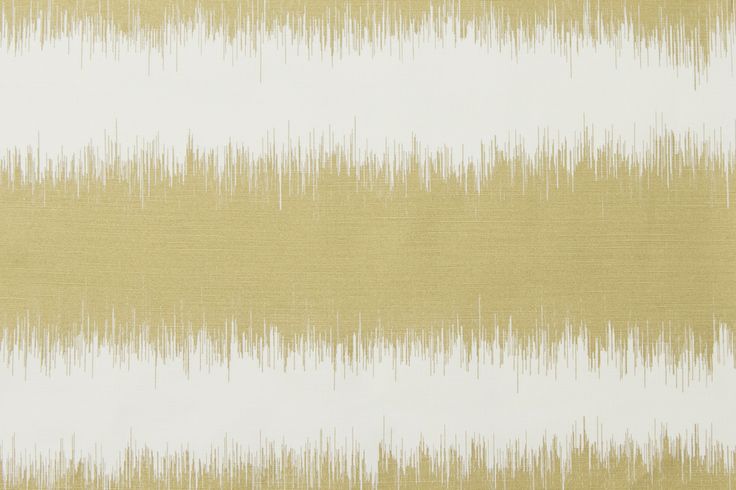
When choosing fabric, it is very important to be mindful of lifestyle when selecting fabrics. Homes with children and pets should have fabric that is more durable and easy to clean. Making wise choices is essential. You wouldn’t want something delicate on a sofa, for example. Having a source of versatile fabrics allows even the busiest, most active homes to enjoy beautiful fabrics in many different applications.
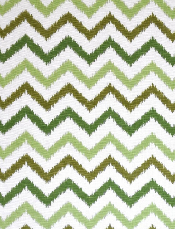
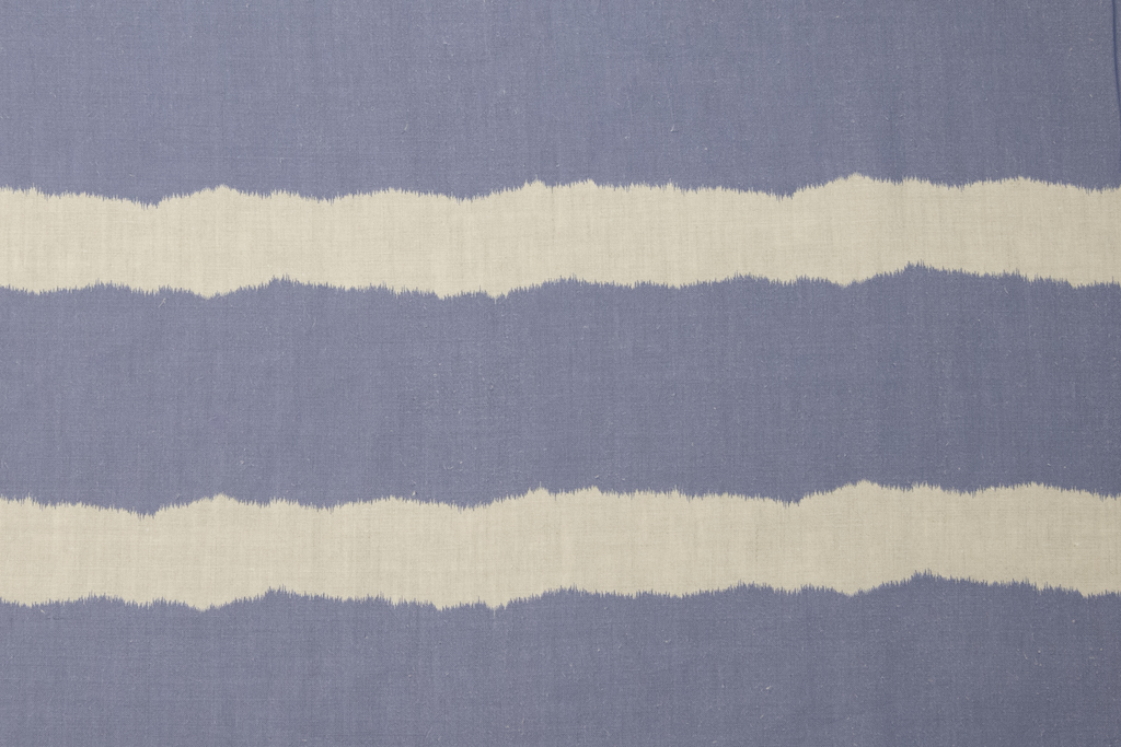
What are your favorite fabrics?
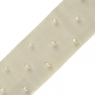
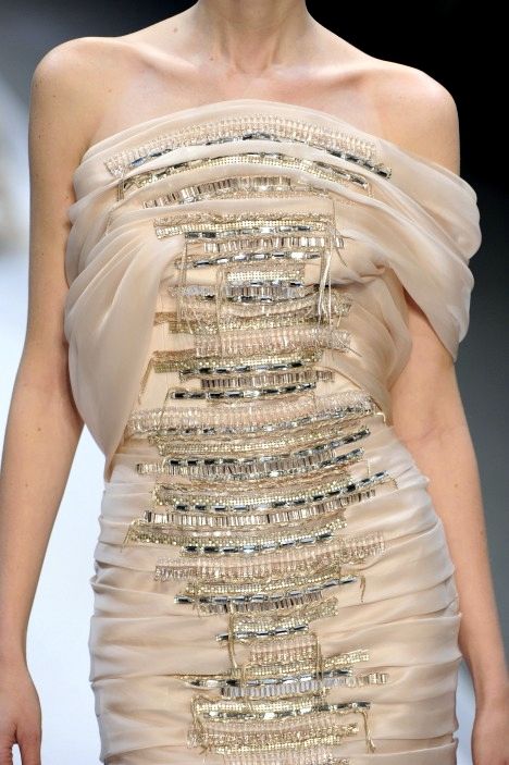
Embellishments
In both fashion and design, it is often the small details that tie a look together.
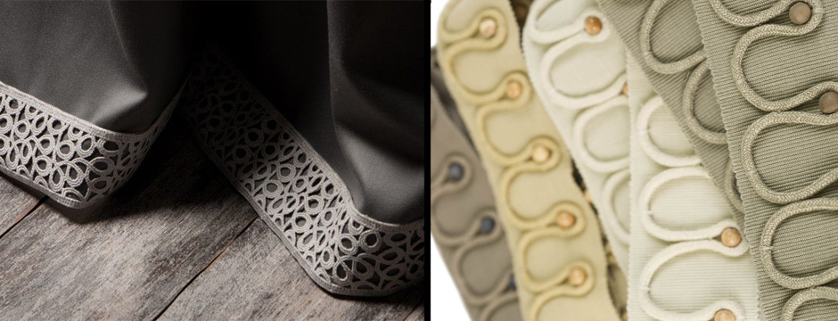
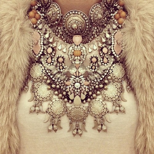
In both fashion and design, it is often the small details that tie a look together. When these details are in the form of embellishments, a look can be made eye-catching and unique.
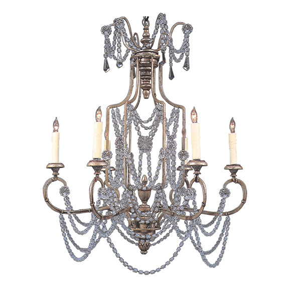
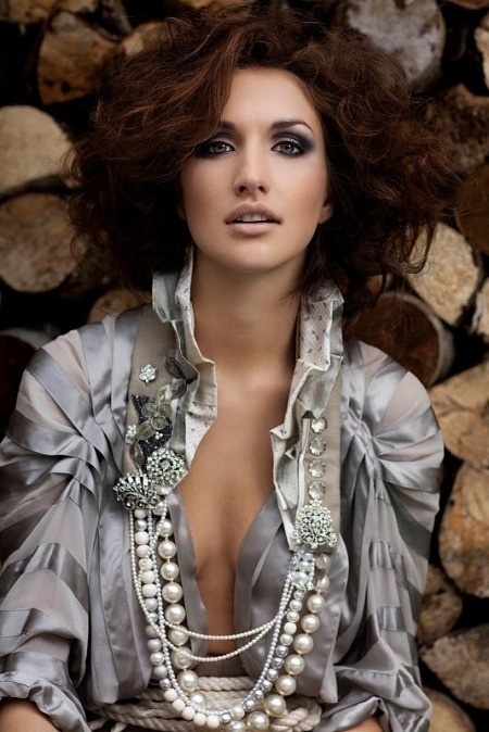
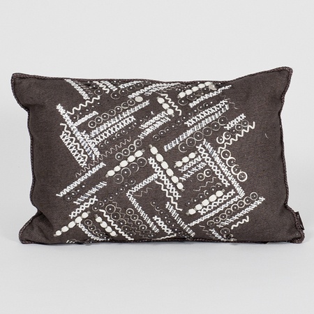
Embellishments can add sparkle or color, brighten with reflective surfaces, and coordinate with other aspects of the design. You can use embellishments for a grounding effect or an added touch of prettiness.
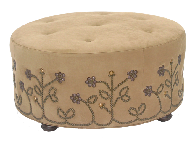
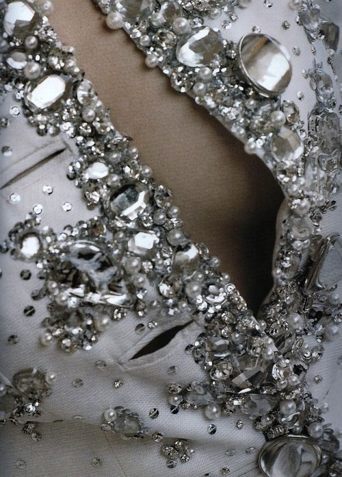
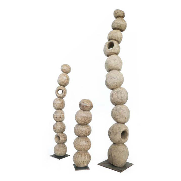
Think of ways to give your interior, or your outfit, a hint of glamor or just the right detail to elevate it or add an unexpected bit of flair.
Color Obsession: Blueberry and Yellow
Blueberry and yellow is one color combination I really love.
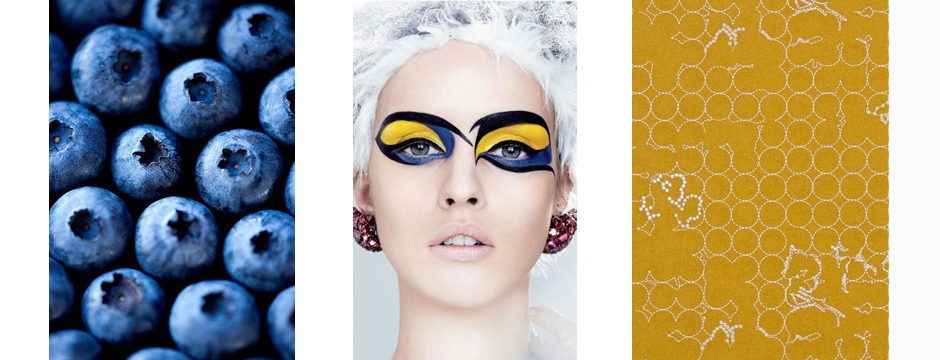
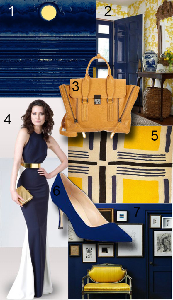
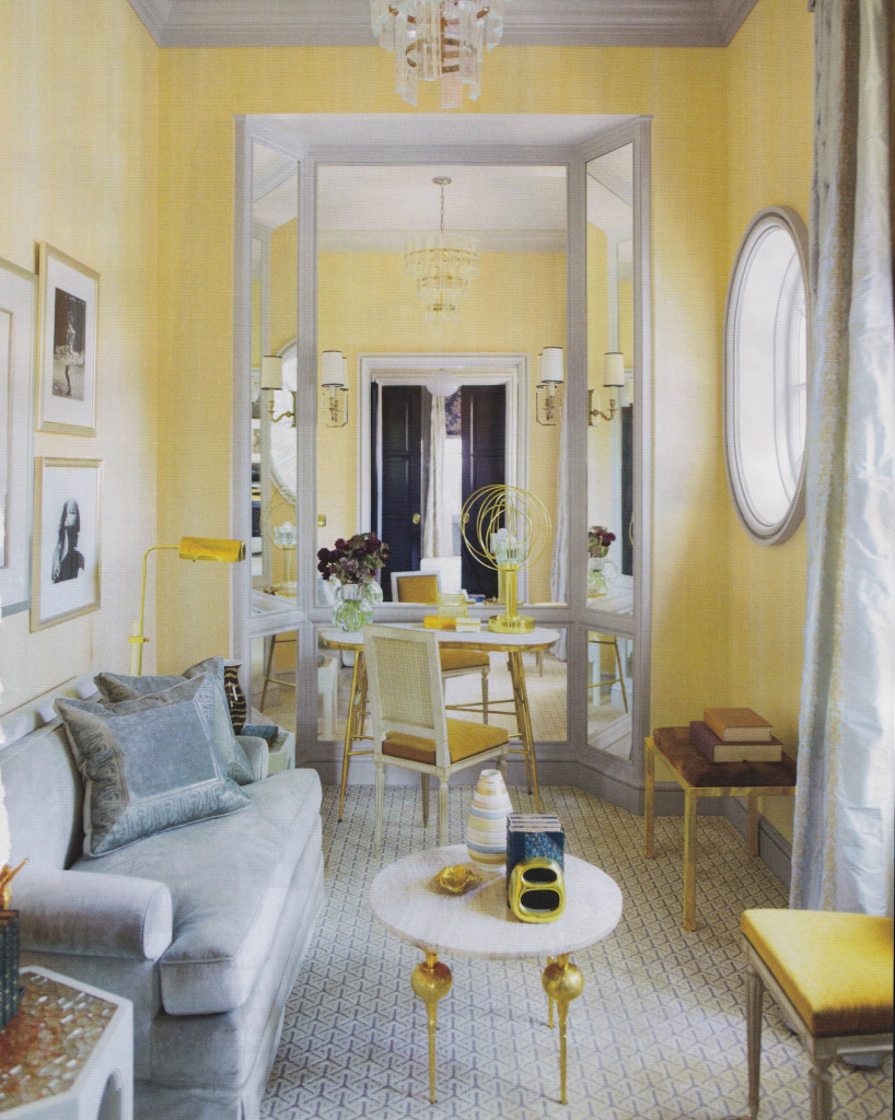
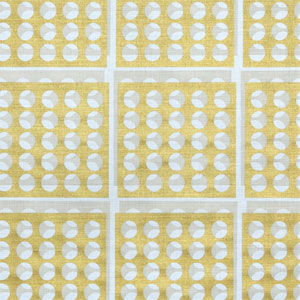
A few days ago, I saw some freelance work my Project Manager Jess was working on. She makes beautiful cards, and was testing colors for her creations. One of her palettes used blueberry and yellow, and it struck me as so appealing. The next day, Krystal, another project manager, came in dressed in a really great outfit with the same blueberry and yellow palette. I love how inspiration can come in tiny ways like this; a lovely card or a striking outfit. Inspiration doesn’t have to come from some grand scheme but can be found in so many places. These colors became the inspiration for an entire family room design.
The contrasting shades of blueberry and yellow bring out the best in each other and provide such a bright, rich hue. It’s a graphic and eye-catching combination, with the darker blue bringing out the sunniness of the yellow. It brings to mind warm summer days, something most of us are looking forward to this time of year. In both interior design and fashion, blueberry and yellow are so uplifting.
2. Suellen Gregory Interior Design
4. Dress by Stella McCartney
5. Swatch by artist Sonia Delaunay
7. Design by Joel Bray
Pretty Rooms
The Merriam-Webster dictionary defines pretty as, “attractive to look at, usually in a simple or delicate way.”
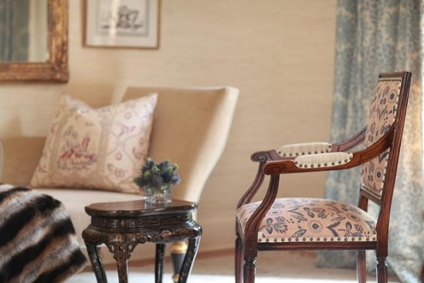
The Merriam-Webster dictionary defines pretty as, “attractive to look at, usually in a simple or delicate way.” When I’m sourcing for inspiration, I sometimes come across rooms that just strike me as being so pretty. When all of the elements of a space come together to create a pretty environment, the room looks so welcoming and pleasant.
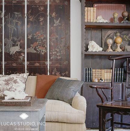
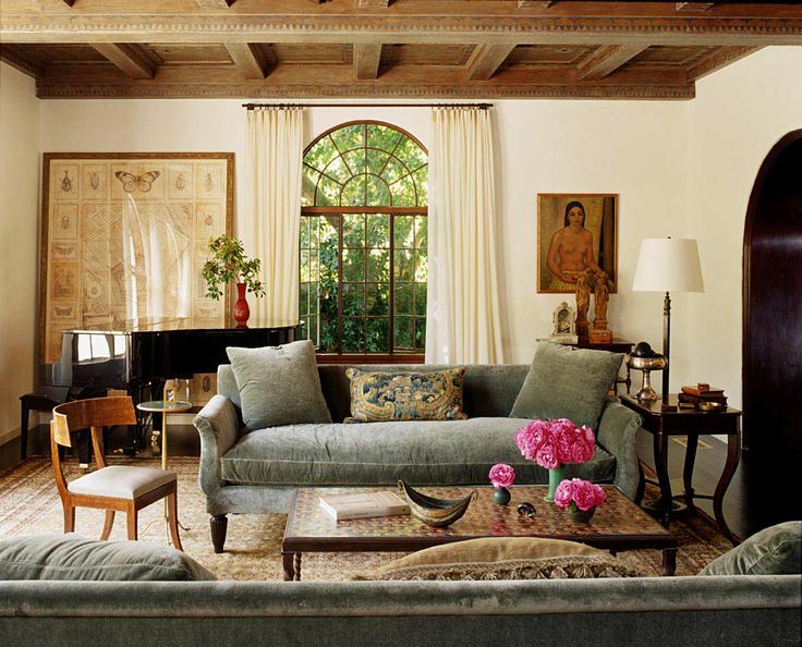
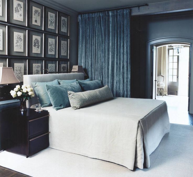
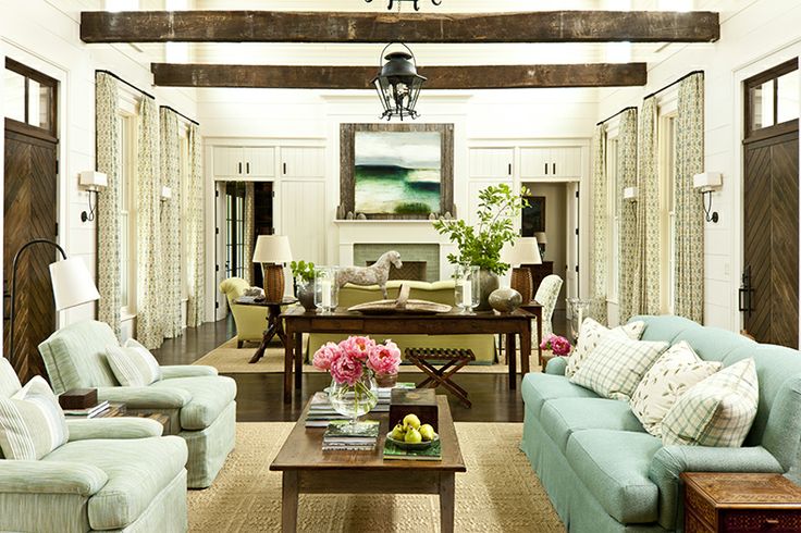
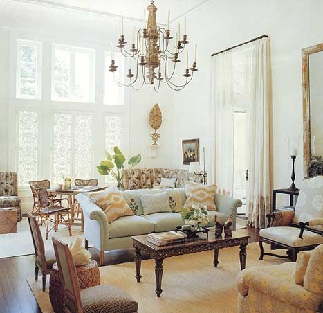
When a room is soft and warm, it is naturally inviting. Pretty rooms are comfortable and charming without being boring or run-of-the-mill. A bright, cheerful room makes a relaxing sanctuary. Making small statements with lighting, accessories, or additional color saves a pretty room from being too cloying. The overall effect is clean, simple, and appealing.
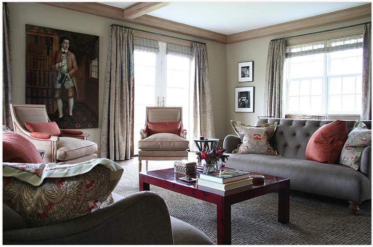
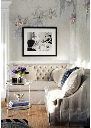
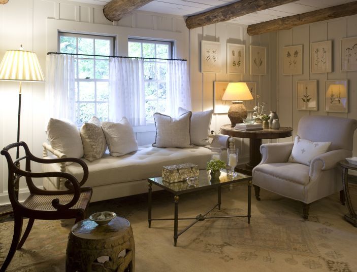
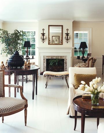
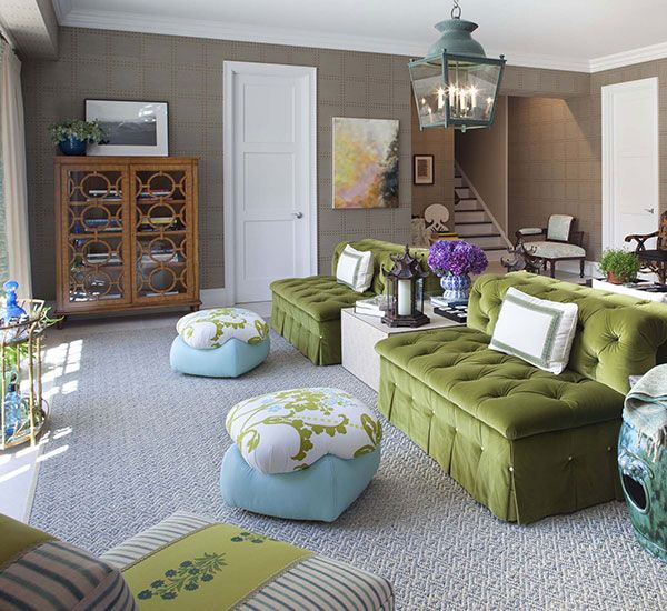
What’s your idea of a pretty room?
Great Articles in Feb 2014 House Beautiful
The current issue of House Beautiful, February 2014, included some really great features.
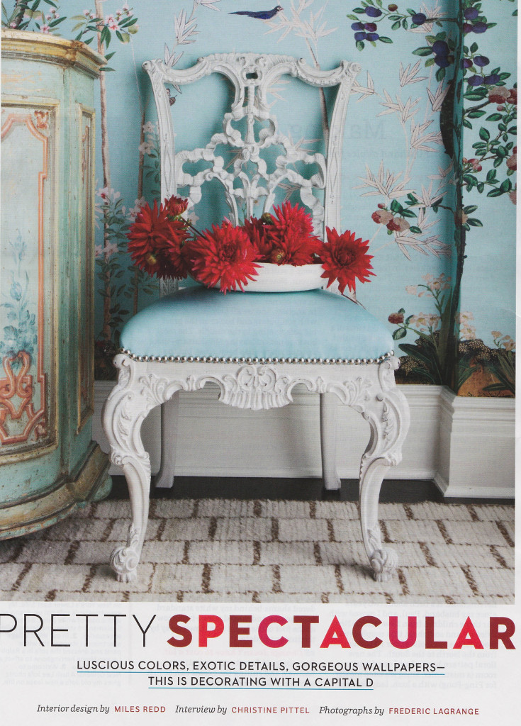
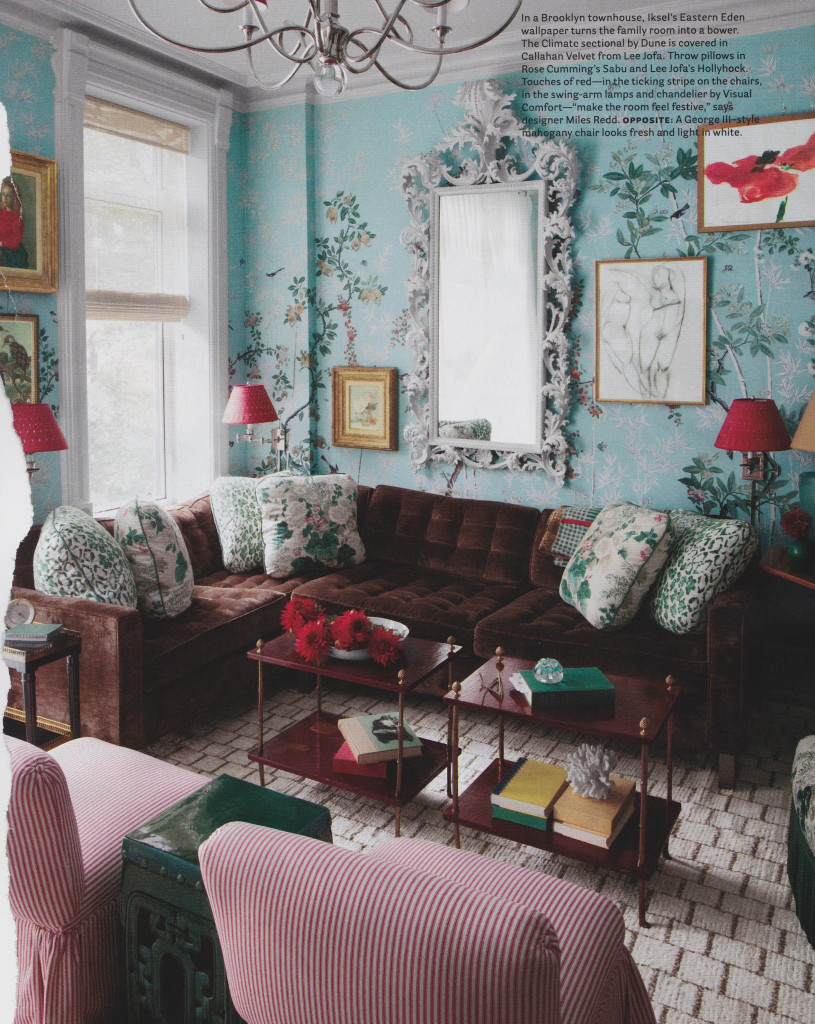
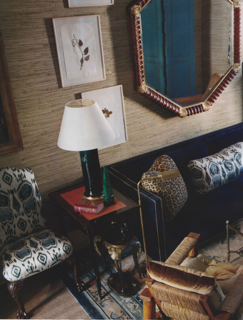
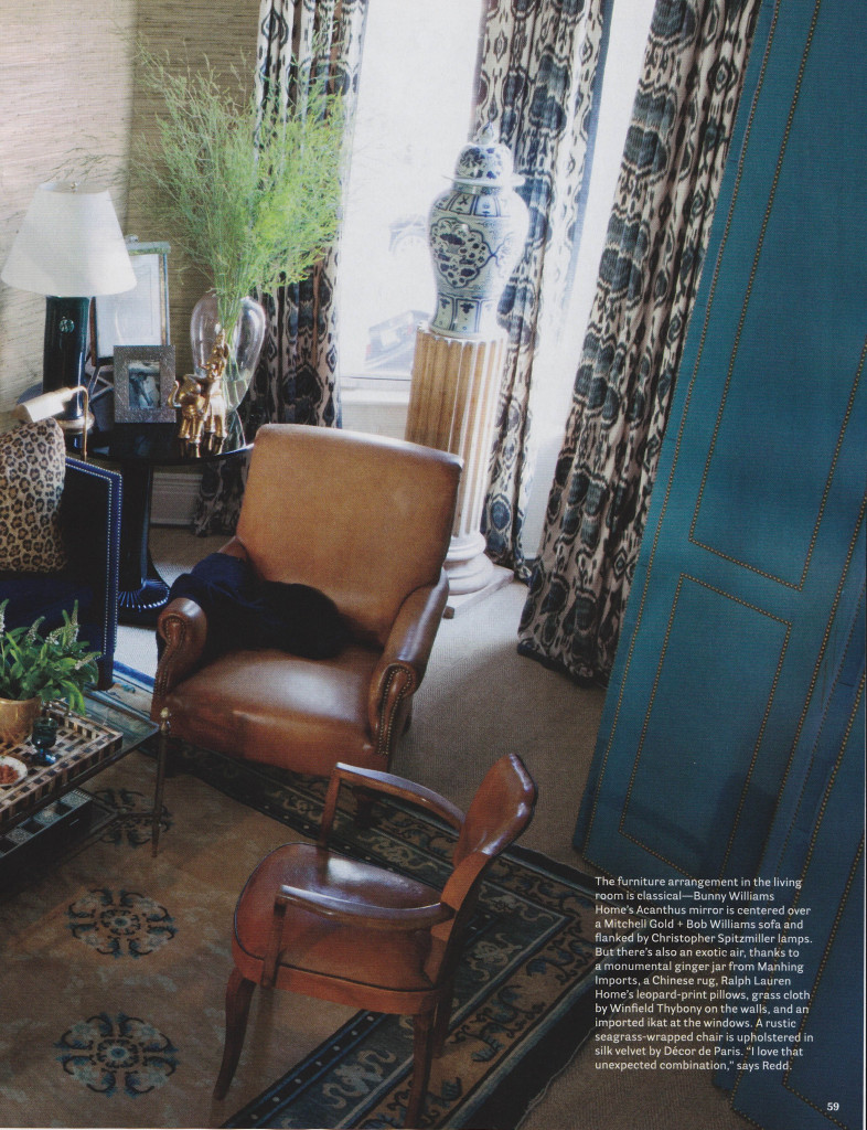
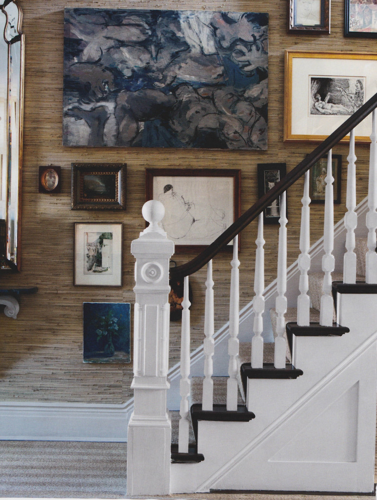
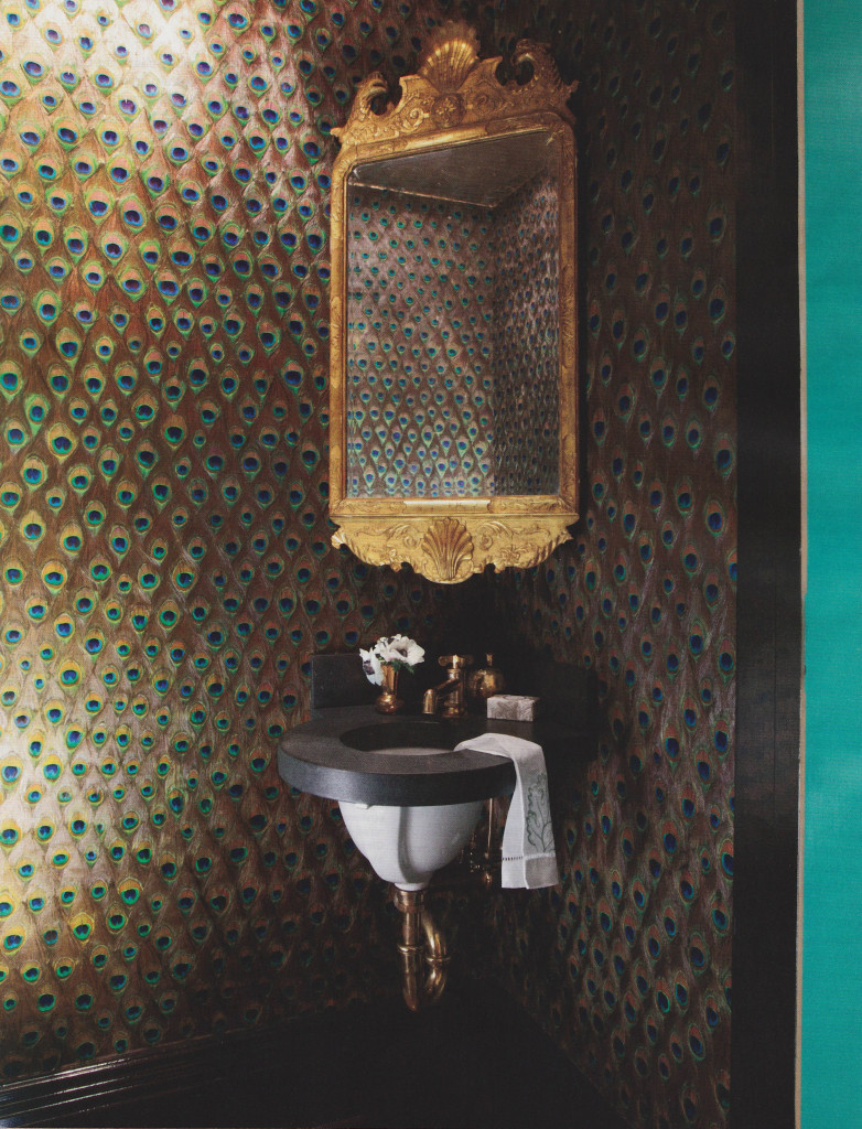
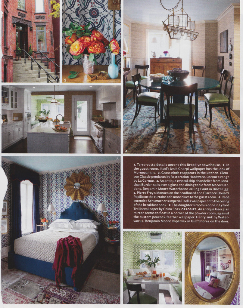
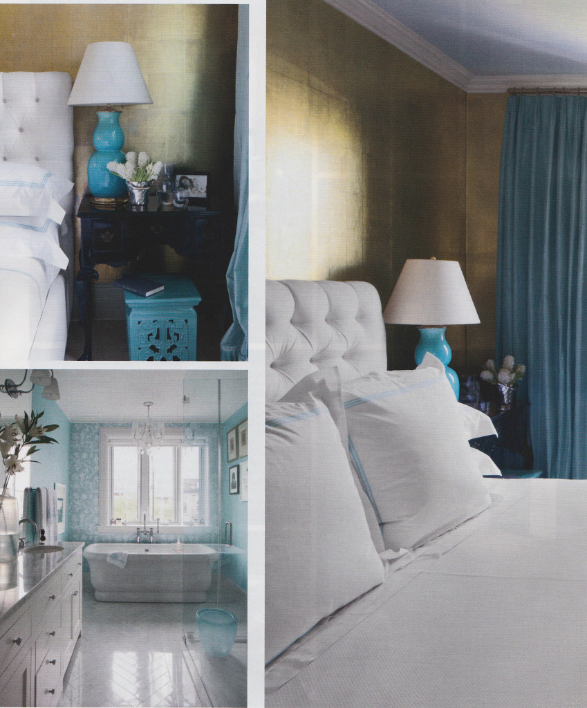
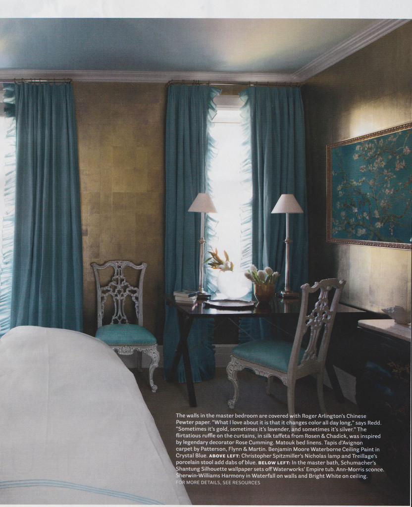
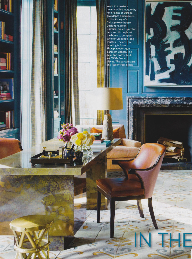
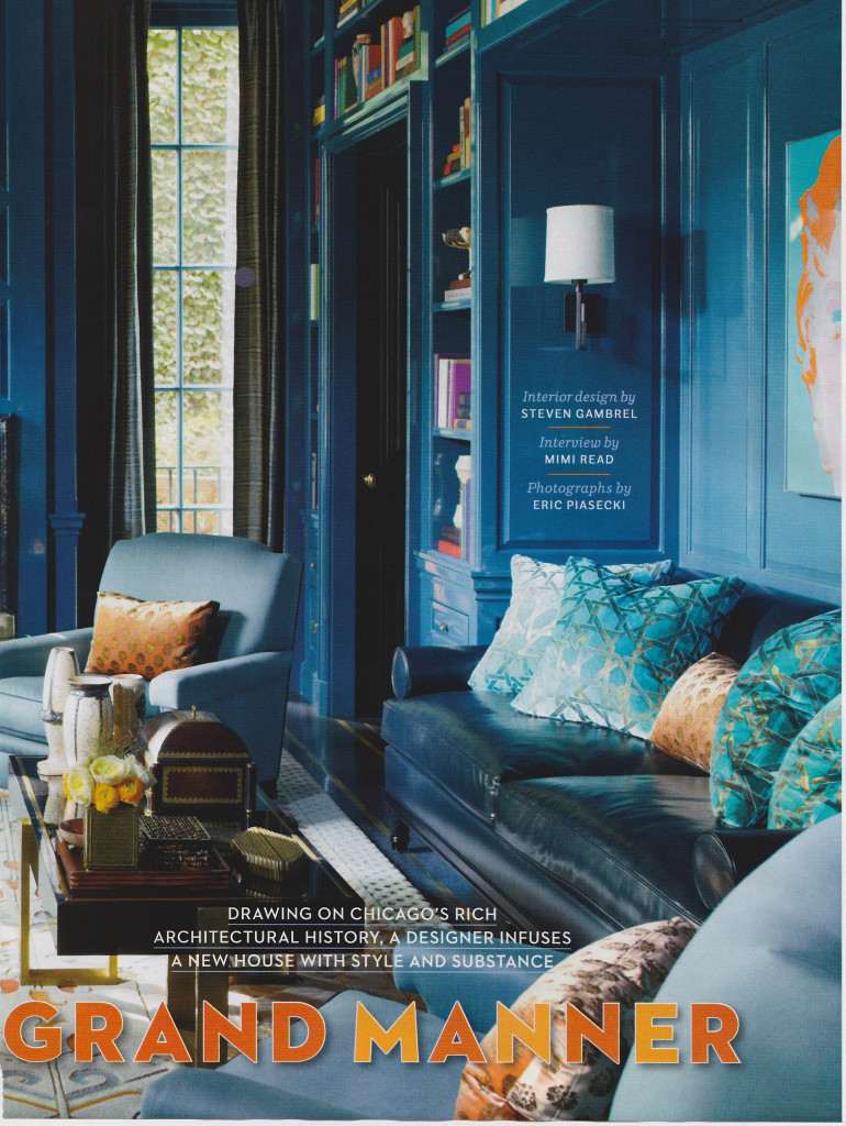
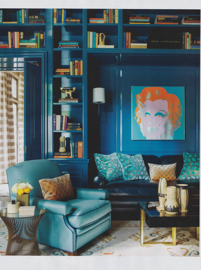
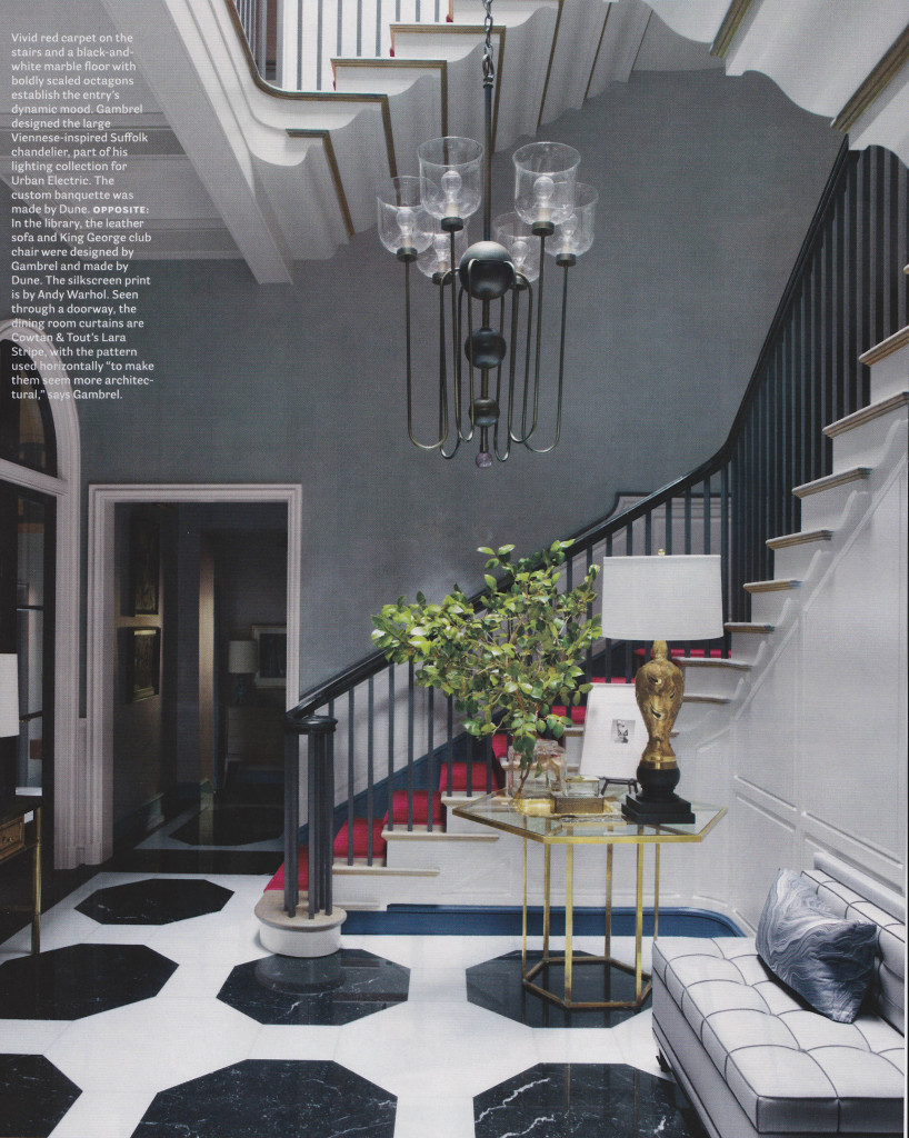
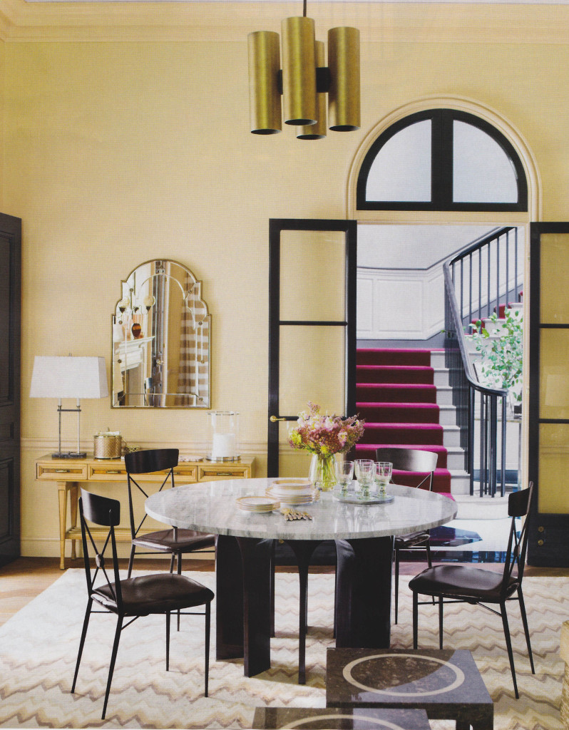
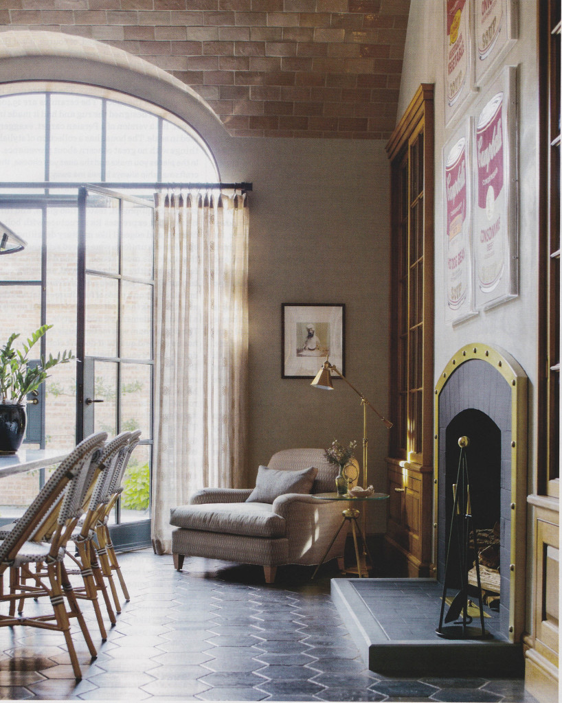
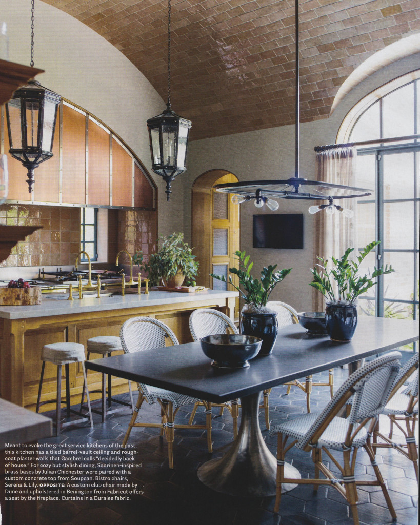
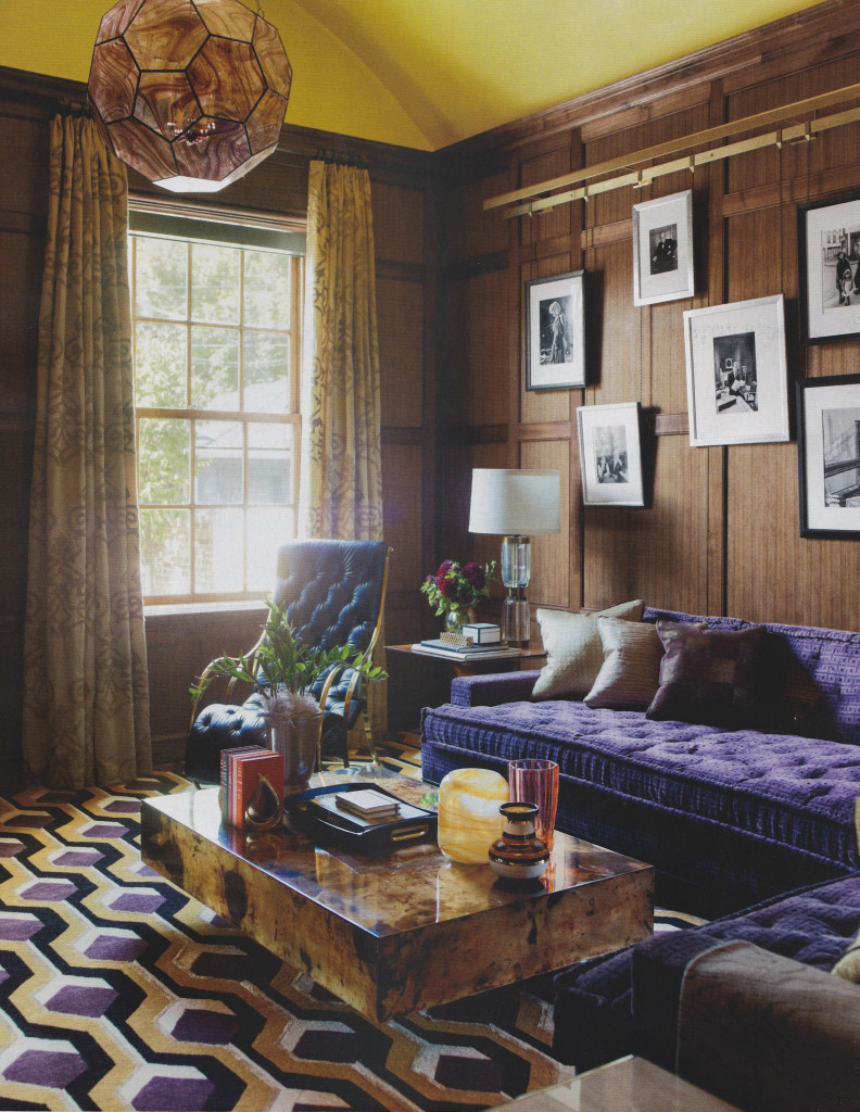
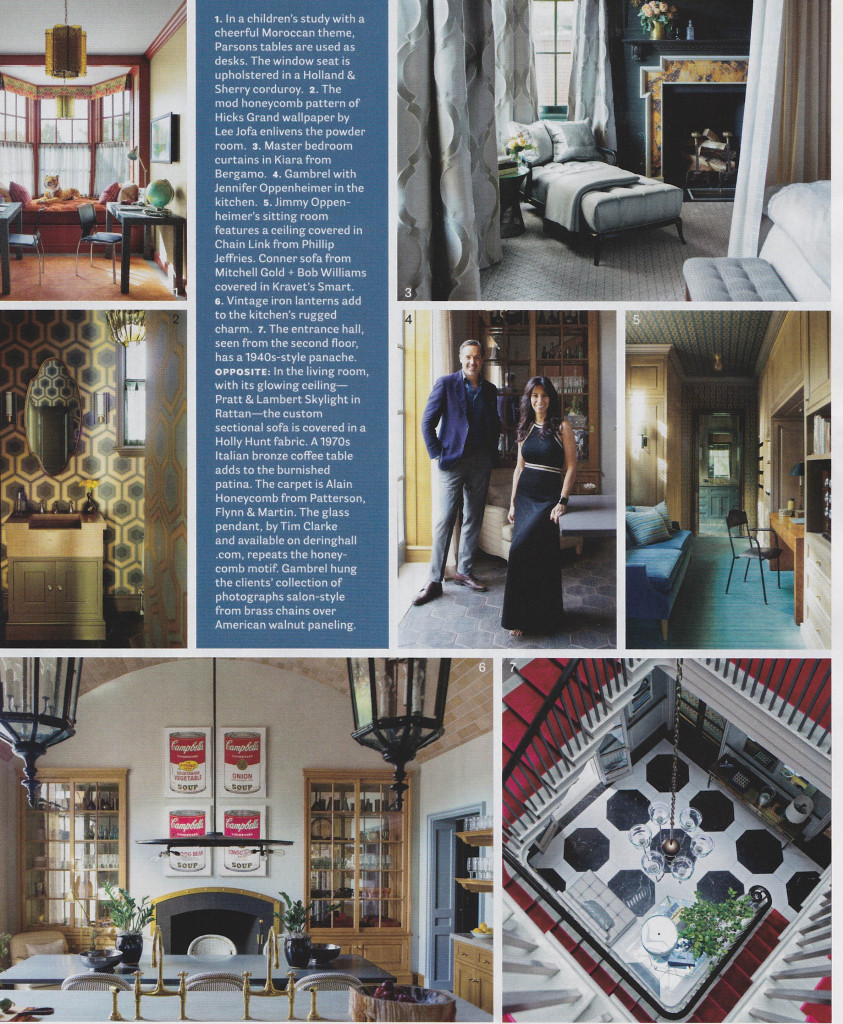
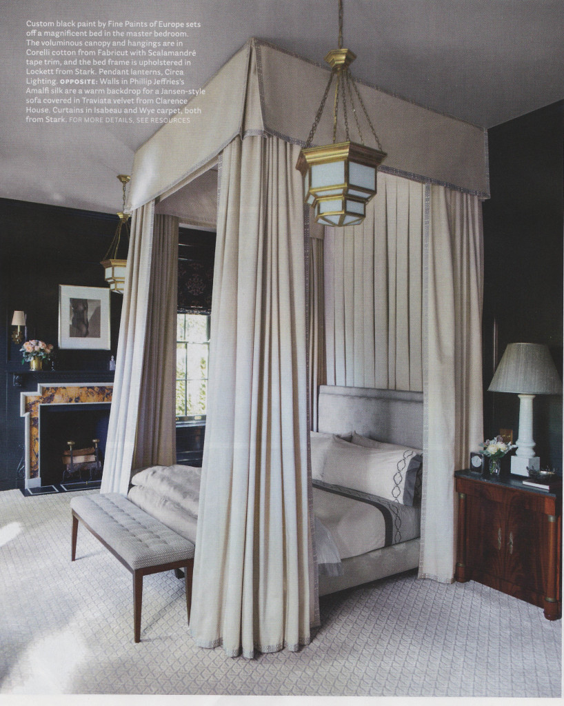
The current issue of House Beautiful, February 2014, included some really great features. Two articles in particular stood out for me; Pretty Spectacular, featuring design by Miles Redd, and In the Grand Manner, featuring design by Stephen Gambrel. Both articles showed how these wonderful designers used an amazing amount of color. From Gambrel’s use of peacock blue lacquer to Redd’s bursts of bold colors throughout a Brooklyn residence, the rich color stands out in these beautiful spaces. The effect is so textural and rich. The saturated colors create warmth and pure decoration, with tons of pattern upon pattern.
When I design for clients, I sometimes struggle between days of preferring clean, sleek interiors, and then days when I love layering with color and just inundating a room with detail. What I love about these features in House Beautiful is how they show that Redd and Gambrel don’t sacrifice on quality and their clientele understand that something so perfectly orchestrated can be comfortable and livable. It is really inspiring! I walked away from this issue wanting to shake off the winter doldrums and do something bold.
Pretty Spectacular
By Christine Pittle. Photos by Frederic Lagrange.
In the Grand Manner
By Mimi Read. Photos by Eric Piasecki.

