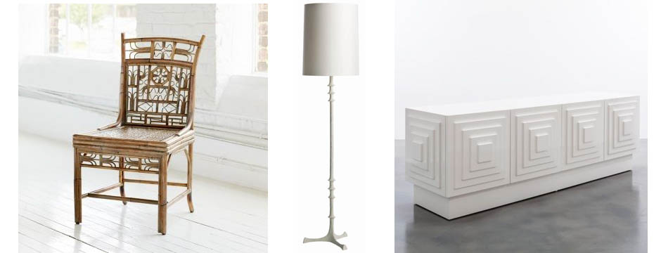
I’ve been working on a project for an existing client’s second home in Boca Raton, Florida. Designing a home that isn’t a primary residence is always nice because you have more flexibility. When you don’t live in the home on a daily basis, you are more open to different ideas and styles. In this case, the home started out with a really dismal interior. In spite of the beautiful location, the original interior of the home was old and dated. In contrast, my client’s family is young, active, and full of life. I wanted the home to reflect that and was thrilled when I was given carte blanche with color.
I used the home’s sunny location as inspiration when designing for this project — warmth, brightness, and palm trees. I decided to go with a bit of a retro throwback look and create a world of turquoise, full of vibrant color that suited my client’s young family and the lush surroundings.
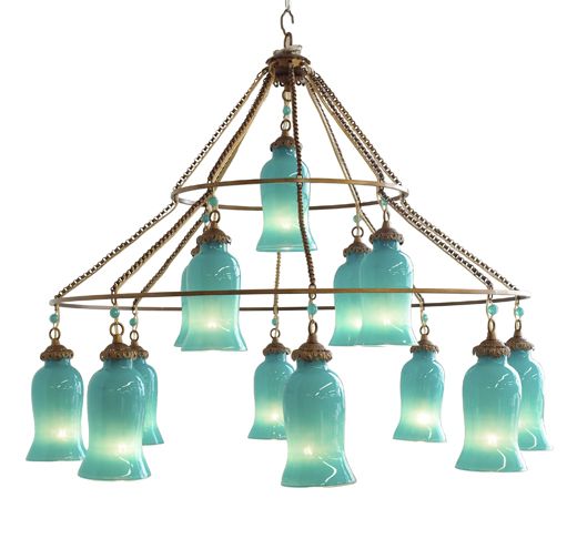
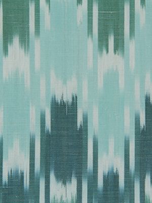
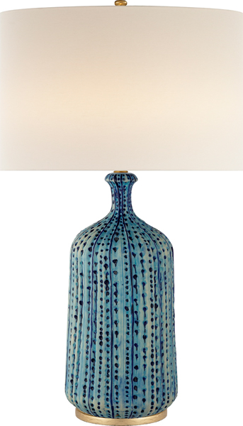
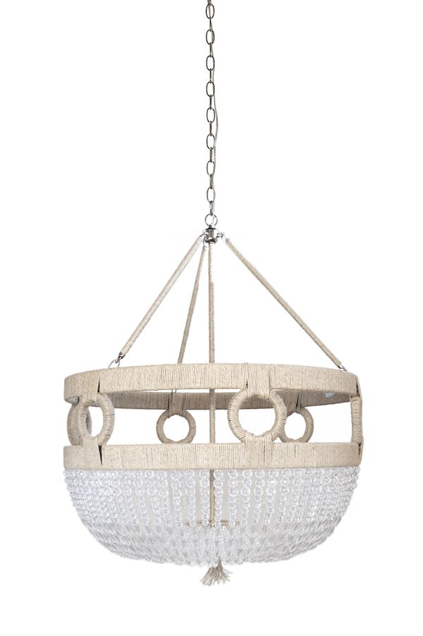
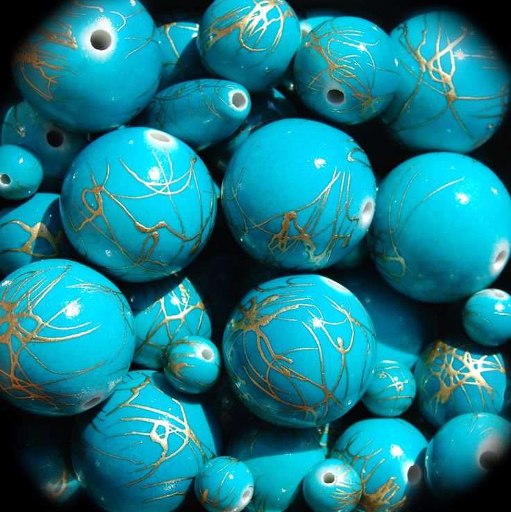
Balancing the turquoise, I incorporated plenty of crisp white, keeping the home’s exiting tile because it reminded me of sand. I wanted the home to look glamorous and have a polished, retro style but also be user-friendly. I tested different fabrics by actually pouring red wine onto them!
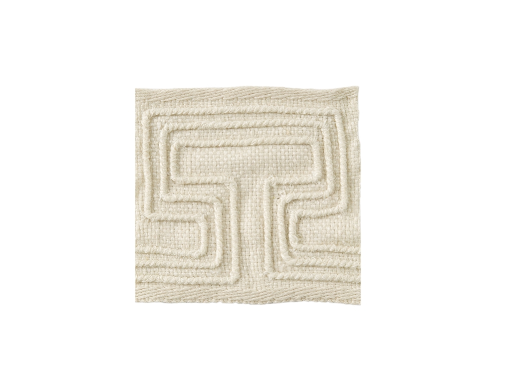
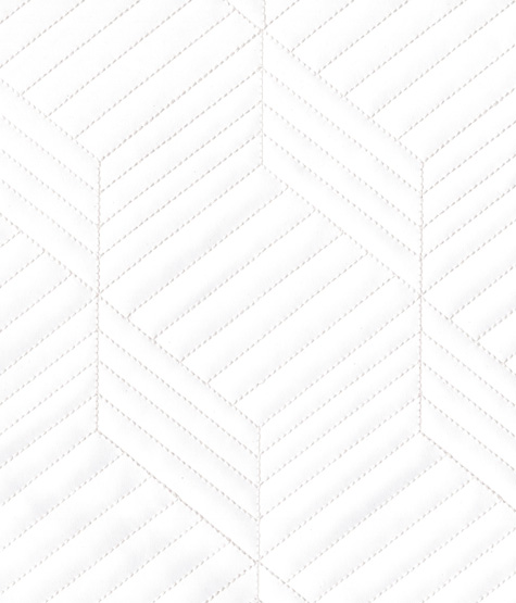
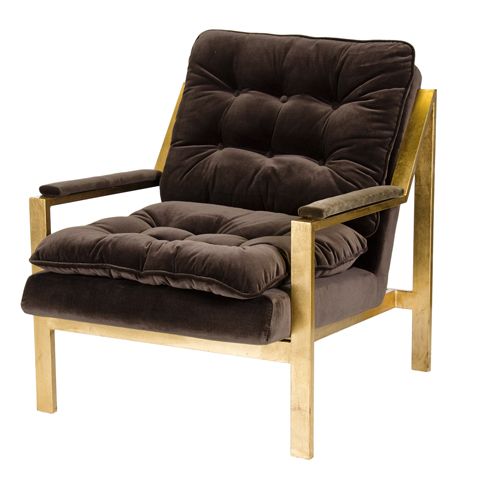
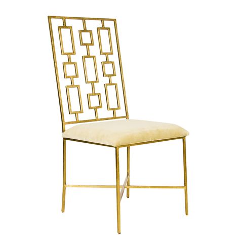
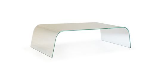
My client likes mid-century pieces, so I kept that in mind when choosing furnishings.
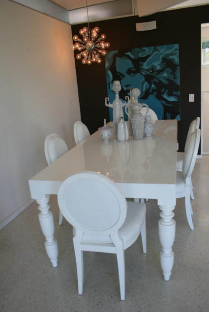
For art, we went with bold choices that have a different vibe than you typically see here in Connecticut. With the turquoise inserted everywhere, I am confident the final results of this project will be stunning!
Stay tuned for installations photos, coming soon!

