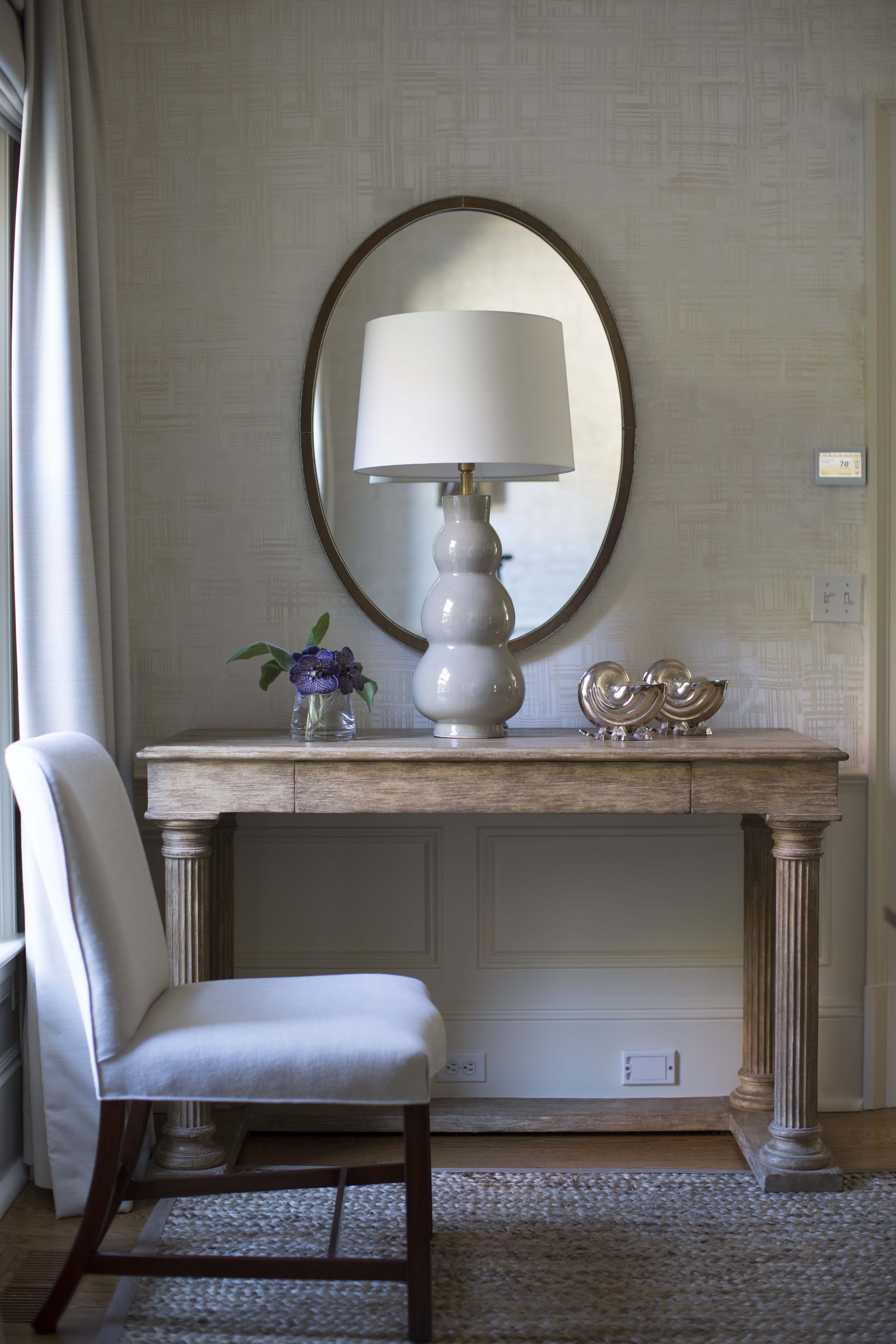
Came across this image — so inspiring. Fresh & simple.
Design by Tamara Magel.
Photo by Rikki Snyder.
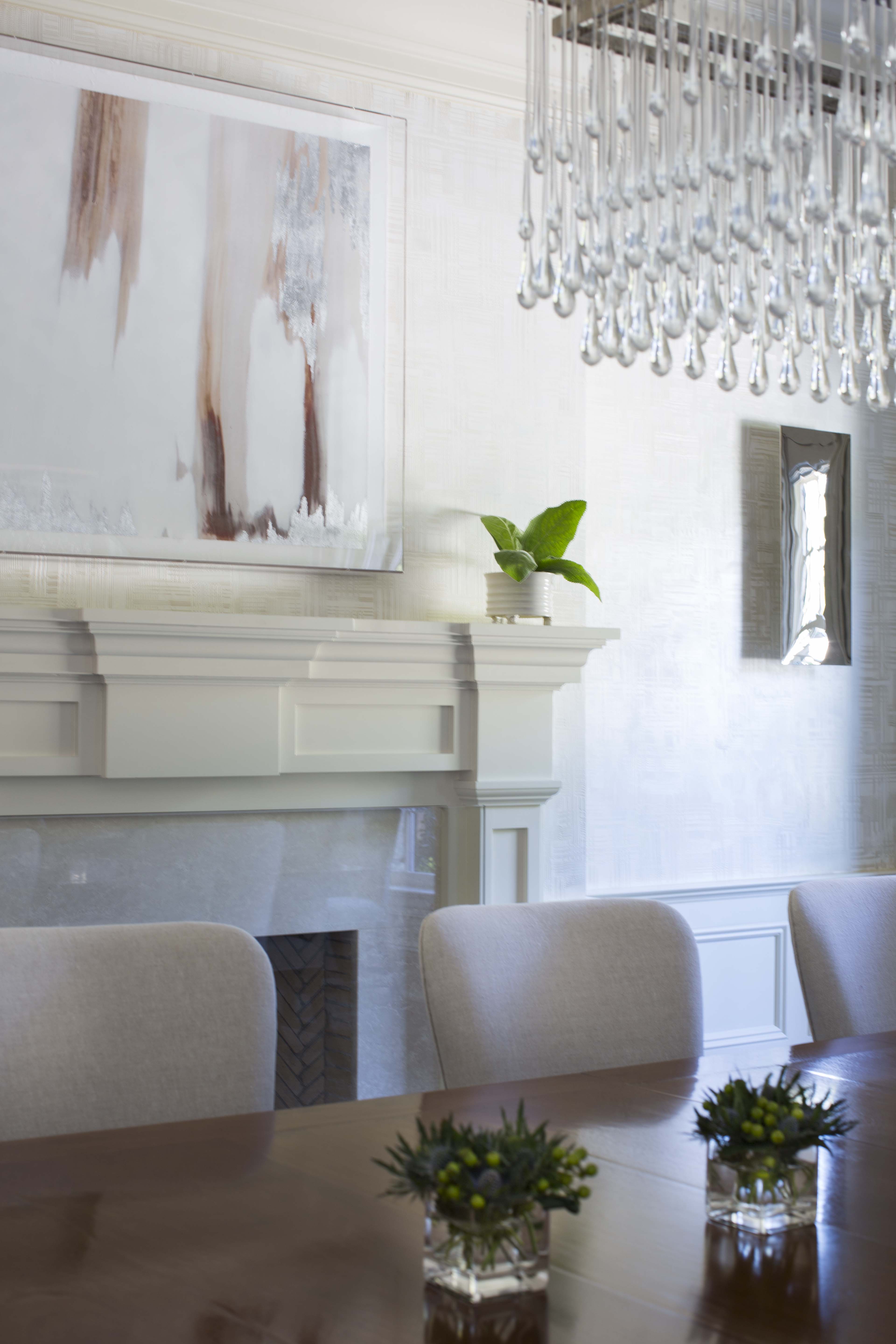
Design by Tamara Magel.
Photo by Rikki Snyder.
In the dining room, a credenza is ideal for added storage and provides a great surface to serve from.
A credenza is a large, closed cabinet often used as a sideboard or a buffet. In the dining room, a credenza is ideal for added storage and provides a great surface to serve from. We often use custom pieces to meet a client’s individual needs, an option that allows us to integrate the credenza’s interior into the design. A custom credenza gives you added flexibility for size, style, color, and material for a super unique look. Additionally, a credenza provides structure and a foundation for lamps and art. It grounds a space. I love using elements such as shagreen and ebony or two dimensional doors. When working with a craftsman, you can trick out a credenza for a memorable, one of a kind piece. Here are some of my favorite examples of gorgeous credenzas.
Morgan Console from Four Hands
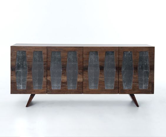
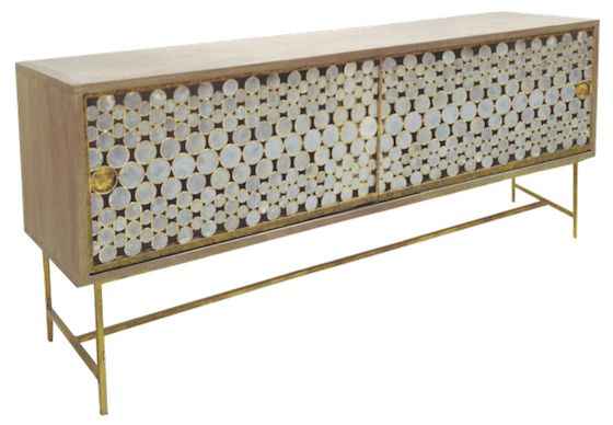
Irwindale Buffet from Theodore Alexander
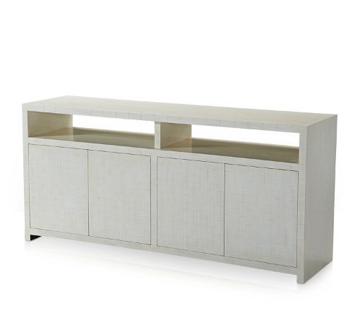
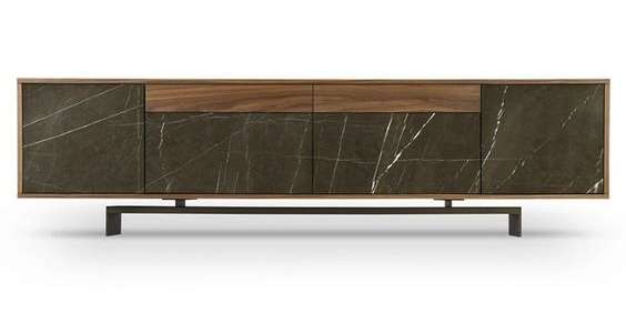
Tompkins Buffet from Wud Furniture Design
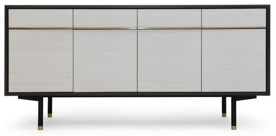
Rondelle Credenza by John Pomp
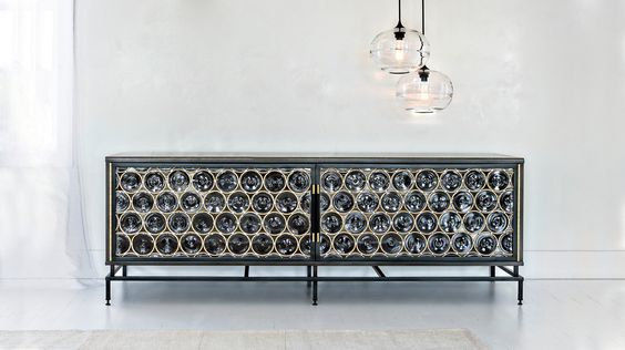
Fumed Oak Credenza from ISOM
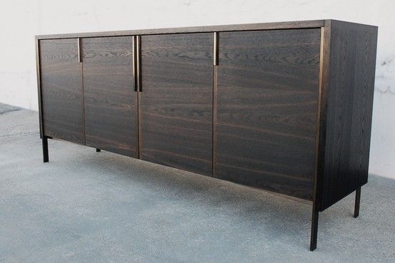
Milano Mystic Buffet from Ercole Home.
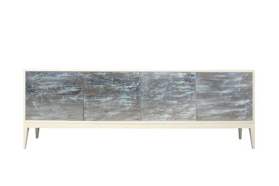
Harper Side Board from Precedent Furniture
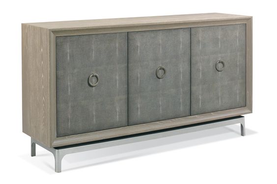
Painted Credenza from Jeff Martin Joinery
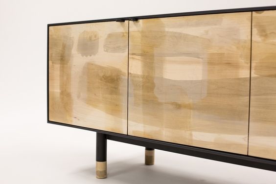
Ingemar Cabinet from KGBL
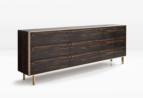
Raised Front Ebonized Floating Credenza from 1st Dibs
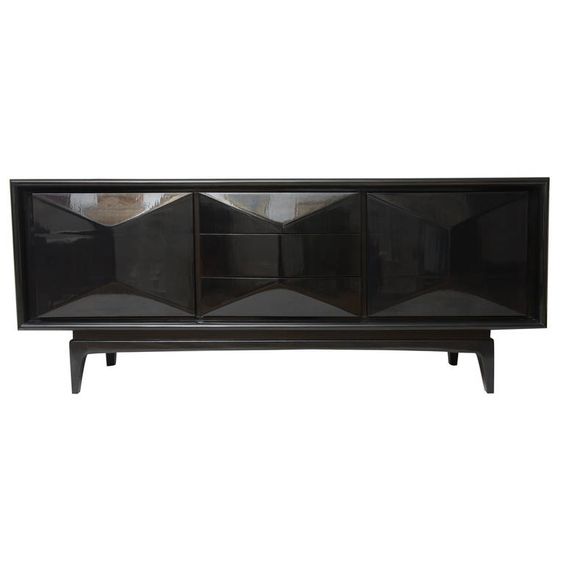
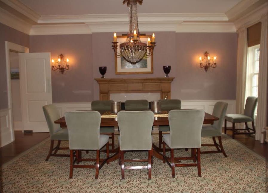
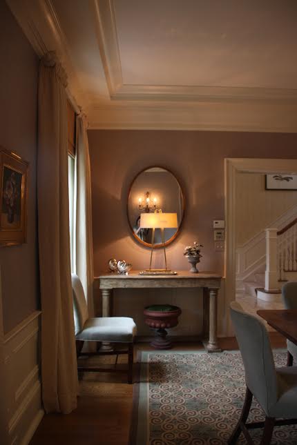
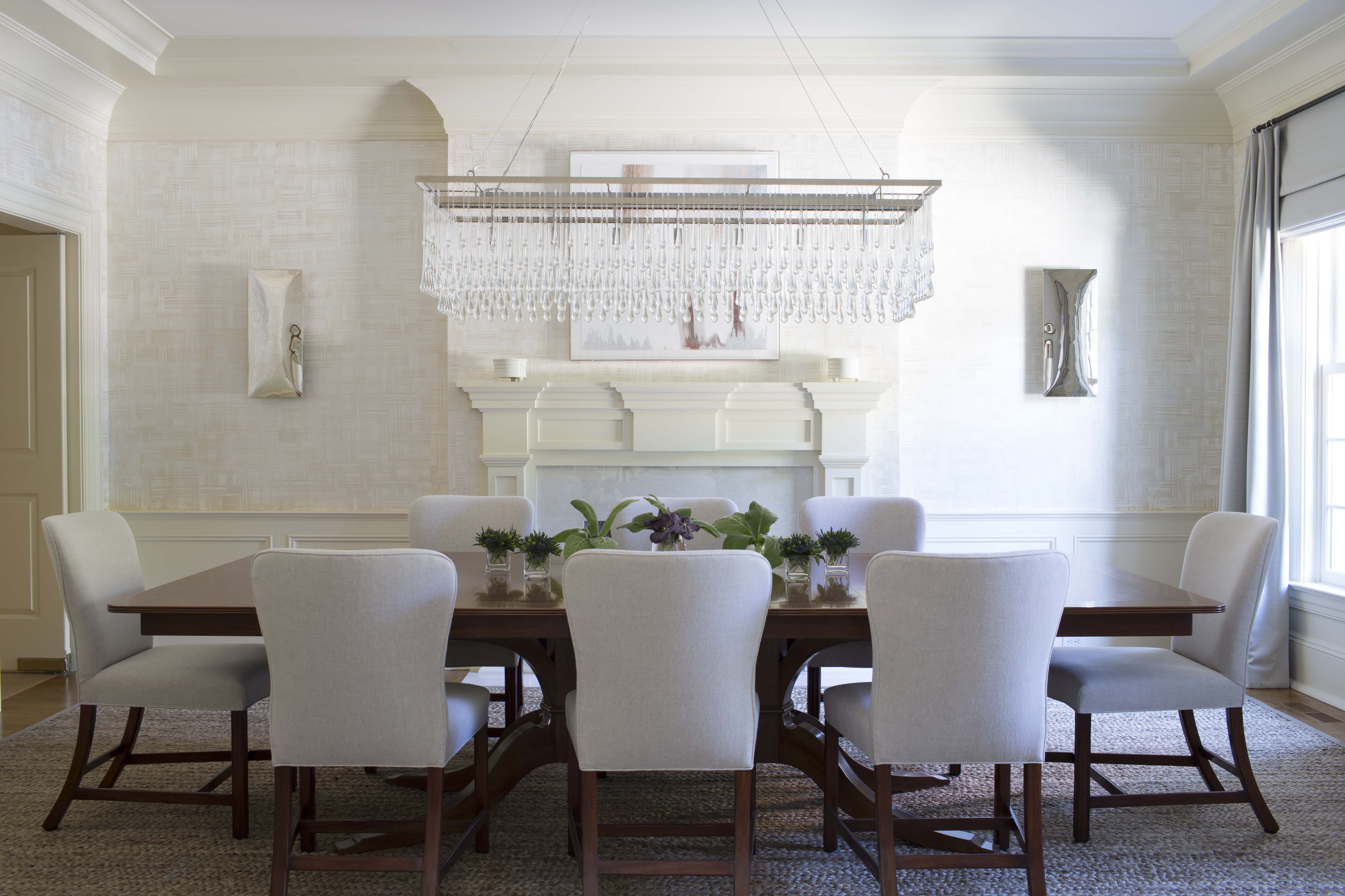
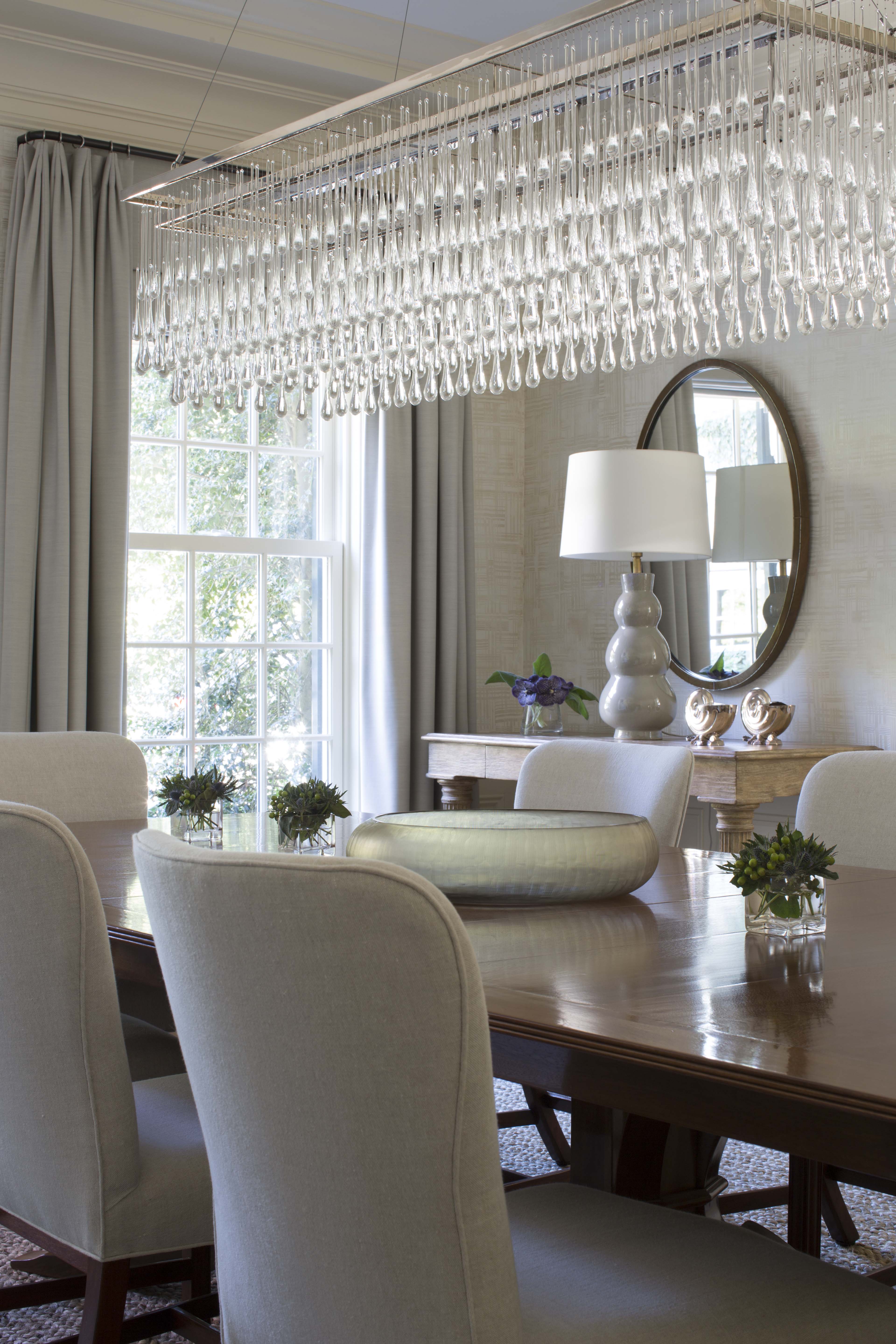
While this dining room was a good size and had some nice features, it lacked a cohesive, finished design.
Last week, I shared some before and after photos of a library we designed for a client. Today’s before and after features another room in that same home — this time, the dining room. Like the library, the dining room needed a facelift to brighten and update the space. While the dining room was a good size and had some nice features, it lacked a cohesive, finished design.
To see more photos of our design projects, visit my website or my Houzz profile.