Darryl Carter’s Washington Store and Studio Restoration

When Darryl Carter, a favorite designer of mine, purchased the property for his new store and studio in Washington, the buildings were rundown and in need of a serious amount of work from years of neglect and decay.

When Darryl Carter, a favorite designer of mine, purchased the property for his new store and studio in Washington, the buildings were rundown and in need of a serious amount of work from years of neglect and decay.  Missing windows and a lack of working plumbing were only two of the building’s issues, but Darryl Carter was able to see past the blemishes to the building’s structure, history, and potential.  With the help of his own design team, Wnuk Spurlock Architecture, and Glass Construction, Carter succeeded in transforming the property.
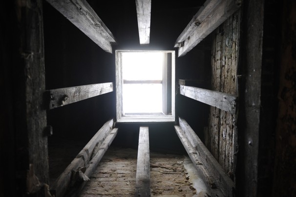
This original skylight was kept in place during the restoration project.
The exposed brick became an important part of the finished space.
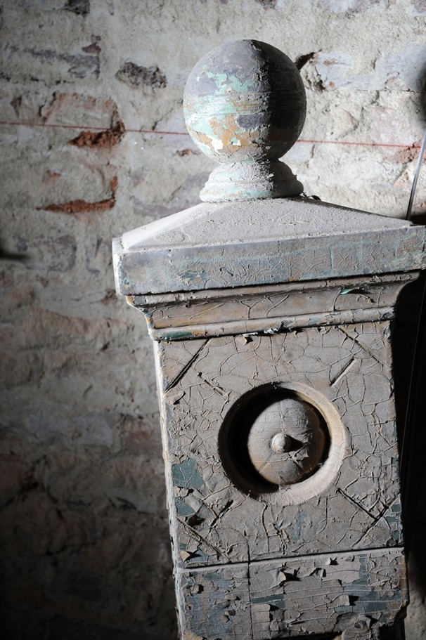
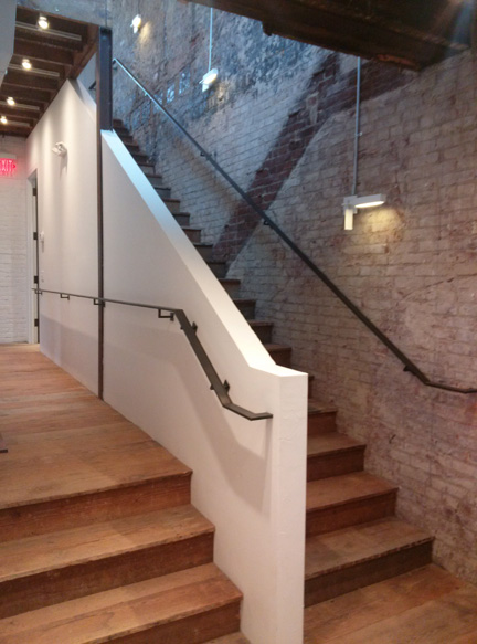
Part of a salvaged staircase.

With parts of the building dating to the pre-Civil War era, Carter was able to use many original aspects of the property to his advantage.  Wood beams, exposed brick, and other elements were salvaged during the restoration and incorporated into the final design.  Other materials for the store and studio have been salvaged from other places, including arched glass doors from Georgetown’s Dunbarton House, reclaimed timbers from the former embassy of the Central African Republic, and granite blocks from Baltimore’s Druid Hill.  The amount of vision that went into transforming the main building and carriage house from near ruin to completely beauty is incredible!
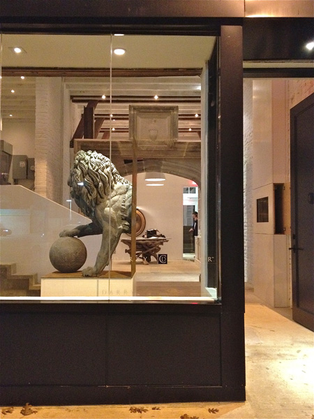
The finished storefront.
I love how the “ghost” of the original stairway is still visible!
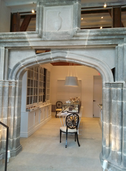
A gorgeous stone archway.
The finished store features so many rooms for shoppers to explore.

To see more examples of Darryl Carter’s designs, you can visit his website or find him on Facebook.  He also published The Collected Home and The New Traditional, both of which are great interior design books for any collection.


Windsor Smith

I adore Windsor Smith’s designs, from her interiors to her own home line.

I adore Windsor Smith’s designs, from her interiors to her own home line.  She’s an amazing designer and very clever about choices, making the success of her many ventures no surprise.

One of my favorite projects involving Windsor Smith was her collaboration with Veranda magazine on the House of Windsor.  This first ever Veranda concept house, located in Los Angeles, California, featured Windsor Smith’s architectural design as well as the skills of several other notable designers such as Martyn Lawrence Bullard, Kathryn M. Ireland, Richard Hallburg, and others.  The creation of this dream house was a very cool concept.  Proceeds from the open house ticket sales and VIP events benefited two charities for children, the Children’s Action Network and P.S. Arts.

Veranda’s website about the House of Windsor is really interesting.  It shows the floor plan of the concept house as well as 360 degree tours of each room in the home, including exterior areas like the courtyards and stables.  You can even browse specific designers involved with this project and watch videos featuring each designer’s thoughts and experiences.  The House of Winsdor was a huge undertaking based on a truly grand vision.  Veranda’s unveiling of the home showed it to be very well executed.

House of Windsor floor plan.
Entry hall, designed by Windsor Smith, is wide enough to serve as a dining room for entertaining on a grand scale.
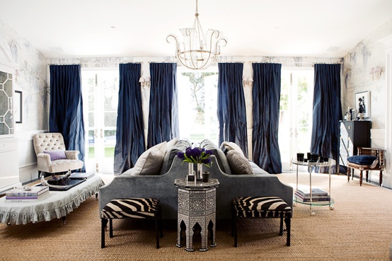
A graceful room with back to back sofas for increased seating and entertaining.
Geometric pattern on the carpet offsets the chinioserie on the walls.
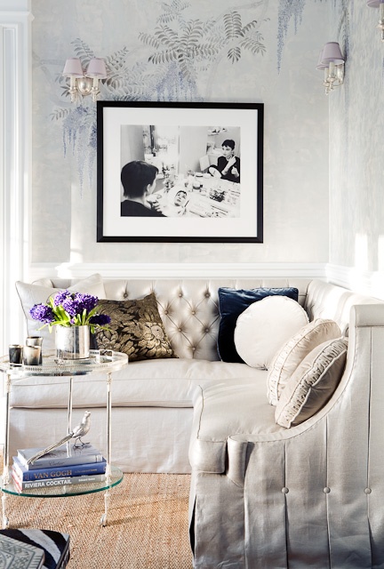
The use of a corner sofa is very smart, and the wallpaper is beautiful!

Windsor Smith uses beautiful products in her designs.  I love the way her rooms are layered and how everything looks perfectly collected.  She can be bold, but her interiors never look too decorated.  They seem effortless and timeless.  Windsor Smith’s own collection reflects her design style, featuring furnishings that are as well thought out and executed as all of her other projects.

Samantha scroll arm chair.
Moroccan ottoman: Great style and size.
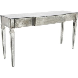
Mirrored console: Super chic!
Colony breakfront.
Insignia printed pattern: Great for window treatments. Check out all of the color ways.

To see more of Windsor Smith’s designs, visit her website.  You can also see her Collection, find her on Facebook, and follow her on Pinterest.


Jeffrey Bilhuber

I adore Jeffrey Bilhuber for so many reasons.

Since founding Bilhuber and Associates in 1984, Jeffrey Bilhuber has earned his place as one of the world’s top interior designers.  He’s been published in more than 50 design books and been featured in every nation and international design magazine.  He’s completed projects from New York to London and exudes such an accessible philosophy that he’s been invited to appear on shows such as The View and Conan O’Brien as well as HGTV.  His Bilhuber Basics line for Stark Carpets increased his name recognition as did the success of his first book, Jeffrey Bilhuber’s Design Basics, as well as his next two books, Defining Luxury and The Way Home:  Reflections on American Beauty.  Jeffrey is known for blending traditionalism with modern sensibilities to produce beautiful and practical interiors uniquely suited to each client.  His career and clientele so far have been really amazing so far!

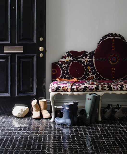
Love the suzani and the black floors.
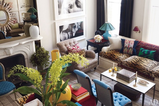
More layers and textiles. Great combinations!

I adore Jeffrey Bilhuber for so many reasons.  Each of his spaces is the perfect collected mix of details and fearless, unexpected, fascinating touches.  His designs feature vivacious colors and timeless, sophisticated beauty.  He implements top-notch finishes and creates these layered interiors that I really admire.  Everything from his color selections to the way he uses big plants or bunches of grapes to bring a human element to a room resonates with me and certainly inspires me.  When I find a stack of new design magazines in my mail box, I can’t wait to see Jeffrey Bilhuber designs among the pages.

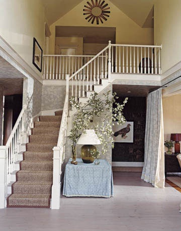
I love this foyer: light, simple, and comfortable.
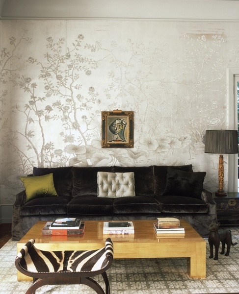
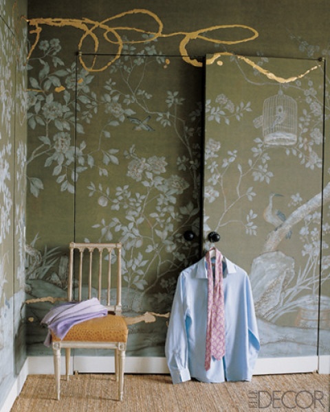
Truly a bold statement with the gilt paint on the de Gournay panels.

My own designs have definitely been influenced by Jeffrey’s work.  He inspires me to use the unexpected but still be timeless.  I know when I give my clients examples from Jeffrey’s designs, we build a relationship of trust and confidence to maybe take design risks they might not otherwise have considered.  I wouldn’t copy Jeffrey’s ideas, of course, but reinterpret elements and make them my own.  The magnitude of his design is so big, other designers can learn so much just from just from taking a bit here and there to adapt to their own style and their clients’ needs.

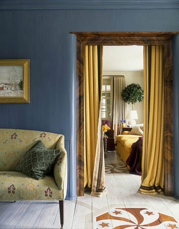
The color combination is luscious with a stunning hand-painted detail on the floor.
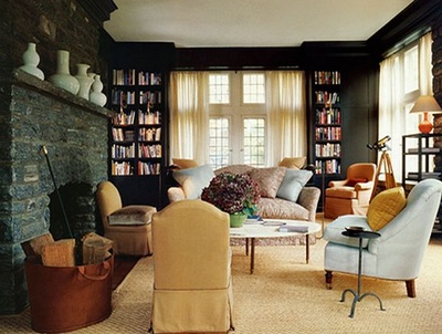
The backdrop of the black against the light sisal area rug is a great contrast.


Fashion

It probably comes as no surprise that fashion and interior design are closely linked. A passion for one usually includes a strong interest in the other and we can see overlapping trends in color and texture.

It probably comes as no surprise that fashion and interior design are closely linked.  A passion for one usually includes a strong interest in the other and we can see overlapping trends in color and texture.  I know I’m not alone in my love of both fashion and interior design!

What is it about fashion that appeals to designers?  I think it’s the creativity and individual expression allowed by both.  Fashion designers often take risks, combining materials and colors in unconventional ways.  They focus on details, on creating a certain mood or feel, and typically have their own signature style.  Like interior design, fashion often includes unique uses of materials, layers of textures, and important accessories.  You don’t see a model sauntering down the runway without jewelry, makeup, a hand bag, and a gorgeous hairstyle.  For the same reasons, a thoughtfully designed room has its own accessories that are crucial to the overall design.

Being both a mother and a busy designer, actually wearing the fashions I love on a daily basis is sadly impractical.  As much as I’d adore spending my days looking fabulous, some styles just aren’t meant for grade school concerts, installs at new construction, or afternoons at the playground.  If I could have my way, however, these are some of the gorgeous fashions I’d be seen in!

LV - The skirt reminds me of a laser cut leather pillow I just installed.
Louboutins.
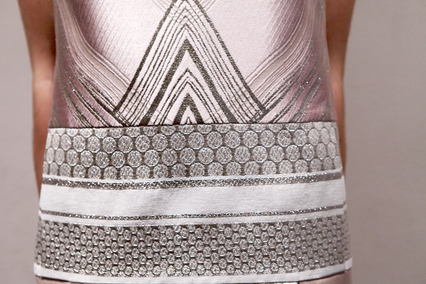
Love the metallic embroidered detail.
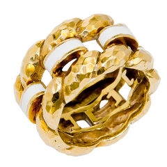
Enamel hand hammered ring - so cool!
Chanel
Alexander McQueen - Absolutely love the structure!
Victoria Beckham - Fabulous shoe!
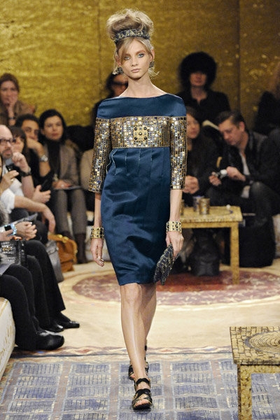
Chanel - Arabian Nights

I may not be able to spend my days dressed as a runway star, but I do love my high heels.  Anyone who knows me, knows I wear heels every day.  It actually becomes comical sometimes when I visit new construction.  The contractors comment on the heels and occasionally have to improvise platforms as we tour the site!  I can’t run around in high fashion, but at least I still have my high heels!
 

*Cover image via Felicity Brown


Jeffrey Bilhuber Lecture and Luncheon

Earlier this week I had an incredible time at the Jeffrey Bilhuber Lecture and Luncheon, hosted by the Greenwich Historical Society.

Earlier this week I had an incredible time at the Jeffrey Bilhuber Lecture and Luncheon, hosted by the Greenwich Historical Society and exclusive media sponsor Connecticut Cottages and Gardens.  Jeffrey Bilhuber has long been one of my all-time favorite designers.  I find his style so inspirational, with his use of amazing color combinations and his knack for layers.  He has such an extravagant, eccentric design flair and a fascinating personal story.  When I heard about this event to benefit the Historical Society, I knew I couldn’t pass up the opportunity to hear Jeffrey Bhilhuber speak and showcase his new book, The Way Home: Reflections on American Beauty.

Jeffrey’s lecture demonstrated his mastery of design and set my mind spinning with ideas and possibilities.  His creative design concepts never fail to amaze me.  One particular highlight of the luncheon was the chance to meet Jeffrey and speak to him face-to-face.  If you’ve ever had the opportunity to meet someone you’ve long looked up to as an inspiration and icon, you can imagine how I felt at that moment!

Photo by Neil Landino

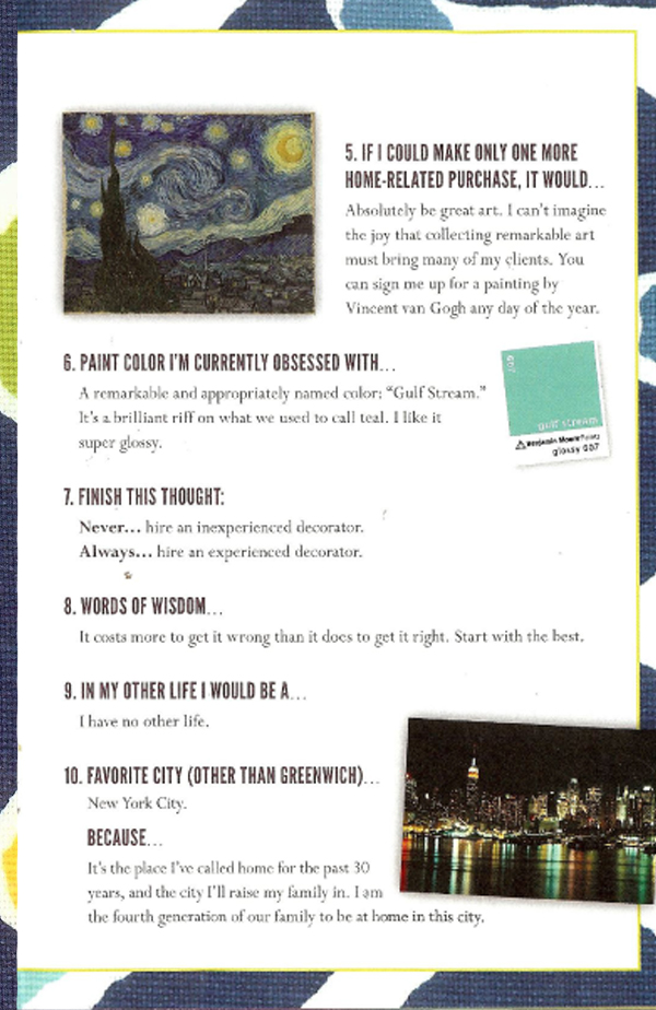
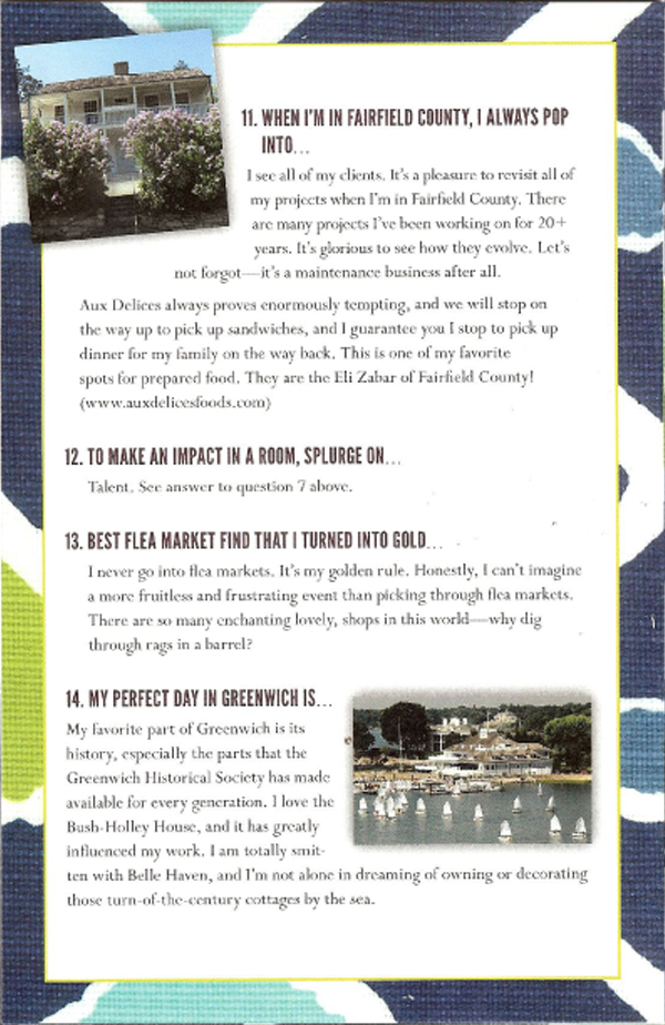
I loved this brochure handed out at the luncheon.  Titled “Jeffrey Bilhuber Unedited,” it listed Jeffrey’s responses to 14 prompts about his favorite things and places, featured a very cool design,  and included references to unique Greenwich spots!