ne thing I’ve learned as an interior designer is that people love before and after photos! I am a huge fan of them myself.
One thing I’ve learned as an interior designer is that people love before and after photos! I am a huge fan of them myself. It’s always insightful and fascinating to see the prior space and compare it to the final product. Today I gathered together some informal before and after shots featuring a few of my own projects and hope you enjoy looking at these transformations!
This is a client’s entry before renovations started. The home is a 1920’s residence and some of the decor was rather antiquated.

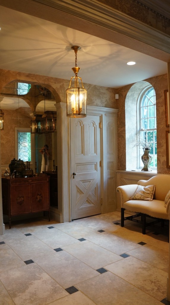
To update this entry, we opened it up and brightened the area by stripping and lightening the woodwork. We maintained the entry’s architectural integrity but created a much more welcoming area.

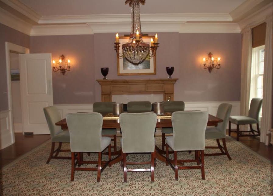
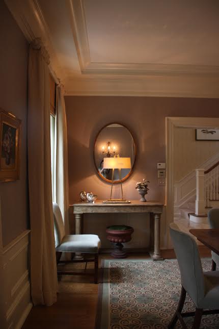
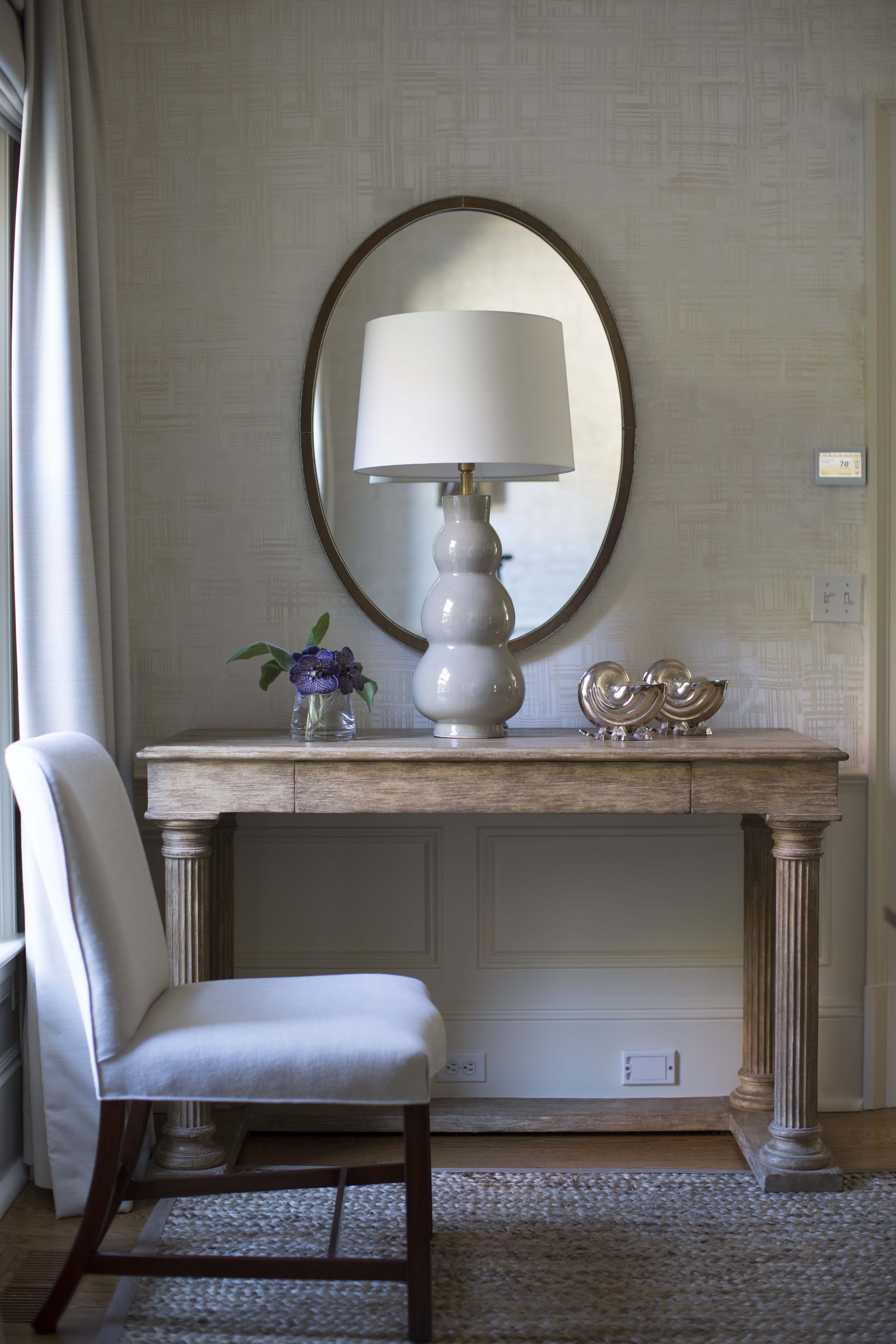
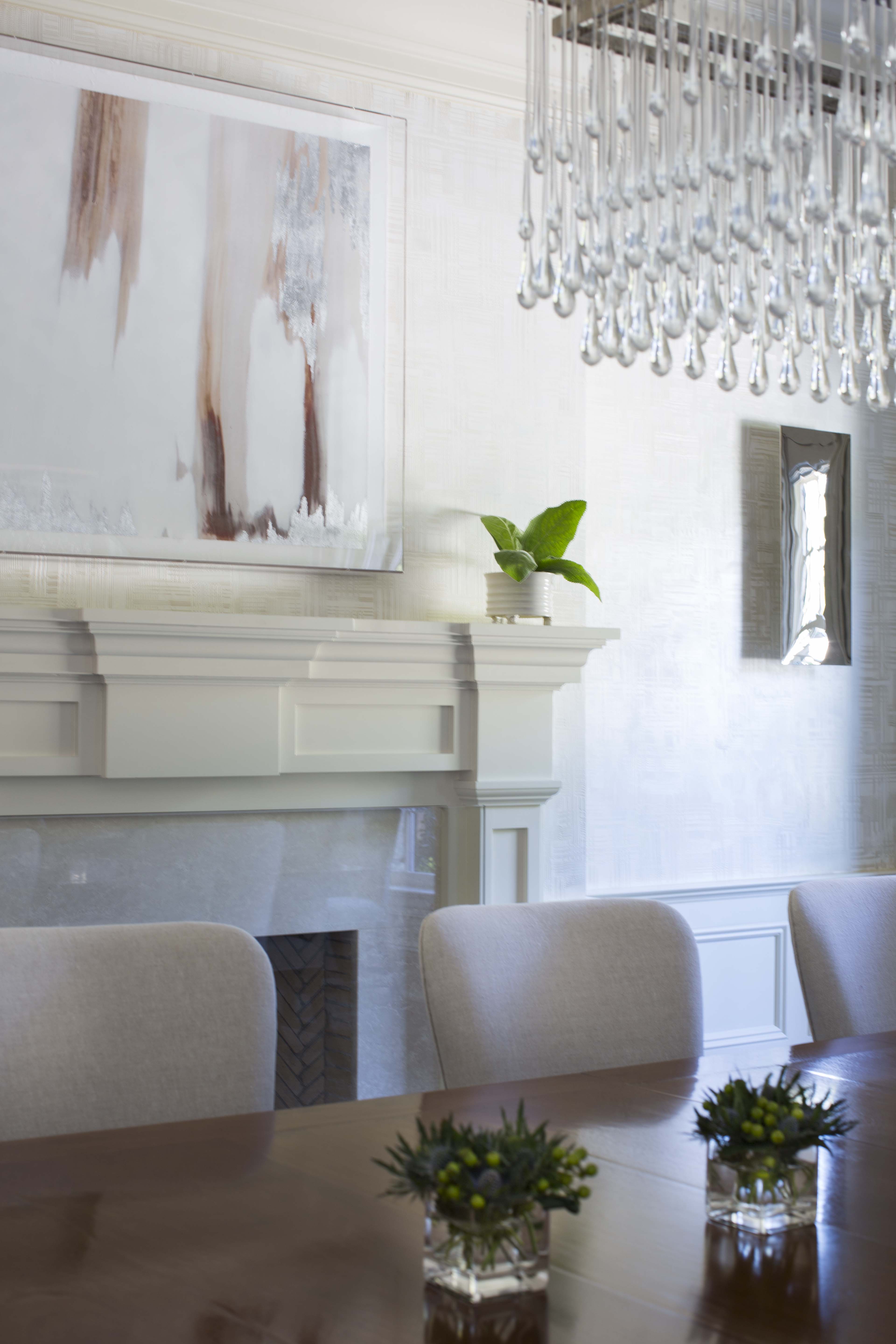
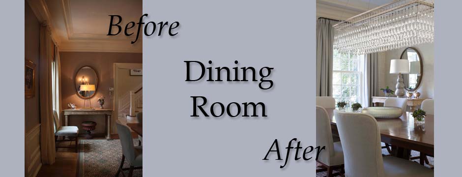
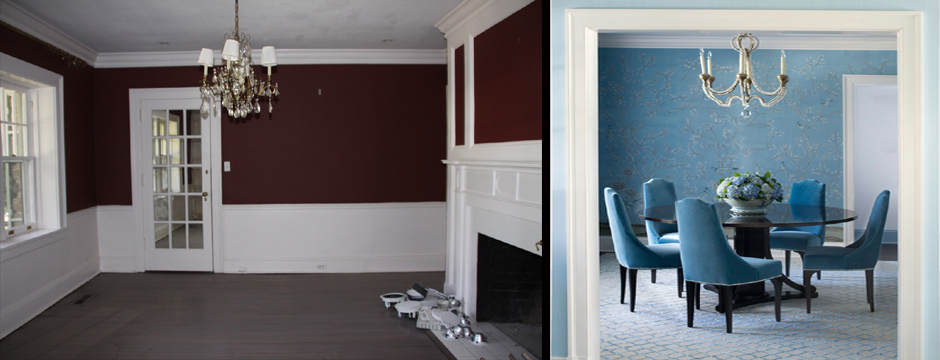
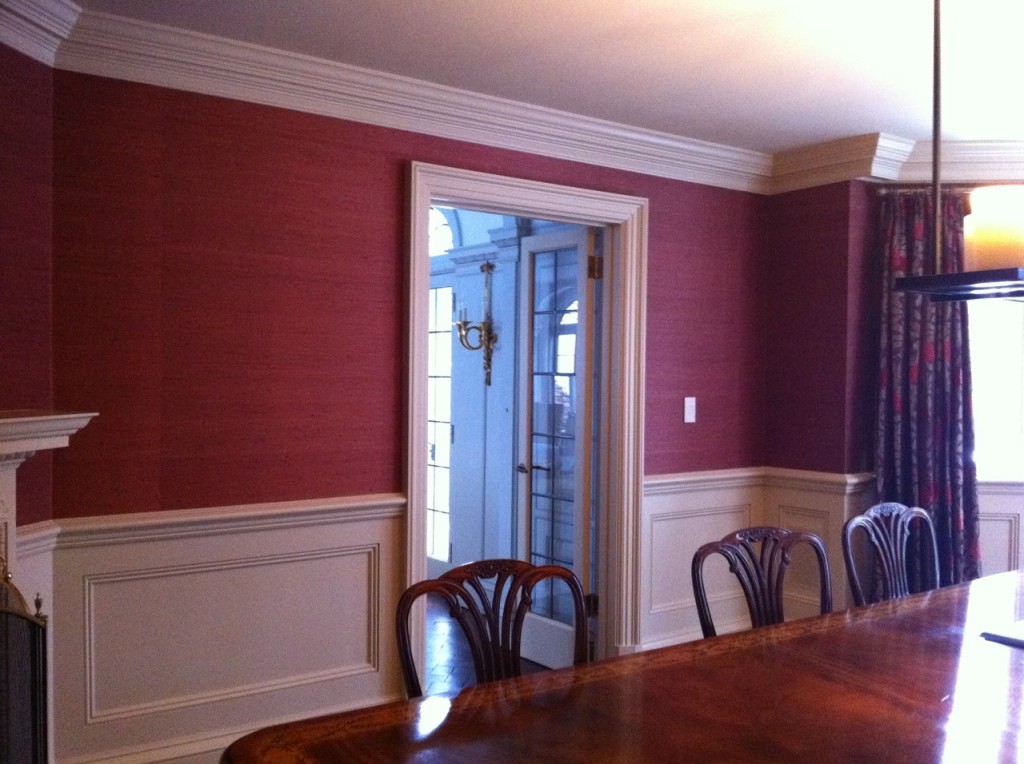
In the same home, I also designed the dining room. It wasn’t a particularly large room and had a rather traditional decor.

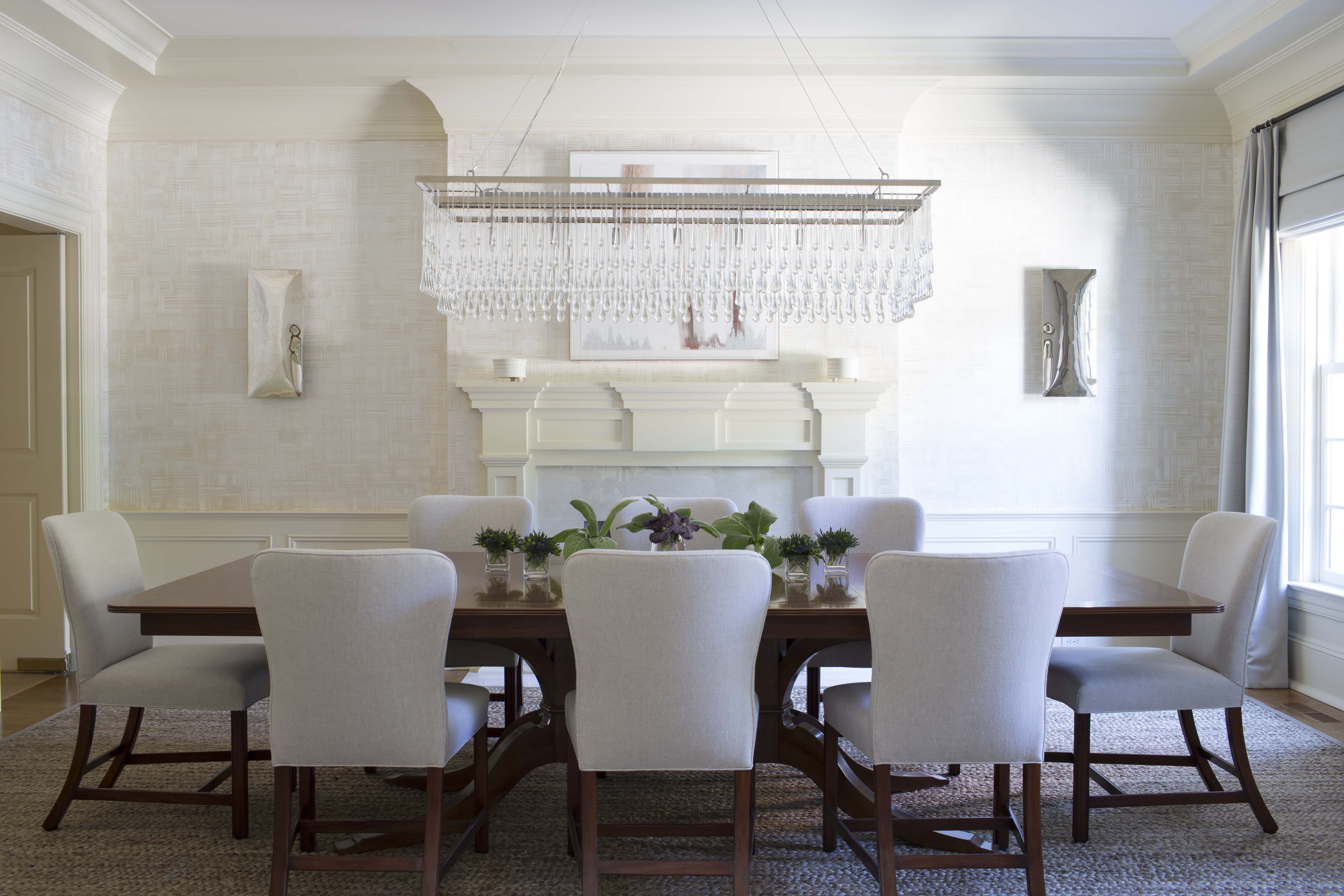
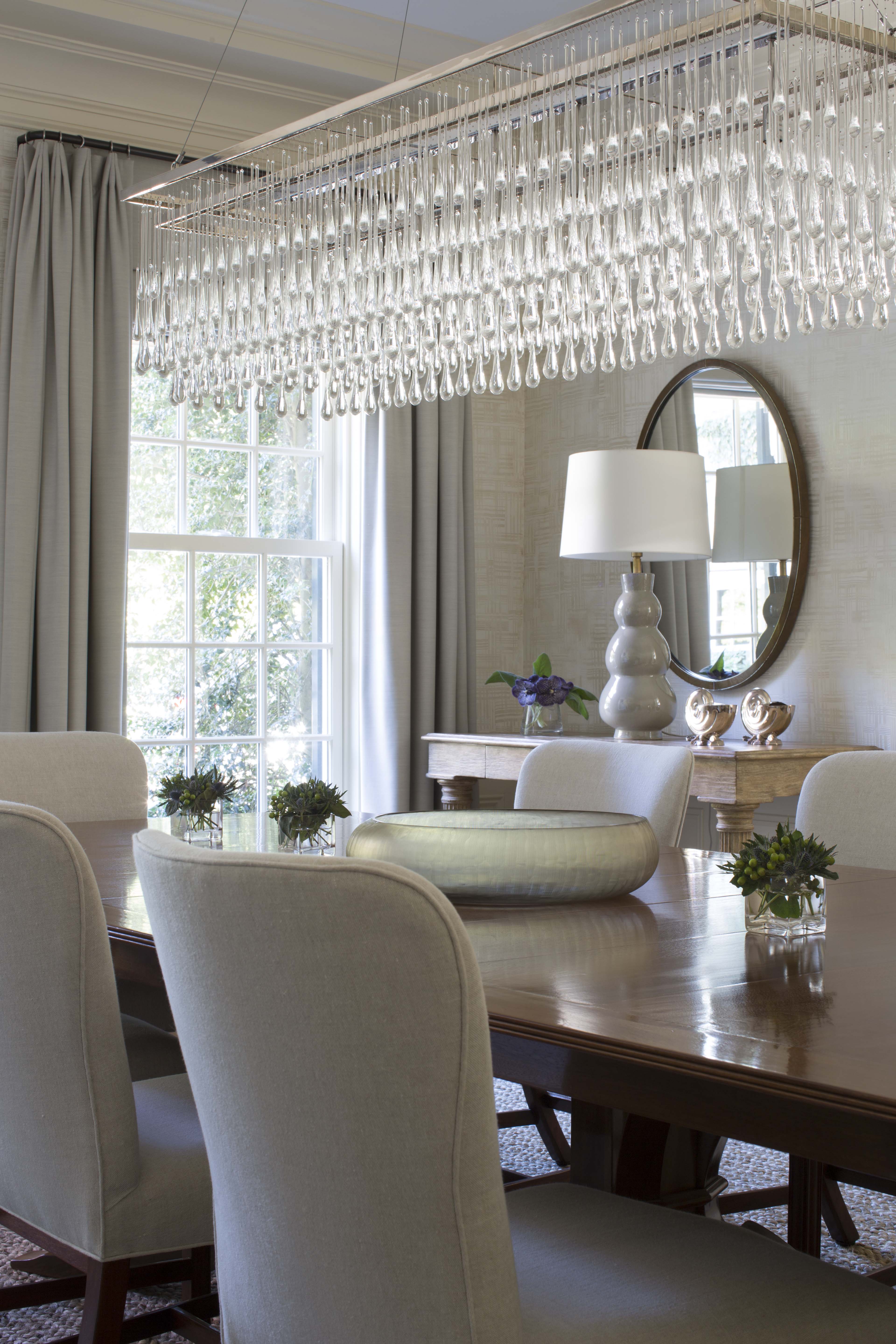
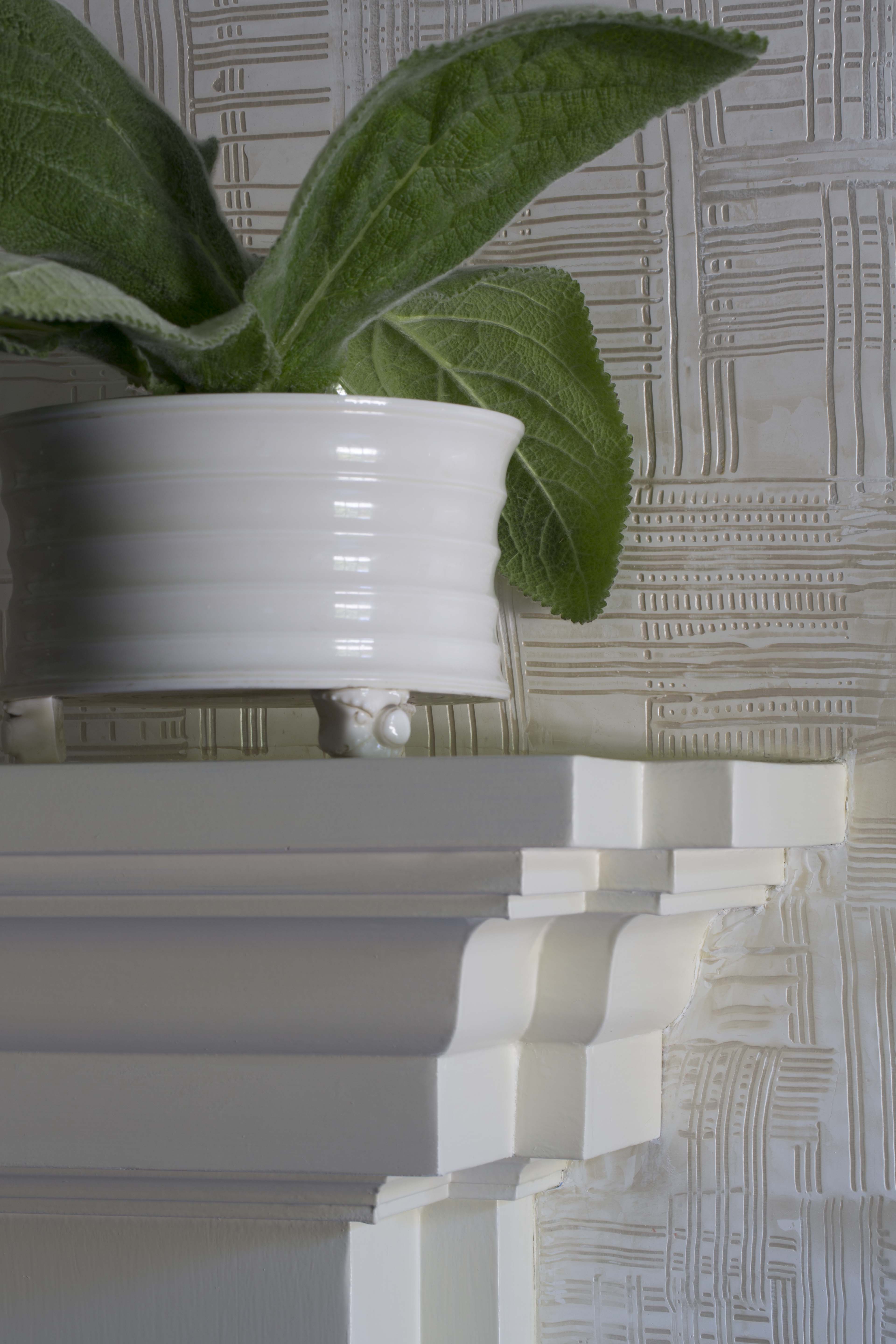
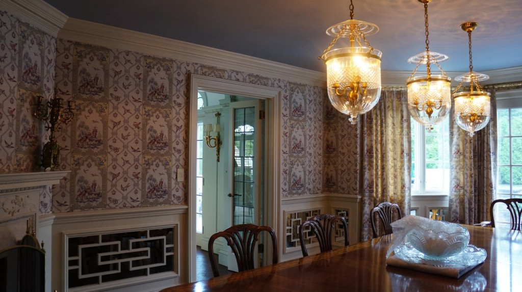
To create the perfect dining room for this client, we enhanced the simple architecture with the kind of elaborate design the client loves. Replacing the wainscoting with mirrored fretwork helps make the room seem larger. The walls were covered in the same material we used for the window treatments.

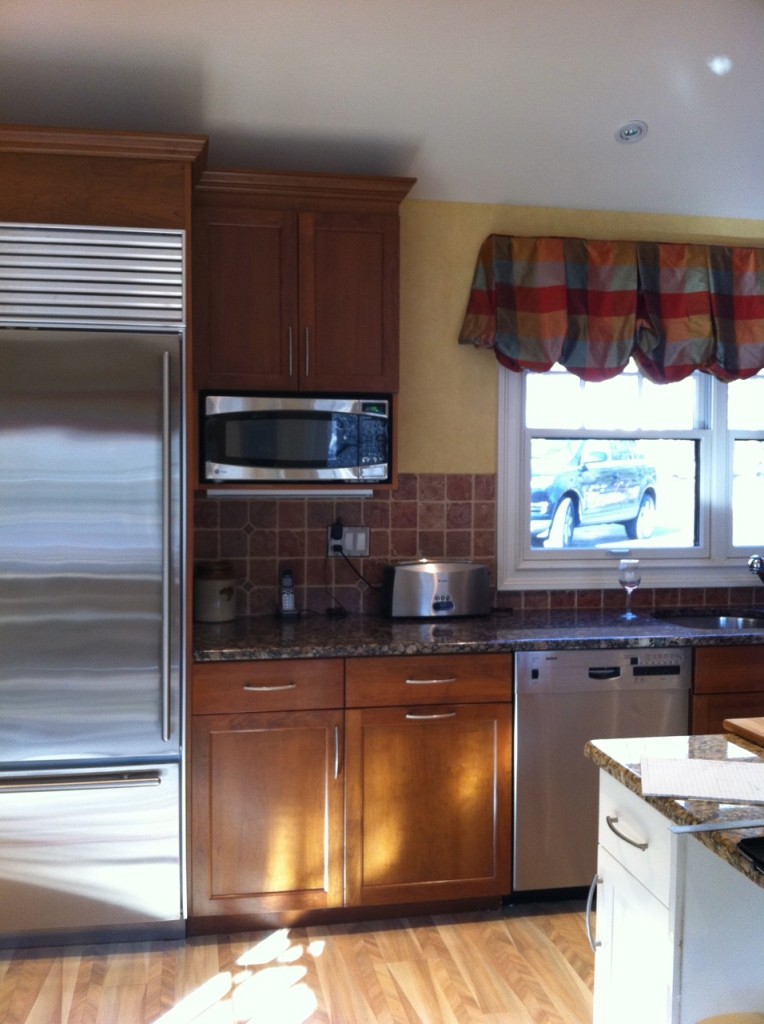
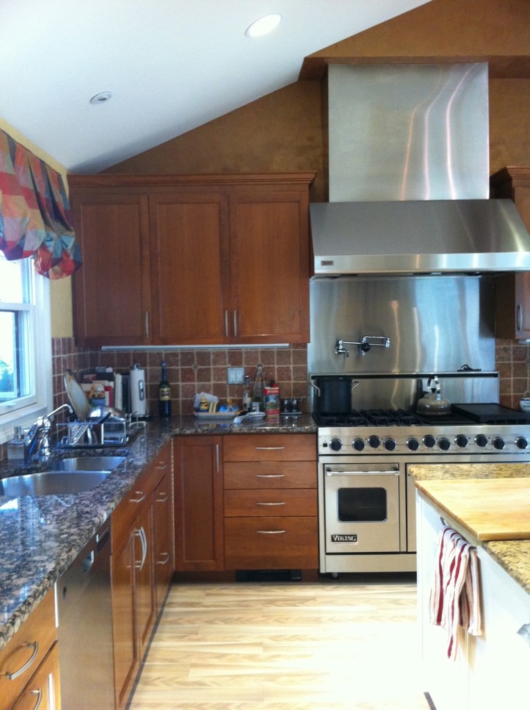
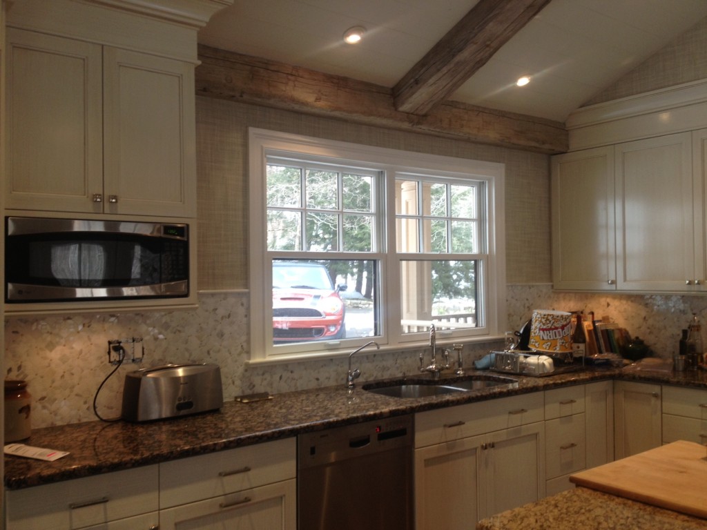
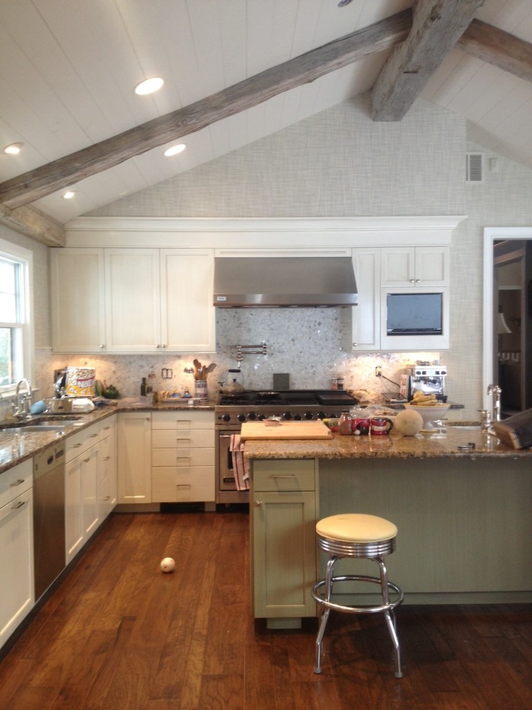
In these next photos, you can see how a kitchen can be completely transformed without gutting the entire space.


The original kitchen had two different counter materials, which we kept in place. We added rustic pine beams on the ceiling, changed the back splash, and covered the walls in grass cloth. For the cabinets, we mostly kept the existing structures but painted them. It’s amazing sometimes what paint can do. The finished kitchen is so refreshing!


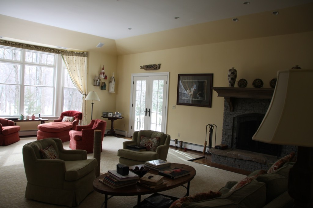
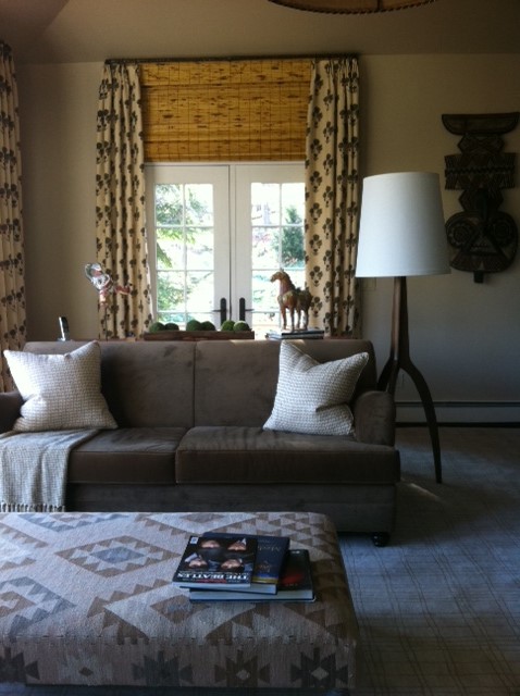
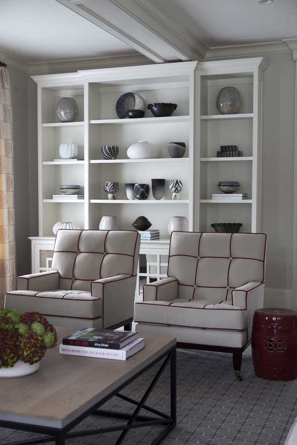
Also in this home, I worked with the client to redesign the family room. It was a big space with an impressive collection of tribal artifacts.

With the size of this room, we were able to create three seating areas and use the theme of the tribal items to create a comfortable retreat. This room is also a great example of how installing treatments high above the windows and doors elongates these openings and has a great effect on the space.

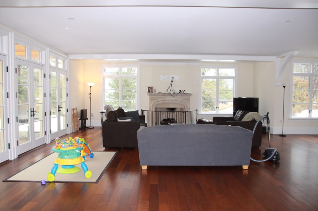
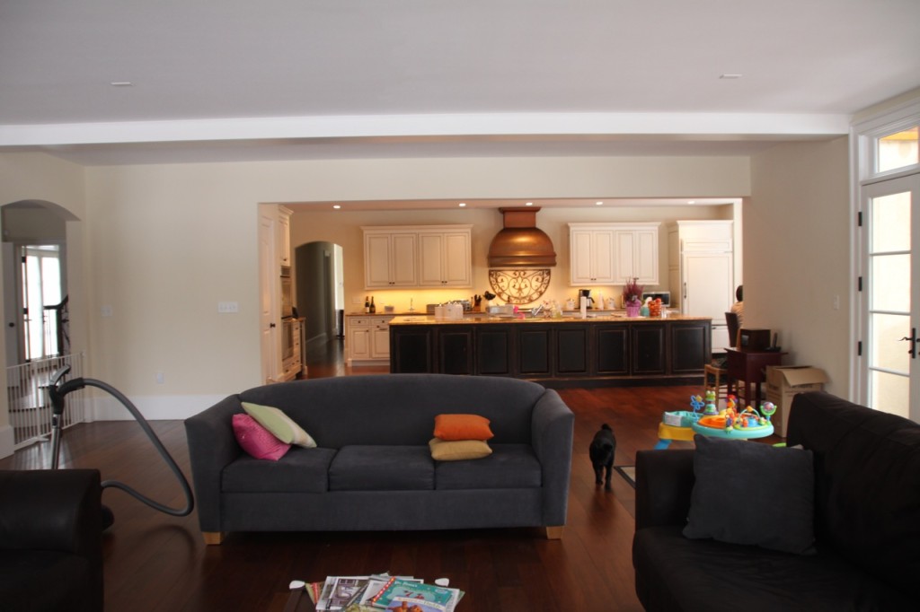
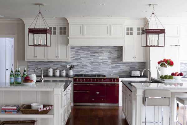
This last example shows how important a good architectural foundation is. When the client is willing to let the designer and contractor go back to the home’s architectural base and design from there, it makes the finished home look that much better. It’s essential to get those basic elements right, but then everything else falls neatly into place. For this project, we started with a kitchen and family room that were rather separate, but large and full of potential.


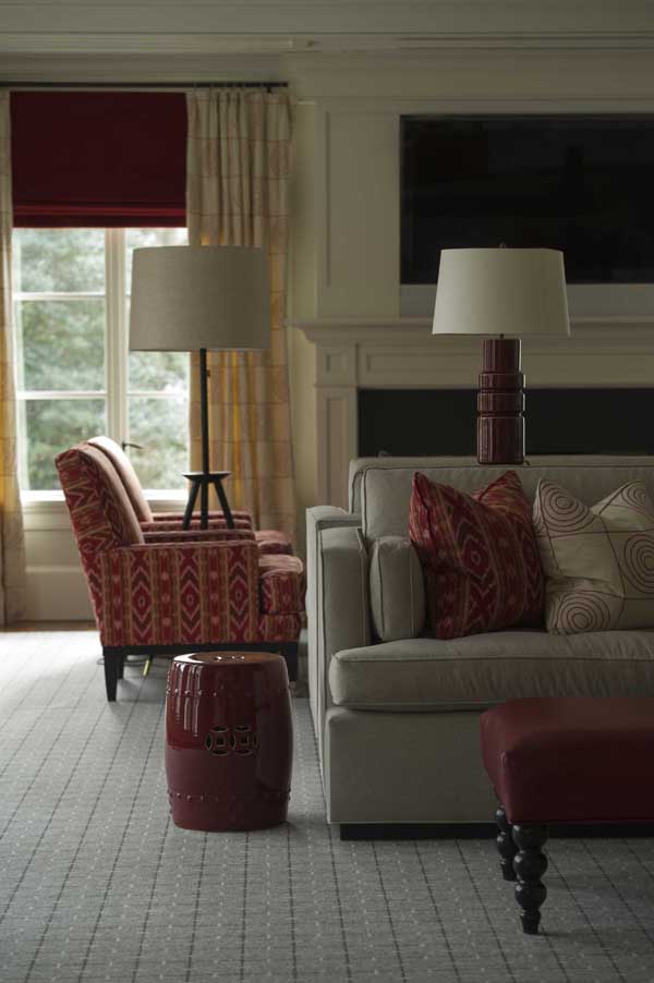
To renovate this area, I worked with the contractor to change doorways and openings, making a more open environment with better flow between the kitchen and living room. Now the homeowners can enjoy family and guests while cooking. The finished project makes ideal use of the home’s architecture to give the family their perfect living space.


What’s the most dramatic renovation you’ve done?
