5 Under 40, New England Home Magazine

I am so honored and pleased to announce that I was chosen as a 2012 New England Home Magazine 5 Under 40 Award Winner for Interior Design!

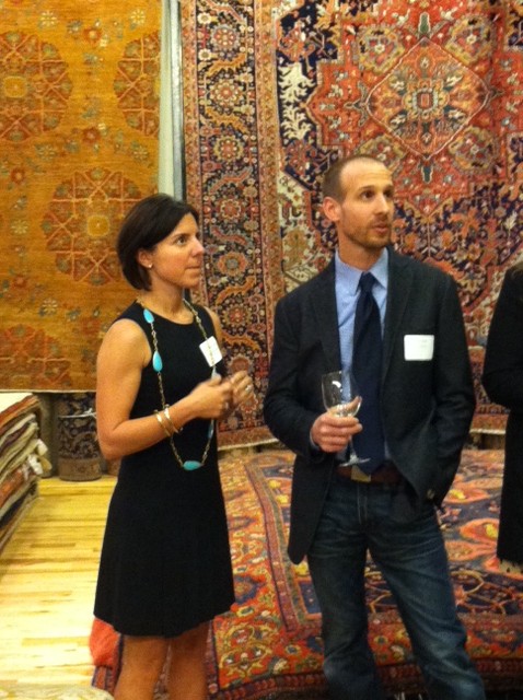
I am so honored and pleased to announce that I was chosen as a 2012 New England Home Magazine 5 Under 40 Award Winner for Interior Design!  Receiving this recognition from one of my favorite publications has certainly been a highlight of my year.  Thursday night I attended a special winners’ reception at the Landry and Arcari Showroom in Boston and felt very humbled to find myself in great company!

Each year, the 5 Under 40 award focuses on up and coming talent in the areas of architecture, interiors, furniture, and home design products and accessories.  Winners are chosen by a committee of regional design leaders, and are “people to watch, producing some of the most innovative and beautiful work available today.”  At a celebratory event in Boston on Thursday, April 26, the winners were officially announced.
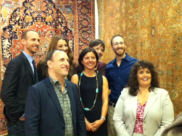
John Day and Me

Winners with NEH Editor-in-Chief Kyle Hoepner and Publisher Kathy Bush-Dutton

New England Home Magazine’s July/August issue will also announce the complete winners list and the September/October issue will feature profiles of the 2012 winners in a special magazine section as a prelude to the September 13 awards celebration.

As part of the awards celebration in September, an auction will be held featuring custom rugs designed by each of the 5 Under 40 winners.  Proceeds from the auction benefit Barakat, Inc., a Cambridge, Mass.–based charity promoting educational opportunities for women and children in central and south Asia.  Sponsored by Landry and Arcari, the auction promises to be a really fun event showcasing some extremely creative designs.

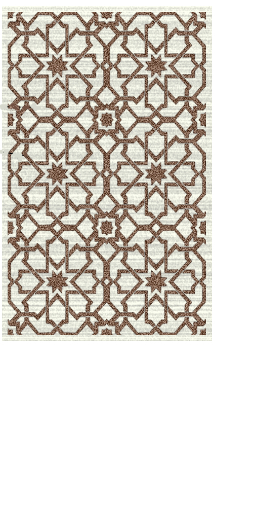
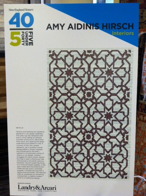
Display of my rug design

Texture and layering is a signature element of my design aesthetic. The area rug was designed with that in mind, taking an antique sumac construction fabricated from wool and layering the large scale Moroccan pattern in silk. Two very simple elements, yet a complex overall design pattern. The Moroccan tile originated in the 10th century; always inspired and influenced by the past, I wanted to incorporate a sense of history in my design choice.  The rug is made up of two colors, cream and chocolate brown. Initially, I struggled to insert a bold, vibrant hue which is familiar with the Moroccan tiles, however, I always found myself returning to a monochromatic palette. This color selection is a true representation of what I gravitate towards. I decided to finish the rug with a leather bound border. This added element makes you aware of something unexpected and adds a slight modern twist to a traditional design.

A Fit Lifestyle

I’m not an obsessive health nut, but I do love the way a good workout clears my head and energizes me for the day to come.

Each morning, I wake up early to exercise.  I’m not an obsessive health nut, but I do love the way a good workout clears my head and energizes me for the day to come.  Between my work and my family, my head is constantly buzzing away with things I need to do and remember.  Running gives my mind a rest and focuses me like nothing else.

Besides running, I also do Cross Fit and circuit training so, overall, I feel strong to the core and ready to take on whatever challenges might come my way.

Also, I think it’s really important for my kids to see me making my workout a priority but not going overboard with crazy diets.  In fact, you’re much more likely to see me enjoying a big steak than picking away at a salad!

For workout clothes, my favorite source is Lululemon.  They are the best and have different styles all the time.

What’s your fitness routine, and how does it impact your lifestyle?


Jeffrey Bilhuber Lecture and Luncheon

Earlier this week I had an incredible time at the Jeffrey Bilhuber Lecture and Luncheon, hosted by the Greenwich Historical Society.

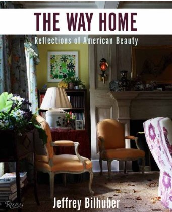
Earlier this week I had an incredible time at the Jeffrey Bilhuber Lecture and Luncheon, hosted by the Greenwich Historical Society and exclusive media sponsor Connecticut Cottages and Gardens.  Jeffrey Bilhuber has long been one of my all-time favorite designers.  I find his style so inspirational, with his use of amazing color combinations and his knack for layers.  He has such an extravagant, eccentric design flair and a fascinating personal story.  When I heard about this event to benefit the Historical Society, I knew I couldn’t pass up the opportunity to hear Jeffrey Bhilhuber speak and showcase his new book, The Way Home: Reflections on American Beauty.

Jeffrey’s lecture demonstrated his mastery of design and set my mind spinning with ideas and possibilities.  His creative design concepts never fail to amaze me.  One particular highlight of the luncheon was the chance to meet Jeffrey and speak to him face-to-face.  If you’ve ever had the opportunity to meet someone you’ve long looked up to as an inspiration and icon, you can imagine how I felt at that moment!

Photo by Neil Landino

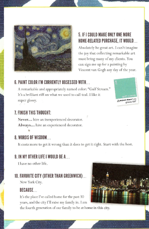
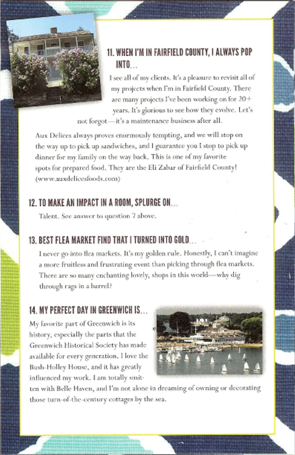
I loved this brochure handed out at the luncheon.  Titled “Jeffrey Bilhuber Unedited,” it listed Jeffrey’s responses to 14 prompts about his favorite things and places, featured a very cool design,  and included references to unique Greenwich spots!


Bunny’s Buzz

In 1988, after more than two decades of design experience with Parish Hadley Associates, Bunny Williams opened her own interior design company: Bunny Williams Incorporated.

In 1988, after more than two decades of design experience with Parish Hadley Associates, Bunny Williams opened her own interior design company:  Bunny Williams Incorporated.  Her design style reflects her training in a classic, refined style.  Known for perfectly balanced textures, patterns, and colors, Bunny’s designs look so appealing and effortless.  Her focus and attention to detail show in all of her projects, from the living room to the garden.  In fact, she co-owns a New York garden furniture and ornament shop called Treillage with antique dealer John Rosselli.  Bunny also has her own line of home furnishings and accessories at Beeline Home.

Bunny and her design team work around the US and abroad.  Her success is a tribute to the timeless appeal of her design style and, thanks to her blog Bunny’s Buzz, accessible and enjoyable by all.  Loaded with visually charming photo collages featuring products, rooms, magazine spreads, and more, Bunny’s Buzz highlights many of the best things the world of interior design today.  At the right side of the blog’s page are links to other blogs worth visiting so you will never find yourself with a shortage of amazing design inspiration!

Fig and Olive Restaurant, NYC

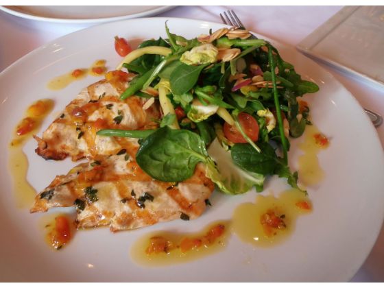
One of my favorite places to eat in NYC is Fig and Olive Restaurant.

One of my favorite places to eat in NYC is Fig and Olive Restaurant.  With three locations around town (also in Westchester, NY and West Hollywood, CA) and delicious food and wine for lunch or dinner, I can always find a good reason to stop in for a meal!

Laurent Halasz, founder of Fig and Olive, expresses the restaurant’s philosophy best:  “At FIG & OLIVE, I want to highlight our menu’s core ingredient of olive oil, which we use in place of butter in our dishes. From a sweet and delicate olive oil from the French Riviera that pairs well with a Steamed Lemon Sole Papillote to an assertive Spanish Picual or a Tuscan olive oil that holds its own with Seared Salmon with Fennel and Green Olives, and a green-fruit Provence olive oil that we serve with a Green Apple Sorbet. Our cuisine along with an elegant white, green and terra-cotta décor immerse our guests into the essence of the Mediterranean region in which I grew up.”

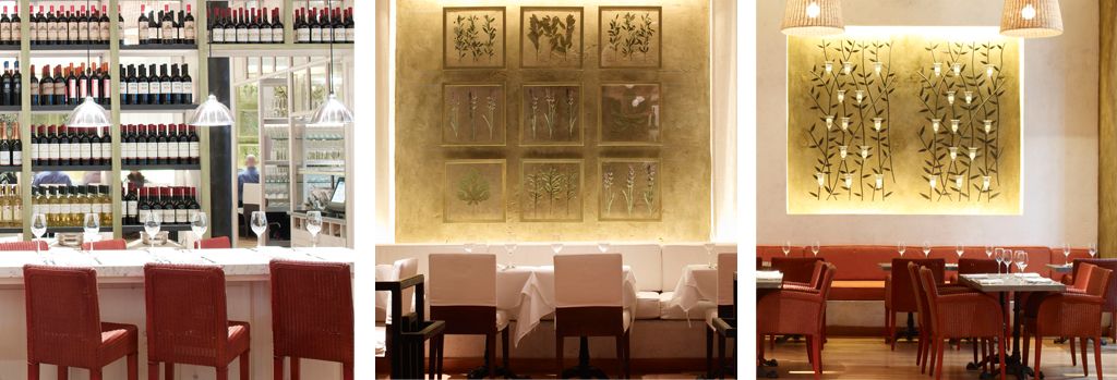
This philosophy serves Fig and Olive very well.  Featuring a communal table and tasting bar backed by a beautiful display of olive oils, the entrance to the restaurant immediately stresses that treasured ingredient at the center of each dish.  The warm and intimate main dining room provides a view of the open kitchen where more bottles of olive oil from around the world are on display.

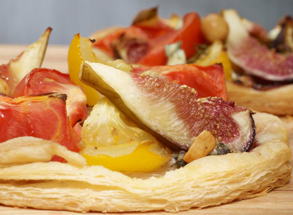
Of course, the true star of the show at Fig and Olive is the food.  For lunch, you absolutely can’t go wrong the the Prix Fixe menu.  Served Monday through Friday, you choose three courses for one set price:  crostini, soup or carpaccio, and a main dish.  Following the meal, coffee or tea is served with biscotti.  Choosing what to order from the prix fixe menu provides quite a challenge.  Crostini choices include Prosciutto, Ricotta, Fig, Olive, Walnut or Manchego, Fig, Marcona Almond, among others.  Follow that with a Cote d’Azure Fish Soup or Beef Carpaccio and a main course of Grilled Steak Skewers and Couscous or Pumpkin Sage Ravioli.

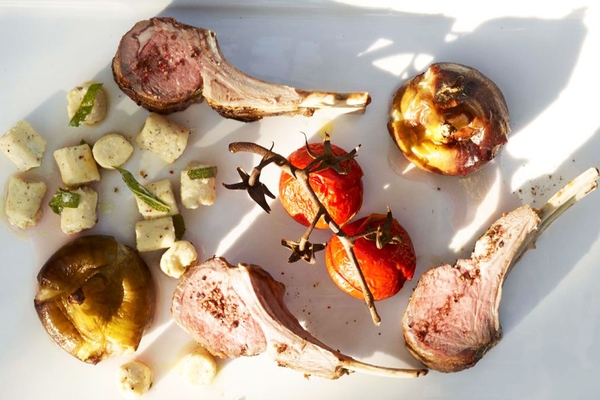
The regular lunch or dinner menu includes temptations such as the Fig and Olive Club Sandwich, the Riviera Shrimp and Salmon Salad, assorted cheeses, Rosemary Lamb Chops, Trio De La Mer Bouillabaisse, and Filet Mignon from grass fed beef.  In other words, the menu boasts a range of dishes to appeal to any tastes, all expertly prepared and elegantly presented.  Desserts range from Raspberry Sorbet to Chocolate Pot de Creme to Marzipan Cake with, of course, various coffees, teas, and dessert drinks.

If you’re looking for a pleasant lunch or sumptuous dinner, you really can’t go wrong at Fig and Olive for food, service, and atmosphere!  They are also on Facebook if you’d like to keep up to date on events and menu changes.


The Lonny Blog and Magazine

Lonny Magazine, an online magazine and blog, is a fantastic resource and inspiration.

Lonny Magazine, an online magazine and blog, is a fantastic resource and inspiration.  While the magazine is “published” online bimonthly (soon to be monthly!), the blog is updated more often with design and lifestyle trends and finds.  Between the two formats, you can always find something intriguing!

Launched in 2009 by designer Michelle Adams and photographer Patrick Cline, Lonny focuses on interesting interiors, bloggers, and current design trends.  They strive to make incredible design accessible to their readers while introducing their favorite products and companies.  The online format allows Lonny certain freedoms a print magazine can’t offer, such as the ability to click on an image to learn more about that project.  Some articles even feature videos!  User-friendly, visually interesting, and easy to share via Facebook, Twitter, and other social media sites, Lonny is as pleasurable to flip through as a traditional print magazine.

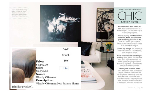
Hover over a product in the magazine to learn more.
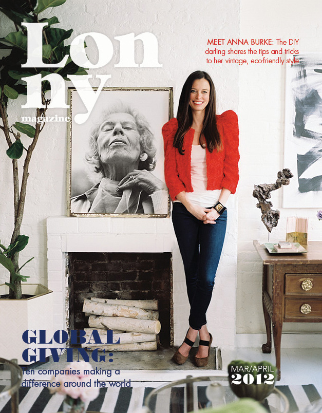
March/April 2012 Cover

The Lonny Blog features a team of several bloggers, each with their own contributing style.  Focusing on everything from books to trends to art, colorful blog posts compliment the regular magazine content and give readers plenty of reasons to visit between issues.

From a photography post
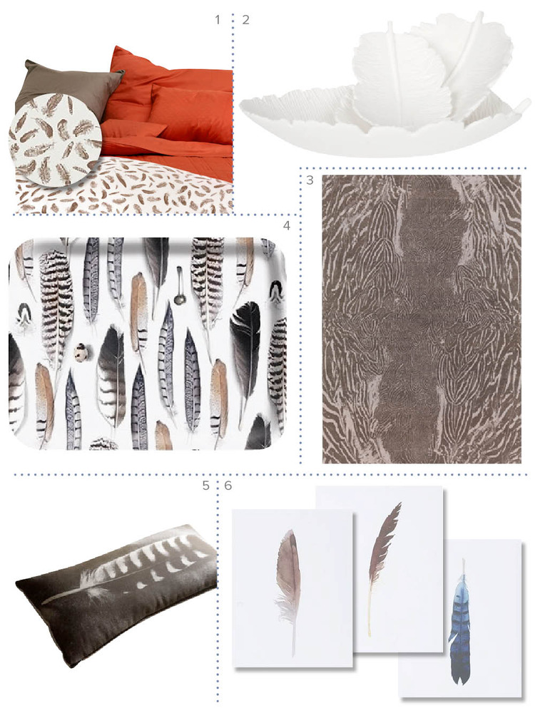
Focus on feathery decor
Living room by Jarlath Mellett
Accessories from Waterworks

Lonny Magazine is also on Facebook and Twitter so you can stay updated on all their new issues and posts!

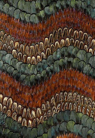
Peacocks

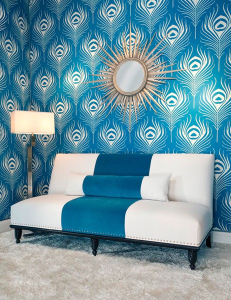
With their regal, rich colors and unmistakeable texture and form, peacock feathers naturally lend their beautiful attributes to everything from jewelry to walls to accessories.

It’s no wonder peacocks have inspired all manner of designs.  With their regal, rich colors and unmistakeable texture and form, peacock feathers naturally lend their iridescent attributes to everything from jewelry to walls to accessories.  A symbol which has figured in art for centuries, the peacock transcends design.
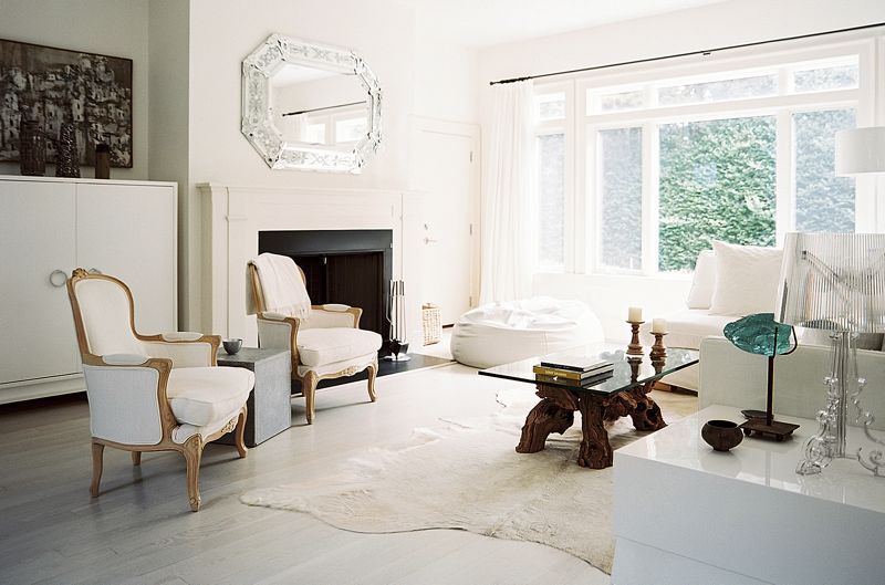
In early Christian art, the peacock symbolized eternal life.  To the Buddhists, it symbolizes wisdom and to the Hindus, the stars.  Whatever the meaning placed on the dramatic feathers and colors of the peacock, we can all enjoy the stunning result of its influence on design.
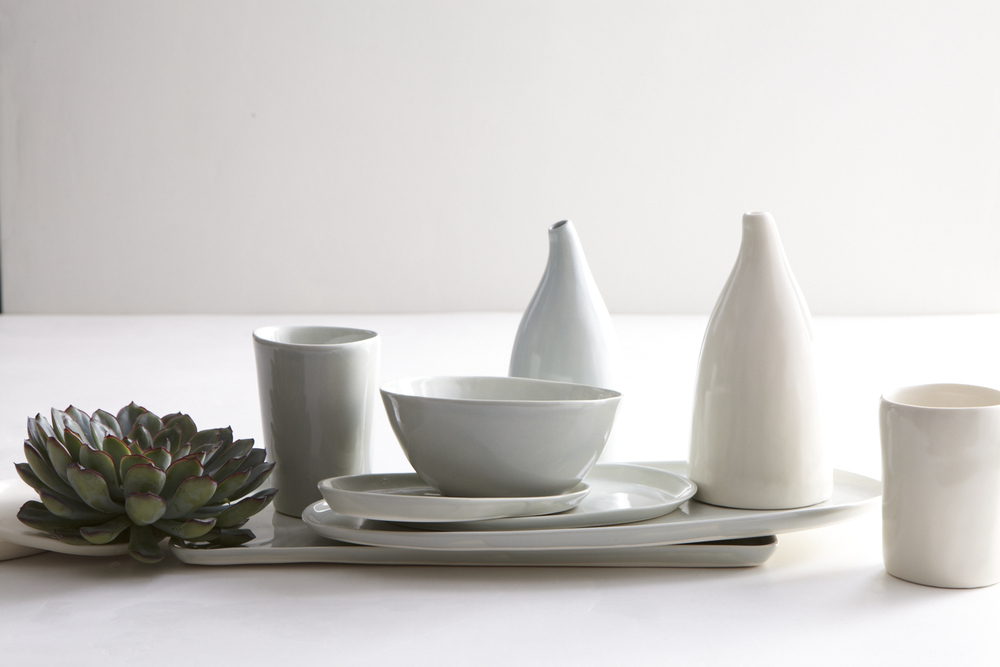
Peacock gate in Jaipur, India
Peacock & Pheasant wall covering by F. Schumacher
Peacock blue.
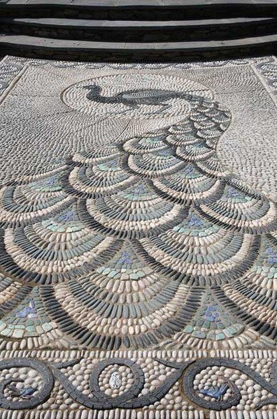
Amazing peacock mosaic by Maggie Howarth
Peacock couture.
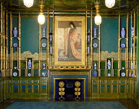
Peacock Dining Room - James McNeill Whistler
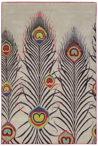
Nepalese Rug - Matthew Williamson
Peacock hue interiors - Tilton Fenwick


1920’s Fashion

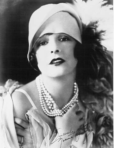
By 1925, the style of the Roaring 20’s was in full effect, with dresses that allowed freedom of movement and short hair to fit under stylish cloche hats.

I love just about everything about the 1920’s era.  Art deco, flapper dresses, Elsie de Wolfe’s design, the carefree entertainment lifestyle.  Rather than try to cover all of the fantastic things about this time period at once, I want to focus on one aspect at a time.  And today, that focus is the fashion of the Roaring 20’s.

In order to understand the forces behind fashion changes that look place in the 20’s, you first need to understand the mood of the country at that time.  The U.S. had just come out of WW I and was enjoying a time of prosperity and optimism which, naturally, led to relaxed social customs and morals.  Prohibition was in effect but was widely ignored.  Women finally won the right to vote.  New advances in clothing materials such as rayon and easier-to-use fasteners like hook and eye closures and zippers made it easier to fasten clothing shut.  This combination of a national good mood and modern convenience caused women to begin to abandon strict, formal modes of dress for more comfortable fashions such as shorter skirts and trousers.

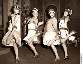
By 1925, the style of the Roaring 20’s was in full effect, with dresses that allowed freedom of movement and short hair to fit under stylish cloche hats.  Fashion icon Coco Chanel was one of the first women to reject the corset, cut her hair, and wear trousers.  I can easily imagine how liberation from corsets would inspire women to kick up their heels and do the Charleston!

Bobbed hair, cloche hat
Flappers (image via corbis)
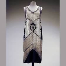
Love the black and metallic combination.
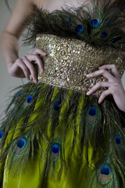
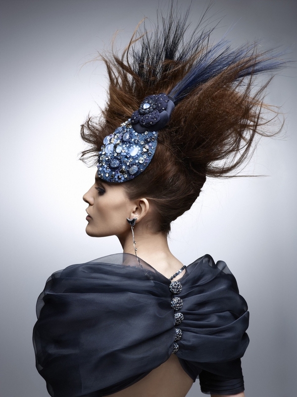
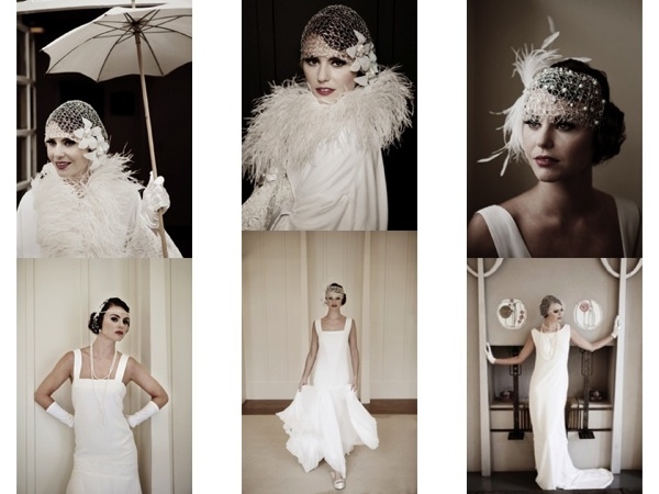
Unsurprisingly, modern fashion still takes inspiration from the 1920s.  You don’t have to look far at all to find designers drawing from iconic flapper style.
Chanel Spring '12


1920's inspired
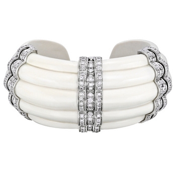
Rigate mammoth ivory and diamond cuff - so 20's!
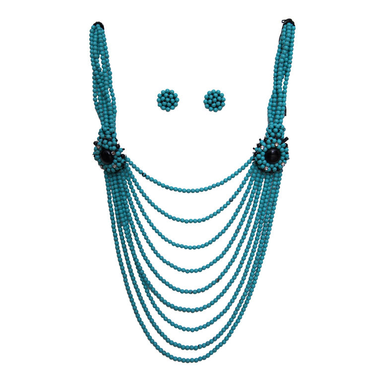
Turquoise bib necklace from 1st dibs

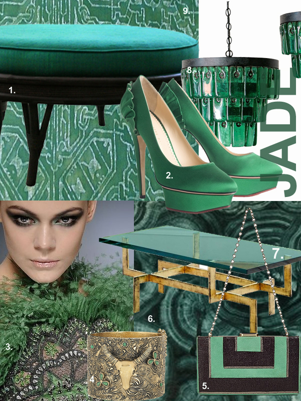
Color Obsession: Jade

I am obsessed with this amazing shade of green right now.

I am obsessed with this amazing shade of green right now.  From fashion to design, it is so chic and glamorous!

1. SJAE ALEXANDRE 1950’s ottoman/coffee table

2.  Paloma by Charlotte Olympia — my new fave shoe designer

3.  Valentino Couture

4.  Aurelie Bidermann Wild West Cuff

5.  Diane von Furstenberg Jade/Ebony Clutch

6.  Malachite

7.  French Glass Coffee Table by Jamb

8.  Emerald glass chandelier by Amsterdam Modern

9.  Fortuny fabric:  Moresto


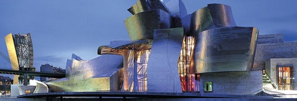
Guggenheim Museum, Bilbao Spain

The Guggenheim Museum Bilbao, designed by architect Frank Gehry, is widely considered one of the most important and admired works of contemporary architecture.

Imagine walking through the old city of Bilbao, Spain, with ancient cobblestones under your feet, surrounded by buildings adorned with lively colors.  The shape of the alley naturally brings your eye up where, at the end, sits a massive modern structure that seems to undulate in the sun.  This is the Guggenheim Museum Bilbao, designed by architect Frank Gehry and widely considered one of the most important and admired works of contemporary architecture.

Image: Damian Corrigan

I find the idea of this modern masterpiece in the heart of an old Spanish city so conceptually cool; I’d love to experience this!  Gehry designed the building to have an organic feel, with seemingly random curves.  Sitting along the Nervion River, the building looks like a ship about to head out to the Atlantic.  At the same time, the titanium panels covering those dramatic curves bring to mind schools of shiny fish cutting through the nearby waters.  It’s incredible how one structure expresses different aspects from varying angles.

Image by Pignatelli Massimo
Image courtesy of 2008 Gehry Partners LLP
Image courtesy of guggenheim.org