Ashley Pittman Collection

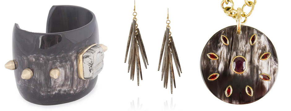
During the winter, I tend to gravitate toward chunkier jewelry like the pieces designed by Ashley Pittman.

During the winter, I tend to gravitate toward chunkier jewelry like the pieces designed by Ashley Pittman.  Her jewelry is so edgy and can make an entire outfit.  I like the way many of these jewelry designs make sounds as I wear them, adding another layer of sensation.

Horn Pendant
Horn Pendant
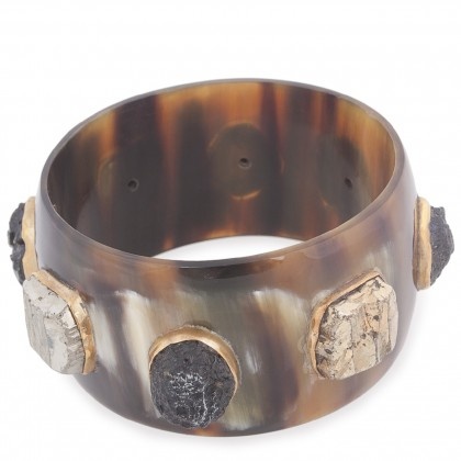
Horn Bangle
Horn Bangle
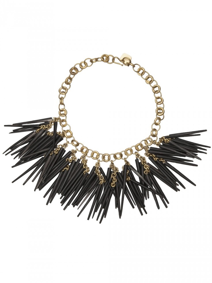
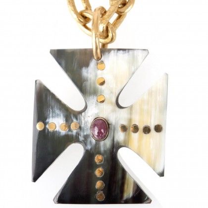
Kumweka necklace with horn and bronze.

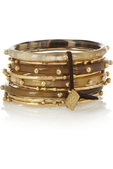
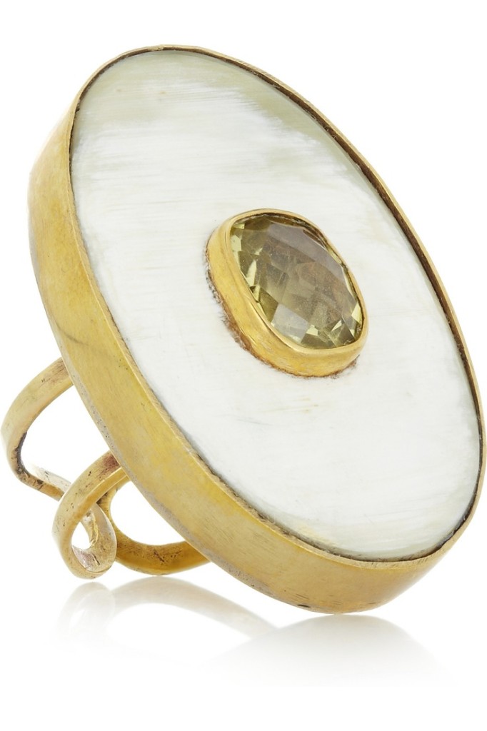
Ashley Pittman Collection jewelry is handmade in Africa, with a portion of the profits helping to fund education and health improvements in rural Kenya.  Each piece is hand crafted from natural indigenous materials such as ethically sourced horn, bronze, and semi-precious gemstones.  I consider my Ashley Pittman jewelry to be heavy artillery in my collection of accessories.

Dark Horn Fuvu Earrings
Shaba Bangles, horn and gold-toned bronze.
Kubwa topaz and horn ring.

You can find Ashley Pittman on Facebook or see more of her designs on her website.


Primary Food and Drink, Greenwich

I recently had the pleasure of trying a new restaurant in Greenwich: Primary Food and Drink.

I recently had the pleasure of trying a new restaurant in Greenwich:  Primary Food and Drink.  Located at 409 Greenwich Avenue, Primary is the newest restaurant from celebrity chef Graham Eliot Bowles.  In addition to being a critically acclaimed chef with two Michelin starred restaurants and the more casual Graham Eliot Bistro, he is one of the stars of the reality television shows Master Chef and Master Chef Junior.  The Chicago native opened Primary with longtime culinary and business partner Merlin Verrier, who will act as Primary’s Executive Chef and Managing Partner.

Graham Eliot and Merlin Verrier

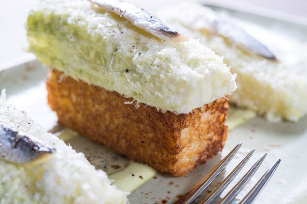
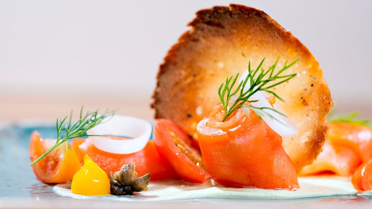
The experience and talent behind Primary is quickly evident when you visit this unique restaurant.  The menu offers modern, gourmet takes on classic dishes such as Caesar Salad, Beef Stroganoff, and Gnocchi.  The menu is not extensive but focuses on high quality, fresh ingredients prepared artfully and with the utmost attention to flavor.  At Primary, the food really is art.  Each bite is so delicious; you can easily tell how thoughtfully the various flavors are paired together.   The Lobster Schnitzel, for example, is such a different way to serve this classic New England seafood.

Deconstructed Caesar
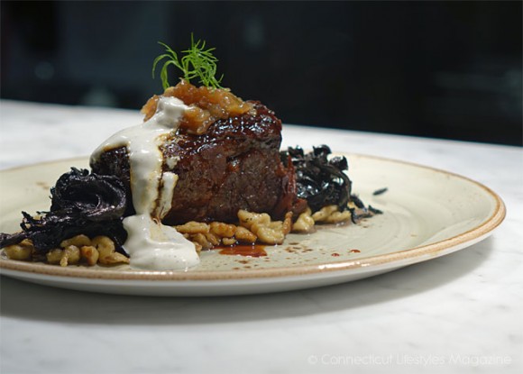
Beef Stroganoff, made with braised short rib.
Beef Stroganoff, made with braised short rib. Image via Connecticut Lifestyles Magazine.
Food as art.
Food as art.
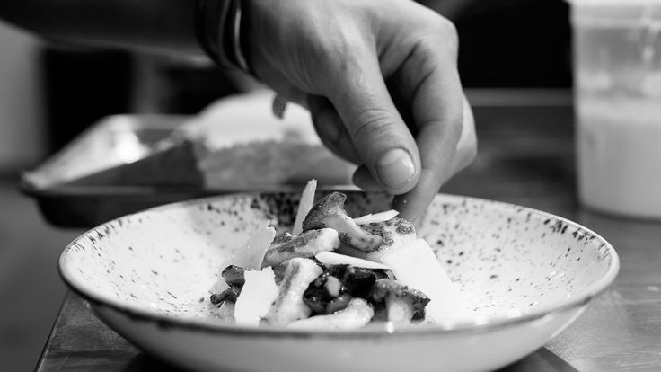
Each dish shows attention to detail.

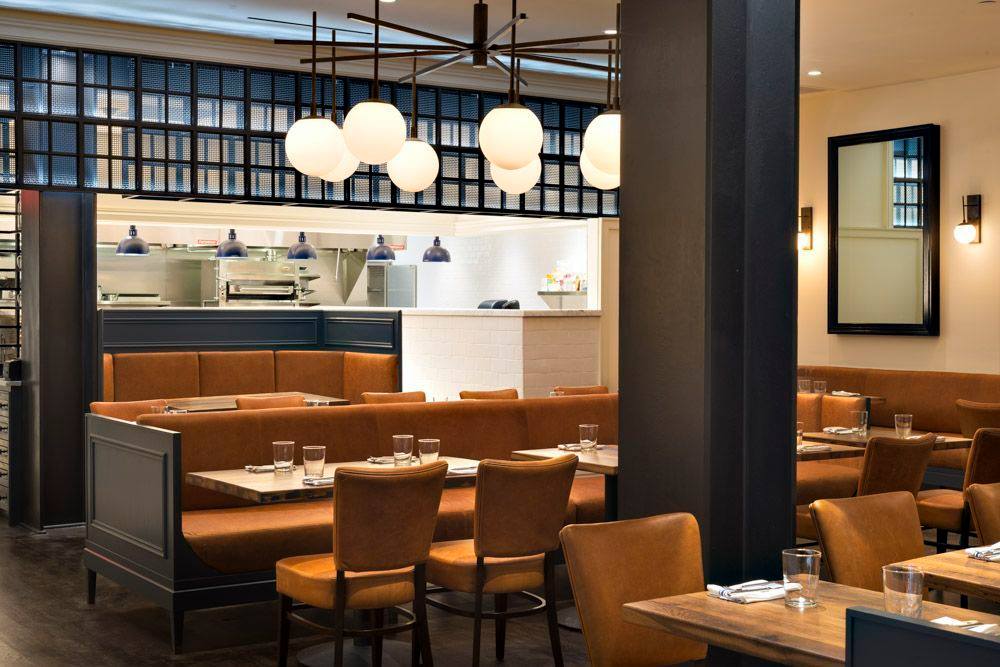
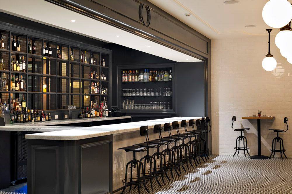
The interior of Primary is a great reflection of the menu.  It is simple and open, with some seating that allows for a view into the open kitchen.  Wood tables, leather seating, and wall decorations consisting of mirrors and understated lighting are playfully balanced by a tile mosaic floor.  The bar area also features a clean, simple look that works well with the restaurant’s modern vibe.  The waitstaff’s uniform of checkered shirts and jeans reflect Primary’s casual mood and allow the food to be the main attraction.

Dining Room
Dining Room
Bar
Bar
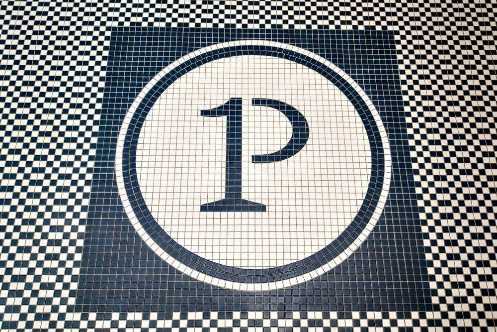
The tile floor mosaic with the Primary logo.

I really enjoyed visiting Primary and am already looking forward to going back.  You can see their full menu and make reservations at Primary’s website.  They are also on Facebook and Twitter.


Designer Connection on Artisphere Online

I recently sat down with Patrick Ganino, the editor of Artisphere Online and an artist I’ve worked with in the past, to discuss the link between interior design and decorative painting.

Artisphere Online is a digital magazine for decorative painting professionals.  Decorative artists are skilled artisans who specialize in creating custom murals and painted finishes, as well as restoration.  I recently sat down with Patrick Ganino, the editor of Artisphere Online and an artist I’ve worked with in the past, to discuss the link between interior design and decorative painting.  While there are benefits and conveniences to using ready-made wall applications, in some cases only a professional artist can achieve the desired effect.  Having a relationship with an experienced, talented artist can really expand a designer’s toolbox as well as a client’s options.

The Designer Connection

Written by Patrick Ganino

Amy Aidinis HirschAmy Hirsch is an interior design located in Greenwich, CT   With a keen eye for timeless interiors and a nod towards an unexpected approach for modern details, Amy creates a balance of form and function.  Sophisticated, unusual palettes and resourceful selections define the comfortable nature of Amy’s interiors. Whether it is a project of grand scale or an intimate abode each project is comprehensive and collaborative. With great exuberance and an innovative perspective Amy creates environments that are inspired, yet uniquely you. I thought it might be fun to start getting insight from prestigious interior designers on their thoughts of our craft.

1.  How often do you use decorative painting in your design?Amy Aidinis Hirsch Interior Design
Quite often.  It really depends on what type of media is involved.   When I do call upon an artist it ranges from murals to leaf to simple glazes.  Times when I do not go with an artist is usually because of economic reasons.  Sometimes it is easier for the scope of the project to use textural wallpapers.

 2.  Is it easier because you take the artist out of the equation?

It is because it is instant gratification.  The product is already done and it is easier for the client to understand what they are getting creating a more viable end game.

3.   OK then, when do you use an artist?

There is a beauty about using an artist.  With an artist your possibilities are endless.  You have no limitations when it comes to color or technique.  It is truly a custom product that is created.  Working with an artist takes patience which adds more time but there are certain applications that only an artist can create and there lies the value.

4.   What are your favorite techniques when hiring a decorative artist?

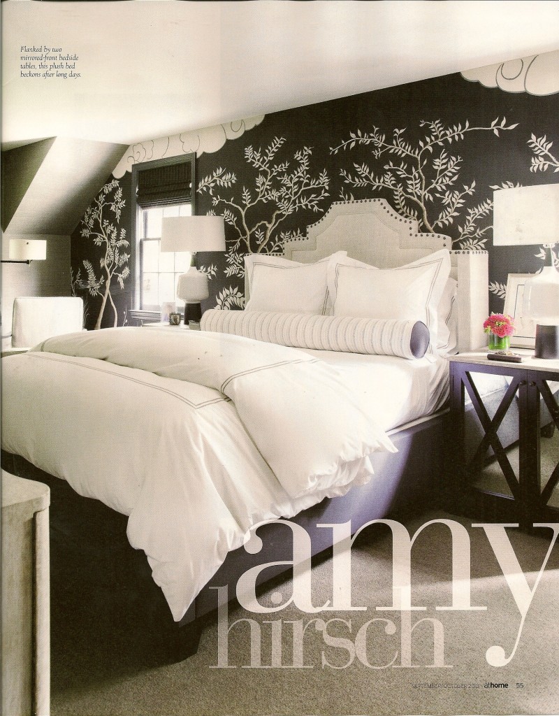
I am in love with silver leaf right now.

High polished venetian plaster.

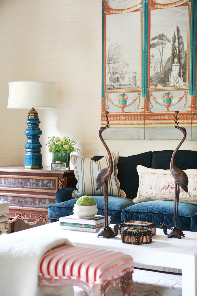
Chinoiserie is a favorite of mine.  There is a sexiness of something clean and modern but I also love layers and details that go into creating that piece.
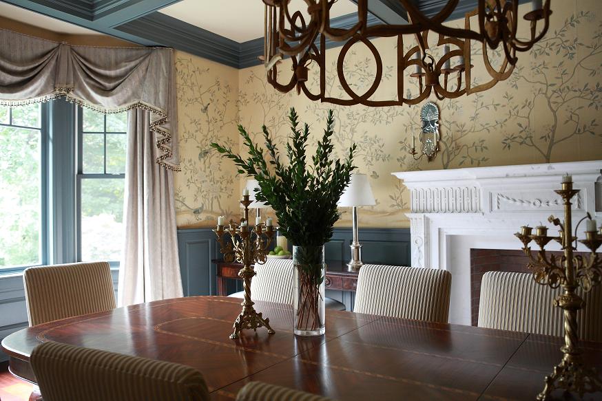
Amy Hirsch Greenwich Interior DesignAs a designer, I come across things that inspire my creativity almost constantly.  Whether it’s the vibrant color of moss growing on a stone wall or that perfect find at a local antique dealer, inspiration is everywhere.  Keeping an idea book of materials, references, photos, and sources isn’t at all a new concept among designers.  What’s amazing is how quickly the ideas accumulate, but I love having a wealth of inspiration to draw from as the need arises.  I think working with artists is a collaboration.  What I portray and then what the artist can simulate.  Each eye works hand in hand with each other and that is the beauty of it.
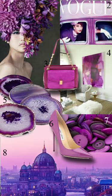
Pantone 2014 Color of the Year: Radiant Orchid

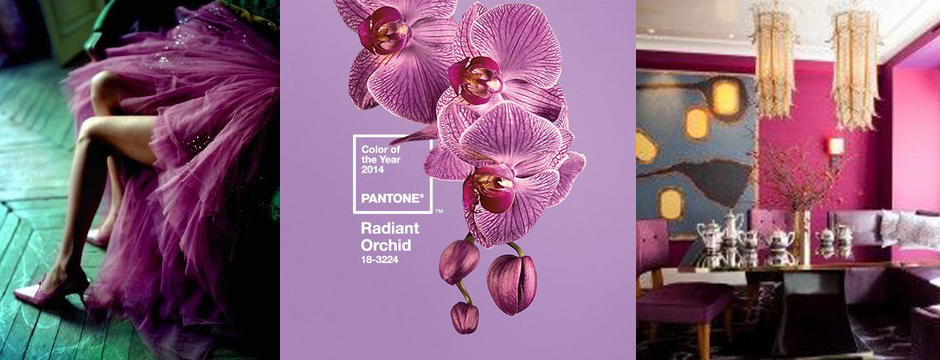
This year, Pantone chose Radiant Orchid as the Color of the Year.

This year, Pantone chose Radiant Orchid as the Color of the Year.  This color has a lot of saturation and really lends itself to pulling in both lighter and deeper hues of fuschia for balance.  Radiant Orchid is fearless and radiates femininity.  It also reminds me of a well dressed man in a beautiful suit with a gorgeous pop of color underneath.  That’s the true genius of this color; I think even a real guy’s guy can wear it and exude confidence.  This color is seductive.  While it isn’t a color everyone would immediately think of when designing an interior, it can be used very well.  I think Amanda Nesbit (see cover image) was ahead of her time in using this color in her designs.  This color sparks inspiration.  As Pantone describes it, “Radiant Orchid emanates great joy, love and health,” which we all wish for in a prosperous new year.  What do you think of Radiant Orchid?

pantone 2014 copy

1.  Floral art by Takaya Hanayuishi.

2.  Vintage Vogue with Audrey Hepburn.

3.  Tory Burch Priscilla Shoulder Bag

4.  Amazing piece of art, total saturation.  Image via The Suite Life Designs.

5.  Agate Coasters by Richard Mishaan

6.  Jimmy Choo

7.  Purple buttons, photo by Tony Hisgett.
8.  Berlin Dome, image via Shutterstock Blog.
Cover images, left to right: Knot and Pop, Pantone, and Amanda Nesbit Design.


2014: The Year of the Horse

Horses have long held the admiration and imagination of people.

Tomorrow night we’ll say goodbye to 2013 and welcome a New Year full of possibilities and new opportunities.  2014 will also be The Year of the Horse, according to the Chinese Zodiac.  Horses have long held the admiration and imagination of people.  These strong, beautiful animals and their close relationship to mankind throughout history are deservedly admired for their grace and their role in human history.  It’s no wonder that so many artists, including interior and fashion designers, turn to the horse for inspiration.  In the Chinese Zodiac, the horse is known for being warm-hearted, strong, and intelligent.  Incorporating equestrian themed designs into your home or style naturally conveys these same attributes.

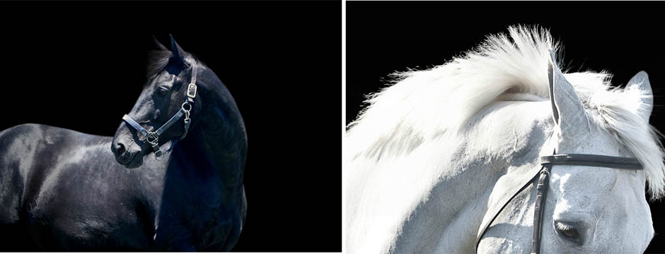
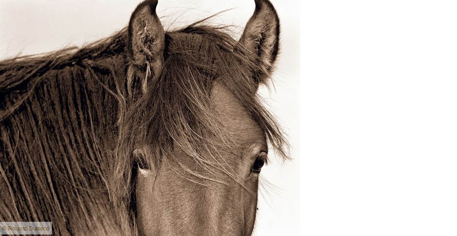
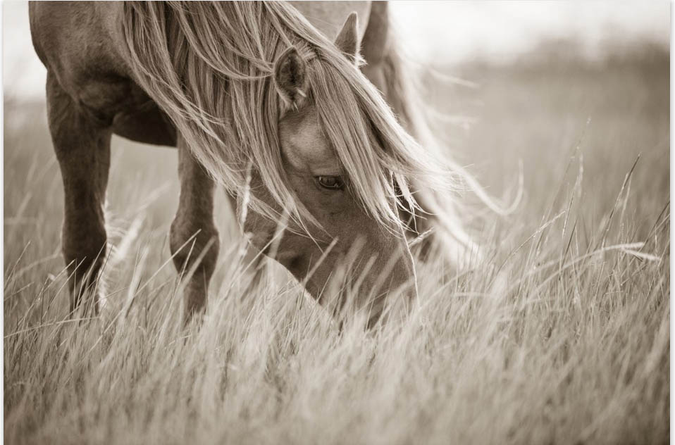
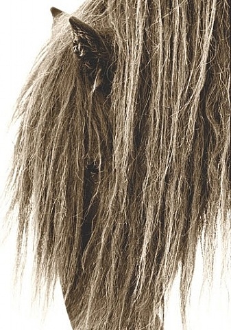
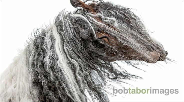
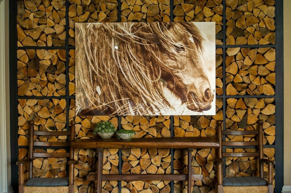
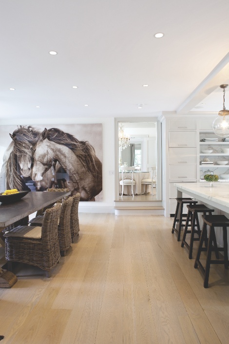
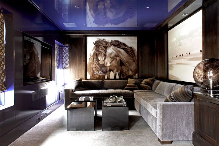
I’ve featured some of this photography in the past, but I think it’s worth sharing again.  A stunning piece of horse photography is a dramatic art choice for any room.  Lisa Cueman, Bob Tabor, and Roberto Dutesco are three photographers whose horse images are simply incredible.

Photo by Lisa Cueman
Robert Dutesco
Roberto Dutesco
Lisa Cueman
Lisa Cueman
Robert Dutesco
Roberto Dutesco
Bob Tabor Images
Bob Tabor Images
Robert Dutesco
Roberto Dutesco

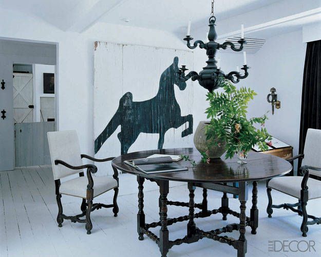
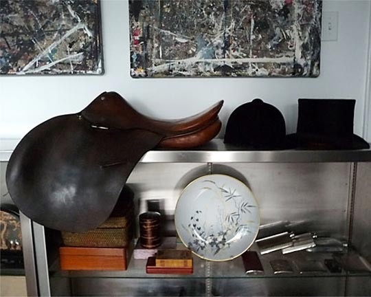
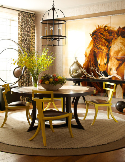
In interior design, using equestrian art or other horse-themed elements can add style to a room without being too overdone.  You can use items such as saddles or stirrups as accents, or go with a more subtle look by incorporating equestrian patterns.  Think of leather, warm tones, natural materials, and elegance.

A room I designed for a client.
By Leslie Cohen Design
From Elle Decor
From Elle Decor
Design by Mar Silver
Using equestrian elements as accents.  From Apartment Therapy.
Using equestrian elements as accents. From Apartment Therapy.
Design by Thom Filicia
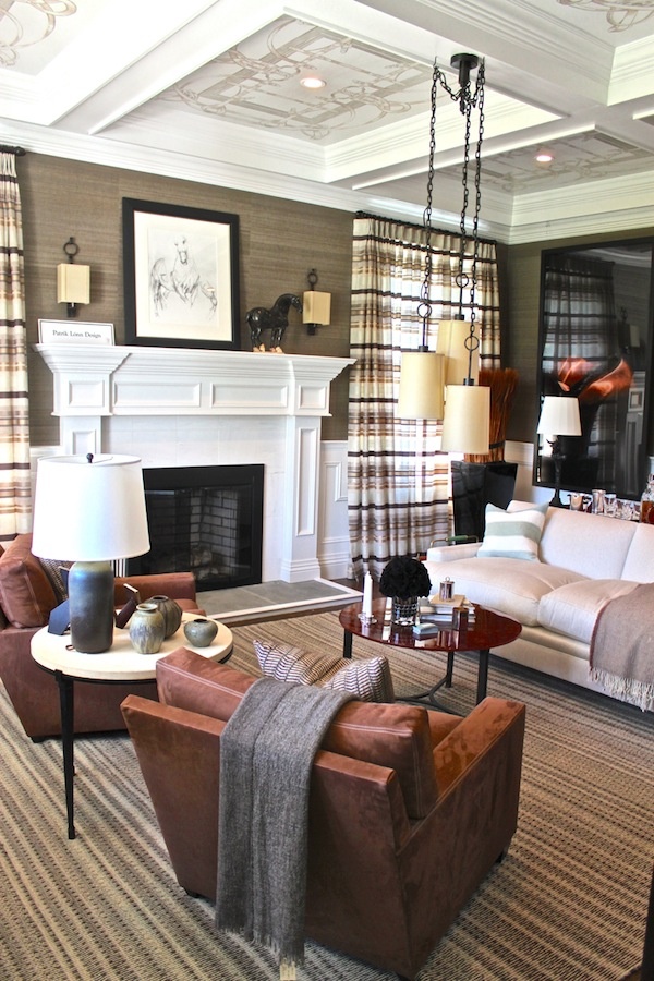
A more subtle equestrian influence.  Design by Patrick Lonn.
A more subtle equestrian influence. Design by Patrik Lonn.

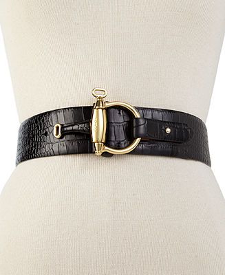
There are also a lot of great ways to add an equestrian flair to your wardrobe.  I love the idea of adding a really cool accessory to give your look just a hint of the equestrian without being over the top.

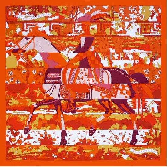
Iconic Hermes scarf.
Equestrian belt from Macy's.
Equestrian belt by Ralph Lauren.
Another gorgeous Hermes scarf.
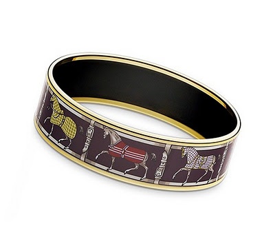
Hermes Cuff
Hermes Cuff

How would you incorporate an equestrian feel to your home or wardrobe?

Cover photos by Bob Tabor Images.


2013 Year in Review

This past year was a great year of growth and opportunities for my design firm.

This past year was a great time of growth and opportunities for my design firm.  I loved working on so many amazing projects and meeting clients who were able to share my vision for the ideal design for their homes.  I loved the experience of designing my new studio and offices and am looking forward to seeing what incredible things wait for my business in 2014.  I’m fortunate to have a wonderful family and talented staff to support me on this journey.

During the past year, I really enjoyed seeing my work gain the attention of different publications.  That sort of recognition is so validating.  I’ve been reflecting on the past year lately and thinking about how I continue to grow as a designer.  Looking back on the press I received in 2013 is both humbling and exciting.  Here are the various publications which featured my work last year.  I can’t wait to see what 2014 has in store for Amy Aidinis Hirsch, LLC!

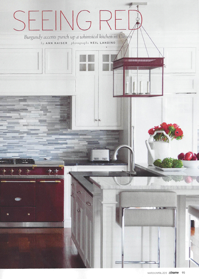
March 2013:  Seeing Red in At Home in Fairfield County Magazine

Seeing Red Amy Hirsch At Home Magazine

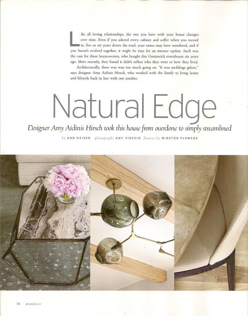
May 2013:  Natural Edge in At Home in Fairfield County Magazine

Natural Edge Amy Hirsch At Home Magazine

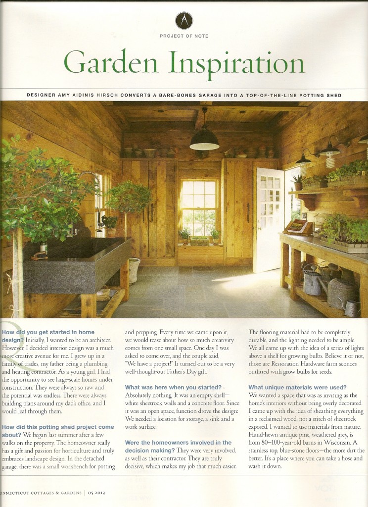
 May 2013:  Connecticut Cottages & Gardens Project of Note

Amy Hirsch CTC&G Project of Note

 August 2013:  Designers’ Houses in At Home in Fairfield County Magazine

Amy Hirsch At Home in Fairfield County Magazine

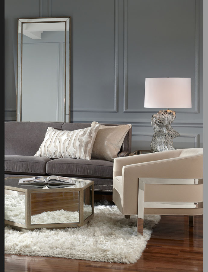
September 2013:  CTC&G’s Mitchell Gold + Bob Williams Fall Collection Launch

Amy Hirsch CTCG Mitchell Gold Bob Williams Fall 2013

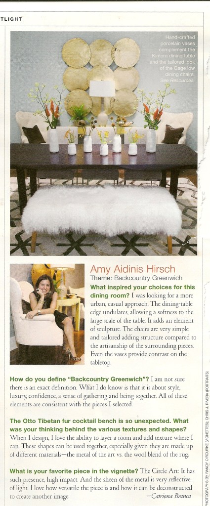
November 2013:  Q&A with Connecticut Cottages and Gardens Magazine

Connecticut Cottages and Gardens Amy Hirsch

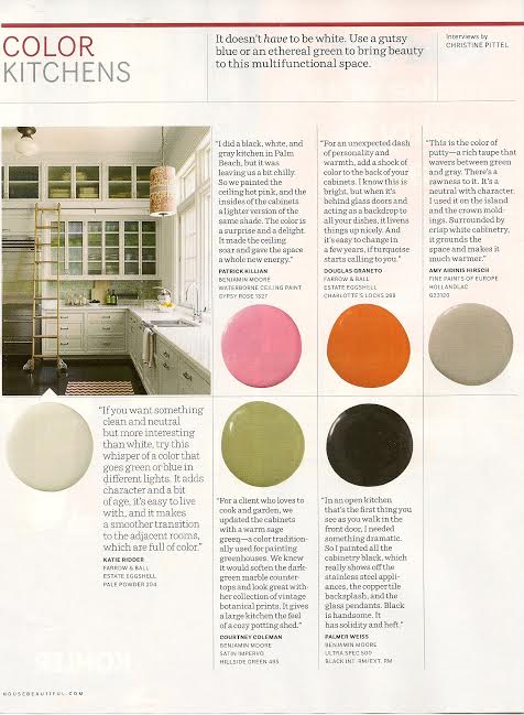
December 2013:  Kitchen Color in House Beautiful Magazine

Amy-Hirsch-House-Beautiful

Favorite Things: The Art of Wrapping

The only thing better than receiving a well wrapped gift, is giving a well wrapped gift.

The only thing better than receiving a well wrapped gift, is giving a well wrapped gift.  Beautiful wrapping shows care and thoughtfulness, whether you are presenting a gift to a cherished loved one or the hostess at a holiday party.  I love great wrapping paper and bows.  There are so many creative ways to wrap gifts with varying textures, layers, and materials.  When wrapping holiday gifts, you don’t need to feel constrained by typical colors and themes.  Not everything has to be red and green!  Think of less obvious elements that invoke the season and incorporate those into your gift wrapping instead.  Creating a uniquely pretty gift is definitely an art form, and certainly one that will be appreciated by your family and friends.  Here are some of my favorite paper products and inspirations for wrapping holiday gifts.

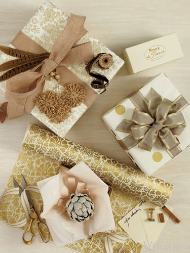
1.  Eclectic, but cohesive, gift wrap inspiration.  Photo by Max Kim-Bee.

Max Kim-Bee

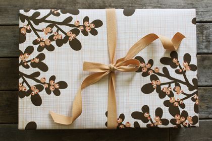
2.  Peach Berries paper from Kate & Birdie Paper Company.

Kate and Birdie

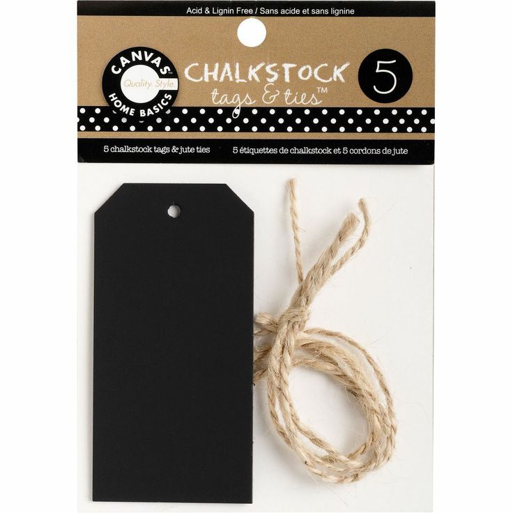
3.  Chalkstock Tags from Paper Source.

Paper Source Chalkstock

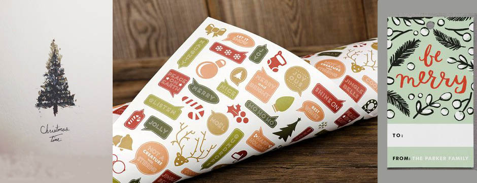
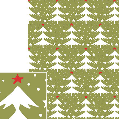
4.  Vintage Trees paper from Paper Source.

Paper Source Vintage Tree

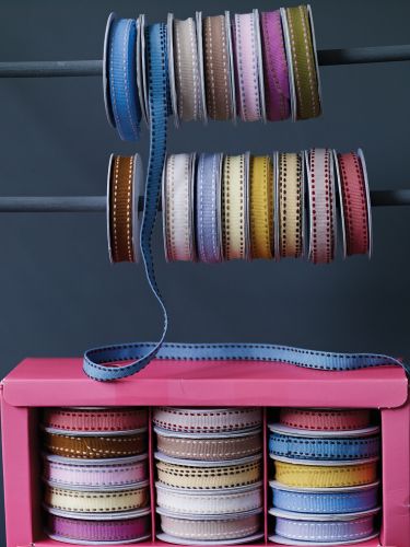
5.  Box of Gorgeous Ribbons from Cox & Cox.

Cox and Cox Ribbon

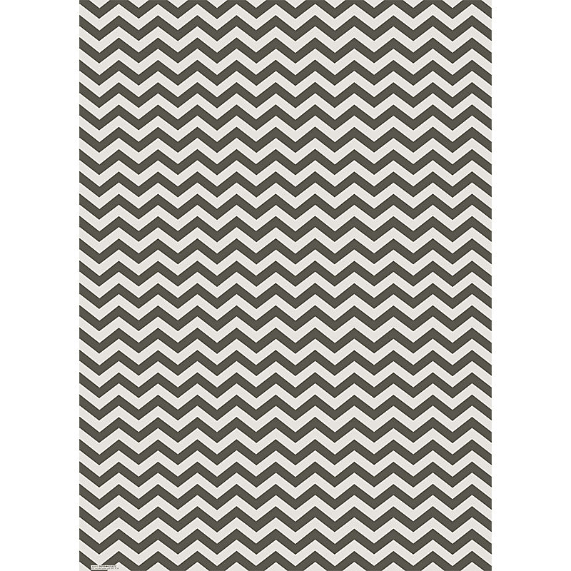
6.  Chevron paper from Paper Source.

Paper Source Chevron

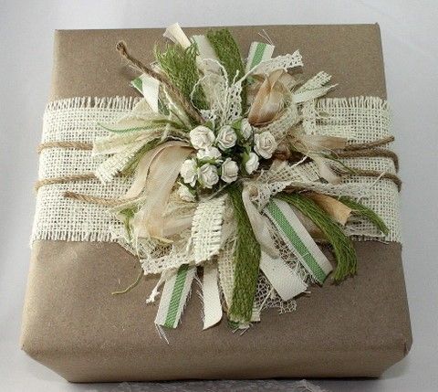
7.  Burlap wrap and bow from May Arts.

May Arts Burlap

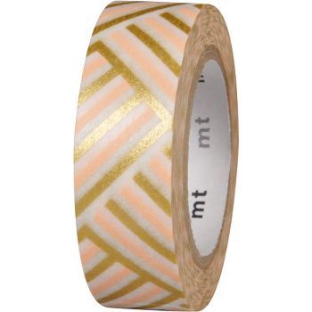
8.  Corner Peach Washi tape from Paper Source.

Corner Peach Washi Tape Paper Source

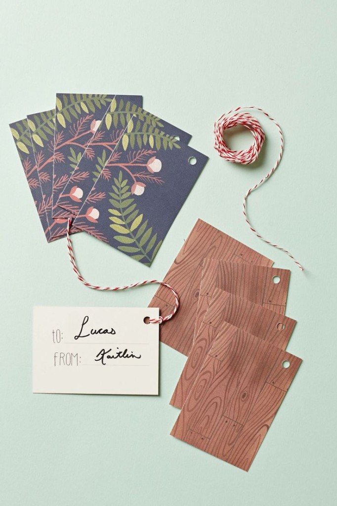
9.  Forest-Found Gift Tags from Anthropologie.

Gift Tags Anthropologie

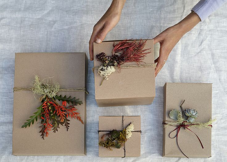
10.  Gift wrapping inspiration with natural greenery by Flora Grubb Gardens.

Flora Grubb Wrapping Ideas

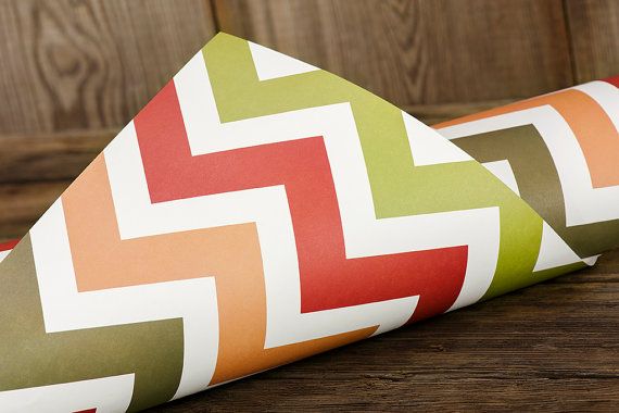
11. Chevron paper from ruffhouseart on Etsy.

Chevron Wrapping Paper

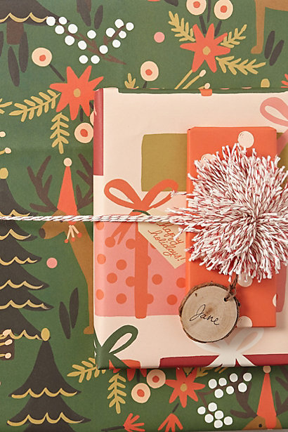
12.   Good Tidings paper from Anthropologie.

Good Tidings Anthropologie