NY and Paris Fashion Weeks, Spring 2014

Browsing through designs from various Fashion Week events inspires me and provides a boost to my creativity.

Here in Connecticut, brutal temperatures and piles of snow make spring feel like a distant dream.  In the fashion world, however, spring lines have already been designed and are being launched at events around the world.  This exciting look at trends and styles to come captures the attention of anyone interested in fashion.  In particular, New York Fashion Week (Feb 6-13) and Paris Fashion Week (Feb 25-Mar 5) provide an exciting venue for designers to showcase their new pieces.

Isabel Marant
Isabel Marant

The worlds of fashion and design influence each other in so many ways.  Colors, patterns, textures, and styles transpose from one medium to the other, so that looking at the world of fashion provides insight into the world of design.  My own love of fashion is closely intertwined with my passion for interior design.  Browsing through designs from various Fashion Week events inspires me and provides a boost to my creativity.

Valentino
Valentino

Here are some more of my favorite fashions that are coming out of this year’s Fashion Week events:

Pamella Roland
Pamella Roland
Miu Miu:  I love the color combination of this retro look.
Miu Miu: I love the color combination of this retro look.
Pamella Roland
Pamella Roland
Chanel:  Always chic.
Chanel: Always chic.
Kenzo
Kenzo
Nina Ricci
Nina Ricci
Breathtaking design by Mabille.
Zuhair Murad Haute Couture
Guy Laroche
Guy Laroche
Vionnet
Vionnet
Vionnet
Vionnet

Which spring fashions are you most excited about?


Color Obsession: Blueberry and Yellow

Blueberry and yellow is one color combination I really love.

A few days ago, I saw some freelance work my Project Manager Jess was working on.  She makes beautiful cards, and was testing colors for her creations.  One of her palettes used blueberry and yellow, and it struck me as so appealing.  The next day, Krystal, another project manager, came in dressed in a really great outfit with the same blueberry and yellow palette.  I love how inspiration can come in tiny ways like this; a lovely card or a striking outfit.  Inspiration doesn’t have to come from some grand scheme but can be found in so many places.  These colors became the inspiration for an entire family room design.

The contrasting shades of blueberry and yellow bring out the best in each other and provide such a bright, rich hue.  It’s a graphic and eye-catching combination, with the darker blue bringing out the sunniness of the yellow.  It brings to mind warm summer days, something most of us are looking forward to this time of year.  In both interior design and fashion, blueberry and yellow are so uplifting.

Amy Aidinis Hirsch

1.  Blue and Yellow

2.  Suellen Gregory Interior Design

3.  Phillip Lim Pashli Satchel

4.  Dress by Stella McCartney

5.  Swatch by artist Sonia Delaunay

6.  Manolo Blahnik Suede Pumps

7.  Design by Joel Bray


Golden View Firenze

I recently visited a new restaurant in Greenwich called Golden View Firenze and was really impressed with everything from the food to the decor.

I recently visited a new restaurant in Greenwich called Golden View Firenze and was really impressed with everything from the food to the decor.  From the start of my visit to Golden View Firenze, I loved the fresh, exciting atmosphere of this very chic restaurant.

Golden View Firenze Greenwich CT
Golden View Firenze

Owner Tommaso Grasso also has a restaurant in Florence, Italy.  He decided to open a second restaurant in Connecticut after a visit to the area.  Tommaso brought chef Francesco Casu with him from Florence, ensuring the food at Golden View Firenze would be a true representation of authentic Tuscan cuisine.

The decor at Golden View Firenze is intimate and based in a clean white palette.  The view to the kitchen is open, letting diners watch the chefs prepare fresh dishes, including hand-made pastas.  Shelves of wine are a prominent feature of the restaurant’s interior, but it isn’t all for show.  The staff are very knowledgeable about the wine and well prepared to offer suggestions.

Golden View Firenze Greenwich
View into the kitchen.
Golden View Firenze
Simple, elegant decor.
Golden View Firenze Connecticut
The impressive wine display.

Just like in any really good restaurant, the food must be the star of the show.  Everything we tasted was excellent!  I started with a wine mojito, which was delicious.  We had a cheese plate and I tried the veal dish as well as an incredible four cheese pasta.  My husband had the filet with an amazing dipping sauce.  Even the bread was perfect.  It really was like eating in Italy.  The menu is very well done and I look forward to going back soon!

Golden View Firenze CT
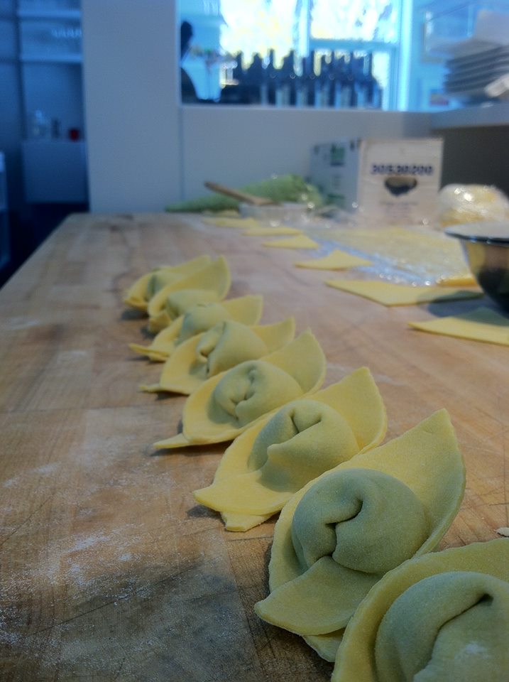
Hand-made pasta.
Golden View Restaurant CT
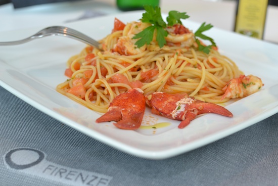
Seafood pasta. Image courtesy of Connecticut Mag.
Golden View Firenze Restaurant CT
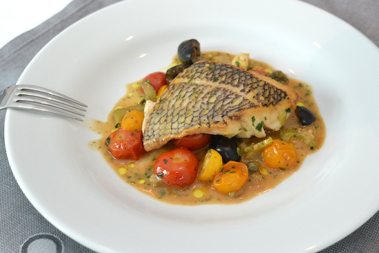
Fresh fish with roasted tomatoes. Image via Connecticut Mag.

A review on Ilovefc.com by Mary Kate Hogan mirrors the fantastic experience we had at Gold View Firenze and describes some of the other perfect dishes.  You can learn more about Golden View Firenze by finding them on Facebook.


NEH Design in Depth: A New Studio in Greenwich

Last week, I was happy to host New England Home’s networking event for designers, builders, and architects at my Greenwich studio.

Last week, I was happy to host New England Home‘s networking event for designers, builders, and architects at my Greenwich studio.  We had a wonderful evening!  My friend Stacy Kunstel – talented stylist, writer, producer, and editor – wrote a great feature about this event for the NEH blog.  What a great start to a new year in my new studio.

Design in Depth: A New Studio in Greenwich

By Stacy Kunstel

Last Thursday night New England Home kicked off its networking events for 2014 in Greenwich at the new studio of Amy Aidinis Hirsh Interior Design. Having published Amy’s work before in our Connecticut edition, and having recognized her with a 5 Under 40 design award,* we of course expected it to be a wonderful space. I, for one, was unprepared for how much I absolutely loved this interior design studio. Here are a few photos of the space before it started to fill up with people.

01-amy-hirsch-studio

Photos by Stacy Kunstel

02-amy-hirsch-studio

03-amy-hirsch-studio

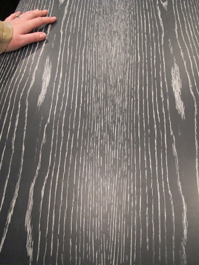
As with her residential designs, details are so important and play such a crucial role. These cerused tables and baskets serve as stylish markers and organizational tools.

04-amy-hirsch-studio

05-amy-hirsch-studio

06-amy-hirsch-studio

More than once during the evening I heard other designers mention how much they wished their own samples room looked like Amy’s.

07-amy-hirsch-studio

08-amy-hirsch-studio

09-amy-hirsch-studio

10-amy-hirsch-studio

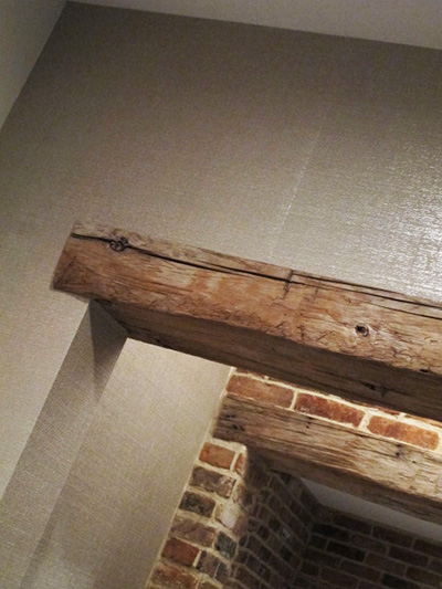
Equal measures rough and glam balance the studio, such as this combination of rough-hewn beams and shimmering paper.

11-amy-hirsch-studio

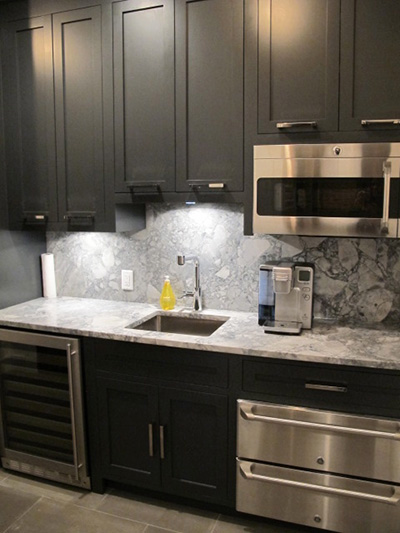
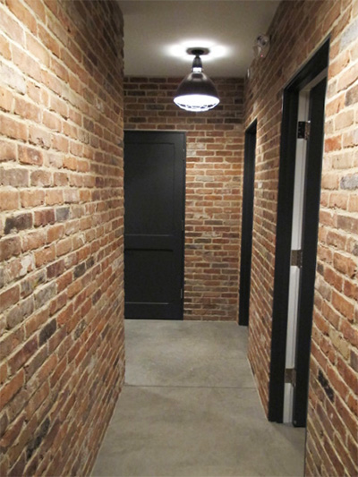
Check out the powder room, break room, and back hall.

12-amy-hirsch-studio

13-amy-hirsch-studio

14-amy-hirsch-studio

15-amy-hirsch-studio

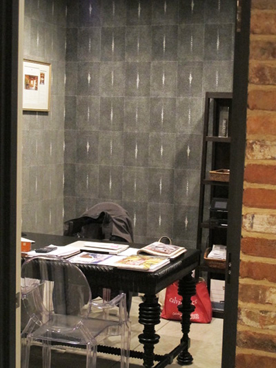
Amy’s own office is just as chic.

16-amy-hirsch-studio

Congratulations, Amy, on your new space, and thanks for making it such a great party!

17-amy-hirsch-studio

* Editor’s note: It’s not too late to be one of 2014’s 5 Under 40 award winners—however, all nominations and supporting material are due next Monday, February 10. Click here for more information.

Giambotte: Sausage, Chicken, Peppers, and Potatoes

This is a great dish to make on a cold night!

I found this recipe in a cookbook my mom gave me years ago.  The cookbook is Elodia Rigante’s Italian Immigrant Cookbook and it is filled with many wonderful recipes.  She also shares stories and pictures of her family throughout the book.  Many of the dishes are from her mother, whom she calls Mammanon.  She says Giambotte is from Bari, her father’s hometown in southern Italy.

Italian Immigrant CookingThe word Giambotte means mixture and is a peasant dish.  The original recipe calls for boneless chicken breasts, but I like to use bone-in pieces as they tend to stay moist when cooking.  I also add chicken stock to the recipe, which creates a delicious sauce.  If you use sweet sausage, you may want to add hot red pepper flakes to make a spicy Gambotte.  If you use hot sausage, the dish will be spicy enough.  Either way, it is a great dish to make on a cold night!
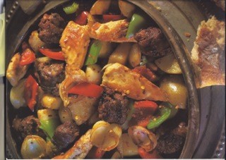
Giambotte

INGREDIENTS

1 lb sweet sausage

1 lb hot sausage

or

2 lbs of either hot or sweet sausage

4 whole boneless, skinless chicken breasts, sliced in 2 inch pieces

or

2 whole chicken breasts, bone in, skin removed, cut in half, then each half cut again

4 to 6 drumsticks

¼ cup olive oil

1 bag small yellow creamer potatoes, halved

1 red pepper, sliced

2 Italian green peppers, sliced

1 large onion, sliced

chicken stock (optional)

1 teaspoon oregano

½ cup each chopped fresh basil and parsley

2 whole bay leaves

salt and pepper to taste

hot red pepper flakes (optional)

Serves 4 to 6

In a large skillet, add some of the olive oil.  Add the sausage and sauté over medium heat until browned.  Remove the sausage and set aside in bowl.

Sauté the chicken pieces in the oils from the sausage in the skillet.  Season with black pepper and cook until brown. Reduce the heat to low; add the sausage back to the skillet and simmer.

In a separate skillet, heat up some olive oil and add the peppers, onions and potatoes.  Season with salt and pepper, brown the vegetables and cook until tender.  Transfer the vegetables to the skillet with the sausage and chicken.  If using the chicken stock, add to the mixture.  Add the chopped parsley and basil, the whole bay leaves, and season with salt and pepper to taste.  Simmer until all flavors are mixed together.  For additional spiciness, add ¼ tsp of hot red pepper flakes; adjust accordingly.  Remove whole bay leaves before serving.

Serve the Giambotte with warm, crusty Italian bread and your favorite salad!


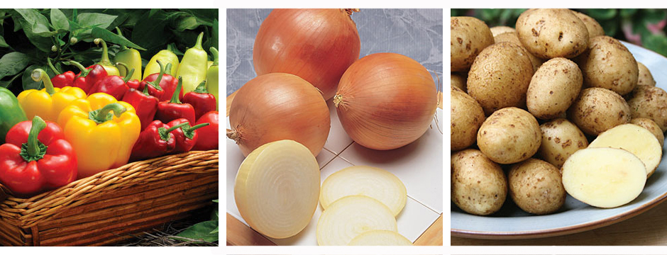
Cover images courtesy of Burpee


Feature in Greenwich Magazine

I recently sat down with Greenwich Magazine to talk about my new studio and office space.

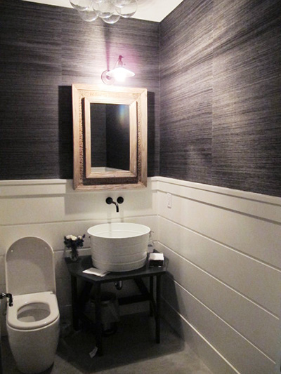
I was recently interviewed by Greenwich Magazine to talk about my new studio and office space.  It was a great opportunity to express why this building is so special as well as the process of creating my ideal working office and I was so excited to see their feature in this month’s issue.
Moffly Article Amy copy

Pretty Rooms

The Merriam-Webster dictionary defines pretty as, “attractive to look at, usually in a simple or delicate way.”

The Merriam-Webster dictionary defines pretty as, “attractive to look at, usually in a simple or delicate way.”  When I’m sourcing for inspiration, I sometimes come across rooms that just strike me as being so pretty.  When all of the elements of a space come together to create a pretty environment, the room looks so welcoming and pleasant.

Design by Lucas Studio Inc.
Design by Kerry Joyce
Design by McAlpine Booth & Ferrier Interiors
Designed by Phoebe Howard
By Tom Scheerer
By Tom Scheerer

When a room is soft and warm, it is naturally inviting.  Pretty rooms are comfortable and charming without being boring or run-of-the-mill.  A bright, cheerful room makes a relaxing sanctuary.  Making small statements with lighting, accessories, or additional color saves a pretty room from being too cloying.  The overall effect is clean, simple, and appealing.

By Carrier and Company
Design by Windsor Smith
Design by Phoebe Howard
Albert Hadley, Colonial design.
Tilton Fenwick for the Hampton Show House

What’s your idea of a pretty room?

Great Articles in Feb 2014 House Beautiful

The current issue of House Beautiful, February 2014, included some really great features.

The current issue of House Beautiful, February 2014, included some really great features.  Two articles in particular stood out for me; Pretty Spectacular, featuring design by Miles Redd, and In the Grand Manner, featuring design by Stephen Gambrel.  Both articles showed how these wonderful designers used an amazing amount of color.  From Gambrel’s use of peacock blue lacquer to Redd’s bursts of bold colors throughout a Brooklyn residence, the rich color stands out in these beautiful spaces.  The effect is so textural and rich.  The saturated colors create warmth and pure decoration, with tons of pattern upon pattern.

When I design for clients, I sometimes struggle between days of preferring clean, sleek interiors, and then days when I love layering with color and just inundating a room with detail.  What I love about these features in House Beautiful is how they show that Redd and Gambrel don’t sacrifice on quality and their clientele understand that something so perfectly orchestrated can be comfortable and livable.  It is really inspiring!  I walked away from this issue wanting to shake off the winter doldrums and do something bold.

Pretty Spectacular

By Christine Pittle.  Photos by Frederic Lagrange.

House Beautiful Feb 1House Beautiful 2 febHouse Beautiful 3 febHouse Beautiful 4 febHouse Beautiful 5 febHouse Beautiful 7 febHouse Beautiful 8 febHouse Beautiful 9 febHouse Beautiful 10 feb

In the Grand Manner

By Mimi Read.  Photos by Eric Piasecki.

House Beautiful 11 febHouse Beautiful 12 febHouse Beautiful 13 febHouse Beautiful 14 febHouse Beautiful 15 febHouse Beautiful 16 febHouse Beautiful 17 febHouse Beautiful 18 febHouse Beautiful 19 febHouse Beautiful 20 febHouse Beautiful 21 Feb


Ashley Pittman Collection

During the winter, I tend to gravitate toward chunkier jewelry like the pieces designed by Ashley Pittman.

During the winter, I tend to gravitate toward chunkier jewelry like the pieces designed by Ashley Pittman.  Her jewelry is so edgy and can make an entire outfit.  I like the way many of these jewelry designs make sounds as I wear them, adding another layer of sensation.

Horn Pendant
Horn Pendant
Horn Bangle
Horn Bangle
Kumweka necklace with horn and bronze.

Ashley Pittman Collection jewelry is handmade in Africa, with a portion of the profits helping to fund education and health improvements in rural Kenya.  Each piece is hand crafted from natural indigenous materials such as ethically sourced horn, bronze, and semi-precious gemstones.  I consider my Ashley Pittman jewelry to be heavy artillery in my collection of accessories.

Dark Horn Fuvu Earrings
Shaba Bangles, horn and gold-toned bronze.
Kubwa topaz and horn ring.

You can find Ashley Pittman on Facebook or see more of her designs on her website.


Primary Food and Drink, Greenwich

I recently had the pleasure of trying a new restaurant in Greenwich: Primary Food and Drink.

I recently had the pleasure of trying a new restaurant in Greenwich:  Primary Food and Drink.  Located at 409 Greenwich Avenue, Primary is the newest restaurant from celebrity chef Graham Eliot Bowles.  In addition to being a critically acclaimed chef with two Michelin starred restaurants and the more casual Graham Eliot Bistro, he is one of the stars of the reality television shows Master Chef and Master Chef Junior.  The Chicago native opened Primary with longtime culinary and business partner Merlin Verrier, who will act as Primary’s Executive Chef and Managing Partner.

Graham Eliot and Merlin Verrier

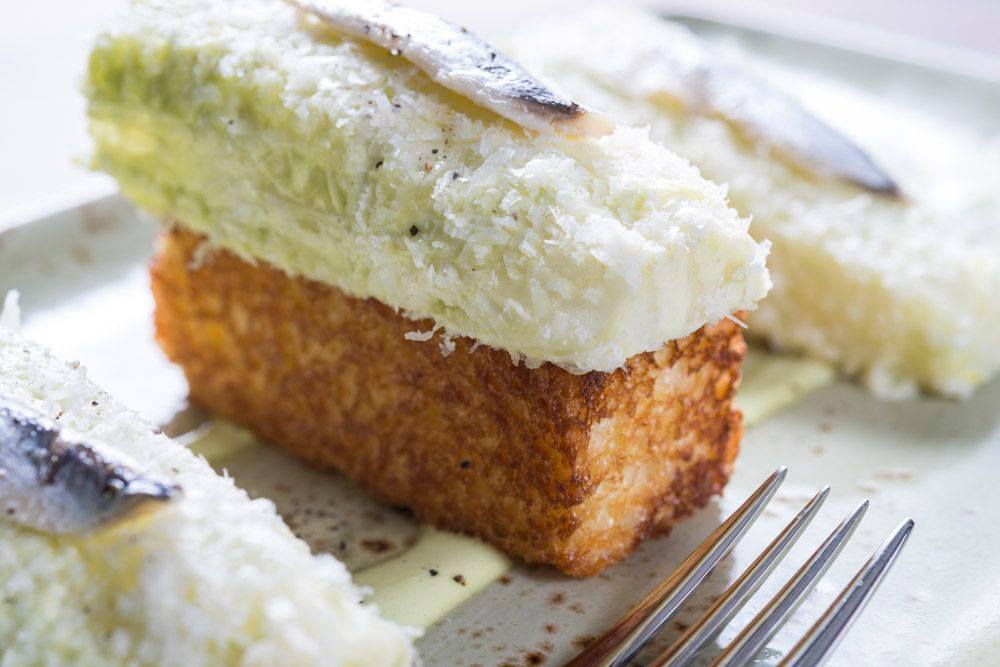
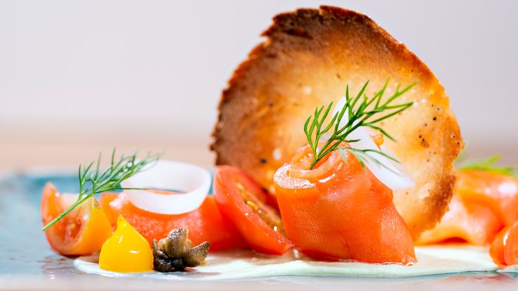
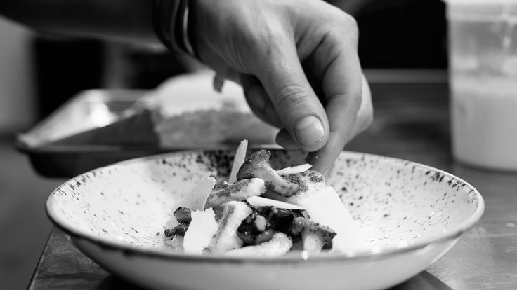
The experience and talent behind Primary is quickly evident when you visit this unique restaurant.  The menu offers modern, gourmet takes on classic dishes such as Caesar Salad, Beef Stroganoff, and Gnocchi.  The menu is not extensive but focuses on high quality, fresh ingredients prepared artfully and with the utmost attention to flavor.  At Primary, the food really is art.  Each bite is so delicious; you can easily tell how thoughtfully the various flavors are paired together.   The Lobster Schnitzel, for example, is such a different way to serve this classic New England seafood.

Deconstructed Caesar
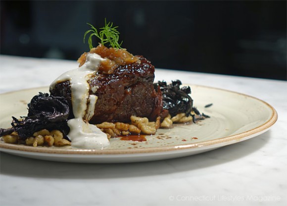
Beef Stroganoff, made with braised short rib.
Beef Stroganoff, made with braised short rib. Image via Connecticut Lifestyles Magazine.
Food as art.
Food as art.
Each dish shows attention to detail.

The interior of Primary is a great reflection of the menu.  It is simple and open, with some seating that allows for a view into the open kitchen.  Wood tables, leather seating, and wall decorations consisting of mirrors and understated lighting are playfully balanced by a tile mosaic floor.  The bar area also features a clean, simple look that works well with the restaurant’s modern vibe.  The waitstaff’s uniform of checkered shirts and jeans reflect Primary’s casual mood and allow the food to be the main attraction.

Dining Room
Dining Room
Bar
Bar
The tile floor mosaic with the Primary logo.

I really enjoyed visiting Primary and am already looking forward to going back.  You can see their full menu and make reservations at Primary’s website.  They are also on Facebook and Twitter.