Author: Amy Hirsch
Design Seeds
Design Seeds is a site that celebrates colors found in nature.
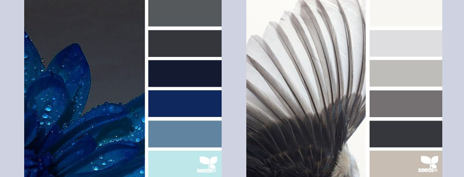
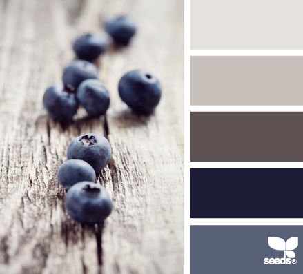
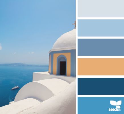
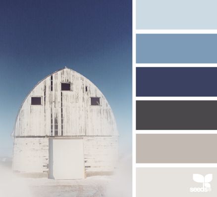
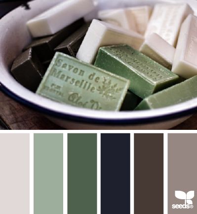
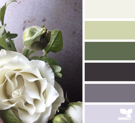
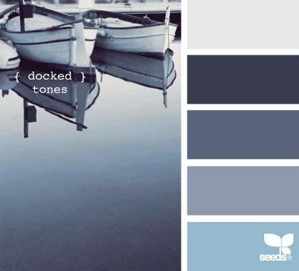
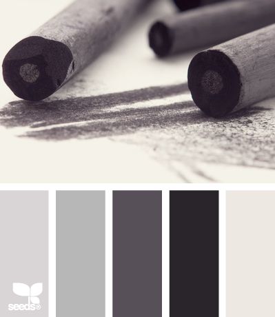
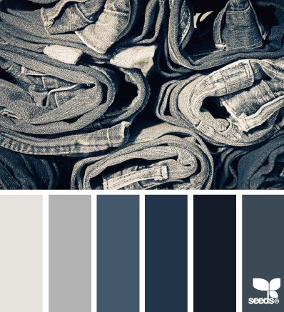
Design Seeds is a site that celebrates colors found in nature. Created by Jessica Colaluca, Design Seeds is a unique site that lets you explore color palettes based on stunning photos of everything from flowers to interior vignettes. Jessica uses her own photos or images submitted to her and creates custom color palettes based on those photos. Unlike automatic color generating programs, Jessica digitally creates each hue herself.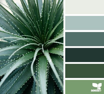
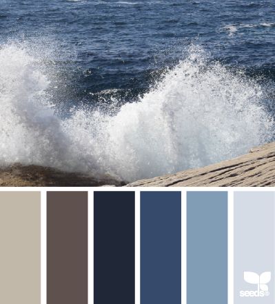
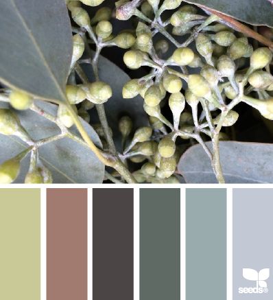
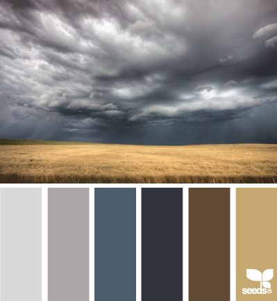
In addition to being visually quite beautiful, Design Seeds is a great resource for a variety of applications. Comparing the many palettes is really inspiring. It’s fascinating to see the images deconstructed to individual colors and to think of the many ways to incorporate them into an interior or other color scheme. Jessica has made the HEX code (a way of specifying color using hexadecimal values) available for each color, making it easier to digitally recreate a hue you may want to use. A good paint store should be able to match shades printed with a well calibrated printer.
Design Seeds is a great resource. I love to browse through the site and feel inspired by how different colors are paired. It’s a fascinating way to create a palette as well as a helpful visual tool to exemplify a vision to a client.
Roman and Williams
Roman and Williams is a New York based design firm with an interesting back story.
Roman and Williams is a New York based design firm with an interesting back story. Robin Standefer and Stephen Alesch spent ten years designing sets for Hollywood films before taking on their first residential project, a home in Los Angeles. Together they formed Roman and Williams (named for their grandfathers) in 2002 and in 2004 relocated the firm to New York. Since then, they’ve completed an impressive scope of projects including homes, restaurants, hotels, and retail locations.
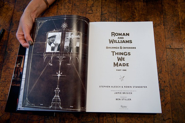
 I have a book of work by Roman and Williams called Things We Made, given to me by a cousin who is studying architecture. She thought I’d be interested in their projects, and she was right. I really appreciate what they do and how they do it. Roman and Williams have a different approach than I do, but I like the moodiness and industrial vibe of many of their projects.
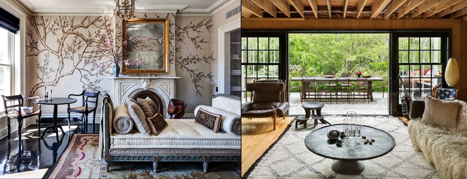
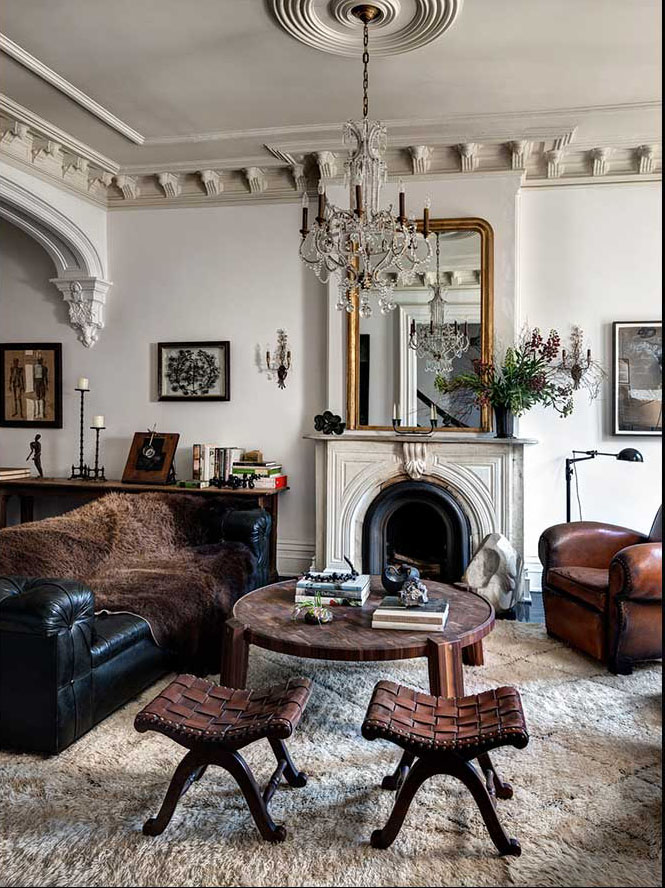
I find it interesting how they mix materials. Their interiors feature so many collected items — it takes skill to make this look effortless. They can take dilapidation and expand on it, creating a memorable environment. Roman and Williams has a huge design range, everything from industrial to clubby.
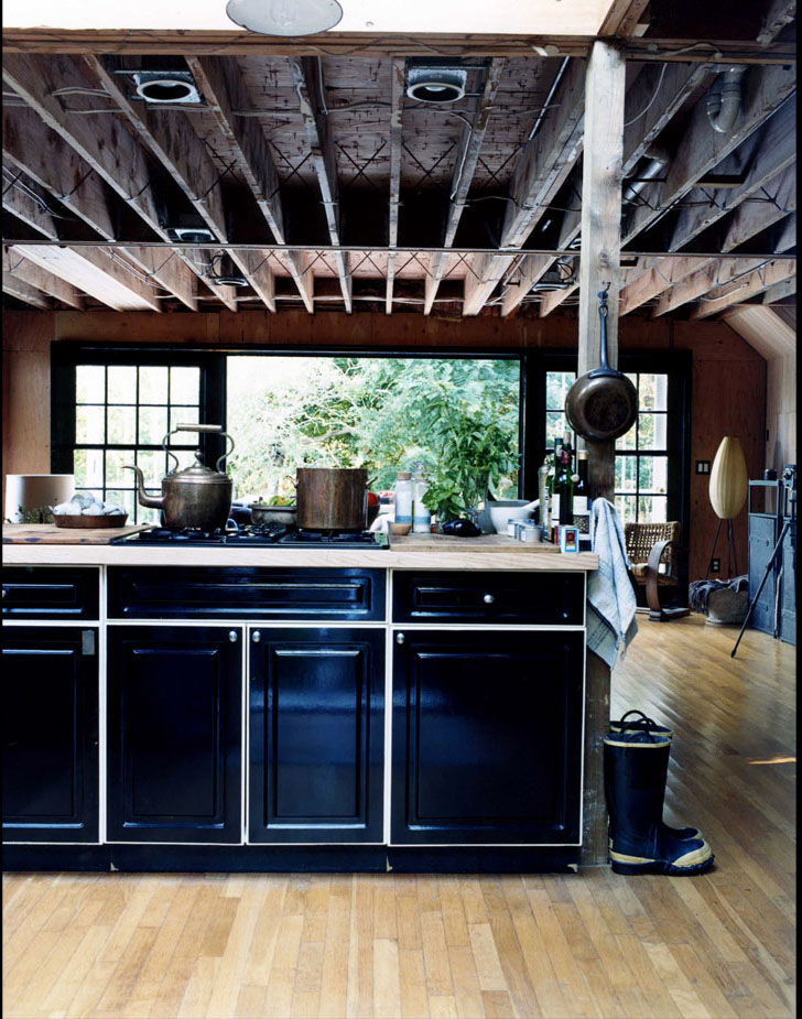
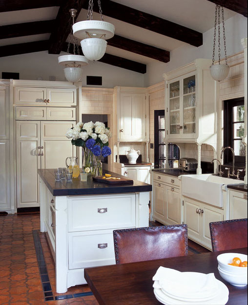


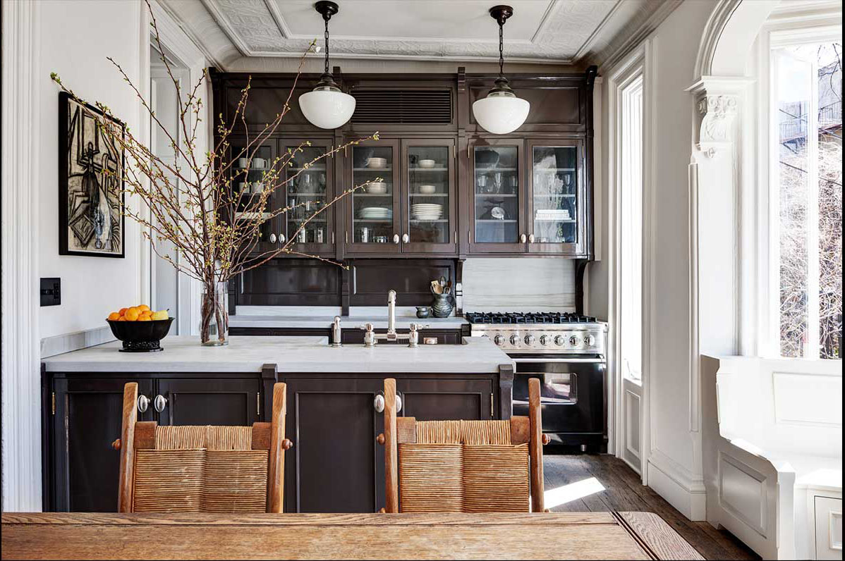 I recall seeing a kitchen years ago and remembering it was in actor Ben Stiller’s home. I was enchanted by the use of 3×6 tiles all over the kitchen walls and not just allocated to the back splash. It’s funny how certain things stay with you, and once I found out the kitchen was a Roman and Williams design, I was even more impressed with the the space and their work.
Design Dose
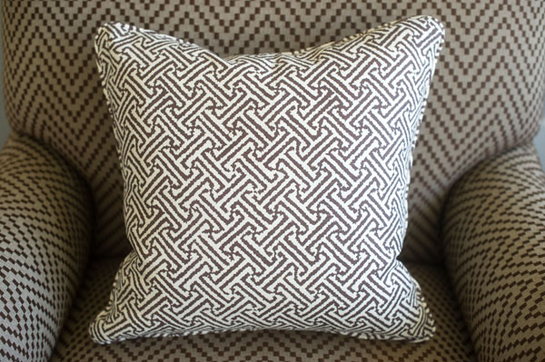
Get graphic with the same tones.
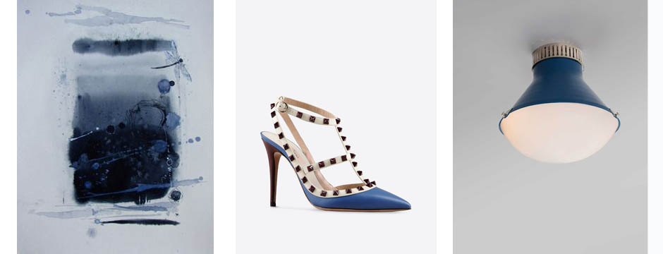
Color Obsession: Nautical Blue
To me, Nautical Blue brings to mind a more lush, sophisticated take on summer.
The word nautical typically conjures up images of novelty items like anchors, gulls, and sailboats. To me, Nautical Blue brings to mind a more lush, sophisticated take on summer. It’s a strong, bold color that reminds me of growing up on the water. Nautical Blue makes me think of the ocean, reflections, and the places where I find inspiration. As part of an interior, you can do a play on a nautical theme in a subtle way by using nubby fabric or a blue and white stripe. The interpretation of this shade and theme doesn’t have to be literal.
1. Togo Sofa from Ligne Roset
2. Commodore by Sherwin Williams
3. Cushion cover by Shibori
4. Chanel
5. Hexagon Range from Geometric Carpets
6. Blue Note Blonde, oil on canvas, Matt Story
7. Fabric by Ferrick Mason
8. Shoulder bag by Prada
Favorite Things: Desks
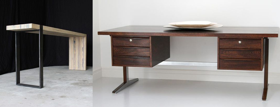
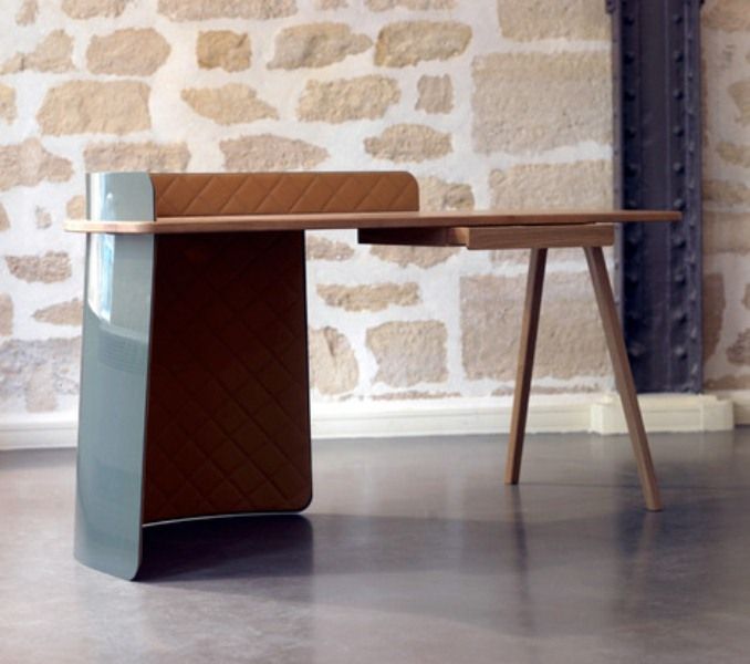
A desk can be very practical or more streamlined; it all comes down to how the piece will be used.
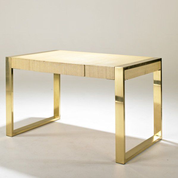
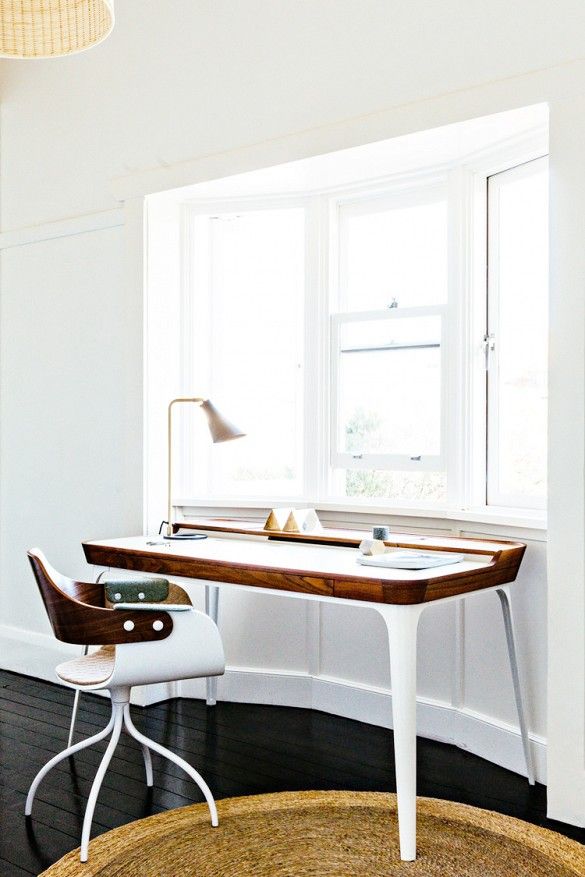
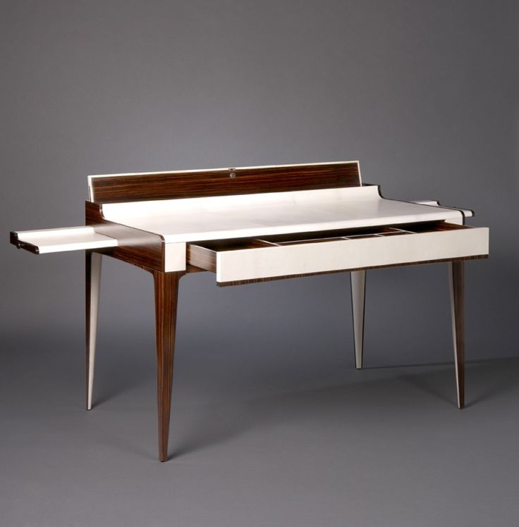
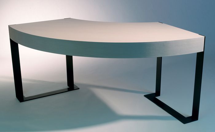
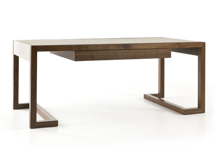
I recently went on a scavenger hunt for a desk for a client. This endeavor got me thinking about desks in general and how the choice of a desk is very personal. Individual people have different needs and, like people, desks come in all manner of shapes and sizes. A desk can be very practical or more streamlined; it all comes down to how the piece will be used. For example, if the desk is in a room custom fitted with plenty of storage, then it can be minimal as opposed to something with a variety of drawers and shelves. Men and women tend to have distinct preferences as well. Here are some of my favorite examples of desks:
1. Ana Casa Interiors: Yves Desk by Baxter
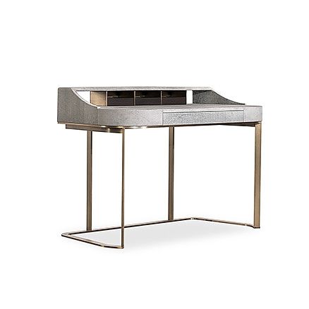 2. Big Boss Desk by Piergil Fourquie
3. Homework Desk from Design Within Reach
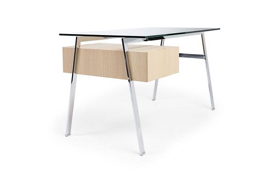 4. Lacquered Linen and Brass Desk
5. White and Walnut Desk, cm studio
6. Jobs by Poltrona Frau
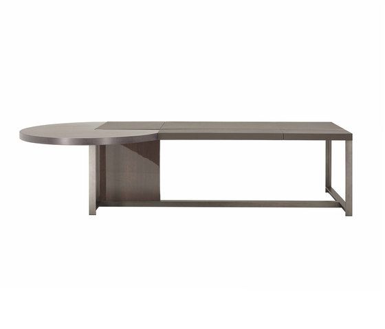 7. Aerial Desk, Dering Hall
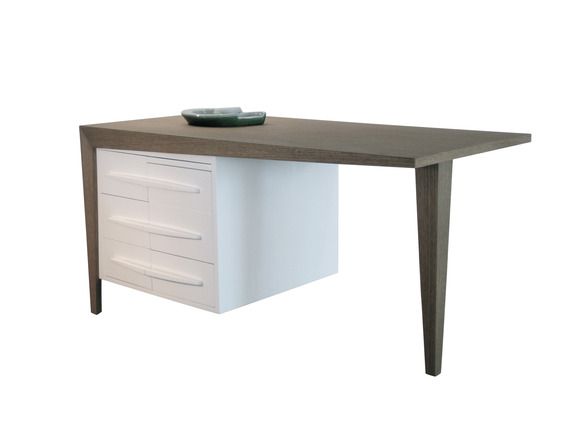 8. Louxor Desk by Nicolas Aubagnac
9. Antoine Proulx from Dennis Miller Associates
10. Bureau Plat Desk from Mortice & Tenon
Design Dose
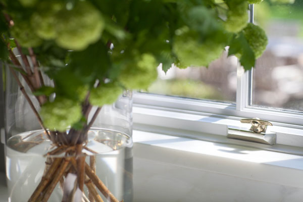
Capture the sunlight — simple beauty.
Meyer Davis Studio
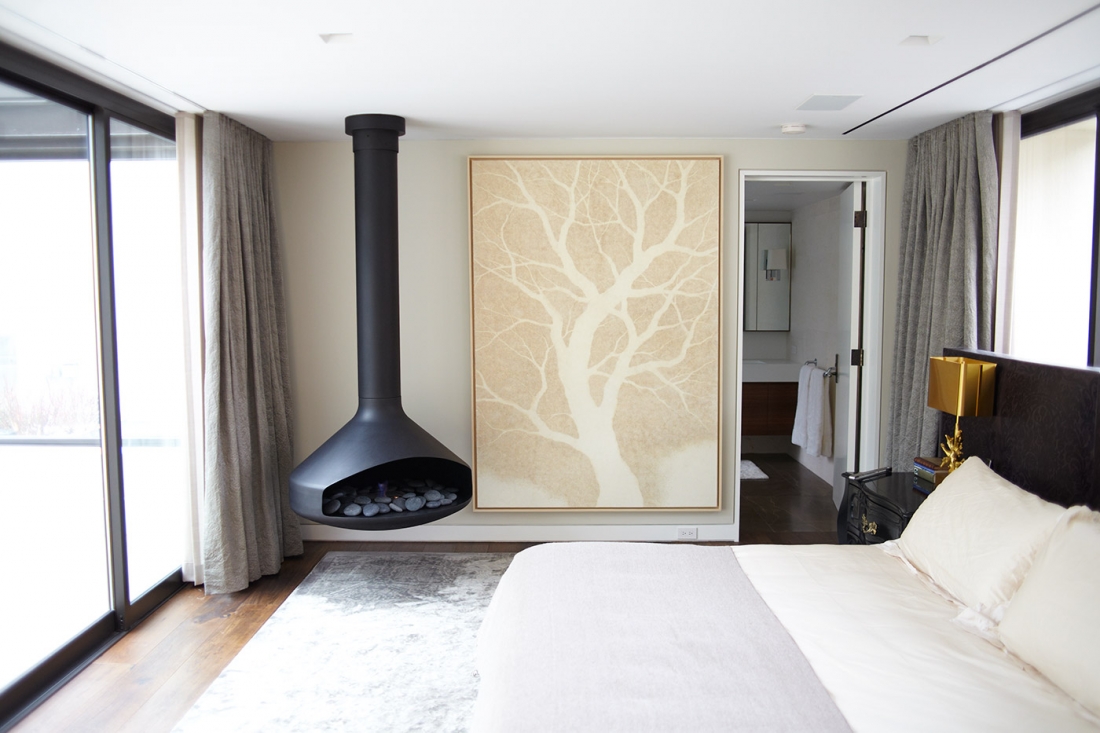
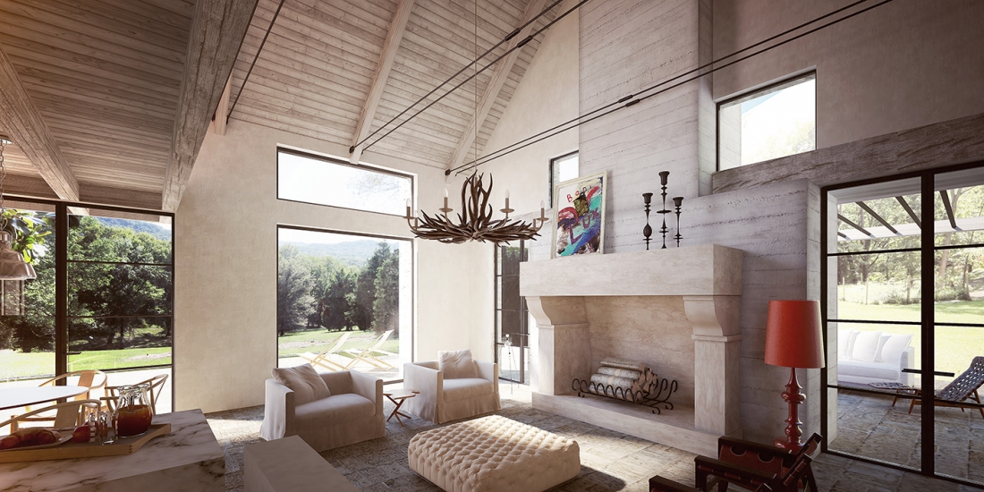
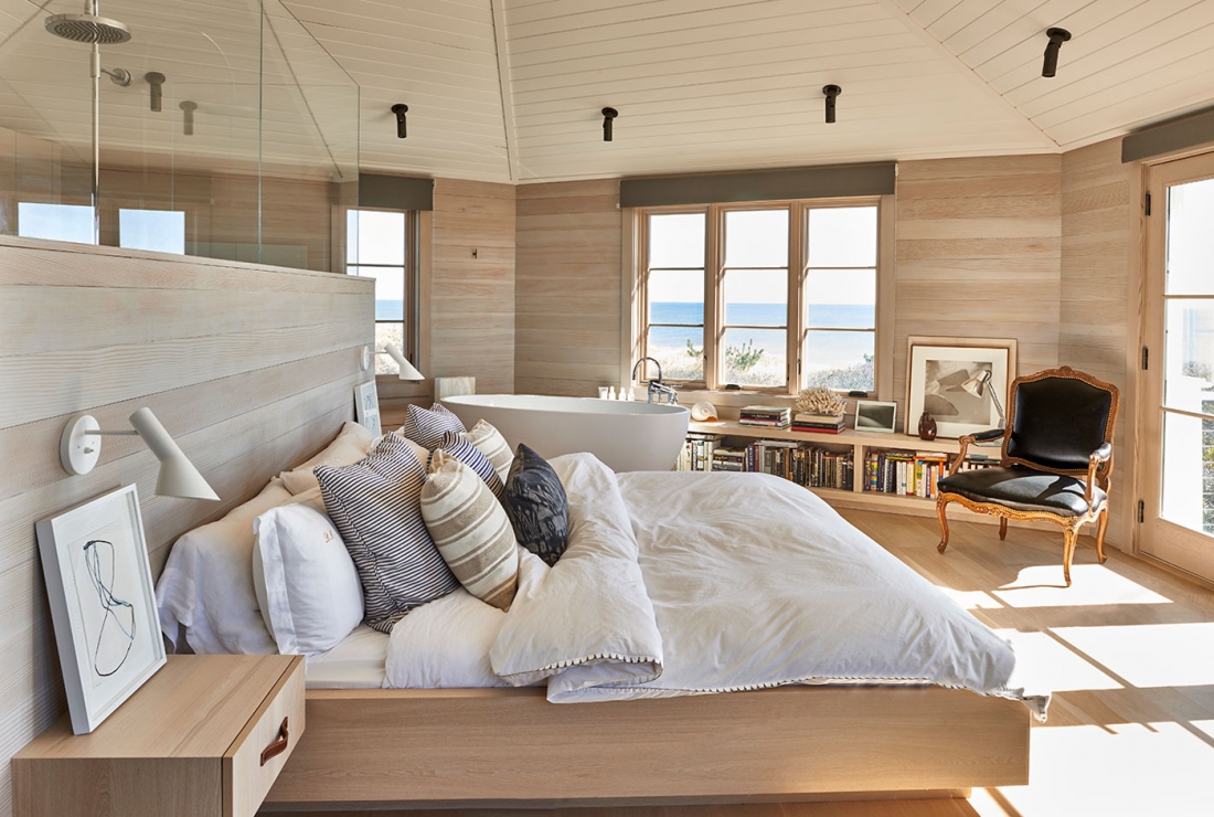
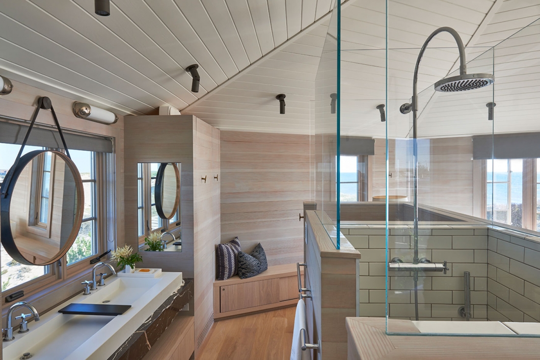
I really identify with the true quality of design shown by Meyer Davis Studio and appreciate how they take time for details.
Founded in 1999 by Will Meyer and Gray Davis, the New York City based firm Meyer Davis Studio has established itself at the forefront of luxury design for home, retail, hospitality, and office. Using “space, form, texture, and light, they develop a visual experience that seeks to compel and inspire.”
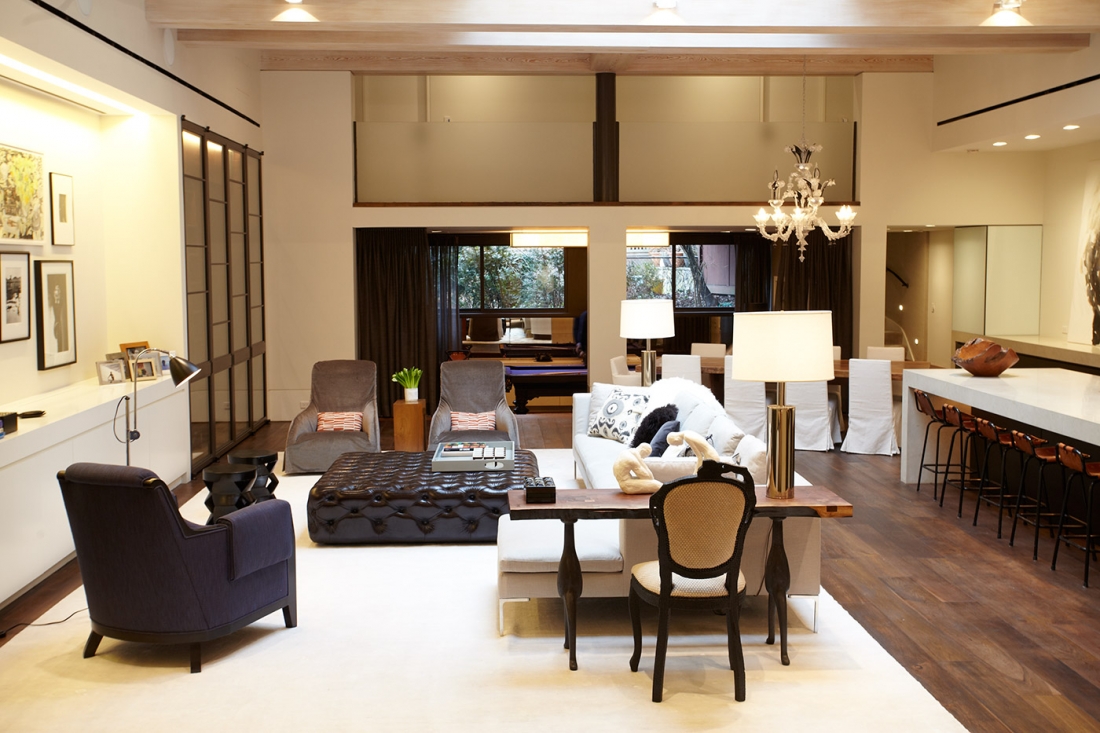
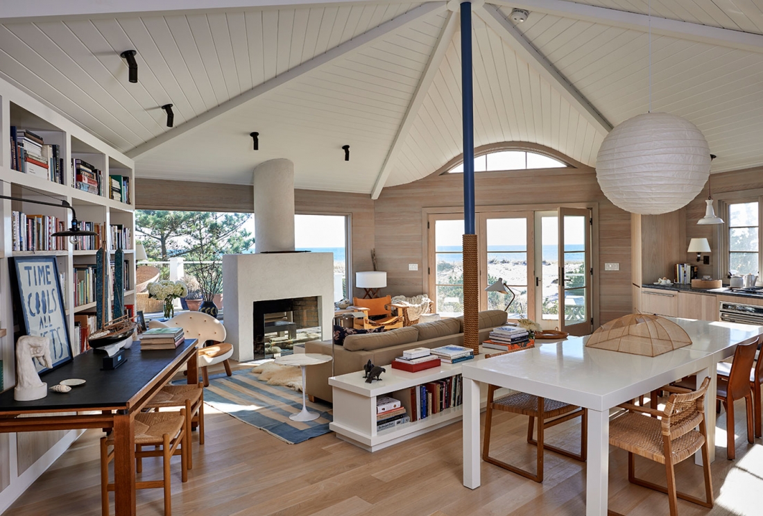
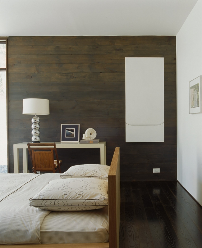
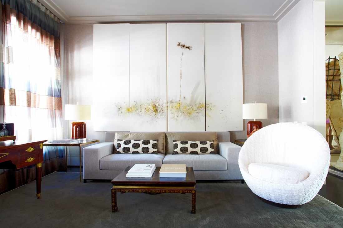
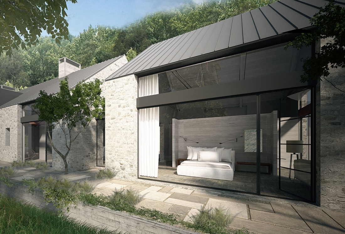
Prominent projects include the design of hotels such as 1 South Beach Hotel in Miami, Four Seasons, the Ritz Carlton, and W Hotels. Their work on Paramount Hotel in New York City was also recognized by Boutique Design’s 2014 Gold Key Awards. Their restaurant designs have been widely recognized by various award groups, making them highly sought after by some of the world’s leading restaurateurs. Meyer Davis also designed Oscar de la Renta’s worldwide boutiques.
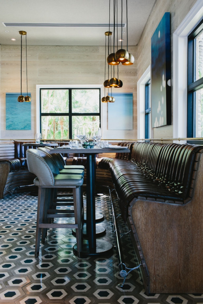
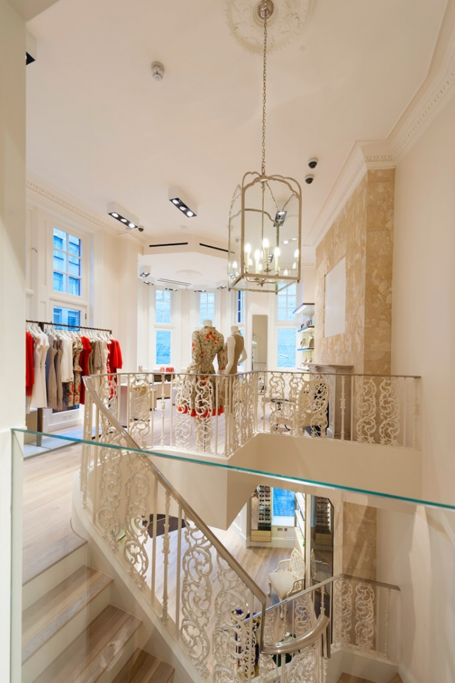
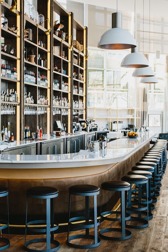
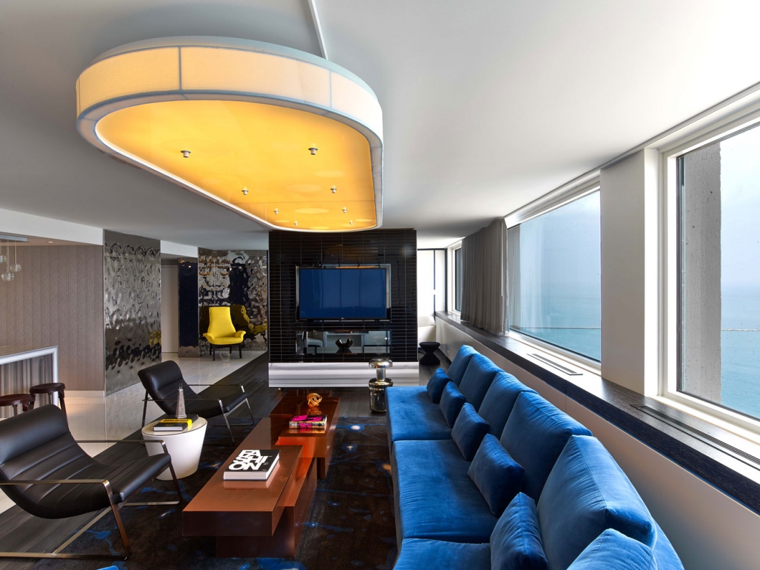
I really identify with the true quality of design shown by Meyer Davis Studio and appreciate how they take time for details. I love design that is simple and streamlined, but also crave more decorative, well appointed items. So many of their projects are just perfection to me.
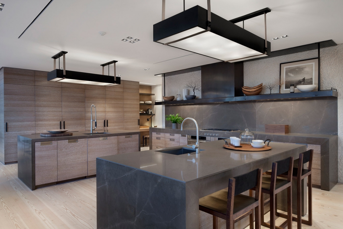
You can see more Meyer Davis projects on their website. They are also on Facebook.
Windsor Smith Collection for Arteriors
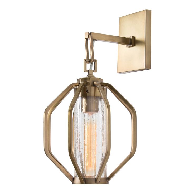
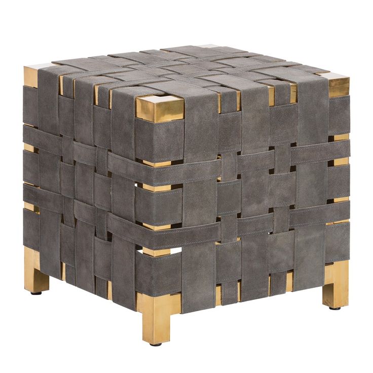
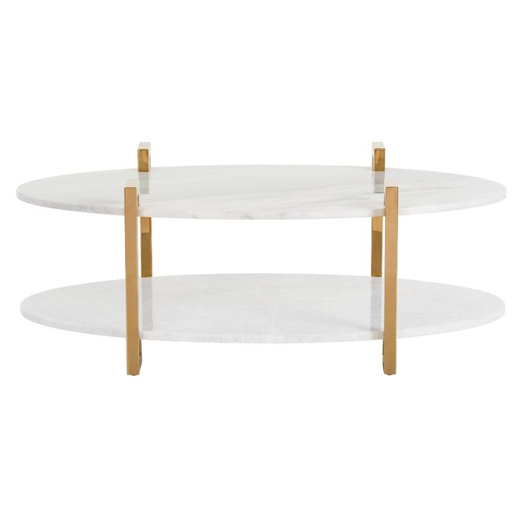
Earlier this year, Arteriors debuted a collection by Windsor Smith.
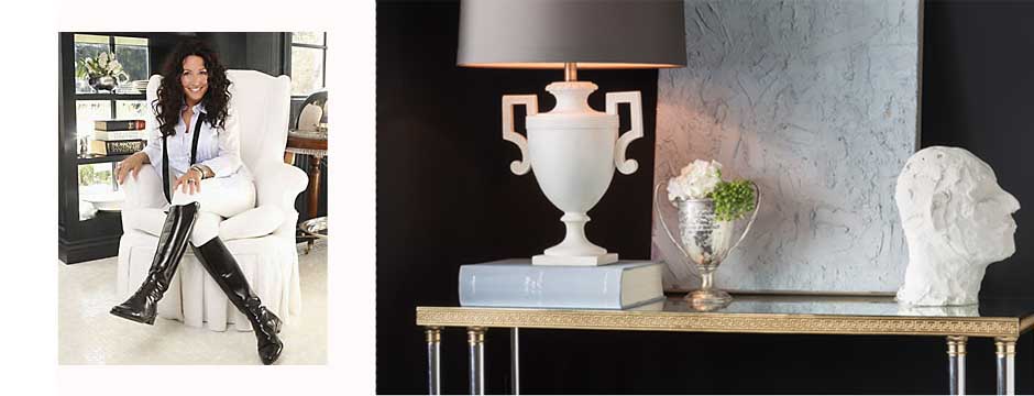
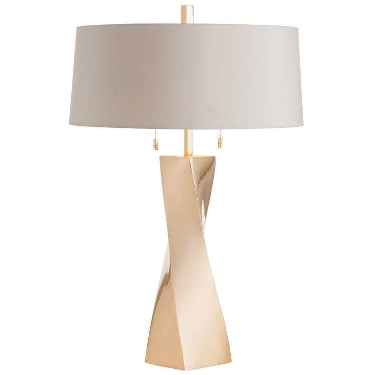
Earlier this year, Arteriors debuted a collection by Windsor Smith. Featuring Windsor’s iconic style, a luxurious blend of traditional and modern sensibilities, the collection is comprised of items that are as functional as they are sophisticated. Windsor has created a line with the goal, as she states, “for…each piece [to] engage conversation. I want these to be well loved now and heirlooms tomorrow.”
I love the geometric look of the pieces Windsor Smith designed for Arteriors. Each item looks very chic; you can see the influence of traditional aesthetics and classical Greek and Roman design, although the overall look of the line is quite modern.
Another great aspect to this line is the mix of materials found in many of the pieces. This blending of textures and finishes lends to the line’s elegance and timelessness.
You can see the full Windsor Smith Collection on the Arteriors website.

